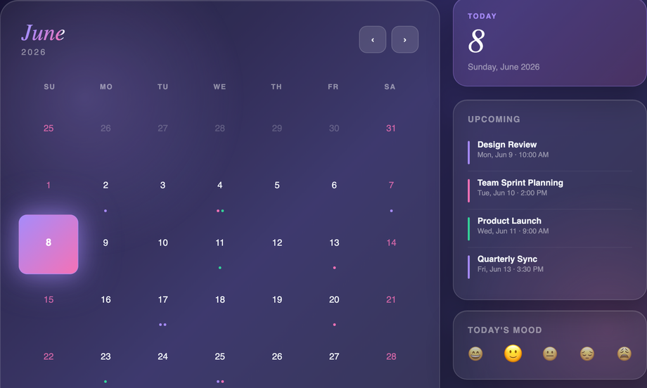
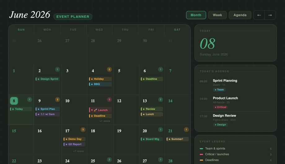
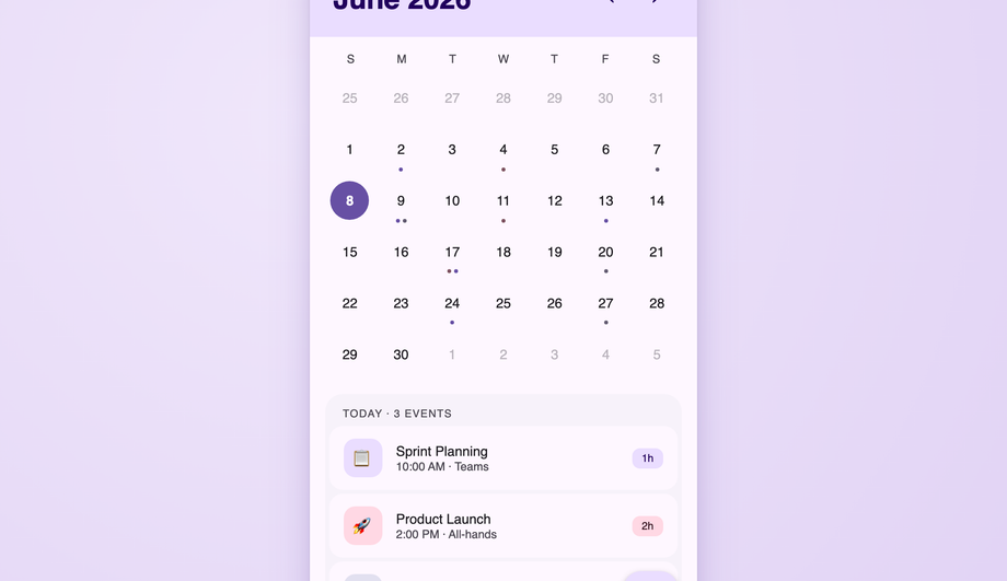
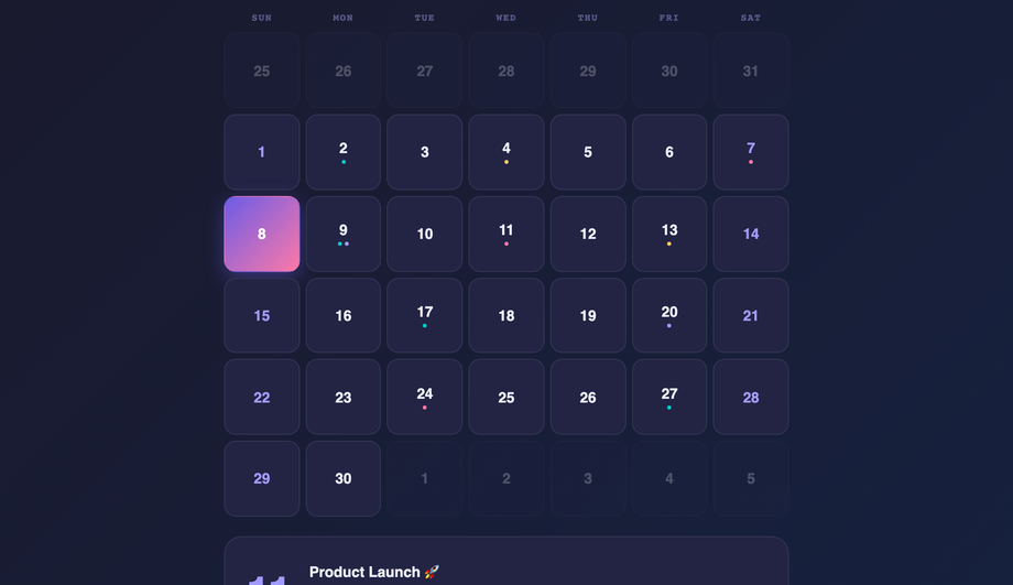
A dense event planner where each date cell anchors layered events via position:relative: an absolute count badge, a flex stack of color-coded event blocks with ::before accent bars, and a +N more overflow.
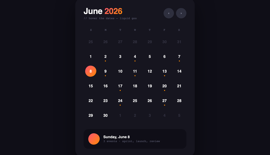
Two design languages in one: a Material 3 calendar with accent-ring today, filled-circle selection, state layers and JS ripple animations plus a FAB; and a Fluent events list with pointer-tracking reveal glow borders built via radial-gradient and mask-composite.
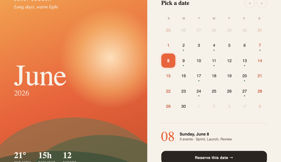
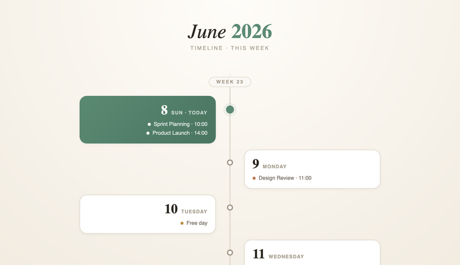
A landing-page hero split into an immersive seasonal half (sunset gradient, drifting sun orb, layered hills, giant Fraunces month) and a clean date-selector half with pulsing today, event dots, a live selected-day readout and a CTA.
How do I build a calendar in pure CSS without JavaScript?
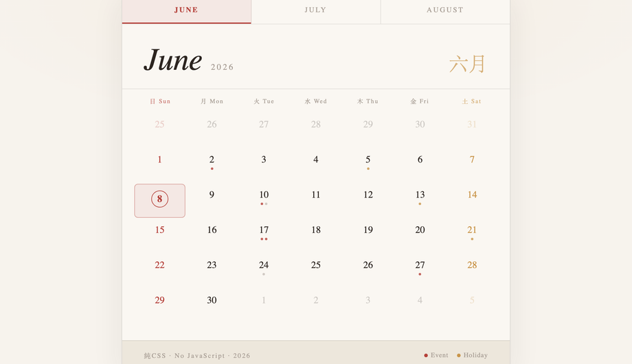
Demo #04 ships the canonical pattern. The trick: hardcode the 42 grid cells (6 weeks × 7 days) for a specific month, give each cell a static day number, and use CSS Grid with <code>grid-template-columns: repeat(7, 1fr)</code> to lay them out. Modifier classes on individual cells (<code>.other-month</code>, <code>.today</code>, <code>.weekend</code>, <code>.has-event</code>) handle visual state. For a real production calendar you'll likely want JavaScript to generate the cells dynamically for any month — but for portfolio pieces, marketing pages, or as a starting point that visitors edit, the pure-CSS approach ships in zero kilobytes of JS and works without runtime cost. Most "CSS calendar" tutorials online jump straight to JavaScript for cell generation; the static-grid approach is a real competitor gap.
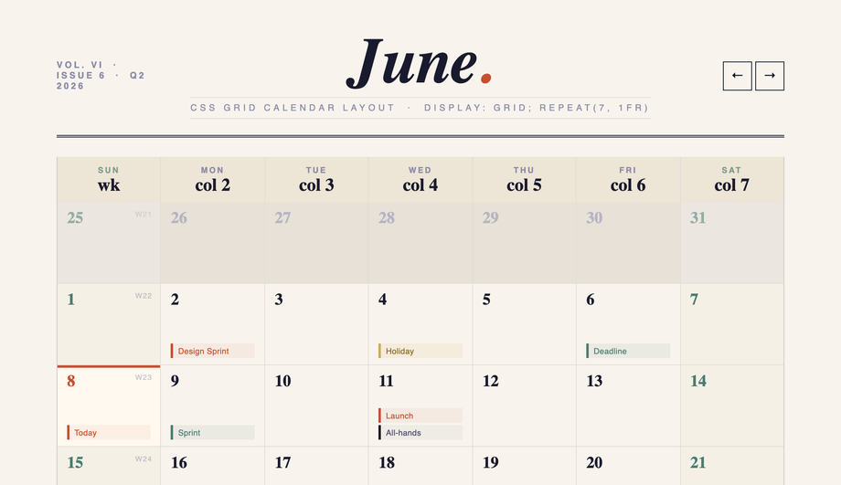
CSS Grid vs Flexbox — which is better for calendar layouts?
<strong>CSS Grid wins for calendars, period.</strong> A calendar is a true 2D layout — 7 columns × 5-6 rows — and that's exactly what Grid was designed for. With <code>grid-template-columns: repeat(7, 1fr)</code> and <code>grid-auto-rows: 1fr</code>, you get equal-width days, equal-height rows, and the entire month fits in 6 lines of CSS. Flexbox can fake it with <code>flex-basis: calc(100% / 7)</code> + wrap, but you lose the row-alignment guarantee — long event labels in one cell will push that row taller, leaving uneven grids. <strong>Use Flexbox</strong> for the header row (logo / month-name / nav buttons) and the day-label row above the grid — those are 1D layouts. Use <strong>Grid</strong> for the date cells. Demo #05 (CSS Grid Calendar Layout) is the textbook reference; Demos #07 / #15 / #16 all use Grid for the cells with Flexbox for the chrome above. Most "calendar tutorial" articles teach Flexbox-only patterns that work for static demos but break under real content.
How do I make a glassmorphism calendar widget that actually looks glassy?
Demo #01 (Glassmorphism CSS Calendar Widget) and #07 (Glassmorphism Calendar Card) ship the real recipe. Three CSS properties are doing the work: (1) <strong>Animated gradient backdrop</strong> behind the card with two drifting light orbs (radial gradients animated via <code>@keyframes</code>) — without something colorful behind the glass, there's nothing for the blur to blur. (2) <strong>Card background</strong>: <code>background: rgba(255, 255, 255, 0.08); backdrop-filter: blur(24px) saturate(180%); -webkit-backdrop-filter: blur(24px) saturate(180%);</code> — both the standard and -webkit- prefix for Safari which still requires it. (3) <strong>Inner highlight</strong> via <code>box-shadow: inset 0 1px 0 rgba(255,255,255,0.4)</code> for the soft top edge that makes it read as physical glass. Most "glassmorphism calendar" tutorials skip step 1 (and the card sits on a flat background, defeating the entire effect) or step 3 (and the card reads as flat semi-transparent instead of physical glass).
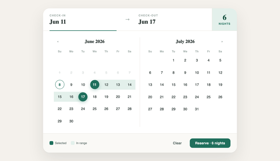
How do I build a date-range picker UI for bookings (Airbnb / Booking.com style)?
Demo #13 (CSS Booking Date Picker UI) ships the production-ready pattern. The trick is in the cell state machine: each date cell has three possible states beyond default — <code>.is-start</code>, <code>.is-end</code>, and <code>.is-in-range</code>. CSS handles all three visually: start + end get a filled rounded background, in-range gets a softer fill connecting them. The crucial detail most tutorials miss: the connecting fill needs to extend through the cell padding so adjacent in-range cells visually merge into one continuous range. We use <code>::before</code> pseudo-elements with negative horizontal margins (<code>::before { content: ''; position: absolute; inset: 0 -4px; }</code>) so the fill bleeds INTO the cell gap. Demo #23 (Bento Grid Style Booking System) extends this with a complete multi-panel booking interface — calendar + room cards + total pricing + reservation summary.
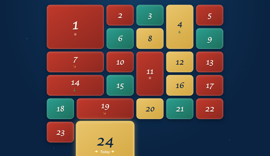
How do I create an advent calendar with CSS Grid?
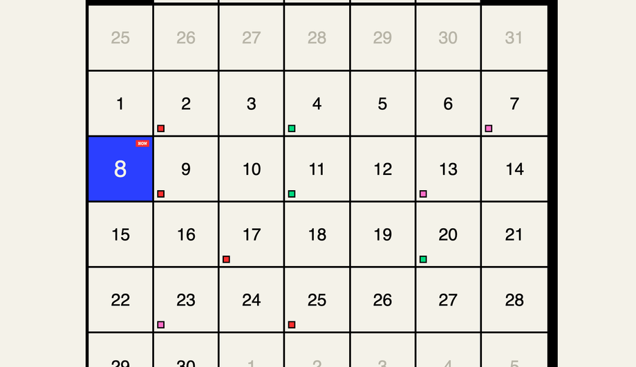
Demo #14 (CSS Grid Advent Calendar) is the canonical 24-day Christmas count-down pattern, built with <code>grid-template-columns: repeat(6, 1fr)</code> (or <code>repeat(4, 1fr)</code> for a portrait variant). Each cell is a "door" — a `<details>` element with a numbered front and hidden content inside. CSS does all the work: the doors are visually 3D via inset/outset box-shadows, hover and `[open]` states animate the door swinging open, and the content reveals beneath. <code>grid-auto-flow: dense</code> + variable <code>grid-row: span 2</code> on a few special doors creates the asymmetric advent-calendar feel where some doors are bigger (Dec 24th is traditionally larger). High-commercial-intent search keyword: December advent calendars are a major retail / branding moment. Pattern works for any 24-30 day countdown — product launches, conference run-ups, course modules.
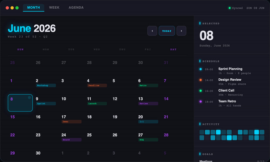
What's the difference between Fluent Design and Material Design for calendar UI?
Demo #15 covers both because they share enough DNA that one demo can demonstrate the differences. <strong>Fluent Design</strong> (Microsoft) emphasizes acrylic surfaces (gaussian blur with noise overlay), reveal highlights on hover, and 4px-rounded corners — the calendar reads as part of a Windows 11 app. <strong>Material Design</strong> (Google) emphasizes elevated surfaces (drop shadows at z-depth 1-8), ripple effects on tap (concentric circles expanding from click point), and 12-16px rounded corners — the calendar reads as part of an Android Material You app. Both systems agree on the underlying calendar mechanics (7-column grid, today indicator, prev/next nav). The differences are pure surface treatment: shadow profile, corner radius, hover/active feedback. Demo #15 shows the cell state transitions side-by-side so you can compare the elevation system against the reveal-highlight system without switching demos.
How do I make a calendar responsive and mobile-friendly?
Demo #06 (Responsive Mobile-Friendly Calendar UI) ships the canonical reference. Three transformations happen as the viewport shrinks below ~720px: (1) <strong>Day-label abbreviation</strong> — "Sunday" / "Monday" become "S" / "M" via <code>::first-letter</code> or hidden span text, freeing column width. (2) <strong>Cell sizing</strong> — switch from fixed <code>aspect-ratio: 1</code> to <code>min-height: 36px</code> so cells can be shorter on narrow screens. (3) <strong>Touch targets</strong> — interactive cells need <code>min-height: 44px</code> per Apple HIG / WCAG 2.1 (Target Size criterion). Below 480px, consider dropping to a single-week strip instead of the full month — the calendar becomes a "this week" widget with a button to expand. Demo #11 (Horizontal Scroll / Timeline Calendar) ships exactly this pattern. Most "responsive calendar" tutorials show only step 1 (shorten labels); the touch-target compliance and single-week-strip fallback are real competitor gaps.
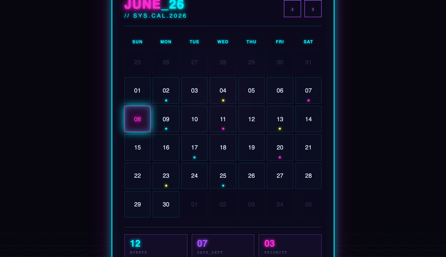
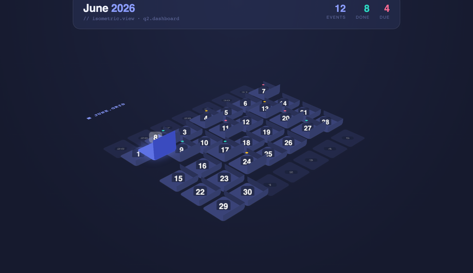
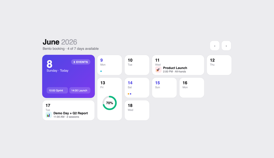
What's a bento-grid calendar and why is it trending?
"Bento grid" — modular asymmetric panel layouts inspired by Japanese lunch boxes — became the dominant marketing-site / dashboard pattern in 2024-2026 (Linear, Stripe, Apple's website). For calendars specifically (Demo #23: Bento Grid Style Booking System), the bento approach groups the calendar with adjacent panels: nights / guests count, room cards, pricing breakdown, summary block — each in its own rectangular cell of varying size, all tiled into one cohesive interface. CSS Grid is the only viable layout tool — use <code>grid-template-areas</code> with named regions, OR <code>grid-column: span N; grid-row: span M</code> per panel. The bento pattern's win: each panel has a single job, the eye reads them as a coordinated set, and visitors can scan to the action they want (book vs. browse vs. compare) without the all-in-one-screen complexity of older booking UIs. High-conversion pattern for hotels, vacation rentals, event tickets.
How do I do a 3D flip card calendar (front-back rotation effect)?
Demo #19 (Interactive 3D Flip Card Calendar) uses the classic two-face pattern. The cell wrapper has <code>perspective: 1000px</code> on its parent and <code>transform-style: preserve-3d</code> on itself. Inside, two children — <code>.face-front</code> and <code>.face-back</code> — are absolutely positioned to fill the wrapper. The back is rotated 180deg out of view via <code>transform: rotateY(180deg); backface-visibility: hidden</code>; the front shows by default. On hover (or `:focus-within` for keyboard accessibility), the wrapper itself gets <code>transform: rotateY(180deg)</code>, flipping which face is visible. Both faces need <code>backface-visibility: hidden</code> or you'll see the mirror-text-through-the-card bug. Apply this per cell and the whole month's worth of dates flip independently — perfect for event details that need to stay tucked behind the date until interaction.
Should I use a calendar JavaScript library like FullCalendar or roll my own with CSS?
Honest trade-off. <strong>Use FullCalendar / react-big-calendar / TUI Calendar</strong> if you genuinely need: recurring events, drag-to-create, multi-view (month / week / day / agenda) switching, timezone math, ICS feed import, integration with Google / Outlook calendars. These are real-time event-management products where someone is managing 50+ events. The library cost (~150-300 KB minified + gzipped) is justified. <strong>Roll your own with the CSS in this collection</strong> if you need: a date picker for a form, a marketing-page month preview, a content calendar showing publish dates, an availability calendar for bookings (Demo #13 + #23), an event-planner schedule for a static-content event site (Demo #09). For 80% of "calendar UI on a website" use cases, you don't need a library — you need ~100 lines of CSS + ~30 lines of JS for prev/next navigation. The libraries solve problems you might not have.
Are these CSS calendar designs accessible and responsive?
Yes on both. Every demo respects <code>@media (prefers-reduced-motion: reduce)</code> and disables continuous animations for visitors with that OS preference. Every interactive cell is a real <code><button></code> or <code><a></code> (or <code><label></code>-wrapped checkbox) — no clickable <code><div></code>s — so keyboard navigation and screen readers work without JS. The booking date picker (#13) and bento booking (#23) ship aria-current="date" on today's cell and aria-selected on range start/end. The 3D flip card (#19) uses <code>:focus-within</code> so Tab into a cell flips it. Touch targets meet WCAG 2.1 minimum (44×44 px) on mobile. All 27 demos are MIT-licensed for both personal AND commercial projects.
Which calendar should I use for my project?
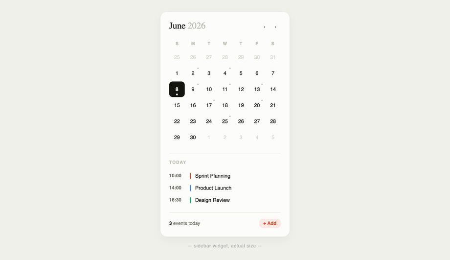
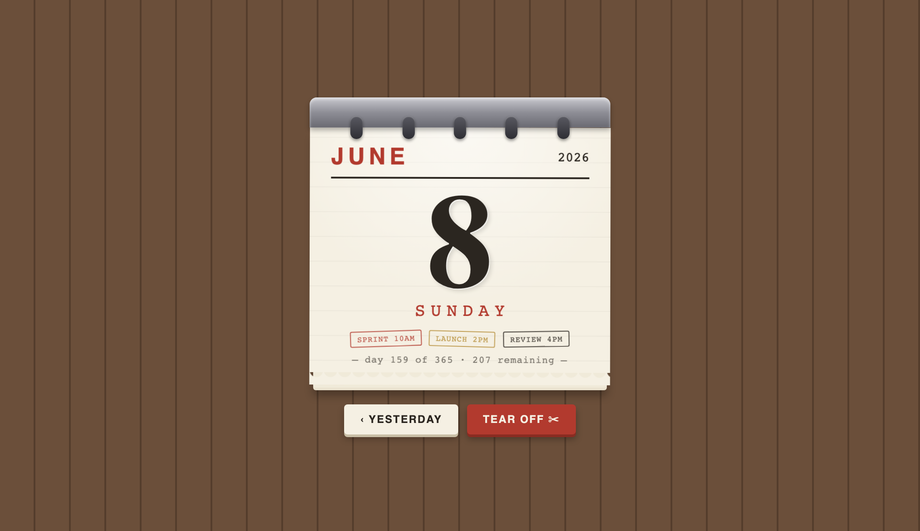
Quick decision guide. <strong>SaaS dashboard / admin panel</strong>: Demo #15 (Fluent / Material) for app-system consistency, or Demo #03 (Dark Mode) for IDE-style products. <strong>Marketing landing page / portfolio</strong>: Demo #01 (Glassmorphism) or Demo #21 (Split-Screen Hero) for visual impact. <strong>Hotel / vacation rental / booking</strong>: Demo #13 (Date Range Picker) + Demo #23 (Bento Booking) — both built specifically for this conversion path. <strong>E-commerce / retail event</strong>: Demo #14 (Advent Calendar) for seasonal campaigns. <strong>Conference / event website</strong>: Demo #09 (Event Planner) or Demo #25 (Vertical Timeline) for schedule layouts. <strong>Personal blog / content site</strong>: Demo #12 (Sidebar Widget) or Demo #04 (Pure CSS) for low-overhead inline displays. <strong>Brand differentiation</strong>: Demo #02 (Brutalist), Demo #17 (Cyberpunk), Demo #18 (Bold Typography), Demo #24 (Vintage Skeuomorphic) — each projects a strong aesthetic identity. All 27 are scoped with non-colliding class names so you can copy multiple onto the same project safely.