22 examples Responsive Uses JS intermediate

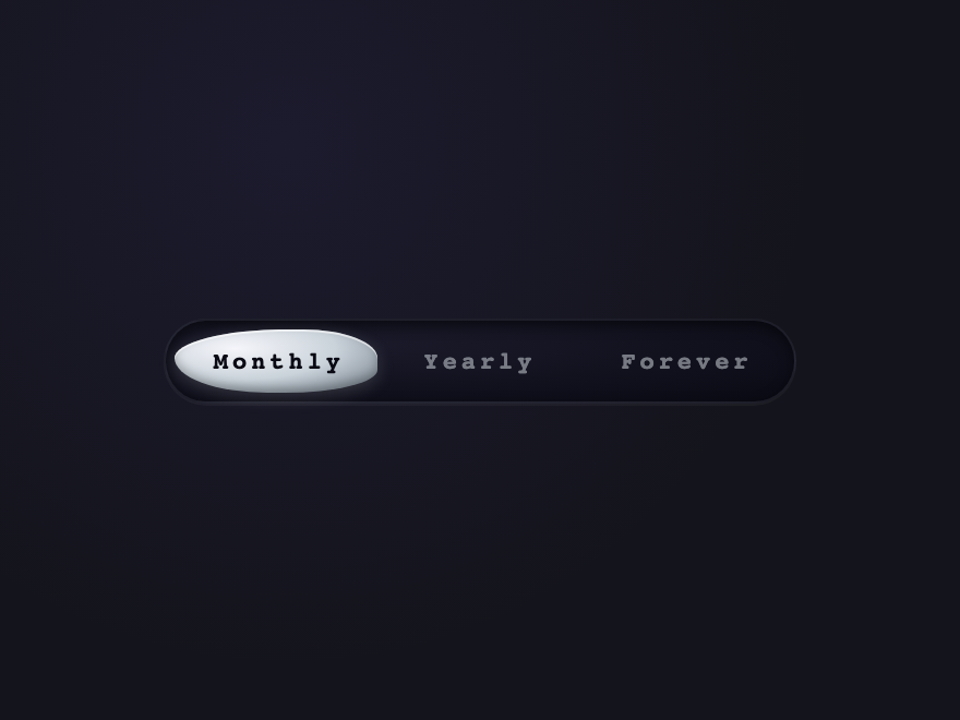
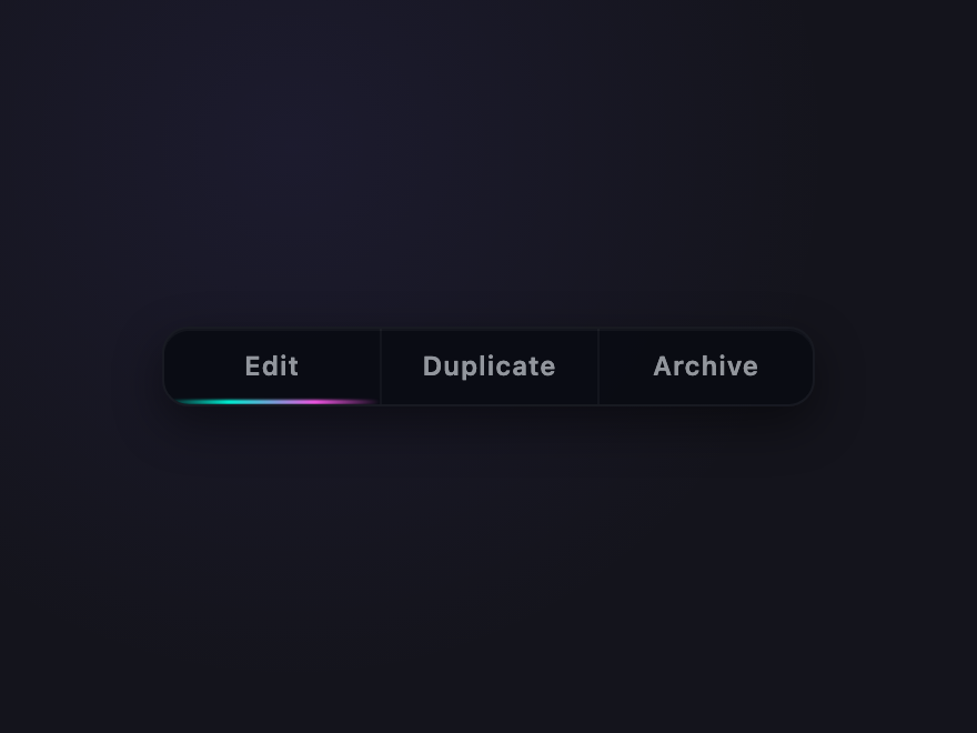
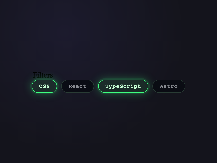
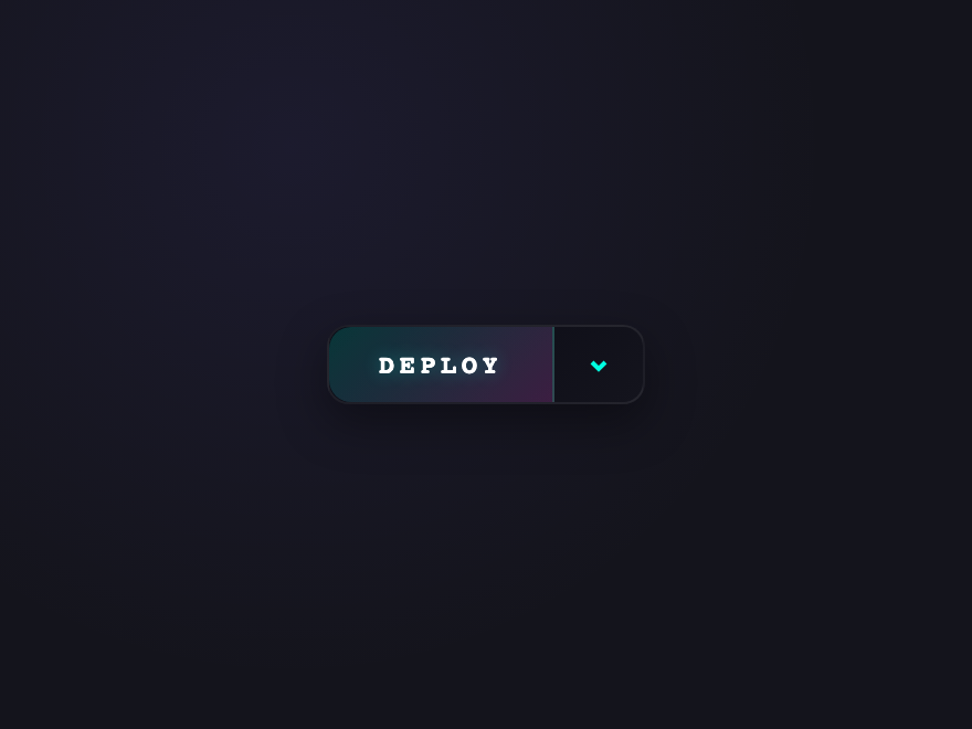
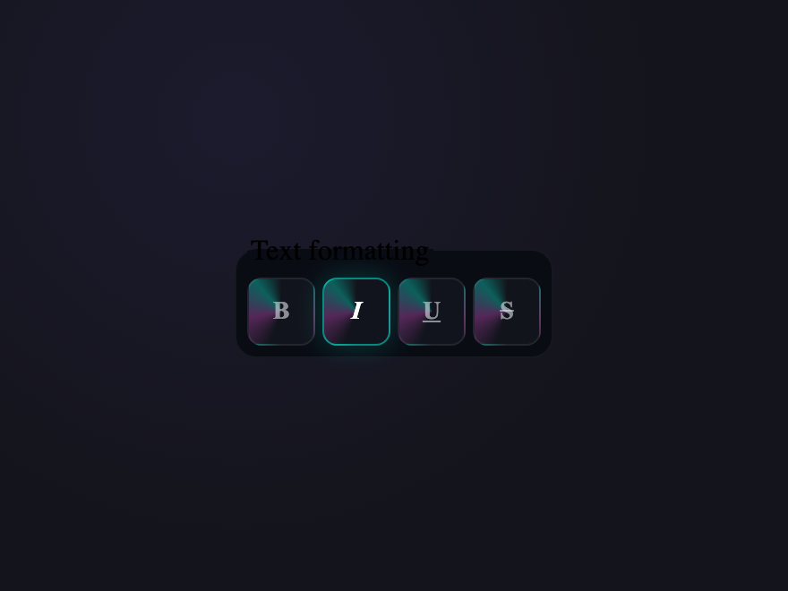
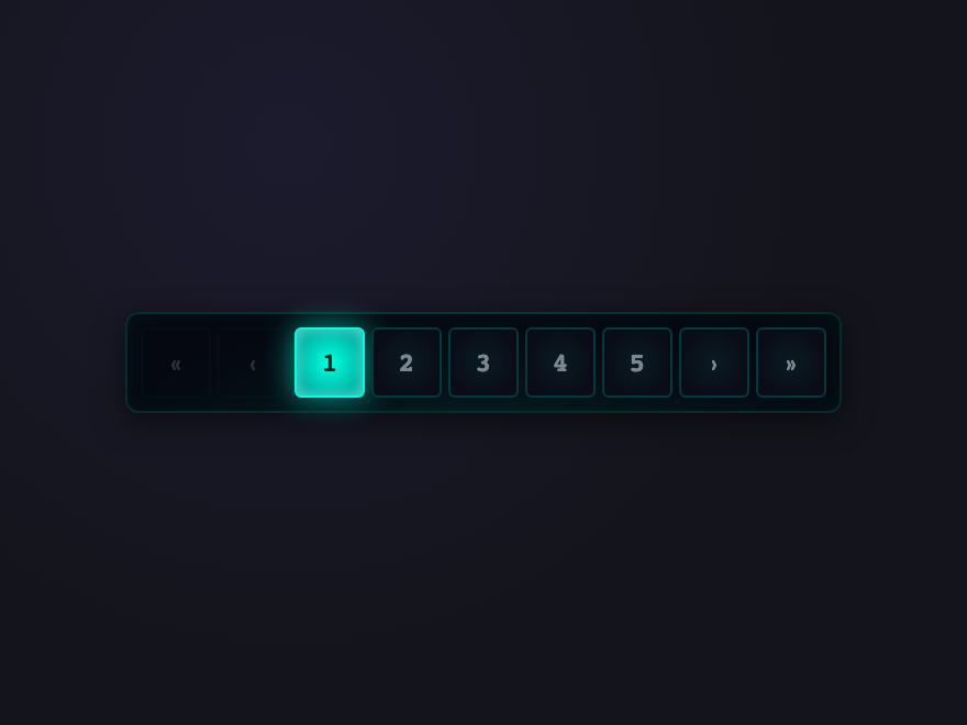
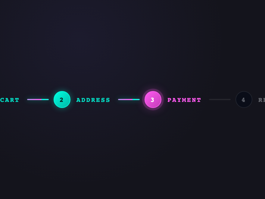
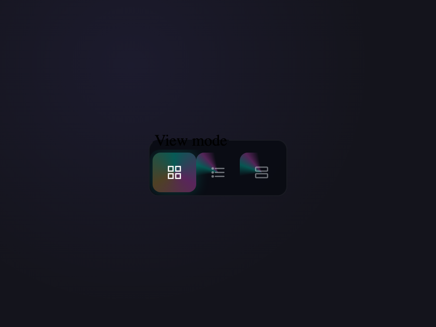
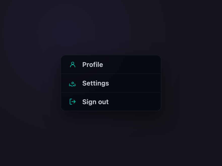
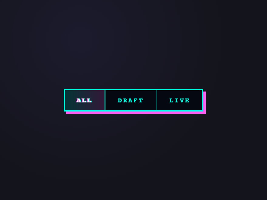
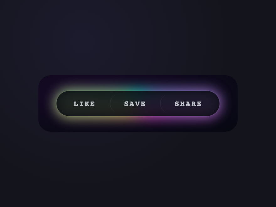
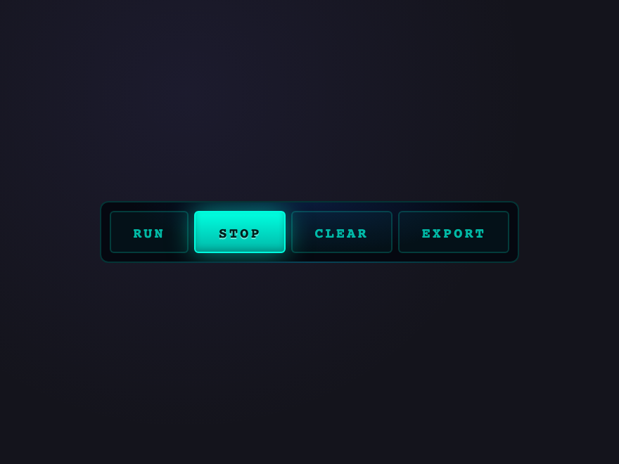
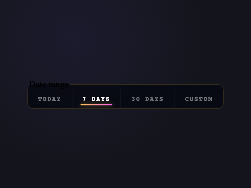
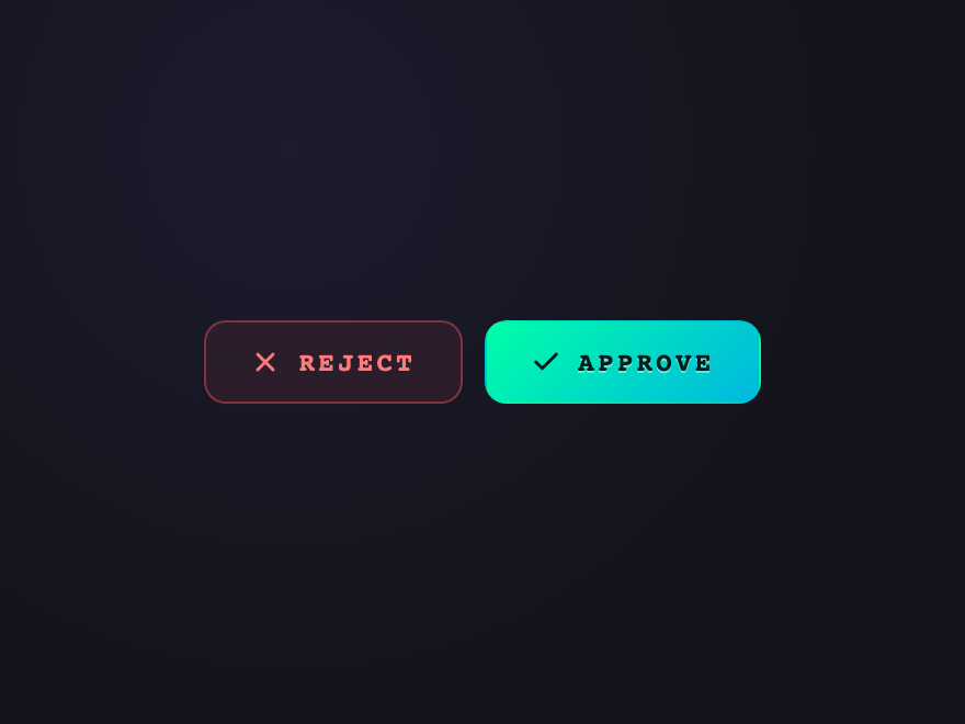
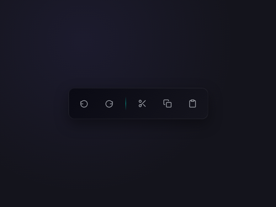
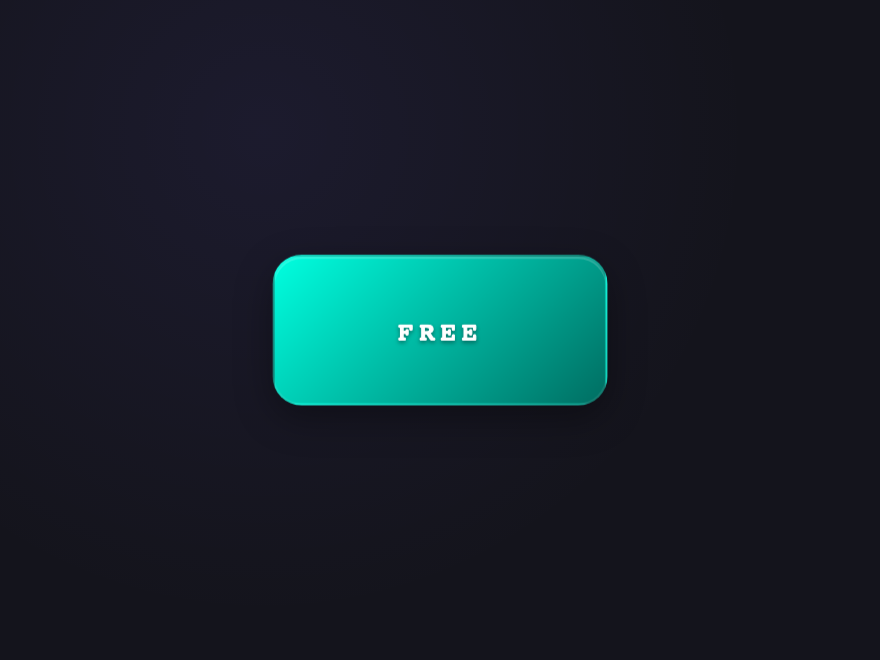
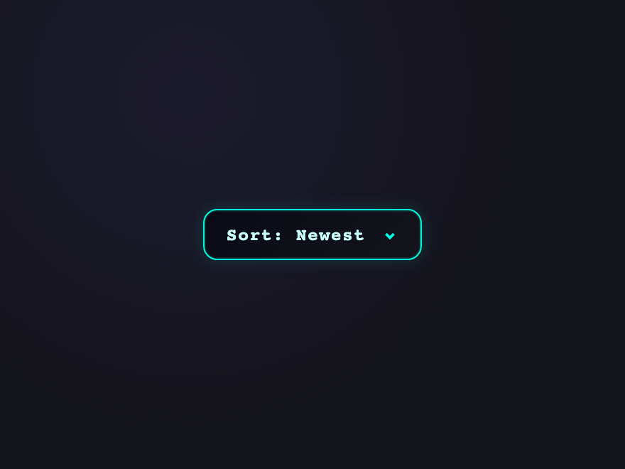
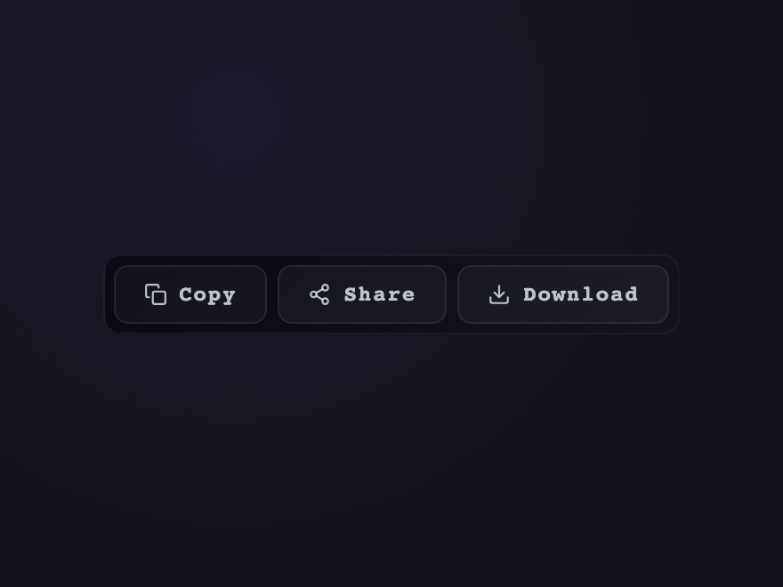
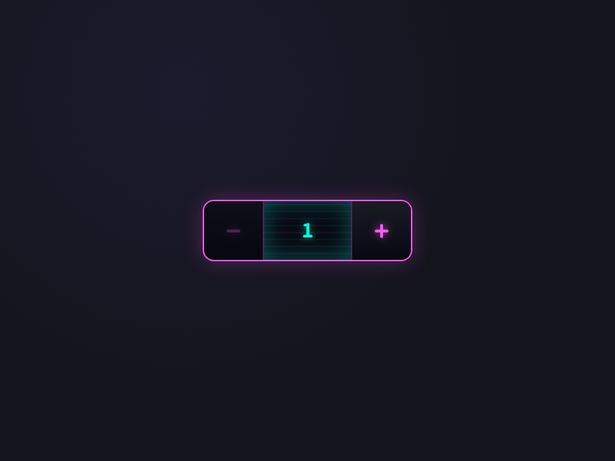
22 CSS Button Group Designs
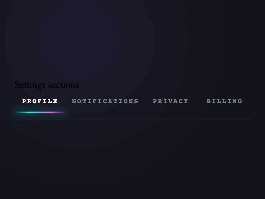
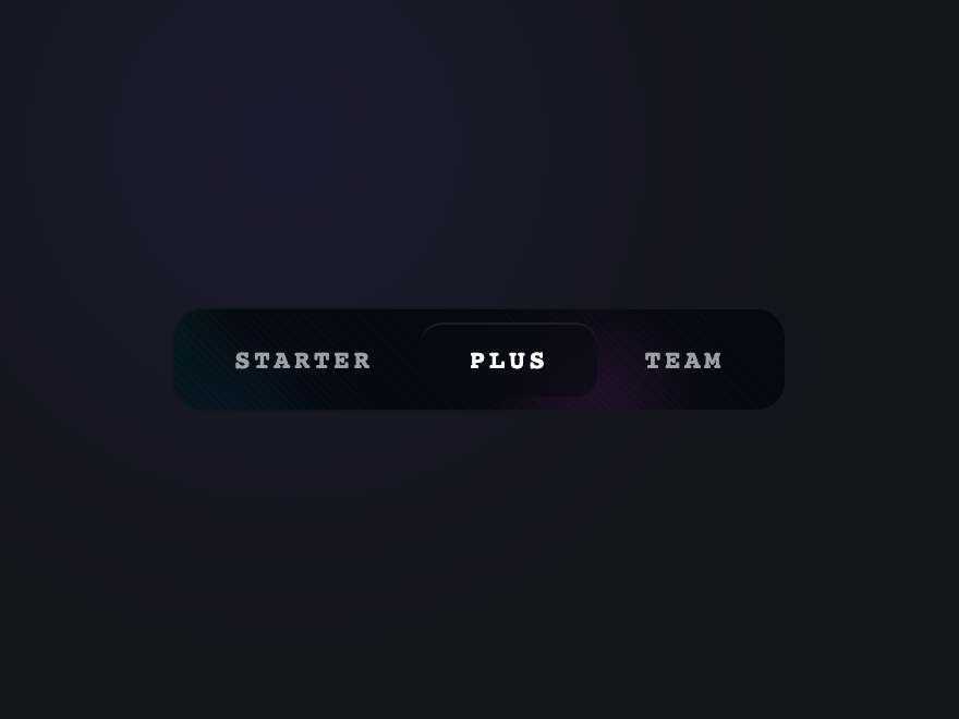
A CSS button group is a set of related buttons rendered as a single visual unit — segmented controls, split buttons, pagination, toolbars, steppers, tabs and toggle bars all fall under this umbrella. These 22 hand-coded designs cover every common pattern: iOS-style segmented pills, connected outlines, filter chips, split actions with dropdowns, multi-select toggles, full pagination, stepper wizards, view switchers, FABs, brutalist and glass variants, date-range pickers, approve/reject pairs and more. Every demo uses semantic HTML (real buttons, real radios, real <details>), proper ARIA, and works without JavaScript wherever :checked or :has() can drive the state.

22 hand-coded CSS button group designs — segmented pill, connected outline, filter chips, split action, toggle group, pagination, stepper wizard, view switcher, vertical stack, FAB, brutalist, glass, neon, date range, approve / reject, icon toolbar, stacked cards, dropdown combo, action group with feedback, number stepper, tab nav, aurora drift. Every demo uses semantic HTML, scoped class-based CSS, and JavaScript only where it adds real interaction.

22 unique groups 19 Pure CSS 3 Light JS WCAG-friendly Mobile-first MIT licensed
01 / 22
Segmented Pill
Pure CSS
Billing period
Three mutually-exclusive options (radios) with a sliding pill thumb that follows the checked input — the canonical iOS-style segmented control.
.cbgp-seg {
  display: inline-flex; position: relative; padding: 4px;
  background: #1a1a28; border: 1px solid rgba(255,255,255,0.08);
  border-radius: 999px;
}
.cbgp-seg input { appearance: none; -webkit-appearance: none; position: absolute; opacity: 0; }
.cbgp-seg label {
  flex: 1 1 0; min-width: 80px;
  position: relative; z-index: 1;
  padding: 8px 16px; text-align: center;
  font: 600 12px/1 system-ui, sans-serif; color: #9d9bbf;
  cursor: pointer; transition: color 0.25s;
  border-radius: 999px;
}
.cbgp-seg input:checked + label { color: #fff; }
.cbgp-seg-thumb {
  position: absolute; top: 4px; bottom: 4px; left: 4px;
  width: calc(33.333% - 2.667px);
  background: linear-gradient(135deg, #7c6cff, #a78bfa);
  border-radius: 999px; z-index: 0;
  transition: transform 0.4s cubic-bezier(0.65,0,0.35,1);
}
#cbgp-seg-2:checked ~ .cbgp-seg-thumb { transform: translateX(100%); }
#cbgp-seg-3:checked ~ .cbgp-seg-thumb { transform: translateX(200%); }
<fieldset class="cbgp-seg" role="group" aria-label="Billing period">
  <legend class="cbgp-sr">Billing period</legend>
  <input type="radio" name="cbgp-seg" id="cbgp-seg-1" checked />
  <label for="cbgp-seg-1">Monthly</label>
  <input type="radio" name="cbgp-seg" id="cbgp-seg-2" />
  <label for="cbgp-seg-2">Yearly</label>
  <input type="radio" name="cbgp-seg" id="cbgp-seg-3" />
  <label for="cbgp-seg-3">Forever</label>
  <span class="cbgp-seg-thumb" aria-hidden="true"></span>
</fieldset>
02 / 22
Connected Outline
Pure CSS
Three independent action buttons sharing a single outline, with thin internal dividers — the toolbar pattern most product apps use for related actions.
.cbgp-conn {
  display: inline-flex;
  background: #1a1a28;
  border: 1px solid rgba(255,255,255,0.1);
  border-radius: 8px;
  overflow: hidden;
}
.cbgp-conn button {
  padding: 9px 16px;
  border: 0; cursor: pointer;
  background: transparent;
  color: #cbd5e1;
  font: 500 13px/1 system-ui, sans-serif;
  border-right: 1px solid rgba(255,255,255,0.08);
  transition: background 0.15s, color 0.15s;
}
.cbgp-conn button:last-child { border-right: 0; }
.cbgp-conn button:hover  { background: rgba(124,108,255,0.1); color: #fff; }
.cbgp-conn button:focus-visible { outline: 2px solid #7c6cff; outline-offset: -2px; }
<div class="cbgp-conn" role="group" aria-label="Document actions">
  <button type="button">Edit</button>
  <button type="button">Duplicate</button>
  <button type="button">Archive</button>
</div>
03 / 22
Filter Chips
Pure CSS
Filters
A horizontal row of selectable filter chips driven by checkboxes — multi-select, mobile-friendly, ideal for faceted search and tag filters.
.cbgp-chips {
  display: inline-flex; flex-wrap: wrap; gap: 6px;
  border: 0; padding: 0; margin: 0;
}
.cbgp-chips input { appearance: none; -webkit-appearance: none; position: absolute; opacity: 0; }
.cbgp-chips label { display: inline-block; cursor: pointer; }
.cbgp-chips span {
  display: inline-block;
  padding: 6px 13px;
  background: #1a1a28;
  border: 1px solid rgba(255,255,255,0.1);
  border-radius: 999px;
  color: #9d9bbf;
  font: 500 12px/1 system-ui, sans-serif;
  transition: background 0.15s, border-color 0.15s, color 0.15s;
}
.cbgp-chips label:hover span { border-color: rgba(255,255,255,0.2); color: #cbd5e1; }
.cbgp-chips input:checked + span {
  background: rgba(46,184,138,0.12);
  border-color: #2eb88a;
  color: #2eb88a;
}
.cbgp-chips input:focus-visible + span { outline: 2px solid #7c6cff; outline-offset: 2px; }
<fieldset class="cbgp-chips" role="group" aria-label="Filters">
  <legend class="cbgp-sr">Filters</legend>
  <label><input type="checkbox" checked /><span>CSS</span></label>
  <label><input type="checkbox" /><span>React</span></label>
  <label><input type="checkbox" checked /><span>TypeScript</span></label>
  <label><input type="checkbox" /><span>Astro</span></label>
</fieldset>
04 / 22
Split Action
Pure CSS
Primary action button + dropdown chevron — uses native `<details>`/`<summary>` for the menu, no JS required. Click the main button OR the chevron for the menu.
.cbgp-split {
  display: inline-flex;
  position: relative;
  background: linear-gradient(135deg, #7c6cff, #a78bfa);
  border-radius: 8px;
  overflow: visible;
}
.cbgp-split-main {
  padding: 10px 18px;
  border: 0; cursor: pointer;
  background: transparent;
  color: #fff;
  font: 600 13px/1 system-ui, sans-serif;
  border-radius: 8px 0 0 8px;
  border-right: 1px solid rgba(255,255,255,0.18);
}
.cbgp-split-main:hover { background: rgba(255,255,255,0.08); }
.cbgp-split-menu summary {
  list-style: none; cursor: pointer;
  padding: 10px 14px;
  color: #fff;
  font-size: 11px;
  border-radius: 0 8px 8px 0;
  transition: background 0.15s;
}
.cbgp-split-menu summary::-webkit-details-marker { display: none; }
.cbgp-split-menu summary:hover { background: rgba(255,255,255,0.12); }
.cbgp-split-menu[open] summary { background: rgba(0,0,0,0.18); }
.cbgp-split-list {
  position: absolute; right: 0; top: calc(100% + 6px);
  min-width: 180px;
  background: #1a1a28;
  border: 1px solid rgba(255,255,255,0.1);
  border-radius: 8px;
  padding: 4px;
  z-index: 10;
  box-shadow: 0 8px 24px rgba(0,0,0,0.4);
}
.cbgp-split-list button {
  display: block; width: 100%;
  padding: 7px 10px;
  border: 0; cursor: pointer;
  background: transparent;
  color: #cbd5e1;
  font: 500 12px/1 system-ui, sans-serif;
  text-align: left;
  border-radius: 5px;
}
.cbgp-split-list button:hover { background: rgba(124,108,255,0.12); color: #fff; }
<div class="cbgp-split" role="group" aria-label="Save options">
  <button type="button" class="cbgp-split-main">Save</button>
  <details class="cbgp-split-menu">
    <summary aria-label="More save options">▾</summary>
    <div class="cbgp-split-list">
      <button type="button">Save as draft</button>
      <button type="button">Save and publish</button>
      <button type="button">Save and duplicate</button>
    </div>
  </details>
</div>
05 / 22
Toggle Group
Pure CSS
Text formatting
Multi-select toggle buttons (bold / italic / underline) — checkboxes drive the active state via `:checked`, no JS. Uses `aria-label` per chip for screen-reader clarity.
.cbgp-toggle {
  display: inline-flex; gap: 0;
  border: 0; padding: 0;
  background: #1a1a28;
  border-radius: 8px;
  overflow: hidden;
}
.cbgp-toggle input { appearance: none; -webkit-appearance: none; position: absolute; opacity: 0; }
.cbgp-toggle label {
  display: block; cursor: pointer;
  border-right: 1px solid rgba(255,255,255,0.06);
}
.cbgp-toggle label:last-child { border-right: 0; }
.cbgp-toggle span {
  display: flex; align-items: center; justify-content: center;
  width: 36px; height: 36px;
  font: 700 14px/1 'Times New Roman', serif;
  color: #9d9bbf;
  transition: background 0.15s, color 0.15s;
}
.cbgp-toggle label:hover span { background: rgba(124,108,255,0.08); color: #cbd5e1; }
.cbgp-toggle input:checked + span {
  background: rgba(124,108,255,0.18);
  color: #a78bfa;
}
.cbgp-toggle input:focus-visible + span { outline: 2px solid #7c6cff; outline-offset: -2px; }
<fieldset class="cbgp-toggle" role="group" aria-label="Text formatting">
  <legend class="cbgp-sr">Text formatting</legend>
  <label><input type="checkbox" /><span aria-label="Bold"><strong>B</strong></span></label>
  <label><input type="checkbox" checked /><span aria-label="Italic"><em>I</em></span></label>
  <label><input type="checkbox" /><span aria-label="Underline"><u>U</u></span></label>
  <label><input type="checkbox" /><span aria-label="Strikethrough"><s>S</s></span></label>
</fieldset>
06 / 22
Pagination
Pure CSS
First / Prev / numbered pages / Next / Last. `aria-current="page"` marks the active page; disabled state on edges uses `aria-disabled` for AT.
.cbgp-page {
  display: inline-flex; gap: 4px;
  font-family: 'JetBrains Mono', monospace;
}
.cbgp-page button {
  min-width: 32px; height: 32px;
  padding: 0 8px;
  border: 1px solid rgba(255,255,255,0.08);
  background: #1a1a28;
  color: #9d9bbf;
  font: 600 12px/1 'JetBrains Mono', monospace;
  cursor: pointer;
  border-radius: 6px;
  transition: background 0.15s, border-color 0.15s, color 0.15s;
}
.cbgp-page button:hover {
  background: rgba(124,108,255,0.1);
  border-color: rgba(124,108,255,0.3);
  color: #fff;
}
.cbgp-page button[aria-current="page"] {
  background: linear-gradient(135deg, #7c6cff, #a78bfa);
  border-color: transparent;
  color: #fff;
}
.cbgp-page button[aria-disabled="true"] {
  opacity: 0.4; cursor: not-allowed;
  background: transparent;
}
.cbgp-page button[aria-disabled="true"]:hover {
  background: transparent; border-color: rgba(255,255,255,0.08);
  color: #9d9bbf;
}
<nav class="cbgp-page" aria-label="Pagination">
  <button type="button" aria-label="First page" aria-disabled="true">«</button>
  <button type="button" aria-label="Previous page" aria-disabled="true">‹</button>
  <button type="button" aria-current="page">1</button>
  <button type="button">2</button>
  <button type="button">3</button>
  <button type="button">4</button>
  <button type="button">5</button>
  <button type="button" aria-label="Next page">›</button>
  <button type="button" aria-label="Last page">»</button>
</nav>
07 / 22
Stepper Wizard
Pure CSS
  1. Cart
  2. Address
  3. 3Payment
  4. 4Review
Numbered steps with active highlight and connector lines between — perfect for multi-step forms, onboarding flows, and checkout.
.cbgp-step {
  display: inline-flex; gap: 0;
  list-style: none; padding: 0; margin: 0;
}
.cbgp-step li {
  display: flex; align-items: center; gap: 8px;
  padding: 6px 0;
  font: 600 12px/1 system-ui, sans-serif;
  color: #6b6987;
  position: relative;
}
.cbgp-step li:not(:last-child) { padding-right: 56px; }
.cbgp-step li:not(:last-child)::after {
  content: '';
  position: absolute; right: 8px; top: 50%;
  width: 36px; height: 1.5px;
  background: rgba(255,255,255,0.1);
  transform: translateY(-50%);
}
.cbgp-step li.is-done::after { background: #2eb88a; }
.cbgp-step-num {
  display: flex; align-items: center; justify-content: center;
  width: 24px; height: 24px;
  border-radius: 50%;
  background: #1a1a28;
  border: 1.5px solid rgba(255,255,255,0.12);
  font: 700 11px/1 'JetBrains Mono', monospace;
}
.cbgp-step li.is-done .cbgp-step-num {
  background: #2eb88a; border-color: #2eb88a;
  color: #0a0f0c;
}
.cbgp-step li.is-current .cbgp-step-num {
  background: linear-gradient(135deg, #7c6cff, #a78bfa);
  border-color: transparent;
  color: #fff;
  box-shadow: 0 0 0 3px rgba(124,108,255,0.15);
}
.cbgp-step li.is-current { color: #f0eeff; }
.cbgp-step li.is-done    { color: #cbd5e1; }
<ol class="cbgp-step" aria-label="Checkout progress">
  <li class="is-done"><span class="cbgp-step-num">✓</span><span class="cbgp-step-label">Cart</span></li>
  <li class="is-done"><span class="cbgp-step-num">✓</span><span class="cbgp-step-label">Address</span></li>
  <li class="is-current" aria-current="step"><span class="cbgp-step-num">3</span><span class="cbgp-step-label">Payment</span></li>
  <li><span class="cbgp-step-num">4</span><span class="cbgp-step-label">Review</span></li>
</ol>
08 / 22
View Switcher
Pure CSS
View mode
Icon-only segmented control for grid / list / card views — a common dashboard pattern. Real radios under the hood; SVG icons are decorative.
.cbgp-view {
  display: inline-flex; gap: 0;
  border: 1px solid rgba(255,255,255,0.08);
  background: #1a1a28;
  border-radius: 8px;
  overflow: hidden;
  padding: 0;
}
.cbgp-view input { appearance: none; -webkit-appearance: none; position: absolute; opacity: 0; }
.cbgp-view label {
  display: flex; align-items: center; justify-content: center;
  width: 38px; height: 36px;
  cursor: pointer;
  border-right: 1px solid rgba(255,255,255,0.06);
  transition: background 0.15s;
}
.cbgp-view label:last-of-type { border-right: 0; }
.cbgp-view svg {
  width: 16px; height: 16px;
  fill: none; stroke: #9d9bbf;
  stroke-width: 1.8; stroke-linecap: round;
}
.cbgp-view label:hover svg { stroke: #cbd5e1; }
.cbgp-view input:checked + label {
  background: rgba(124,108,255,0.18);
}
.cbgp-view input:checked + label svg { stroke: #a78bfa; }
.cbgp-view input:focus-visible + label { outline: 2px solid #7c6cff; outline-offset: -2px; }
<fieldset class="cbgp-view" role="group" aria-label="View mode">
  <legend class="cbgp-sr">View mode</legend>
  <input type="radio" name="cbgp-view" id="cbgp-view-1" checked />
  <label for="cbgp-view-1" aria-label="Grid view"><svg viewBox="0 0 24 24" aria-hidden="true"><rect x="3" y="3" width="7" height="7"/><rect x="14" y="3" width="7" height="7"/><rect x="3" y="14" width="7" height="7"/><rect x="14" y="14" width="7" height="7"/></svg></label>
  <input type="radio" name="cbgp-view" id="cbgp-view-2" />
  <label for="cbgp-view-2" aria-label="List view"><svg viewBox="0 0 24 24" aria-hidden="true"><line x1="8" y1="6" x2="21" y2="6"/><line x1="8" y1="12" x2="21" y2="12"/><line x1="8" y1="18" x2="21" y2="18"/><circle cx="4" cy="6" r="1"/><circle cx="4" cy="12" r="1"/><circle cx="4" cy="18" r="1"/></svg></label>
  <input type="radio" name="cbgp-view" id="cbgp-view-3" />
  <label for="cbgp-view-3" aria-label="Card view"><svg viewBox="0 0 24 24" aria-hidden="true"><rect x="3" y="4" width="18" height="6" rx="1"/><rect x="3" y="14" width="18" height="6" rx="1"/></svg></label>
</fieldset>
09 / 22
Vertical Stack
Pure CSS
Vertical button column with shared border — the sidebar action pattern. Each button takes the full width; dividers separate them.
.cbgp-vstack {
  display: inline-flex; flex-direction: column;
  background: #1a1a28;
  border: 1px solid rgba(255,255,255,0.08);
  border-radius: 8px;
  overflow: hidden;
  min-width: 180px;
}
.cbgp-vstack button {
  display: flex; align-items: center; gap: 10px;
  padding: 10px 14px;
  border: 0; border-bottom: 1px solid rgba(255,255,255,0.06);
  background: transparent;
  color: #cbd5e1;
  font: 500 13px/1 system-ui, sans-serif;
  cursor: pointer;
  text-align: left;
  transition: background 0.15s;
}
.cbgp-vstack button:last-child { border-bottom: 0; }
.cbgp-vstack button:hover { background: rgba(124,108,255,0.08); color: #fff; }
.cbgp-vstack svg { width: 14px; height: 14px; flex-shrink: 0; fill: none; stroke: #7a7899; stroke-width: 2; stroke-linecap: round; stroke-linejoin: round; }
.cbgp-vstack button:hover svg { stroke: #a78bfa; }
<div class="cbgp-vstack" role="group" aria-label="Profile actions">
  <button type="button"><svg viewBox="0 0 24 24" aria-hidden="true"><circle cx="12" cy="8" r="4"/><path d="M4 21a8 8 0 0 1 16 0"/></svg>Profile</button>
  <button type="button"><svg viewBox="0 0 24 24" aria-hidden="true"><circle cx="12" cy="12" r="3"/><path d="M19.4 15a2 2 0 0 0 .4 2.2l.1.1a2.5 2.5 0 1 1-3.5 3.5l-.1-.1a2 2 0 0 0-2.2-.4 2 2 0 0 0-1.2 1.8V22a2.5 2.5 0 0 1-5 0v-.1a2 2 0 0 0-1.3-1.8 2 2 0 0 0-2.2.4l-.1.1a2.5 2.5 0 1 1-3.5-3.5l.1-.1a2 2 0 0 0 .4-2.2 2 2 0 0 0-1.8-1.2H2a2.5 2.5 0 0 1 0-5h.1a2 2 0 0 0 1.8-1.3 2 2 0 0 0-.4-2.2l-.1-.1a2.5 2.5 0 1 1 3.5-3.5l.1.1a2 2 0 0 0 2.2.4H9a2 2 0 0 0 1.2-1.8V2a2.5 2.5 0 0 1 5 0v.1a2 2 0 0 0 1.2 1.8 2 2 0 0 0 2.2-.4l.1-.1a2.5 2.5 0 1 1 3.5 3.5l-.1.1a2 2 0 0 0-.4 2.2V9a2 2 0 0 0 1.8 1.2H22a2.5 2.5 0 0 1 0 5h-.1a2 2 0 0 0-1.8 1.2z"/></svg>Settings</button>
  <button type="button"><svg viewBox="0 0 24 24" aria-hidden="true"><path d="M9 21H5a2 2 0 0 1-2-2V5a2 2 0 0 1 2-2h4M16 17l5-5-5-5M21 12H9"/></svg>Sign out</button>
</div>
10 / 22
Floating Action
Pure CSS
A FAB primary button that reveals 3 child actions on hover via `:hover` + `:focus-within` — keyboard accessible because focus stays inside the group.
.cbgp-fab {
  position: relative;
  width: 56px; height: 56px;
}
.cbgp-fab button {
  position: absolute;
  width: 48px; height: 48px;
  border-radius: 50%; border: 0; cursor: pointer;
  display: flex; align-items: center; justify-content: center;
  font-size: 20px;
  transition: transform 0.35s cubic-bezier(0.34,1.56,0.64,1), background 0.2s;
}
.cbgp-fab-main {
  z-index: 2;
  bottom: 0; left: 0;
  background: linear-gradient(135deg, #ff6c8a, #ff9a76);
  color: #fff;
  font: 700 24px/1 system-ui, sans-serif;
  box-shadow: 0 6px 20px rgba(255,108,138,0.4);
}
.cbgp-fab:hover .cbgp-fab-main,
.cbgp-fab:focus-within .cbgp-fab-main { transform: rotate(45deg); }
.cbgp-fab-child {
  z-index: 1;
  bottom: 0; left: 0;
  background: #1a1a28;
  border: 1px solid rgba(255,255,255,0.1);
  font-size: 16px;
  opacity: 0;
  pointer-events: none;
}
.cbgp-fab:hover .cbgp-fab-child,
.cbgp-fab:focus-within .cbgp-fab-child {
  opacity: 1; pointer-events: auto;
}
.cbgp-fab:hover .cbgp-fab-c1,
.cbgp-fab:focus-within .cbgp-fab-c1 { transform: translateY(-60px); }
.cbgp-fab:hover .cbgp-fab-c2,
.cbgp-fab:focus-within .cbgp-fab-c2 { transform: translate(48px, -42px); }
.cbgp-fab:hover .cbgp-fab-c3,
.cbgp-fab:focus-within .cbgp-fab-c3 { transform: translateX(60px); }
<div class="cbgp-fab" role="group" aria-label="Create new">
  <button type="button" class="cbgp-fab-main" aria-label="Open create menu">+</button>
  <button type="button" class="cbgp-fab-child cbgp-fab-c1" aria-label="New document">📄</button>
  <button type="button" class="cbgp-fab-child cbgp-fab-c2" aria-label="New folder">📁</button>
  <button type="button" class="cbgp-fab-child cbgp-fab-c3" aria-label="Upload file">⬆</button>
</div>
11 / 22
Brutalist Bar
Pure CSS
Hard-edged offset-shadow group — bold mono labels, zero radius, press collapses into the shadow on click. Brutalist design system fixture.
.cbgp-brut {
  display: inline-flex;
  background: #f0eeff;
  border: 2.5px solid #1a1a2e;
  box-shadow: 5px 5px 0 #ff6c8a;
  transition: transform 0.1s, box-shadow 0.1s;
}
.cbgp-brut button {
  padding: 10px 16px;
  border: 0; border-right: 2.5px solid #1a1a2e;
  cursor: pointer;
  background: #f0eeff;
  color: #1a1a2e;
  font: 800 12px/1 'Courier New', monospace;
  letter-spacing: 0.12em;
}
.cbgp-brut button:last-child { border-right: 0; }
.cbgp-brut button:hover  { background: #ffeef2; }
.cbgp-brut button.is-on  { background: #1a1a2e; color: #f0eeff; }
.cbgp-brut button:focus-visible { outline: 2px solid #ff6c8a; outline-offset: -2px; }
.cbgp-brut:focus-within { transform: translate(-1px,-1px); box-shadow: 6px 6px 0 #ff6c8a; }
<div class="cbgp-brut" role="group" aria-label="Filters">
  <button type="button" class="is-on">ALL</button>
  <button type="button">DRAFT</button>
  <button type="button">LIVE</button>
</div>
12 / 22
Glass Group
Pure CSS
Frosted-glass pill with translucent dividers — sits beautifully over hero images and gradient backgrounds. `backdrop-filter: blur` does the heavy lifting.
.cbgp-glass {
  display: inline-flex;
  padding: 4px;
  background: rgba(255,255,255,0.08);
  border: 1px solid rgba(255,255,255,0.18);
  border-radius: 999px;
  backdrop-filter: blur(14px);
  -webkit-backdrop-filter: blur(14px);
}
.cbgp-glass button {
  padding: 7px 18px;
  border: 0; cursor: pointer;
  background: transparent;
  color: rgba(255,255,255,0.85);
  font: 600 12px/1 system-ui, sans-serif;
  border-radius: 999px;
  position: relative;
  transition: background 0.2s, color 0.2s;
}
.cbgp-glass button:not(:last-child)::after {
  content: '';
  position: absolute; right: 0; top: 25%; bottom: 25%;
  width: 1px;
  background: rgba(255,255,255,0.18);
}
.cbgp-glass button:hover {
  background: rgba(255,255,255,0.1);
  color: #fff;
}
.cbgp-glass button:focus-visible { outline: 2px solid rgba(255,255,255,0.6); outline-offset: -2px; }
<div class="cbgp-glass" role="group" aria-label="Quick actions">
  <button type="button">Like</button>
  <button type="button">Save</button>
  <button type="button">Share</button>
</div>
13 / 22
Neon Toolbar
Pure CSS
Synthwave-styled action bar with a cyan neon outline that intensifies on hover. Built for dark dashboards and developer-tool aesthetics.
.cbgp-neon {
  display: inline-flex; gap: 6px;
  padding: 6px;
  background: #0a0014;
  border: 1px solid #6cffff;
  border-radius: 4px;
  box-shadow: 0 0 8px rgba(108,255,255,0.3), inset 0 0 6px rgba(108,255,255,0.1);
}
.cbgp-neon button {
  padding: 7px 13px;
  border: 1px solid rgba(108,255,255,0.3);
  background: transparent;
  color: #6cffff;
  font: 700 10px/1 'Courier New', monospace;
  letter-spacing: 0.12em;
  cursor: pointer;
  border-radius: 2px;
  transition: background 0.15s, color 0.15s, border-color 0.15s, box-shadow 0.15s;
}
.cbgp-neon button:hover {
  background: rgba(255,108,255,0.12);
  border-color: #ff6cff;
  color: #ff6cff;
  box-shadow: 0 0 8px rgba(255,108,255,0.5);
}
.cbgp-neon button:focus-visible {
  outline: 2px solid #ff6cff; outline-offset: 2px;
}
<div class="cbgp-neon" role="toolbar" aria-label="Terminal actions">
  <button type="button">RUN</button>
  <button type="button">STOP</button>
  <button type="button">CLEAR</button>
  <button type="button">EXPORT</button>
</div>
14 / 22
Date Range
Pure CSS
Date range
Common date-range presets ("Today / 7d / 30d / Custom") with the selected range highlighted. Native radios + sliding accent underline.
.cbgp-range {
  display: inline-flex; gap: 0;
  border: 0; padding: 0;
  background: #1a1a28;
  border-radius: 8px;
}
.cbgp-range input { appearance: none; -webkit-appearance: none; position: absolute; opacity: 0; }
.cbgp-range label {
  padding: 9px 14px;
  font: 600 12px/1 system-ui, sans-serif;
  color: #9d9bbf;
  cursor: pointer;
  position: relative;
  transition: color 0.2s;
}
.cbgp-range label::after {
  content: '';
  position: absolute; left: 14px; right: 14px; bottom: 4px;
  height: 2px;
  background: linear-gradient(90deg, #f5a623, #ff6c8a);
  border-radius: 2px;
  opacity: 0;
  transform: scaleX(0.4);
  transition: opacity 0.25s, transform 0.25s;
}
.cbgp-range label:hover { color: #cbd5e1; }
.cbgp-range input:checked + label { color: #fff; }
.cbgp-range input:checked + label::after { opacity: 1; transform: scaleX(1); }
.cbgp-range input:focus-visible + label { outline: 2px solid #f5a623; outline-offset: -2px; border-radius: 6px; }
<fieldset class="cbgp-range" role="group" aria-label="Date range">
  <legend class="cbgp-sr">Date range</legend>
  <input type="radio" name="cbgp-range" id="cbgp-range-1" />
  <label for="cbgp-range-1">Today</label>
  <input type="radio" name="cbgp-range" id="cbgp-range-2" checked />
  <label for="cbgp-range-2">7 days</label>
  <input type="radio" name="cbgp-range" id="cbgp-range-3" />
  <label for="cbgp-range-3">30 days</label>
  <input type="radio" name="cbgp-range" id="cbgp-range-4" />
  <label for="cbgp-range-4">Custom</label>
</fieldset>
15 / 22
Approve / Reject
Pure CSS
Two-button decision row with destructive accent on the reject side — common pattern for review queues, approval flows, and moderation UIs.
.cbgp-decide {
  display: inline-flex; gap: 8px;
}
.cbgp-decide button {
  display: inline-flex; align-items: center; gap: 8px;
  padding: 9px 16px;
  border-radius: 8px;
  cursor: pointer;
  font: 600 13px/1 system-ui, sans-serif;
  transition: background 0.15s, border-color 0.15s, transform 0.1s;
}
.cbgp-decide button:active { transform: scale(0.97); }
.cbgp-decide svg { width: 14px; height: 14px; fill: none; stroke-width: 2.5; stroke-linecap: round; stroke-linejoin: round; }
.cbgp-decide-no {
  background: transparent;
  border: 1px solid rgba(255,93,108,0.4);
  color: #ff5d6c;
}
.cbgp-decide-no svg { stroke: #ff5d6c; }
.cbgp-decide-no:hover { background: rgba(255,93,108,0.1); border-color: #ff5d6c; }
.cbgp-decide-yes {
  background: linear-gradient(135deg, #2eb88a, #2dd4bf);
  border: 1px solid transparent;
  color: #0a0f0c;
}
.cbgp-decide-yes svg { stroke: #0a0f0c; }
.cbgp-decide-yes:hover { filter: brightness(1.1); }
.cbgp-decide button:focus-visible { outline: 2px solid #2eb88a; outline-offset: 2px; }
<div class="cbgp-decide" role="group" aria-label="Review decision">
  <button type="button" class="cbgp-decide-no">
    <svg viewBox="0 0 24 24" aria-hidden="true"><line x1="18" y1="6" x2="6" y2="18"/><line x1="6" y1="6" x2="18" y2="18"/></svg>
    Reject
  </button>
  <button type="button" class="cbgp-decide-yes">
    <svg viewBox="0 0 24 24" aria-hidden="true"><polyline points="20 6 9 17 4 12"/></svg>
    Approve
  </button>
</div>
16 / 22
Icon Toolbar
Pure CSS
Icon-only toolbar with native browser tooltips on hover (`title` attribute). Accessible name comes from `aria-label`. Compact for sidebars and editors.
.cbgp-icontb {
  display: inline-flex; gap: 2px; align-items: center;
  padding: 4px;
  background: #1a1a28;
  border: 1px solid rgba(255,255,255,0.08);
  border-radius: 8px;
}
.cbgp-icontb button {
  width: 32px; height: 32px;
  border: 0; cursor: pointer;
  background: transparent;
  border-radius: 6px;
  display: flex; align-items: center; justify-content: center;
  transition: background 0.15s;
}
.cbgp-icontb button:hover { background: rgba(124,108,255,0.12); }
.cbgp-icontb button:focus-visible { outline: 2px solid #7c6cff; outline-offset: -2px; }
.cbgp-icontb svg { width: 14px; height: 14px; fill: none; stroke: #9d9bbf; stroke-width: 2; stroke-linecap: round; stroke-linejoin: round; }
.cbgp-icontb button:hover svg { stroke: #a78bfa; }
.cbgp-icontb-divider {
  width: 1px; height: 18px;
  background: rgba(255,255,255,0.1);
  margin: 0 4px;
}
<div class="cbgp-icontb" role="toolbar" aria-label="Editor tools">
  <button type="button" aria-label="Undo" title="Undo (⌘Z)"><svg viewBox="0 0 24 24" aria-hidden="true"><path d="M3 7v6h6M3 13a9 9 0 1 0 3-6.7L3 9"/></svg></button>
  <button type="button" aria-label="Redo" title="Redo (⌘⇧Z)"><svg viewBox="0 0 24 24" aria-hidden="true"><path d="M21 7v6h-6M21 13a9 9 0 1 1-3-6.7L21 9"/></svg></button>
  <span class="cbgp-icontb-divider" aria-hidden="true"></span>
  <button type="button" aria-label="Cut" title="Cut (⌘X)"><svg viewBox="0 0 24 24" aria-hidden="true"><circle cx="6" cy="6" r="3"/><circle cx="6" cy="18" r="3"/><line x1="20" y1="4" x2="8.12" y2="15.88"/><line x1="14.47" y1="14.48" x2="20" y2="20"/><line x1="8.12" y1="8.12" x2="12" y2="12"/></svg></button>
  <button type="button" aria-label="Copy" title="Copy (⌘C)"><svg viewBox="0 0 24 24" aria-hidden="true"><rect x="9" y="9" width="13" height="13" rx="2"/><path d="M5 15H4a2 2 0 0 1-2-2V4a2 2 0 0 1 2-2h9a2 2 0 0 1 2 2v1"/></svg></button>
  <button type="button" aria-label="Paste" title="Paste (⌘V)"><svg viewBox="0 0 24 24" aria-hidden="true"><path d="M16 4h2a2 2 0 0 1 2 2v14a2 2 0 0 1-2 2H6a2 2 0 0 1-2-2V6a2 2 0 0 1 2-2h2"/><rect x="8" y="2" width="8" height="4" rx="1"/></svg></button>
</div>
17 / 22
Stacked Cards
Pure CSS
Three buttons rendered as stacked cards with 3D depth — hovering raises the top card and reveals the cascade beneath. Quirky pattern for premium feel.
.cbgp-stack {
  position: relative;
  width: 140px; height: 60px;
  perspective: 600px;
}
.cbgp-stack button {
  position: absolute;
  inset: 0;
  border: 0; cursor: pointer;
  border-radius: 12px;
  font: 700 13px/1 system-ui, sans-serif;
  color: #fff;
  transition: transform 0.4s cubic-bezier(0.34,1.56,0.64,1), box-shadow 0.3s;
}
.cbgp-stack-1 {
  background: #1a1a28;
  border: 1px solid rgba(255,255,255,0.1);
  color: #cbd5e1;
  z-index: 3;
  transform: translateY(0);
}
.cbgp-stack-2 {
  background: linear-gradient(135deg, #7c6cff, #a78bfa);
  z-index: 2;
  transform: translateY(6px) scale(0.95);
}
.cbgp-stack-3 {
  background: linear-gradient(135deg, #ff6c8a, #f5a623);
  z-index: 1;
  transform: translateY(12px) scale(0.9);
}
.cbgp-stack:hover .cbgp-stack-1 { transform: translateY(-12px); box-shadow: 0 12px 24px rgba(0,0,0,0.4); }
.cbgp-stack:hover .cbgp-stack-2 { transform: translateY(-2px) scale(0.97); }
.cbgp-stack:hover .cbgp-stack-3 { transform: translateY(8px) scale(0.93); }
.cbgp-stack button:focus-visible { outline: 2px solid #7c6cff; outline-offset: 4px; }
<div class="cbgp-stack" role="group" aria-label="Tier picker">
  <button type="button" class="cbgp-stack-1">Free</button>
  <button type="button" class="cbgp-stack-2">Pro</button>
  <button type="button" class="cbgp-stack-3">Team</button>
</div>
18 / 22
Dropdown Combo
Light JS
Trigger button that opens a dropdown menu with `aria-expanded` reflecting state — click trigger or use Escape to close. The full keyboard combobox pattern.
.cbgp-combo {
  position: relative;
  display: inline-block;
}
.cbgp-combo-trigger {
  display: inline-flex; align-items: center; gap: 8px;
  padding: 9px 14px;
  background: #1a1a28;
  border: 1px solid rgba(255,255,255,0.1);
  border-radius: 8px;
  color: #cbd5e1;
  font: 500 13px/1 system-ui, sans-serif;
  cursor: pointer;
  transition: border-color 0.15s, background 0.15s;
}
.cbgp-combo-trigger:hover { background: #1f1f2e; border-color: rgba(255,255,255,0.18); }
.cbgp-combo-trigger:focus-visible { outline: 2px solid #7c6cff; outline-offset: 2px; }
.cbgp-combo-trigger svg { width: 10px; height: 10px; fill: none; stroke: #9d9bbf; stroke-width: 1.8; transition: transform 0.2s; }
.cbgp-combo-trigger[aria-expanded="true"] svg { transform: rotate(180deg); }
.cbgp-combo-list {
  position: absolute; top: calc(100% + 4px); left: 0; right: 0;
  margin: 0; padding: 4px;
  list-style: none;
  background: #1a1a28;
  border: 1px solid rgba(255,255,255,0.1);
  border-radius: 8px;
  z-index: 10;
  box-shadow: 0 8px 24px rgba(0,0,0,0.4);
}
.cbgp-combo-list li {
  padding: 7px 12px;
  font: 500 13px/1 system-ui, sans-serif;
  color: #cbd5e1;
  cursor: pointer;
  border-radius: 5px;
}
.cbgp-combo-list li[aria-selected="true"] { color: #a78bfa; }
.cbgp-combo-list li:hover { background: rgba(124,108,255,0.12); color: #fff; }
<div class="cbgp-combo" role="group" aria-label="Sort options">
  <button type="button" class="cbgp-combo-trigger" aria-haspopup="listbox" aria-expanded="false" data-cbgp-combo>
    <span>Sort: Newest</span>
    <svg viewBox="0 0 12 12" aria-hidden="true"><path d="M3 5l3 3 3-3"/></svg>
  </button>
  <ul class="cbgp-combo-list" role="listbox" hidden>
    <li role="option" aria-selected="true">Newest</li>
    <li role="option">Oldest</li>
    <li role="option">A → Z</li>
    <li role="option">Z → A</li>
    <li role="option">Most popular</li>
  </ul>
</div>
// Dropdown combobox — toggle aria-expanded; click outside or Escape to close
document.querySelectorAll('[data-cbgp-combo]').forEach(function (trigger) {
  var list  = trigger.nextElementSibling;
  var label = trigger.querySelector('span');
  if (!list) return;

  function open()  { list.hidden = false; trigger.setAttribute('aria-expanded', 'true'); }
  function close() { list.hidden = true;  trigger.setAttribute('aria-expanded', 'false'); }

  trigger.addEventListener('click', function (e) {
    e.stopPropagation();
    list.hidden ? open() : close();
  });
  trigger.addEventListener('keydown', function (e) {
    if (e.key === 'Escape') { close(); trigger.focus(); }
  });
  list.addEventListener('click', function (e) {
    var li = e.target.closest('li[role="option"]');
    if (!li) return;
    list.querySelectorAll('li').forEach(function (x) { x.removeAttribute('aria-selected'); });
    li.setAttribute('aria-selected', 'true');
    label.textContent = label.textContent.split(': ')[0] + ': ' + li.textContent;
    close();
  });
  document.addEventListener('click', close);
});
19 / 22
Copy / Share / Download
Light JS
Three icon actions with a click-confirmation flash — copy shows "Copied!", others briefly highlight on click. Inline tooltip on the active state.
.cbgp-actions {
  display: inline-flex; gap: 6px;
}
.cbgp-actions button {
  display: inline-flex; align-items: center; gap: 6px;
  padding: 8px 14px;
  background: #1a1a28;
  border: 1px solid rgba(255,255,255,0.1);
  border-radius: 8px;
  color: #cbd5e1;
  font: 500 12px/1 system-ui, sans-serif;
  cursor: pointer;
  transition: background 0.15s, border-color 0.15s, color 0.15s;
}
.cbgp-actions button:hover {
  background: rgba(124,108,255,0.08);
  border-color: rgba(124,108,255,0.3);
  color: #fff;
}
.cbgp-actions svg { width: 13px; height: 13px; fill: none; stroke: currentColor; stroke-width: 2; stroke-linecap: round; stroke-linejoin: round; }
.cbgp-actions button.is-flash {
  background: rgba(46,184,138,0.15);
  border-color: #2eb88a;
  color: #2eb88a;
}
.cbgp-actions button:focus-visible { outline: 2px solid #7c6cff; outline-offset: 2px; }
<div class="cbgp-actions" role="group" aria-label="Quick actions">
  <button type="button" data-cbgp-flash="Copied!" aria-label="Copy link">
    <svg viewBox="0 0 24 24" aria-hidden="true"><rect x="9" y="9" width="13" height="13" rx="2"/><path d="M5 15H4a2 2 0 0 1-2-2V4a2 2 0 0 1 2-2h9a2 2 0 0 1 2 2v1"/></svg>
    <span>Copy</span>
  </button>
  <button type="button" data-cbgp-flash="Sharing!" aria-label="Share">
    <svg viewBox="0 0 24 24" aria-hidden="true"><circle cx="18" cy="5" r="3"/><circle cx="6" cy="12" r="3"/><circle cx="18" cy="19" r="3"/><line x1="8.59" y1="13.51" x2="15.42" y2="17.49"/><line x1="15.41" y1="6.51" x2="8.59" y2="10.49"/></svg>
    <span>Share</span>
  </button>
  <button type="button" data-cbgp-flash="Downloading…" aria-label="Download">
    <svg viewBox="0 0 24 24" aria-hidden="true"><path d="M21 15v4a2 2 0 0 1-2 2H5a2 2 0 0 1-2-2v-4M7 10l5 5 5-5M12 15V3"/></svg>
    <span>Download</span>
  </button>
</div>
// Action buttons with click-flash confirmation
document.querySelectorAll('[data-cbgp-flash]').forEach(function (btn) {
  var label = btn.querySelector('span');
  var msg   = btn.dataset.cbgpFlash;
  var orig  = label ? label.textContent : '';
  btn.addEventListener('click', function () {
    if (btn.classList.contains('is-flash')) return;
    btn.classList.add('is-flash');
    if (label) label.textContent = msg;
    setTimeout(function () {
      btn.classList.remove('is-flash');
      if (label) label.textContent = orig;
    }, 1400);
  });
});
20 / 22
Number Stepper
Light JS
Quantity stepper with `[ - ] qty [ + ]` controls — clamps at min/max, disables the relevant button at the boundary, real `<input type="number">` for form submission.
.cbgp-num {
  display: inline-flex; align-items: stretch;
  background: #1a1a28;
  border: 1px solid rgba(255,255,255,0.1);
  border-radius: 8px;
  overflow: hidden;
}
.cbgp-num button {
  width: 36px; height: 36px;
  border: 0; cursor: pointer;
  background: transparent;
  color: #cbd5e1;
  font: 700 16px/1 system-ui, sans-serif;
  transition: background 0.15s;
}
.cbgp-num button:hover { background: rgba(124,108,255,0.12); color: #fff; }
.cbgp-num button:focus-visible { outline: 2px solid #7c6cff; outline-offset: -2px; }
.cbgp-num button:disabled {
  opacity: 0.3; cursor: not-allowed;
}
.cbgp-num button:disabled:hover { background: transparent; color: #cbd5e1; }
.cbgp-num input {
  width: 48px;
  border: 0; outline: none; background: transparent;
  color: #f0eeff;
  font: 600 14px/1 system-ui, sans-serif;
  text-align: center;
  border-left: 1px solid rgba(255,255,255,0.06);
  border-right: 1px solid rgba(255,255,255,0.06);
  -moz-appearance: textfield;
}
.cbgp-num input::-webkit-outer-spin-button,
.cbgp-num input::-webkit-inner-spin-button { -webkit-appearance: none; margin: 0; }
<div class="cbgp-num" role="group" aria-label="Quantity">
  <button type="button" data-cbgp-step="-1" aria-label="Decrease quantity">−</button>
  <input type="number" min="1" max="10" value="1" aria-label="Quantity" data-cbgp-num />
  <button type="button" data-cbgp-step="1" aria-label="Increase quantity">+</button>
</div>
// Number stepper — clamp to min/max and disable boundary buttons
document.querySelectorAll('.cbgp-num').forEach(function (group) {
  var input = group.querySelector('[data-cbgp-num]');
  var minus = group.querySelector('[data-cbgp-step="-1"]');
  var plus  = group.querySelector('[data-cbgp-step="1"]');
  if (!input) return;

  function update() {
    var min = Number(input.min) || -Infinity;
    var max = Number(input.max) ||  Infinity;
    var val = Number(input.value) || 0;
    if (minus) minus.disabled = val <= min;
    if (plus)  plus.disabled  = val >= max;
  }

  group.querySelectorAll('[data-cbgp-step]').forEach(function (btn) {
    btn.addEventListener('click', function () {
      var dir = parseInt(btn.dataset.cbgpStep, 10) || 0;
      var min = Number(input.min) || -Infinity;
      var max = Number(input.max) ||  Infinity;
      var val = (Number(input.value) || 0) + dir;
      input.value = String(Math.max(min, Math.min(max, val)));
      update();
    });
  });
  input.addEventListener('input', update);
  update();
});
21 / 22
Tab Group
Pure CSS
Settings sections
Tab-style horizontal nav with an animated underline that follows the checked tab — radio-driven so it works without JS. `aria-current="page"` for the active tab.
.cbgp-tab {
  display: grid;
  grid-template-columns: repeat(4, 1fr);
  position: relative;
  border: 0; padding: 0;
  border-bottom: 1px solid rgba(255,255,255,0.08);
  width: 100%; max-width: 440px;
}
.cbgp-tab input { appearance: none; -webkit-appearance: none; position: absolute; opacity: 0; }
.cbgp-tab label {
  padding: 10px 8px 12px;
  font: 600 13px/1 system-ui, sans-serif;
  color: #9d9bbf;
  cursor: pointer;
  position: relative;
  text-align: center;
  transition: color 0.2s;
}
.cbgp-tab label span {
  position: relative;
  display: inline-block;
}
.cbgp-tab label span::after {
  content: '';
  position: absolute;
  left: 0; right: 0; bottom: -10px;
  height: 2px;
  background: linear-gradient(90deg, #7c6cff, #a78bfa);
  border-radius: 2px;
  transform: scaleX(0);
  transform-origin: center;
  transition: transform 0.3s cubic-bezier(0.65,0,0.35,1);
}
.cbgp-tab label:hover { color: #cbd5e1; }
.cbgp-tab input:checked + label { color: #fff; }
.cbgp-tab input:checked + label span::after { transform: scaleX(1); }
.cbgp-tab input:focus-visible + label { outline: 2px solid #7c6cff; outline-offset: -2px; border-radius: 4px; }
<fieldset class="cbgp-tab" role="tablist" aria-label="Settings sections">
  <legend class="cbgp-sr">Settings sections</legend>
  <input type="radio" name="cbgp-tab" id="cbgp-tab-1" checked />
  <label for="cbgp-tab-1"><span>Profile</span></label>
  <input type="radio" name="cbgp-tab" id="cbgp-tab-2" />
  <label for="cbgp-tab-2"><span>Notifications</span></label>
  <input type="radio" name="cbgp-tab" id="cbgp-tab-3" />
  <label for="cbgp-tab-3"><span>Privacy</span></label>
  <input type="radio" name="cbgp-tab" id="cbgp-tab-4" />
  <label for="cbgp-tab-4"><span>Billing</span></label>
</fieldset>
22 / 22
Aurora Drift
Pure CSS
A premium aurora gradient drifts gently behind the group on a slow 14s loop — gentle motion, no chromatic aberration. The "this is a premium product" group.
.cbgp-aurora {
  position: relative; display: inline-flex;
  padding: 4px;
  background: #15151d;
  border-radius: 12px;
  overflow: hidden;
  isolation: isolate;
}
.cbgp-aurora::before {
  content: ''; position: absolute;
  top: -40%; left: -20%;
  width: 140%; height: 220%;
  background:
    radial-gradient(ellipse 240px 120px at 20% 50%, rgba(124,108,255,0.55), transparent 60%),
    radial-gradient(ellipse 200px 100px at 60% 50%, rgba(255,108,138,0.45), transparent 60%),
    radial-gradient(ellipse 220px 120px at 100% 50%, rgba(46,204,138,0.35), transparent 60%);
  filter: blur(18px);
  z-index: -1;
  animation: cbgp-aurora-drift 14s ease-in-out infinite;
  opacity: 0.85;
}
.cbgp-aurora button {
  padding: 8px 16px;
  border: 0; cursor: pointer;
  background: transparent;
  color: rgba(240,238,255,0.75);
  font: 600 12px/1 system-ui, sans-serif;
  border-radius: 8px;
  transition: background 0.2s, color 0.2s;
}
.cbgp-aurora button:hover { color: #fff; background: rgba(255,255,255,0.06); }
.cbgp-aurora button.is-on { background: rgba(21,21,29,0.7); color: #fff; backdrop-filter: blur(4px); }
.cbgp-aurora button:focus-visible { outline: 2px solid rgba(255,255,255,0.6); outline-offset: 2px; }
@keyframes cbgp-aurora-drift {
  0%, 100% { transform: translateX(0)    translateY(0); }
  50%       { transform: translateX(-8%) translateY(2%); }
}
<div class="cbgp-aurora" role="group" aria-label="Subscription tiers">
  <button type="button">Starter</button>
  <button type="button" class="is-on">Plus</button>
  <button type="button">Team</button>
</div>
FAQ

Frequently asked questions

What is a CSS button group?
A button group is a set of related buttons rendered together as a single visual unit — toolbars, segmented controls, pagination, split-action buttons, stepper wizards and toggle bars are all button groups. The pattern signals to users that the buttons share a context or are mutually exclusive.
When should I use a button group instead of separate buttons?
Use a group when the buttons share an axis of meaning — same data target, mutually exclusive states (radio-style), multi-select toggles (bold/italic/underline), or sequential actions like pagination. Use separate buttons when the actions are unrelated or have different priorities.
Are these CSS button groups accessible?
Yes. Each demo uses real interactive elements — button, input radio, input checkbox, details/summary — with appropriate ARIA (aria-current, aria-pressed, aria-expanded, aria-label) and visible focus states. They work with keyboard, mouse, and screen readers out of the box.
Do button groups work without JavaScript?
Most do. Of the 22 patterns, 17 are pure CSS using :checked, :hover, :focus-within and :has() to drive state. Only the dropdown combo, number stepper, copy-flash and a couple of others include small self-contained JS snippets.
Can I use these button groups in React, Vue, or Astro?
Yes. Every demo is plain HTML and CSS (with optional vanilla JS) and has no dependencies. Drop the markup into any framework — React JSX, Vue templates, Astro components, plain HTML — and the styles work as-is. MIT licensed.

Related collections