12 examples Responsive intermediate
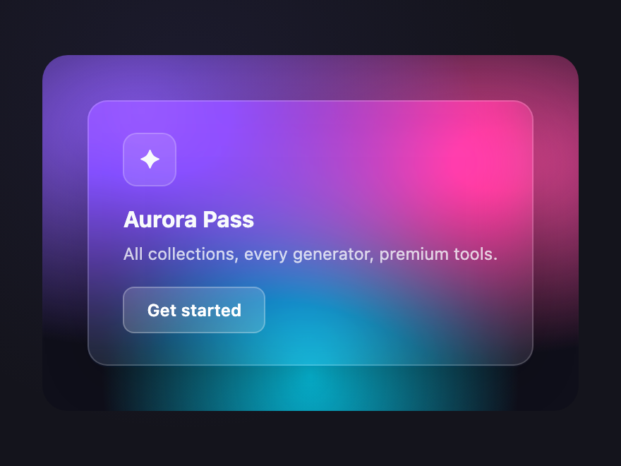
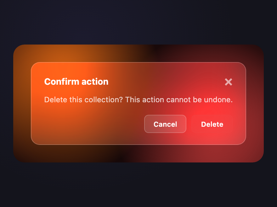
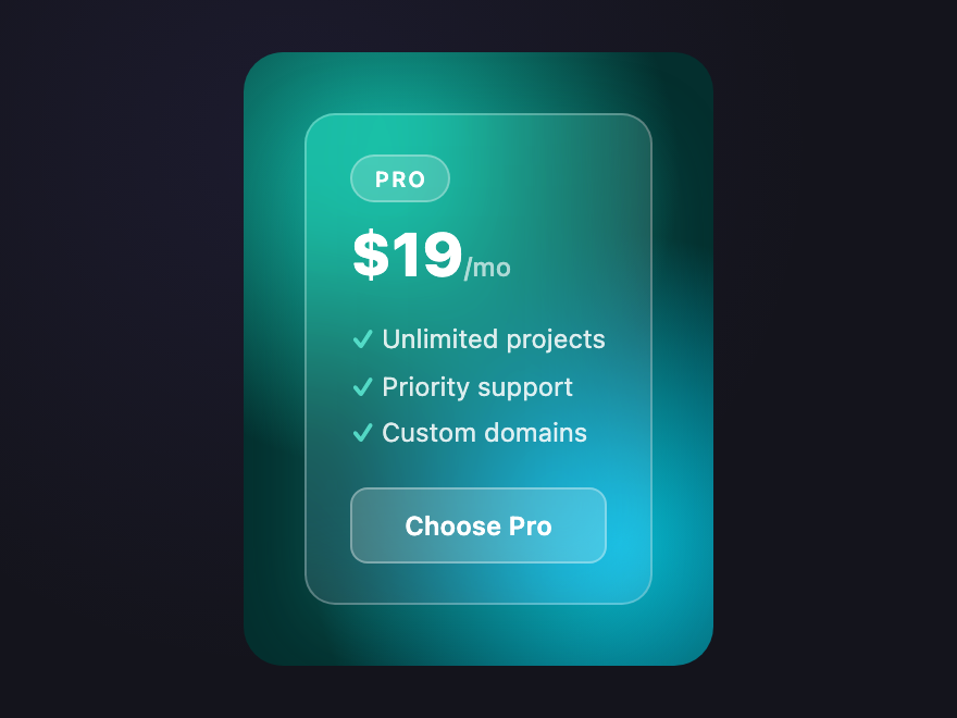
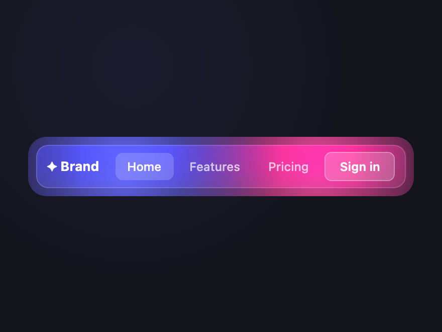
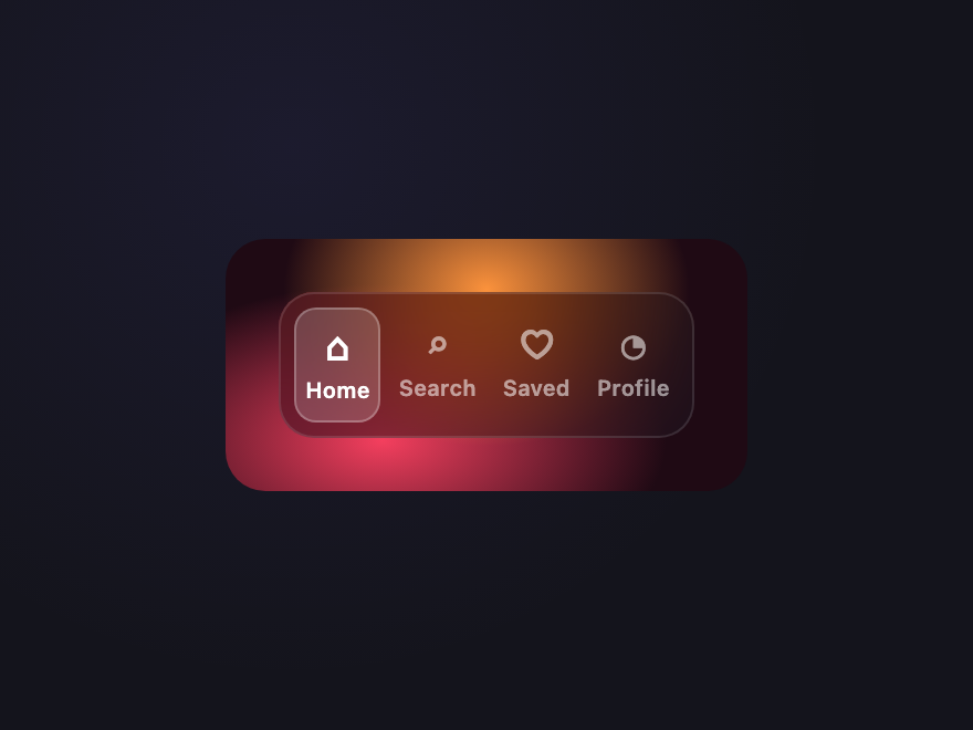
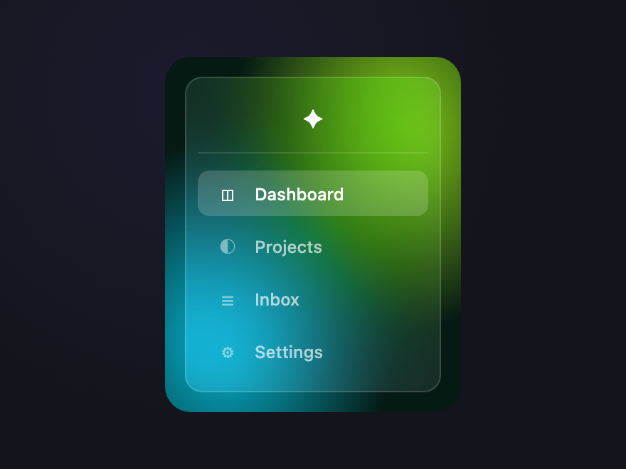
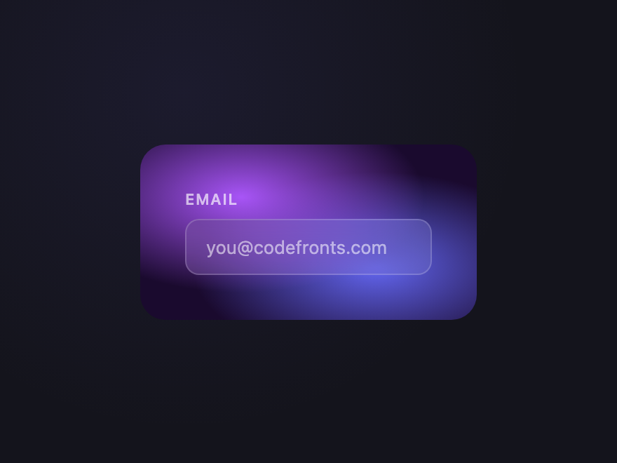
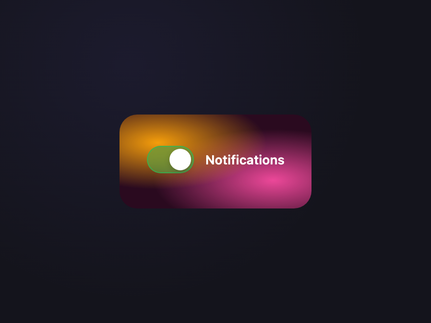
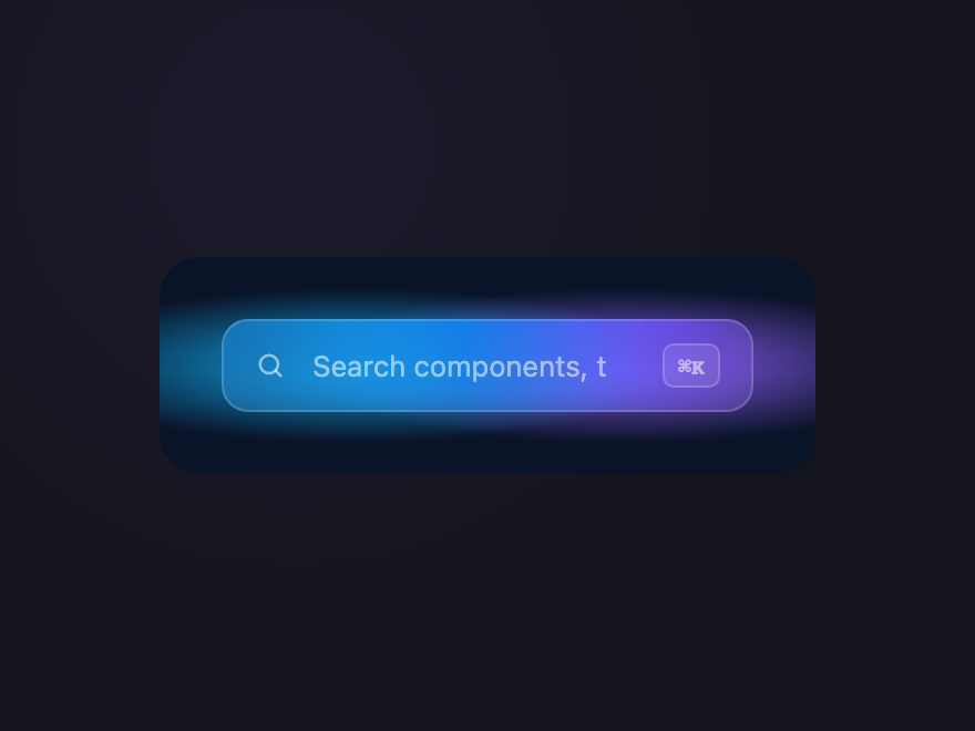
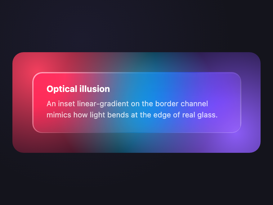
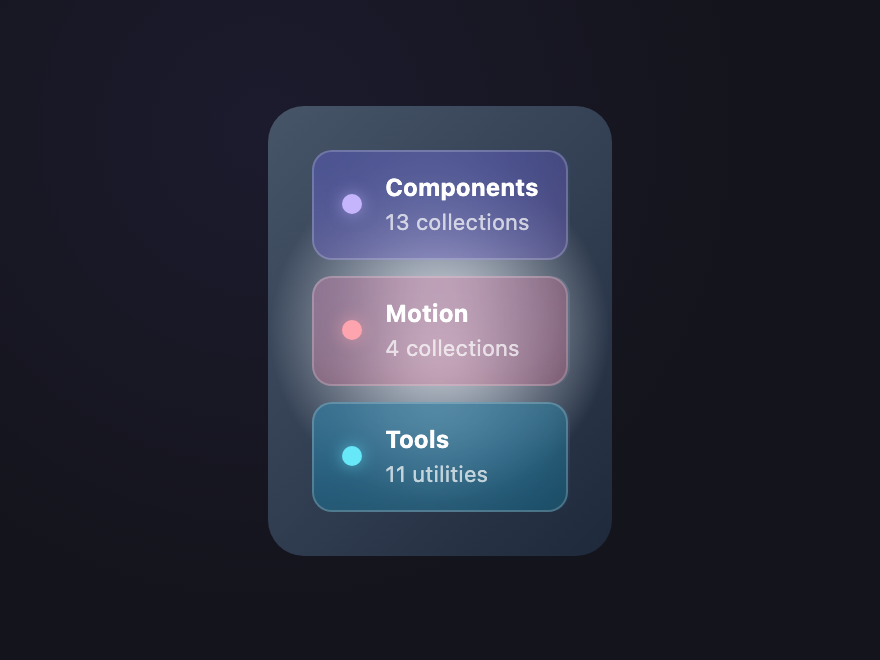
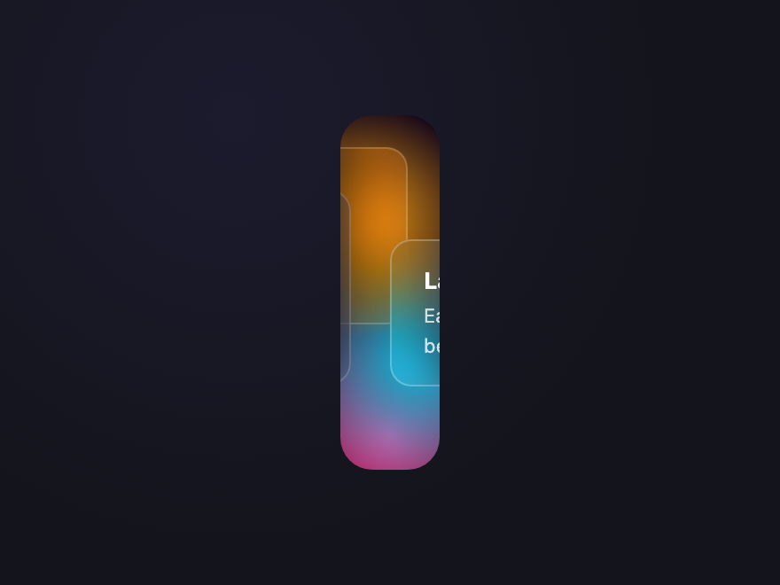
12 CSS Glassmorphism Designs
A CSS glassmorphism design is a frosted-glass surface effect built with backdrop-filter: blur(), a translucent background, a subtle border, and (often) a soft inner shadow — popularised by macOS Big Sur and iOS control centre. These 12 hand-coded examples use no images, are fully responsive, and copy-paste ready.
01 / 12
Glass Card
Pure CSS ✦
Aurora Pass
All collections, every generator, premium tools.
The canonical glass surface — translucent white over a vivid aurora gradient. Backdrop-filter blur is what sells the effect.
.gm-card-bg {
position: relative; padding: 32px;
border-radius: 18px; overflow: hidden;
background:
radial-gradient(ellipse at 18% 20%, #8b5cf6 0%, transparent 55%),
radial-gradient(ellipse at 82% 30%, #ec4899 0%, transparent 55%),
radial-gradient(ellipse at 50% 90%, #06b6d4 0%, transparent 55%),
#0f0f1a;
}
.gm-card {
background: rgba(255, 255, 255, 0.08);
-webkit-backdrop-filter: blur(20px) saturate(160%);
backdrop-filter: blur(20px) saturate(160%);
border: 1px solid rgba(255, 255, 255, 0.18);
border-radius: 14px;
padding: 22px 24px;
color: #f8fafc;
box-shadow: 0 8px 32px rgba(0, 0, 0, 0.18);
}
.gm-card__icon {
width: 38px; height: 38px;
background: rgba(255, 255, 255, 0.12);
border: 1px solid rgba(255, 255, 255, 0.2);
border-radius: 10px;
display: grid; place-items: center;
font-size: 18px; margin-bottom: 14px;
}
.gm-card__title { margin: 0 0 6px; font: 700 16px/1.2 system-ui, sans-serif; }
.gm-card__body { margin: 0 0 14px; font: 12px/1.55 system-ui, sans-serif; opacity: 0.78; }
.gm-card__btn {
background: rgba(255, 255, 255, 0.16);
border: 1px solid rgba(255, 255, 255, 0.25);
color: #fff;
padding: 8px 16px; border-radius: 8px;
font: 600 12px system-ui, sans-serif;
cursor: pointer;
transition: background 0.2s;
}
.gm-card__btn:hover { background: rgba(255, 255, 255, 0.28); } <div class="gm-card-bg">
<div class="gm-card">
<div class="gm-card__icon">✦</div>
<h3 class="gm-card__title">Aurora Pass</h3>
<p class="gm-card__body">All collections, every generator, premium tools.</p>
<button class="gm-card__btn">Get started</button>
</div>
</div> 02 / 12
Frosted Modal
Pure CSS Confirm action
Delete this collection? This action cannot be undone.
A heavy-blur dialog floating over a busy backdrop — the modal pattern that finally makes sense in 2024+ browsers.
.gm-modal-bg {
position: relative; padding: 28px;
border-radius: 18px; overflow: hidden;
background:
radial-gradient(circle at 20% 30%, #f97316 0%, transparent 45%),
radial-gradient(circle at 80% 70%, #ef4444 0%, transparent 45%),
#1a0a0a;
}
.gm-modal {
background: rgba(255, 255, 255, 0.1);
-webkit-backdrop-filter: blur(28px) saturate(180%);
backdrop-filter: blur(28px) saturate(180%);
border: 1px solid rgba(255, 255, 255, 0.22);
border-radius: 14px;
padding: 18px 20px;
color: #fff;
box-shadow: 0 16px 48px rgba(0, 0, 0, 0.3);
}
.gm-modal__head {
display: flex; justify-content: space-between; align-items: center;
margin-bottom: 10px;
}
.gm-modal__head h3 { margin: 0; font: 700 14px system-ui, sans-serif; }
.gm-modal__close {
background: none; border: none; color: rgba(255, 255, 255, 0.6);
font: 600 22px system-ui; line-height: 1; cursor: pointer; padding: 0;
}
.gm-modal__close:hover { color: #fff; }
.gm-modal__body { margin: 0 0 14px; font: 12px/1.55 system-ui, sans-serif; opacity: 0.78; }
.gm-modal__row { display: flex; gap: 8px; justify-content: flex-end; }
.gm-modal__btn {
background: rgba(255, 255, 255, 0.12);
border: 1px solid rgba(255, 255, 255, 0.2);
color: #fff;
padding: 7px 14px; border-radius: 7px;
font: 600 11px system-ui, sans-serif; cursor: pointer;
}
.gm-modal__btn:hover { background: rgba(255, 255, 255, 0.2); }
.gm-modal__btn--danger {
background: rgba(239, 68, 68, 0.3);
border-color: rgba(239, 68, 68, 0.5);
}
.gm-modal__btn--danger:hover { background: rgba(239, 68, 68, 0.5); } <div class="gm-modal-bg">
<div class="gm-modal">
<div class="gm-modal__head">
<h3>Confirm action</h3>
<button class="gm-modal__close" aria-label="Close">×</button>
</div>
<p class="gm-modal__body">Delete this collection? This action cannot be undone.</p>
<div class="gm-modal__row">
<button class="gm-modal__btn">Cancel</button>
<button class="gm-modal__btn gm-modal__btn--danger">Delete</button>
</div>
</div>
</div> 03 / 12
Pricing Glass
Pure CSS Pro
$19/mo
- Unlimited projects
- Priority support
- Custom domains
Tiered pricing card with featured glass treatment — the middle plan reads "premium" through stronger glass + brighter rim.
.gm-price-bg {
position: relative; padding: 28px;
border-radius: 18px; overflow: hidden;
background:
radial-gradient(circle at 30% 20%, #14b8a6 0%, transparent 50%),
radial-gradient(circle at 80% 80%, #06b6d4 0%, transparent 50%),
#042f2e;
}
.gm-price {
background: rgba(255, 255, 255, 0.1);
-webkit-backdrop-filter: blur(24px) saturate(180%);
backdrop-filter: blur(24px) saturate(180%);
border: 1.5px solid rgba(255, 255, 255, 0.28);
border-radius: 14px;
padding: 18px 20px;
color: #fff;
box-shadow: 0 12px 36px rgba(20, 184, 166, 0.25);
}
.gm-price__tag {
display: inline-block;
background: rgba(255, 255, 255, 0.18);
border: 1px solid rgba(255, 255, 255, 0.3);
padding: 4px 10px; border-radius: 12px;
font: 600 10px system-ui, sans-serif;
letter-spacing: 0.08em; text-transform: uppercase;
margin-bottom: 10px;
}
.gm-price__amount { font: 800 28px/1 system-ui, sans-serif; margin-bottom: 14px; }
.gm-price__amount span { font-size: 12px; opacity: 0.65; font-weight: 500; }
.gm-price__list { list-style: none; padding: 0; margin: 0 0 14px; font: 12px/1.8 system-ui, sans-serif; opacity: 0.85; }
.gm-price__list li::before { content: '✓ '; color: #5eead4; font-weight: 700; }
.gm-price__btn {
width: 100%;
background: rgba(255, 255, 255, 0.18);
border: 1px solid rgba(255, 255, 255, 0.32);
color: #fff;
padding: 9px; border-radius: 8px;
font: 600 12px system-ui, sans-serif; cursor: pointer;
}
.gm-price__btn:hover { background: rgba(255, 255, 255, 0.3); } <div class="gm-price-bg">
<div class="gm-price">
<div class="gm-price__tag">Pro</div>
<div class="gm-price__amount">$19<span>/mo</span></div>
<ul class="gm-price__list">
<li>Unlimited projects</li>
<li>Priority support</li>
<li>Custom domains</li>
</ul>
<button class="gm-price__btn">Choose Pro</button>
</div>
</div> 04 / 12
Glass Navbar
Pure CSS Sticky navbar that stays translucent over any page background — backdrop-filter saturate boosts the colors behind to keep contrast.
.gm-nav-bg {
position: relative; padding: 8px;
border-radius: 18px; overflow: hidden;
background:
radial-gradient(circle at 25% 50%, #6366f1 0%, transparent 50%),
radial-gradient(circle at 75% 50%, #ec4899 0%, transparent 50%),
#1a1426;
}
.gm-nav {
display: flex; align-items: center; gap: 4px;
background: rgba(255, 255, 255, 0.08);
-webkit-backdrop-filter: blur(18px) saturate(180%);
backdrop-filter: blur(18px) saturate(180%);
border: 1px solid rgba(255, 255, 255, 0.15);
border-radius: 12px;
padding: 6px 10px;
}
.gm-nav__logo {
font: 700 13px system-ui, sans-serif;
color: #fff; margin-right: 12px;
}
.gm-nav__link {
font: 500 12px system-ui, sans-serif;
color: rgba(255, 255, 255, 0.7);
text-decoration: none;
padding: 6px 12px; border-radius: 7px;
transition: background 0.2s, color 0.2s;
}
.gm-nav__link:hover {
background: rgba(255, 255, 255, 0.1); color: #fff;
}
.gm-nav__link--active {
background: rgba(255, 255, 255, 0.18);
color: #fff;
}
.gm-nav__cta {
margin-left: auto;
background: rgba(255, 255, 255, 0.2);
border: 1px solid rgba(255, 255, 255, 0.3);
color: #fff;
padding: 6px 14px; border-radius: 7px;
font: 600 12px system-ui, sans-serif; cursor: pointer;
}
.gm-nav__cta:hover { background: rgba(255, 255, 255, 0.32); } <div class="gm-nav-bg">
<nav class="gm-nav">
<span class="gm-nav__logo">✦ Brand</span>
<a class="gm-nav__link gm-nav__link--active" href="#">Home</a>
<a class="gm-nav__link" href="#">Features</a>
<a class="gm-nav__link" href="#">Pricing</a>
<button class="gm-nav__cta">Sign in</button>
</nav>
</div> 05 / 12
Glass Tab Bar
Pure CSS Bottom navigation bar (mobile-app pattern) where the active pill is a brighter glass surface inside a darker glass container.
.gm-tabbar-bg {
position: relative; padding: 24px;
border-radius: 18px; overflow: hidden;
background:
radial-gradient(ellipse at 50% 20%, #fb923c 0%, transparent 55%),
radial-gradient(ellipse at 30% 80%, #f43f5e 0%, transparent 55%),
#1f0a14;
}
.gm-tabbar {
display: flex; gap: 4px;
background: rgba(20, 20, 30, 0.5);
-webkit-backdrop-filter: blur(24px) saturate(160%);
backdrop-filter: blur(24px) saturate(160%);
border: 1px solid rgba(255, 255, 255, 0.12);
border-radius: 16px;
padding: 6px;
}
.gm-tabbar__tab {
flex: 1;
background: none; border: none;
color: rgba(255, 255, 255, 0.55);
padding: 8px 4px;
display: flex; flex-direction: column; align-items: center; gap: 4px;
font: 600 10px system-ui, sans-serif;
border-radius: 10px;
cursor: pointer;
transition: background 0.2s, color 0.2s;
}
.gm-tabbar__icon { font-size: 18px; line-height: 1; }
.gm-tabbar__tab:hover { color: rgba(255, 255, 255, 0.85); }
.gm-tabbar__tab--active {
background: rgba(255, 255, 255, 0.18);
border: 1px solid rgba(255, 255, 255, 0.25);
color: #fff;
} <div class="gm-tabbar-bg">
<nav class="gm-tabbar">
<button class="gm-tabbar__tab gm-tabbar__tab--active">
<span class="gm-tabbar__icon">⌂</span>Home
</button>
<button class="gm-tabbar__tab">
<span class="gm-tabbar__icon">⌕</span>Search
</button>
<button class="gm-tabbar__tab">
<span class="gm-tabbar__icon">♡</span>Saved
</button>
<button class="gm-tabbar__tab">
<span class="gm-tabbar__icon">◔</span>Profile
</button>
</nav>
</div> 06 / 12
Glass Sidebar
Pure CSS Vertical glass sidebar with active-item highlight — the classic dashboard chrome reimagined as a single semi-transparent panel.
.gm-side-bg {
position: relative; padding: 14px;
border-radius: 18px; overflow: hidden;
background:
radial-gradient(ellipse at 80% 20%, #84cc16 0%, transparent 50%),
radial-gradient(ellipse at 20% 80%, #06b6d4 0%, transparent 50%),
#061a14;
}
.gm-side {
display: flex; flex-direction: column; gap: 4px;
background: rgba(255, 255, 255, 0.08);
-webkit-backdrop-filter: blur(24px) saturate(160%);
backdrop-filter: blur(24px) saturate(160%);
border: 1px solid rgba(255, 255, 255, 0.15);
border-radius: 12px;
padding: 12px 8px; width: 180px;
}
.gm-side__brand {
font-size: 18px; color: #fff;
text-align: center; padding: 6px 0 12px;
border-bottom: 1px solid rgba(255, 255, 255, 0.12);
margin-bottom: 8px;
}
.gm-side__item {
display: flex; align-items: center; gap: 10px;
padding: 8px 12px; border-radius: 8px;
font: 500 12px system-ui, sans-serif;
color: rgba(255, 255, 255, 0.65);
text-decoration: none;
transition: background 0.2s, color 0.2s;
}
.gm-side__item span {
width: 18px; text-align: center;
font-size: 13px; opacity: 0.7;
}
.gm-side__item:hover { background: rgba(255, 255, 255, 0.08); color: #fff; }
.gm-side__item--active {
background: rgba(255, 255, 255, 0.18);
color: #fff;
}
.gm-side__item--active span { opacity: 1; } <div class="gm-side-bg">
<aside class="gm-side">
<div class="gm-side__brand">✦</div>
<a class="gm-side__item gm-side__item--active" href="#"><span>◫</span>Dashboard</a>
<a class="gm-side__item" href="#"><span>◐</span>Projects</a>
<a class="gm-side__item" href="#"><span>☰</span>Inbox</a>
<a class="gm-side__item" href="#"><span>⚙</span>Settings</a>
</aside>
</div> 07 / 12
Glass Input
Pure CSS Translucent text input with a subtle inner glow on focus — useful when a form sits over imagery or a video background.
.gm-input-bg {
position: relative; padding: 32px;
border-radius: 18px; overflow: hidden;
background:
radial-gradient(ellipse at 30% 30%, #a855f7 0%, transparent 55%),
radial-gradient(ellipse at 70% 70%, #6366f1 0%, transparent 55%),
#1a0a2e;
}
.gm-input { display: block; }
.gm-input__lbl {
display: block;
font: 600 11px system-ui, sans-serif;
color: rgba(255, 255, 255, 0.65);
letter-spacing: 0.06em; text-transform: uppercase;
margin-bottom: 8px;
}
.gm-input__field {
width: 100%; box-sizing: border-box;
background: rgba(255, 255, 255, 0.08);
-webkit-backdrop-filter: blur(20px);
backdrop-filter: blur(20px);
border: 1px solid rgba(255, 255, 255, 0.18);
border-radius: 10px;
padding: 11px 14px;
color: #fff;
font: 13px system-ui, sans-serif;
transition: border-color 0.25s, box-shadow 0.25s;
}
.gm-input__field::placeholder { color: rgba(255, 255, 255, 0.55); }
.gm-input__field:focus {
outline: none;
border-color: rgba(255, 255, 255, 0.55);
box-shadow: inset 0 0 0 1px rgba(255, 255, 255, 0.18),
0 0 24px rgba(168, 85, 247, 0.25);
} <div class="gm-input-bg">
<label class="gm-input">
<span class="gm-input__lbl">Email</span>
<input class="gm-input__field" type="email" placeholder="[email protected]" />
</label>
</div> 08 / 12
Glass Toggle
Pure CSS Frosted iOS-style toggle switch sitting over a vivid backdrop — the thumb is a brighter glass island inside the track.
.gm-toggle-bg {
position: relative; padding: 32px 28px;
border-radius: 18px; overflow: hidden;
background:
radial-gradient(ellipse at 20% 30%, #f59e0b 0%, transparent 50%),
radial-gradient(ellipse at 80% 70%, #ec4899 0%, transparent 55%),
#2a0a1f;
}
.gm-toggle {
display: inline-flex; align-items: center; gap: 12px; cursor: pointer;
}
.gm-toggle__input {
position: absolute; opacity: 0; pointer-events: none;
}
.gm-toggle__track {
position: relative; display: inline-block;
width: 48px; height: 28px;
background: rgba(255, 255, 255, 0.1);
-webkit-backdrop-filter: blur(14px);
backdrop-filter: blur(14px);
border: 1px solid rgba(255, 255, 255, 0.2);
border-radius: 999px;
transition: background 0.25s, border-color 0.25s;
}
.gm-toggle__thumb {
position: absolute; top: 2px; left: 2px;
width: 22px; height: 22px;
background: rgba(255, 255, 255, 0.85);
border-radius: 50%;
box-shadow: 0 2px 6px rgba(0, 0, 0, 0.18);
transition: left 0.25s cubic-bezier(.3, 1.3, .5, 1), background 0.25s;
}
.gm-toggle__input:checked + .gm-toggle__track {
background: rgba(34, 197, 94, 0.4);
border-color: rgba(34, 197, 94, 0.6);
}
.gm-toggle__input:checked + .gm-toggle__track .gm-toggle__thumb {
left: 22px;
background: #fff;
}
.gm-toggle__label {
font: 600 13px system-ui, sans-serif;
color: #fff;
} <div class="gm-toggle-bg">
<label class="gm-toggle">
<input type="checkbox" class="gm-toggle__input" checked>
<span class="gm-toggle__track">
<span class="gm-toggle__thumb"></span>
</span>
<span class="gm-toggle__label">Notifications</span>
</label>
</div> 09 / 12
Glass Search
Pure CSS A frosted search field with a built-in icon — the kind of search bar that hovers over a hero image or video without competing.
.gm-search-bg {
position: relative; padding: 28px;
border-radius: 18px; overflow: hidden;
background:
radial-gradient(ellipse at 30% 50%, #0ea5e9 0%, transparent 50%),
radial-gradient(ellipse at 70% 50%, #8b5cf6 0%, transparent 50%),
#0a1428;
}
.gm-search {
display: flex; align-items: center; gap: 10px;
background: rgba(255, 255, 255, 0.08);
-webkit-backdrop-filter: blur(22px) saturate(160%);
backdrop-filter: blur(22px) saturate(160%);
border: 1px solid rgba(255, 255, 255, 0.18);
border-radius: 12px;
padding: 10px 14px;
}
.gm-search__icon { color: rgba(255, 255, 255, 0.55); flex-shrink: 0; }
.gm-search__field {
flex: 1;
background: none; border: none; outline: none;
color: #fff;
font: 13px system-ui, sans-serif;
}
.gm-search__field::placeholder { color: rgba(255, 255, 255, 0.55); }
.gm-search__kbd {
font: 600 10px ui-monospace, monospace;
color: rgba(255, 255, 255, 0.55);
background: rgba(255, 255, 255, 0.1);
border: 1px solid rgba(255, 255, 255, 0.18);
border-radius: 5px;
padding: 3px 6px;
} <div class="gm-search-bg">
<label class="gm-search">
<svg class="gm-search__icon" width="14" height="14" viewBox="0 0 24 24" fill="none" stroke="currentColor" stroke-width="2.2" stroke-linecap="round">
<circle cx="11" cy="11" r="7"/><path d="M20 20l-4-4"/>
</svg>
<input class="gm-search__field" type="search" placeholder="Search components, tags, demos…" />
<kbd class="gm-search__kbd">⌘K</kbd>
</label>
</div> 10 / 12
Refraction Card
Pure CSS Optical illusion
An inset linear-gradient on the border channel mimics how light bends at the edge of real glass.
Glass card with a fake refraction edge — a brighter rim on one side simulates how real glass bends light at its boundary.
.gm-refr-bg {
position: relative; padding: 32px;
border-radius: 18px; overflow: hidden;
background:
radial-gradient(circle at 10% 20%, #f43f5e 0%, transparent 50%),
radial-gradient(circle at 90% 80%, #8b5cf6 0%, transparent 50%),
radial-gradient(circle at 50% 50%, #06b6d4 0%, transparent 60%),
#0e0a1a;
}
.gm-refr {
position: relative;
background: rgba(255, 255, 255, 0.08);
-webkit-backdrop-filter: blur(28px) saturate(180%);
backdrop-filter: blur(28px) saturate(180%);
border-radius: 14px;
padding: 18px 22px;
color: #fff;
/* Refractive rim — gradient border via background-clip */
border: 1.5px solid transparent;
background-clip: padding-box;
}
.gm-refr::before {
content: ''; position: absolute; inset: -1.5px;
border-radius: 15.5px;
background: linear-gradient(135deg,
rgba(255, 255, 255, 0.6),
rgba(255, 255, 255, 0.1) 40%,
transparent 60%,
rgba(255, 255, 255, 0.3));
-webkit-mask:
linear-gradient(#000 0 0) content-box,
linear-gradient(#000 0 0);
-webkit-mask-composite: xor;
mask-composite: exclude;
padding: 1.5px;
pointer-events: none;
}
.gm-refr h4 { margin: 0 0 6px; font: 700 14px/1.2 system-ui, sans-serif; }
.gm-refr p { margin: 0; font: 12px/1.55 system-ui, sans-serif; opacity: 0.78; } <div class="gm-refr-bg">
<div class="gm-refr">
<h4>Optical illusion</h4>
<p>An inset linear-gradient on the border channel mimics how light bends at the edge of real glass.</p>
</div>
</div> 11 / 12
Tinted Glass
Pure CSS Components13 collections
Motion4 collections
Tools11 utilities
Each glass surface tints subtly with its own brand hue while sharing the same blur — useful for color-coded categories.
.gm-tint-bg {
position: relative; padding: 22px;
border-radius: 18px; overflow: hidden;
display: flex; flex-direction: column; gap: 8px;
background:
radial-gradient(circle at 50% 50%, #e2e8f0 0%, transparent 60%),
linear-gradient(135deg, #475569, #1e293b);
}
.gm-tint {
display: flex; align-items: center; gap: 12px;
-webkit-backdrop-filter: blur(20px) saturate(180%);
backdrop-filter: blur(20px) saturate(180%);
border: 1px solid rgba(255, 255, 255, 0.2);
border-radius: 10px;
padding: 10px 14px;
color: #fff;
}
.gm-tint b { display: block; font: 700 12px system-ui, sans-serif; }
.gm-tint small { font: 11px system-ui, sans-serif; opacity: 0.7; }
.gm-tint__dot { width: 10px; height: 10px; border-radius: 50%; }
.gm-tint--violet { background: rgba(139, 92, 246, 0.22); }
.gm-tint--violet .gm-tint__dot { background: #c4b5fd; box-shadow: 0 0 8px rgba(196, 181, 253, 0.6); }
.gm-tint--rose { background: rgba(244, 63, 94, 0.22); }
.gm-tint--rose .gm-tint__dot { background: #fda4af; box-shadow: 0 0 8px rgba(253, 164, 175, 0.6); }
.gm-tint--cyan { background: rgba(6, 182, 212, 0.22); }
.gm-tint--cyan .gm-tint__dot { background: #67e8f9; box-shadow: 0 0 8px rgba(103, 232, 249, 0.6); } <div class="gm-tint-bg">
<div class="gm-tint gm-tint--violet">
<span class="gm-tint__dot"></span>
<div><b>Components</b><small>13 collections</small></div>
</div>
<div class="gm-tint gm-tint--rose">
<span class="gm-tint__dot"></span>
<div><b>Motion</b><small>4 collections</small></div>
</div>
<div class="gm-tint gm-tint--cyan">
<span class="gm-tint__dot"></span>
<div><b>Tools</b><small>11 utilities</small></div>
</div>
</div> 12 / 12
Stacked Glass
Pure CSS Layered depth
Each pane blurs the surfaces beneath it.
Three glass layers stacked at offset depths — each pane blurs the panes behind it, creating a dimensional sandwich effect.
.gm-stack-bg {
position: relative; padding: 28px;
border-radius: 18px; overflow: hidden;
min-height: 200px;
background:
radial-gradient(circle at 25% 30%, #f59e0b 0%, transparent 45%),
radial-gradient(circle at 75% 70%, #06b6d4 0%, transparent 45%),
radial-gradient(circle at 50% 90%, #ec4899 0%, transparent 45%),
#1a0a1a;
}
.gm-stack__pane {
position: absolute;
-webkit-backdrop-filter: blur(16px) saturate(160%);
backdrop-filter: blur(16px) saturate(160%);
background: rgba(255, 255, 255, 0.08);
border: 1px solid rgba(255, 255, 255, 0.18);
border-radius: 12px;
color: #fff;
}
.gm-stack__pane--3 {
top: 18px; right: 18px;
width: 140px; height: 100px;
background: rgba(255, 255, 255, 0.05);
}
.gm-stack__pane--2 {
top: 42px; right: 50px;
width: 160px; height: 110px;
background: rgba(255, 255, 255, 0.07);
}
.gm-stack__pane--1 {
top: 70px; left: 28px;
width: 200px; padding: 14px 18px;
background: rgba(255, 255, 255, 0.12);
border: 1px solid rgba(255, 255, 255, 0.25);
}
.gm-stack__pane--1 h4 { margin: 0 0 4px; font: 700 13px system-ui, sans-serif; }
.gm-stack__pane--1 p { margin: 0; font: 11px/1.5 system-ui, sans-serif; opacity: 0.78; } <div class="gm-stack-bg">
<div class="gm-stack__pane gm-stack__pane--3"></div>
<div class="gm-stack__pane gm-stack__pane--2"></div>
<div class="gm-stack__pane gm-stack__pane--1">
<h4>Layered depth</h4>
<p>Each pane blurs the surfaces beneath it.</p>
</div>
</div>