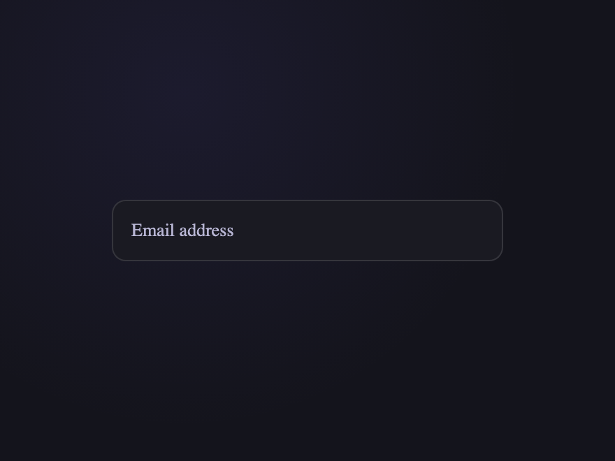
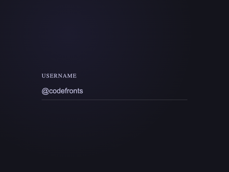
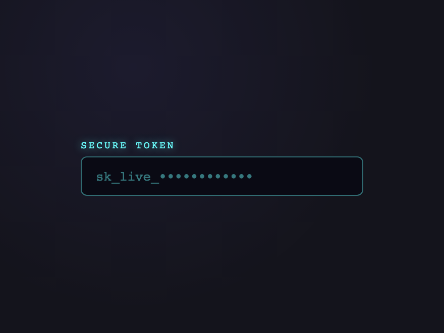
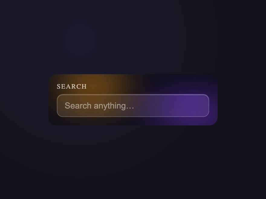
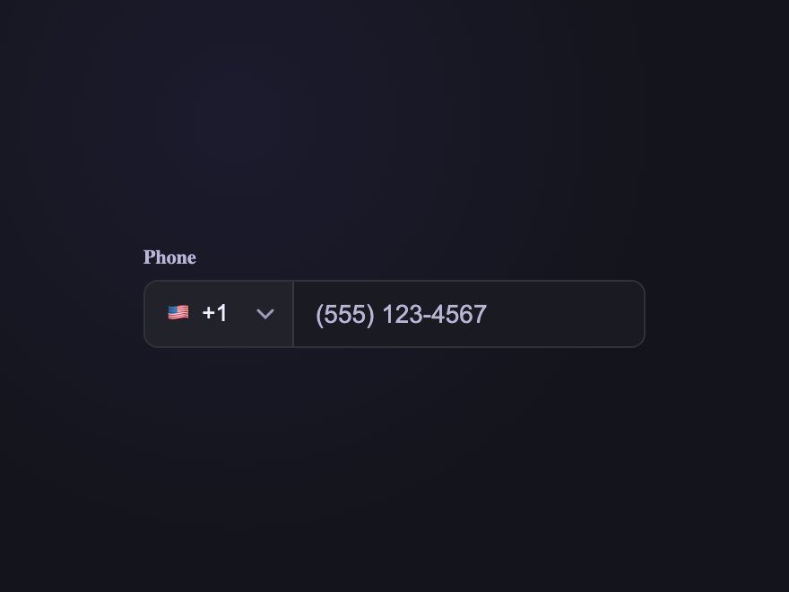
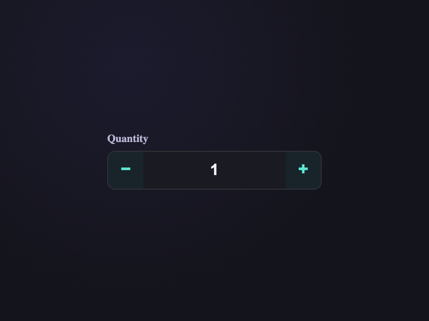
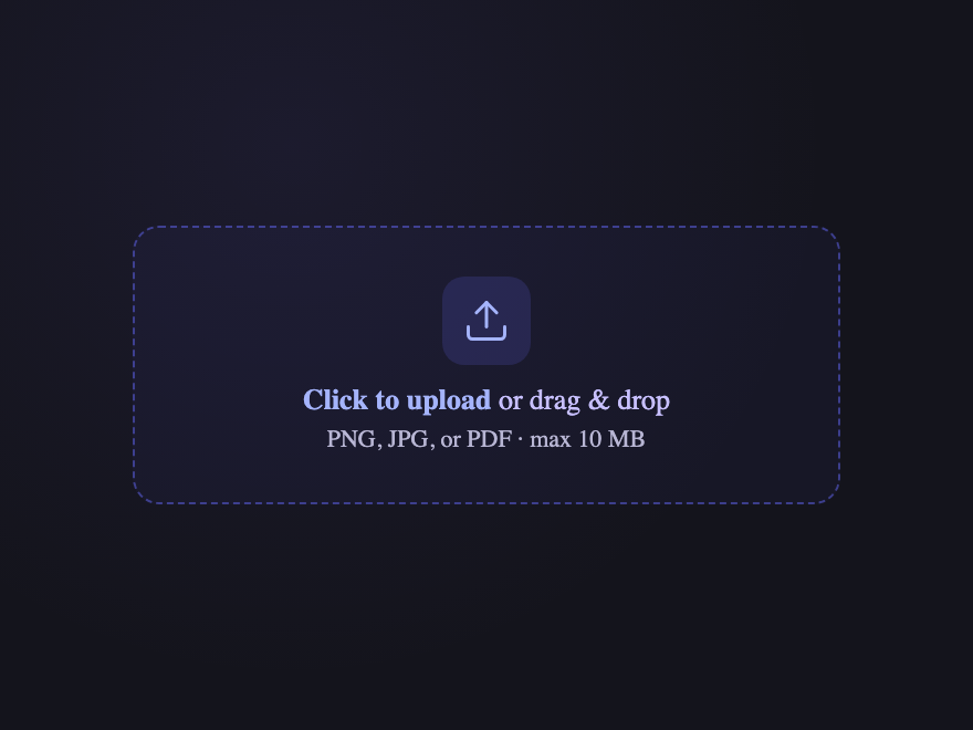
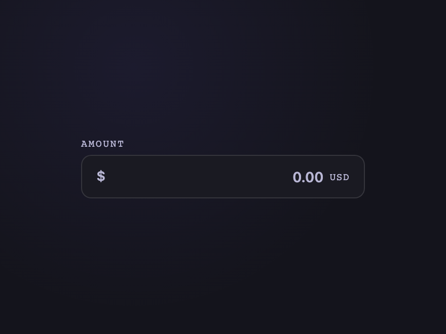
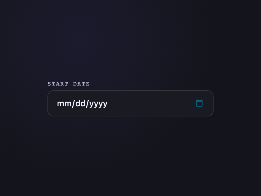
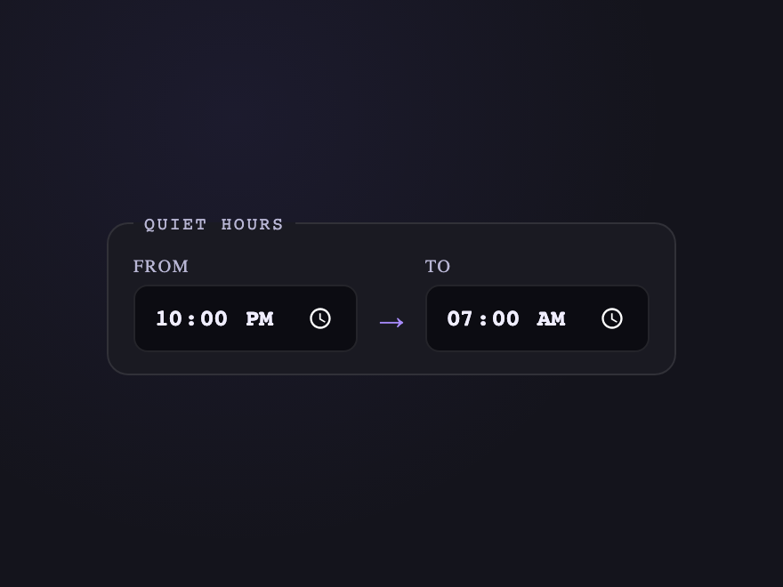
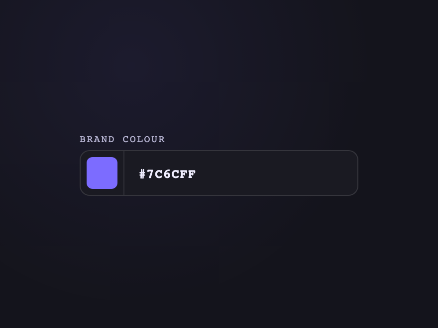
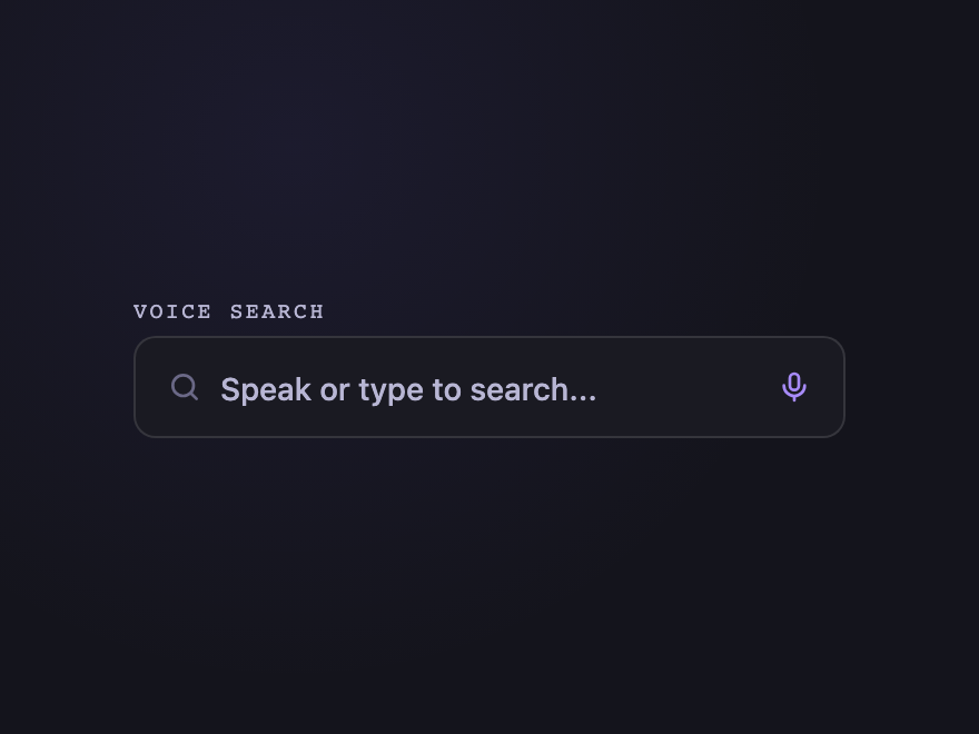
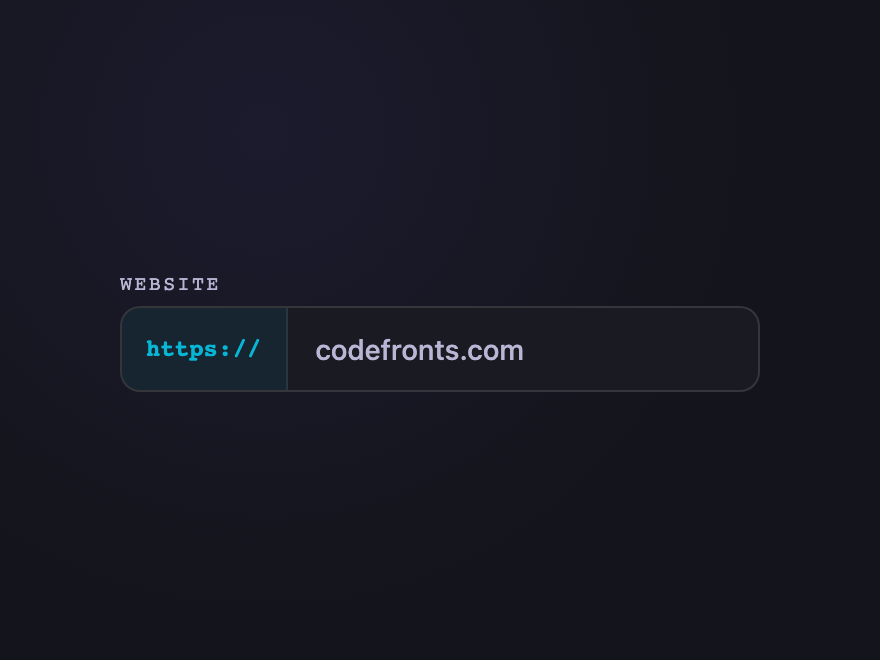
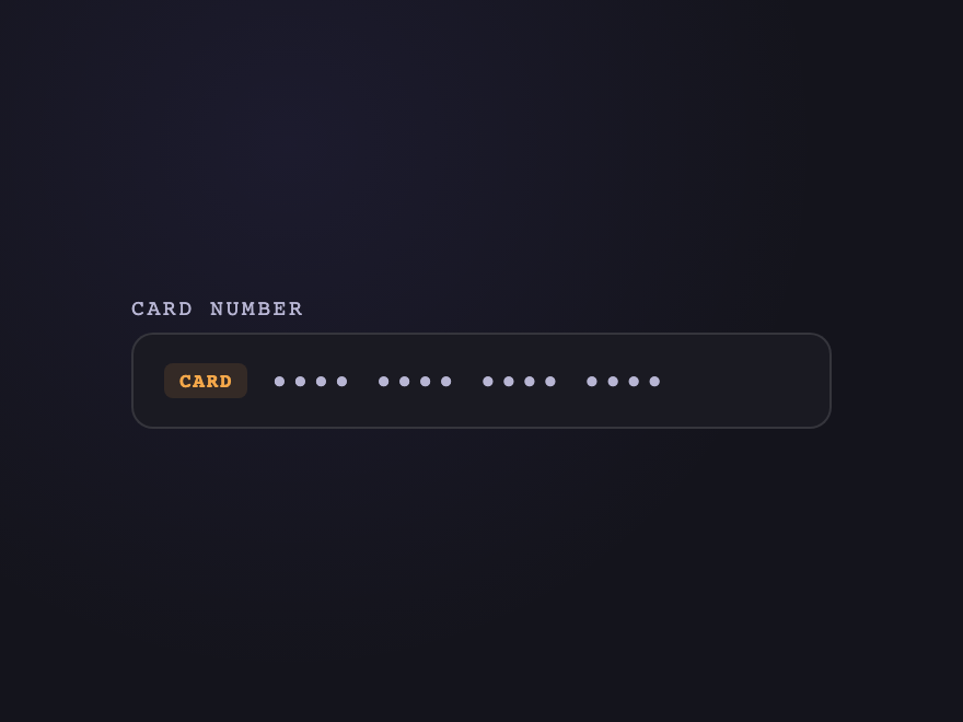
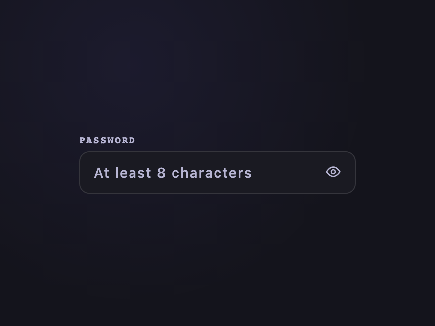
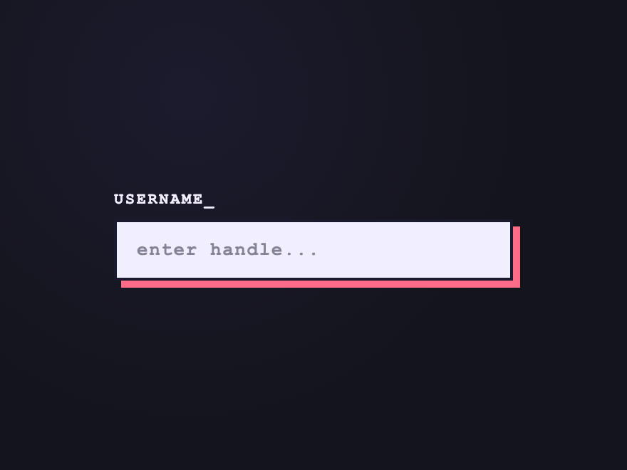
28 CSS Input Field Designs
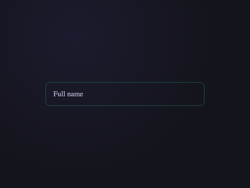
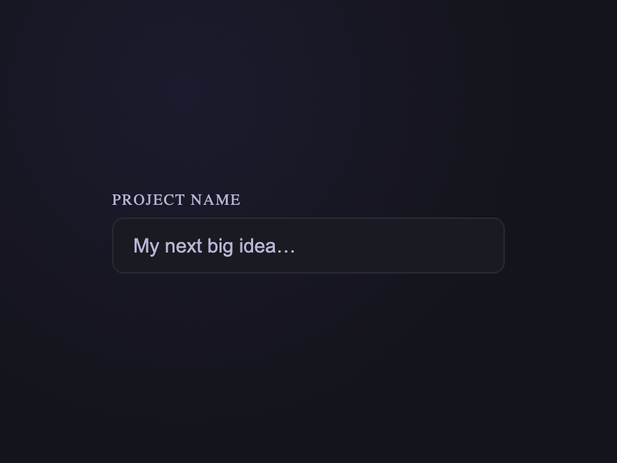
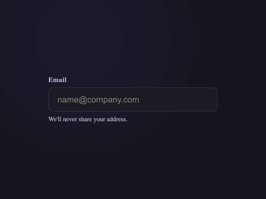
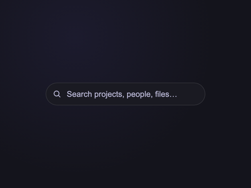
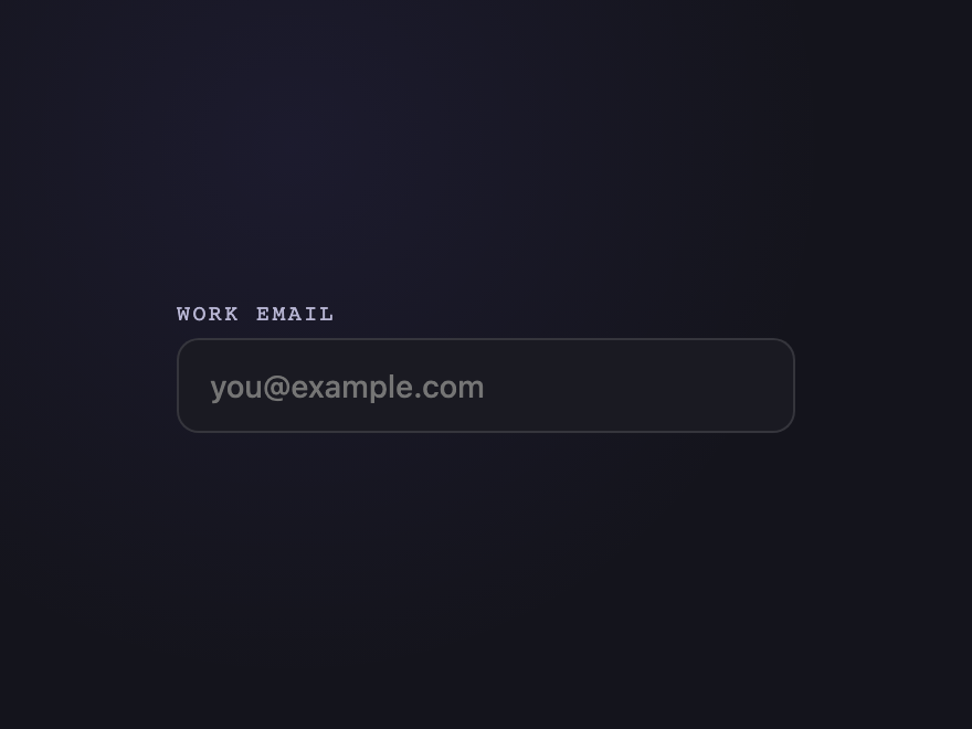
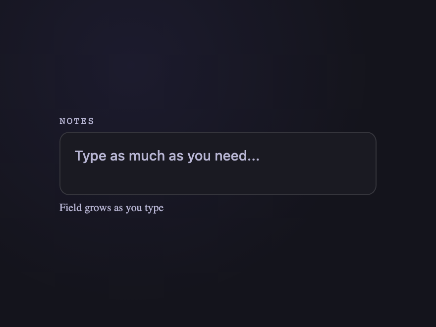
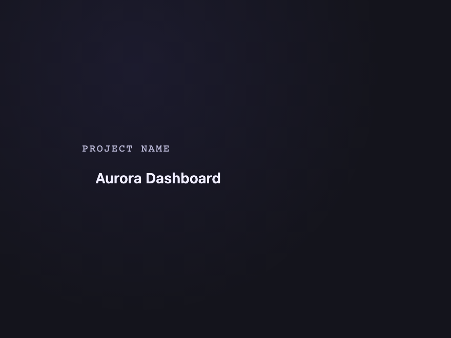
A CSS input field is a styled text-input control where users type information into a form. These 28 hand-coded designs are ready-to-ship inputs for sign-up forms, search bars, settings screens, and checkout flows — copy the markup, drop into your form, and ship.
Build your own
Tweak the exact look in our visual generators — no signup, instant copy-paste.
Frequently asked questions
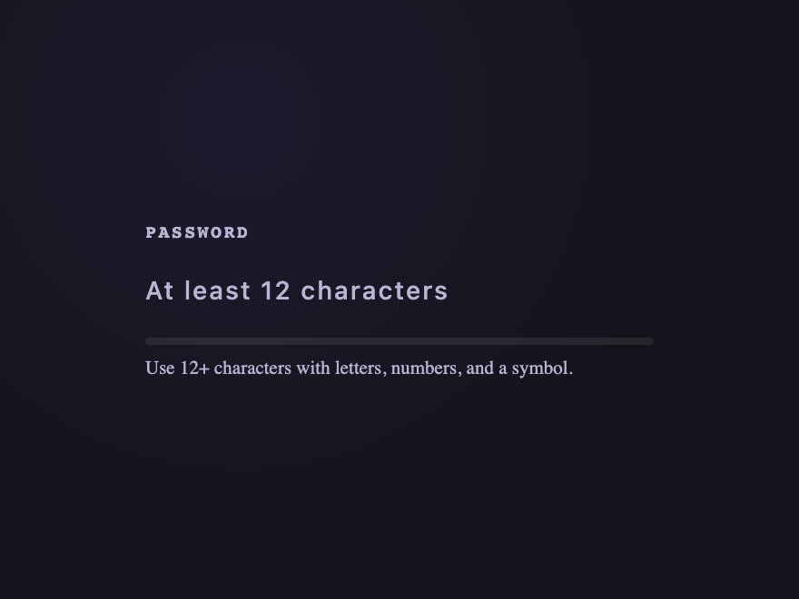
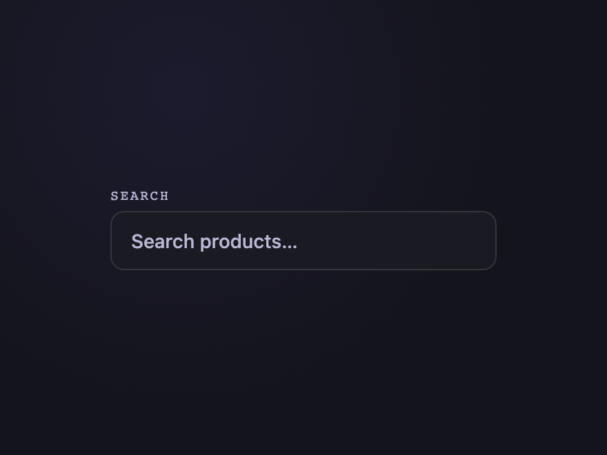
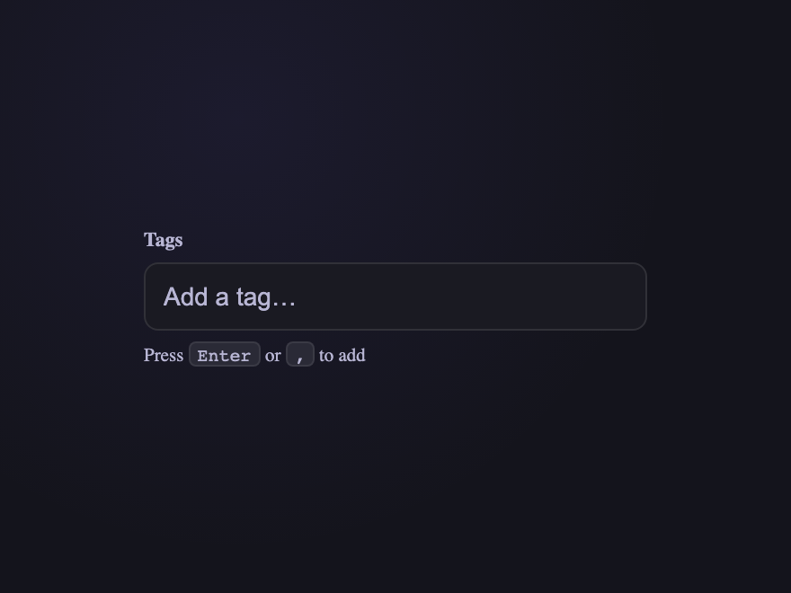
How do I style a CSS input field?
Are these CSS input fields accessible?
What's the most accessible way to do a floating label?
Do these inputs need JavaScript?
Will autofill and password managers work with these inputs?
Related collections

22 CSS Button Group Designs
22 dynamic CSS button groups with motion-driven interactions — plasma loops, holographic gradients, magnetic discs, wormhole tabs, particle aurora. Pure CSS or light JS, copy-paste ready.

43 CSS Button Designs
43 hand-coded CSS buttons — real-world materials like brushed brass and vinyl, interactive use-case buttons (add-to-cart, download, like, delete), and click-effect studies: magnetic mercury ripple, brutalist glitch, neon plasma burst, clay press, ink spread, and particle shards.

27 CSS Calendar Designs
27 hand-coded CSS calendar designs covering every search intent for 'css calendar' — pure-CSS calendar (no JavaScript), CSS Grid layouts, glassmorphism widgets, brutalist designs, dark mode UIs, neumorphic cards, horizontal timelines, sidebar widgets, booking date-range pickers, CSS Grid advent calendars, Fluent / Material Design, circular / radial layouts, retro neon cyberpunk, 3D flip cards, isometric dashboards, split-screen heroes, liquid micro-interactions, bento grid booking, vintage paper tear-offs, vertical timelines, kinetic typography, and slanted diagonal grids. 1 truly pure-CSS, 26 with small vanilla JS snippets for event handling. Scoped class names that never collide, prefers-reduced-motion respected, MIT-licensed.