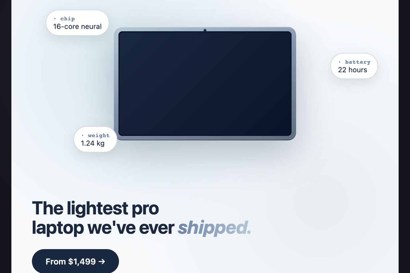
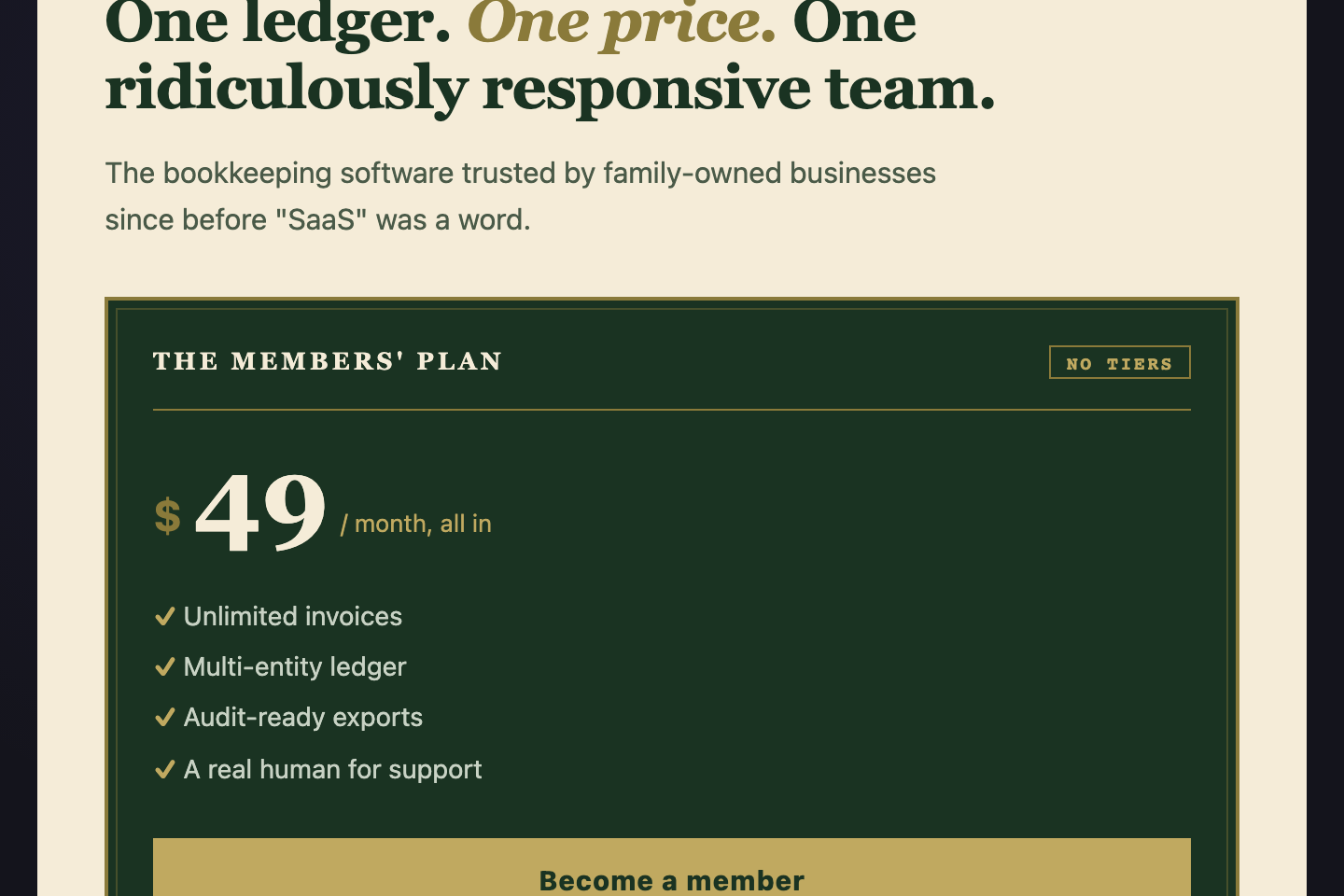
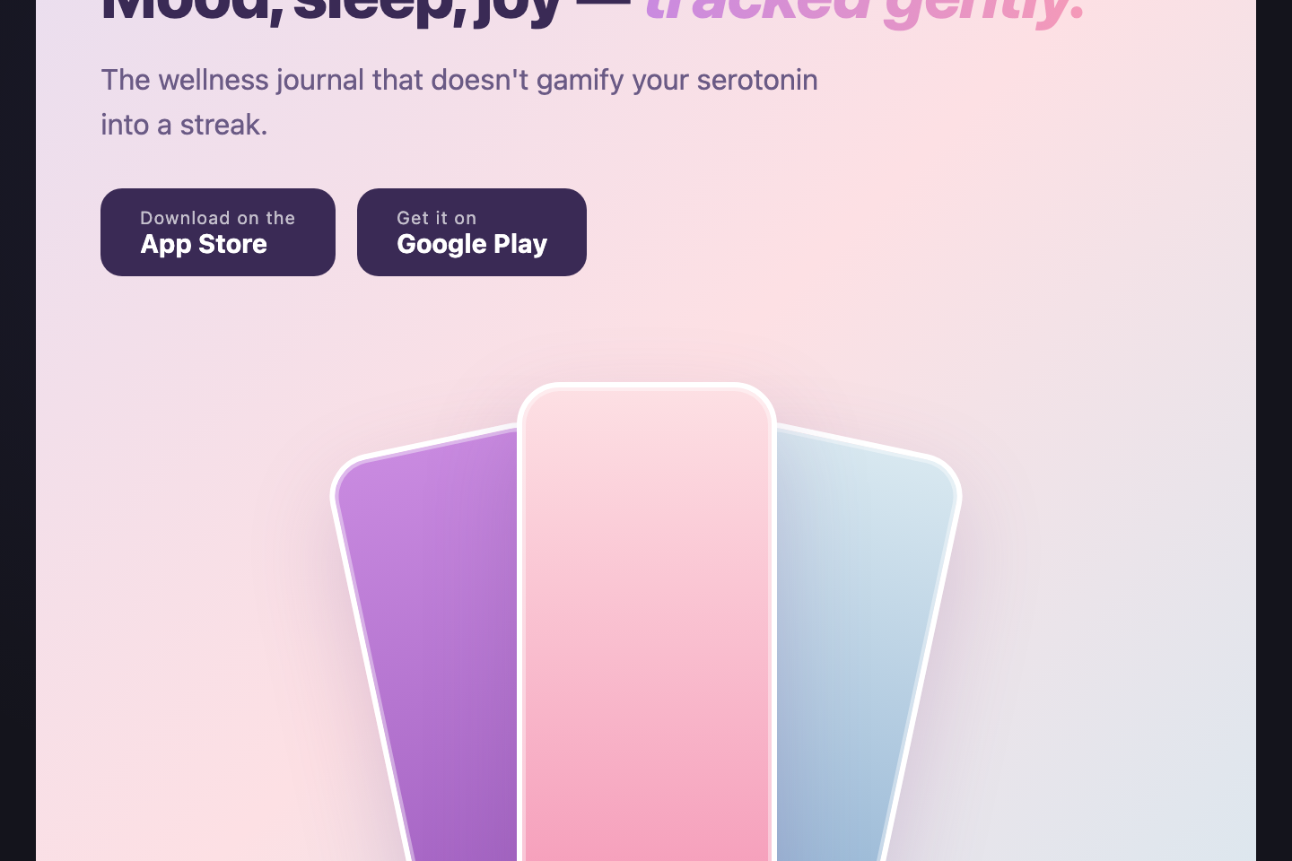
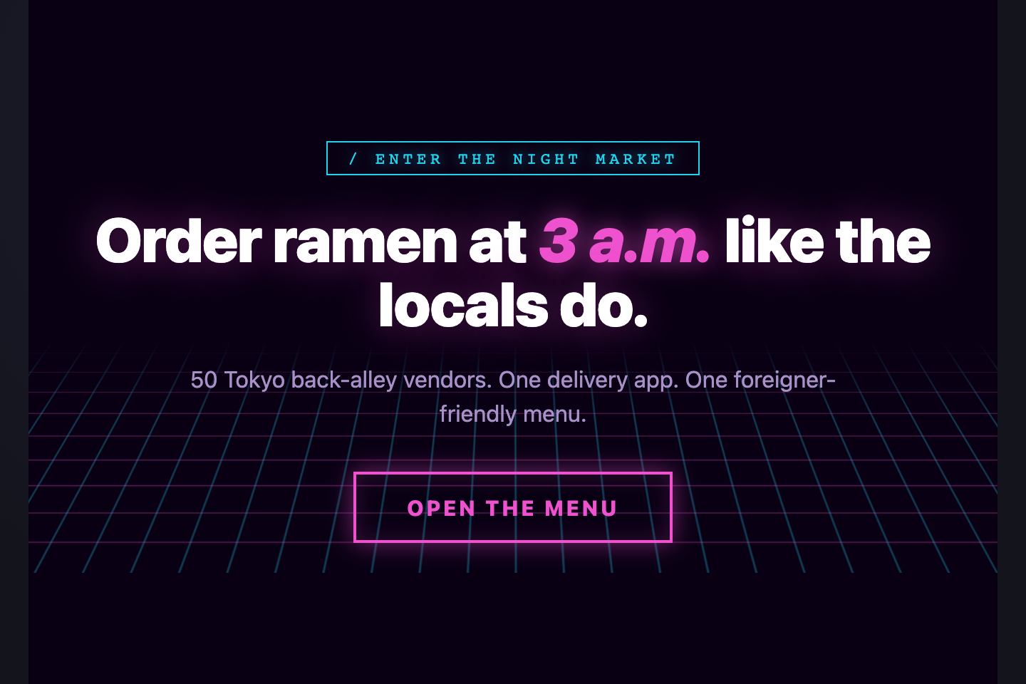
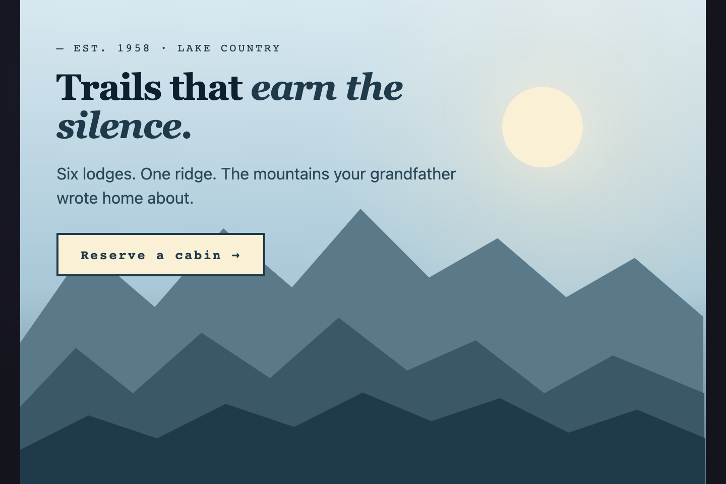
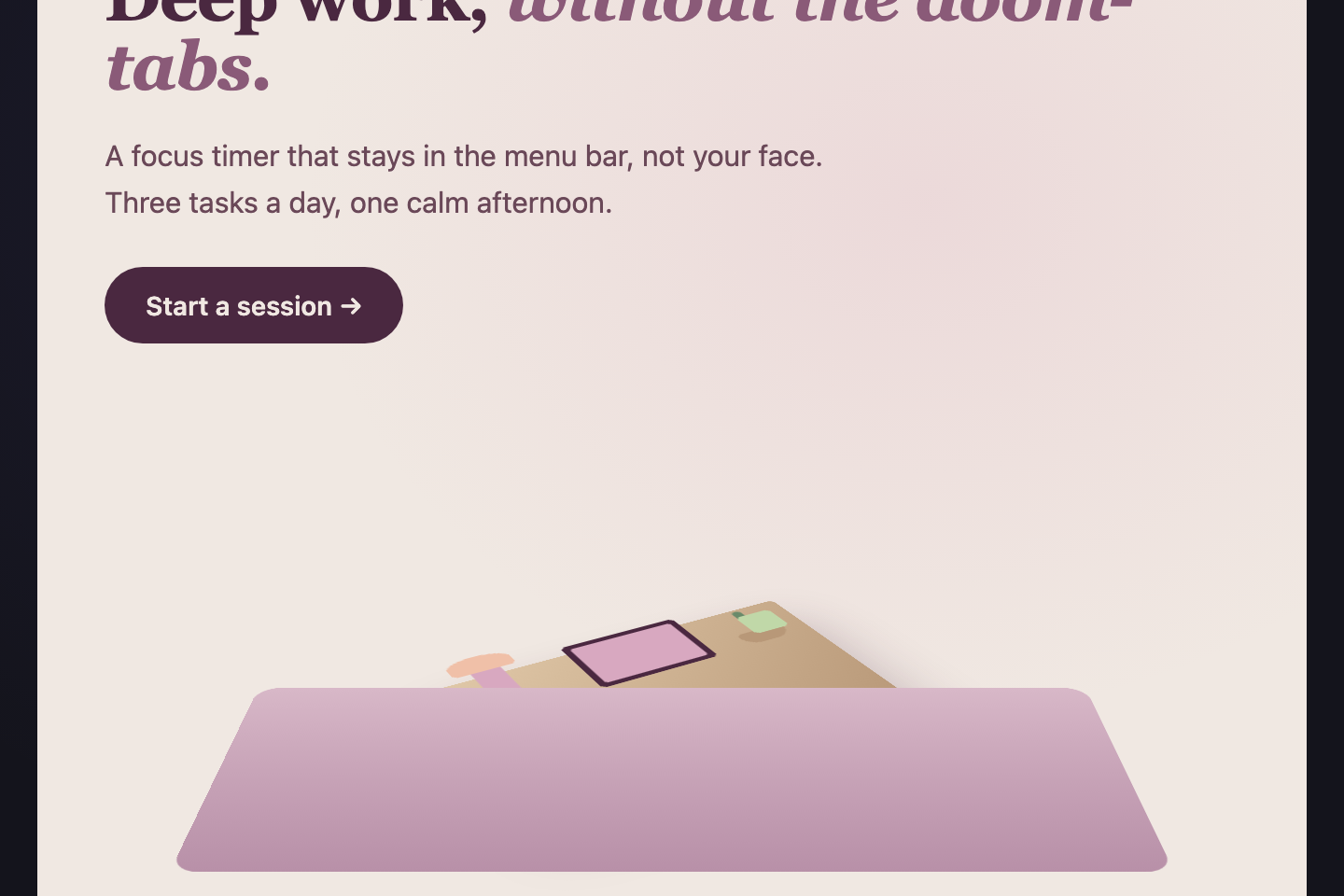
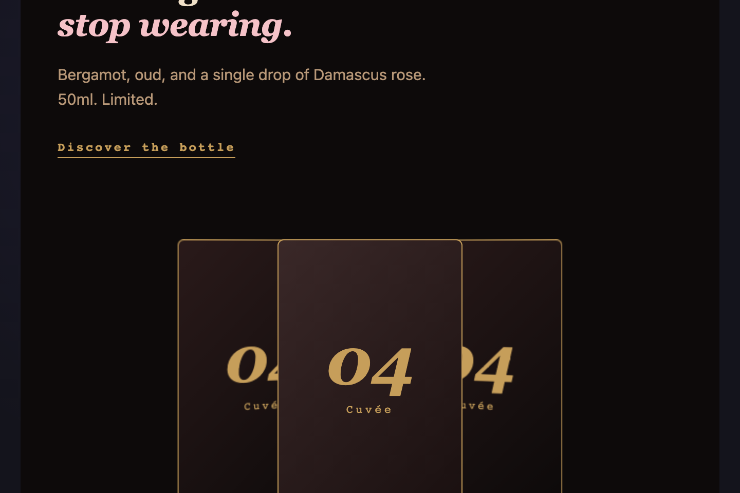
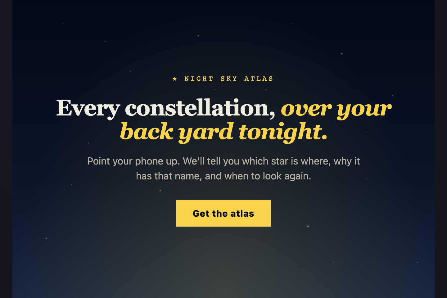
30 CSS Hero Sections

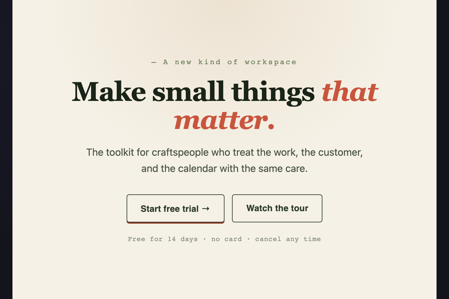
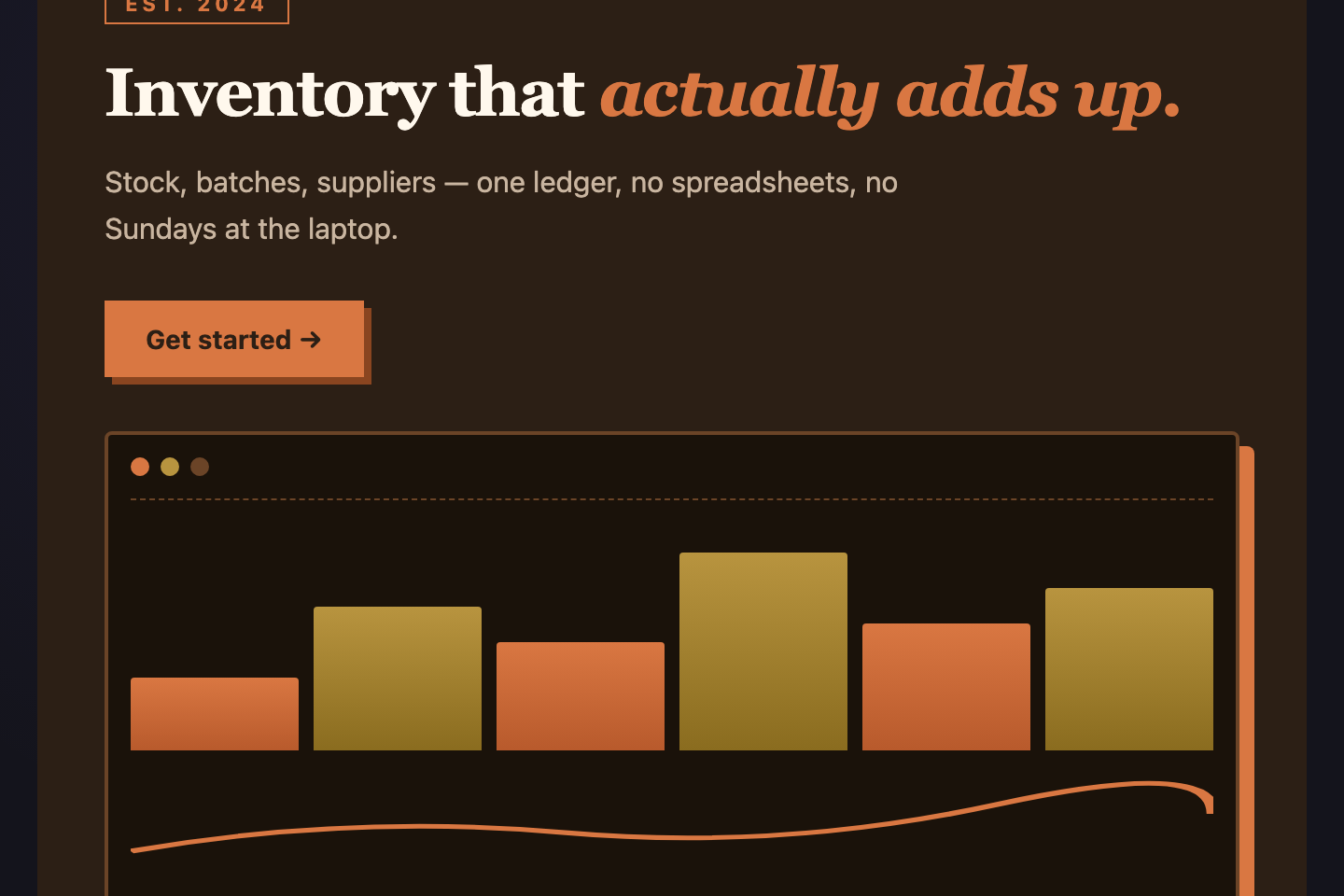
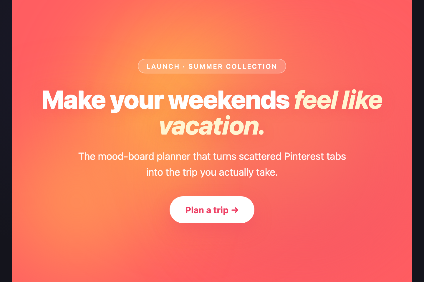
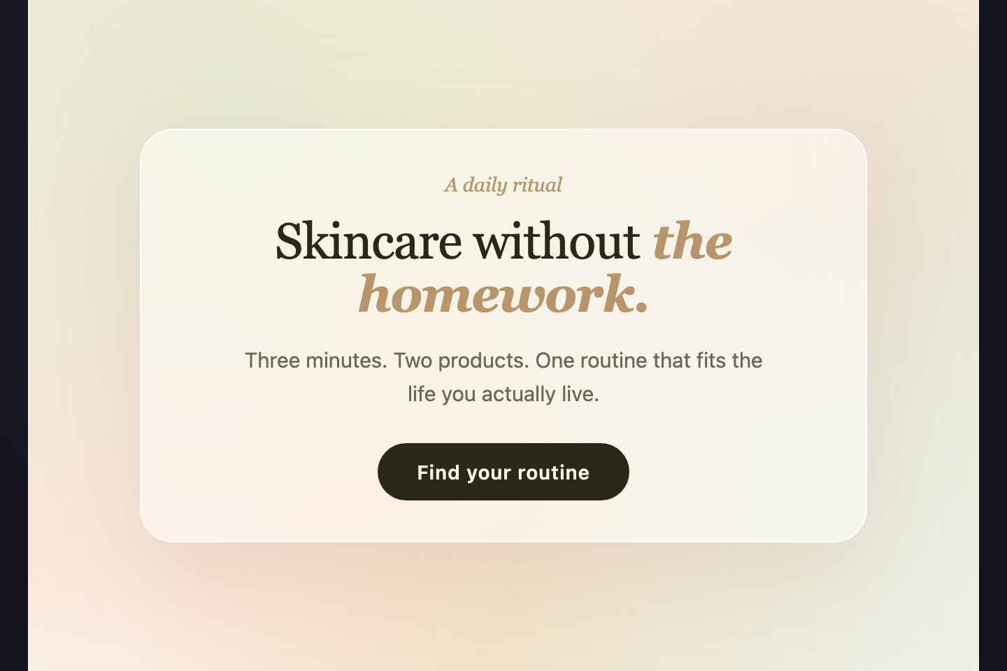
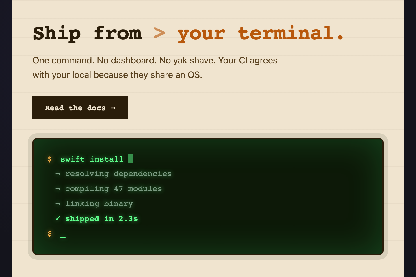
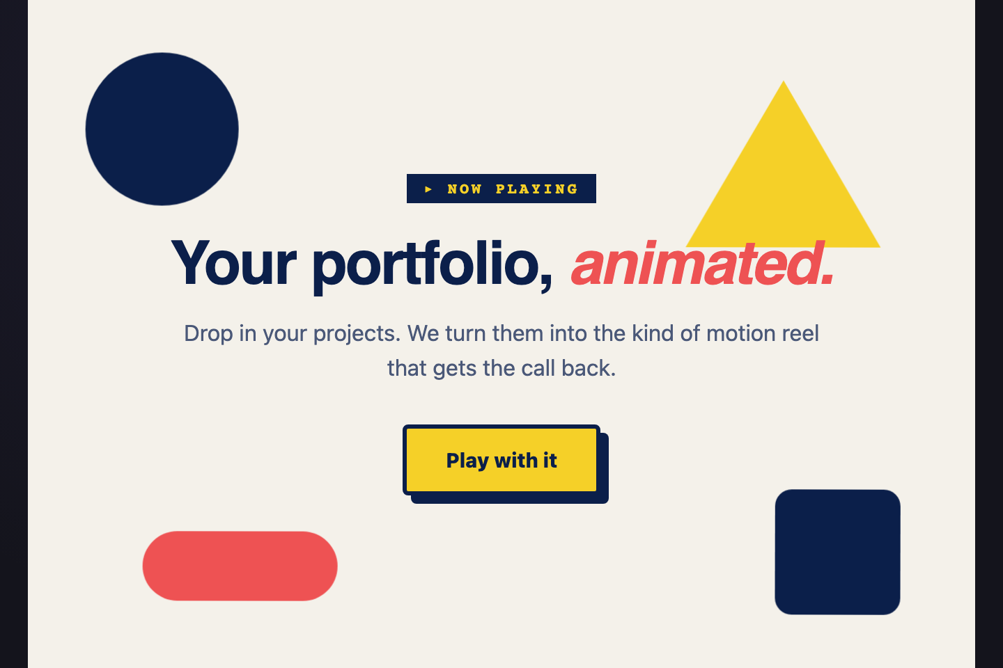
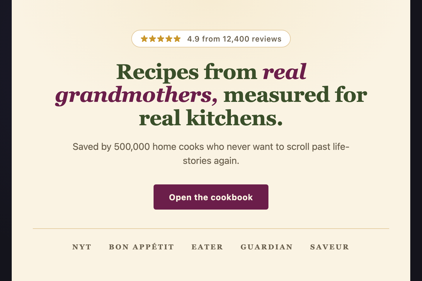
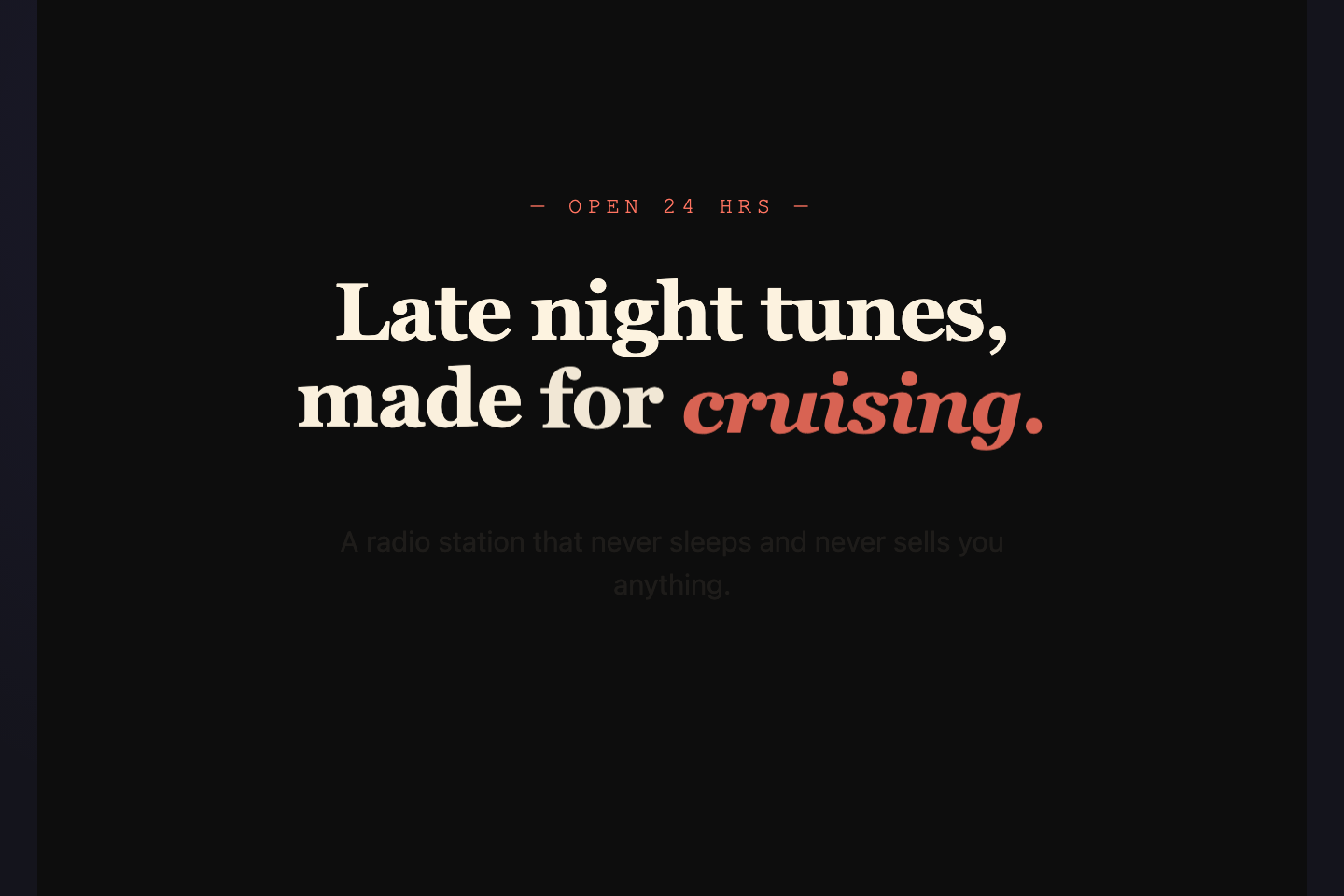
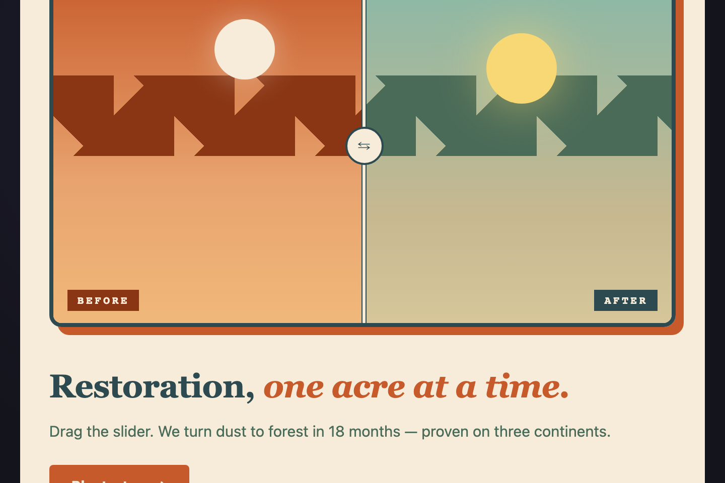
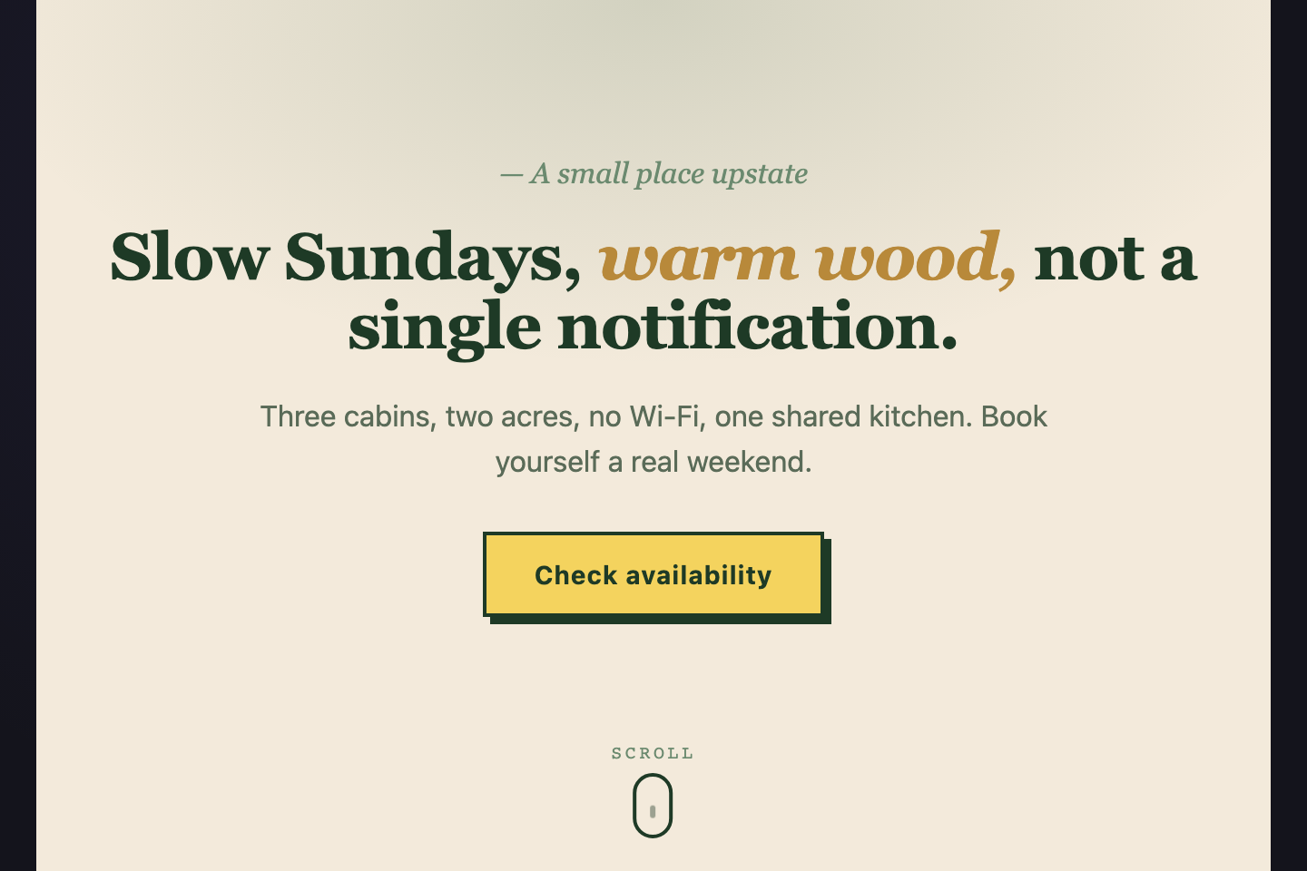
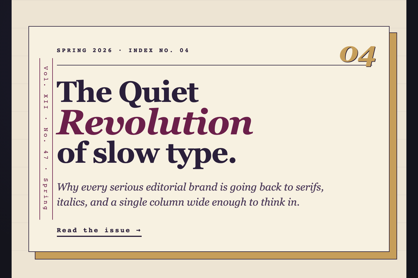
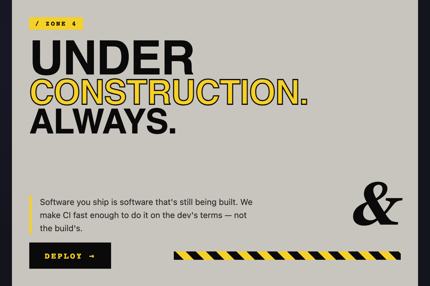
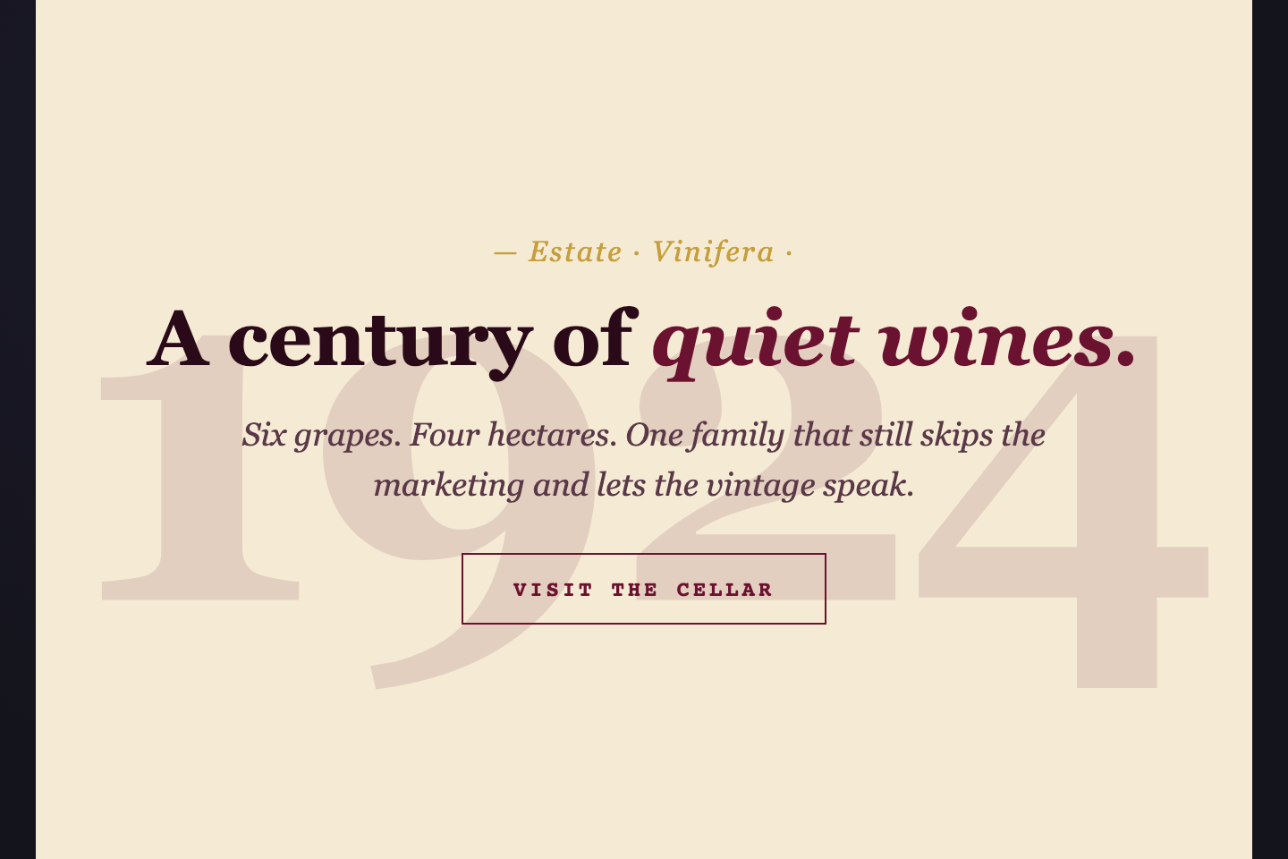
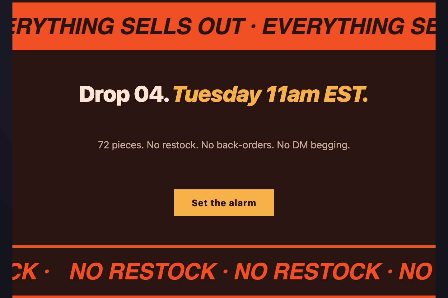
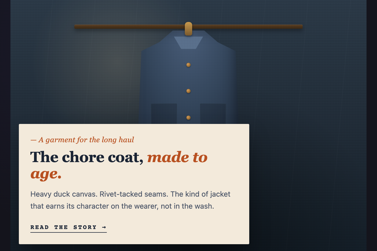
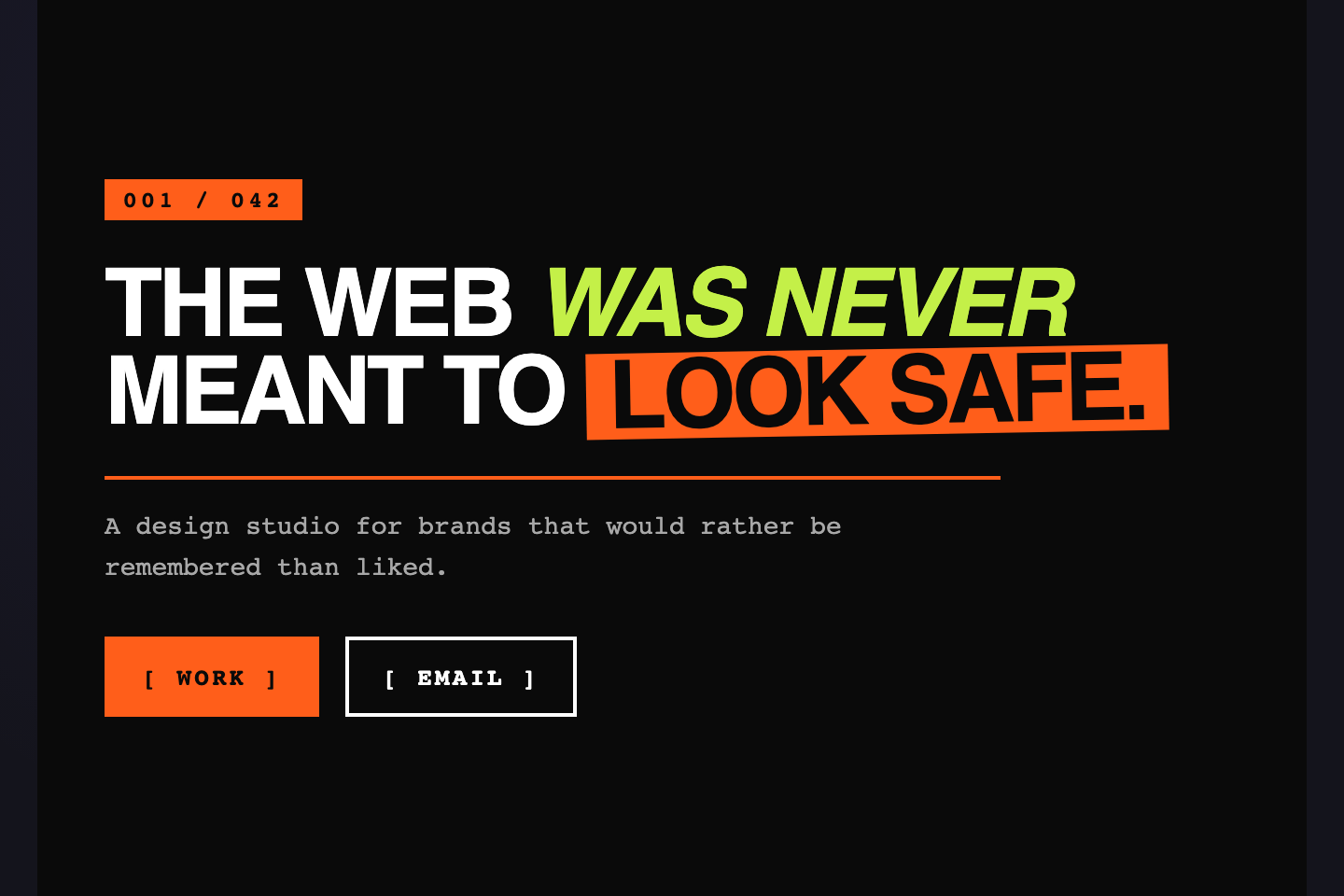
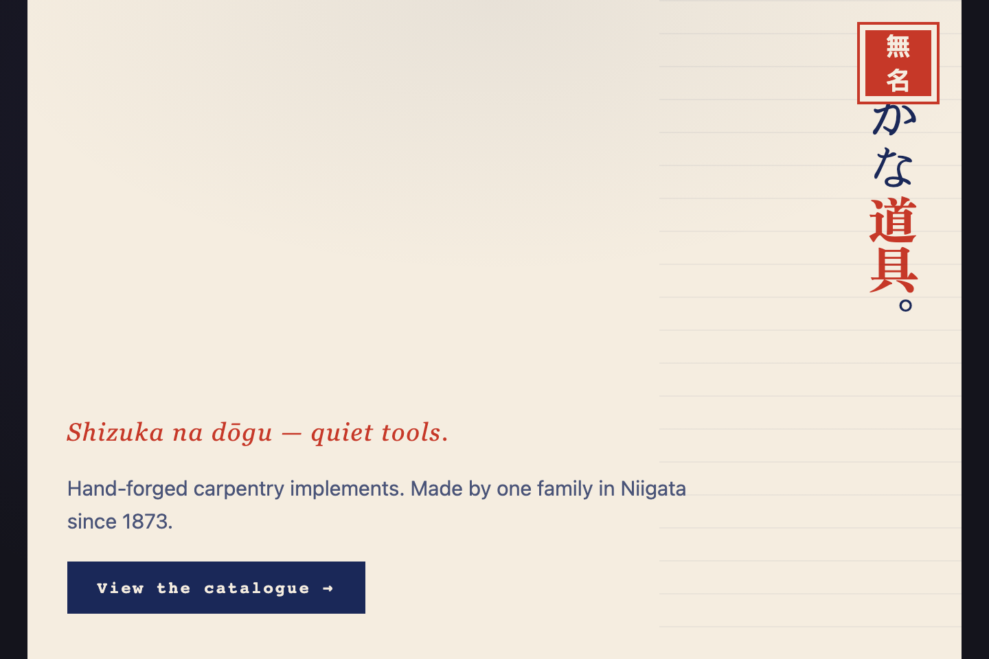
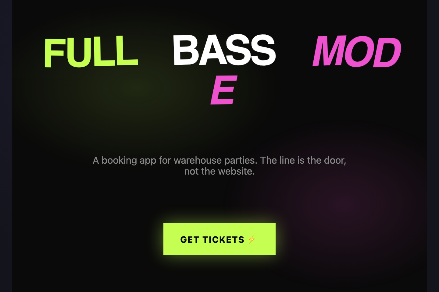
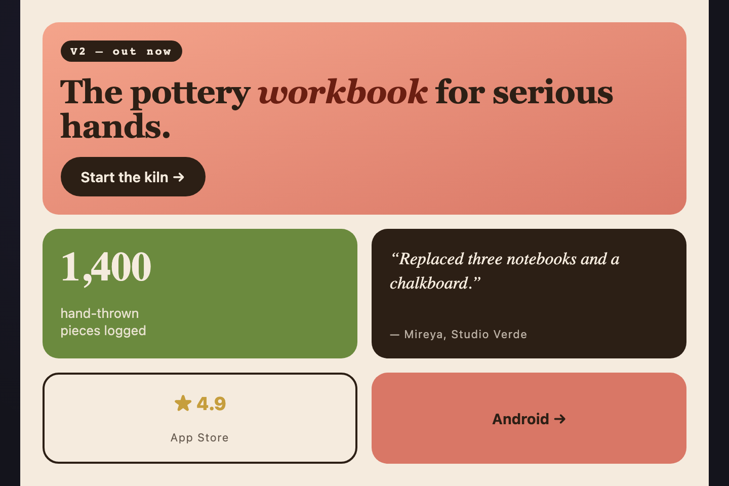
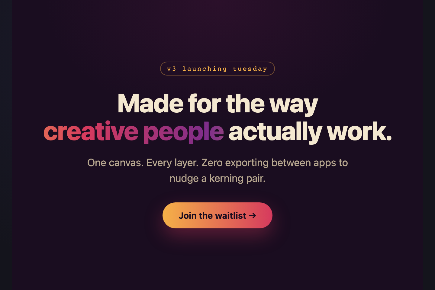
A CSS hero section is the first full-bleed band of a landing page where visitors get pitched in 3 seconds. These 30 hand-coded heroes are full-page landing-section starters you can drop into a marketing site today — find-and-replace the headline, swap the CTA, and ship.

30 unique heroes 29 Pure CSS 1 CSS + JS 100% copy-paste ready Published
01 / 30
Centered Classic
Pure CSS
Centered Classic — preview
The artisanal SaaS hero — eyebrow, serif headline, prose subhead, a single deep-terracotta primary CTA flanked by a quiet ghost button.
02 / 30
Split with Mockup
Pure CSS
Split with Mockup — preview
Two-column hero with copy left, an SVG-painted dashboard mockup right.
03 / 30
Gradient Mesh
Pure CSS
Gradient Mesh — preview
Tropical mesh gradient — overlapping radial blobs in mango, papaya, and dragon fruit on a warm coral base.
04 / 30
Glass over Aurora
Pure CSS
Glass over Aurora — preview
Frosted-glass card floating over a calm spa aurora — pale mint, champagne gold, soft rose.
05 / 30
Terminal Dev Hero
Pure CSS
Terminal Dev Hero — preview
Vintage-CRT terminal hero — phosphor green text + amber prompt on a warm beige paper backdrop.
06 / 30
Video Loop Hero
Pure CSS
Video Loop Hero — preview
Memphis-modern video-pretender — geometric SVG shapes oscillating like a video loop, pinned behind cobalt-on-bone copy with a lemon CTA.
07 / 30
Social Proof Hero
Pure CSS
Social Proof Hero — preview
Mediterranean-tone social-proof hero — star rating pill above the headline, customer logo wall on warm cream, olive serif headlines with aubergine accents.
08 / 30
Animated Headline
Pure CSS
Animated Headline — preview
1950s-diner animated headline — words lift into view with staggered delay, retro coral and ivory on jet black, neon-script CTA.
09 / 30
Before/After Hero
Light JS
Before/After Hero — preview
Native <code>&lt;input type="range"&gt;</code> drives a CSS clip-path slider that wipes between a "before" desert scene and an "after" lush scene.
10 / 30
Sticky Scroll Cue
Pure CSS
Sticky Scroll Cue — preview
Tall full-bleed hero with a bouncing scroll indicator at the bottom.
11 / 30
Magazine Cover
Pure CSS
Magazine Cover — preview
Print-magazine cover treatment — issue stamp, oversized italic serif headline, vertical spine label, foil-stamped corner number.
12 / 30
Asymmetric Type
Pure CSS
Asymmetric Type — preview
Construction-site asymmetric typography — broken across columns with intentional misalignment, hi-vis safety yellow on concrete grey, black hard rules.
Advertisement
13 / 30
Oversized Number
Pure CSS
Oversized Number — preview
Vintage wine-label poster — a massive faded burgundy "1924" set behind italic serif copy with gold-leaf accents on cream paper.
14 / 30
Marquee Headline
Pure CSS
Marquee Headline — preview
A single phrase scrolls horizontally on a loop with a counter-direction line beneath.
15 / 30
Photo Card Hero
Pure CSS
Photo Card Hero — preview
Aesop / Apple-style full-bleed photo with copy in the bottom-left corner.
16 / 30
Brutalist Text-Only
Pure CSS
Brutalist Text-Only — preview
Raw Swiss-punk brutalist hero — pure black, traffic-cone orange highlight, acid lime accent, hard 8px offset shadows.
17 / 30
Vertical Type Hero
Pure CSS
Vertical Type Hero — preview
Japanese traditional vertical typography — headline reads top-to-bottom using <code>writing-mode: vertical-rl</code>.
18 / 30
Kinetic Type Hero
Pure CSS
Kinetic Type Hero — preview
Rave-poster kinetic typography — letters rotate, scale, and float individually using per-letter delay.
19 / 30
Bento Hero
Pure CSS
Bento Hero — preview
Apple-style bento hero — one large headline tile with stat / quote / pill cells fanning around it.
20 / 30
Gradient Text Spotlight
Pure CSS
Gradient Text Spotlight — preview
Oversized headline with an animated marigold → ruby → grape gradient sweeping across the letters.
21 / 30
Product Shot Hero
Pure CSS
Product Shot Hero — preview
Apple-keynote product shot — a CSS-painted device front-and-centre with floating feature badges that pulse around it.
22 / 30
Price Card Hero
Pure CSS
Price Card Hero — preview
Heritage-banking pricing-led hero — copy left, single-tier brass-on-forest pricing card right.
23 / 30
App Store Hero
Pure CSS
App Store Hero — preview
iOS-pastel app-launch hero — three phone mockups fanned in lavender, soft pink, powder blue, with App Store and Google Play CTA pills below.
24 / 30
Neon CTA Hero
Pure CSS
Neon CTA Hero — preview
Tokyo-cyberpunk neon CTA — pure black backdrop, neon pink and electric cyan glows, single CTA that breathes with a soft pulse.
Advertisement
25 / 30
Parallax Mountain
Pure CSS
Parallax Mountain — preview
Layered SVG mountain silhouettes drift at different speeds — glacier blue and pine on alpine snow.
26 / 30
Isometric Room
Pure CSS
Isometric Room — preview
Cozy WFH isometric — a CSS-painted desk + laptop + plant + lamp scene rendered with `transform: skewY()`.
27 / 30
3D Card Stack
Pure CSS
3D Card Stack — preview
Three luxury-cosmetics product cards in 3D perspective, fanning forward on hover.
28 / 30
Particle Starfield
Pure CSS
Particle Starfield — preview
Pure-CSS starfield — dots positioned via radial-gradient on a deep-navy backdrop.
29 / 30
Glitch Text Hero
Pure CSS
Glitch Text Hero — preview
VHS-glitch hero — RGB-channel offsets create a tape-static glitch effect.
30 / 30
Conic Orbit Hero
Pure CSS
Conic Orbit Hero — preview
Solar-corona conic gradient ring orbits the headline using <code>@property</code> animatable angle.
FAQ

Frequently asked questions

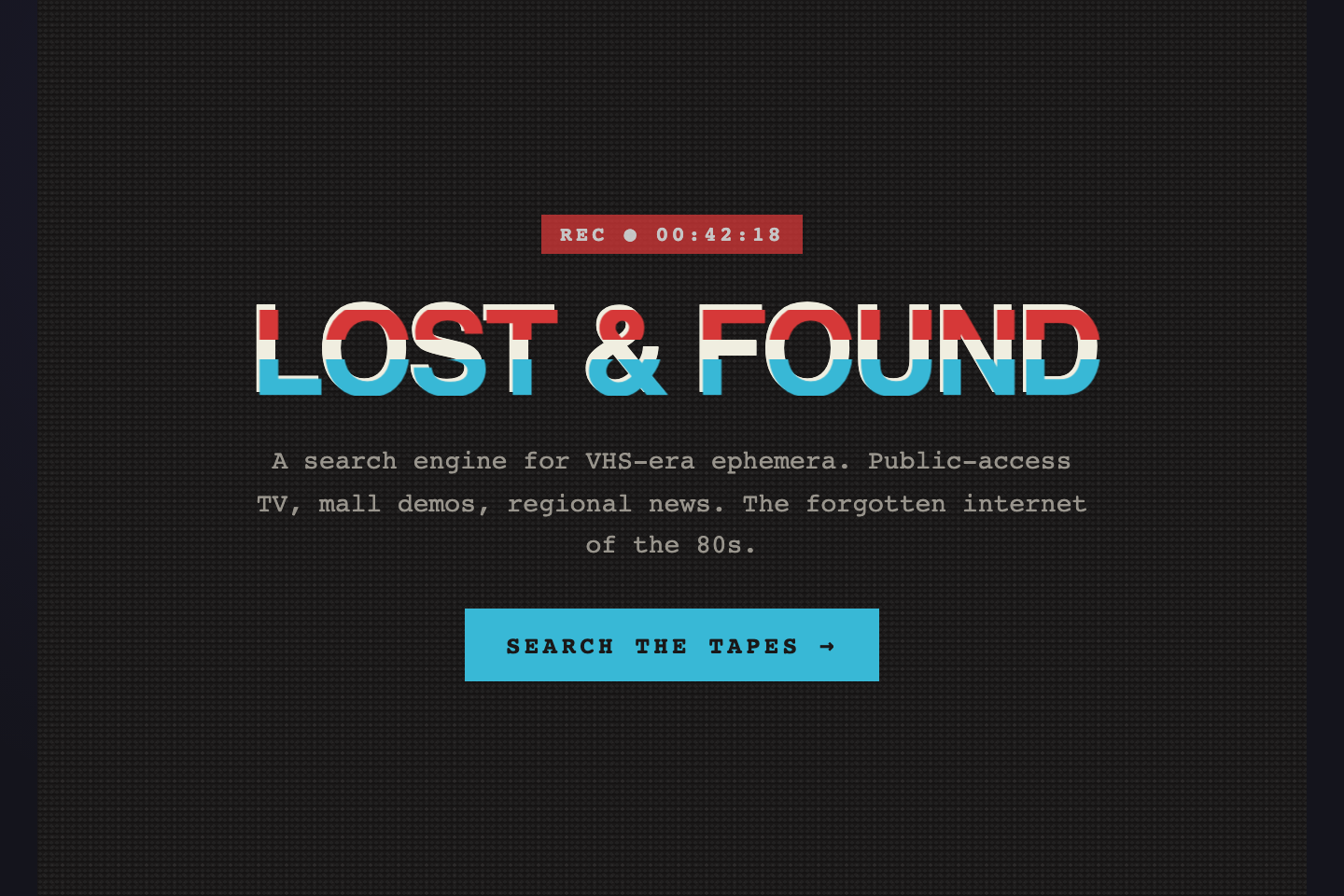
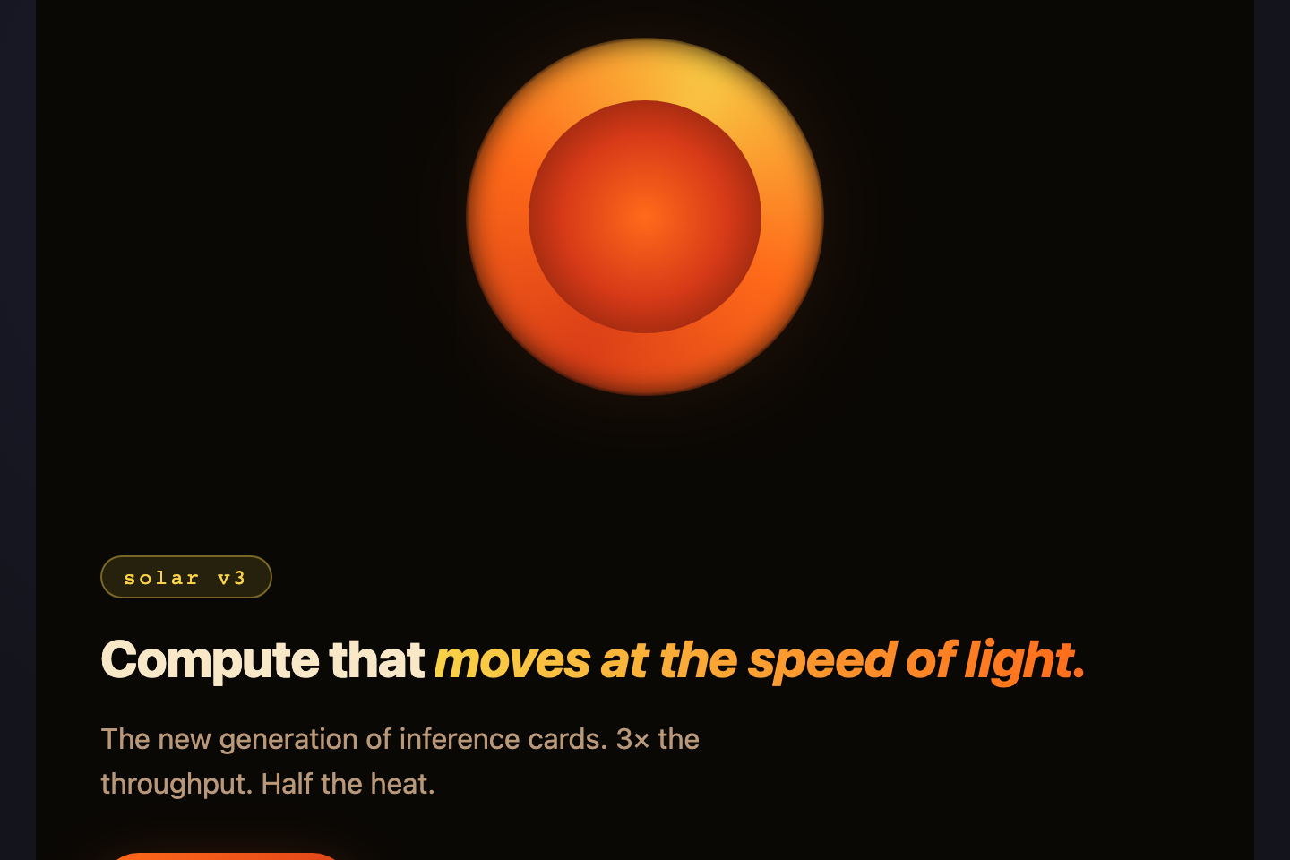
What is a CSS hero section?
A hero section is the first full-bleed band of a landing page — typically containing an eyebrow tag, headline, subheadline, primary call-to-action, and a supporting visual. It's the most important block on the page because it carries the value proposition above the fold.
Should a hero be exactly 100vh tall?
Not always. Use `min-height: 100vh` for a true full-screen statement (campaign sites, agency portfolios), but `min-height: clamp(380px, 60vh, 720px)` is more practical for SaaS — tall enough to feel intentional, short enough that critical content below the fold isn't hidden on landscape laptops.
How do I make a hero section responsive?
Use `clamp()` for headline font sizes (`clamp(24px, 5vw, 64px)`), `padding: clamp(20px, 4vh, 80px) clamp(16px, 4vw, 40px)` for breathing room that scales, and a single breakpoint at 720px to switch split-column layouts to stacked. Avoid fixed pixel widths anywhere.
Do I need a background image?
No — these heroes use only inline SVG illustrations and pure-CSS gradients. Real photos add weight and licensing constraints; for visual richness, stack `radial-gradient` blobs (mesh gradient pattern) or `backdrop-filter: blur()` over coloured shapes (glassmorphism). Both rival photographic richness without the bytes.
Are these heroes accessible?
Yes. Every hero uses semantic HTML — `
` for the band, exactly one `

` for the headline, real anchor links for CTAs. Animations honour `prefers-reduced-motion`, decorative SVG carries `aria-hidden="true"`, and color contrast on copy meets WCAG AA.

Related collections

CSS Center a Div preview

CSS Center a Div

5

The complete guide to centering a div in CSS in 2026 — covering all 5 production techniques with live interactive demos. <strong>Flexbox</strong> (the modern default, works for 95% of cases): <code>display: flex; align-items: center; justify-content: center</code> on the parent. <strong>CSS Grid</strong> (one-line shorthand): <code>display: grid; place-items: center</code>. <strong>Absolute positioning + transform</strong> (for overlays and modals): <code>position: absolute; top: 50%; left: 50%; transform: translate(-50%, -50%)</code>. <strong>Margin auto</strong> (for block elements with a known width): <code>margin: 0 auto</code> (horizontal only) or <code>margin: auto</code> with <code>position: absolute</code> + <code>inset: 0</code> (both axes). <strong>All methods side-by-side comparison</strong> — see every technique render the same content with visible axis crosshairs so you can see exactly where each method lands the element. All 5 demos are 100% pure CSS, MIT-licensed, copy-paste ready, with detailed explanations of which method to use when. Works in every modern browser (Chrome, Safari, Firefox, Edge), no JavaScript required.

css center a div center a div center div css Responsive
10 CSS Feature Sections preview

10 CSS Feature Sections

10

10 hand-coded CSS feature section templates covering the patterns landing pages actually need in 2026 — icon grid with stats strip, Apple-style bento grid layout, dark glassmorphism with animated blobs, scroll-reveal alternating rows, developer SDK with syntax-highlighted code preview, side-by-side comparison table with pricing cards, full SaaS hero with mesh-gradient + social proof, 3D mousemove tilt cards, parchment-cream floating phone mockup, and Linear-style product roadmap timeline. 7 of 10 demos are 100% pure CSS — drop into any stack. The 3 JS-enhanced demos (scroll-reveal, 3D tilt, timeline-glow) degrade gracefully if JavaScript is disabled. Every demo respects prefers-reduced-motion, uses scoped .fsNN__* class names so multiple can coexist, and ships MIT-licensed.

css feature section feature section css feature sections Responsive
15 CSS Flexbox Layouts preview

15 CSS Flexbox Layouts

15

15 production-ready CSS flexbox layouts with live demos and copy-paste code — holy grail page shell, responsive card grid, sticky navbar, masonry-style columns, sidebar dashboard, product cards, pricing table, magazine article, sticky footer with min-block-size: 100dvh, centered hero, vertical timeline, chat interface, mosaic gallery, two-column form, and kanban board. Every demo is mobile-first, WCAG-friendly, and works without a build step.

css flexbox flexbox layout css flexbox layout Responsive

Search CodeFronts

Loading…