15 Pure CSS Loading Animations

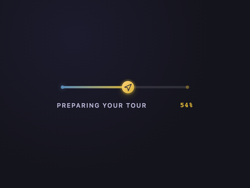
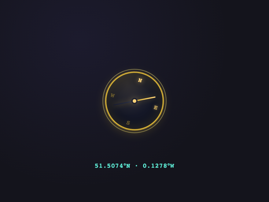
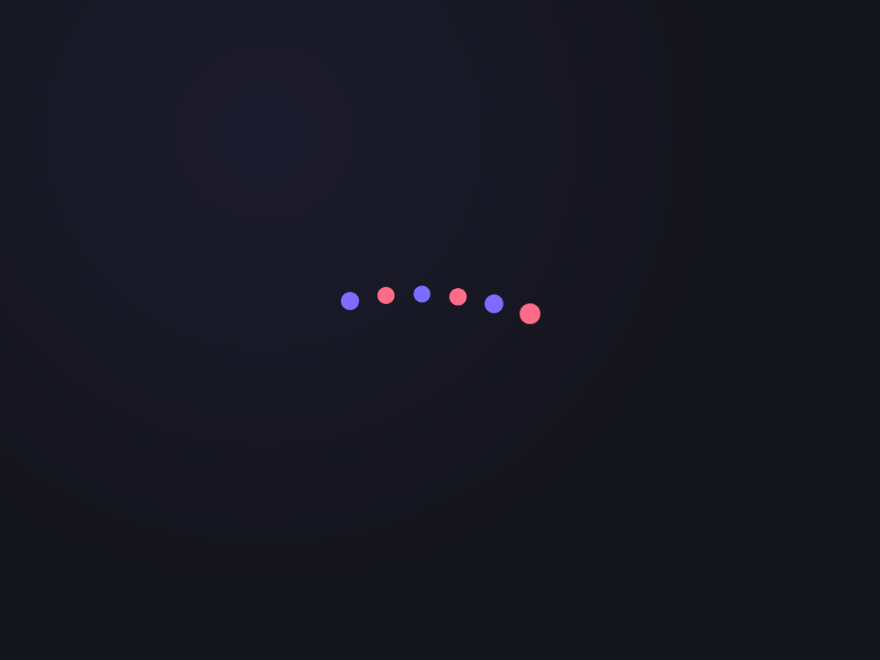
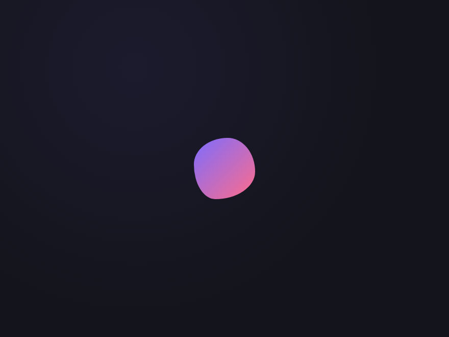
A CSS loading animation is the visual placeholder shown while users wait for content or a route to load. These 15 hand-coded loaders are ready-to-ship spinners, dot loaders, and progress indicators for any async UI — copy the markup, show during fetches, and ship.

15 unique loaders 10 Pure CSS 5 CSS + JS 100% copy-paste ready Published
01 / 15
House Unlock
CSS + JS
House Unlock — preview
A closed-front-door loader for property sites.
02 / 15
Listing Card Skeleton
CSS + JS
Listing Card Skeleton — preview
A premium listing-card skeleton that mirrors the real layout — photo, price, address, agent — then crossfades into the loaded card when `.ready` is added. Users see the page shape before content arrives, which is the modern, perceived-performance pattern used by Airbnb and Booking. Respects `prefers-reduced-motion`.
03 / 15
Progress Path
CSS + JS
Progress Path — preview
An honest progress bar built on the native `<progress>` element — semantic, screen-reader-announced, and bindable to real load progress (image preloads, fetch chunks, route transitions).
04 / 15
Heat-Map Compass
CSS + JS
Heat-Map Compass — preview
A premium navigation loader for property and travel platforms — a brass compass dial with cardinal points lighting one at a time as warm "heat" rings pulse outward.
05 / 15
Floor-by-Floor
CSS + JS
Floor-by-Floor — preview
A vertical luxury-building loader.
06 / 15
DNA Helix
Pure CSS
DNA Helix — preview
Alternating dots oscillate up and down in a staggered wave, mimicking the visual rhythm of a DNA double helix.
07 / 15
Liquid Blob
Pure CSS
Liquid Blob — preview
A gradient circle morphs its border-radius through organic blob shapes, creating a fluid, living feeling.
08 / 15
Orbit System
Pure CSS
Orbit System — preview
Two rings rotate at different speeds and directions around a central core, like a miniature solar system.
09 / 15
Signal Bars
Pure CSS
Signal Bars — preview
Five bars of varying heights pulse in and out of opacity with a staggered delay, like an equaliser or signal indicator.
10 / 15
Clock Sweep
Pure CSS
Clock Sweep — preview
Two pseudo-element hands rotate at different speeds inside a circular face — a literal animated clock using only CSS.
11 / 15
Bouncing Chain
Pure CSS
Bouncing Chain — preview
Four coloured dots bounce independently with staggered delays, creating a chain-like wave of movement.
12 / 15
Neon Ring Draw
Pure CSS
Neon Ring Draw — preview
A glowing ring spinner with a layered neon box-shadow creates a vivid electric glow as it spins.
Advertisement
13 / 15
Pixel Dissolve
Pure CSS
Pixel Dissolve — preview
A 4×4 grid of squares fade and shrink in a rolling wave, like pixels dissolving from a screen.
14 / 15
Hourglass Flip
Pure CSS
Hourglass Flip — preview
A pure CSS triangle-based hourglass that flips 180° and pauses, then repeats — built from two border triangles.
15 / 15
Heartbeat Line
Pure CSS
Heartbeat Line — preview
An SVG heartbeat waveform scrolls horizontally in a continuous loop — an inline data URI with a CSS translateX animation.
FAQ

Frequently asked questions

How do I create a loading animation in pure CSS?
Define a @keyframes rule for the motion, then apply it to an element with the animation property — set a duration and animation-iteration-count: infinite so it loops while content loads. A basic spinner is a circle with a partial border that rotates 360 degrees; richer loaders animate multiple elements, transforms and opacity. All 15 animations in this gallery are pure CSS — copy the @keyframes and markup straight from the code panel.
Can a loading spinner be made without JavaScript?
Yes — every loading animation here is 100% CSS, no JavaScript. CSS @keyframes and the animation property handle the entire loop. You add the loader to the page while data is loading and remove it when ready; the animation itself never needs JS.
What's the difference between a loading spinner and a skeleton loader?
A spinner is an abstract indicator — a rotating or pulsing shape that signals 'something is happening' without hinting at the content. A skeleton loader shows grey placeholder shapes in the layout of the real content (cards, lines of text, an avatar) so the page feels structured before data arrives. This collection includes both — for example the Listing Card Skeleton alongside spinner-style loaders.
How do I make a CSS loading animation smooth and not janky?
Animate only transform and opacity — they're GPU-accelerated and don't trigger layout. Avoid animating width, height, top or left. Use animation-timing-function (ease-in-out or a custom cubic-bezier) so the motion feels natural, and keep the loop duration steady. Every demo here follows this approach.
Are these CSS loading animations accessible and free to use?
Yes. Continuous motion honours the prefers-reduced-motion media query, so motion-sensitive users get a calm or static fallback; loaders should also be paired with an aria-live region or role=status so screen readers announce the loading state. All 15 animations are MIT licensed and free for commercial use.

Related collections

15 CSS Background Animations preview

15 CSS Background Animations

15

15 hand-coded CSS background animations with live demos — infinite shifting gradient, floating particle bubbles, parallax starry night, clickable cyberpunk ripple, sliding geometric grid, SVG wave overlays, glassmorphism orbs, aurora borealis ribbons, matrix digital rain, mesh gradient blobs, falling snow, morphing blob, retro synthwave 3D grid, infinite scrolling diagonal marquee, comic-book halftone dots. 100% Pure CSS, no JavaScript, no canvas, no particles.js. prefers-reduced-motion respected, scoped class names, MIT-licensed.

css background animation animated gradient background css css floating particles Responsive
27 CSS Button Hover Effects preview

27 CSS Button Hover Effects

27

27 hand-coded CSS button hover effects — 3D press, neon glow, gradient slide, border draw, liquid fill, ripple, glitch text, and kinetic flips. Every demo is pure CSS (no JavaScript, no framework), tuned for 60fps with transform and opacity, and respects prefers-reduced-motion out of the box.

css buttons button hover button hover effects Responsive
33 CSS Card Hover Effects preview

33 CSS Card Hover Effects

33

33 hand-coded CSS card hover effects with live demos — multi-axis 3D tilt with parallax, glowing gradient glassmorphic border, image zoom with content slide-up, front-to-back 3D flip, sibling de-emphasis with :has(), minimalist elevation, plus 27 more (elastic lift, conic-gradient border, holographic foil, neon sign, glitch RGB split, magnetic float, blueprint reveal, aurora drift and more). 26 pure CSS + 7 with a small vanilla JS snippet for cursor tracking. prefers-reduced-motion respected, scoped class names, MIT-licensed.

css card hover effect css card hover animation card hover effect pure css Responsive

Search CodeFronts

Loading…