22 CSS Split Screen Layouts
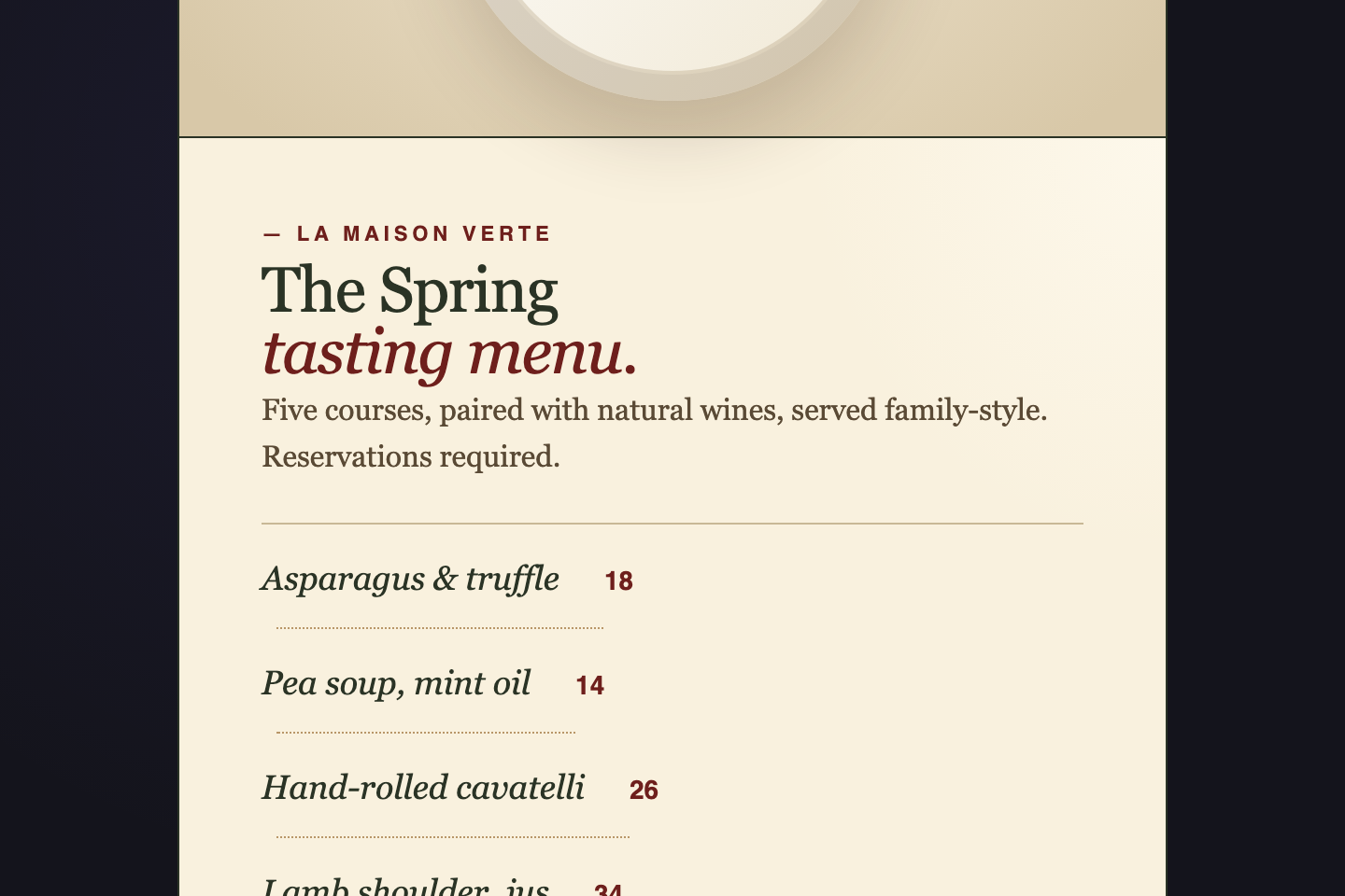
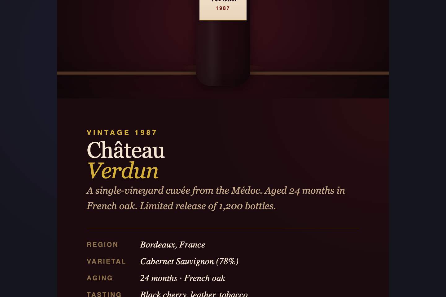
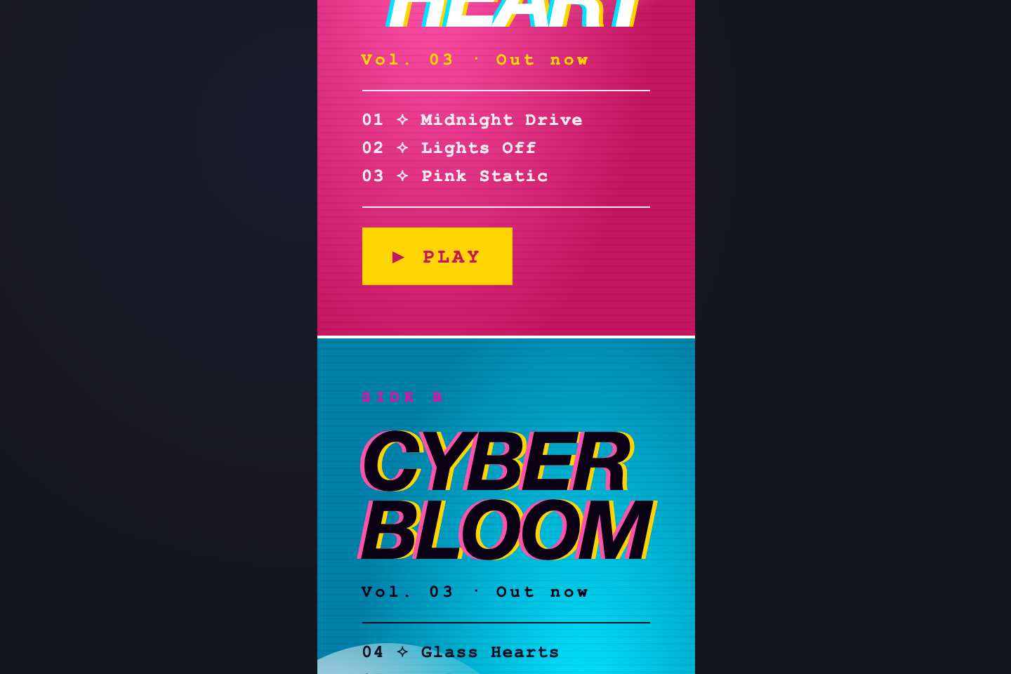
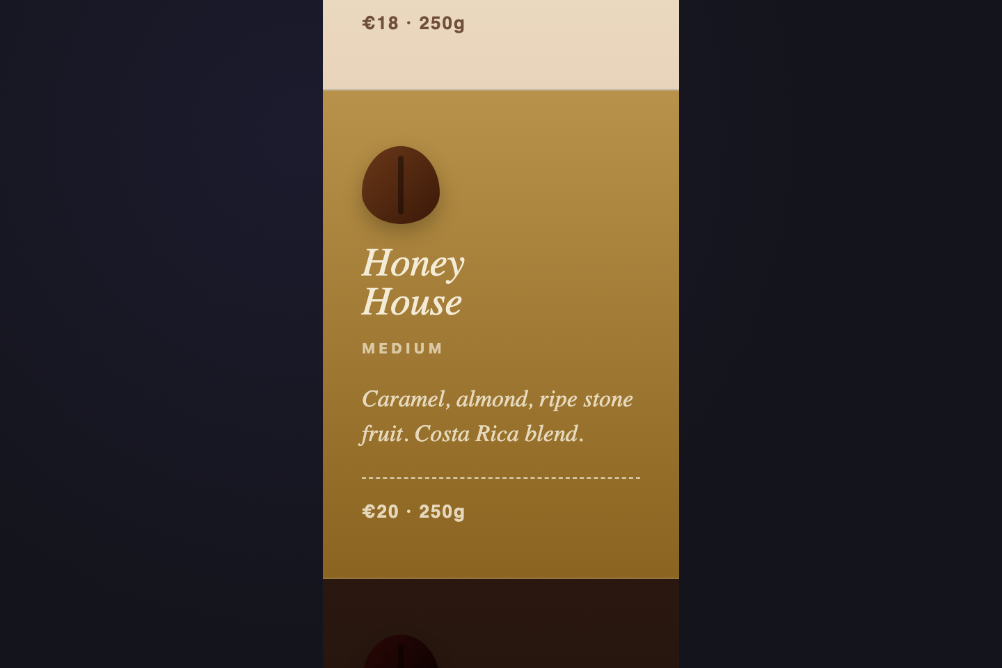
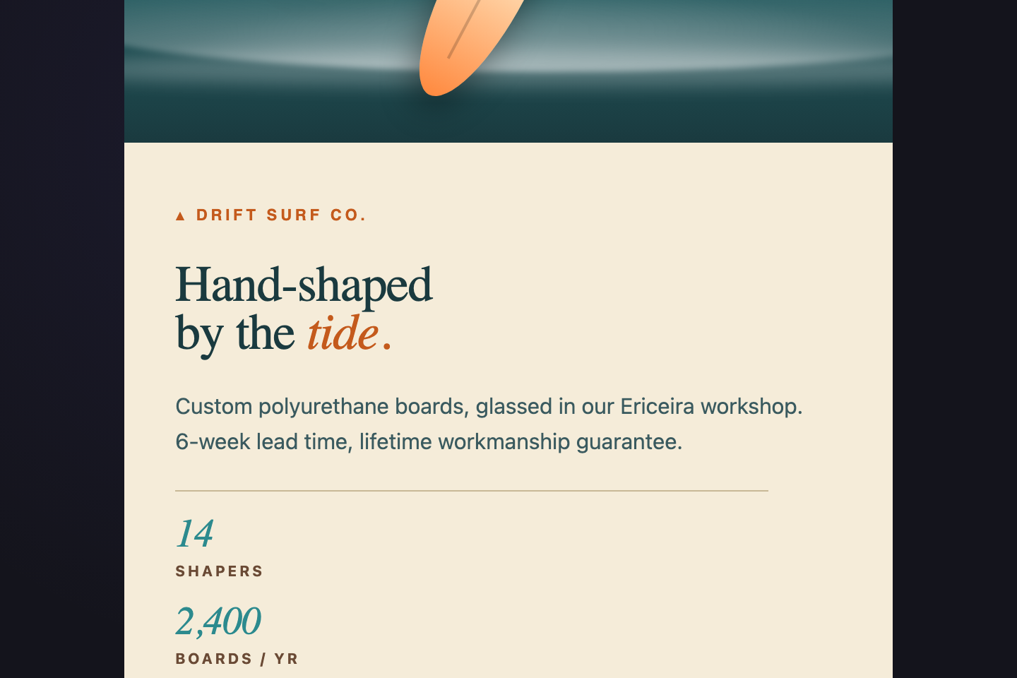
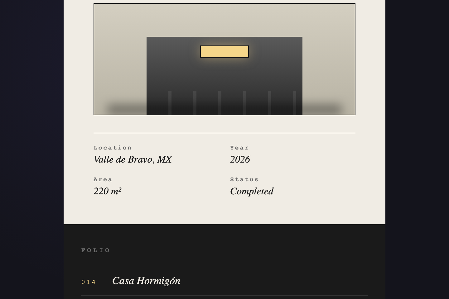
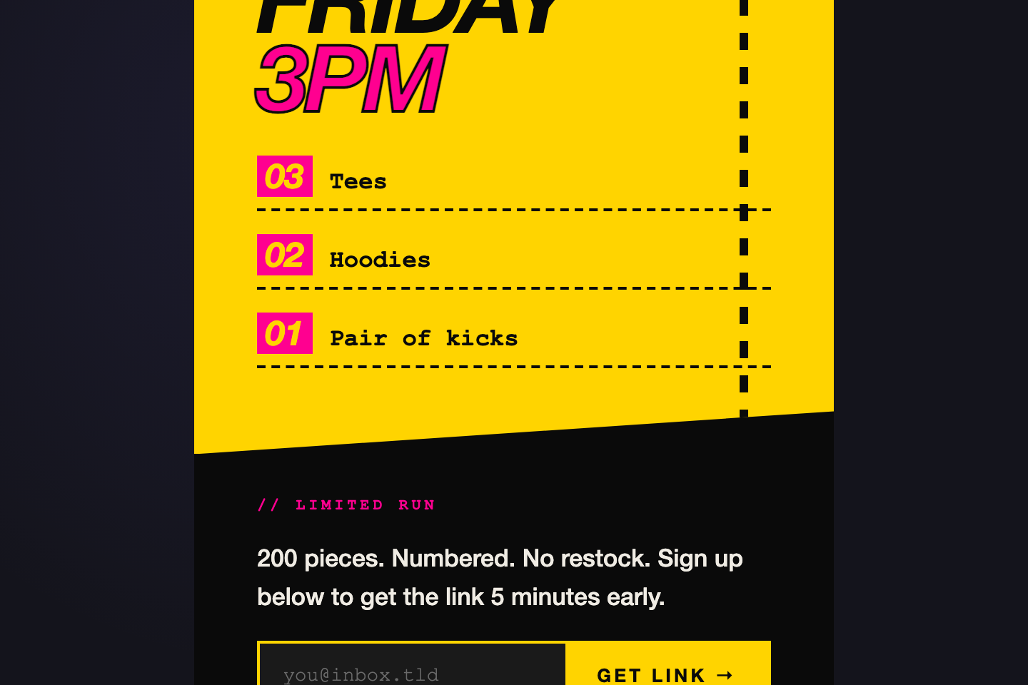
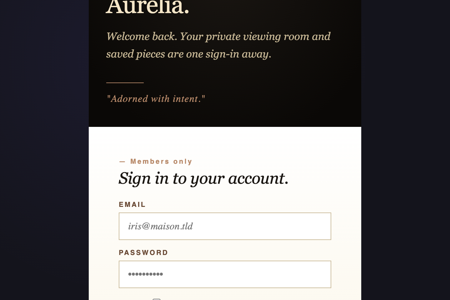
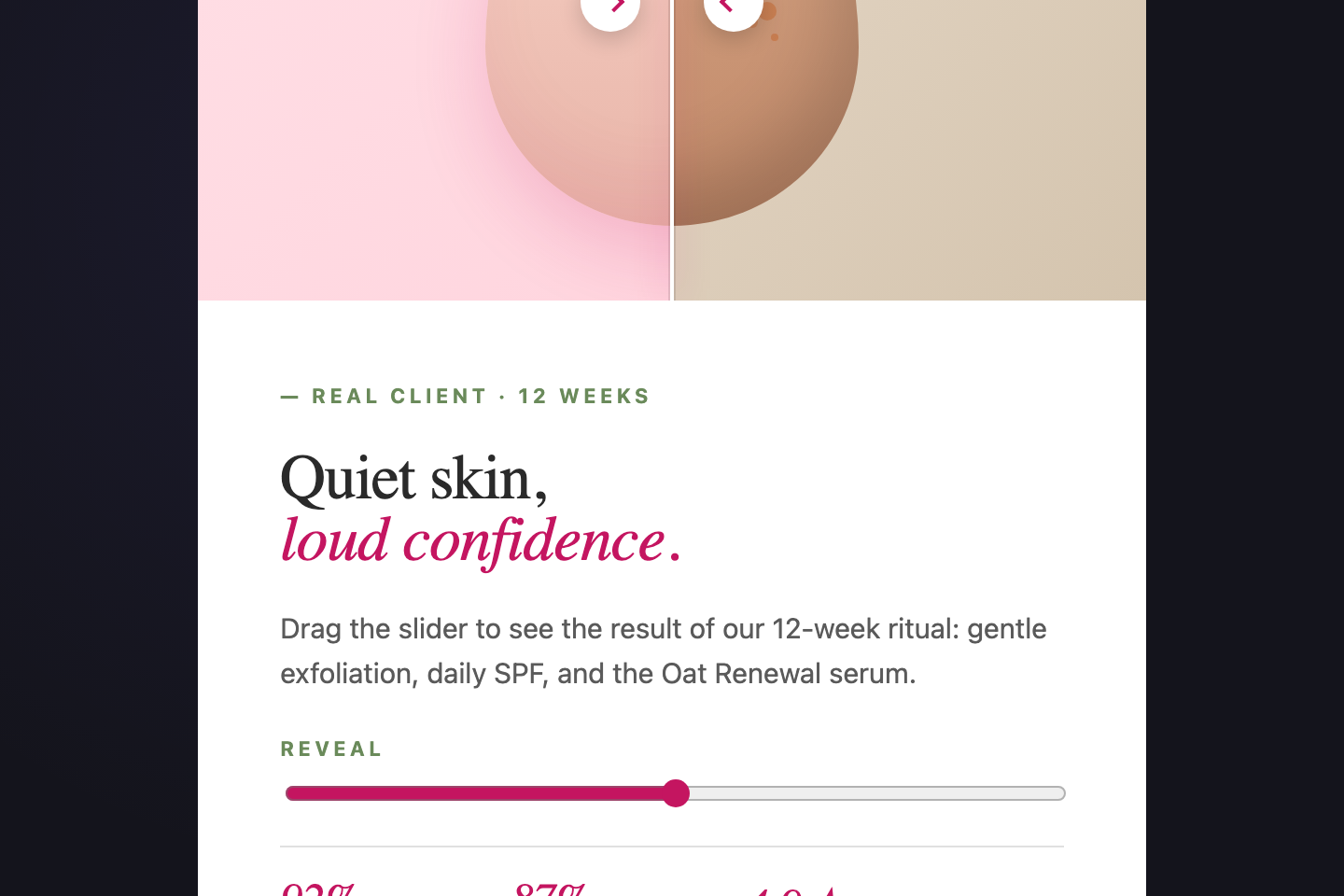
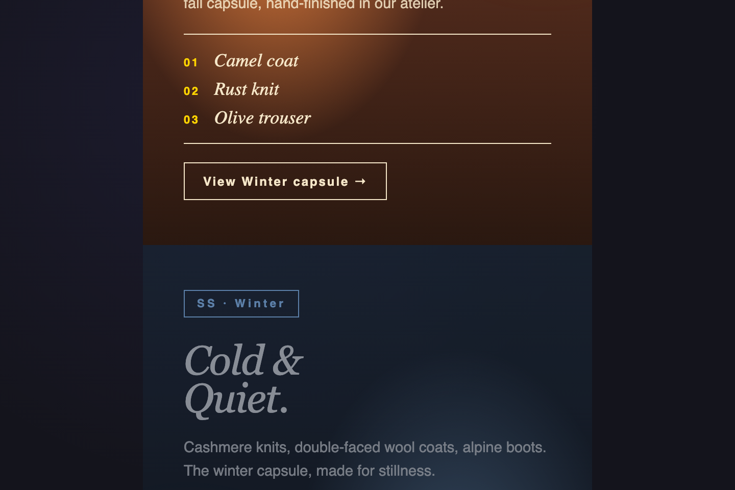
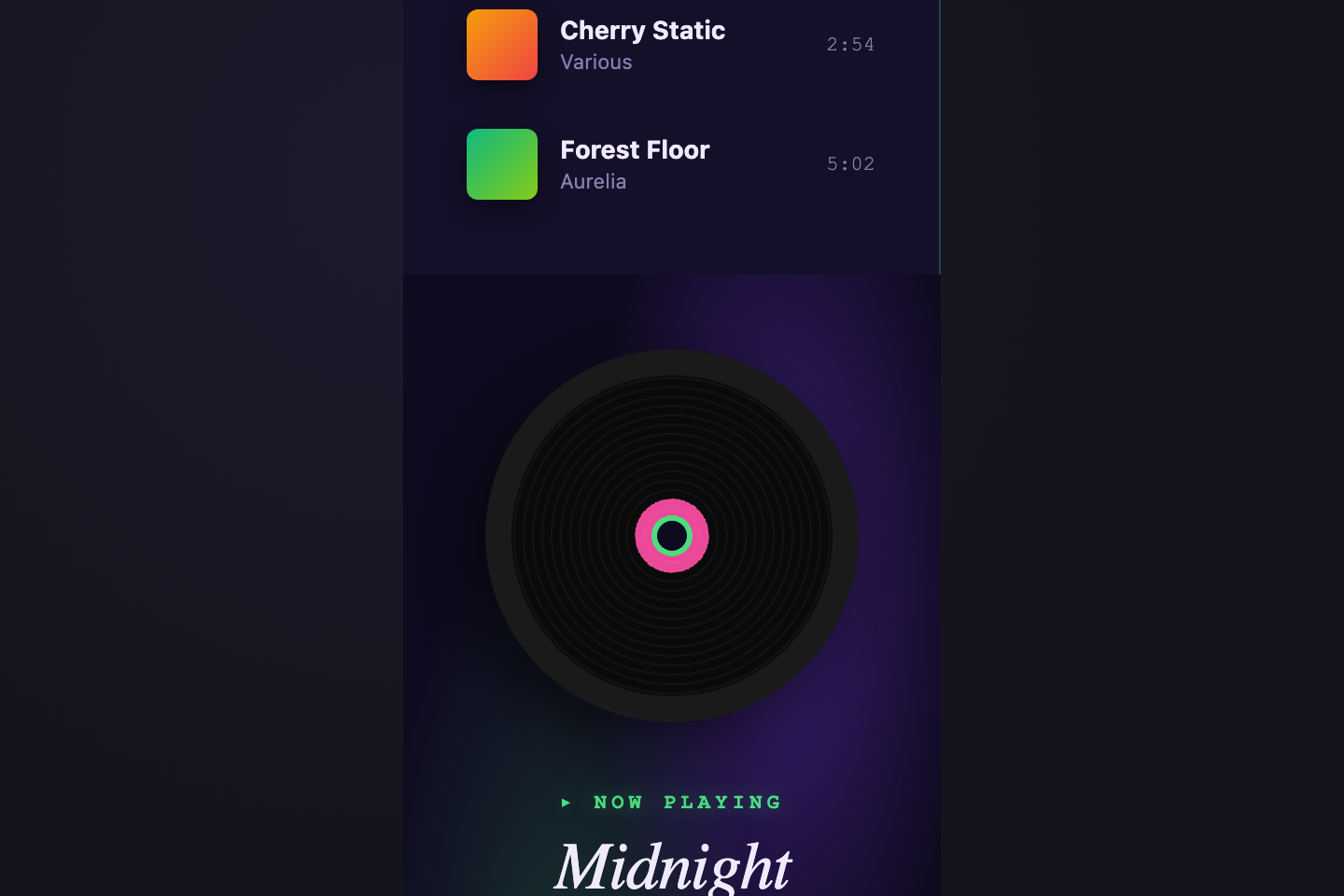
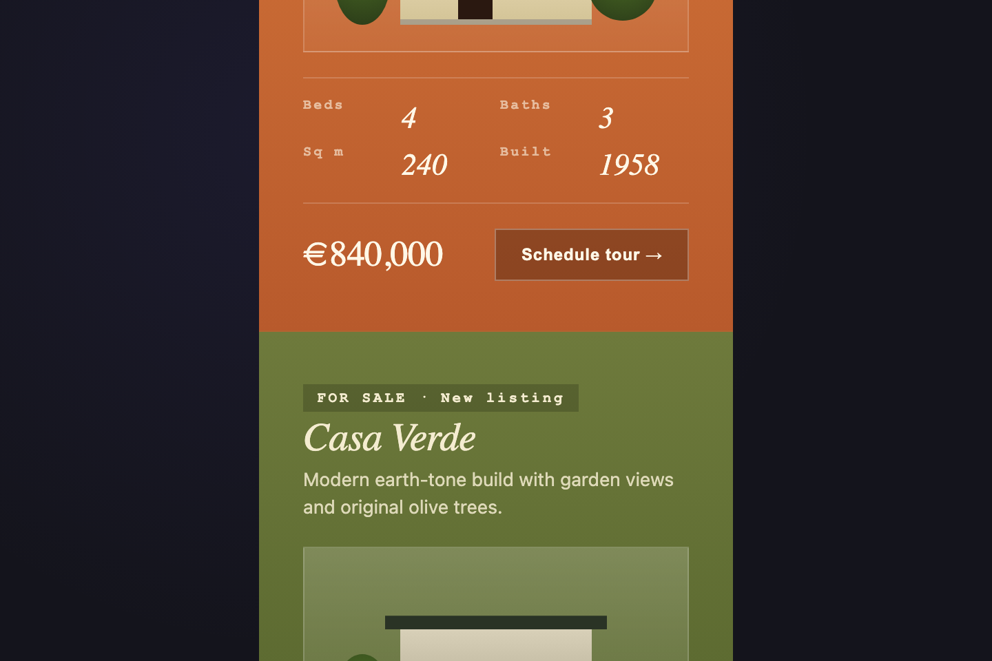
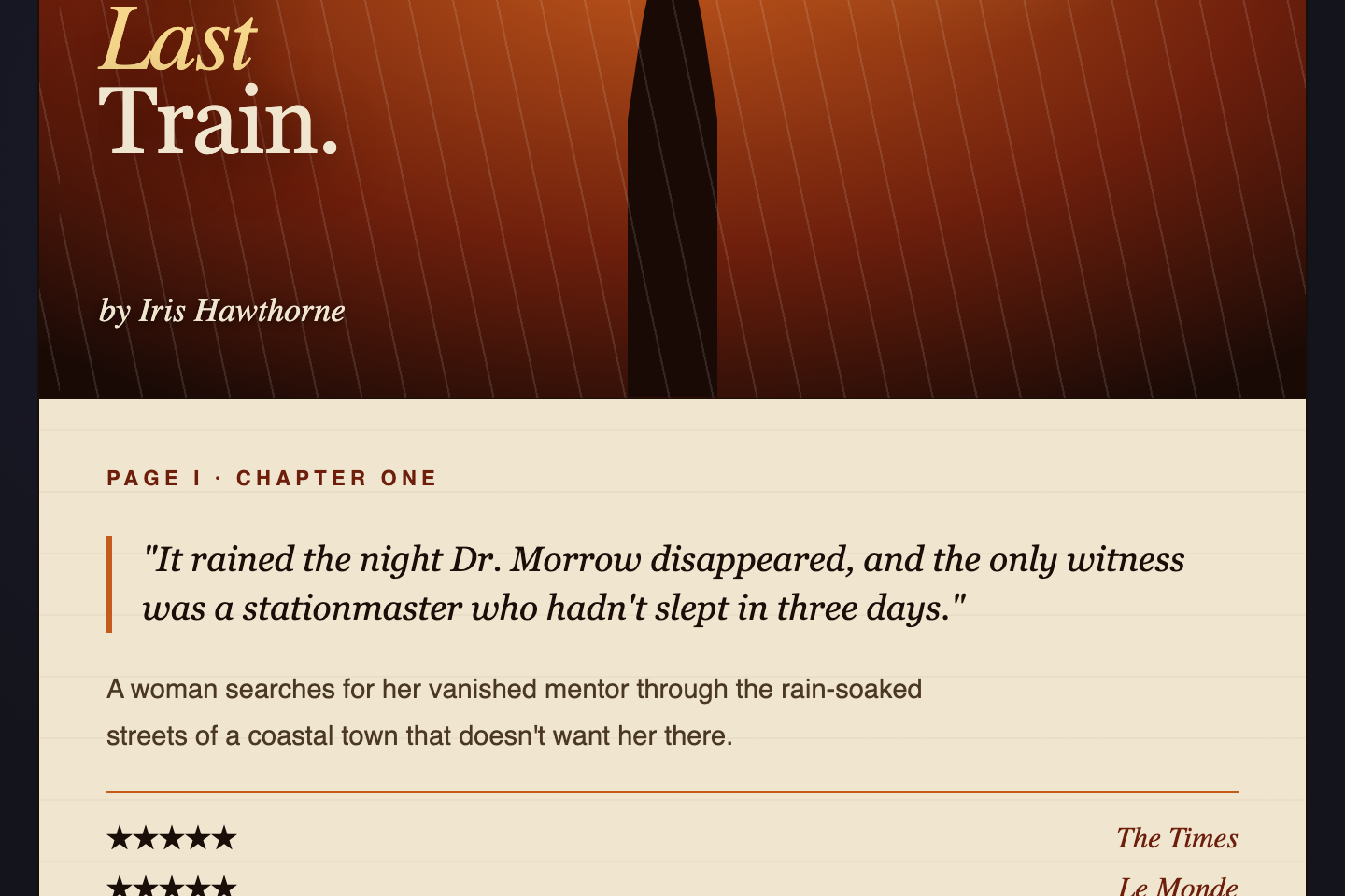
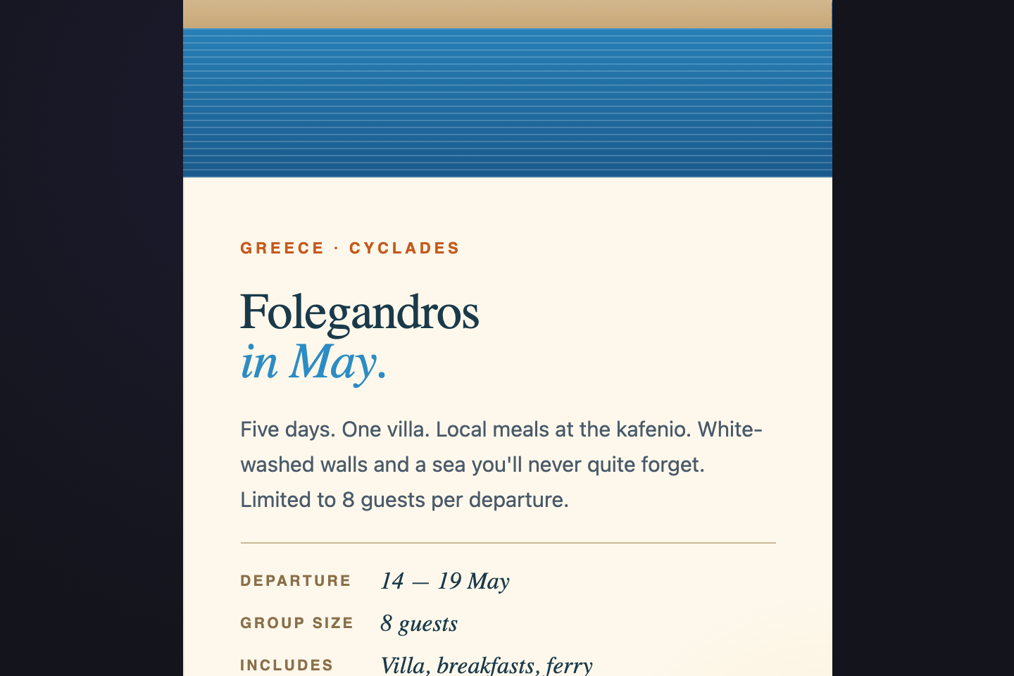
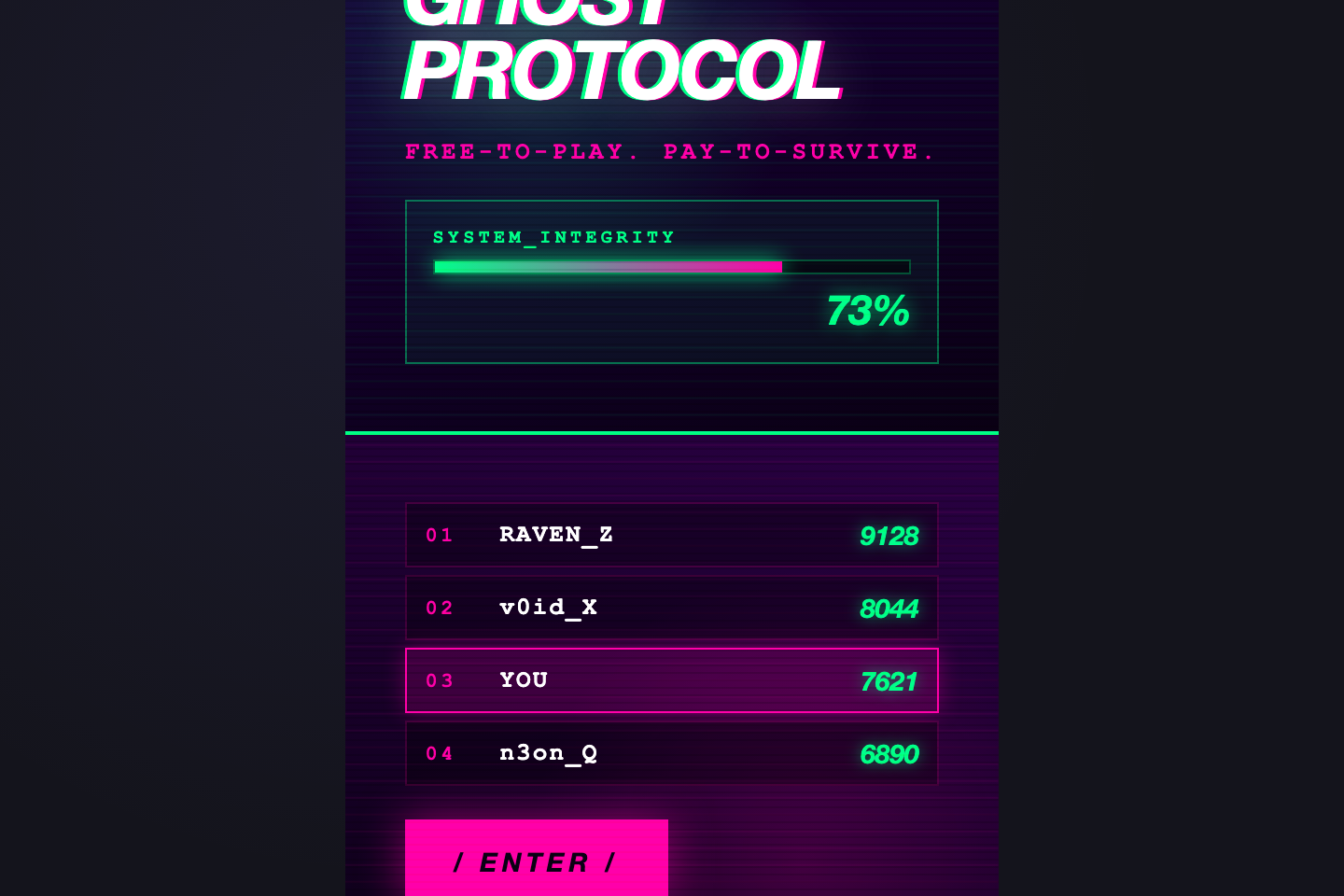
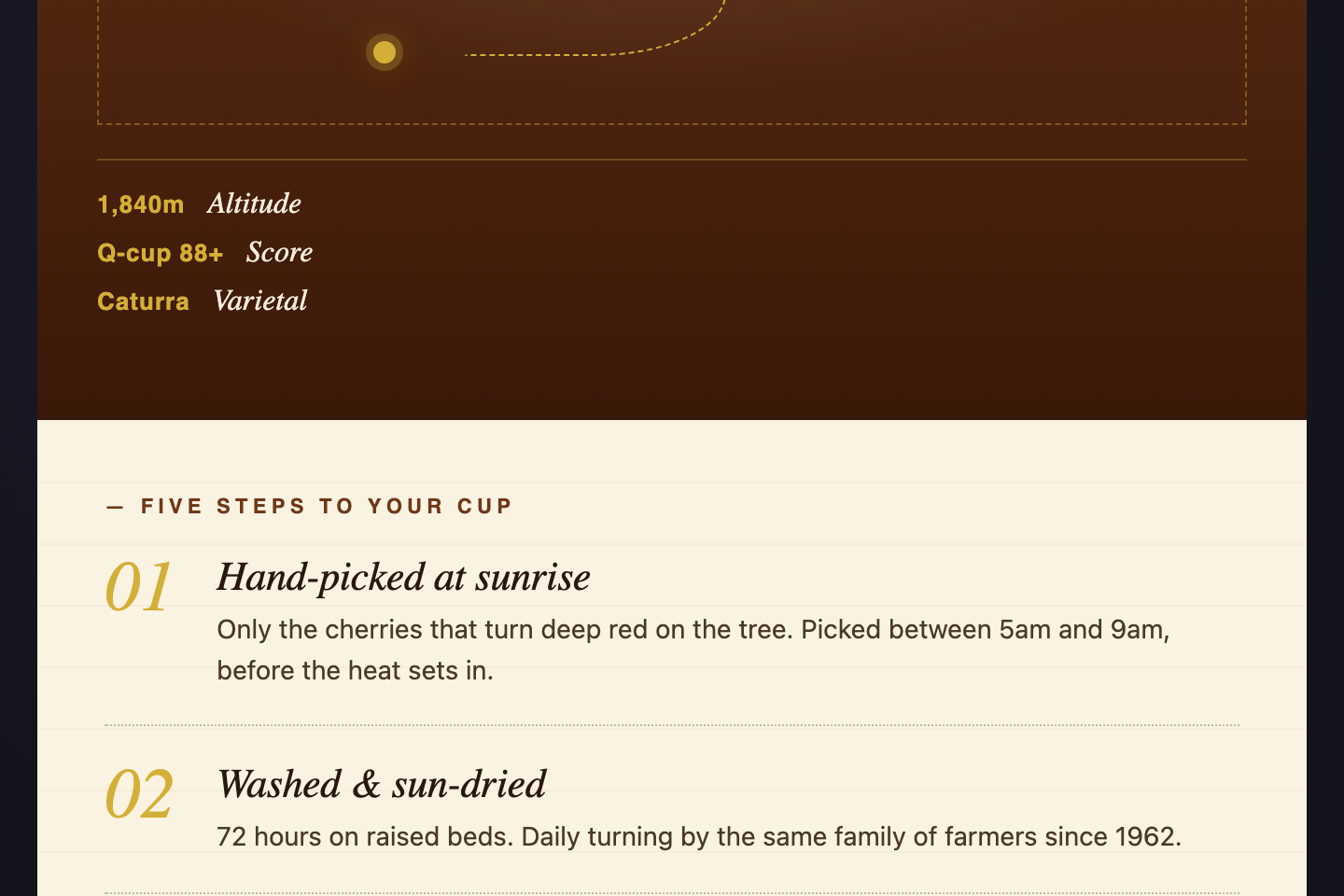
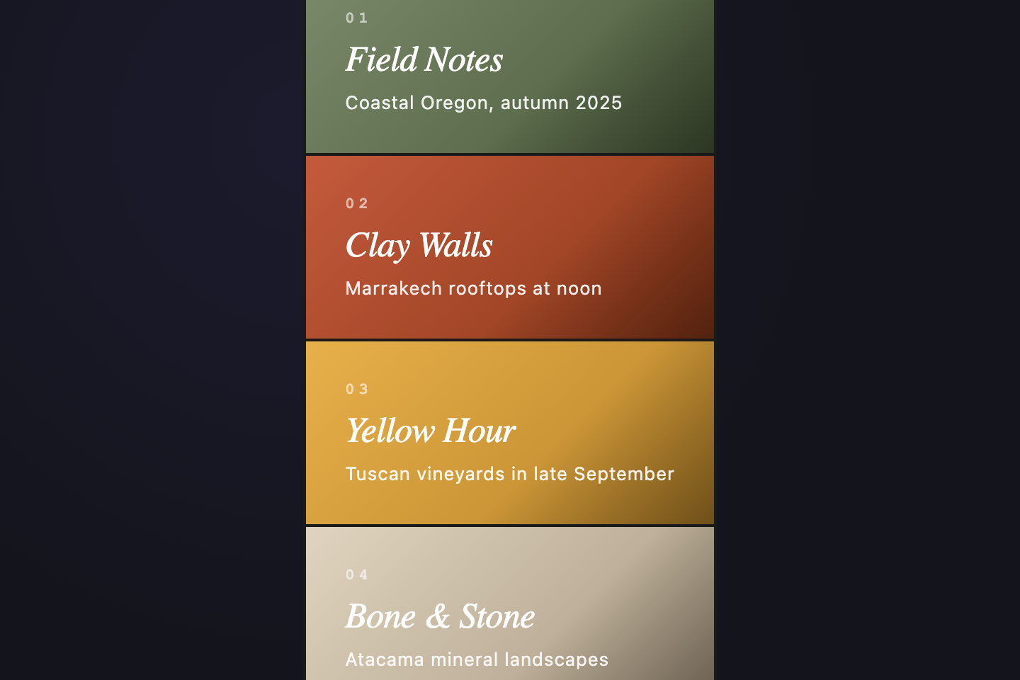
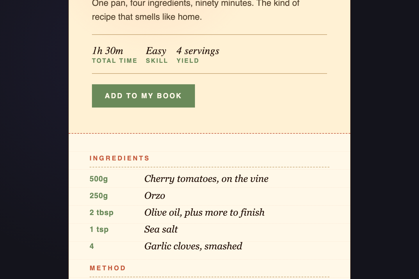
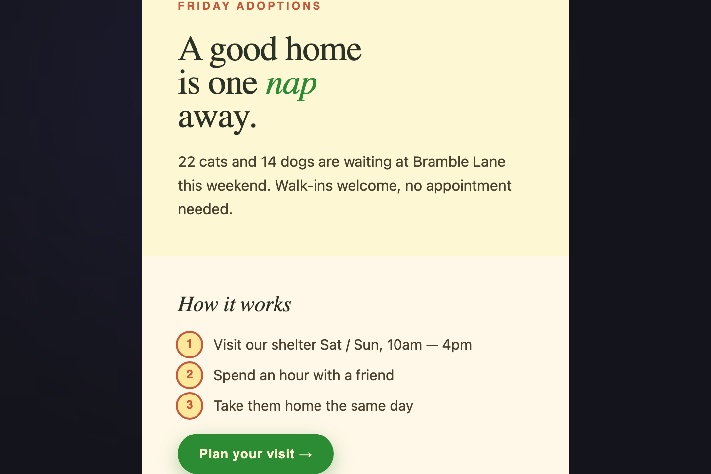
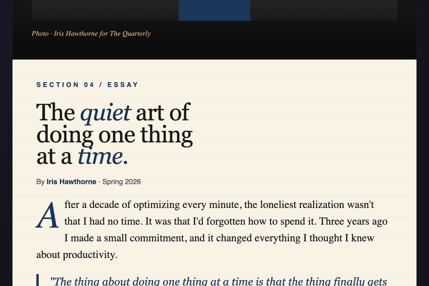
A CSS split-screen layout divides the page into two full-bleed regions side by side. These 22 hand-coded layouts are ready-to-ship splits for landing-page heroes, sign-in flows, before/after compares, and dual-narrative pages — copy the markup, swap your content, and ship.

Build your own
Tweak the exact look in our visual generators — no signup, instant copy-paste.
Frequently asked questions
What is a CSS split-screen layout?
Should the split be exactly 50/50?
How do I make a split-screen layout responsive?
grid-template-columns: 50% 50%) and switches to a single column under 720px via @media (max-width: 720px). The layout stacks vertically on mobile with the visual side first, then the text side. Watch out for fixed widths or absolute-positioned overlays — those break the stack; relative + flex/grid is more forgiving.Can I animate the split ratio?
grid-template-columns with named percentages (30% 70% ↔ 50% 50%) — that's how the Music App Toggle and Two Seasons demos shift live. Pure CSS via :has(:checked) on a hidden checkbox or radio input. No JavaScript needed.What's the difference between a split-screen and a sidebar layout?
Related collections
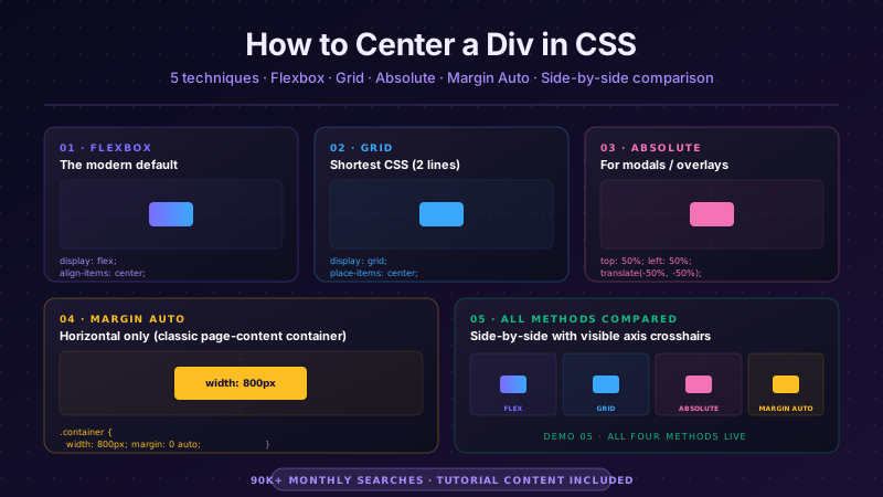
CSS Center a Div
The complete guide to centering a div in CSS in 2026 — covering all 5 production techniques with live interactive demos. <strong>Flexbox</strong> (the modern default, works for 95% of cases): <code>display: flex; align-items: center; justify-content: center</code> on the parent. <strong>CSS Grid</strong> (one-line shorthand): <code>display: grid; place-items: center</code>. <strong>Absolute positioning + transform</strong> (for overlays and modals): <code>position: absolute; top: 50%; left: 50%; transform: translate(-50%, -50%)</code>. <strong>Margin auto</strong> (for block elements with a known width): <code>margin: 0 auto</code> (horizontal only) or <code>margin: auto</code> with <code>position: absolute</code> + <code>inset: 0</code> (both axes). <strong>All methods side-by-side comparison</strong> — see every technique render the same content with visible axis crosshairs so you can see exactly where each method lands the element. All 5 demos are 100% pure CSS, MIT-licensed, copy-paste ready, with detailed explanations of which method to use when. Works in every modern browser (Chrome, Safari, Firefox, Edge), no JavaScript required.
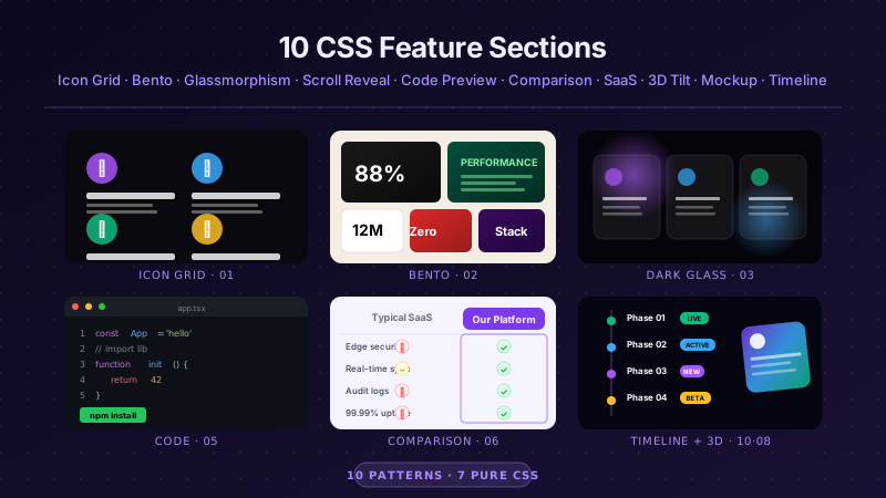
10 CSS Feature Sections
10 hand-coded CSS feature section templates covering the patterns landing pages actually need in 2026 — icon grid with stats strip, Apple-style bento grid layout, dark glassmorphism with animated blobs, scroll-reveal alternating rows, developer SDK with syntax-highlighted code preview, side-by-side comparison table with pricing cards, full SaaS hero with mesh-gradient + social proof, 3D mousemove tilt cards, parchment-cream floating phone mockup, and Linear-style product roadmap timeline. 7 of 10 demos are 100% pure CSS — drop into any stack. The 3 JS-enhanced demos (scroll-reveal, 3D tilt, timeline-glow) degrade gracefully if JavaScript is disabled. Every demo respects prefers-reduced-motion, uses scoped .fsNN__* class names so multiple can coexist, and ships MIT-licensed.
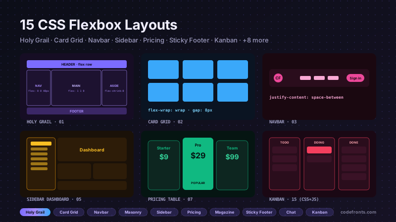
15 CSS Flexbox Layouts
15 production-ready CSS flexbox layouts with live demos and copy-paste code — holy grail page shell, responsive card grid, sticky navbar, masonry-style columns, sidebar dashboard, product cards, pricing table, magazine article, sticky footer with min-block-size: 100dvh, centered hero, vertical timeline, chat interface, mosaic gallery, two-column form, and kanban board. Every demo is mobile-first, WCAG-friendly, and works without a build step.