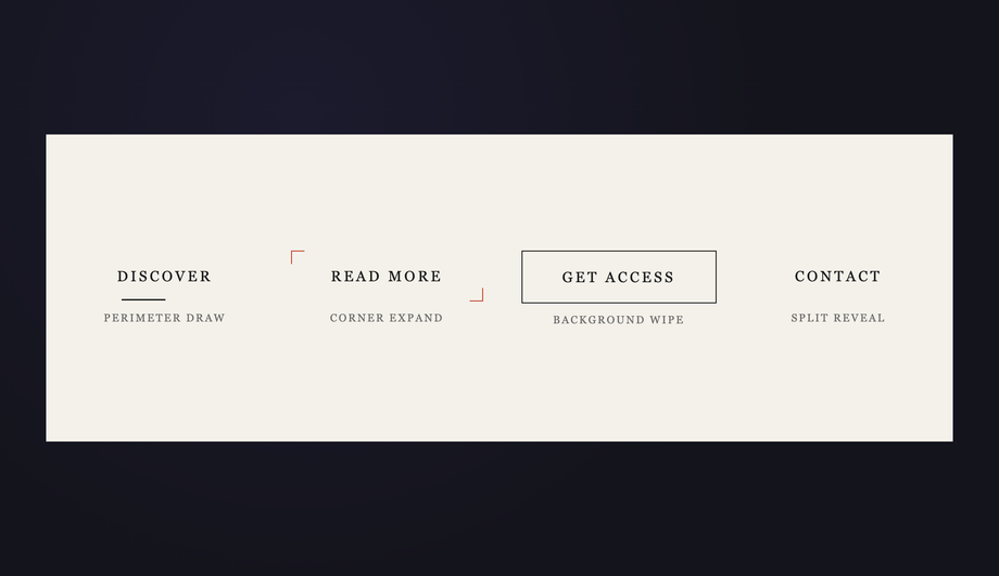
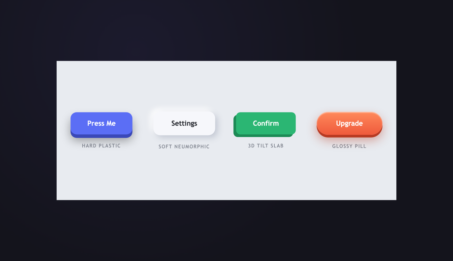
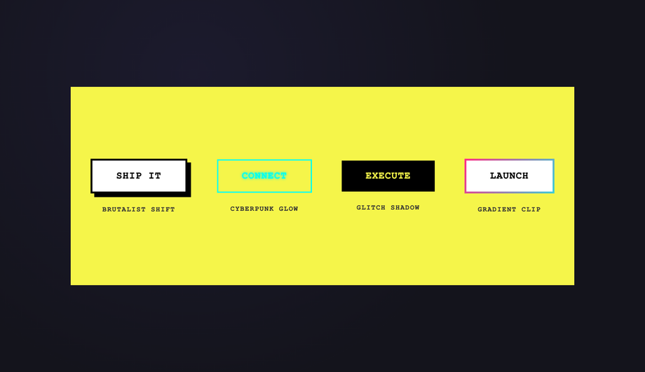
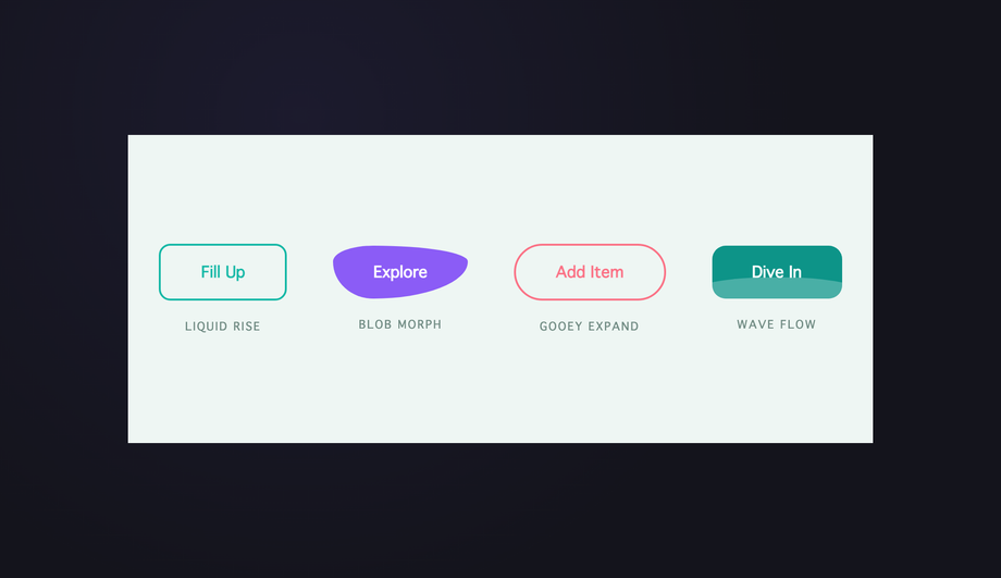
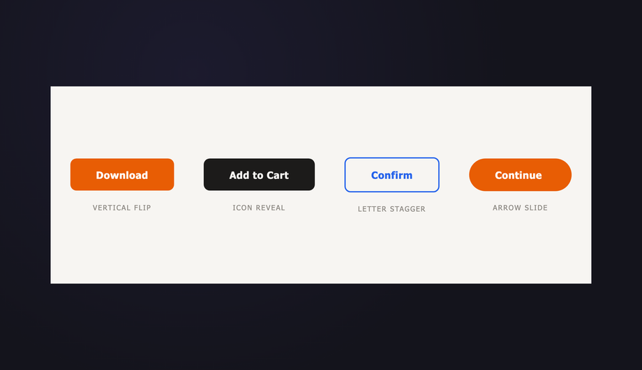
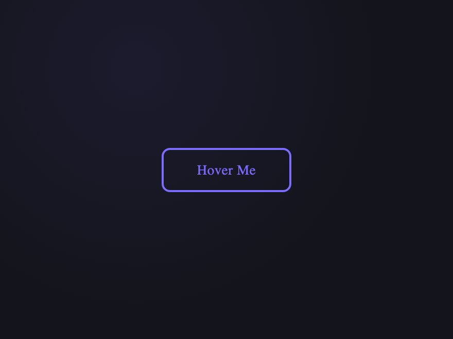
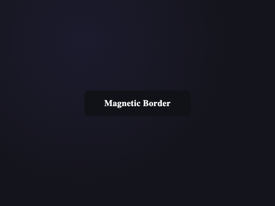
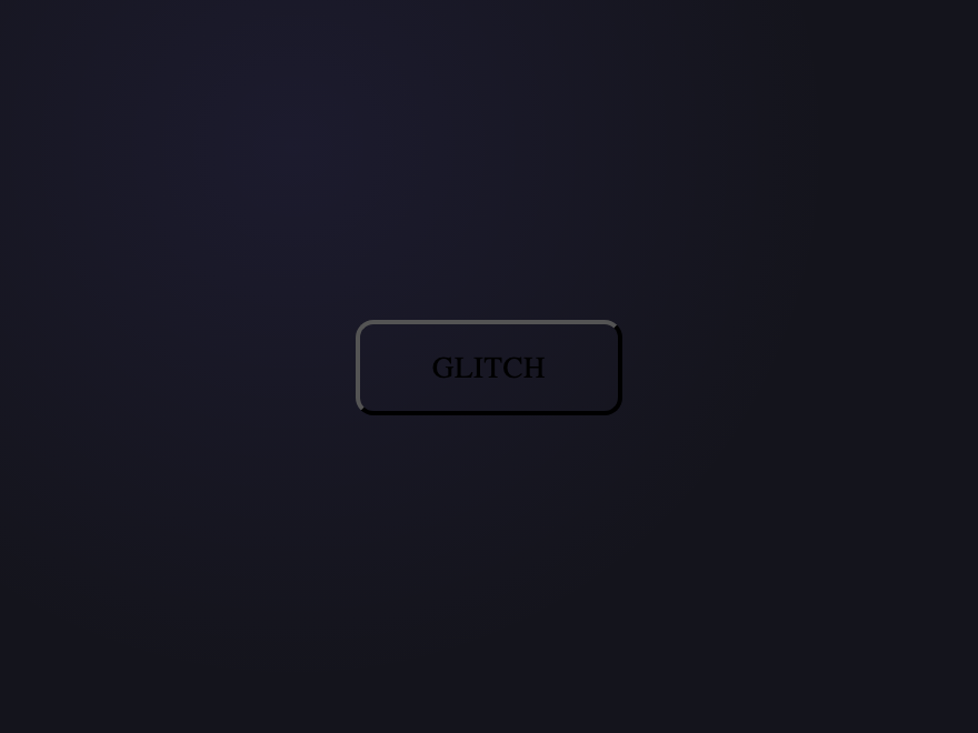
27 CSS Button Hover Effects
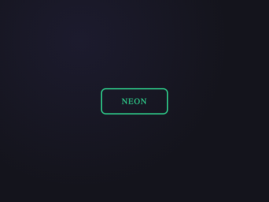
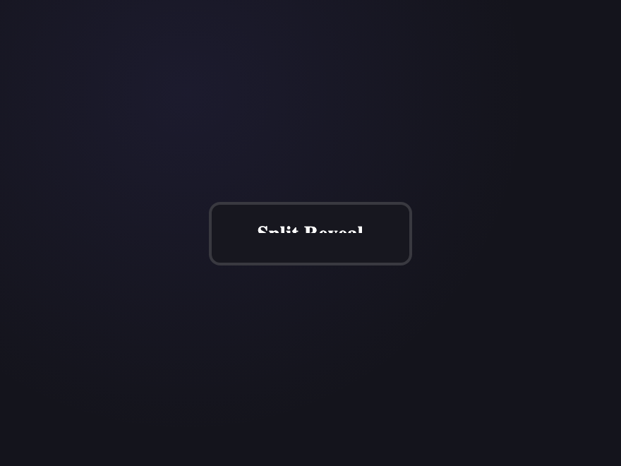
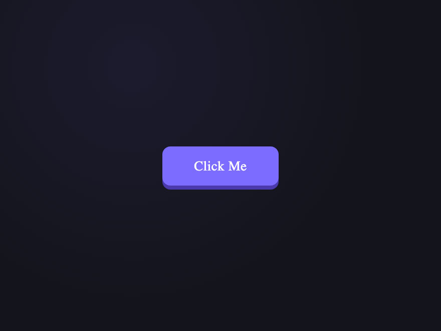
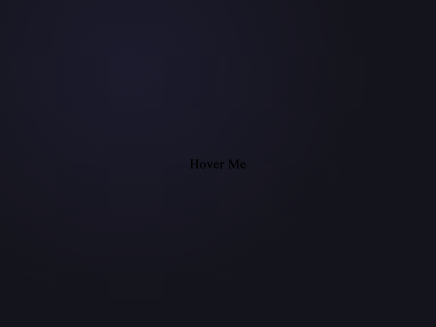
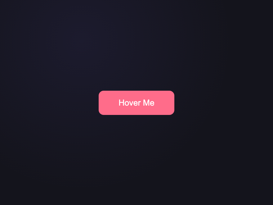
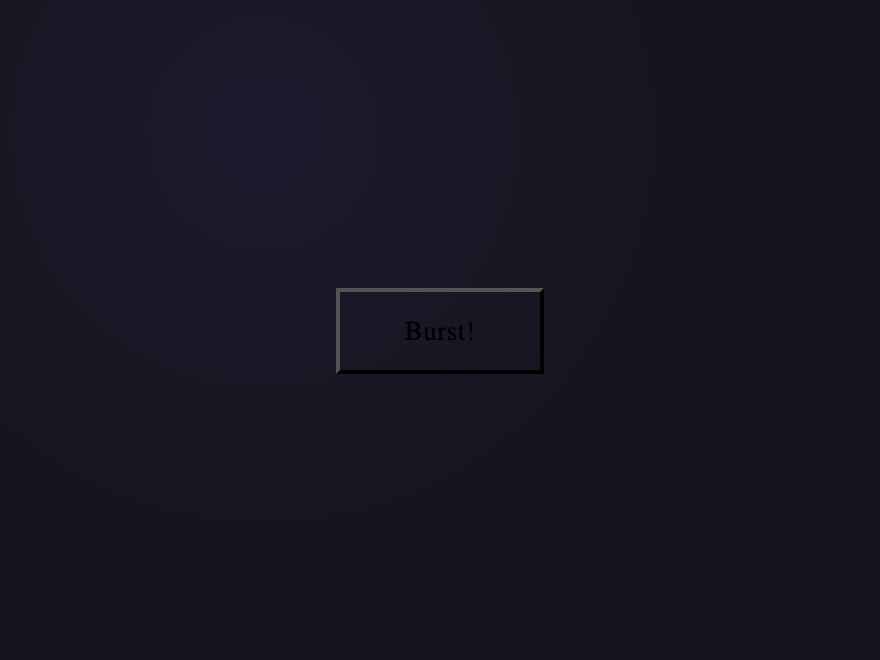
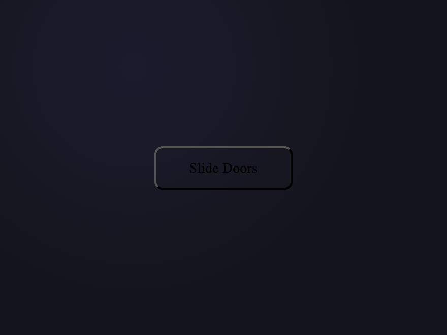
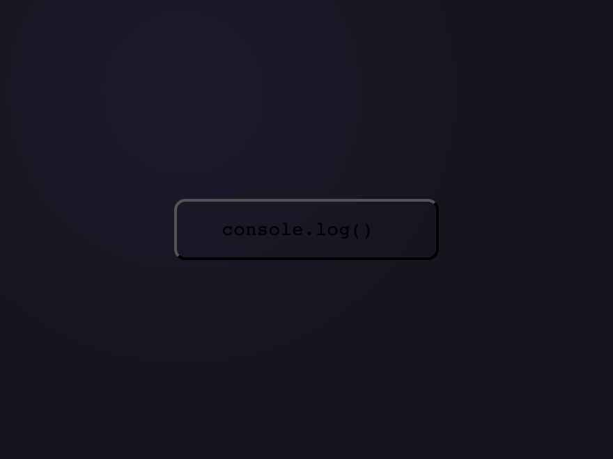
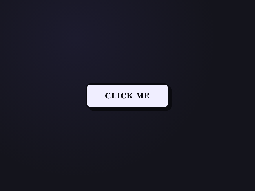
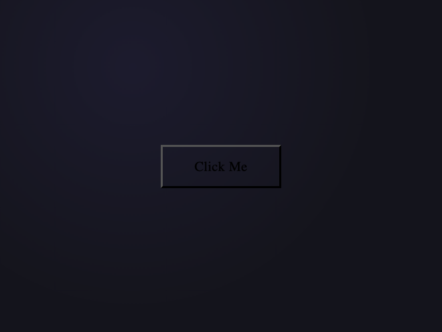
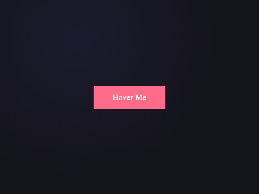
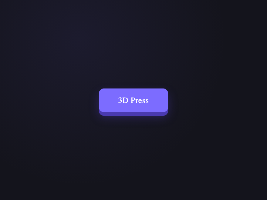
27 hand-coded CSS button hover effects you can copy-paste into any project — 3D button press, neon button glow, gradient button slide, border animation draw, liquid fill, ripple, glitch text, and kinetic flips. Every demo is pure CSS (no JavaScript, no framework, no build step), tuned for 60fps with transform and opacity, and respects prefers-reduced-motion out of the box. Attach a class to your existing <button> markup and ship.


Build your own
Tweak the exact look in our visual generators — no signup, instant copy-paste.
Frequently asked questions
How do I add a hover effect to a button in CSS?
Which of these CSS button hover effects work without JavaScript?
How does the liquid fill button hover effect work?
How do I make a CSS ripple button effect on click without JavaScript?
Are these CSS button animations accessible and mobile-friendly?
How do I keep CSS button hover effects at 60fps?
Are these button hover effects accessible and free?
Related collections

15 CSS Background Animations
15 hand-coded CSS background animations with live demos — infinite shifting gradient, floating particle bubbles, parallax starry night, clickable cyberpunk ripple, sliding geometric grid, SVG wave overlays, glassmorphism orbs, aurora borealis ribbons, matrix digital rain, mesh gradient blobs, falling snow, morphing blob, retro synthwave 3D grid, infinite scrolling diagonal marquee, comic-book halftone dots. 100% Pure CSS, no JavaScript, no canvas, no particles.js. prefers-reduced-motion respected, scoped class names, MIT-licensed.

33 CSS Card Hover Effects
33 hand-coded CSS card hover effects with live demos — multi-axis 3D tilt with parallax, glowing gradient glassmorphic border, image zoom with content slide-up, front-to-back 3D flip, sibling de-emphasis with :has(), minimalist elevation, plus 27 more (elastic lift, conic-gradient border, holographic foil, neon sign, glitch RGB split, magnetic float, blueprint reveal, aurora drift and more). 26 pure CSS + 7 with a small vanilla JS snippet for cursor tracking. prefers-reduced-motion respected, scoped class names, MIT-licensed.

30 CSS Hover Effects
30 hand-coded CSS hover effects covering every production interactive pattern in 2026 — text hover (underline draw, glitch, letter-spacing expand, gradient reveal, split text, neon glow), button hover (magnetic liquid, border draw, shimmer shine, fill wipe, 3D press, ripple), card hover (3D tilt, flip, glassmorphism, spotlight, slide reveal, stack lift), image hover (zoom-pan, color channel split, distortion, duotone, curtain reveal, Ken Burns), navigation hover (underline slide, highlight fill, strikethrough link, inline word swap), and pointer-tracking effects (cursor dot trail, magnetic pull). 24 demos are 100% pure CSS using <code>:hover</code> + GPU-accelerated <code>transform</code> / <code>opacity</code> transitions; 6 use ~30-60 lines of vanilla JavaScript for pointer-coordinate tracking. All respect <code>prefers-reduced-motion</code>, use scoped <code>.hv-NN__*</code> class names so multiple effects coexist on the same page without style bleed, ship INP-safe (no layout-triggering animations), MIT-licensed. Drop into React, Vue, Astro, Svelte, Rails ERB, plain HTML, or WordPress — zero framework dependencies.