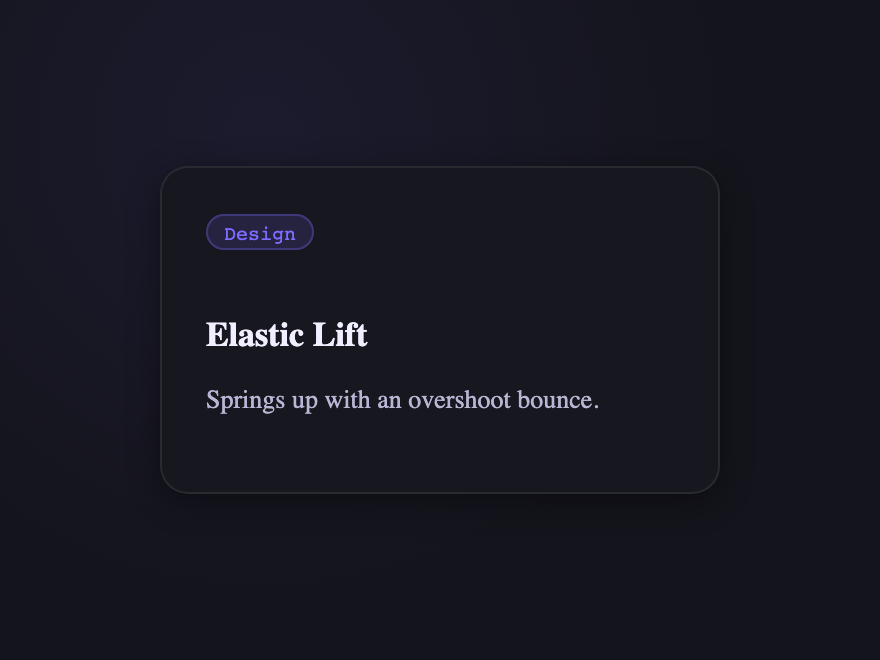
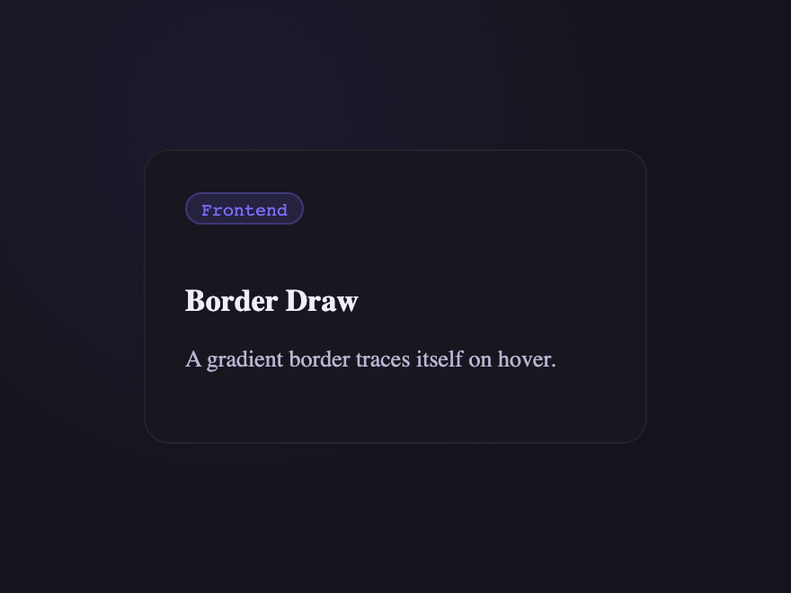
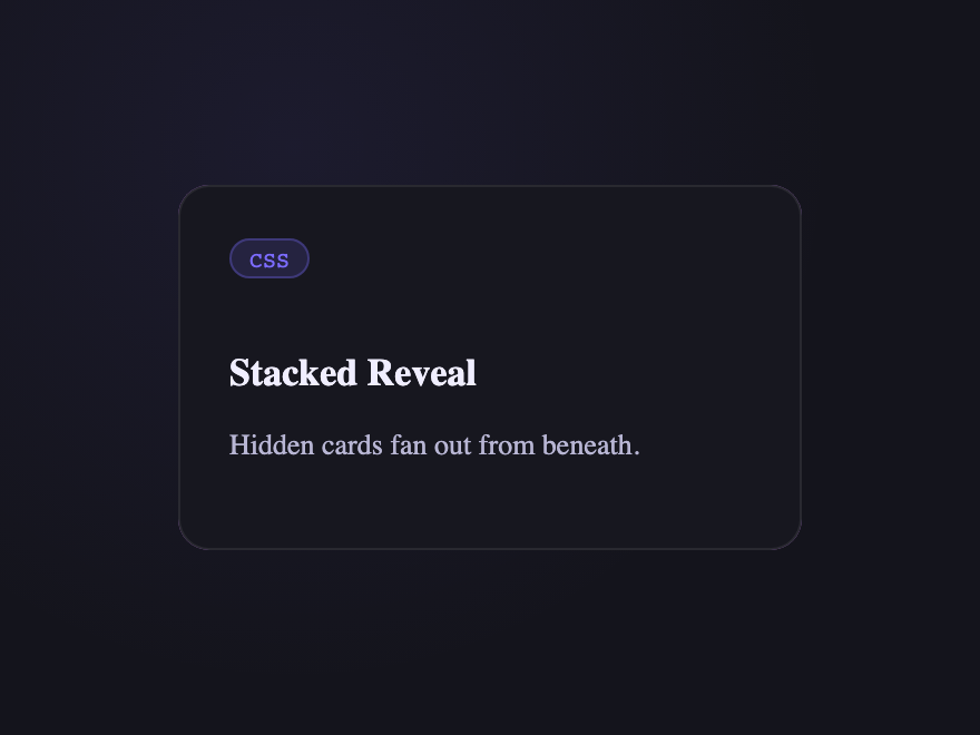
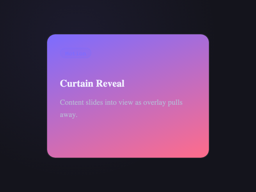
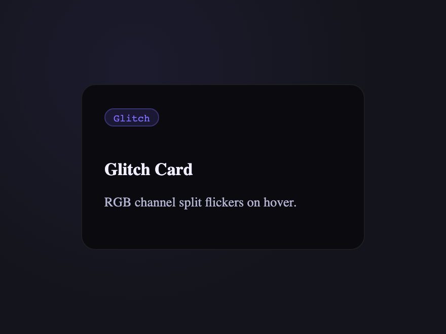
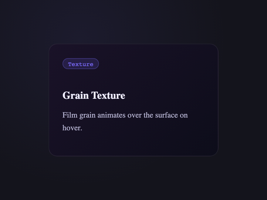
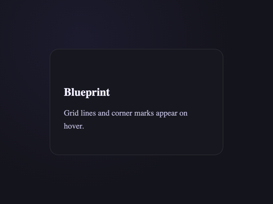
A CSS card hover effect is the motion or transformation that fires when a pointer enters a card surface. These 33 hand-coded effects span the full microinteraction range: a multi-axis 3D tilt card with cursor parallax across layered Z-depth planes, a glowing gradient glassmorphic border that tracks the pointer, an image zoom with a frosted detail panel sliding up from the bottom, a front-to-back 3D flip for team profile cards, a CSS :has() sibling de-emphasis that blurs every non-hovered card in a pricing grid, a minimalist elevation with layered multi-step shadows — plus a bouncy elastic lift, a holographic foil shimmer, an animated @property conic-gradient border, a glassmorphism card whose backdrop-filter blur intensifies on hover, a glitch card with RGB channel split, a spotlight that follows the cursor, a magnetic float, a blueprint reveal, an aurora drift and more. 26 are pure CSS; 7 add a short vanilla JS snippet for cursor tracking. Each demo ships with semantic HTML, scoped .card-NN class names that never collide with your existing styles, prefers-reduced-motion fallbacks, and MIT licensing — copy from any code panel and drop onto your existing card markup.
33 unique effects26 Pure CSS7 CSS + JS100% copy-paste readyPublished
Updated · 6 new designs added
·
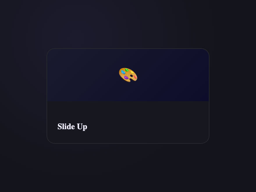
01 / 33
3D Tilt & Parallax Card Effects
CSS + JS NEW
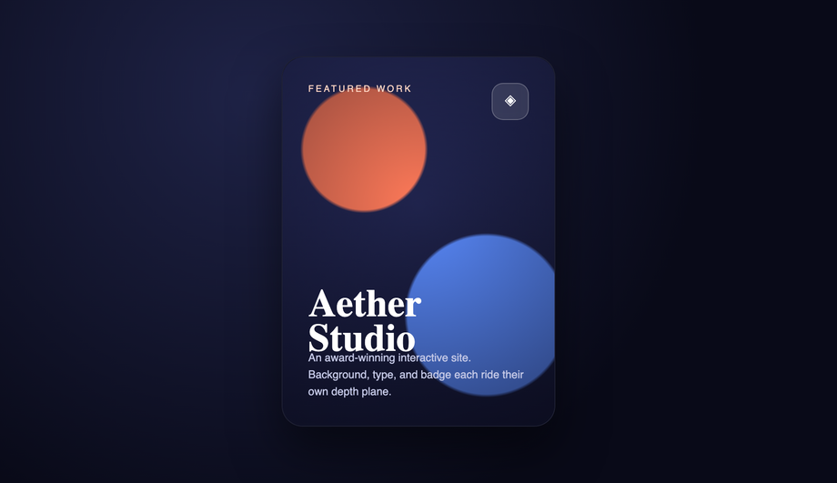
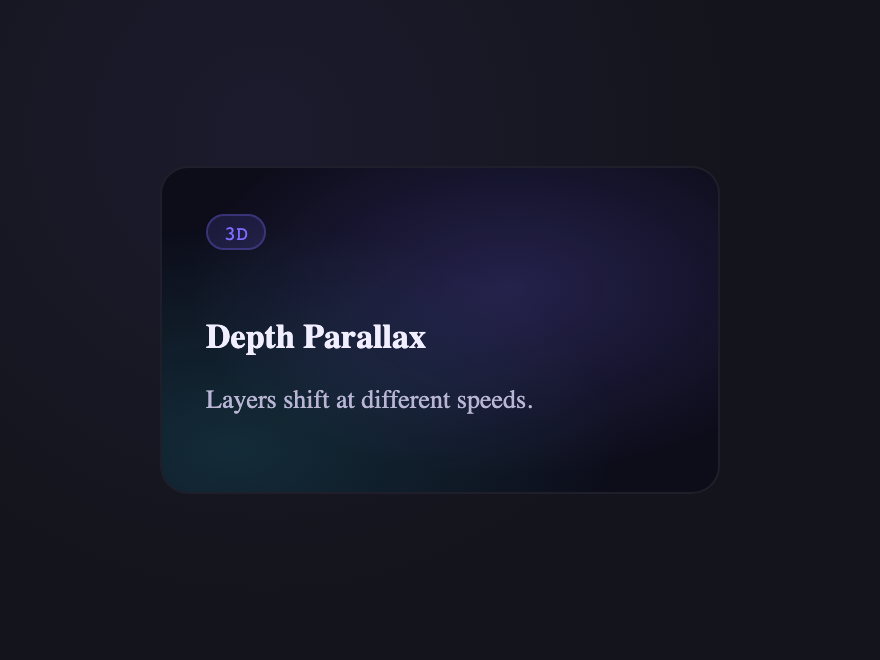
A premium portfolio card that follows the cursor's orientation in real 3D, with the background, badge, title, and description each pushed onto separate Z-axis depth planes so they shift at different rates as you move.
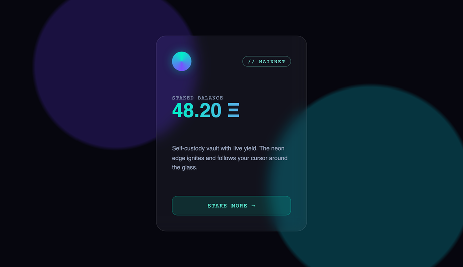
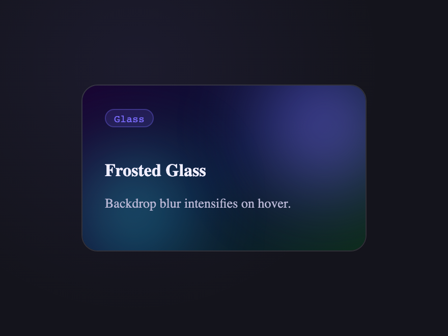
A dark web3/crypto wallet card on a frosted-glass surface where a vibrant teal-to-violet radial glow blooms behind the blur and a matching neon border lights up, both tracking the cursor around the edges.
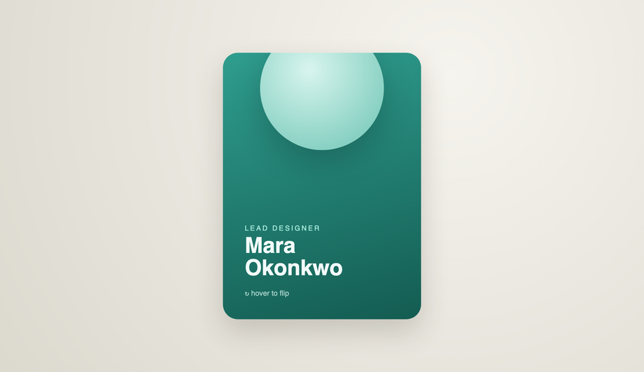
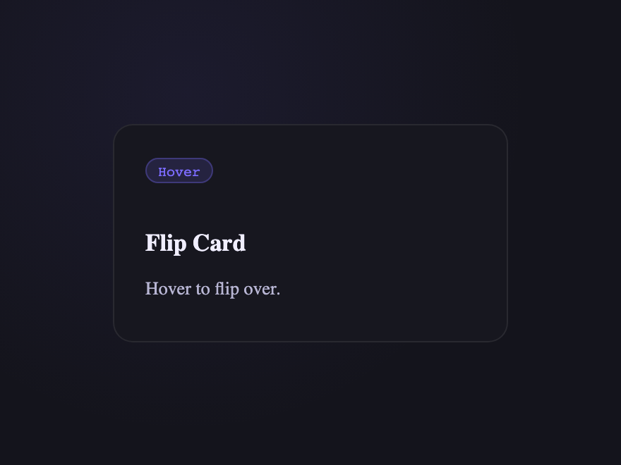
A team-member profile card that rotates a full 180° on the Y-axis using perspective and backface-visibility, flipping from a photo-and-name front to a back face with bio and social links.
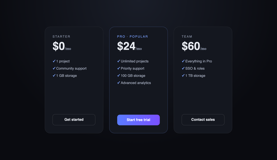
A pricing grid where hovering one card scales it up and brings it forward, while modern :has() and :not(:hover) selectors automatically blur and dim every neighboring card — pulling all attention to the chosen option with zero JavaScript.
Best forpricing tables, minimalist galleries, and any multi-column layout where guiding focus matters.
A clean corporate/SaaS documentation card that sits nearly flat at rest, then lifts on hover with a translateY shift and a layered, multi-step box-shadow that expands to mimic a real card rising off the page.
Best forSaaS marketing sites, docs platforms, and restrained UI systems where subtlety is the point.
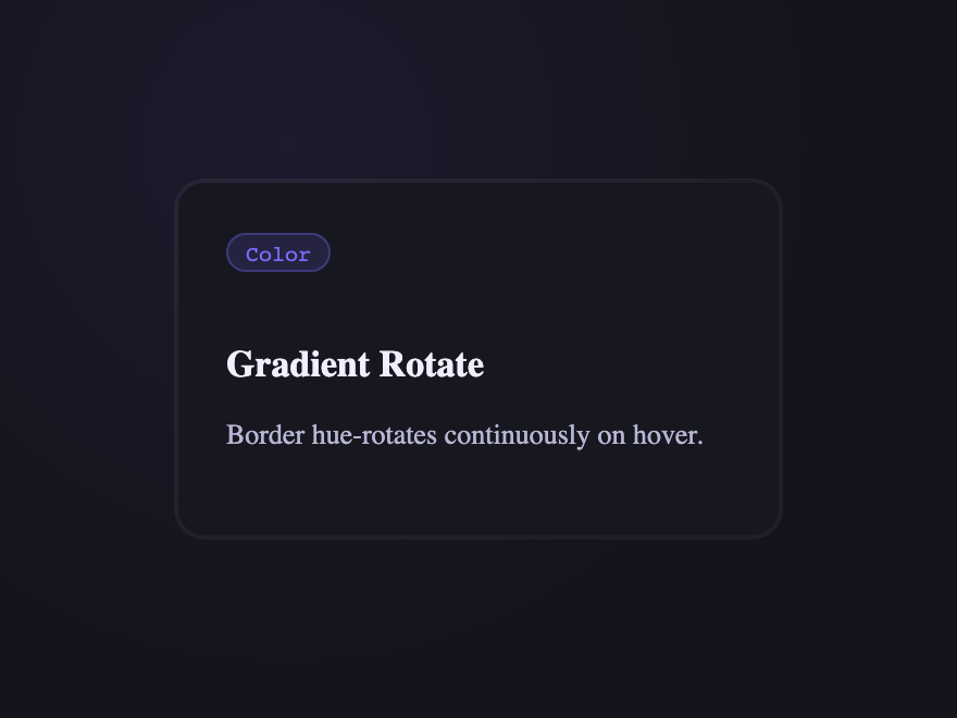
A dark edge-compute product card where a multi-color conic gradient traces a live circuit around the border on hover, powered by the modern @property animated angle.
Best fortech, SaaS, or developer-tool cards that want a premium "powered-on" signal without distracting from the content.
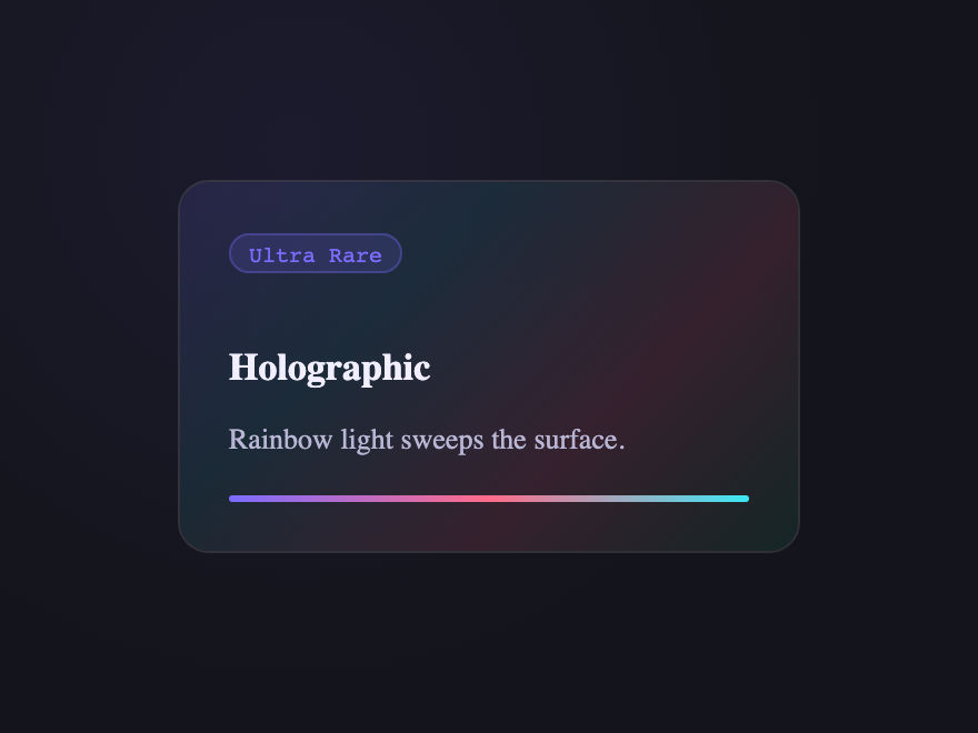
A collectible trading-card treatment with a color-dodge foil sweep, sparkle grain, and a subtle 3D tilt, mimicking light catching a holographic surface.
Best forNFT/collectible, gaming, or limited-edition product cards that need a "rare item" feel.
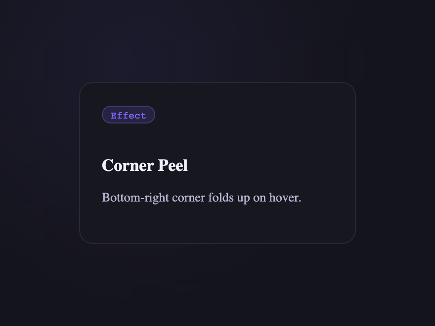
A sticker-style promo card whose top-right corner physically peels back to expose a hidden discount underneath, with a soft drop shadow on the lifted flap.
Best forcoupons, membership perks, or any card with a reward worth "uncovering.
A landscape/travel card with stacked depth layers (mountains, sun, foreground hills) that shift independently as the cursor moves, creating real 3D depth.
Best fortravel, outdoor, and immersive storytelling cards where motion conveys place.
Put a <code>transition</code> on the card's resting state, then change a property on <code>:hover</code> — most commonly <code>transform: translateY(-6px)</code> for a lift, plus a deeper <code>box-shadow</code>. For richer effects, animate a pseudo-element (<code>::before</code> / <code>::after</code>) or a child layer (a border, a gradient, an overlay). Every one of the 33 effects in this gallery is built from this pattern; copy the CSS from any demo's code panel and drop it onto your existing card markup. The Minimalist Elevation demo (#06) is the cleanest reference for the pure-lift pattern — a flat resting state, one <code>:hover</code> rule with <code>translateY(-8px)</code> + a layered multi-step <code>box-shadow</code>, and a CTA arrow that nudges forward.
How do I build a 3D tilt card with multi-axis cursor parallax?
The 3D Tilt & Parallax demo (#01) is the production-ready reference. Three pieces: (1) give the card's PARENT <code>perspective: 1000px</code> so the rotation has depth; (2) on the card, set <code>transform-style: preserve-3d</code> and read the cursor position with a small JS snippet (~15 lines of vanilla JS that listens for <code>mousemove</code> on the card, normalises <code>e.clientX/Y</code> against <code>getBoundingClientRect()</code>, and writes <code>rotateY</code>/<code>rotateX</code>); (3) push child layers (background, badge, title, description, glare) to different <code>translateZ</code> depths so they shift at different rates — that's what gives the parallax depth, not just the rotation. The single-axis Depth Parallax demo (#15) and the simpler 3D Tilt (#17) ship the same pattern at different complexity levels.
How do I make a glowing gradient glassmorphic border on hover?
The Glowing Gradient & Glassmorphic Borders demo (#02) layers three effects: (1) a frosted-glass card with <code>backdrop-filter: blur(20px)</code> + low-opacity white background tint, (2) a radial-gradient glow positioned at the cursor's X/Y (tracked by ~10 lines of JS that writes <code>--x</code> and <code>--y</code> custom properties), (3) a masked gradient ring via <code>border-image</code> or a pseudo-element with <code>mask-composite: exclude</code>. The glow blooms behind the blur (so the glass softens it) AND the border lights up around the cursor's nearest edge. Add <code>-webkit-backdrop-filter</code> for Safari. For a simpler version, the Frosted Glass Intensify demo (#27) does the blur-deepens-on-hover trick without the cursor tracking.
How do I make a CSS card flip on hover (front to back)?
The 3D Flip Cards demo (#04) is the canonical pattern. Wrap the card in a parent with <code>perspective: 1000px</code>, set <code>transform-style: preserve-3d</code> on the card itself, then position <code>.front</code> and <code>.back</code> as siblings with <code>position: absolute; inset: 0</code> and rotate the back face by <code>rotateY(180deg)</code>. Both faces get <code>backface-visibility: hidden</code> so the back doesn't show through the front at rest. On <code>:hover</code>, rotate the whole card by <code>rotateY(180deg)</code> — the back face becomes visible while the front rotates out of view. The demo ships a team-member profile pattern with photo + name on the front, bio + social links on the back. The legacy Flip Card demo (#19) ships a credit-card variant with magnetic strip and CVV.
How do I blur and dim sibling cards when one is hovered using CSS :has()?
The Sibling De-emphasis demo (#05) uses the modern <code>:has()</code> selector with zero JavaScript. The selector reads: <code>.grid:has(.card:hover) .card:not(:hover) { filter: blur(2px); opacity: 0.5; transform: scale(0.96); }</code>. Plain English: 'when the grid contains any hovered card, dim every card that isn't itself hovered.' The hovered card stays sharp and lifts forward (<code>.grid:has(.card:hover) .card:hover { transform: scale(1.04); }</code>), pulling all visual focus to the chosen option. Browser support: Chrome 105+, Safari 15.4+, Firefox 121+ — every current major browser. In older browsers the selector matches nothing and the grid renders normally, no JS fallback needed.
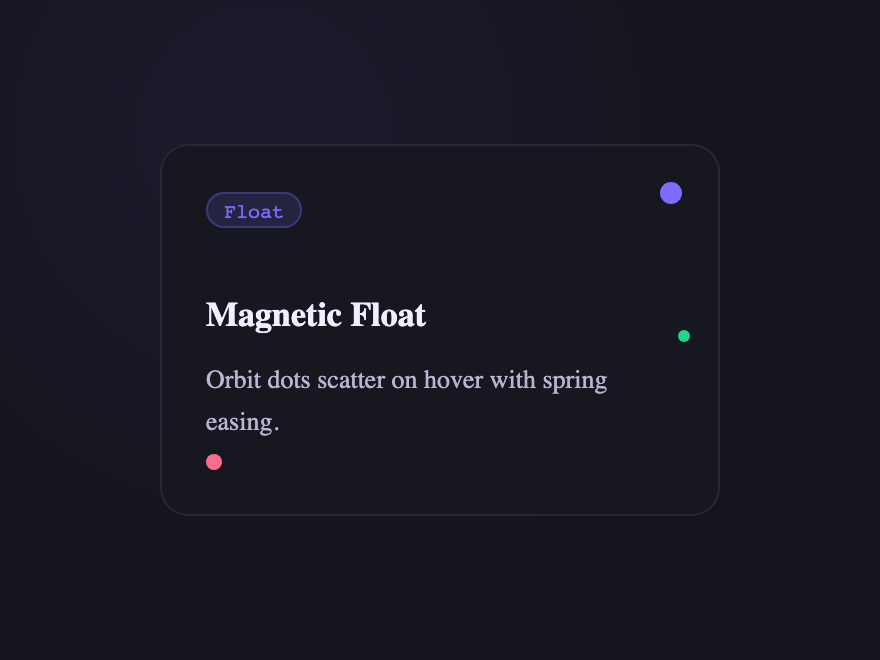
Which of the 33 demos use JavaScript? Are they accessible without it?
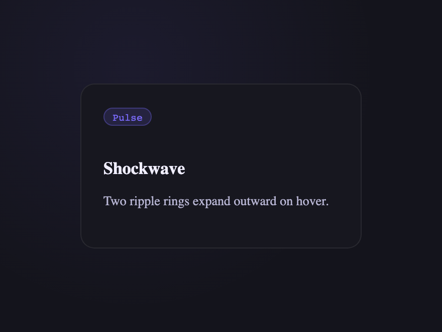
Seven demos use a short vanilla JS snippet for cursor tracking: 3D Tilt & Parallax (#01), Glowing Gradient & Glassmorphic Borders (#02), Depth Parallax (#15), Spotlight (#16), 3D Tilt (#17), Magnetic Float (#23), and Shockwave (#29). The other 26 are pure CSS — <code>:hover</code> with transitions, transforms, pseudo-elements, <code>:has()</code>, and <code>@keyframes</code>. The JS demos degrade gracefully: card content is fully visible and interactive without hover (touch + keyboard users see the resting state), the cursor-tracking only enhances the experience for pointer devices. Every continuous animation respects <code>@media (prefers-reduced-motion: reduce)</code>. No library required for any of them.
How do I add minimalist elevation shadows that feel real?
Real-feeling elevation isn't one <code>box-shadow</code> — it's layered. The Minimalist Elevation demo (#06) shows the pattern: at rest, a single tight ambient shadow (<code>0 1px 2px rgba(0,0,0,0.06)</code>). On hover, swap to TWO shadows stacked — a tight one for contact (<code>0 4px 12px rgba(0,0,0,0.08)</code>) and a wider, softer one for ambient diffusion (<code>0 16px 40px rgba(0,0,0,0.12)</code>) — combined with <code>translateY(-8px)</code> to lift the card off the surface. The two shadows expand at different rates because light has two falloffs in reality: hard for nearby surfaces, soft for distant ones. Animate both via a single <code>transition: transform 0.3s, box-shadow 0.3s</code>.
How do I keep card hover effects smooth and not janky?
Animate <code>transform</code> and <code>opacity</code> ONLY — they're GPU-accelerated and skip layout reflow. Avoid animating <code>width</code>, <code>height</code>, <code>margin</code>, or <code>top/left</code> on hover (they trigger reflow and paint every frame). Put the <code>transition</code> on the card's base state so it eases out as well as in. Use <code>will-change: transform</code> on the card sparingly — only when an effect is heavy enough to need it; over-using <code>will-change</code> hurts performance because the browser pre-allocates GPU layers for elements that never animate. Keep transition durations in the 150–350ms range — fast enough to feel responsive, long enough to read as motion.
Are these card hover effects accessible and free to use?
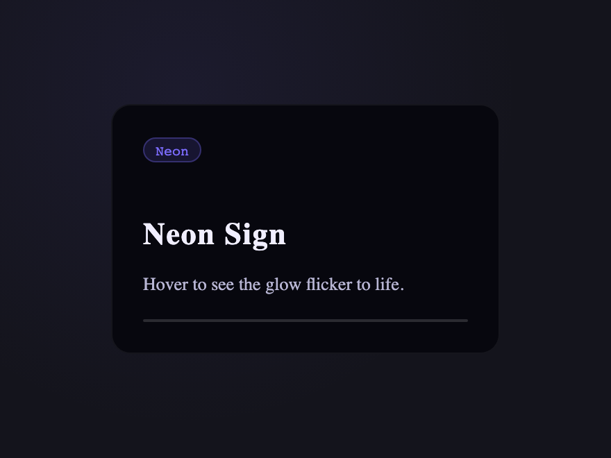
Yes. Hover effects are progressive enhancement — every card's content is fully readable and interactive without hover, so touch and keyboard users lose nothing. Continuous keyframe animations (the conic-gradient spin in Gradient Border Draw, the neon flicker in Neon Sign, the aurora drift, the grain breathe) all wrap in <code>@media (prefers-reduced-motion: reduce) { animation: none }</code>. Triggered transitions on <code>:hover</code> stay (they're user-initiated, not autoplay). Scoped <code>.card-NN</code> class names never collide with your existing styles. All 33 effects are MIT licensed and free for personal AND commercial projects.