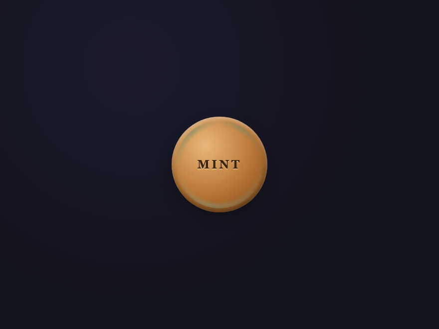
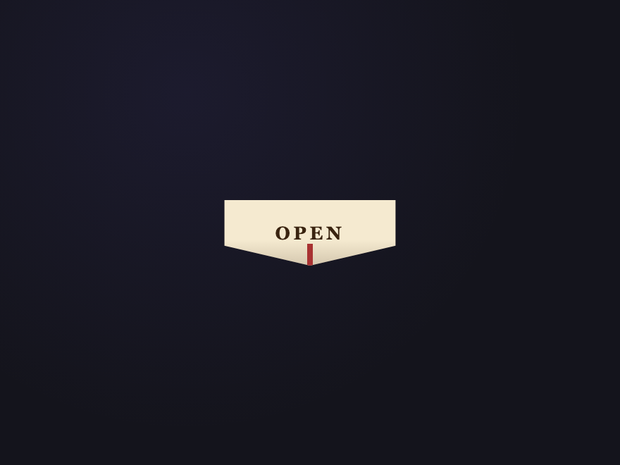
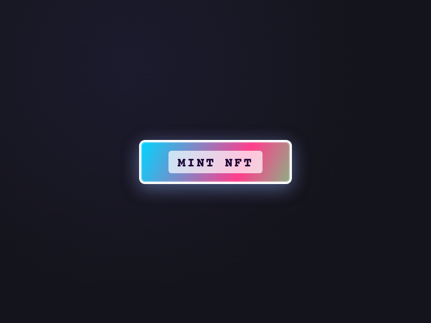
A CSS button is the primary call-to-action element on any page — the control that gets clicked. These 43 hand-coded designs are ready-to-ship buttons for forms, hero CTAs, toolbars, and inline actions — copy the markup, drop in your label, and ship.
43 unique buttons25 Pure CSS18 CSS + JS100% copy-paste readyPublished
Updated · 12 new designs added
·
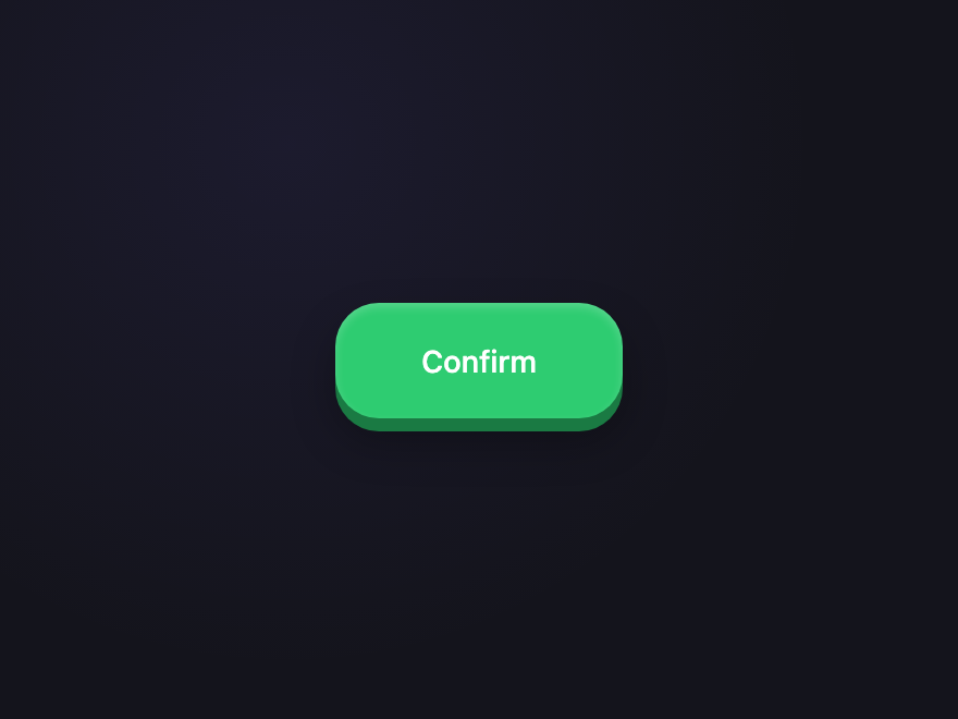
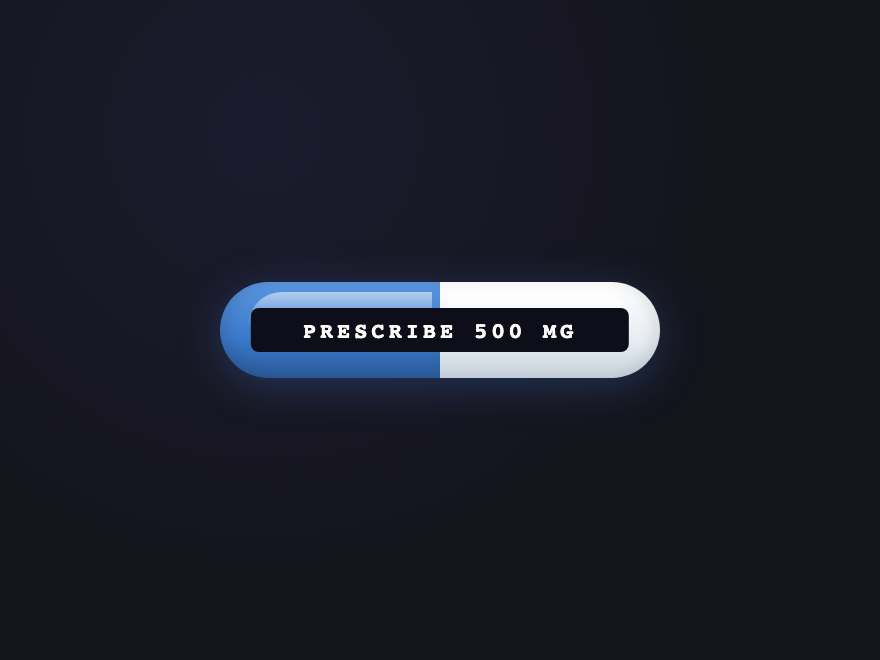
01 / 43
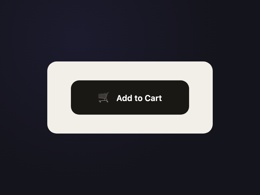
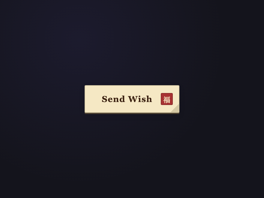
Add to Cart
CSS + JS NEW
A real e-commerce state machine: click fills a green progress bar along the bottom edge, snaps to a success state with a particle burst, then auto-resets after two seconds.
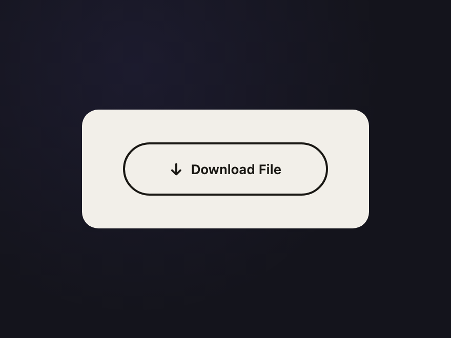
The button body itself fills left-to-right like a true progress indicator while the arrow bounces, then morphs into a "Complete" state with a checkmark.
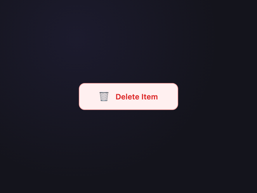
A two-step destructive pattern: the first click shakes the button and slides up a red confirmation panel; a second click within three seconds wipes it with a sweep into a "Deleted" ghost state.
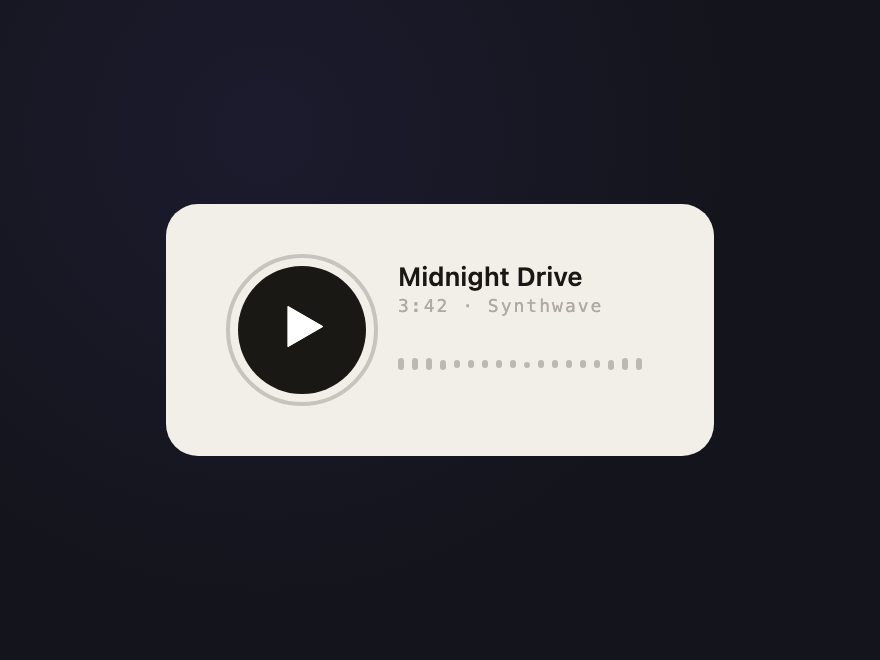
A media control whose icon morphs between a triangle and pause bars; a pulsing halo ring appears while playing and a row of waveform bars dances with staggered timing.
The border fills upward with a purple gradient, the label swaps to a checkmark, then twenty-four confetti pieces in six colors burst outward in a celebratory fan.
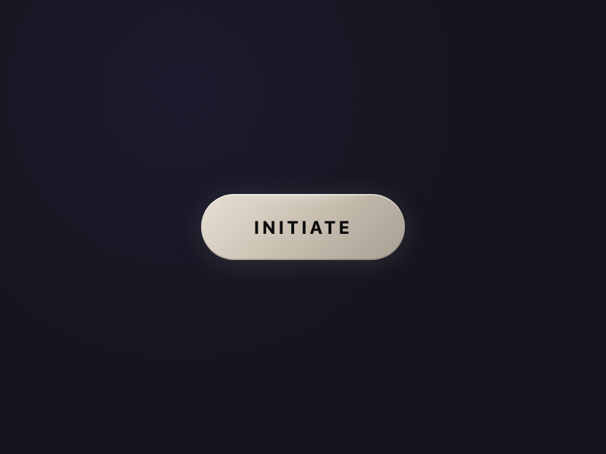
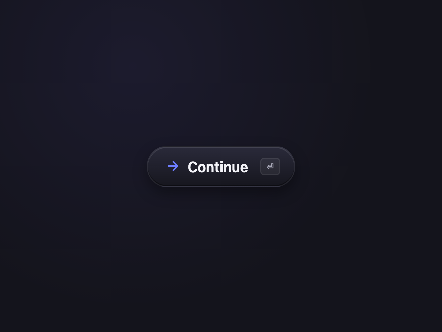
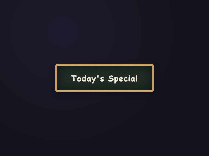
The Linear / Raycast / Vercel button trend of 2026 — soft gradient pill with a crisp inset highlight, ambient glow, and a tiny shortcut chip on the right.
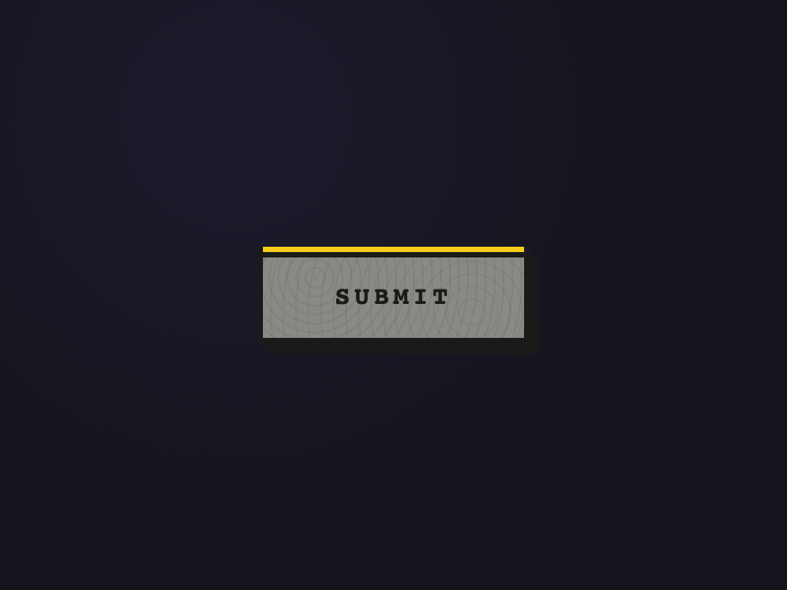
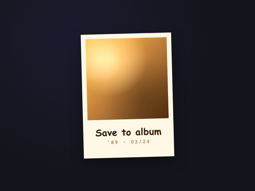
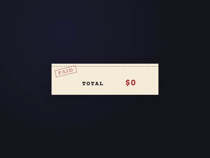
Newsprint-cream receipt with a dashed perforation along the top, a tilted "PAID" rubber stamp watermark in the top-left corner, and a total that counts up on click before resetting.
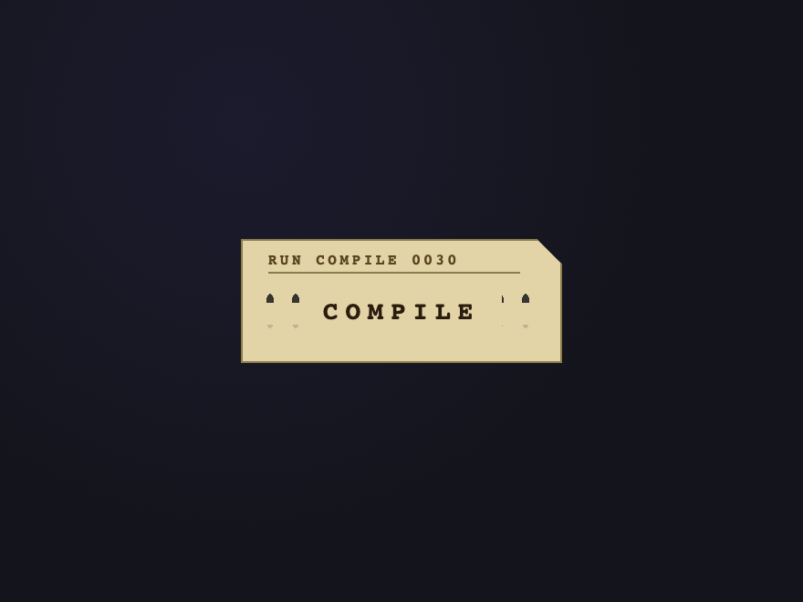
Manila IBM-style punch card with the iconic clipped top-right corner, a stamped FORTRAN-style header at the top, and a real grid of column-and-row holes punched through the body.
Start from a real button element, then style it: set padding, a background or gradient, border-radius, font-weight, and cursor: pointer. Add a :hover and :active state with a transition so the change is smooth, and a :focus-visible outline so keyboard users can see focus. Every button design in this gallery is built this way — open any demo's code panel to copy the exact CSS.
Should I use a button or an a element for a CSS button?
Use a button element when the control performs an action on the same page (submit, toggle, add to cart, open a dialog). Use an a element when it navigates to another URL. They can look identical with CSS, but the semantics matter for accessibility and SEO: a button is announced as a button and fires on Space, a link is announced as a link and is crawlable. Don't style a div as a button — it loses keyboard and screen-reader support.
Do these CSS buttons need JavaScript?
Most are pure CSS. The visual designs — gradients, materials, and hover and click effects like the magnetic mercury ripple, neon plasma burst, clay press and glitch — are done entirely with CSS transitions, animations and pseudo-elements. A few interactive use-case buttons (Download Progress, Confirm Delete, Subscribe Confetti) include a small self-contained JS snippet in the JS tab for behaviour CSS can't do.
How do I add a ripple or click effect to a button in CSS?
Use a pseudo-element that scales up from the centre. Put position: relative on the button, add an ::after that starts at scale(0) with a radial-gradient or solid circle, and on :active animate it to a larger scale with fading opacity. The Magnetic Mercury and ink-spread demos here show copy-paste ripple effects that need no JavaScript.
Are these CSS buttons accessible and free to use?
Yes to both. Every demo uses a real button element with a visible :focus-visible state, sufficient colour contrast, and aria-label on icon-only buttons; continuous animations honour prefers-reduced-motion. All 43 designs are MIT licensed — free for personal and commercial projects, no attribution required.