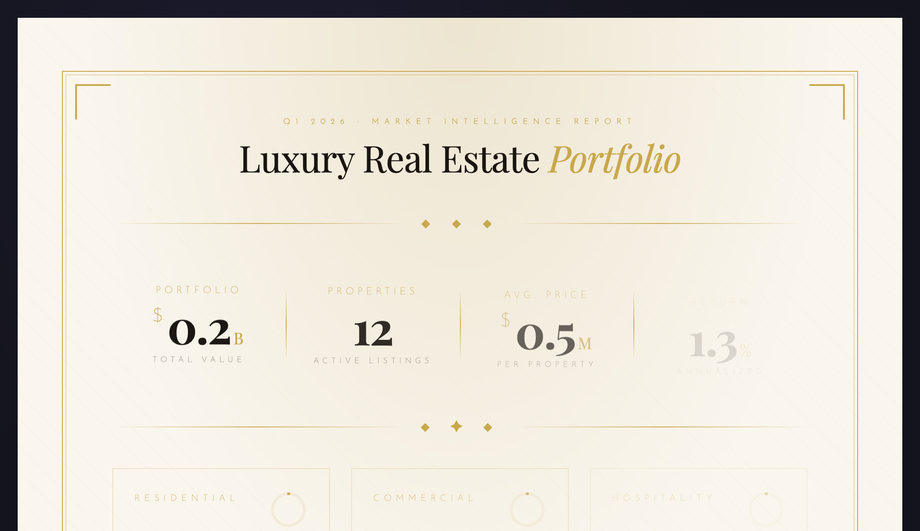
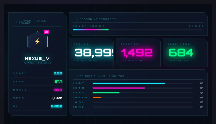
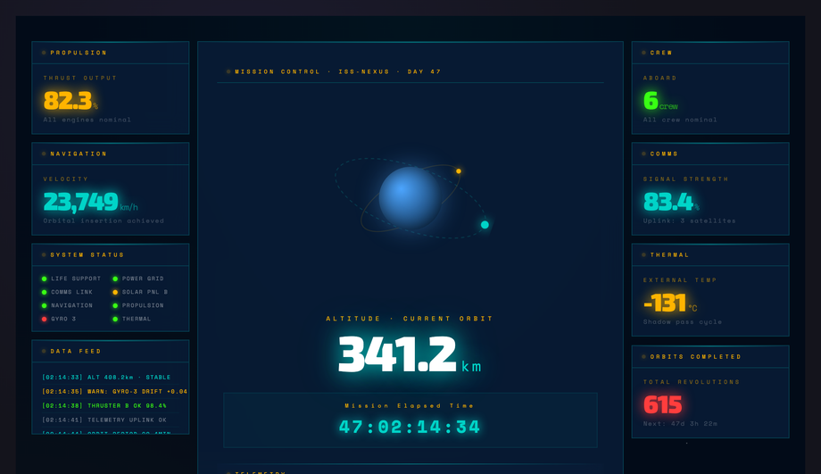
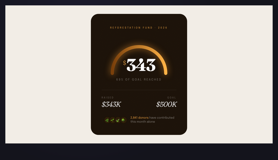
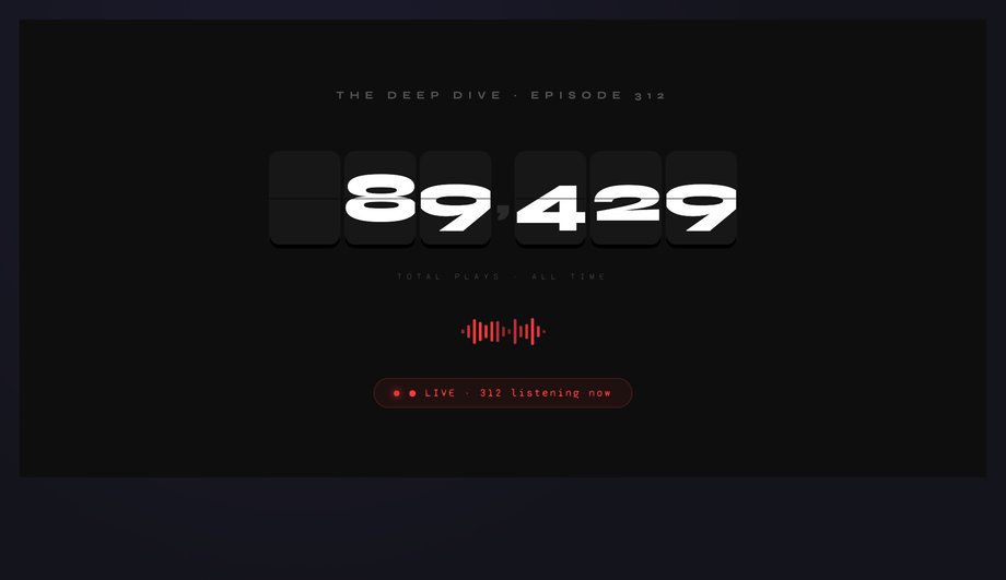
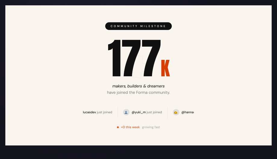
An animated stat counter turns a static number into a moment of motion — the count-up that earns the user’s attention before the number itself lands. Each demo below is a complete composition: the count-up paired with the chrome around it — progress bars, ring charts, ticker tapes, flip digits, sparklines, status dots — so you can drop one in as a finished dashboard moment rather than a counter in isolation. The JavaScript is tiny (a requestAnimationFrame loop with easing, zero dependencies); the visual chrome is pure CSS.
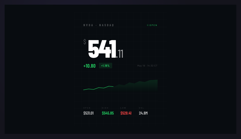
Dark Bloomberg-esque block with a massive Barlow Condensed price counting up to $924.18, a green sparkline drawing itself in, and live decimal micro-flicker. OHLC row counts up simultaneously. Built for fintech apps, portfolio trackers and trading dashboards.
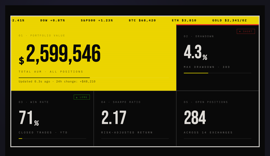
Raw high-contrast trading-desk dashboard with a live scrolling ticker tape, a featured portfolio counter, scanline overlay and neon-yellow progress bars.
A number counter animation is a small interaction where a static figure — a revenue number, a user count, a stat — animates from zero (or another starting value) up to its real value, usually over one to three seconds with an easing curve. It is one of the most common motion patterns on landing pages and dashboards because it gives an otherwise lifeless number a sense of arrival, drawing the user's attention exactly where you want it. The 15 demos here pair the count-up with the chrome around it — progress bars, ring charts, ticker tapes, flip digits, status dots — so each one is a complete composition rather than a counter in isolation.
Do CSS counter animations need JavaScript?
For a true count-up where the digits actually scroll through every intermediate value, you need a small amount of JavaScript — a requestAnimationFrame loop that interpolates a number from 0 to its target with an easing function, writing the rounded value into the element on every frame. CSS alone can animate visual properties (opacity, transform, width), but it cannot drive a textNode through a numeric sequence. The good news is the JavaScript is genuinely tiny — about 15 lines per demo here, zero dependencies — and the visual chrome (progress fills, ring charts, ticker scrolling, breathing glows) is all pure CSS.
How do I trigger a counter to animate only when it scrolls into view?
Wrap the count-up logic in an IntersectionObserver. Create the observer with a threshold of 0.3 or so, point it at the counter element, and when the entry intersects, start the requestAnimationFrame loop and disconnect the observer so it does not re-fire. This is the right pattern for counters lower on the page — without it, the animation runs while the section is still offscreen and the user arrives at a static final number. The JS in these demos is structured as a simple init function, so wrapping it in an observer is a five-line change. Remember to call the init immediately if prefers-reduced-motion is on, so the final value is always visible.
What is the @property approach to counter animations?
CSS @property lets you register a custom property as a number, then animate it like any other animatable value. Combined with the counter() function or content rendering, you can build a pure-CSS counter that ramps up over time without JavaScript. It is elegant, but it has two real-world limits: the rendered number tends to be a single typographic style with no easy way to format thousands separators or decimals, and browser support is good but newer than the requestAnimationFrame approach. These demos use the JS approach because it produces formatted, locale-aware numbers (1,847 not 1847) and works everywhere today; @property is a great option for simpler counters.
How long should a counter animation last?
A range of 1.5 to 2.5 seconds is the sweet spot. Too fast (under a second) and the number feels punched into place rather than counted; too slow (over three seconds) and the user moves on before the figure has settled. Pair the count-up with an ease-out curve so the early part is brisk and the final digits settle gently — that final easing is what makes the motion feel deliberate rather than mechanical. Several demos here also stagger their counters by a few hundred milliseconds across the dashboard, so the eye is pulled through the layout rather than every figure arriving at once.
Can I use these counters in React, Vue or Svelte?
Yes — the JavaScript here is framework-agnostic. In React, drop the count-up logic into a useEffect that runs once on mount and writes to a ref attached to the number span, so the framework's render cycle never has to re-render on every animation frame (which would tank performance). In Vue and Svelte, the same idea applies: bind the loop to a ref / DOM node and let it write textContent directly. The HTML and CSS port unchanged — only the lifecycle hook around the count-up loop changes. Strip the IIFE wrapper from the demo JS and you have a function you can call from any framework's mount hook.
Do counter animations hurt Core Web Vitals or page performance?
Not if you build them right. requestAnimationFrame yields between frames, so a count-up loop will not block the main thread for layout or input. Each demo here animates a single number (or a small handful) — that is well under any budget. The two things to watch are: writing to textContent does trigger a layout if the number's character width changes, so keep the counter inside a fixed-width container or use a tabular-numeric font feature; and never count up a number that is below the fold without an IntersectionObserver gate, because you are spending frames on something the user cannot see. None of the demos here measurably affect LCP, CLS or INP in testing.
Are these counter animations accessible?
Yes. Every demo honours prefers-reduced-motion — when a user has asked for less motion, the count-up resolves to its final value instantly and the entrance animations are suppressed, so the page is still complete and readable. Numbers are rendered as real text in the DOM (not as background images), so screen readers announce the final value correctly. Make sure the surrounding label is paired with the number so the announcement reads as 'Win Rate, 78 percent' rather than just '78' — the demo HTML keeps the label adjacent for exactly this reason. For counters representing live data, add aria-live='polite' to the parent so screen readers announce updates without interrupting the user.