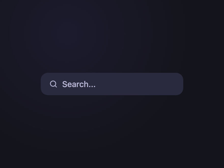
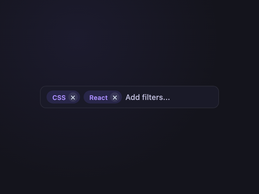
A CSS search box is the input where users type a query to find content on a site or in a product. These 32 hand-coded designs are ready-to-ship search bars with autocomplete, scope filters, and command-palette variants — copy the markup, wire to your search handler, and ship.
32 unique searches24 Pure CSS8 CSS + JS100% copy-paste readyPublished
01 / 32
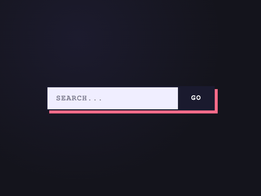
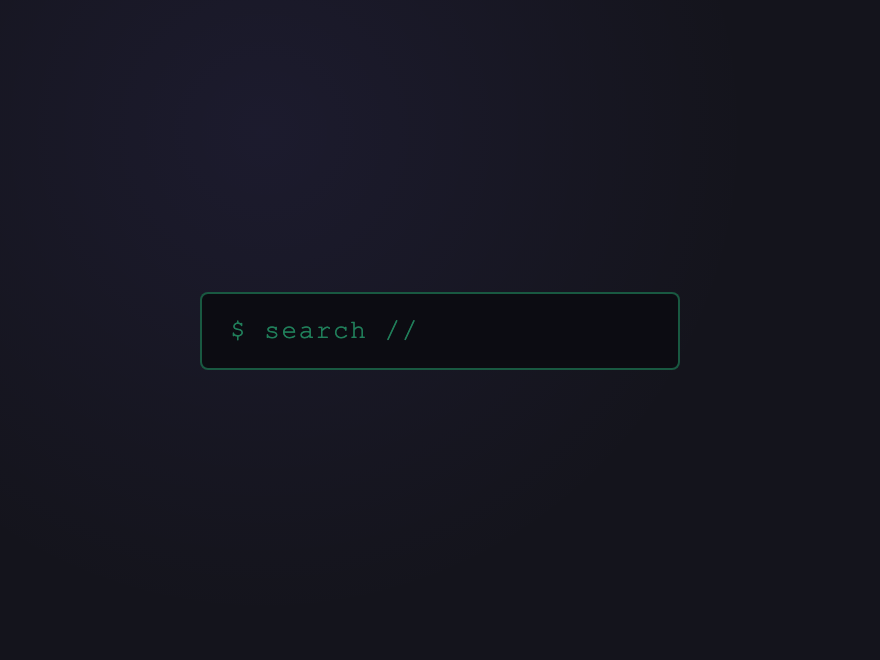
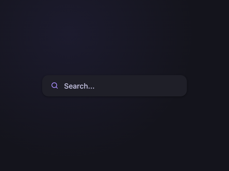
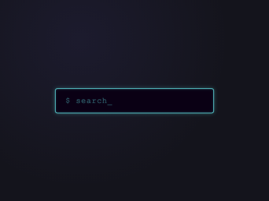
Minimal Underline
Pure CSS
Borderless input with a thin bottom rule that animates outward from the centre on focus — the cleanest pattern that still signals interactivity.
On focus, a single accent line sweeps left-to-right across the bottom of the input — a one-shot reveal that signals "this field is active" without any perpetual motion.
Wrap input type=search inside a form with role=search and pair it with a real label (visually hidden if needed). The form lets users submit with Enter; the type=search adds a clear button on iOS and triggers SMS-style suggestions on mobile; role=search is the WAI-ARIA landmark that lets screen-reader users jump directly to it.
How do I make a clear button appear only when there's text?
Pure CSS, no JavaScript: use the :placeholder-shown pseudo-class on the input. When the field is empty the placeholder shows, so input:placeholder-shown ~ .clear { opacity: 0; }. When the user types, the placeholder hides, the clear button appears. Combine with :has() to drive parent state too.
How do I add a CSS search animation when the input is focused?
Animate the search bar on :focus or :focus-within. Common search-animation patterns: a collapsed icon-only bar that expands its width into a full input, an underline that wipes in from left to right, a magnifier icon that slides and morphs into a clear (X) icon, or a soft glow ring. All of it is done with transition on width, transform, and box-shadow — no JavaScript. Several demos in this gallery show focus-driven search animations you can copy directly.
What's the difference between a search box and a search bar?
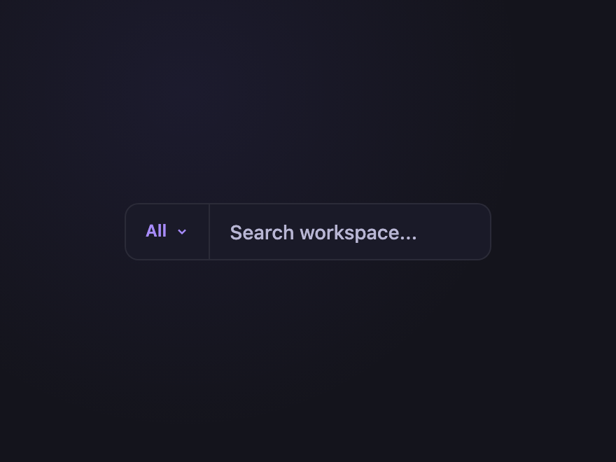
There's no real difference — search box, search bar, and search field all describe the same component: an input type=search where the user types a query. 'Search bar' usually implies a wider, full-width input (common in site headers), while 'search box' often implies a more compact one, but the HTML and CSS are identical. Every design in this gallery works at any width.
Are these CSS search boxes accessible?
Yes. Every demo uses a real label associated with input type=search inside a form role=search. Voice and clear buttons have aria-label. Autocomplete dropdowns implement the full combobox pattern (aria-controls, aria-expanded, aria-activedescendant, role=listbox/option) so screen readers announce options correctly.
Do I need JavaScript for autocomplete and recent searches?
Yes for the data, no for the visuals. The dropdowns themselves open and close via :focus-within or :checked — pure CSS. JS is only needed to filter results based on what the user typed and to persist recent searches in localStorage. Each interactive demo includes a self-contained JS snippet.
Will browser autofill work with these search boxes?
Yes. Each input keeps the native input type=search with name attribute, so browser autofill, suggestion history, and password manager search are all preserved. The custom styling never breaks native behaviour.


