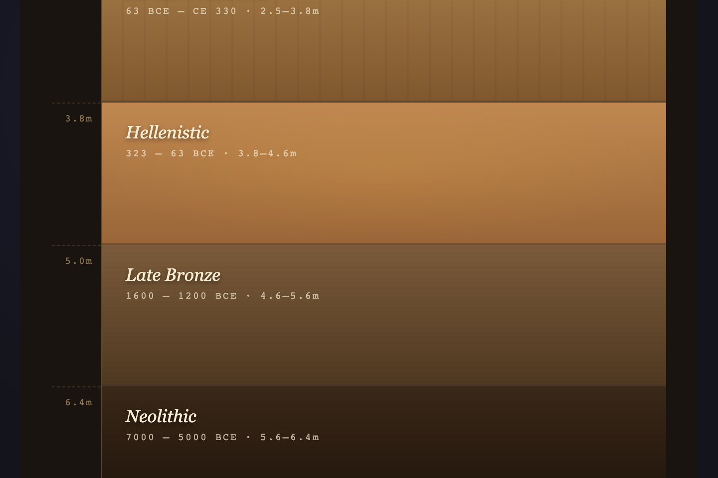
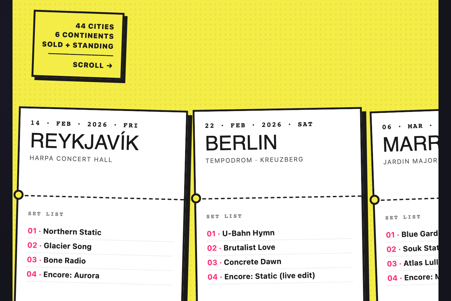
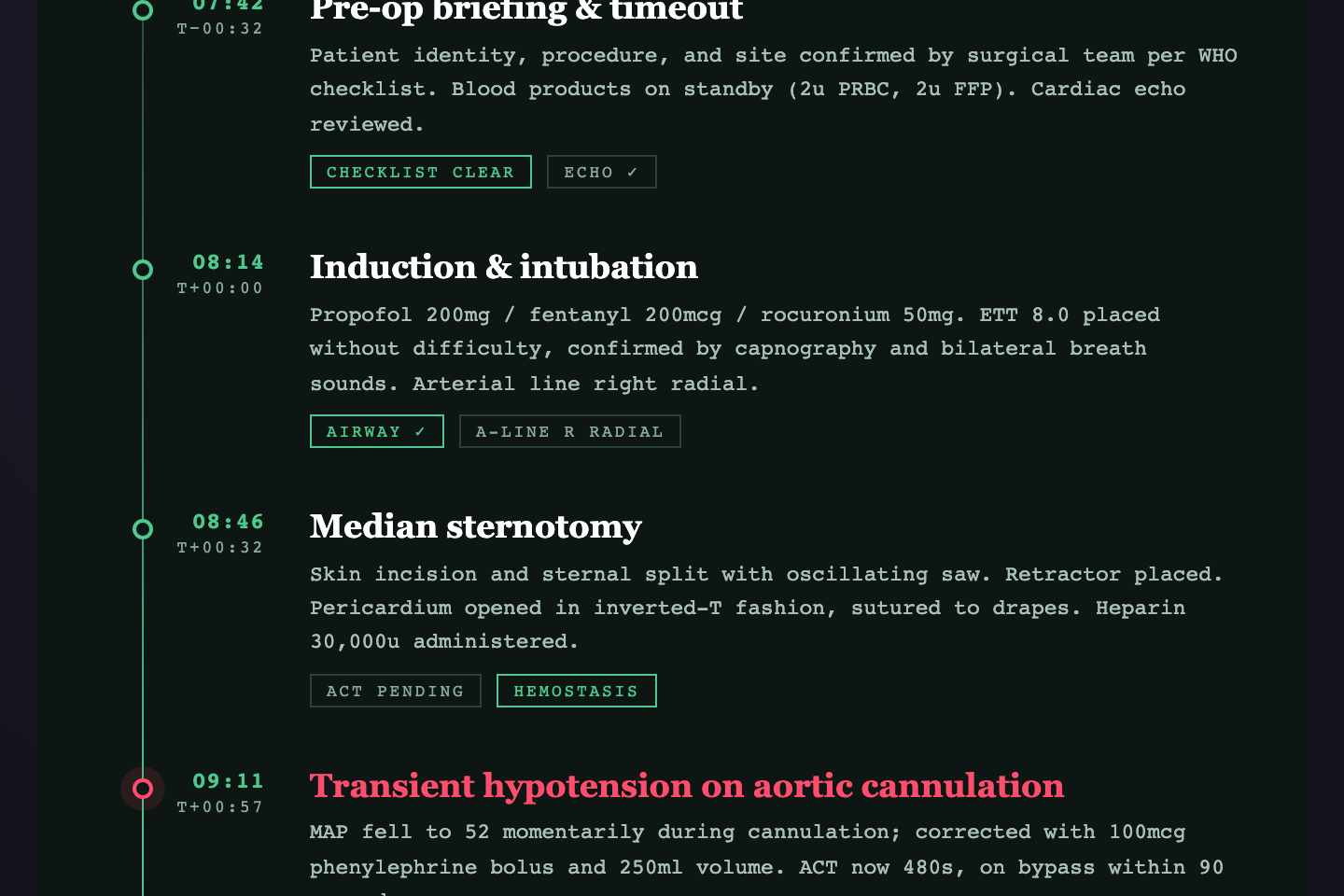
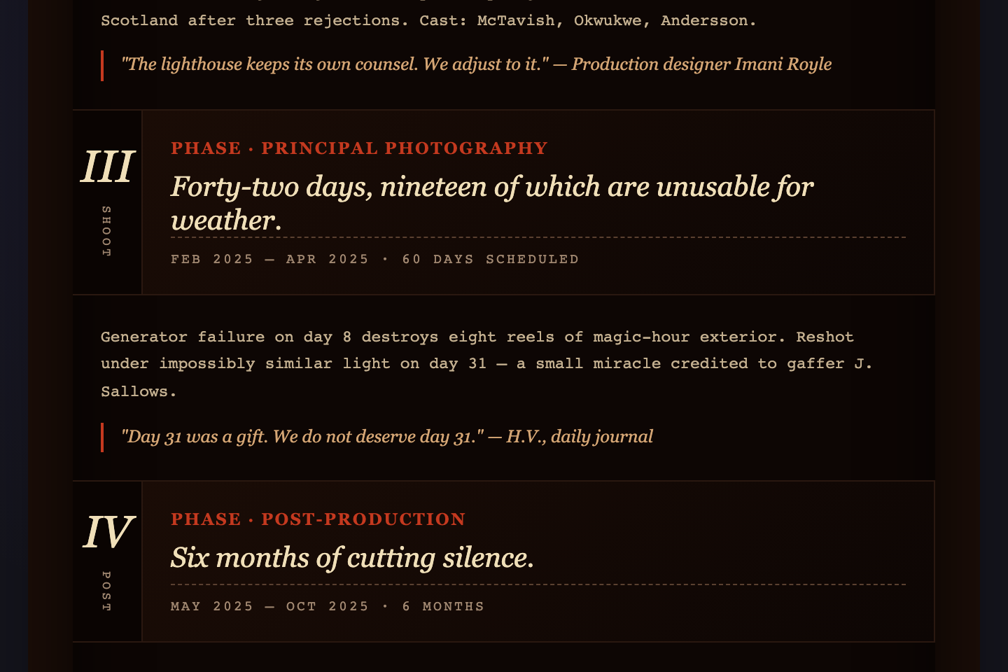
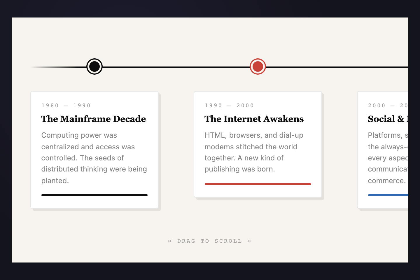
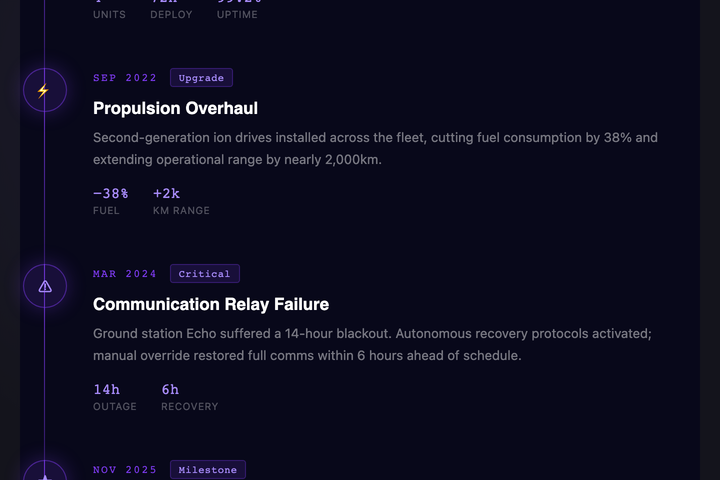
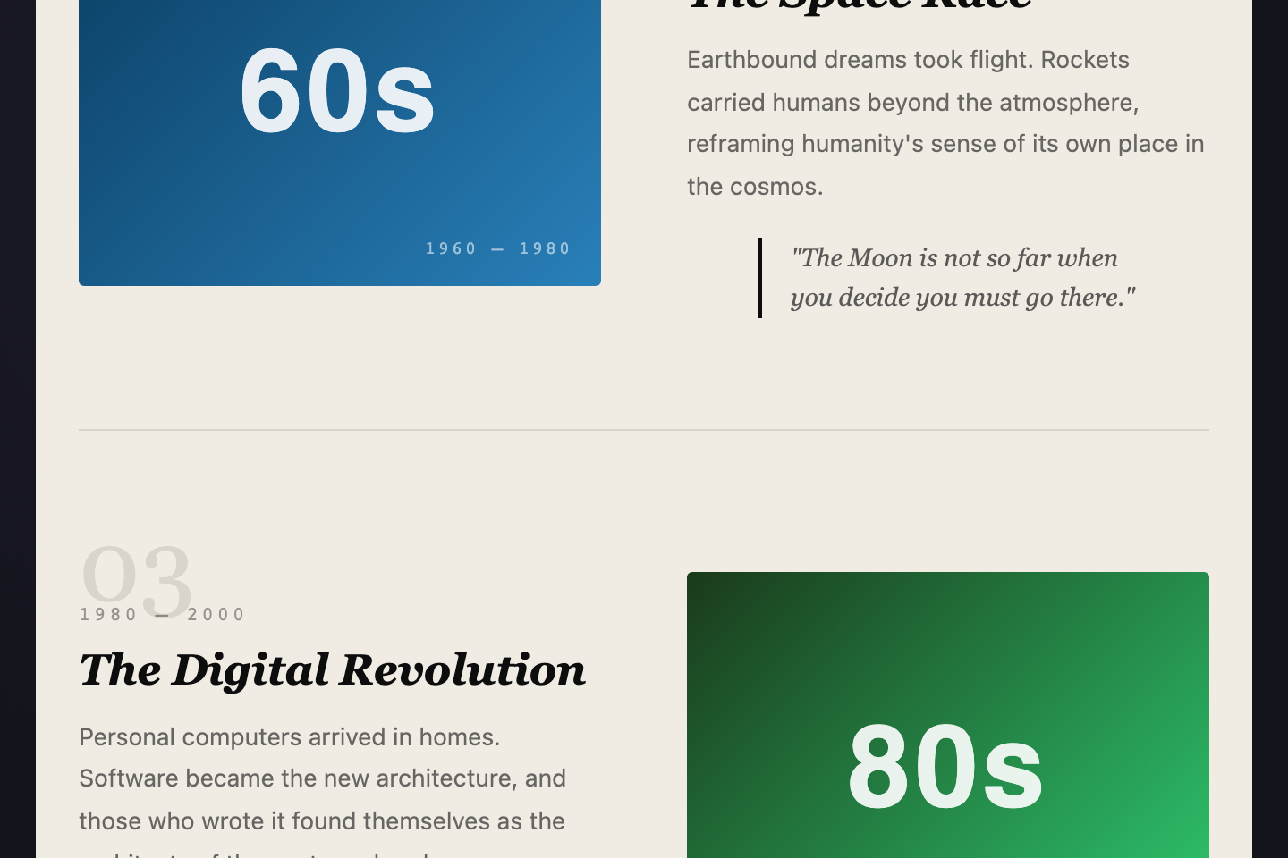
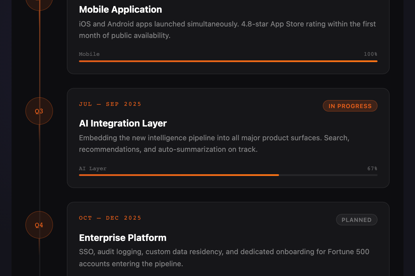
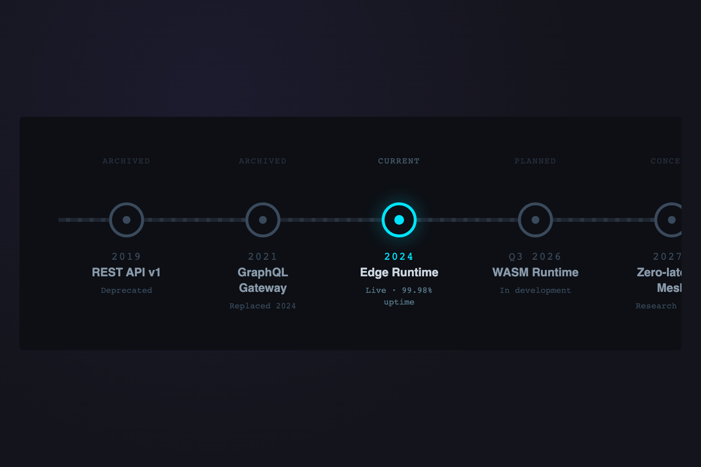
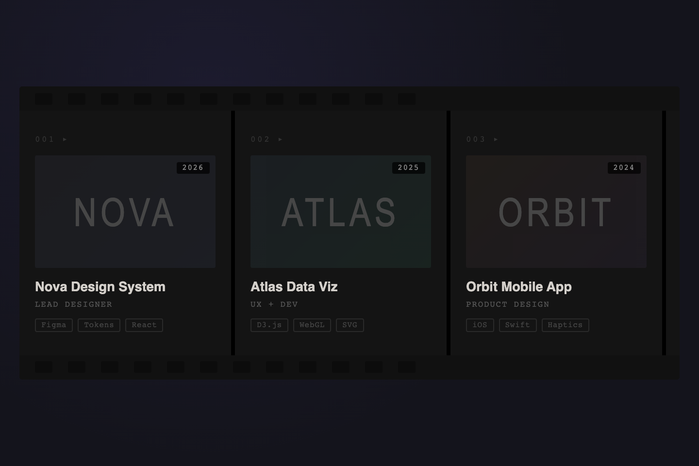
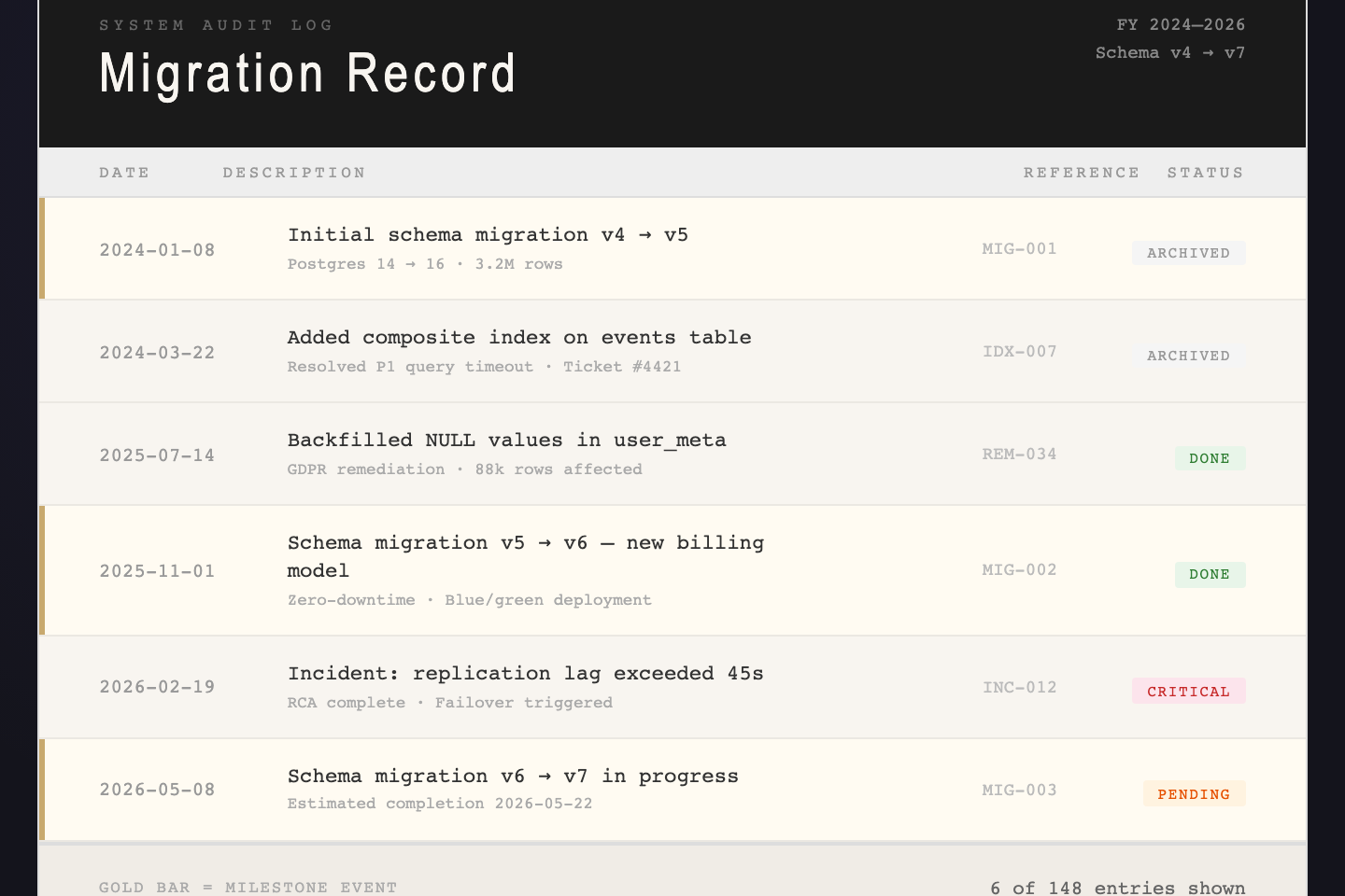
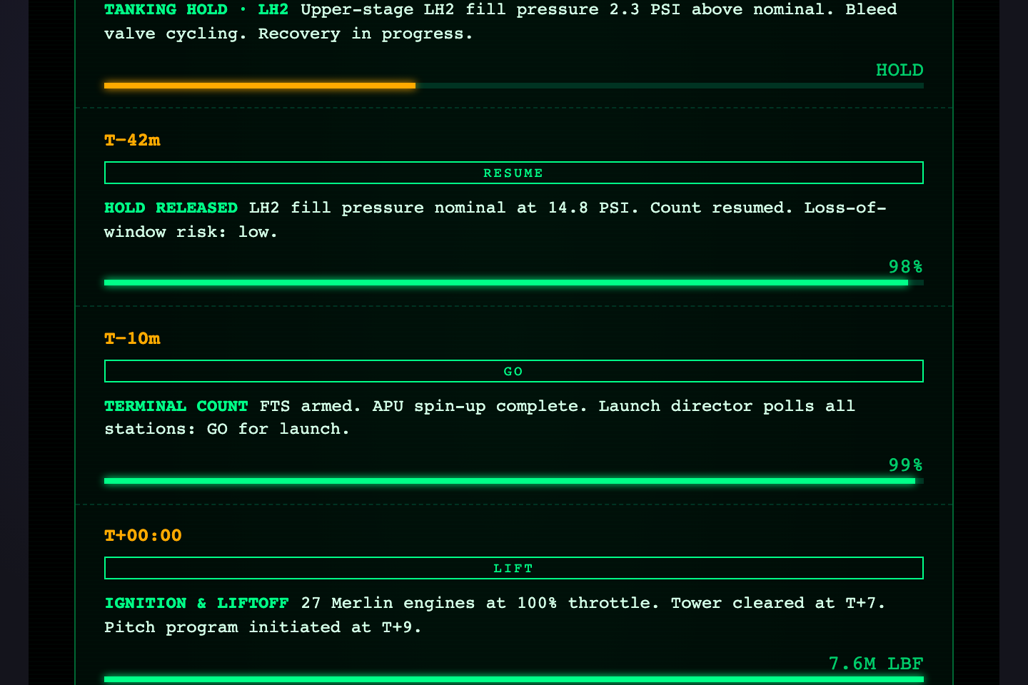
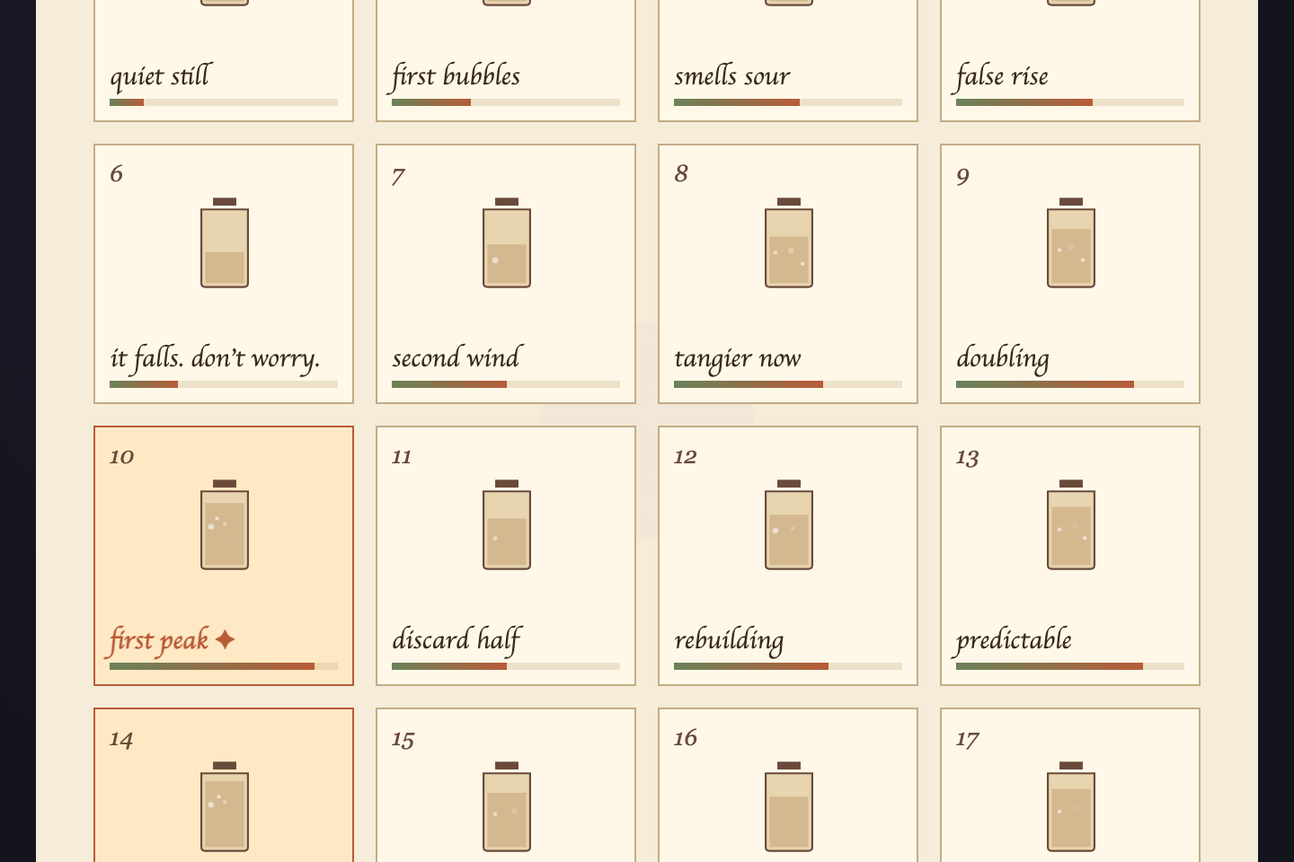
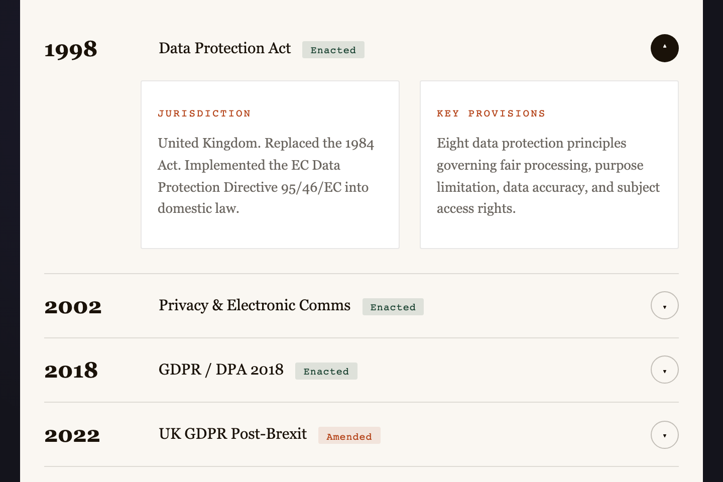
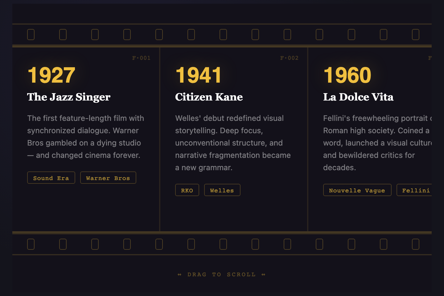
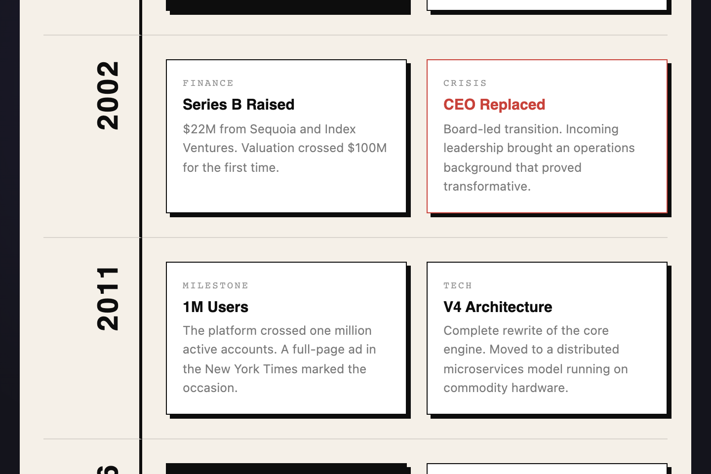
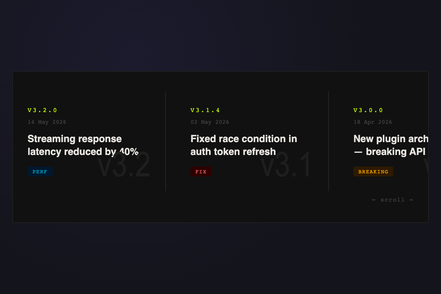
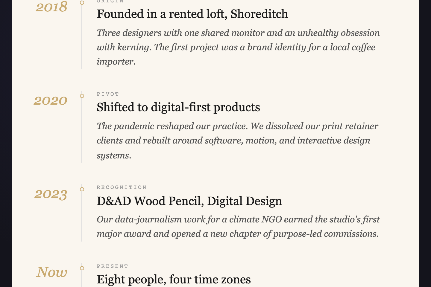
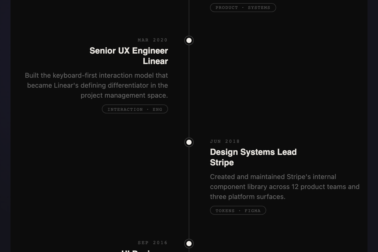
A CSS timeline is a layout that orders information chronologically or sequentially — milestones, events, log entries, or stages laid out for the eye to scan. These 24 hand-coded timelines are tuned to real-world contexts: patient records, legal history, film production, sustainability reporting, incident postmortems, and museum retrospectives. Copy the markup, replace the data, ship.
Vertical hover-expand archaeological cross-section. Each layer is a geological era — flex-grow reveals finds when hovered, with a depth ruler on the left and an artifact card panel on the right. Built for museum dig reports, geological surveys, and historical site catalogues.
Horizontal snap-scroll strip of concert ticket stubs. Each card carries a city, venue, set list, and a hand-stamped seal — slightly rotated, with dashed tear-perforations and offset shadows. Built for tour archives, festival lineups, and any event-driven brand history.
Clinical procedural timeline with a live EKG SVG trace, four colour-coded readouts (HR, SpO₂, BP, temp), and alert pulses on critical events. Built for surgical case logs, anaesthesia records, and incident retrospectives in healthcare environments.
Vertical cinema reel with sprocket-hole borders top and bottom, three-column frames (frame number, scene still, director notes), and an Italianate Playfair display headline. Built for production diaries, film festival retrospectives, and any project broken into named phases.
Space-program terminal aesthetic with T-minus countdown, telemetry rows, status pills (GO, HOLD, CRIT) and per-event gauge bars driven by --g custom properties. CRT scanlines and phosphor glow give a Cape Canaveral readout feel. Built for launch logs, deploy timelines, and ops postmortems.
Hand-drawn 21-day grid where each day is a glass jar SVG with rising bubble animations and an activity bar. Soft EB Garamond + Caveat typography on cream paper. Peak days are highlighted in terracotta. Built for time-lapse projects, recipe diaries, and any patient process measured by days.
Conversational thread format where each moment reads like a message. Tight left-aligned thread line with chat-bubble entries and system-event dividers. Perfect for healthcare patient histories, support ticket logs, or onboarding checklists that tell a human story step by step.
Collapsible year-rows that expand to reveal structured detail panels. Built for legislation history, contract amendments, compliance records — anywhere dense information must be scannable before it is readable. The accordion uses a small onclick handler so only one row stays open at a time.
Horizontal film reel you drag to explore. Sprocket holes, warm amber type, and frame numbers give it a physical celluloid feel — ideal for film studies, festival histories, or any media company timeline that wants to read as cinema rather than spreadsheet.
Stepping stones along a dashed path. Each milestone is anchored by an icon gem, a year marker, and impact tags. Earthy greens, alternating left/right layout, and an organic visual rhythm — made for environmental reports, ESG storytelling, and brand sustainability journeys.
Terminal-style incident timeline. Each log line carries a timestamp, severity level, and event detail. Scanlines, mono fonts, and blinking critical alerts create genuine operational tension. Built for incident reports, security audits, deployment postmortems.
Gallery-wall layout with geometric ornamentation, italic serif eras, and curated work tags. Indigo on cream with diamond decorations and serif grandeur — for museums, heritage brands, artist retrospectives, and any institution whose history should feel like a permanent collection.
Classic alternating layout with a glowing red center spine and editorial dot markers. Items zigzag left and right along a vertical line — the most recognizable timeline pattern, refined with bold serif type and a moody dark canvas.
A draggable horizontal ribbon of era cards above a ruled line. Each card gets its own accent color, building a rainbow chronology you can scroll left-to-right. Made for tech histories, product evolution, brand decades.
A glowing purple spine anchors event icons to detailed metric cards. Dark, dense, and data-forward — built for engineering dashboards, mission logs, and product announcements where every event needs numbers attached.
Magazine-style two-column alternating layout with large gradient visuals, italic serif headings, and pull quotes. Refined type on warm paper — built for retrospectives, brand histories, and long-read feature articles.
Left-anchored trail with per-card progress bars and status pills. Built for product roadmaps, quarterly OKRs, and milestone trackers where each step carries a percentage and a "done / in progress / planned" state.
Raw borders, offset shadows, and a rigid year-column grid. Vertical year labels in the left rail; two-up event blocks in the right rail. No softness — just structure, contrast, and impact. For brand histories that want to read as built, not designed.
Horizontal snap-scroll changelog with giant ghost version numerals behind each card and colour-coded tags (Feature / Fix / Breaking / Perf). Built for software release notes, version histories, and product update streams.
Magazine-style vertical with italic display years on the left of a hairline gold rule, kicker labels, Instrument Serif titles, and Crimson Pro italic body copy on warm paper. Built for company histories, personal biographies, and long-read editorial features.
Dark alternating left/right layout with a faded center spine and ringed dot markers. Each entry carries a date, two-line heading, body copy, and a discipline pill. Built for career histories, CVs, and project milestone retrospectives.
Horizontal stations on a dashed track with one active station glowing cyan. Each station has a status header (Archived / Current / Planned / Concept), year, name, and sub-line. Built for product roadmaps, technology evolution, and API version maps.
Horizontal portfolio reel with sprocket holes top and bottom, gradient project tiles with year stickers, role line, and tech-stack chips. Built for design portfolios, case-study indexes, and creative project galleries.
Financial-grade audit log table with a dark masthead, column ruling, status badges (Done / Pending / Critical / Archived), and a gold left-edge marker on milestone rows. Built for database migration history, compliance records, and incident logs.
A CSS timeline is a layout that orders information sequentially — usually chronologically — so the reader can scan the story before diving into details. Common implementations include vertical thread layouts, horizontal filmstrips, accordion year-rows, stepping-stone paths, grid-based brutalist patterns, audit-style ledgers, changelog tickers, station-stop roadmaps, and domain-themed treatments like archaeological strata, surgical vitals traces, mission-control logs, or hand-drawn day calendars. The right choice depends on whether the content reads as conversation, archive, retrospective, operational log, product roadmap, release stream, audit record, or slow daily process.
Vertical or horizontal timeline — which should I use?
Vertical timelines (Stratigraphy, Vitals, Film Reel, Mission Control, Fermentation Calendar, Thread, Accordion, Nature Trail, Art Deco, Terminal, Vertical Centered, Neon Left Rail, Stacked Progress, Editorial, Brutalist Grid, Editorial Spine, Split Screen, Ledger) suit dense storytelling with multiple paragraphs per entry — the eye naturally scrolls top-to-bottom. Horizontal timelines (Tour Stub, Cinematic Filmstrip, Horizontal Scroll, Ticker Tape, Railroad Stations, Film Strip Portfolio) suit short visual entries where comparing adjacent items matters — tickets, film posters, era cards, version cards, stations, project frames. Avoid horizontal scroll on mobile unless drag-to-scroll or snap-scroll feels intentional.
How do I make a timeline accessible?
Use semantic markup wherever possible. Real headings for entry titles, real lists where the items are a list, aria-label on the timeline container, and aria-hidden on decorative dots/icons. The Accordion uses an inline onclick you can replace with a proper button + aria-expanded for production. Terminal Log, Vitals, Mission Control, Fermentation, and Editorial Spine respect prefers-reduced-motion where animation is decorative. Every demo's reading order is correct so a screen reader walks the timeline cleanly even without ARIA tags.
Can I use these without JavaScript?
Twenty-one of the twenty-four are pure CSS/SVG. Three carry small JS helpers: Accordion (one 5-line toggle function), Cinematic Filmstrip (10-line drag-scroll IIFE), and Horizontal Scroll (same drag-scroll pattern). The JS lives in each demo's js field so you can copy HTML + CSS alone if you don't need the interaction, or paste all three for the full demo. The field-study demos and the documentation volume (Stratigraphy, Tour Stub, Vitals, Film Reel, Mission Control, Fermentation, Ticker Tape, Editorial Spine, Split Screen, Railroad, Film Strip Portfolio, Ledger) ship with zero JavaScript — animations and interactions are pure CSS, including the EKG trace and the rising fermentation bubbles.
How do I adapt these to my data?
Each demo is a structural template — replace the content but keep the markup hierarchy. The class prefix per demo (tl1- through tl24-) is scoped so you can paste multiple demos into the same project without collision. Most demos use CSS custom properties at the wrapper level for the dominant colours — change those and the whole demo retones. The display fonts come from Google Fonts (Anton, Playfair Display, Fraunces, EB Garamond, Caveat, VT323, Major Mono Display, Special Elite, Cormorant Garamond, IBM Plex Mono, JetBrains Mono, Syne, DM Mono, Instrument Serif, Bebas Neue, Crimson Pro, Space Mono) — keep the @import or swap to your own type stack.