20 examples Responsive Uses JS intermediate

20 CSS Tags & Chips Designs
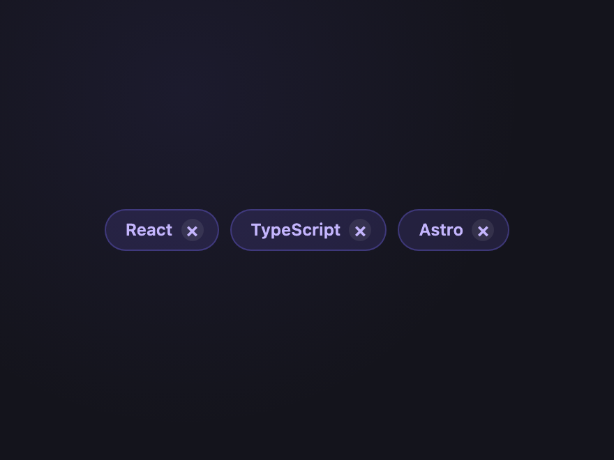
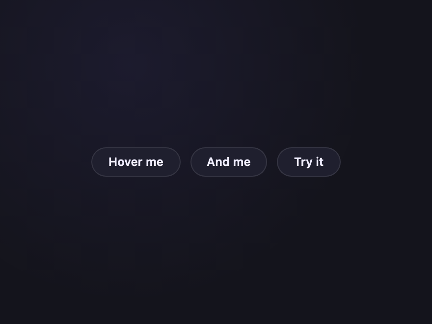
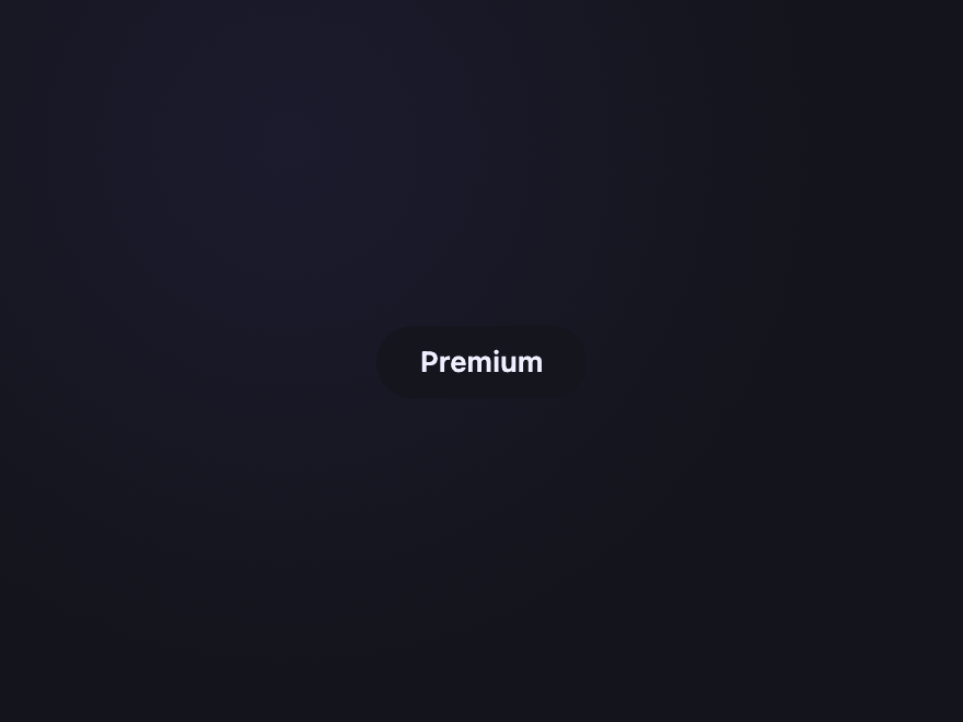
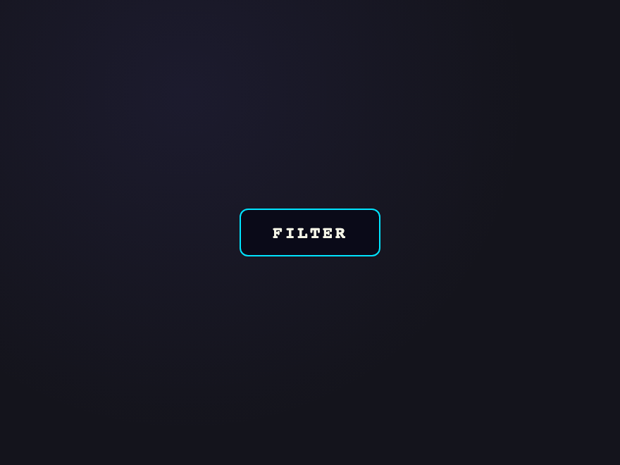
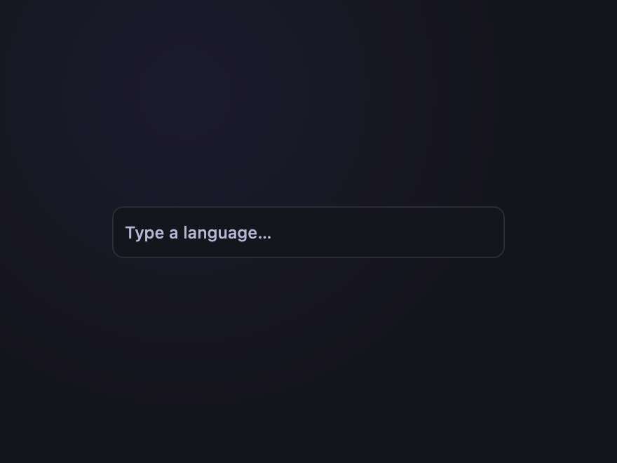
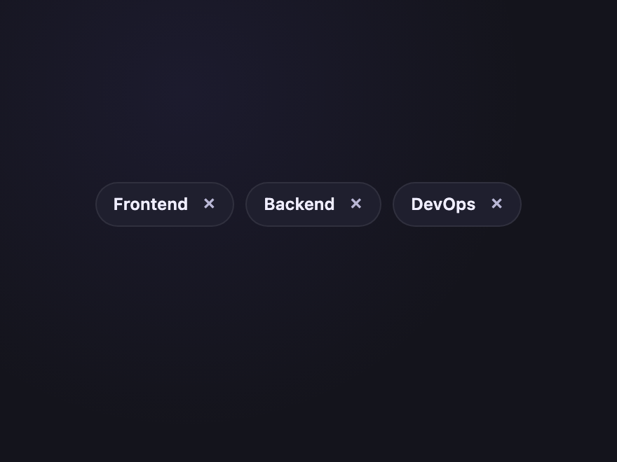
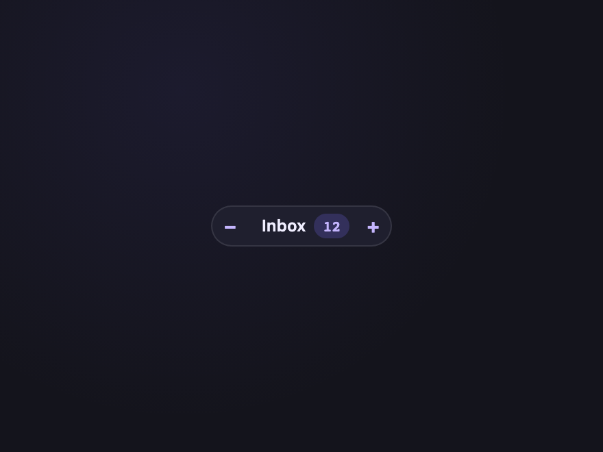
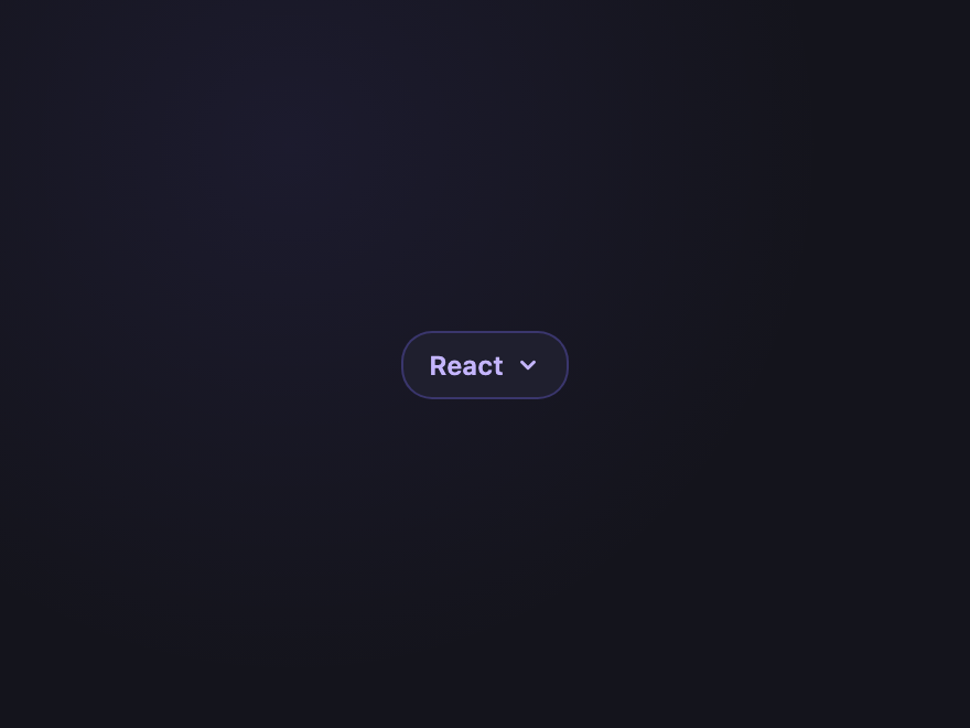
A CSS tag or chip is a compact, pill-shaped UI element used for filters, labels, selections, statuses, and metadata. These 20 hand-coded designs go beyond the standard pill-and-outline genre — they include a removable :has()-driven filter chip, a true @property-animated rotating border, a clip-path notched luggage tag, drag-to-reorder, full tag-input with autocomplete, remove-with-undo, marquee on overflow, semantic <details>-based expansion, and a complete lifecycle animation showing adding/active/removing states. Every demo uses semantic HTML, scoped class-based CSS, and JavaScript only where it adds real interaction.

20 hand-coded CSS tag and chip designs — removable filter, magnetic hover, sliding @property border, liquid fill, stack of three, notch luggage tag, glassmorphic, aurora outline, pixel grid, brutalist, gradient edge, status pulse, drag-to-reorder, autocomplete tag input, remove with undo, counter, marquee on overflow, expandable detail, linked group, and full lifecycle animation. Every demo uses semantic HTML, scoped class-based CSS, and JavaScript only where it adds real interaction.

20 unique chips 15 Pure CSS 5 Light JS WCAG-friendly Mobile-first MIT licensed
01 / 20
Removable Pill
Pure CSS
Three filter chips with × buttons that actually remove the chip — pure CSS via :has(:checked) hiding the parent. The canonical filter pattern, working without a single line of JS.
.ctc-rem { display: flex; flex-wrap: wrap; gap: 8px; }
.ctc-rem-chip {
  display: inline-flex; align-items: center; gap: 6px;
  padding: 6px 10px 6px 14px;
  background: rgba(124,108,255,0.14);
  color: #c4b5fd;
  border: 1px solid rgba(124,108,255,0.3);
  border-radius: 999px;
  font: 600 12px/1 system-ui, sans-serif;
  cursor: pointer;
  transition: opacity 0.2s, transform 0.2s;
}
.ctc-rem-chip:hover { background: rgba(124,108,255,0.22); }
.ctc-rem-x {
  display: inline-flex; align-items: center; justify-content: center;
  width: 16px; height: 16px;
  border-radius: 50%;
  background: rgba(255,255,255,0.08);
  font-size: 14px; line-height: 1;
  transition: background 0.15s;
}
.ctc-rem-chip:hover .ctc-rem-x { background: rgba(255,255,255,0.18); }
.ctc-rem-chip:has(:checked) { display: none; }
<div class="ctc-rem">
  <label class="ctc-rem-chip">
    <input type="checkbox" hidden />
    <span>React</span>
    <span class="ctc-rem-x" aria-hidden="true">×</span>
  </label>
  <label class="ctc-rem-chip">
    <input type="checkbox" hidden />
    <span>TypeScript</span>
    <span class="ctc-rem-x" aria-hidden="true">×</span>
  </label>
  <label class="ctc-rem-chip">
    <input type="checkbox" hidden />
    <span>Astro</span>
    <span class="ctc-rem-x" aria-hidden="true">×</span>
  </label>
</div>
02 / 20
Magnetic Hover
Pure CSS
On hover the chip text drifts toward the cursor edge via a CSS-only "magnet" trick — purely transition-based, no pointer math, no JS.
.ctc-mag { display: flex; gap: 10px; }
.ctc-mag-chip {
  position: relative;
  display: inline-flex; align-items: center;
  padding: 8px 16px;
  background: #1f1f2e;
  border: 1px solid rgba(255,255,255,0.1);
  border-radius: 999px;
  color: #f0eeff;
  font: 600 12px/1 system-ui, sans-serif;
  text-decoration: none;
  cursor: pointer;
  overflow: hidden;
  transition: border-color 0.2s, background 0.2s;
}
.ctc-mag-chip span {
  display: inline-block;
  transition: transform 0.35s cubic-bezier(0.34, 1.56, 0.64, 1);
}
.ctc-mag-chip:hover { background: #2a2a3e; border-color: #7c6cff; }
.ctc-mag-chip:hover span { transform: translateX(3px) scale(1.05); }
.ctc-mag-chip::before {
  content: '';
  position: absolute;
  inset: 0;
  background: radial-gradient(circle at var(--mx,50%) var(--my,50%), rgba(124,108,255,0.35), transparent 60%);
  opacity: 0;
  transition: opacity 0.25s;
}
.ctc-mag-chip:hover::before { opacity: 1; }
<div class="ctc-mag">
  <a href="#" class="ctc-mag-chip"><span>Hover me</span></a>
  <a href="#" class="ctc-mag-chip"><span>And me</span></a>
  <a href="#" class="ctc-mag-chip"><span>Try it</span></a>
</div>
03 / 20
Sliding Border
Pure CSS
A real @property-animated conic gradient traces around the chip on hover — true CSS angle animation, not the keyframes-on-position hack everyone else uses.
@property --ctc-angle {
  syntax: '<angle>';
  inherits: false;
  initial-value: 0deg;
}
.ctc-slide {
  position: relative;
  display: inline-flex; align-items: center;
  padding: 10px 20px;
  border-radius: 999px;
  background: #15151d;
  color: #f0eeff;
  font: 600 13px/1 system-ui, sans-serif;
  text-decoration: none;
  isolation: isolate;
}
.ctc-slide::before {
  content: '';
  position: absolute;
  inset: -1.5px;
  border-radius: inherit;
  background: conic-gradient(from var(--ctc-angle), #7c6cff, #ff6c8a, #2eb88a, #7c6cff);
  z-index: -1;
}
.ctc-slide:hover {
  animation: ctc-slide-spin 2.4s linear infinite;
}
@keyframes ctc-slide-spin {
  to { --ctc-angle: 360deg; }
}
@media (prefers-reduced-motion: reduce) { .ctc-slide:hover { animation: none; } }
<a href="#" class="ctc-slide">
  <span>Premium</span>
</a>
04 / 20
Liquid Fill
Pure CSS
Outline chip whose interior fills with brand colour from left-to-right on hover. Text colour inverts at the fill boundary using mix-blend-mode: difference.
.ctc-liquid {
  position: relative;
  display: inline-flex; align-items: center;
  padding: 10px 22px;
  border: 1.5px solid #00e5ff;
  border-radius: 6px;
  font: 700 12px/1 ui-monospace, monospace;
  letter-spacing: 0.14em;
  color: #00e5ff;
  text-decoration: none;
  overflow: hidden;
  background: #0a0a18;
}
.ctc-liquid::before {
  content: '';
  position: absolute;
  inset: 0; right: auto;
  width: 0;
  background: #00e5ff;
  transition: width 0.45s cubic-bezier(0.65,0,0.35,1);
}
.ctc-liquid:hover::before { width: 100%; }
.ctc-liquid span {
  position: relative;
  mix-blend-mode: difference;
  color: #fff;
}
<a href="#" class="ctc-liquid"><span>FILTER</span></a>
05 / 20
Stack of Three
Pure CSS
Chip rendered as three stacked layers offset by 2px each — depth illusion. On hover the layers fan out diagonally. Pure CSS via two ::before/::after pseudo-elements.
.ctc-stack {
  position: relative;
  display: inline-flex; align-items: center;
  padding: 9px 18px;
  background: #ff6c8a;
  color: #0a0a0a;
  border-radius: 4px;
  font: 700 12px/1 ui-monospace, monospace;
  letter-spacing: 0.1em;
  text-decoration: none;
  transition: transform 0.3s ease;
  z-index: 3;
}
.ctc-stack::before, .ctc-stack::after {
  content: 'DESIGN';
  position: absolute;
  inset: 0;
  display: inline-flex; align-items: center; justify-content: center;
  border-radius: inherit;
  font: inherit; letter-spacing: inherit;
  pointer-events: none;
  transition: transform 0.3s ease;
}
.ctc-stack::before { background: #f5a84a; transform: translate(2px, 2px); z-index: -1; color: transparent; }
.ctc-stack::after  { background: #2eb88a; transform: translate(4px, 4px); z-index: -2; color: transparent; }
.ctc-stack:hover { transform: translate(-2px, -2px); }
.ctc-stack:hover::before { transform: translate(4px, 4px); }
.ctc-stack:hover::after  { transform: translate(8px, 8px); }
<a href="#" class="ctc-stack">DESIGN</a>
06 / 20
Notch Chip
Pure CSS
Chip with a triangular notch cut into the left edge using clip-path — a real shape, not a background trick. Reads as a luggage tag or boarding-pass entry.
.ctc-notch {
  position: relative;
  display: inline-flex; align-items: center; gap: 12px;
  padding: 10px 18px 10px 28px;
  background: #ffd479;
  color: #0a0a0a;
  font: 700 11px/1 ui-monospace, monospace;
  letter-spacing: 0.16em;
  text-decoration: none;
  clip-path: polygon(12px 0%, 100% 0%, 100% 100%, 12px 100%, 0% 50%);
  transition: transform 0.25s ease, background 0.25s ease;
}
.ctc-notch-hole {
  width: 6px; height: 6px;
  border-radius: 50%;
  background: rgba(0,0,0,0.6);
  flex-shrink: 0;
}
.ctc-notch:hover { transform: translateX(2px); background: #ffe4a3; }
<a href="#" class="ctc-notch">
  <span class="ctc-notch-hole" aria-hidden="true"></span>
  <span class="ctc-notch-text">FIRST CLASS</span>
</a>
07 / 20
Glassmorphic
Pure CSS
Frosted-glass chip with backdrop-blur over a coloured page background. Translucent surface, white border, soft inner highlight.
.ctc-glass-bg {
  display: flex; gap: 8px; flex-wrap: wrap;
  padding: 24px;
  border-radius: 14px;
  background: linear-gradient(135deg, #7c6cff 0%, #ff6c8a 100%);
}
.ctc-glass {
  display: inline-flex; align-items: center;
  padding: 7px 14px;
  border-radius: 999px;
  background: rgba(255,255,255,0.18);
  border: 1px solid rgba(255,255,255,0.3);
  backdrop-filter: blur(12px);
  -webkit-backdrop-filter: blur(12px);
  box-shadow: inset 0 1px 0 rgba(255,255,255,0.4);
  color: #fff;
  font: 600 12px/1 system-ui, sans-serif;
  text-decoration: none;
  transition: background 0.2s;
}
.ctc-glass:hover { background: rgba(255,255,255,0.28); }
<div class="ctc-glass-bg">
  <a href="#" class="ctc-glass">Glass</a>
  <a href="#" class="ctc-glass">Frosted</a>
  <a href="#" class="ctc-glass">Blur</a>
</div>
08 / 20
Aurora Outline
Pure CSS
Continuously rotating conic-gradient border (violet → pink → mint) using @property for true angle animation. The chip stays still, only the rim rotates. Honours prefers-reduced-motion.
@property --ctc-aurora-angle {
  syntax: '<angle>';
  inherits: false;
  initial-value: 0deg;
}
.ctc-aurora {
  position: relative;
  display: inline-flex; align-items: center;
  padding: 10px 20px;
  border-radius: 999px;
  background: #0d0d16;
  color: #fff;
  font: 700 11px/1 ui-monospace, monospace;
  letter-spacing: 0.18em;
  text-decoration: none;
  isolation: isolate;
  --ctc-aurora-angle: 0deg;
  animation: ctc-aurora-rotate 6s linear infinite;
}
.ctc-aurora::before {
  content: '';
  position: absolute;
  inset: -2px;
  border-radius: inherit;
  background: conic-gradient(from var(--ctc-aurora-angle), #7c6cff, #ff6c8a, #2eb88a, #7c6cff);
  z-index: -1;
}
@keyframes ctc-aurora-rotate {
  to { --ctc-aurora-angle: 360deg; }
}
@media (prefers-reduced-motion: reduce) { .ctc-aurora { animation: none; } }
<a href="#" class="ctc-aurora">
  <span>NEW</span>
</a>
09 / 20
Pixel Grid
Pure CSS
Chip background is a tiny dotted CSS pattern reading as retro/print. On hover the dot density increases via background-size transition.
.ctc-pixel {
  display: inline-flex; align-items: center;
  padding: 9px 18px;
  border: 2px solid #f5a84a;
  border-radius: 4px;
  background-color: #1a1410;
  background-image: radial-gradient(#f5a84a 1px, transparent 1px);
  background-size: 8px 8px;
  background-position: 0 0;
  color: #f5a84a;
  font: 700 12px/1 ui-monospace, monospace;
  letter-spacing: 0.14em;
  text-decoration: none;
  transition: background-size 0.4s ease, color 0.2s ease, border-color 0.2s ease;
}
.ctc-pixel:hover { background-size: 4px 4px; color: #ffd479; border-color: #ffd479; }
<a href="#" class="ctc-pixel">RETRO</a>
10 / 20
Brutalist Stamp
Pure CSS
Hard-edged offset-shadow chip with mono font and a hot-pink shadow. Press collapses into the shadow on click. Brutalist design system fixture.
.ctc-brut {
  display: inline-flex; align-items: center;
  padding: 9px 18px;
  background: #fff7ed;
  color: #0a0a0a;
  border: 2px solid #0a0a0a;
  font: 700 12px/1 'Courier New', monospace;
  letter-spacing: 0.14em;
  text-decoration: none;
  box-shadow: 5px 5px 0 #ff3d6e;
  transition: transform 0.12s ease, box-shadow 0.12s ease;
}
.ctc-brut:hover {
  transform: translate(2px, 2px);
  box-shadow: 3px 3px 0 #ff3d6e;
}
.ctc-brut:active {
  transform: translate(5px, 5px);
  box-shadow: 0 0 0 #ff3d6e;
}
<a href="#" class="ctc-brut">SHIPPED</a>
11 / 20
Gradient Edge
Pure CSS
Solid dark chip whose only accent is a thin gradient line on the bottom edge — minimalism with a single unmistakable signal. Fades up on hover.
.ctc-edge { display: flex; gap: 8px; }
.ctc-edge-chip {
  position: relative;
  display: inline-flex; align-items: center;
  padding: 8px 16px;
  background: #15151d;
  color: #c4b5fd;
  border-radius: 4px;
  font: 600 12px/1 system-ui, sans-serif;
  text-decoration: none;
  overflow: hidden;
  transition: background 0.2s, color 0.2s;
}
.ctc-edge-chip::after {
  content: '';
  position: absolute;
  bottom: 0; left: 0; right: 0;
  height: 2px;
  background: linear-gradient(90deg, #7c6cff, #ff6c8a);
  transform: scaleX(0.4);
  transform-origin: left center;
  transition: transform 0.3s ease;
}
.ctc-edge-chip:hover { background: #1f1f2e; color: #fff; }
.ctc-edge-chip:hover::after { transform: scaleX(1); }
<div class="ctc-edge">
  <a href="#" class="ctc-edge-chip">Frontend</a>
  <a href="#" class="ctc-edge-chip">Backend</a>
  <a href="#" class="ctc-edge-chip">DevOps</a>
</div>
12 / 20
Status Pulse
Pure CSS
Live Degraded Down Maintenance
Status chip with a coloured leading dot that pulses for live/active state. Different colours = different states (success, warning, error, info). The standard health-indicator pattern.
.ctc-status { display: flex; flex-wrap: wrap; gap: 8px; }
.ctc-status-chip {
  display: inline-flex; align-items: center; gap: 6px;
  padding: 5px 11px 5px 8px;
  border-radius: 999px;
  font: 600 11px/1 system-ui, sans-serif;
  border: 1px solid;
}
.ctc-status-dot {
  width: 7px; height: 7px;
  border-radius: 50%;
  position: relative;
}
.ctc-status-dot::after {
  content: '';
  position: absolute; inset: 0;
  border-radius: inherit;
  background: inherit;
  animation: ctc-status-ping 1.6s ease-out infinite;
}
@keyframes ctc-status-ping {
  0%   { transform: scale(1);   opacity: 0.7; }
  100% { transform: scale(2.6); opacity: 0;   }
}
.ctc-status-live { background: rgba(46,204,138,0.12); color: #2ecc8a; border-color: rgba(46,204,138,0.35); }
.ctc-status-live .ctc-status-dot { background: #2ecc8a; }
.ctc-status-warn { background: rgba(245,168,74,0.12); color: #f5a84a; border-color: rgba(245,168,74,0.35); }
.ctc-status-warn .ctc-status-dot { background: #f5a84a; }
.ctc-status-err  { background: rgba(255,61,110,0.12); color: #ff6c8a; border-color: rgba(255,61,110,0.35); }
.ctc-status-err  .ctc-status-dot { background: #ff3d6e; }
.ctc-status-info { background: rgba(96,165,250,0.12); color: #60a5fa; border-color: rgba(96,165,250,0.35); }
.ctc-status-info .ctc-status-dot { background: #60a5fa; }
@media (prefers-reduced-motion: reduce) { .ctc-status-dot::after { animation: none; } }
<div class="ctc-status">
  <span class="ctc-status-chip ctc-status-live">
    <span class="ctc-status-dot" aria-hidden="true"></span>Live
  </span>
  <span class="ctc-status-chip ctc-status-warn">
    <span class="ctc-status-dot" aria-hidden="true"></span>Degraded
  </span>
  <span class="ctc-status-chip ctc-status-err">
    <span class="ctc-status-dot" aria-hidden="true"></span>Down
  </span>
  <span class="ctc-status-chip ctc-status-info">
    <span class="ctc-status-dot" aria-hidden="true"></span>Maintenance
  </span>
</div>
13 / 20
Drag to Reorder
Light JS
  • Frontend
  • Backend
  • DevOps
Three chips that can be drag-reordered with real pointer math — no library. Keyboard accessible: Tab to focus, ←/→ to swap with neighbour. The full reorder pattern.
.ctc-drag {
  display: flex; gap: 8px;
  list-style: none; margin: 0; padding: 0;
}
.ctc-drag-chip {
  display: inline-flex; align-items: center;
  padding: 8px 16px;
  background: #1f1f2e;
  color: #c4b5fd;
  border: 1px solid rgba(124,108,255,0.35);
  border-radius: 999px;
  font: 600 12px/1 system-ui, sans-serif;
  cursor: grab;
  user-select: none;
  touch-action: none;
  transition: transform 0.18s ease, background 0.2s;
}
.ctc-drag-chip:hover { background: rgba(124,108,255,0.18); }
.ctc-drag-chip.is-dragging {
  cursor: grabbing;
  background: #7c6cff;
  color: #fff;
  z-index: 2;
  transition: none;
}
.ctc-drag-chip:focus-visible { outline: 2px solid #a78bfa; outline-offset: 2px; }
<ul class="ctc-drag" role="listbox" aria-label="Reorder tags">
  <li class="ctc-drag-chip" tabindex="0" data-ctc-drag>Frontend</li>
  <li class="ctc-drag-chip" tabindex="0" data-ctc-drag>Backend</li>
  <li class="ctc-drag-chip" tabindex="0" data-ctc-drag>DevOps</li>
</ul>
(function () {
  document.querySelectorAll('.ctc-drag').forEach(function (list) {
    var dragged = null;
    list.querySelectorAll('[data-ctc-drag]').forEach(function (chip) {
      chip.addEventListener('pointerdown', function (e) {
        dragged = chip;
        chip.classList.add('is-dragging');
        chip.setPointerCapture(e.pointerId);
      });
      chip.addEventListener('pointermove', function (e) {
        if (dragged !== chip) return;
        var siblings = Array.from(list.children).filter(function (c) { return c !== chip; });
        for (var i = 0; i < siblings.length; i++) {
          var rect = siblings[i].getBoundingClientRect();
          if (e.clientX > rect.left && e.clientX < rect.right) {
            var dragRect = chip.getBoundingClientRect();
            if (e.clientX < rect.left + rect.width / 2) {
              list.insertBefore(chip, siblings[i]);
            } else {
              list.insertBefore(chip, siblings[i].nextSibling);
            }
            break;
          }
        }
      });
      chip.addEventListener('pointerup', function () {
        chip.classList.remove('is-dragging');
        dragged = null;
      });
      chip.addEventListener('keydown', function (e) {
        var siblings = Array.from(list.children);
        var idx = siblings.indexOf(chip);
        if (e.key === 'ArrowLeft' && idx > 0) {
          e.preventDefault();
          list.insertBefore(chip, siblings[idx - 1]);
          chip.focus();
        } else if (e.key === 'ArrowRight' && idx < siblings.length - 1) {
          e.preventDefault();
          list.insertBefore(chip, siblings[idx + 1].nextSibling);
          chip.focus();
        }
      });
    });
  });
})();
14 / 20
Tag Input
Light JS
    Type to add a chip; Backspace on empty input removes the last chip. Real autocomplete dropdown filtered live by input — the full filter-input pattern with aria-controls/expanded.
    .ctc-input {
      position: relative;
      display: flex; flex-wrap: wrap; align-items: center; gap: 6px;
      padding: 6px 8px;
      width: 280px;
      background: #15151d;
      border: 1px solid rgba(255,255,255,0.1);
      border-radius: 8px;
    }
    .ctc-input:focus-within { border-color: #7c6cff; }
    .ctc-input-chips { display: contents; list-style: none; margin: 0; padding: 0; }
    .ctc-input-chips li {
      display: inline-flex; align-items: center; gap: 4px;
      padding: 3px 6px 3px 10px;
      background: rgba(124,108,255,0.18);
      color: #c4b5fd;
      border-radius: 4px;
      font: 600 11px/1 system-ui, sans-serif;
    }
    .ctc-input-chips button {
      background: transparent; border: 0; padding: 0;
      width: 16px; height: 16px;
      color: inherit; cursor: pointer;
      font-size: 14px; line-height: 1;
    }
    .ctc-input-field {
      flex: 1; min-width: 60px;
      background: transparent; border: 0; outline: none;
      color: #f0eeff;
      font: 500 12px/1 system-ui, sans-serif;
      padding: 4px 0;
    }
    .ctc-input-field::placeholder { color: #6b6987; }
    .ctc-input-list {
      position: absolute;
      top: calc(100% + 4px); left: 0; right: 0;
      margin: 0; padding: 4px;
      list-style: none;
      background: #15151d;
      border: 1px solid rgba(255,255,255,0.1);
      border-radius: 8px;
      z-index: 5;
      max-height: 160px; overflow: auto;
    }
    .ctc-input-list[hidden] { display: none; }
    .ctc-input-list li {
      padding: 6px 10px;
      border-radius: 4px;
      font: 500 12px/1 system-ui, sans-serif;
      color: #c4b5fd;
      cursor: pointer;
    }
    .ctc-input-list li:hover, .ctc-input-list li[aria-selected="true"] { background: rgba(124,108,255,0.18); color: #fff; }
    <div class="ctc-input">
      <ul class="ctc-input-chips" role="list"></ul>
      <input type="text" class="ctc-input-field"
        placeholder="Type a language…"
        aria-label="Add a language tag"
        aria-controls="ctc-input-list"
        aria-expanded="false"
        autocomplete="off" />
      <ul class="ctc-input-list" id="ctc-input-list" role="listbox" hidden></ul>
    </div>
    (function () {
      var SUGGESTIONS = ['JavaScript','TypeScript','Python','Go','Rust','Ruby','Swift','Kotlin','Java','C++','Elixir','Haskell'];
      document.querySelectorAll('.ctc-input').forEach(function (root) {
        var chipsEl = root.querySelector('.ctc-input-chips');
        var input   = root.querySelector('.ctc-input-field');
        var listEl  = root.querySelector('.ctc-input-list');
        var chips = [];
        function render() {
          chipsEl.innerHTML = '';
          chips.forEach(function (c, i) {
            var li  = document.createElement('li');
            var txt = document.createElement('span');
            txt.textContent = c;
            var btn = document.createElement('button');
            btn.type = 'button';
            btn.setAttribute('aria-label', 'Remove ' + c);
            btn.textContent = '×';
            btn.addEventListener('click', function () { chips.splice(i, 1); render(); });
            li.appendChild(txt); li.appendChild(btn);
            chipsEl.appendChild(li);
          });
        }
        function showList(items) {
          if (!items.length) { listEl.setAttribute('hidden',''); input.setAttribute('aria-expanded','false'); return; }
          listEl.innerHTML = '';
          items.forEach(function (s) {
            var li = document.createElement('li');
            li.setAttribute('role','option');
            li.textContent = s;
            li.addEventListener('mousedown', function (e) {
              e.preventDefault();
              if (chips.indexOf(s) === -1) chips.push(s);
              input.value = ''; render(); showList([]);
            });
            listEl.appendChild(li);
          });
          listEl.removeAttribute('hidden');
          input.setAttribute('aria-expanded','true');
        }
        input.addEventListener('input', function () {
          var q = input.value.trim().toLowerCase();
          if (!q) { showList([]); return; }
          var matches = SUGGESTIONS.filter(function (s) {
            return s.toLowerCase().includes(q) && chips.indexOf(s) === -1;
          }).slice(0, 6);
          showList(matches);
        });
        input.addEventListener('keydown', function (e) {
          if (e.key === 'Enter') {
            e.preventDefault();
            var v = input.value.trim();
            if (v && chips.indexOf(v) === -1) { chips.push(v); input.value = ''; render(); showList([]); }
          } else if (e.key === 'Backspace' && !input.value && chips.length) {
            chips.pop(); render();
          } else if (e.key === 'Escape') {
            showList([]);
          }
        });
        input.addEventListener('blur', function () { setTimeout(function () { showList([]); }, 150); });
      });
    })();
    15 / 20
    Remove with Undo
    Light JS
    Frontend Backend DevOps
    Click × to remove a chip — but a small Undo toast appears for 4 seconds before deletion is final. The pattern Gmail and Linear made standard.
    .ctc-undo { position: relative; display: flex; flex-direction: column; gap: 12px; min-height: 70px; }
    .ctc-undo-list { display: flex; flex-wrap: wrap; gap: 8px; }
    .ctc-undo-chip {
      display: inline-flex; align-items: center; gap: 6px;
      padding: 6px 8px 6px 12px;
      background: #1f1f2e;
      color: #f0eeff;
      border: 1px solid rgba(255,255,255,0.08);
      border-radius: 999px;
      font: 600 12px/1 system-ui, sans-serif;
      transition: opacity 0.25s, transform 0.25s;
    }
    .ctc-undo-chip.is-removing { opacity: 0; transform: scale(0.7); pointer-events: none; }
    .ctc-undo-chip button {
      width: 18px; height: 18px;
      background: transparent; border: 0; padding: 0;
      color: #9d9bbf; cursor: pointer;
      font-size: 16px; line-height: 1;
      border-radius: 50%;
    }
    .ctc-undo-chip button:hover { background: rgba(255,255,255,0.1); color: #fff; }
    .ctc-undo-toast {
      display: inline-flex; align-items: center; gap: 12px;
      padding: 8px 12px;
      background: #15151d;
      border: 1px solid rgba(46,204,138,0.4);
      border-radius: 8px;
      font: 500 12px/1.2 system-ui, sans-serif;
      color: #c4b5fd;
      align-self: flex-start;
      animation: ctc-undo-in 0.2s ease;
    }
    .ctc-undo-toast[hidden] { display: none; }
    .ctc-undo-btn {
      background: transparent; border: 0;
      color: #2ecc8a; font: inherit; font-weight: 700;
      cursor: pointer; padding: 0;
    }
    .ctc-undo-btn:hover { text-decoration: underline; }
    @keyframes ctc-undo-in {
      from { opacity: 0; transform: translateY(4px); }
      to   { opacity: 1; transform: translateY(0); }
    }
    <div class="ctc-undo">
      <div class="ctc-undo-list">
        <span class="ctc-undo-chip" data-ctc-undo>Frontend<button type="button" aria-label="Remove Frontend">×</button></span>
        <span class="ctc-undo-chip" data-ctc-undo>Backend<button type="button" aria-label="Remove Backend">×</button></span>
        <span class="ctc-undo-chip" data-ctc-undo>DevOps<button type="button" aria-label="Remove DevOps">×</button></span>
      </div>
      <div class="ctc-undo-toast" role="status" aria-live="polite" hidden>
        <span class="ctc-undo-msg"></span>
        <button type="button" class="ctc-undo-btn">Undo</button>
      </div>
    </div>
    (function () {
      document.querySelectorAll('.ctc-undo').forEach(function (root) {
        var toast = root.querySelector('.ctc-undo-toast');
        var msg   = root.querySelector('.ctc-undo-msg');
        var btn   = root.querySelector('.ctc-undo-btn');
        var pendingChip = null;
        var timer = null;
        function commit() {
          if (pendingChip && pendingChip.parentNode) pendingChip.parentNode.removeChild(pendingChip);
          pendingChip = null;
          toast.setAttribute('hidden','');
          timer = null;
        }
        btn.addEventListener('click', function () {
          if (!pendingChip) return;
          pendingChip.classList.remove('is-removing');
          clearTimeout(timer); timer = null;
          pendingChip = null;
          toast.setAttribute('hidden','');
        });
        root.querySelectorAll('[data-ctc-undo] button').forEach(function (x) {
          x.addEventListener('click', function () {
            if (timer) commit();
            var chip = x.closest('[data-ctc-undo]');
            chip.classList.add('is-removing');
            pendingChip = chip;
            msg.textContent = 'Removed "' + chip.firstChild.textContent.trim() + '"';
            toast.removeAttribute('hidden');
            timer = setTimeout(commit, 4000);
          });
        });
      });
    })();
    16 / 20
    Counter Chip
    Light JS
    Inbox 12
    Chip with a number badge inside; click − / + to decrement/increment with aria-valuenow updated for screen readers. The Gmail label-count pattern.
    .ctc-counter { display: flex; }
    .ctc-counter-chip {
      display: inline-flex; align-items: center;
      padding: 0;
      background: #1f1f2e;
      border: 1px solid rgba(255,255,255,0.1);
      border-radius: 999px;
      overflow: hidden;
      font: 600 12px/1 system-ui, sans-serif;
      color: #f0eeff;
    }
    .ctc-counter-chip button {
      width: 26px; height: 28px;
      background: transparent; border: 0;
      color: #c4b5fd;
      font: 700 14px/1 system-ui, sans-serif;
      cursor: pointer;
      transition: background 0.15s, color 0.15s;
    }
    .ctc-counter-chip button:hover { background: rgba(124,108,255,0.18); color: #fff; }
    .ctc-counter-label { padding: 0 6px 0 10px; }
    .ctc-counter-num {
      display: inline-flex; align-items: center; justify-content: center;
      min-width: 26px; height: 18px;
      margin-right: 4px;
      padding: 0 6px;
      background: rgba(124,108,255,0.22);
      color: #c4b5fd;
      border-radius: 999px;
      font: 700 11px/1 ui-monospace, monospace;
    }
    <div class="ctc-counter">
      <span class="ctc-counter-chip" role="group" aria-label="Inbox count">
        <button type="button" data-ctc-cnt="-1" aria-label="Decrement">−</button>
        <span class="ctc-counter-label">Inbox</span>
        <span class="ctc-counter-num" aria-live="polite" aria-valuenow="12">12</span>
        <button type="button" data-ctc-cnt="+1" aria-label="Increment">+</button>
      </span>
    </div>
    (function () {
      document.querySelectorAll('.ctc-counter-chip').forEach(function (chip) {
        var num = chip.querySelector('.ctc-counter-num');
        chip.querySelectorAll('[data-ctc-cnt]').forEach(function (btn) {
          btn.addEventListener('click', function () {
            var n   = parseInt(num.textContent, 10) || 0;
            var inc = parseInt(btn.getAttribute('data-ctc-cnt'), 10);
            var v   = Math.max(0, n + inc);
            num.textContent = v;
            num.setAttribute('aria-valuenow', v);
          });
        });
      });
    })();
    17 / 20
    Marquee Chip
    Pure CSS
    When the chip text overflows its width, the text scrolls horizontally on hover like a stock ticker. Pause on focus. Pure CSS using a duplicated text trick.
    .ctc-marquee {
      display: inline-flex; align-items: center;
      width: 200px;
      padding: 9px 14px;
      background: #1f1f2e;
      color: #f0eeff;
      border: 1px solid rgba(255,255,255,0.08);
      border-radius: 999px;
      font: 600 12px/1 system-ui, sans-serif;
      text-decoration: none;
      overflow: hidden;
      mask-image: linear-gradient(90deg, transparent 0, #000 12px, #000 calc(100% - 12px), transparent 100%);
    }
    .ctc-marquee-track {
      display: inline-flex;
      gap: 32px;
      white-space: nowrap;
      flex-shrink: 0;
    }
    .ctc-marquee:hover .ctc-marquee-track,
    .ctc-marquee:focus-visible .ctc-marquee-track {
      animation: ctc-marquee-roll 7s linear infinite;
    }
    @keyframes ctc-marquee-roll {
      to { transform: translateX(calc(-50% - 16px)); }
    }
    @media (prefers-reduced-motion: reduce) {
      .ctc-marquee:hover .ctc-marquee-track,
      .ctc-marquee:focus-visible .ctc-marquee-track { animation: none; }
    }
    <a href="#" class="ctc-marquee">
      <span class="ctc-marquee-track">
        <span>Senior Frontend Engineer @ TechCorp</span>
        <span aria-hidden="true">Senior Frontend Engineer @ TechCorp</span>
      </span>
    </a>
    18 / 20
    Expandable Detail
    Pure CSS
    React

    A JavaScript library for building user interfaces with components and hooks.

    Native <details>/<summary> chip that expands inline to reveal a description on click. Real semantic disclosure, not a tooltip — keyboard accessible by default.
    .ctc-exp {
      display: inline-block;
      background: #1f1f2e;
      border: 1px solid rgba(124,108,255,0.3);
      border-radius: 14px;
      overflow: hidden;
      font-family: system-ui, sans-serif;
      max-width: 280px;
    }
    .ctc-exp summary {
      display: inline-flex; align-items: center; gap: 6px;
      padding: 7px 12px;
      list-style: none;
      cursor: pointer;
      font-weight: 600; font-size: 12px;
      color: #c4b5fd;
      user-select: none;
    }
    .ctc-exp summary::-webkit-details-marker { display: none; }
    .ctc-exp summary svg {
      width: 11px; height: 11px;
      color: currentColor;
      transition: transform 0.2s ease;
    }
    .ctc-exp[open] summary svg { transform: rotate(180deg); }
    .ctc-exp[open] {
      display: block;
      border-radius: 14px;
    }
    .ctc-exp-body {
      margin: 0;
      padding: 8px 14px 12px;
      font-size: 12px; line-height: 1.55;
      color: #9d9bbf;
      border-top: 1px solid rgba(255,255,255,0.06);
    }
    .ctc-exp summary:focus-visible { outline: 2px solid #a78bfa; outline-offset: 2px; }
    <details class="ctc-exp">
      <summary>
        <span class="ctc-exp-tag">React</span>
        <svg viewBox="0 0 12 12" aria-hidden="true"><path d="M3 4.5l3 3 3-3" stroke="currentColor" stroke-width="1.6" fill="none" stroke-linecap="round" stroke-linejoin="round"/></svg>
      </summary>
      <p class="ctc-exp-body">A JavaScript library for building user interfaces with components and hooks.</p>
    </details>
    19 / 20
    Linked Group
    Pure CSS
    Three connected chips sharing a single border with hairline dividers — like a segmented breadcrumb of tags. Hover lights individual segments.
    .ctc-linked {
      display: inline-flex;
      background: #1f1f2e;
      border: 1px solid rgba(255,255,255,0.1);
      border-radius: 999px;
      overflow: hidden;
    }
    .ctc-linked-seg {
      display: inline-flex; align-items: center;
      padding: 8px 16px;
      color: #c4b5fd;
      font: 600 12px/1 system-ui, sans-serif;
      text-decoration: none;
      border-right: 1px solid rgba(255,255,255,0.08);
      transition: background 0.15s, color 0.15s;
    }
    .ctc-linked-seg:last-child { border-right: 0; }
    .ctc-linked-seg:hover { background: rgba(124,108,255,0.18); color: #fff; }
    <div class="ctc-linked">
      <a href="#" class="ctc-linked-seg">Components</a>
      <a href="#" class="ctc-linked-seg">CSS</a>
      <a href="#" class="ctc-linked-seg">Buttons</a>
    </div>
    20 / 20
    Lifecycle Chip
    Light JS
    React
    Animates through three states — Adding (slide in + spinner) → Active (settle + checkmark) → Removing (fade out + strikethrough). Click Run demo to replay the full add/remove dance.
    .ctc-life { display: flex; align-items: center; gap: 14px; }
    .ctc-life-run {
      padding: 6px 12px;
      background: rgba(124,108,255,0.14);
      color: #c4b5fd;
      border: 1px solid rgba(124,108,255,0.35);
      border-radius: 6px;
      font: 600 11px/1 ui-monospace, monospace;
      cursor: pointer;
      transition: background 0.15s, border-color 0.15s, color 0.15s;
    }
    .ctc-life-run:hover { background: rgba(124,108,255,0.26); color: #fff; }
    .ctc-life-chip {
      display: inline-flex; align-items: center; gap: 8px;
      padding: 7px 14px 7px 10px;
      background: #1f1f2e;
      color: #f0eeff;
      border: 1px solid rgba(255,255,255,0.1);
      border-radius: 999px;
      font: 600 12px/1 system-ui, sans-serif;
      transition: opacity 0.4s ease, transform 0.4s ease, background 0.3s ease, border-color 0.3s ease;
    }
    .ctc-life-icon {
      width: 14px; height: 14px;
      border-radius: 50%;
      background: rgba(255,255,255,0.12);
      display: inline-flex; align-items: center; justify-content: center;
      font-size: 10px;
      flex-shrink: 0;
    }
    /* Adding: slide in from left, show spinner */
    .ctc-life-chip[data-state="adding"] {
      background: rgba(124,108,255,0.18);
      border-color: rgba(124,108,255,0.4);
      color: #c4b5fd;
      transform: translateX(-12px);
      opacity: 0;
      animation: ctc-life-slide-in 0.45s ease forwards;
    }
    .ctc-life-chip[data-state="adding"] .ctc-life-icon {
      border: 2px solid rgba(124,108,255,0.3);
      border-top-color: #7c6cff;
      background: transparent;
      animation: ctc-life-spin 0.7s linear infinite;
    }
    /* Active: green check */
    .ctc-life-chip[data-state="active"] {
      background: rgba(46,204,138,0.14);
      border-color: rgba(46,204,138,0.4);
      color: #2ecc8a;
    }
    .ctc-life-chip[data-state="active"] .ctc-life-icon {
      background: #2ecc8a;
      color: #0a0f0c;
      font-weight: 900;
    }
    .ctc-life-chip[data-state="active"] .ctc-life-icon::before { content: '✓'; }
    /* Removing: fade + strikethrough */
    .ctc-life-chip[data-state="removing"] {
      background: rgba(255,61,110,0.1);
      border-color: rgba(255,61,110,0.35);
      color: rgba(255,108,138,0.7);
      text-decoration: line-through;
      opacity: 0;
      transform: scale(0.85);
    }
    @keyframes ctc-life-slide-in {
      to { transform: translateX(0); opacity: 1; }
    }
    @keyframes ctc-life-spin {
      to { transform: rotate(360deg); }
    }
    @media (prefers-reduced-motion: reduce) {
      .ctc-life-chip[data-state="adding"] { animation: none; transform: none; opacity: 1; }
      .ctc-life-chip[data-state="adding"] .ctc-life-icon { animation: none; }
    }
    <div class="ctc-life">
      <button type="button" class="ctc-life-run">▶ Run demo</button>
      <span class="ctc-life-chip" data-ctc-life data-state="idle">
        <span class="ctc-life-icon" aria-hidden="true"></span>
        <span class="ctc-life-text">React</span>
      </span>
    </div>
    (function () {
      document.querySelectorAll('.ctc-life').forEach(function (root) {
        var btn  = root.querySelector('.ctc-life-run');
        var chip = root.querySelector('[data-ctc-life]');
        if (!btn || !chip) return;
        var running = false;
        btn.addEventListener('click', function () {
          if (running) return;
          running = true;
          chip.setAttribute('data-state', 'adding');
          setTimeout(function () { chip.setAttribute('data-state', 'active'); }, 1100);
          setTimeout(function () { chip.setAttribute('data-state', 'removing'); }, 2400);
          setTimeout(function () { chip.setAttribute('data-state', 'idle'); running = false; }, 3200);
        });
      });
    })();
    FAQ

    Frequently asked questions

    What's the difference between a tag and a chip?
    Functionally there's no difference — both are compact, often-pill-shaped UI elements used for filters, labels, statuses, or metadata. Material Design popularised chip; Bootstrap and most CSS frameworks call them tags or badges. The patterns in this gallery work for either name.
    How do I make a removable chip work without JavaScript?
    Wrap the chip in a label containing a hidden checkbox plus your visible content, then use the modern CSS :has() pseudo-class on the parent: .chip:has(:checked) { display: none; }. When the user clicks the chip (which toggles the checkbox), the chip removes itself — no JS, fully accessible, the form sees nothing. Demo 01 (Removable Pill) shows the exact pattern.
    Are these chips accessible to keyboard and screen readers?
    Yes. Each demo uses real semantic elements: button for clickable controls, label/input for selectable chips, details/summary for expandable ones, ul/li for lists. ARIA attributes (aria-label, aria-expanded, aria-valuenow, aria-controls, aria-live) cover the dynamic states. Keyboard navigation and focus rings are explicit. Continuous animations honour prefers-reduced-motion.
    Do these tag and chip designs need JavaScript?
    Most don't — 15 of the 20 are pure CSS using :hover, :has(), :checked, conic gradients with @property, clip-path, and animation. The other 5 (drag-to-reorder, tag input with autocomplete, remove with undo, counter chip, and the lifecycle animation) include small self-contained JS snippets in the JS tab of the code panel.
    Can I use these chips in React, Vue, or any other framework?
    Yes. Every demo is plain HTML + CSS (with optional vanilla JS) and has no dependencies. Drop the markup into React (using className), Vue, Svelte, Astro or static HTML — the styles work as-is. MIT licensed.

    Related collections