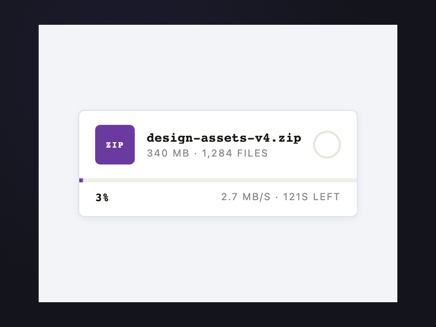
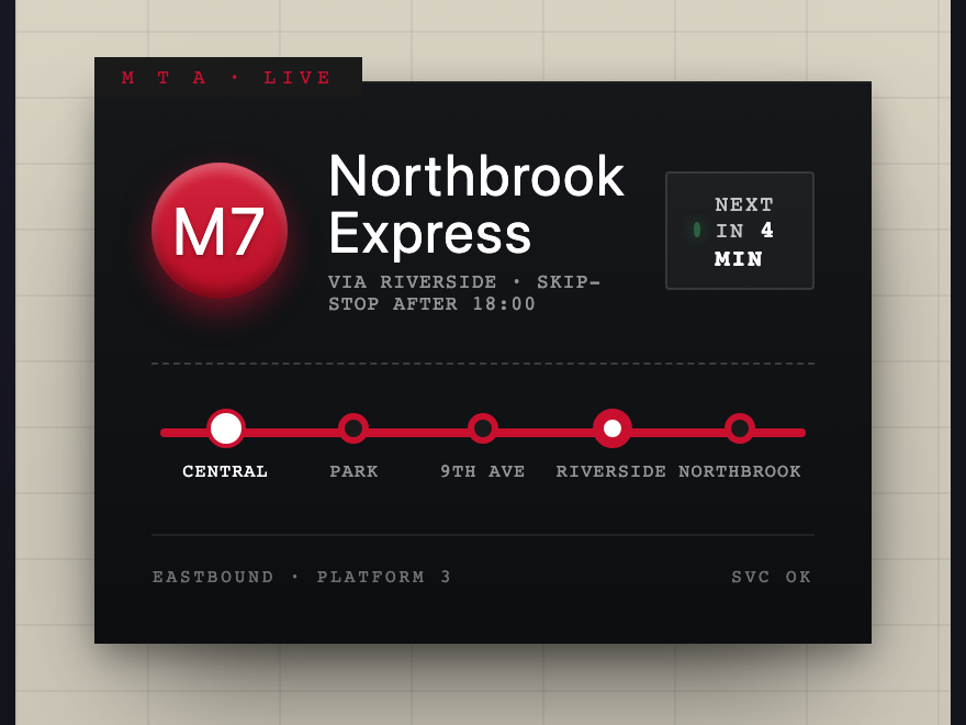
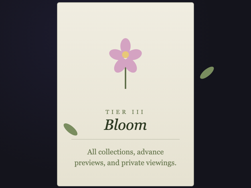
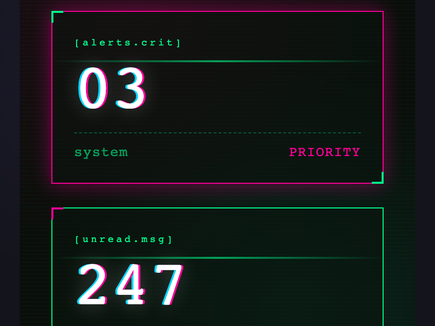
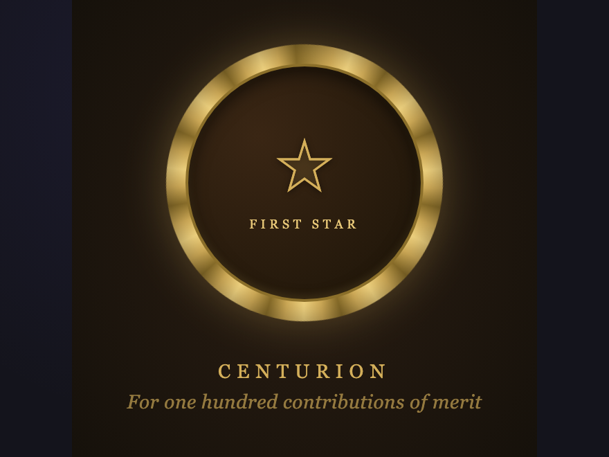
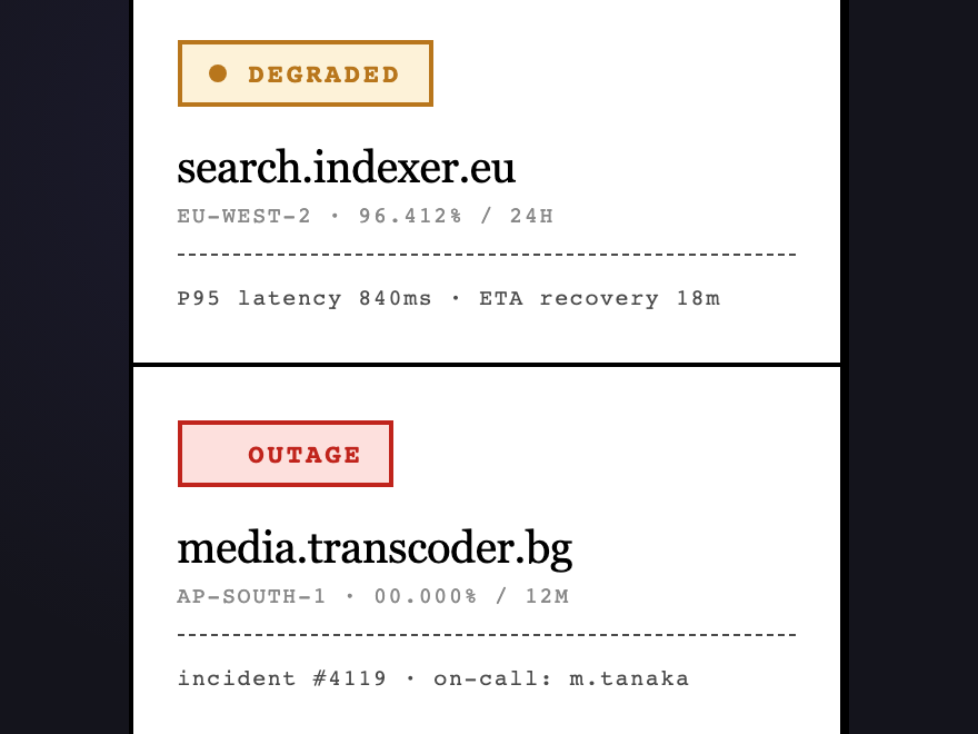
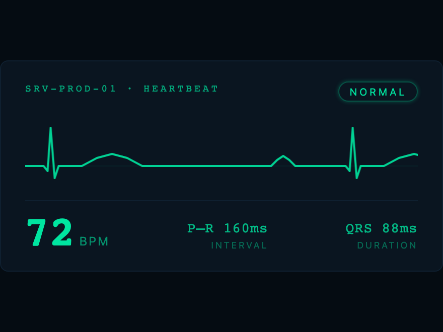
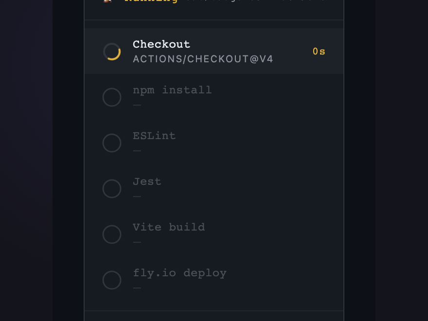
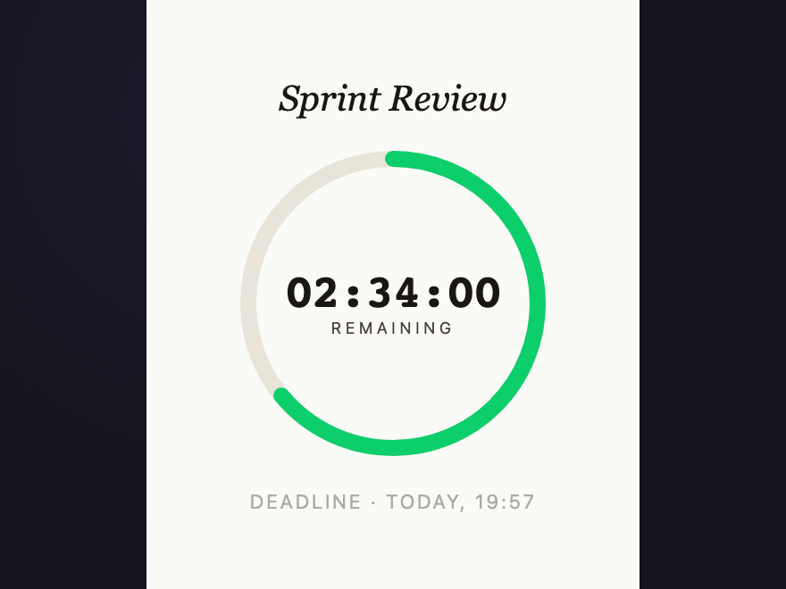
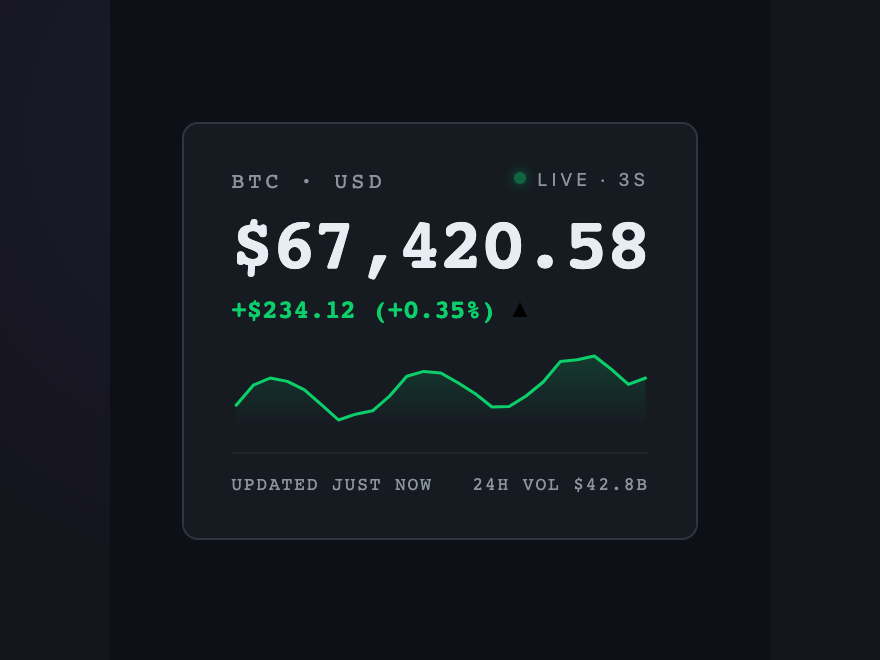
A CSS badge is a small visual component that signals state, identity, or progress — verification, rank, status, count, or live data. These 30 hand-coded badges cover collectibles, status pills, certifications, notifications, membership tiers, and real-time data displays like price tickers, countdowns, and ECG traces. Each badge is fully scoped with a unique CSS class prefix so you can paste any two into the same project with zero style collisions. Copy the markup, swap the content, ship.
A static 73% could be a live transfer or stalled. The shimmer moving through the bar means bytes are flowing; when it becomes a slow pulse, the transfer has stalled; when it stops, it's done. Three states, one animation property.
The three bouncing dots are the convention. Without the animation the badge could mean "typed recently" or "about to type." The motion defines the tense: present continuous, active right now.
One letter, one number. The whole game fits in a square. Hover lifts each tile independently — the kind of small detail that makes a word feel played rather than typed.
A key is a physical object. Three stacked box-shadows form the edge — bottom face, outer drop, top highlight. Click any key and feel it go down. Cmd-K and friends, the way they were meant to look.
Wayfinding distilled. Bullet, name, live arrival, and a strip showing where you are on the line. Built to be read from across a platform — and the next-arrival time keeps counting down.
Paper folded along six creases, lit from the upper-left. A ribbon hangs beneath. Hover lifts the page to catch the fold angles — the lit facets brighten, the shadowed ones recede.
International SEO's most misunderstood tag. Shows the target locale, alternate version count, and — crucially — flags missing reciprocal links. Hreflang must be bidirectional or the entire cluster invalidates.
Googlebot visits and decides: indexed or not. But there are four states before "indexed," and most pages fail before the first one. This badge shows exactly where in the crawl pipeline a URL sits.
Structured data is a contract between a page and Google's parser. The badge names the @type and lists which SERP features it unlocks — the difference between a plain blue link and a result with stars, FAQs, and how-to steps.
Plots a keyword on the Informational / Navigational / Commercial / Transactional spectrum. Intent mismatch is one of the top reasons pages don't rank — this badge surfaces the right page type before a word is written.
LCP, INP, CLS — the three real-world page-experience signals Google ranks on. Three SVG arcs draw to their verdict on load. Green / amber / red thresholds match Google's field-data classification.
Live BPM with a continuously scrolling waveform. Scroll speed equals beats per minute literally — change the duration and you change the rate. The badge and the data are the same thing.
CI/CD stage tracker with a spinning arc on the active step. Sequential steps light up — you know roughly how long remains by which step is spinning. Restarts automatically.
Ring depletes continuously in real time. Color shifts green → amber → red as the deadline approaches. The depletion rate is the data. A static badge cannot know what time it is.
A static price is history; an animated price is now. Green or red flash on each update tells direction without comparison. Sparkline shows the recent walk. The animation IS the signal.
Two adjacent flex blocks — colored extension + white filename. Color is the identifier; nothing else is needed. Hover lifts the whole card off the surface the way you pick up a real file.
A fair die with six possible states. Click to roll — the pip positions are correct, the animation is physical, the number updates. One honest square doing exactly one honest job.
Four rectangles of increasing height — possibly the most iconic data visualization ever designed. Confidence, signal, relevance — whatever the product needs. Hover fills all bars to maximum.
Three states — not started, in progress, done. A 2px bar at the bottom fills to 100% on hover so the user can see what completion looks like. Clean type, no decoration.
Status pill that breathes. Four pools of color drift behind a frosted lens; their hues rotate continuously through the spectrum. For loading, streaming, thinking — when text alone is not enough.
Release channel as marquee. Chrome lettering over a synthwave horizon, ticker tape reminding you exactly what kind of trouble you are in. The sun is striped. The grid recedes. The warning never stops scrolling.
Two-color riso print laid down by drum and squeegee. Pink and cyan with the deliberate misregistration that gives the process its hand. Hover widens the offset.
Embossed oxblood wax disc over a written page, anchored by a gold-leaf monogram. Click the seal to press — the disc compresses, holds, releases. Drips peek out from the base.
Physical badge with ambient sway, hanging from its own clip. Click flips it — front holds the role band and name, back holds the QR. Each card swings at a slightly different frequency.
Membership tier grown as SVG flora — petals, leaves, and a budding center on warm paper. Hover sways the leaves outward and blooms the center. Italiana + Cormorant Garamond carry the names.
Notification counter with perpetual chromatic aberration. Hover triggers a full RGB-split glitch storm; click scrambles the digits hex-style before settling. Scanline drifts top-to-bottom continuously.
Conic-gradient brass ring rotating against a slow ray pattern. Crest in Cinzel display type. Sweep of shine on hover, gentle lift on the whole medallion.
Monospaced status grid — operational, degraded, outage, maintenance, deploying, queued. Inverts on hover. Live pulse on healthy systems, blink on outages, scanline on deploys.
Pentagonal collectible badge with a cursor-tracked conic-gradient foil and a tier glyph. The Mythic tier carries its own ambient pulse — visible across the room.
A badge is a small, opinionated promise — that something has been verified, ranked, named, or scheduled. CSS badges include collectible tiers (holographic, mythic), status indicators (operational, degraded, outage), achievement medallions, real-time signals (live price tickers, countdowns, ECG, build progress), credentials (conference lanyards, wax seals), membership tiers, and notifications. Each badge encodes one piece of information in a way the eye can read at a glance — often before the user has finished reading the surrounding text.
How do I keep multiple badges from clashing in the same project?
Every demo in this collection uses a unique semantic class prefix (e.g. .holo-, .brut-, .deco-, .wax-, .vapor-). No demo shares a prefix with any other, and no demo uses generic class names like .badge or .card. Paste any two demos into the same page and they cannot collide. The pattern is documented in CLAUDE.md — extend it by picking a new short kebab prefix when you write your own badge.
Why is the animation justified on some badges but not others?
Several demos use continuous animation (live price, countdown ring, build pipeline, ECG, aurora, vaporwave marquee, typing dots, upload shimmer, crawl pulse). Each one passed the test: remove the animation, does the badge lose information — not aesthetics, but actual data? A static price loses direction-of-change. A static countdown loses urgency. A static ECG becomes a historical chart. The rest of the badges respond only to hover or click. None animate decoratively.
Can I use these without JavaScript?
Nineteen of the thirty are pure CSS — including all the marquee animations, hover transitions, gradient effects, and SVG flora/medallions. Eleven carry small JS helpers, mostly for cursor tracking (Holographic), click-to-press (Wax Seal, Keycap, Dice), live data simulation (Live Price, Countdown, Build Pipeline, ECG, Upload, Transit), or card flipping (Conference Lanyard, Cyberpunk). The visual chrome on the live-data demos is pure CSS — strip the JS and you get a beautifully styled static version with hardcoded values.
How do I adapt these to my data?
Each demo is a structural template — keep the markup hierarchy, replace the content. Most demos use CSS custom properties for the dominant colors so retoning is one variable change. The display fonts come from Google Fonts (Fraunces, Cinzel, Geist Mono, VT323, Major Mono Display, JetBrains Mono, Cormorant Garamond, Italiana, Bricolage Grotesque). Keep the @import or substitute your own type stack.