18 CSS Divider Collections
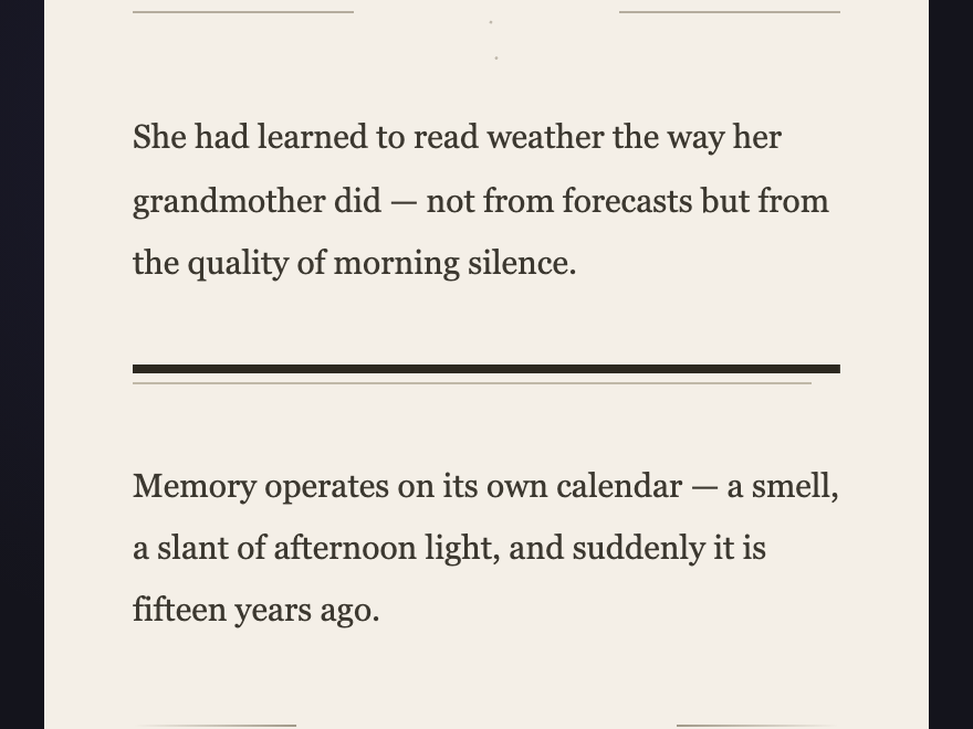
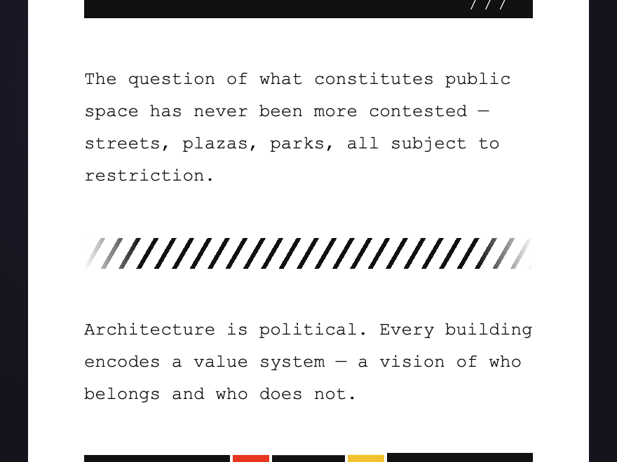
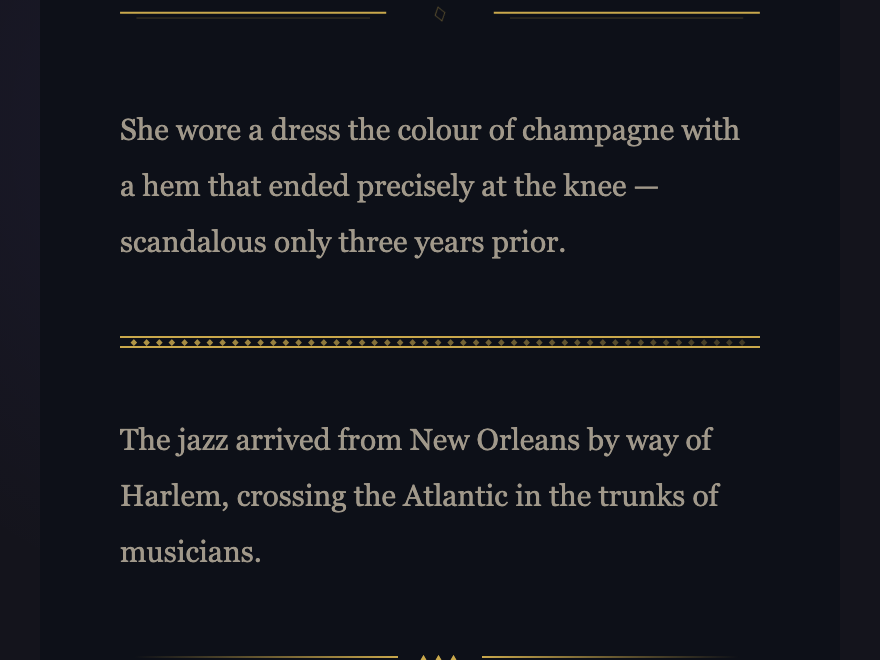
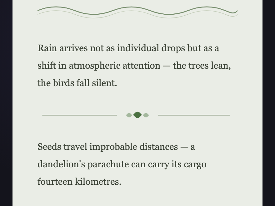
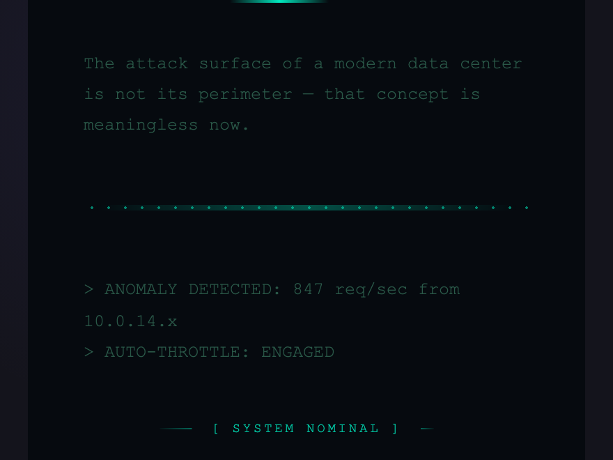
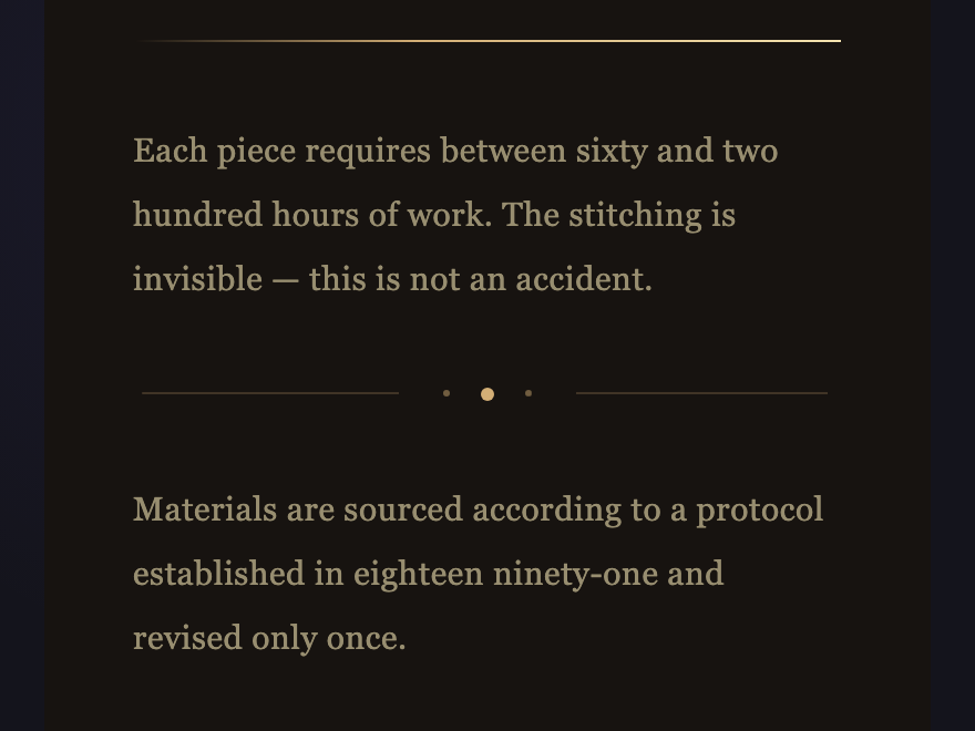
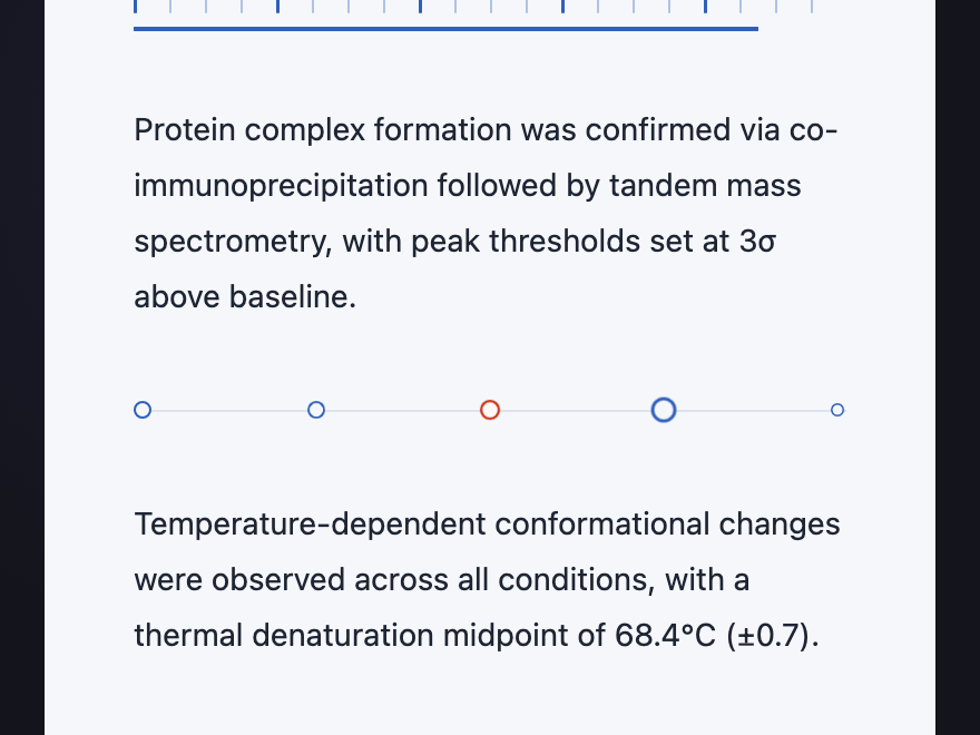
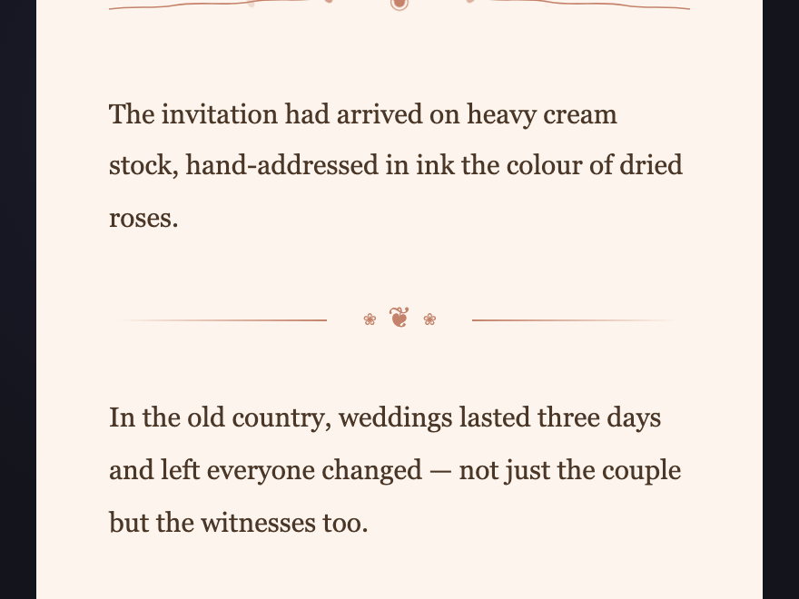
A CSS divider is a styled separator that marks the boundary between sections of content. These 18 hand-coded collections span eighteen design languages — from editorial, brutalist and art deco to cyber, music, festive, corporate and hand-drawn sketch — each presenting three animated divider variants on its intended background. Copy the markup and the scoped CSS, drop it between your sections, and ship.
Frequently asked questions
What is a CSS divider?
Why does each divider demo have its own background colour?
Do these dividers need JavaScript?
How do I use one of these in my own project?
Can I change the colours?
Related collections

30 CSS Badges
30 hand-coded CSS badges spanning collectibles, status indicators, certifications, notifications, membership tiers, and live-data displays. Upload progress, typing indicator, scrabble tile, keycap shortcut, transit indicator, origami medal, hreflang, E-E-A-T, crawl status, schema, search intent, core web vitals, ECG, build pipeline, countdown, live price, file extension, dice, signal bars, reading time, aurora, vaporwave, risograph, wax seal, conference lanyard, botanical tier, cyberpunk glitch, art deco, brutalist status, holographic.

14 CSS Banners & Alerts
Hand-coded CSS banner and alert patterns covering every notification surface a real product needs — dismissible alerts, sticky announcements, semantic status alerts, cookie consent, form validation, toasts, live-update banners, and promotional hero banners. Pure CSS plus scoped JS — no framework, semantic HTML, accessibility-first, copy-paste ready.

19 CSS Blockquote Designs
19 hand-coded CSS blockquote designs — pull quotes, testimonials, speech bubbles, tweet style, newspaper drop-caps, code comments and more. Semantic HTML, copy-paste ready.