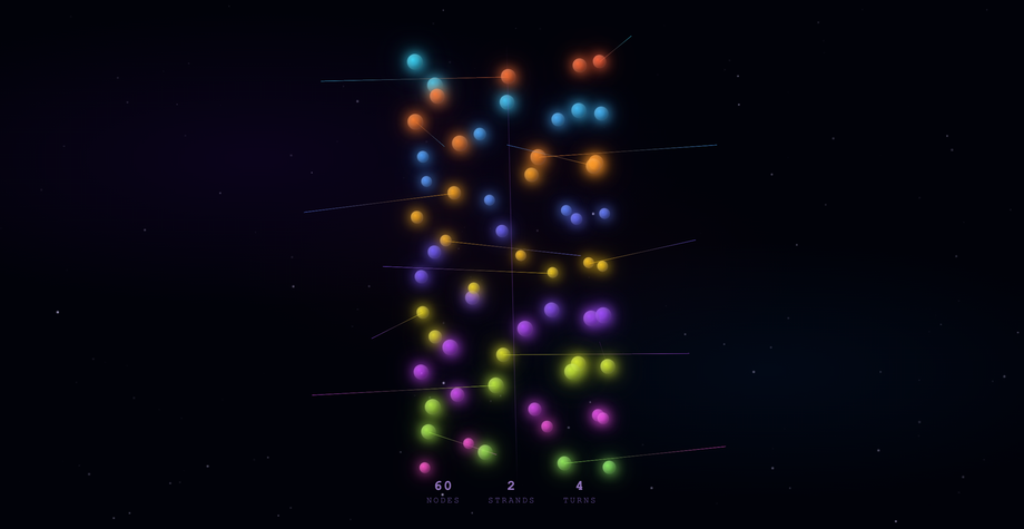
9 hand-coded CSS 3D effects built with real transforms — perspective, preserve-3d, translateZ, rotateX/Y — not pseudo-3D shadows. The collection spans 3D card flips, a cylindrical coverflow carousel, cursor-tilt pricing cards, a page-turn flipbook, a drag-rotate Bauhaus cube, a synth control panel, a luxury jewel showcase, a 5×5 spinning cube matrix, and a 60-orb DNA double helix. Every demo is scope-prefixed so its perspective context and parallax events stay inside its wrapper — drop any combination onto the same page and they coexist without fighting for the cursor. No WebGL, no Three.js, no libraries.
9 unique 3D scenes100% copy-paste readyPublished
01 / 09
Iridescent Flip Cards
CSS + JS
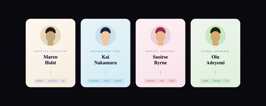
Four team-member cards floating on a near-black ground, each wrapped in a continuously rotating conic-gradient iridescent border driven by a CSS @property custom-angle animation.
Best forteam bio sections, product feature grids, pricing tier showcases, conference speaker pages.
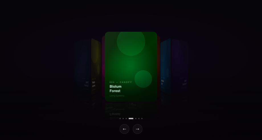
Seven cards arranged in a cylindrical coverflow perspective — the active card at full scale and brightness, flanking cards receding in angle, Z-depth, and brightness so the focused piece reads with cinematic clarity.
Best forportfolio galleries, media collections, hero sliders, editorial product reveals, music/film catalogs.
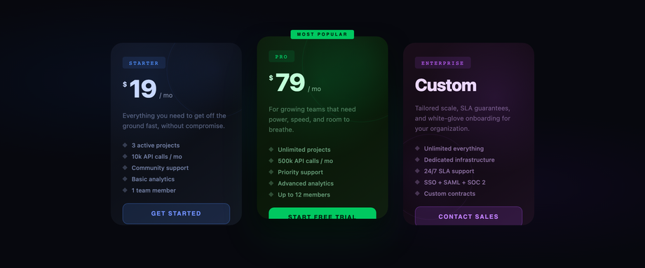
Three pricing cards (Starter / Pro / Enterprise) that track individual mouse positions via smooth lerp animation loops — each card applies perspective + rotateX + rotateY relative to cursor, with a radial glare gradient following the hotspot.
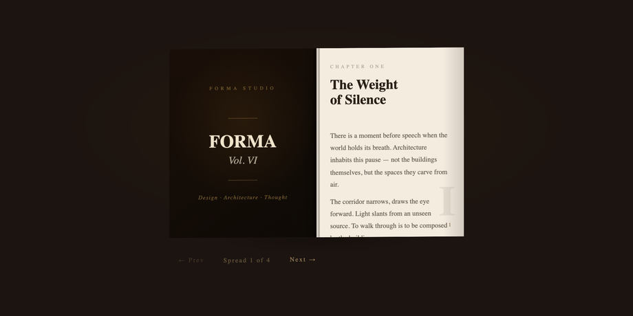
A physical book with a dark leather cover, cream parchment spreads, and pages that arc through a real 0° → -180° rotateY transform with the hinge anchored at transform-origin: left center.
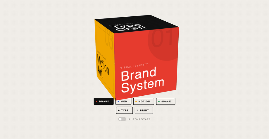
A large drag-rotatable CSS 3D cube where each of the six genuine faces (built with translateZ + rotateX/Y) is a bold Bauhaus color block presenting a service category — Brand, Web, Motion, Space, Type, Print.
Best forproduct configurators, portfolio anchor sections, agency service navigators, interactive menus.
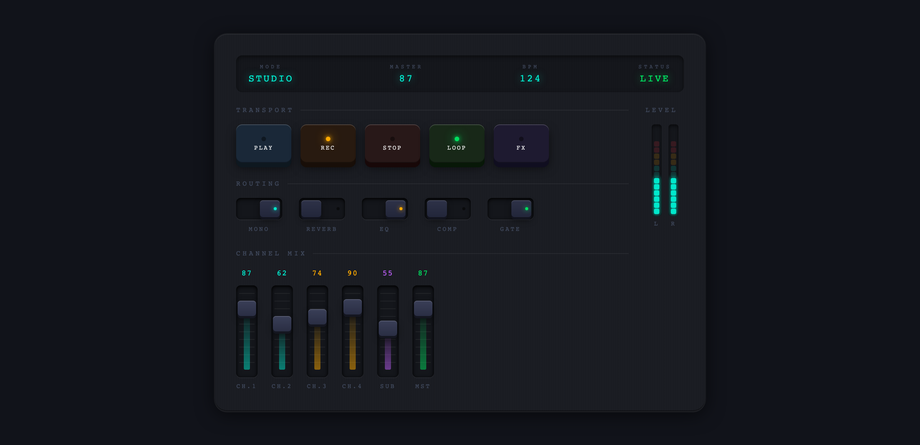
A dark anodized panel with four interaction systems working simultaneously: push buttons with 3D translateY press travel and colored LED dots, toggle switches with a spring-overshoot thumb animation, six vertical faders with drag-to-set handles + fill bars + real-time value readouts, and dual VU meters with color-coded segments (cyan → amber → red) animating continuously.
Best foraudio production apps, game HUDs, creative dashboards, hardware-inspired control panels.
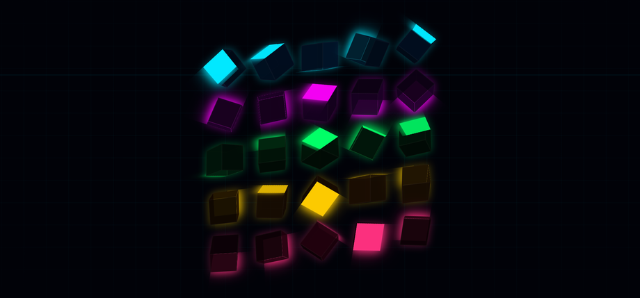
Real 3D. The scenes use the browser's actual transform pipeline — `perspective` on the wrapper to set up the viewing frustum, `transform-style: preserve-3d` on the children so transforms compose in 3D space, and per-element `translateZ` / `rotateX` / `rotateY` / `rotateZ` to position geometry. The Neon Lattice demo, for example, builds each cube from six divs translated to the six face positions of a 52px cube — exactly how the browser was designed to render 3D. No WebGL, no canvas (except the starfield in the helix demo), no libraries. The output is composited on the GPU just like a CSS animation, so it's cheap to run.
When should I use CSS 3D versus reaching for Three.js or WebGL?
CSS 3D is the right tool when the geometry is simple, the camera is mostly static, and the goal is decoration or product reveal — hover-flip cards, exploded-axis dashboards, helix loaders, cube grids, parallax depth on a hero image. The browser does the heavy lifting and you stay in CSS for animation, easing, media queries, and reduced-motion fallbacks. WebGL becomes necessary when you need real lighting, post-processing, dynamic geometry (terrain, particles in the thousands, deforming meshes), arbitrary camera control, or shaders. For a product page that needs a flip card or a spinning logo cube, CSS 3D is faster to build, easier to debug, and ships in 2 KB instead of 200 KB.
Why does my 3D scene look flat or 'cardboard'?
Three near-universal reasons. (1) Missing `perspective` on the parent — without it, transforms are orthographic and depth reads as scale only; add `perspective: 1000px` to the wrapper. (2) Missing `transform-style: preserve-3d` on intermediate containers — transforms collapse to 2D at the first ancestor that flattens. Every container between the wrapper and the rotated child needs `preserve-3d`. (3) `overflow: hidden` on an ancestor with `transform` — this implicitly creates a new stacking context that flattens children. Move the overflow clipping outside the 3D scope, or use a non-transformed clipping wrapper. Run through these three and 90% of 'why is my cube flat' issues resolve.
What about performance on mobile?
CSS 3D transforms are GPU-composited, so they're cheap — even the helix demo (60 orbs, each with multi-layer box-shadow) holds 60fps on a mid-tier Android. The expensive parts are `box-shadow` blur (which is rasterized, not composited) and large `filter: blur()` — both demos here cap blur radius to keep the GPU happy. The animations themselves (rotate transforms, opacity) are essentially free. The one trap is animating non-composited properties (width, height, top/left) — these trigger layout, which on a 3D scene with many children is expensive. Stick to `transform` and `opacity` for animation and the scenes run cold-frame-time on every device that ships in 2026.
How are the three scenes prevented from interfering with each other?
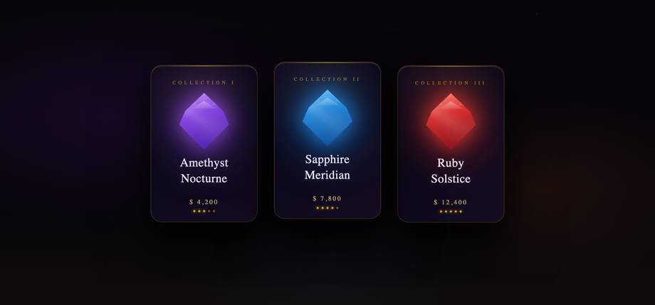
Three layers of containment. (1) CSS is scoped — every selector is prefixed with `.cd-obs` / `.cd-nln` / `.cd-chx`, so there's no class collision and the wrappers carry their own perspective + custom properties. (2) JS is scoped — each demo's mouse and drag handlers attach to `root.addEventListener`, not `document.addEventListener`, so moving the cursor over the helix demo doesn't tilt the cube matrix. (3) DOM injection is scoped — particles, cubes, orbs, and rungs that the source HTMLs appended to `document.body` are appended to the demo's own wrapper instead, so they paint inside the gallery card and clean up cleanly. The starfield canvas in the helix demo uses a ResizeObserver tied to its wrapper, so it stays sized to the card, not the viewport.
Can I disable the motion for users who don't want it?
Already handled. Every demo respects `prefers-reduced-motion: reduce` — float animations, spin loops, glow pulses, parallax interpolation, and the helix auto-rotation all stop. The geometry still renders (you still see the cards, cubes, and helix), but the scene is static. The particle generator in the Obsidian Vault demo skips the spawn loop entirely when reduced motion is requested, so users on motion-sensitive setups don't pay the perf cost of 36 invisibly-animating dust particles.