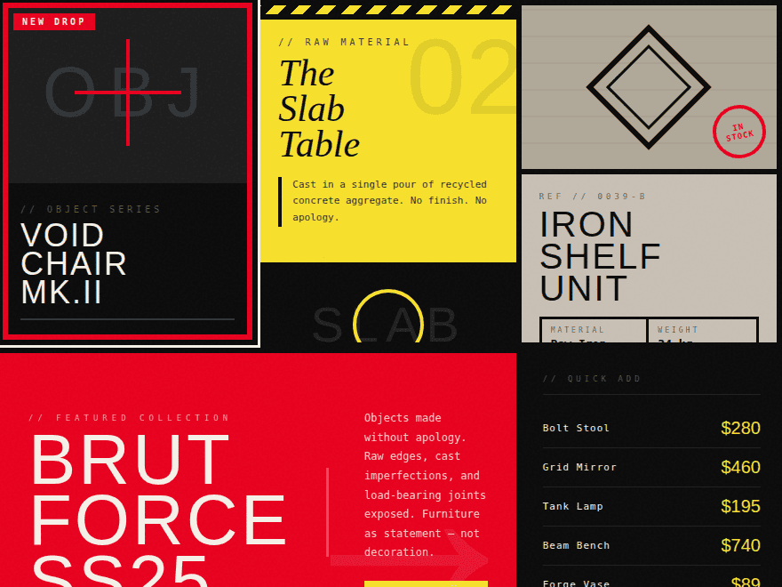
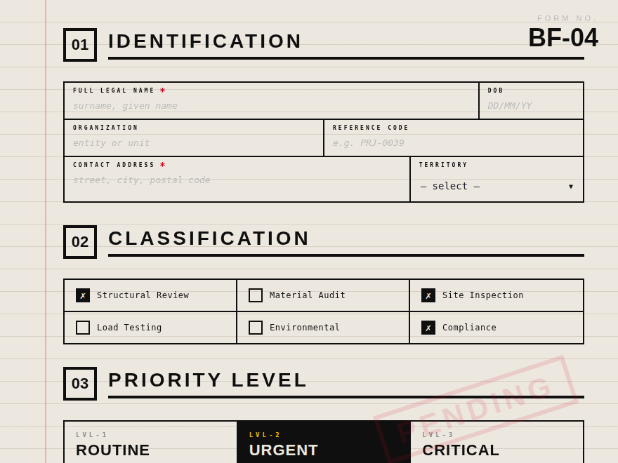
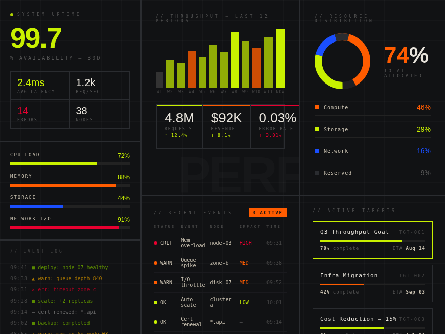
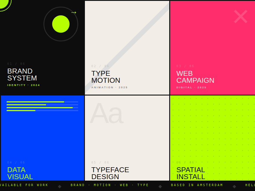
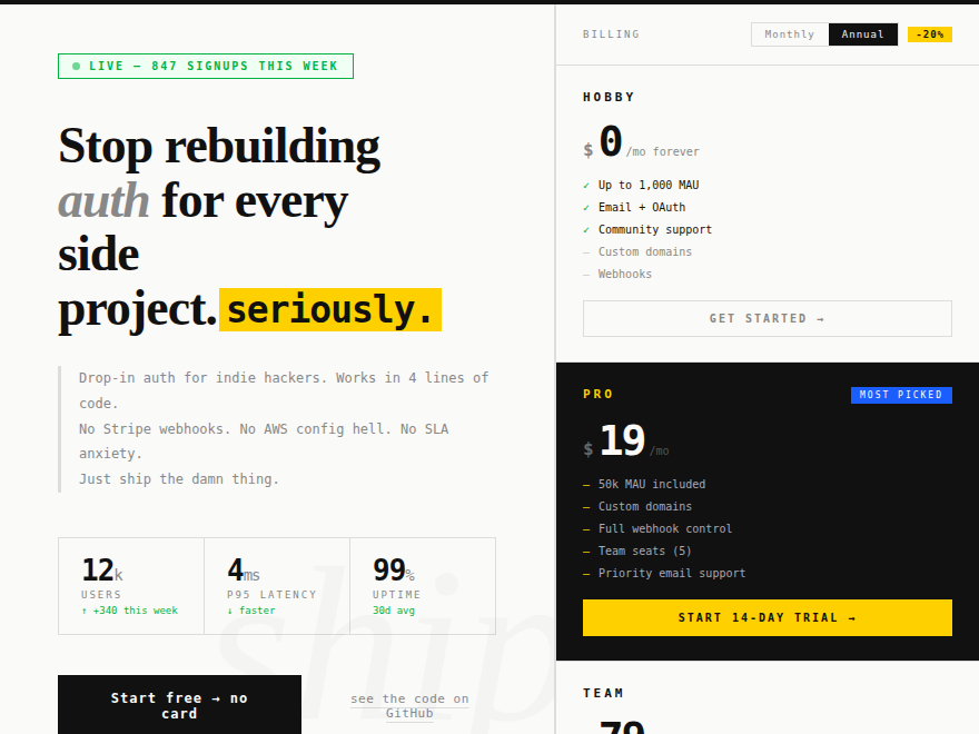
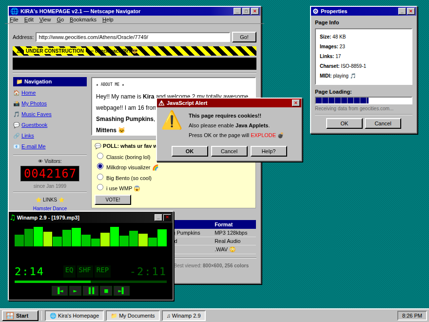
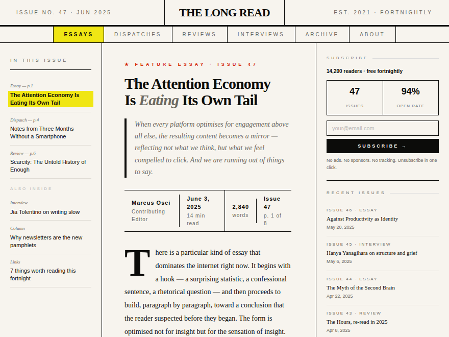
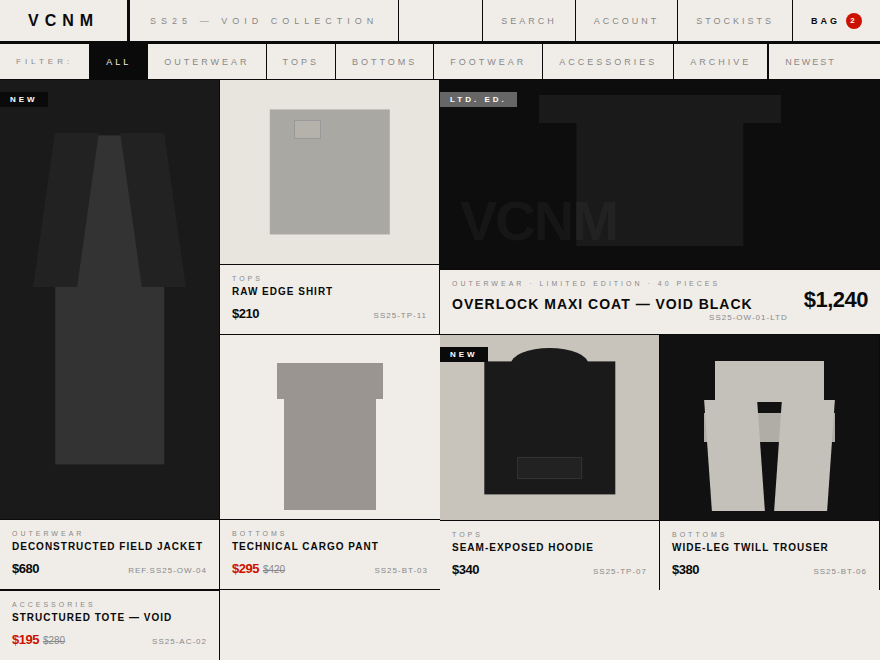
Brutalism in CSS is the loudest dialect a website can speak. Heavy black borders, oversized type, system fonts, no rounded corners, no apologies. These 8 hand-coded widgets push the style across three different contexts: a raw e-commerce card grid, a bureaucratic inspection form, and a constructivist ops dashboard. Every widget's palette is scoped to its wrapper so all three coexist without colour or border collisions.
The web borrowed the term from architecture — concrete buildings that show their structure instead of hiding it. The web version is the same idea: a site that shows its bones. Heavy black borders, system fonts at their default weights, no soft drop shadows, no rounded corners, no subtle gradients pretending to be 'depth'. Hover states are blunt — a black background flips to yellow text, full stop. Brutalism is a reaction against design that tries to be invisible; it makes you feel the interface. The aesthetic peaked around 2018 (brutalistwebsites.com), came back as a counter-trend to Apple's frosted-glass moment in 2022, and is now a stable third option alongside minimal and neumorphic for design-forward brands.
Is brutalist design hard to read?
Done badly, yes — random typography stacks and 12px Times New Roman over a screaming yellow background fail every accessibility check there is. Done well, it's MORE readable than most designs because the contrast is extreme. The product-cards demo here uses a 24px Bebas Neue headline on solid black with #f5f0e8 cream text (contrast ratio 18.2 — far above WCAG AA's 4.5). The form demo's labels are 8px monospace caps on a paper background (contrast ratio 12.6). The dashboard uses #c8f000 acid green on near-black (8.4 contrast). The trick is: brutalism doesn't refuse to consider readability — it just doesn't dress contrast up. Pick a foreground / background pair, push them to 7:1+ contrast, and the result is harsh but legible.
How do I keep a brutalist design from feeling dated?
The 2018 brutalist wave aged badly because it leaned on a small bag of tricks — diagonal stripes, hand-drawn arrows, Comic Sans 'for the lulz' — that became visual cliché within 18 months. The modern version skips the irony and treats brutalism as a serious typographic system. Use one or two condensed display fonts (Bebas Neue, Barlow Condensed, Archivo Black) and one monospace (Space Mono, IBM Plex Mono, JetBrains Mono). Pick three colours total — typically black + paper-tone neutral + one signal accent — and use them with discipline. The brutalism that survives is closer to Swiss typography with louder borders than to deliberately ugly art-school sites.
Can I use brutalism in a serious product (not a portfolio / art site)?
Yes, and it's actually well-suited to dense information surfaces — admin dashboards, monitoring tools, compliance forms, developer documentation. The dashboard demo here shows why: rigid cell-based grids make the data structure visible, monospace type keeps numerical columns aligned, and the high-contrast accent colours encode severity (acid green = OK, orange = warn, red = critical) without needing icons. Stripe's docs, Vercel's dashboard, Linear's issue tracker, Plain's support UI — all of them have brutalist DNA underneath the polish: monospace metadata, hard-edged borders, system-font defaults. You don't need to go full Berghain-club-flyer to claim the genre.
Why does the form demo use ✗ instead of a checkmark?
Checkmarks read as 'approved, move on'. The ✗ glyph on a checked box is a deliberate brutalist inversion — it reads as 'noted, recorded, struck-through on the master copy.' It comes from inspection-sheet conventions (clipboard forms in factories, customs declarations, building permits) where ticking a box means the inspector has CONFIRMED an item, not that the user has CHOSEN it. The form demo is built to feel bureaucratic, like a thing you submit to a department, so the visual language of stamping and crossing-out is more accurate than the consumer-friendly checkmark. You can swap it back to ✓ in one line of CSS if your product needs the friendlier reading.
How is each demo's CSS kept from leaking into the others?
Every widget is wrapped in its own scoped class — `.br-prd` (product cards), `.br-frm` (form), `.br-dsh` (dashboard). All CSS rules are nested under that class (`.br-frm input[type="range"]::-webkit-slider-thumb { … }` not just `input[type="range"]::-webkit-slider-thumb { … }`). The few body-level pseudo-elements from the source mocks (noise texture, ruled paper lines, red margin, grid background) are re-scoped to `.br-XXX::before` / `::after` with `position: absolute` instead of `position: fixed`, so they paint inside the widget's wrapper instead of leaking to the host page viewport. The same scoping technique was used in the neumorphism collection to coexist 13 palettes on one page.