26 CSS Accordions — Vertical & Horizontal
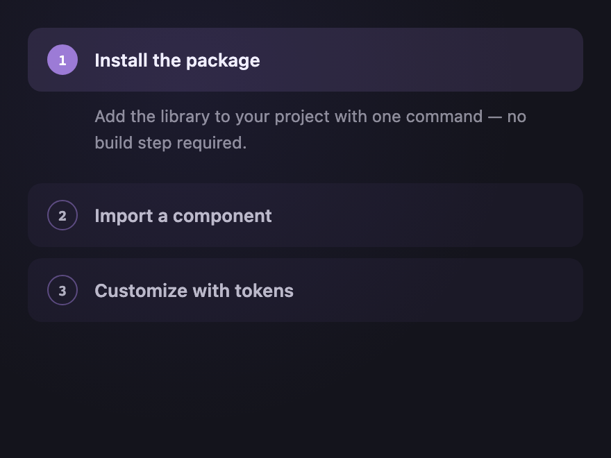
A CSS accordion is a collapsible content panel that hides and reveals a section on click. These 26 hand-coded designs are full-featured FAQ blocks, nav sections, and disclosure panels you can drop into a project today — copy the markup, swap your content, and ship.

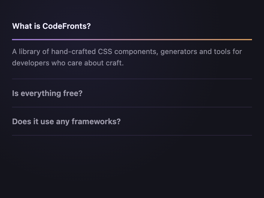
Frequently asked questions
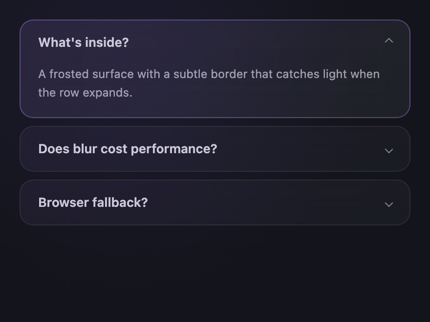
How do I build an accordion in pure CSS?
Can a CSS accordion work without JavaScript?
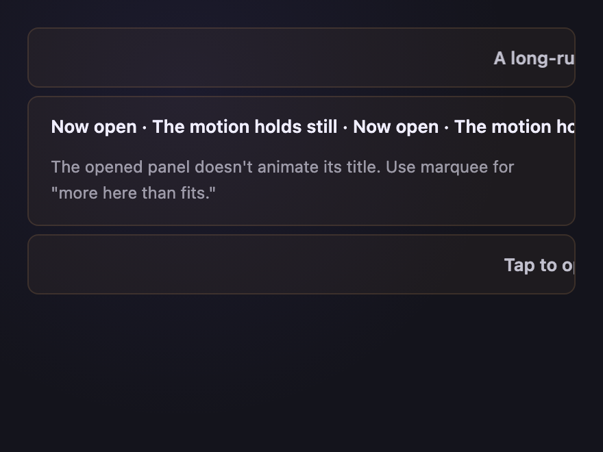
How do I animate an accordion open and close smoothly in CSS?
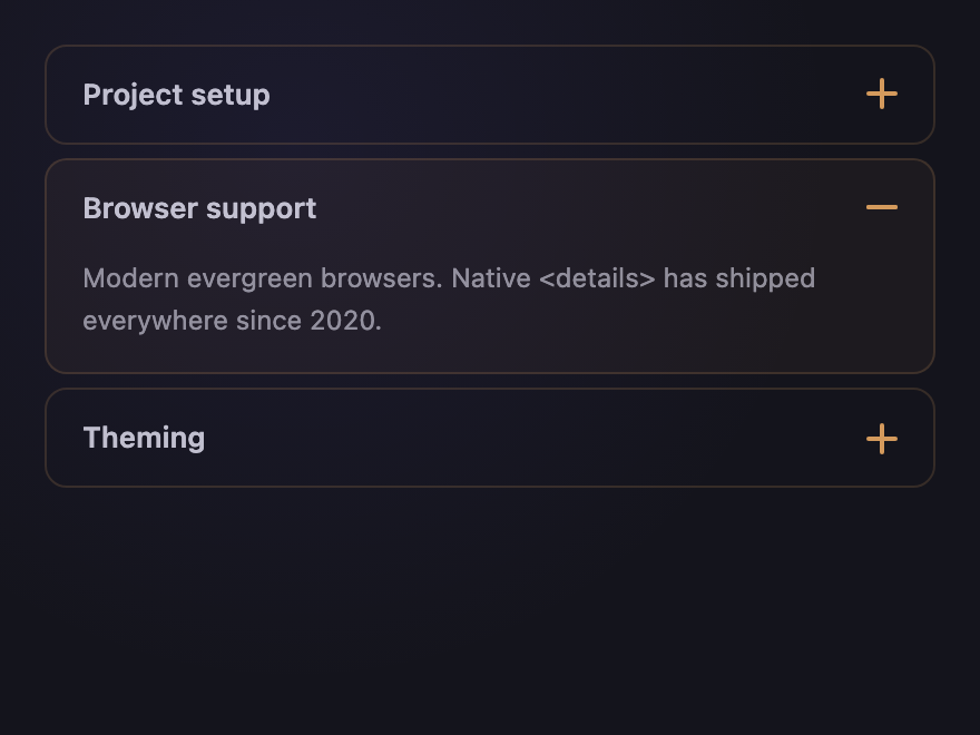
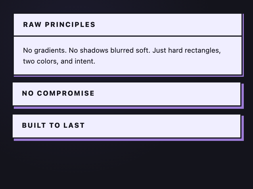
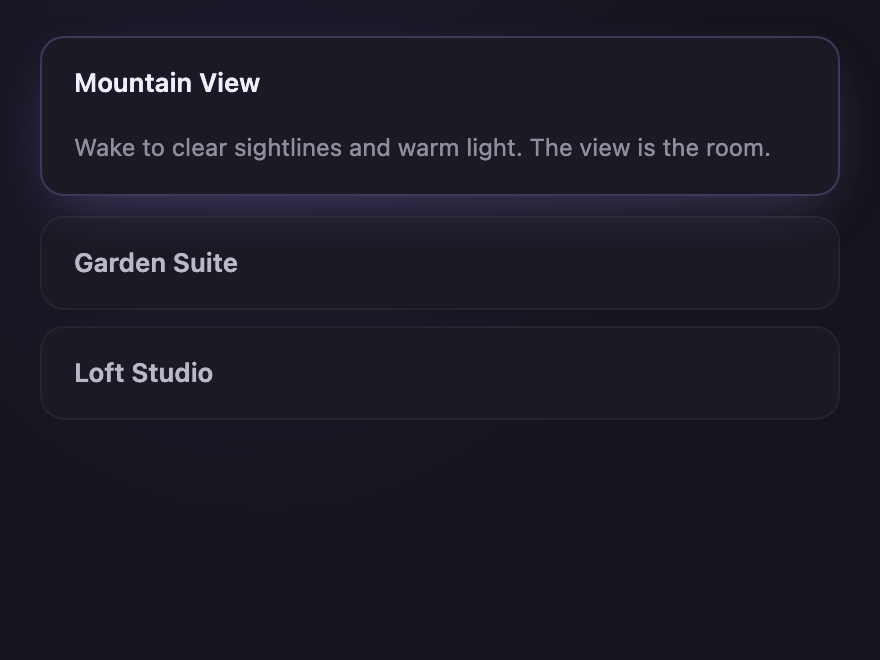
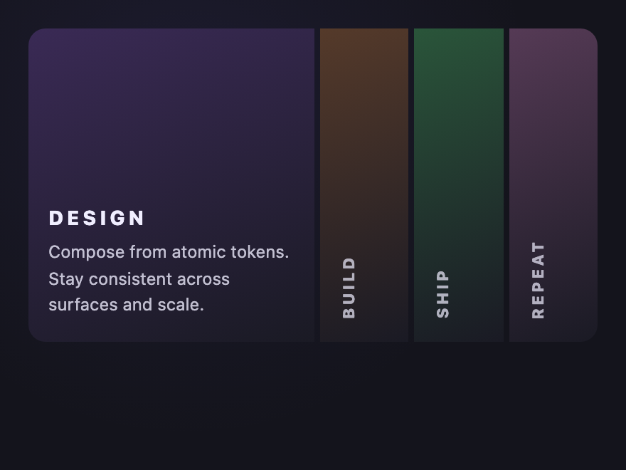
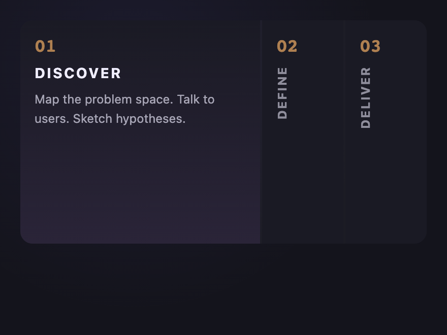
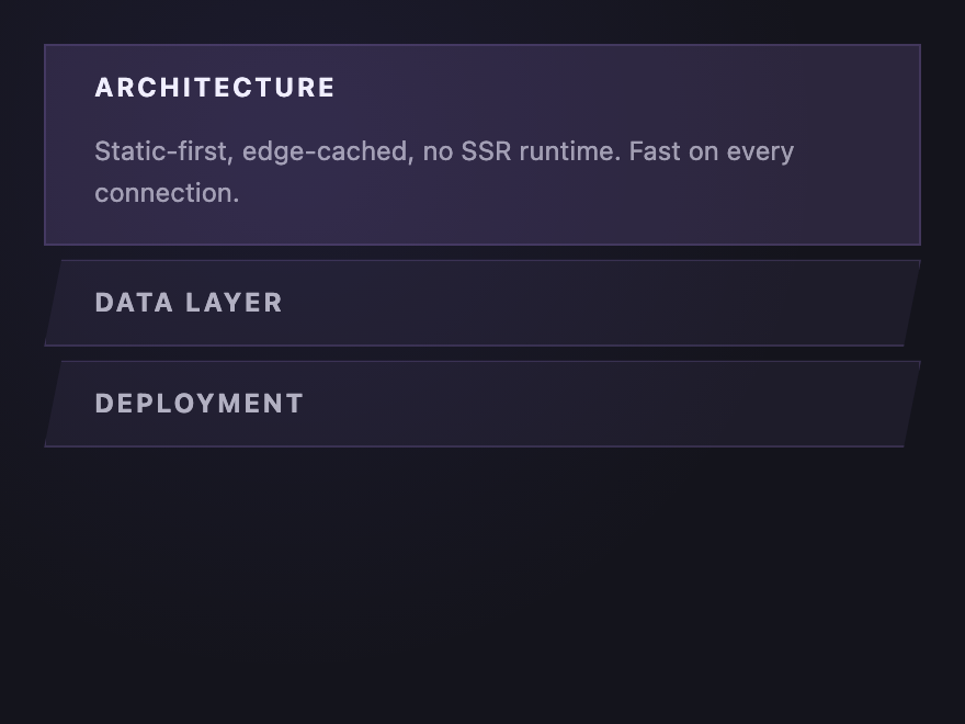
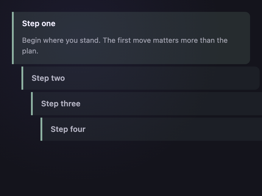
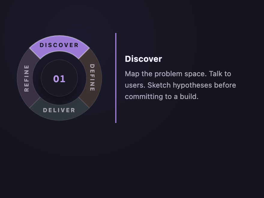
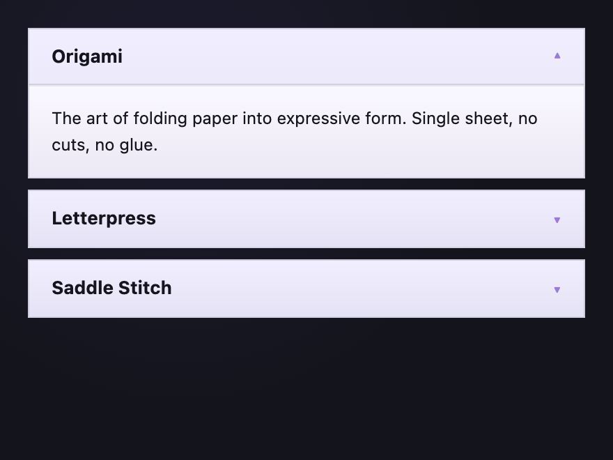
What's the difference between a vertical and horizontal accordion?
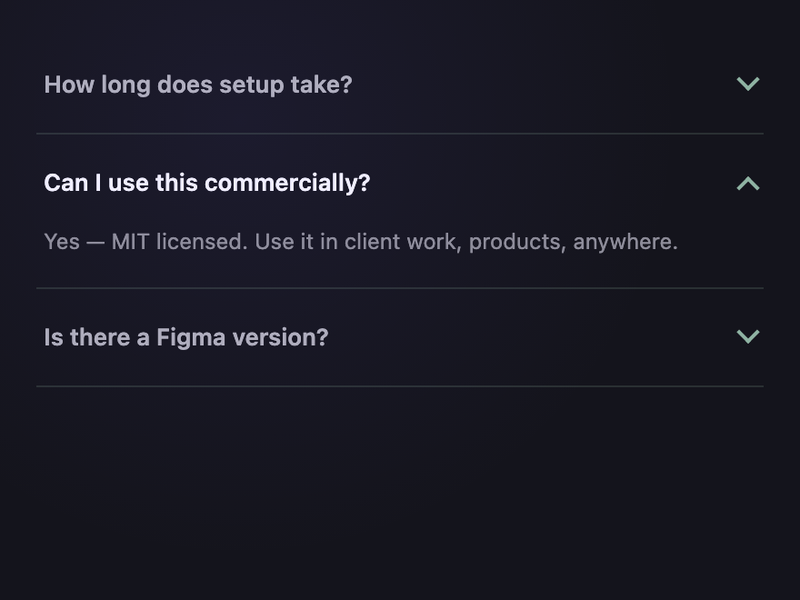
Are these CSS accordions accessible?
Related collections

22 CSS Breadcrumbs
22 original CSS breadcrumb designs — underline grow, pill, diagonal slash, neon trail, brutalist, frosted glass, vertical stacked, progress track, holographic shimmer and more.

21 CSS Circular & Radial Menu Designs
21 free CSS circular and radial menu designs — pie, dome, orbital and skeumorphic layouts with copy-paste HTML and CSS.

20 CSS Hamburger Menus
20 hand-coded CSS hamburger menus with live demos — pure-CSS checkbox-hack toggle (no JavaScript), morphing icon animations, full-screen overlay, slide-out sidebar with push-canvas, responsive navbar, floating FAB radial menu, Tailwind CDN build, Bootstrap 5 navbar, WCAG-accessible aria pattern, grid-template-rows accordion, blur overlay, mobile bottom nav, multi-level nested dropdown, flexbox right-aligned, circular ripple expand, sticky shrinking header, neumorphic toggle, brutalist border, and a 3D rotating canvas push. 16 with a small vanilla JS snippet, 4 truly pure CSS. prefers-reduced-motion respected, scoped class names, WCAG 2.2 aria-expanded + aria-controls patterns demonstrated, MIT-licensed.