22 examples Responsive Uses JS beginner

22 CSS Breadcrumbs

Advertisement

A CSS breadcrumb is a navigation trail that shows where the visitor sits in a site's hierarchy. These 22 hand-coded designs are drop-in trail components for documentation sites, e-commerce categories, and dashboards — copy the markup, point each link at your routes, and ship.
22 unique designs 21 Pure CSS 1 CSS + JS 0 dependencies 100% copy-paste ready Published
01 / 22
Underline Grow
Pure CSS
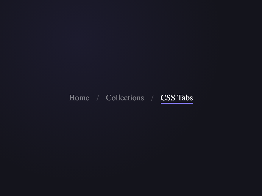
A gradient underline grows from left to right on hover. Current page uses a solid accent line.
Try it
.bc-01__list {
  display: flex;
  align-items: center;
  list-style: none;
  padding: 0;
  margin: 0;
}

.bc-01__item {
  display: flex;
  align-items: center;
}

.bc-01__item + .bc-01__item::before {
  content: "/";
  padding: 0 12px;
  color: rgba(255, 255, 255, 0.2);
  font-size: 14px;
}

.bc-01__link {
  position: relative;
  font-size: 14px;
  font-weight: 500;
  color: rgba(255, 255, 255, 0.45);
  text-decoration: none;
  padding-bottom: 2px;
  transition: color 0.25s;
}

.bc-01__link::after {
  content: "";
  position: absolute;
  bottom: 0;
  left: 0;
  width: 100%;
  height: 2px;
  border-radius: 1px;
  background: linear-gradient(90deg, #8b7fff, #ff6b9d);
  transform: scaleX(0);
  transform-origin: left;
  transition: transform 0.35s cubic-bezier(0.23, 1, 0.32, 1);
}

.bc-01__link:hover {
  color: rgba(255, 255, 255, 0.85);
}

.bc-01__link:hover::after {
  transform: scaleX(1);
}

.bc-01__link--cur {
  color: #fff;
  pointer-events: none;
}

.bc-01__link--cur::after {
  background: #8b7fff;
  transform: scaleX(1);
}
<nav class="bc-01" aria-label="Breadcrumb">
  <ol class="bc-01__list">
    <li class="bc-01__item"><a class="bc-01__link" href="javascript:void(0)">Home</a></li>
    <li class="bc-01__item"><a class="bc-01__link" href="javascript:void(0)">Collections</a></li>
    <li class="bc-01__item">
      <a class="bc-01__link bc-01__link--cur" aria-current="page" href="javascript:void(0)"
        >CSS Tabs</a
      >
    </li>
  </ol>
</nav>
02 / 22
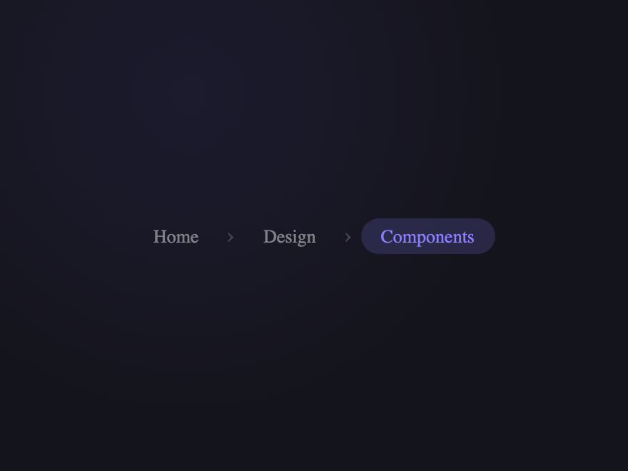
Pill Breadcrumbs
Pure CSS
Each crumb is a rounded pill. Hover blooms a background. Current page shows solid accent fill.
Try it
.bc-02__list {
  display: flex;
  align-items: center;
  gap: 4px;
  list-style: none;
  padding: 0;
  margin: 0;
}

.bc-02__sep {
  color: rgba(255, 255, 255, 0.2);
  font-size: 16px;
  user-select: none;
  padding: 0 2px;
}

.bc-02__link {
  padding: 5px 14px;
  border-radius: 50px;
  font-size: 13px;
  font-weight: 500;
  color: rgba(255, 255, 255, 0.45);
  text-decoration: none;
  display: block;
  transition:
    background 0.25s,
    color 0.25s;
}

.bc-02__link:hover {
  background: rgba(255, 255, 255, 0.08);
  color: rgba(255, 255, 255, 0.85);
}

.bc-02__link--cur {
  background: rgba(139, 127, 255, 0.18);
  color: #8b7fff;
  pointer-events: none;
}
<nav class="bc-02" aria-label="Breadcrumb">
  <ol class="bc-02__list">
    <li class="bc-02__item"><a class="bc-02__link" href="javascript:void(0)">Home</a></li>
    <li class="bc-02__sep" aria-hidden="true">›</li>
    <li class="bc-02__item"><a class="bc-02__link" href="javascript:void(0)">Design</a></li>
    <li class="bc-02__sep" aria-hidden="true">›</li>
    <li class="bc-02__item">
      <a class="bc-02__link bc-02__link--cur" aria-current="page" href="javascript:void(0)"
        >Components</a
      >
    </li>
  </ol>
</nav>
03 / 22
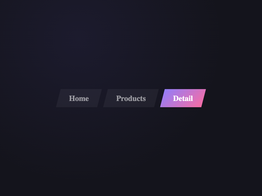
Diagonal Slash
Pure CSS
Parallelogram-shaped crumbs using clip-path. Active fills with gradient; hover lifts slightly.
Try it
.bc-03__list {
  display: flex;
  list-style: none;
  padding: 0;
  margin: 0;
  gap: 2px;
}

.bc-03__link {
  display: block;
  padding: 8px 22px;
  font-size: 13px;
  font-weight: 600;
  color: rgba(255, 255, 255, 0.55);
  text-decoration: none;
  background: rgba(255, 255, 255, 0.05);
  clip-path: polygon(8px 0%, 100% 0%, calc(100% - 8px) 100%, 0% 100%);
  transition:
    background 0.25s,
    color 0.25s,
    transform 0.25s;
}

.bc-03__link:hover {
  background: rgba(255, 255, 255, 0.1);
  color: rgba(255, 255, 255, 0.85);
  transform: translateY(-2px);
}

.bc-03__link--cur {
  background: linear-gradient(135deg, #8b7fff, #ff6b9d);
  color: #fff;
  pointer-events: none;
}
<nav class="bc-03" aria-label="Breadcrumb">
  <ol class="bc-03__list">
    <li class="bc-03__item"><a class="bc-03__link" href="javascript:void(0)">Home</a></li>
    <li class="bc-03__item"><a class="bc-03__link" href="javascript:void(0)">Products</a></li>
    <li class="bc-03__item">
      <a class="bc-03__link bc-03__link--cur" aria-current="page" href="javascript:void(0)"
        >Detail</a
      >
    </li>
  </ol>
</nav>
04 / 22
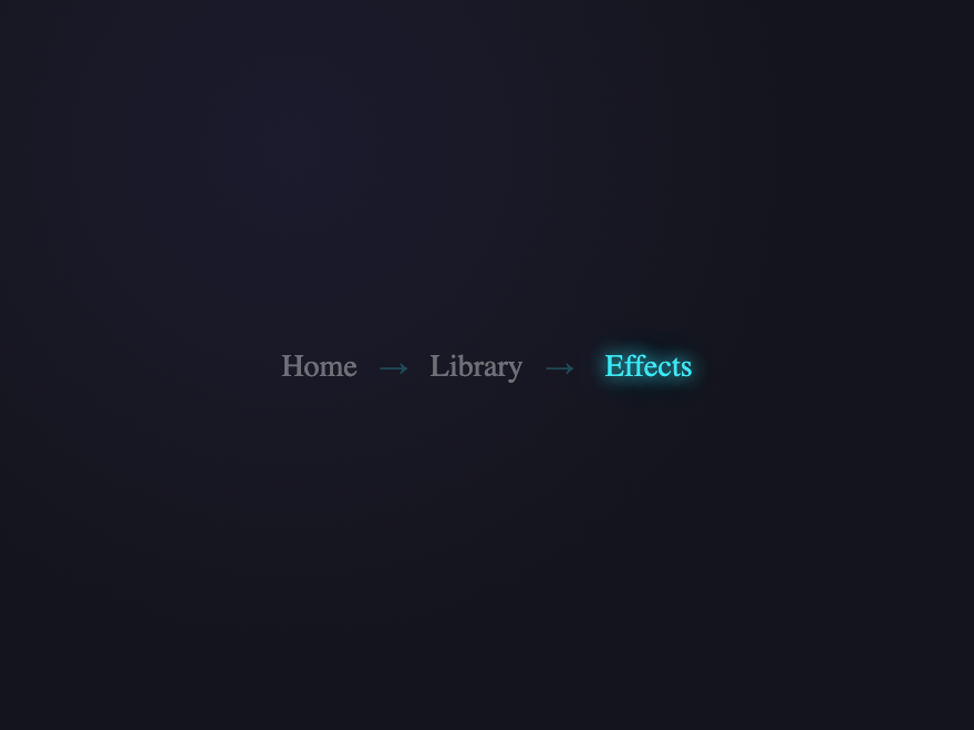
Neon Trail
Pure CSS
Neon glow builds along each separator arrow. Current page pulses with a multi-layer glow.
Try it
.bc-04__list {
  display: flex;
  align-items: center;
  list-style: none;
  padding: 0;
  margin: 0;
}

.bc-04__item + .bc-04__item::before {
  content: "→";
  padding: 0 10px;
  color: rgba(61, 232, 245, 0.25);
  font-size: 13px;
  transition:
    color 0.3s,
    text-shadow 0.3s;
}

.bc-04__item:hover + .bc-04__item::before,
.bc-04__item + .bc-04__item:hover::before {
  color: #3de8f5;
  text-shadow: 0 0 8px #3de8f5;
}

.bc-04__link {
  font-size: 14px;
  font-weight: 500;
  color: rgba(255, 255, 255, 0.38);
  text-decoration: none;
  transition:
    color 0.25s,
    text-shadow 0.25s;
}

.bc-04__link:hover {
  color: #3de8f5;
  text-shadow: 0 0 10px rgba(61, 232, 245, 0.5);
}

.bc-04__link--cur {
  color: #3de8f5;
  pointer-events: none;
  text-shadow:
    0 0 8px #3de8f5,
    0 0 20px rgba(61, 232, 245, 0.4);
}
<nav class="bc-04" aria-label="Breadcrumb">
  <ol class="bc-04__list">
    <li class="bc-04__item"><a class="bc-04__link" href="javascript:void(0)">Home</a></li>
    <li class="bc-04__item"><a class="bc-04__link" href="javascript:void(0)">Library</a></li>
    <li class="bc-04__item">
      <a class="bc-04__link bc-04__link--cur" aria-current="page" href="javascript:void(0)"
        >Effects</a
      >
    </li>
  </ol>
</nav>
05 / 22
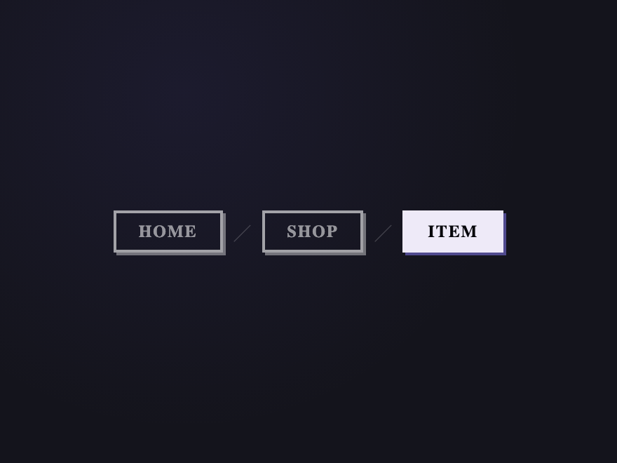
Brutalist Hard Shadow
Pure CSS
Hard offset box-shadows. Hover shifts the shadow. Current page inverts to a filled block.
Try it
.bc-05__list {
  display: flex;
  align-items: center;
  gap: 8px;
  list-style: none;
  padding: 0;
  margin: 0;
}

.bc-05__sep {
  color: rgba(255, 255, 255, 0.2);
  font-size: 12px;
  user-select: none;
}

.bc-05__link {
  display: block;
  padding: 6px 16px;
  border: 2px solid rgba(255, 255, 255, 0.6);
  font-size: 12px;
  font-weight: 800;
  letter-spacing: 0.08em;
  text-transform: uppercase;
  color: rgba(255, 255, 255, 0.55);
  text-decoration: none;
  box-shadow: 2px 2px 0 rgba(255, 255, 255, 0.4);
  transition:
    transform 0.1s,
    box-shadow 0.1s,
    background 0.1s,
    color 0.1s;
}

.bc-05__link:hover {
  transform: translate(-1px, -1px);
  box-shadow: 3px 3px 0 rgba(255, 255, 255, 0.5);
  color: #fff;
}

.bc-05__link--cur {
  background: #eeeaf8;
  color: #07070c;
  border-color: #eeeaf8;
  box-shadow: 2px 2px 0 rgba(139, 127, 255, 0.5);
  pointer-events: none;
}
<nav class="bc-05" aria-label="Breadcrumb">
  <ol class="bc-05__list">
    <li class="bc-05__item"><a class="bc-05__link" href="javascript:void(0)">Home</a></li>
    <li class="bc-05__sep" aria-hidden="true">╱</li>
    <li class="bc-05__item"><a class="bc-05__link" href="javascript:void(0)">Shop</a></li>
    <li class="bc-05__sep" aria-hidden="true">╱</li>
    <li class="bc-05__item">
      <a class="bc-05__link bc-05__link--cur" aria-current="page" href="javascript:void(0)">Item</a>
    </li>
  </ol>
</nav>
06 / 22
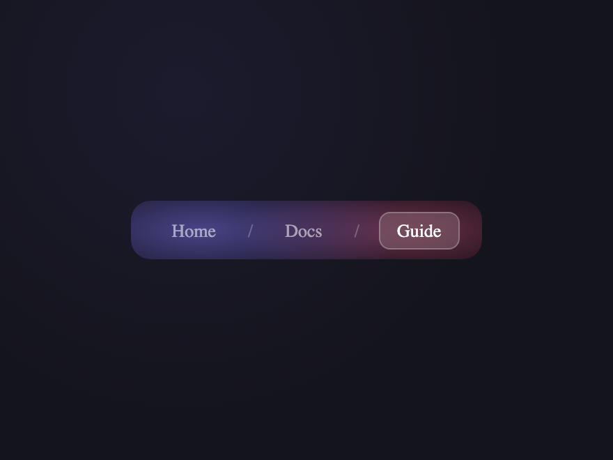
Frosted Glass
Pure CSS
Glass pill breadcrumbs with backdrop-filter over a gradient background.
Try it
.bc-06 {
  background:
    radial-gradient(60% 120% at 20% 50%, rgba(139, 127, 255, 0.5), transparent),
    radial-gradient(50% 100% at 80% 50%, rgba(255, 107, 157, 0.4), transparent), #09090f;
  padding: 12px 16px;
  border-radius: 14px;
}

.bc-06__list {
  display: flex;
  align-items: center;
  gap: 0;
  list-style: none;
  padding: 0;
  margin: 0;
}

.bc-06__item + .bc-06__item::before {
  content: "/";
  padding: 0 10px;
  color: rgba(255, 255, 255, 0.25);
  font-size: 13px;
}

.bc-06__link {
  padding: 5px 12px;
  border-radius: 8px;
  font-size: 13px;
  font-weight: 500;
  color: rgba(255, 255, 255, 0.55);
  text-decoration: none;
  border: 1px solid transparent;
  transition:
    backdrop-filter 0.3s,
    background 0.3s,
    border-color 0.3s,
    color 0.3s;
}

.bc-06__link:hover {
  background: rgba(255, 255, 255, 0.1);
  backdrop-filter: blur(12px);
  border-color: rgba(255, 255, 255, 0.15);
  color: #fff;
}

.bc-06__link--cur {
  background: rgba(255, 255, 255, 0.15);
  backdrop-filter: blur(16px);
  border-color: rgba(255, 255, 255, 0.25);
  color: #fff;
  pointer-events: none;
}
<nav class="bc-06" aria-label="Breadcrumb">
  <ol class="bc-06__list">
    <li class="bc-06__item"><a class="bc-06__link" href="javascript:void(0)">Home</a></li>
    <li class="bc-06__item"><a class="bc-06__link" href="javascript:void(0)">Docs</a></li>
    <li class="bc-06__item">
      <a class="bc-06__link bc-06__link--cur" aria-current="page" href="javascript:void(0)"
        >Guide</a
      >
    </li>
  </ol>
</nav>
07 / 22
Vertical Stacked
Pure CSS
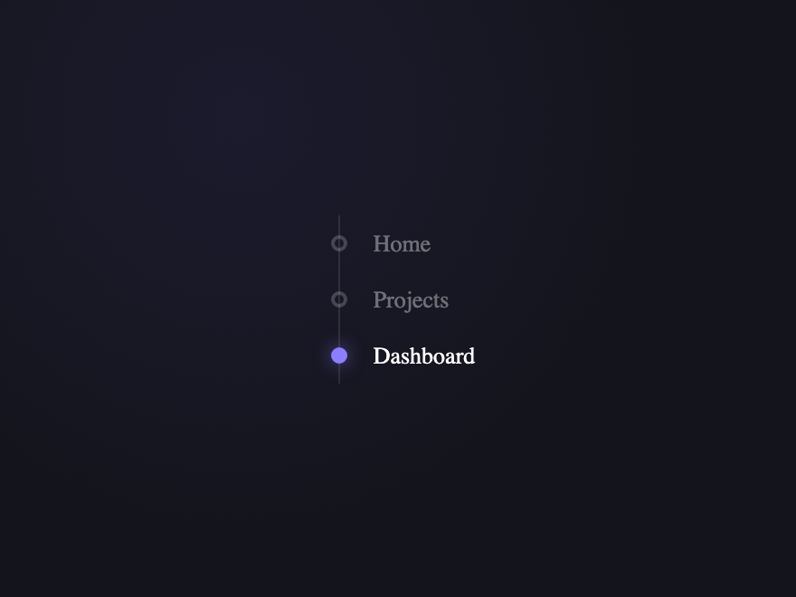
Vertical timeline-style breadcrumb with connecting dots and a glowing active indicator.
Try it
.bc-07__list {
  list-style: none;
  padding: 0;
  margin: 0 0 0 10px;
  display: flex;
  flex-direction: column;
  border-left: 1px solid rgba(255, 255, 255, 0.1);
}

.bc-07__item {
  display: flex;
  align-items: center;
  gap: 10px;
  padding: 8px 0;
  position: relative;
}

.bc-07__dot {
  width: 9px;
  height: 9px;
  border-radius: 50%;
  border: 2px solid rgba(255, 255, 255, 0.2);
  background: transparent;
  position: absolute;
  left: -5px;
  transition:
    border-color 0.3s,
    background 0.3s,
    box-shadow 0.3s;
}

.bc-07__item:hover .bc-07__dot {
  border-color: rgba(255, 255, 255, 0.6);
}

.bc-07__dot--cur {
  border-color: #8b7fff;
  background: #8b7fff;
  box-shadow: 0 0 10px rgba(139, 127, 255, 0.6);
}

.bc-07__link {
  padding-left: 18px;
  font-size: 13px;
  font-weight: 500;
  color: rgba(255, 255, 255, 0.38);
  text-decoration: none;
  transition: color 0.25s;
}

.bc-07__link:hover {
  color: rgba(255, 255, 255, 0.75);
}

.bc-07__link--cur {
  color: #fff;
  pointer-events: none;
}
<nav class="bc-07" aria-label="Breadcrumb">
  <ol class="bc-07__list">
    <li class="bc-07__item">
      <span class="bc-07__dot" aria-hidden="true"></span
      ><a class="bc-07__link" href="javascript:void(0)">Home</a>
    </li>
    <li class="bc-07__item">
      <span class="bc-07__dot" aria-hidden="true"></span
      ><a class="bc-07__link" href="javascript:void(0)">Projects</a>
    </li>
    <li class="bc-07__item bc-07__item--cur">
      <span class="bc-07__dot bc-07__dot--cur" aria-hidden="true"></span
      ><a class="bc-07__link bc-07__link--cur" aria-current="page" href="javascript:void(0)"
        >Dashboard</a
      >
    </li>
  </ol>
</nav>
08 / 22
Editorial Numbered
Pure CSS
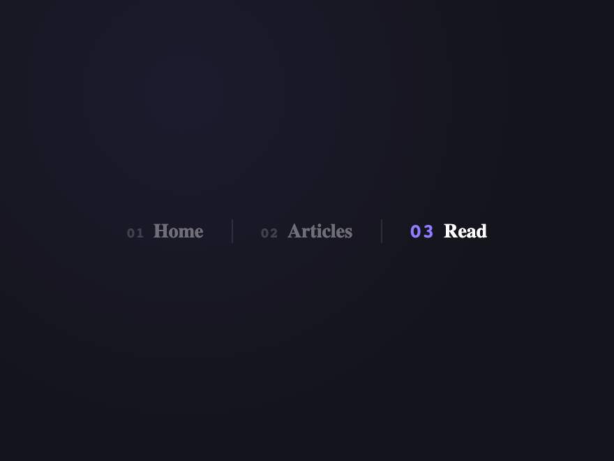
Magazine-style numbered breadcrumbs. Active number swells; separator is a hairline rule.
Try it
.bc-08__list {
  display: flex;
  align-items: center;
  list-style: none;
  padding: 0;
  margin: 0;
  gap: 0;
}

.bc-08__item {
  display: flex;
  align-items: baseline;
  gap: 6px;
}

.bc-08__item + .bc-08__item {
  padding-left: 20px;
  margin-left: 20px;
  border-left: 1px solid rgba(255, 255, 255, 0.1);
}

.bc-08__num {
  font-family: monospace;
  font-size: 10px;
  font-weight: 700;
  color: rgba(255, 255, 255, 0.18);
  letter-spacing: 0.06em;
  transition:
    color 0.3s,
    font-size 0.35s cubic-bezier(0.23, 1, 0.32, 1);
}

.bc-08__num--cur {
  color: #8b7fff;
  font-size: 14px;
}

.bc-08__link {
  font-size: 14px;
  font-weight: 600;
  color: rgba(255, 255, 255, 0.38);
  text-decoration: none;
  transition: color 0.25s;
}

.bc-08__link:hover {
  color: rgba(255, 255, 255, 0.75);
}

.bc-08__link--cur {
  color: #fff;
  pointer-events: none;
}
<nav class="bc-08" aria-label="Breadcrumb">
  <ol class="bc-08__list">
    <li class="bc-08__item">
      <span class="bc-08__num" aria-hidden="true">01</span
      ><a class="bc-08__link" href="javascript:void(0)">Home</a>
    </li>
    <li class="bc-08__item">
      <span class="bc-08__num" aria-hidden="true">02</span
      ><a class="bc-08__link" href="javascript:void(0)">Articles</a>
    </li>
    <li class="bc-08__item bc-08__item--cur">
      <span class="bc-08__num bc-08__num--cur" aria-hidden="true">03</span
      ><a class="bc-08__link bc-08__link--cur" aria-current="page" href="javascript:void(0)"
        >Read</a
      >
    </li>
  </ol>
</nav>
09 / 22
Retro Terminal Path
Pure CSS
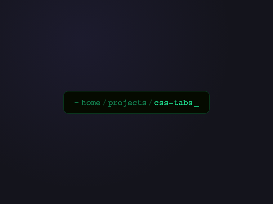
Unix path-style breadcrumbs with a blinking cursor — looks like navigating a filesystem.
Try it
.bc-09 {
  background: #050a00;
  border-radius: 8px;
  padding: 10px 16px;
  border: 1px solid rgba(30, 217, 138, 0.2);
  font-family: monospace;
  display: inline-block;
}

.bc-09__list {
  display: flex;
  align-items: center;
  list-style: none;
  padding: 0;
  margin: 0;
  gap: 0;
}

.bc-09__item {
  display: flex;
  align-items: center;
}

.bc-09__prompt {
  color: rgba(30, 217, 138, 0.5);
  margin-right: 4px;
}

.bc-09__sep {
  color: rgba(30, 217, 138, 0.3);
  padding: 0 2px;
}

.bc-09__link {
  font-size: 13px;
  color: rgba(30, 217, 138, 0.55);
  text-decoration: none;
  transition: color 0.2s;
}

.bc-09__link:hover {
  color: #1ed98a;
}

.bc-09__link--cur {
  color: #1ed98a;
  pointer-events: none;
}

.bc-09__cursor {
  color: #1ed98a;
  animation: bc09blink 0.7s step-end infinite;
  margin-left: 2px;
}

@keyframes bc09blink {
  50% {
    opacity: 0;
  }
}
<nav class="bc-09" aria-label="Breadcrumb">
  <ol class="bc-09__list">
    <li class="bc-09__item">
      <span class="bc-09__prompt" aria-hidden="true">~</span
      ><a class="bc-09__link" href="javascript:void(0)">home</a>
    </li>
    <li class="bc-09__item">
      <span class="bc-09__sep" aria-hidden="true">/</span
      ><a class="bc-09__link" href="javascript:void(0)">projects</a>
    </li>
    <li class="bc-09__item">
      <span class="bc-09__sep" aria-hidden="true">/</span
      ><a class="bc-09__link bc-09__link--cur" aria-current="page" href="javascript:void(0)"
        >css-tabs</a
      >
    </li>
    <span class="bc-09__cursor" aria-hidden="true">_</span>
  </ol>
</nav>
10 / 22
Gradient Text
Pure CSS
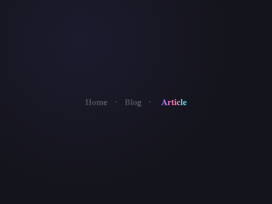
Each crumb shifts from muted grey to a full gradient on hover. Current page always shows the gradient.
Try it
.bc-10__list {
  display: flex;
  align-items: center;
  list-style: none;
  padding: 0;
  margin: 0;
}

.bc-10__item + .bc-10__item::before {
  content: "·";
  padding: 0 12px;
  color: rgba(255, 255, 255, 0.2);
  font-size: 16px;
}

.bc-10__link {
  font-size: 14px;
  font-weight: 600;
  text-decoration: none;
  background: linear-gradient(90deg, #8b7fff, #ff6b9d, #3de8f5);
  -webkit-background-clip: text;
  background-clip: text;
  color: transparent;
  filter: grayscale(1) opacity(0.4);
  transition: filter 0.35s;
}

.bc-10__link:hover {
  filter: grayscale(0) opacity(1);
}

.bc-10__link--cur {
  filter: grayscale(0) opacity(1);
  pointer-events: none;
}
<nav class="bc-10" aria-label="Breadcrumb">
  <ol class="bc-10__list">
    <li class="bc-10__item"><a class="bc-10__link" href="javascript:void(0)">Home</a></li>
    <li class="bc-10__item"><a class="bc-10__link" href="javascript:void(0)">Blog</a></li>
    <li class="bc-10__item">
      <a class="bc-10__link bc-10__link--cur" aria-current="page" href="javascript:void(0)"
        >Article</a
      >
    </li>
  </ol>
</nav>
11 / 22
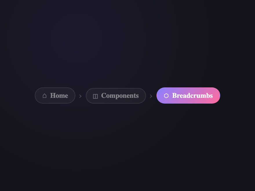
Chip with Icon
Pure CSS
Rounded chip breadcrumbs each with an icon. Active chip fills with accent gradient.
Try it
.bc-11__list {
  display: flex;
  align-items: center;
  list-style: none;
  padding: 0;
  margin: 0;
  gap: 6px;
  flex-wrap: wrap;
}

.bc-11__item {
  display: flex;
  align-items: center;
}

.bc-11__item + .bc-11__item::before {
  content: "›";
  color: rgba(255, 255, 255, 0.2);
  font-size: 16px;
  margin-right: 6px;
}

.bc-11__link {
  display: flex;
  align-items: center;
  gap: 6px;
  padding: 5px 12px;
  border-radius: 50px;
  border: 1px solid rgba(255, 255, 255, 0.1);
  background: rgba(255, 255, 255, 0.04);
  text-decoration: none;
  transition:
    background 0.25s,
    border-color 0.25s,
    transform 0.25s;
}

.bc-11__link:hover {
  background: rgba(255, 255, 255, 0.1);
  border-color: rgba(255, 255, 255, 0.2);
  transform: translateY(-1px);
}

.bc-11__icon {
  font-size: 13px;
  color: rgba(255, 255, 255, 0.35);
}

.bc-11__text {
  font-size: 12px;
  font-weight: 600;
  color: rgba(255, 255, 255, 0.45);
}

.bc-11__link--cur {
  background: linear-gradient(135deg, #8b7fff, #ff6b9d);
  border-color: transparent;
  pointer-events: none;
}

.bc-11__link--cur .bc-11__icon,
.bc-11__link--cur .bc-11__text {
  color: #fff;
}
<nav class="bc-11" aria-label="Breadcrumb">
  <ol class="bc-11__list">
    <li class="bc-11__item">
      <a class="bc-11__link" href="javascript:void(0)"
        ><span class="bc-11__icon" aria-hidden="true">⌂</span
        ><span class="bc-11__text">Home</span></a
      >
    </li>
    <li class="bc-11__item">
      <a class="bc-11__link" href="javascript:void(0)"
        ><span class="bc-11__icon" aria-hidden="true">◫</span
        ><span class="bc-11__text">Components</span></a
      >
    </li>
    <li class="bc-11__item">
      <a class="bc-11__link bc-11__link--cur" aria-current="page" href="javascript:void(0)"
        ><span class="bc-11__icon" aria-hidden="true">⬡</span
        ><span class="bc-11__text">Breadcrumbs</span></a
      >
    </li>
  </ol>
</nav>
12 / 22
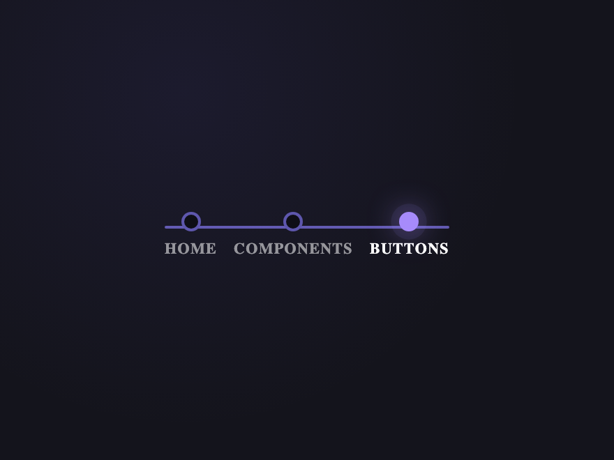
Subway Line
Pure CSS
Crumbs as metro stops on a horizontal line. The current page is the lit "you are here" stop with a soft pulsing glow.
Try it
.bc-12__list {
  display: flex;
  align-items: center;
  list-style: none;
  padding: 14px 18px 8px;
  margin: 0;
  position: relative;
}

.bc-12__list::before {
  content: "";
  position: absolute;
  top: 24px;
  left: 24px;
  right: 24px;
  height: 2px;
  background: linear-gradient(
    90deg,
    rgba(139, 127, 255, 0.65) 0%,
    rgba(139, 127, 255, 0.65) var(--bc12-cur, 100%),
    rgba(255, 255, 255, 0.12) var(--bc12-cur, 100%),
    rgba(255, 255, 255, 0.12) 100%
  );
  border-radius: 2px;
}

.bc-12__item {
  flex: 1;
  display: flex;
  justify-content: center;
}

.bc-12__link {
  display: flex;
  flex-direction: column;
  align-items: center;
  gap: 6px;
  text-decoration: none;
  position: relative;
  padding: 0 6px;
  transition: transform 0.2s;
}

.bc-12__link:hover {
  transform: translateY(-2px);
}

.bc-12__dot {
  width: 14px;
  height: 14px;
  border-radius: 50%;
  background: #0e0e16;
  border: 2px solid rgba(139, 127, 255, 0.65);
  position: relative;
  z-index: 1;
  transition:
    background 0.2s,
    border-color 0.2s,
    box-shadow 0.2s;
}

.bc-12__link:hover .bc-12__dot {
  border-color: #a78bfa;
  background: rgba(139, 127, 255, 0.15);
}

.bc-12__label {
  font-size: 11px;
  font-weight: 600;
  letter-spacing: 0.06em;
  text-transform: uppercase;
  color: rgba(255, 255, 255, 0.55);
  transition: color 0.2s;
  white-space: nowrap;
}

.bc-12__link:hover .bc-12__label {
  color: rgba(255, 255, 255, 0.85);
}

.bc-12__link--cur {
  pointer-events: none;
}

.bc-12__link--cur .bc-12__dot {
  background: #a78bfa;
  border-color: #a78bfa;
  box-shadow:
    0 0 0 4px rgba(167, 139, 250, 0.18),
    0 0 14px rgba(167, 139, 250, 0.6);
  animation: bc12pulse 2s ease-in-out infinite;
}

.bc-12__link--cur .bc-12__label {
  color: #fff;
  font-weight: 700;
}

@keyframes bc12pulse {
  0%,
  100% {
    box-shadow:
      0 0 0 4px rgba(167, 139, 250, 0.18),
      0 0 14px rgba(167, 139, 250, 0.6);
  }
  50% {
    box-shadow:
      0 0 0 6px rgba(167, 139, 250, 0.08),
      0 0 22px rgba(167, 139, 250, 0.85);
  }
}

@media (prefers-reduced-motion: reduce) {
  .bc-12__link--cur .bc-12__dot {
    animation: none;
  }
  .bc-12__link:hover {
    transform: none;
  }
}
<nav class="bc-12" aria-label="Breadcrumb">
  <ol class="bc-12__list">
    <li class="bc-12__item">
      <a class="bc-12__link" href="javascript:void(0)">
        <span class="bc-12__dot" aria-hidden="true"></span>
        <span class="bc-12__label">Home</span>
      </a>
    </li>
    <li class="bc-12__item">
      <a class="bc-12__link" href="javascript:void(0)">
        <span class="bc-12__dot" aria-hidden="true"></span>
        <span class="bc-12__label">Components</span>
      </a>
    </li>
    <li class="bc-12__item">
      <a class="bc-12__link bc-12__link--cur" aria-current="page" href="javascript:void(0)">
        <span class="bc-12__dot" aria-hidden="true"></span>
        <span class="bc-12__label">Buttons</span>
      </a>
    </li>
  </ol>
</nav>
Advertisement
13 / 22
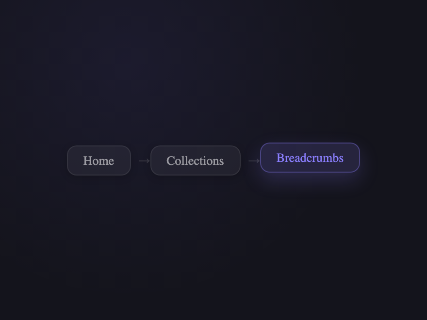
Floating Island
Pure CSS
Each crumb is a floating card that springs upward on hover with a shadow bloom.
Try it
.bc-13__list {
  display: flex;
  align-items: center;
  list-style: none;
  padding: 0;
  margin: 0;
  gap: 8px;
  flex-wrap: wrap;
}

.bc-13__item {
  display: flex;
  align-items: center;
}

.bc-13__item + .bc-13__item::before {
  content: "→";
  color: rgba(255, 255, 255, 0.15);
  font-size: 12px;
}

.bc-13__link {
  display: block;
  padding: 7px 16px;
  border-radius: 10px;
  background: rgba(255, 255, 255, 0.05);
  border: 1px solid rgba(255, 255, 255, 0.08);
  font-size: 13px;
  font-weight: 500;
  color: rgba(255, 255, 255, 0.55);
  text-decoration: none;
  box-shadow: 0 2px 8px rgba(0, 0, 0, 0.2);
  transition:
    background 0.3s,
    border-color 0.3s,
    color 0.3s,
    transform 0.35s cubic-bezier(0.34, 1.56, 0.64, 1),
    box-shadow 0.3s;
}

.bc-13__link:hover {
  background: rgba(255, 255, 255, 0.1);
  border-color: rgba(255, 255, 255, 0.18);
  color: #fff;
  transform: translateY(-3px);
  box-shadow: 0 8px 20px rgba(0, 0, 0, 0.35);
}

.bc-13__link--cur {
  background: rgba(139, 127, 255, 0.15);
  border-color: rgba(139, 127, 255, 0.35);
  color: #8b7fff;
  transform: translateY(-3px);
  box-shadow: 0 8px 20px rgba(139, 127, 255, 0.2);
  pointer-events: none;
}
<nav class="bc-13" aria-label="Breadcrumb">
  <ol class="bc-13__list">
    <li class="bc-13__item"><a class="bc-13__link" href="javascript:void(0)">Home</a></li>
    <li class="bc-13__item"><a class="bc-13__link" href="javascript:void(0)">Collections</a></li>
    <li class="bc-13__item">
      <a class="bc-13__link bc-13__link--cur" aria-current="page" href="javascript:void(0)"
        >Breadcrumbs</a
      >
    </li>
  </ol>
</nav>
14 / 22
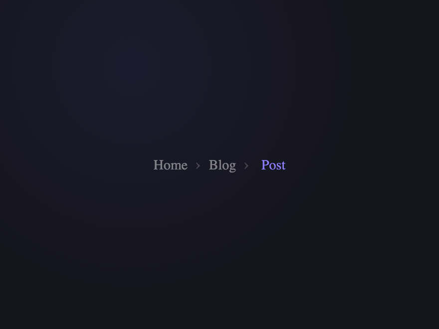
Scale Peek
Pure CSS
On hover the whole list dims and scales down — only the hovered crumb scales up to full.
Try it
.bc-14__list {
  display: flex;
  align-items: center;
  list-style: none;
  padding: 0;
  margin: 0;
  flex-wrap: wrap;
}

.bc-14__item + .bc-14__item::before {
  content: "›";
  padding: 0 8px;
  color: rgba(255, 255, 255, 0.2);
  font-size: 16px;
}

.bc-14__link {
  font-size: 14px;
  font-weight: 500;
  color: rgba(255, 255, 255, 0.45);
  text-decoration: none;
  transition:
    color 0.25s,
    opacity 0.25s,
    transform 0.25s;
}

.bc-14__list:hover .bc-14__link {
  opacity: 0.35;
  transform: scale(0.96);
}

.bc-14__list:hover .bc-14__link:hover {
  opacity: 1;
  transform: scale(1.05);
  color: #fff;
}

.bc-14__link--cur {
  color: #8b7fff;
  pointer-events: none;
}
<nav class="bc-14" aria-label="Breadcrumb">
  <ol class="bc-14__list">
    <li class="bc-14__item"><a class="bc-14__link" href="javascript:void(0)">Home</a></li>
    <li class="bc-14__item"><a class="bc-14__link" href="javascript:void(0)">Blog</a></li>
    <li class="bc-14__item">
      <a class="bc-14__link bc-14__link--cur" aria-current="page" href="javascript:void(0)">Post</a>
    </li>
  </ol>
</nav>
15 / 22
Holographic Shimmer
Pure CSS
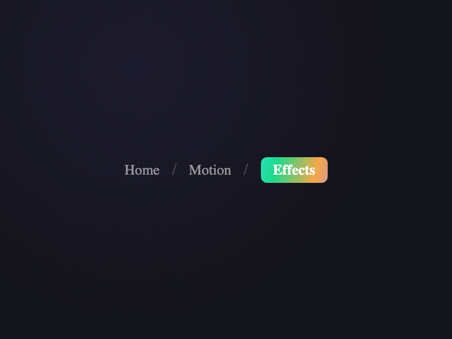
Current page gets a looping rainbow holographic background. Past crumbs are plain text.
Try it
.bc-15__list {
  display: flex;
  align-items: center;
  list-style: none;
  padding: 0;
  margin: 0;
}

.bc-15__item {
  display: flex;
  align-items: center;
}

.bc-15__item + .bc-15__item::before {
  content: "/";
  padding: 0 12px;
  color: rgba(255, 255, 255, 0.2);
}

.bc-15__link {
  font-size: 14px;
  font-weight: 500;
  color: rgba(255, 255, 255, 0.55);
  text-decoration: none;
  transition: color 0.25s;
}

.bc-15__link:hover {
  color: rgba(255, 255, 255, 0.8);
}

.bc-15__link--cur {
  position: relative;
  overflow: hidden;
  display: inline-flex;
  align-items: center;
  padding: 4px 12px;
  border-radius: 6px;
  pointer-events: none;
}

.bc-15__shine {
  position: absolute;
  inset: 0;
  background: linear-gradient(105deg, #8b7fff, #ff6b9d, #3de8f5, #1ed98a, #f5a84a, #8b7fff);
  background-size: 300% 100%;
  animation: bc15holo 3s linear infinite;
}

@keyframes bc15holo {
  from {
    background-position: 0% 50%;
  }
  to {
    background-position: 300% 50%;
  }
}

.bc-15__text {
  position: relative;
  z-index: 1;
  color: #fff;
  font-weight: 700;
}
<nav class="bc-15" aria-label="Breadcrumb">
  <ol class="bc-15__list">
    <li class="bc-15__item"><a class="bc-15__link" href="javascript:void(0)">Home</a></li>
    <li class="bc-15__item"><a class="bc-15__link" href="javascript:void(0)">Motion</a></li>
    <li class="bc-15__item">
      <a class="bc-15__link bc-15__link--cur" aria-current="page" href="javascript:void(0)"
        ><span class="bc-15__shine" aria-hidden="true"></span
        ><span class="bc-15__text">Effects</span></a
      >
    </li>
  </ol>
</nav>
16 / 22
Arrow Chain
Pure CSS
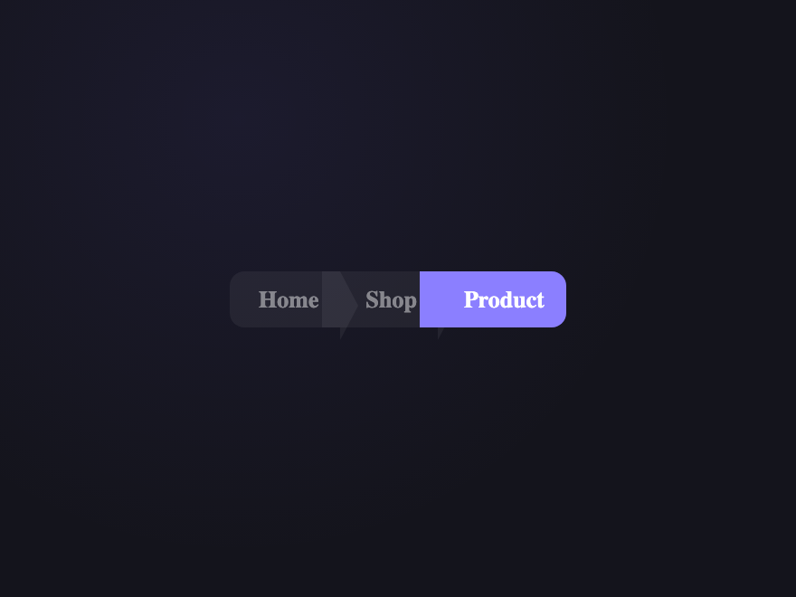
CSS arrow-chevron breadcrumbs using border triangles — no SVG or images needed.
Try it
.bc-16__list {
  display: flex;
  list-style: none;
  padding: 0;
  margin: 0;
}

.bc-16__item {
  display: flex;
}

.bc-16__link {
  display: flex;
  align-items: center;
  padding: 8px 12px 8px 24px;
  position: relative;
  font-size: 13px;
  font-weight: 600;
  background: rgba(255, 255, 255, 0.06);
  color: rgba(255, 255, 255, 0.45);
  text-decoration: none;
  margin-left: -10px;
  transition:
    background 0.25s,
    color 0.25s;
}

.bc-16__item:first-child .bc-16__link {
  padding-left: 16px;
  border-radius: 8px 0 0 8px;
  margin-left: 0;
}

.bc-16__link::after {
  content: "";
  position: absolute;
  right: -10px;
  top: 0;
  width: 0;
  height: 100%;
  border-top: 19px solid transparent;
  border-bottom: 19px solid transparent;
  border-left: 10px solid rgba(255, 255, 255, 0.06);
  z-index: 1;
  transition: border-left-color 0.25s;
}

.bc-16__link:hover {
  background: rgba(255, 255, 255, 0.12);
  color: #fff;
  z-index: 2;
}

.bc-16__link:hover::after {
  border-left-color: rgba(255, 255, 255, 0.12);
}

.bc-16__link--cur {
  background: #8b7fff;
  color: #fff;
  pointer-events: none;
  z-index: 2;
  border-radius: 0 8px 8px 0;
}

.bc-16__link--cur::after {
  display: none;
}
<nav class="bc-16" aria-label="Breadcrumb">
  <ol class="bc-16__list">
    <li class="bc-16__item"><a class="bc-16__link" href="javascript:void(0)">Home</a></li>
    <li class="bc-16__item"><a class="bc-16__link" href="javascript:void(0)">Shop</a></li>
    <li class="bc-16__item">
      <a class="bc-16__link bc-16__link--cur" aria-current="page" href="javascript:void(0)"
        >Product</a
      >
    </li>
  </ol>
</nav>
17 / 22
Dotted Separator
Pure CSS
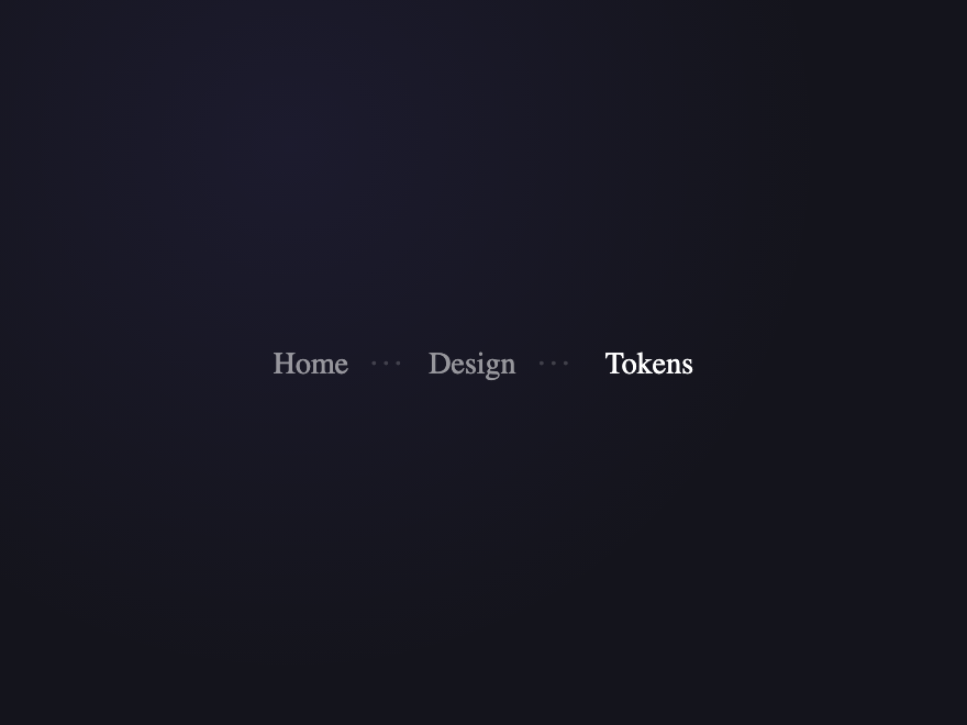
Ellipsis dots between crumbs that expand on hover for a subtle kinetic effect.
Try it
.bc-17__list {
  display: flex;
  align-items: center;
  list-style: none;
  padding: 0;
  margin: 0;
  flex-wrap: wrap;
}

.bc-17__item + .bc-17__item::before {
  content: "···";
  padding: 0 10px;
  color: rgba(255, 255, 255, 0.18);
  font-size: 14px;
  letter-spacing: 2px;
  transition:
    color 0.25s,
    letter-spacing 0.3s;
}

.bc-17__item:hover + .bc-17__item::before {
  color: rgba(255, 255, 255, 0.45);
  letter-spacing: 4px;
}

.bc-17__link {
  font-size: 14px;
  font-weight: 500;
  color: rgba(255, 255, 255, 0.55);
  text-decoration: none;
  transition: color 0.25s;
}

.bc-17__link:hover {
  color: rgba(255, 255, 255, 0.85);
}

.bc-17__link--cur {
  color: #fff;
  pointer-events: none;
}
<nav class="bc-17" aria-label="Breadcrumb">
  <ol class="bc-17__list">
    <li class="bc-17__item"><a class="bc-17__link" href="javascript:void(0)">Home</a></li>
    <li class="bc-17__item"><a class="bc-17__link" href="javascript:void(0)">Design</a></li>
    <li class="bc-17__item">
      <a class="bc-17__link bc-17__link--cur" aria-current="page" href="javascript:void(0)"
        >Tokens</a
      >
    </li>
  </ol>
</nav>
18 / 22
Bordered Box
Pure CSS
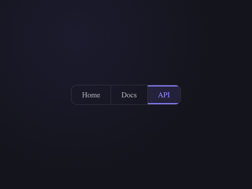
All crumbs share one bordered container with dividers. Active gets an inset top+bottom accent stroke.
Try it
.bc-18__list {
  display: flex;
  align-items: center;
  list-style: none;
  padding: 0;
  margin: 0;
  border: 1px solid rgba(255, 255, 255, 0.1);
  border-radius: 10px;
  overflow: hidden;
}

.bc-18__item + .bc-18__item {
  border-left: 1px solid rgba(255, 255, 255, 0.1);
}

.bc-18__link {
  display: block;
  padding: 9px 18px;
  font-size: 13px;
  font-weight: 500;
  color: rgba(255, 255, 255, 0.55);
  text-decoration: none;
  transition:
    background 0.25s,
    color 0.25s;
}

.bc-18__link:hover {
  background: rgba(255, 255, 255, 0.15);
  color: #fff;
}

.bc-18__link--cur {
  background: rgba(139, 127, 255, 0.12);
  color: #8b7fff;
  pointer-events: none;
  box-shadow:
    inset 0 2px 0 #8b7fff,
    inset 0 -2px 0 #8b7fff;
}
<nav class="bc-18" aria-label="Breadcrumb">
  <ol class="bc-18__list">
    <li class="bc-18__item"><a class="bc-18__link" href="javascript:void(0)">Home</a></li>
    <li class="bc-18__item"><a class="bc-18__link" href="javascript:void(0)">Docs</a></li>
    <li class="bc-18__item">
      <a class="bc-18__link bc-18__link--cur" aria-current="page" href="javascript:void(0)">API</a>
    </li>
  </ol>
</nav>
19 / 22
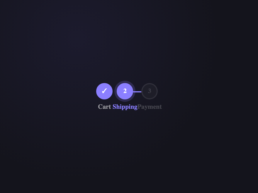
Progress Track
Pure CSS
Stepper-style breadcrumb with numbered nodes connected by a track line — great for multi-step flows.
Try it
.bc-19__list {
  display: flex;
  align-items: flex-start;
  list-style: none;
  padding: 0;
  margin: 0;
  gap: 0;
}

.bc-19__item {
  display: flex;
  flex-direction: column;
  align-items: center;
  gap: 6px;
  flex: 1;
  position: relative;
}

.bc-19__item::before {
  content: "";
  position: absolute;
  top: 14px;
  left: calc(50% + 14px);
  right: calc(-50% + 14px);
  height: 2px;
  background: rgba(255, 255, 255, 0.1);
}

.bc-19__item:last-child::before {
  display: none;
}

.bc-19__item--done::before {
  background: #8b7fff;
}

.bc-19__node {
  width: 28px;
  height: 28px;
  border-radius: 50%;
  display: flex;
  align-items: center;
  justify-content: center;
  font-size: 11px;
  font-weight: 700;
  background: rgba(255, 255, 255, 0.08);
  border: 2px solid rgba(255, 255, 255, 0.2);
  color: rgba(255, 255, 255, 0.35);
  transition: all 0.3s;
}

.bc-19__item--done .bc-19__node {
  background: #8b7fff;
  border-color: #8b7fff;
  color: #fff;
}

.bc-19__node--cur {
  background: transparent;
  border-color: #8b7fff;
  color: #8b7fff;
  box-shadow: 0 0 0 4px rgba(139, 127, 255, 0.2);
}

.bc-19__node--next {
  opacity: 0.4;
}

.bc-19__link {
  font-size: 11px;
  font-weight: 600;
  text-decoration: none;
  color: rgba(255, 255, 255, 0.55);
  text-align: center;
  transition: color 0.25s;
}

.bc-19__link--cur {
  color: #8b7fff;
  pointer-events: none;
}

.bc-19__label {
  font-size: 11px;
  font-weight: 600;
  color: rgba(255, 255, 255, 0.2);
}
<nav class="bc-19" aria-label="Breadcrumb">
  <ol class="bc-19__list">
    <li class="bc-19__item bc-19__item--done">
      <div class="bc-19__node">✓</div>
      <a class="bc-19__link" href="javascript:void(0)">Cart</a>
    </li>
    <li class="bc-19__item bc-19__item--done">
      <div class="bc-19__node bc-19__node--cur">2</div>
      <a class="bc-19__link bc-19__link--cur" aria-current="page" href="javascript:void(0)"
        >Shipping</a
      >
    </li>
    <li class="bc-19__item">
      <div class="bc-19__node bc-19__node--next">3</div>
      <span class="bc-19__label">Payment</span>
    </li>
  </ol>
</nav>
20 / 22
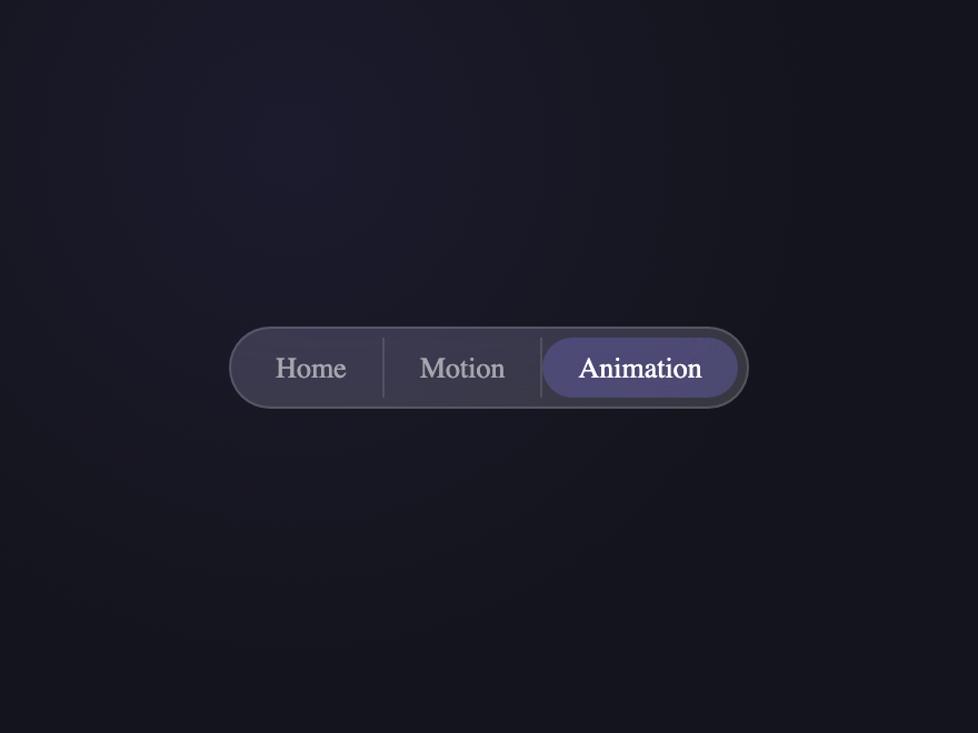
Glassmorphism Bar
Pure CSS
All crumbs live inside a single frosted glass pill container with blur and saturation.
Try it
.bc-20 {
  display: inline-block;
  background: rgba(255, 255, 255, 0.15);
  backdrop-filter: blur(16px) saturate(180%);
  border: 1px solid rgba(255, 255, 255, 0.15);
  border-radius: 50px;
  padding: 4px;
}

.bc-20__list {
  display: flex;
  align-items: center;
  list-style: none;
  padding: 0;
  margin: 0;
}

.bc-20__item + .bc-20__item {
  border-left: 1px solid rgba(255, 255, 255, 0.12);
}

.bc-20__link {
  display: block;
  padding: 6px 16px;
  font-size: 13px;
  font-weight: 500;
  color: rgba(255, 255, 255, 0.55);
  text-decoration: none;
  border-radius: 50px;
  transition:
    background 0.3s,
    color 0.3s;
}

.bc-20__link:hover {
  background: rgba(255, 255, 255, 0.12);
  color: #fff;
}

.bc-20__link--cur {
  background: rgba(139, 127, 255, 0.25);
  color: #fff;
  pointer-events: none;
}
<nav class="bc-20" aria-label="Breadcrumb">
  <ol class="bc-20__list">
    <li class="bc-20__item"><a class="bc-20__link" href="javascript:void(0)">Home</a></li>
    <li class="bc-20__item"><a class="bc-20__link" href="javascript:void(0)">Motion</a></li>
    <li class="bc-20__item">
      <a class="bc-20__link bc-20__link--cur" aria-current="page" href="javascript:void(0)"
        >Animation</a
      >
    </li>
  </ol>
</nav>
21 / 22
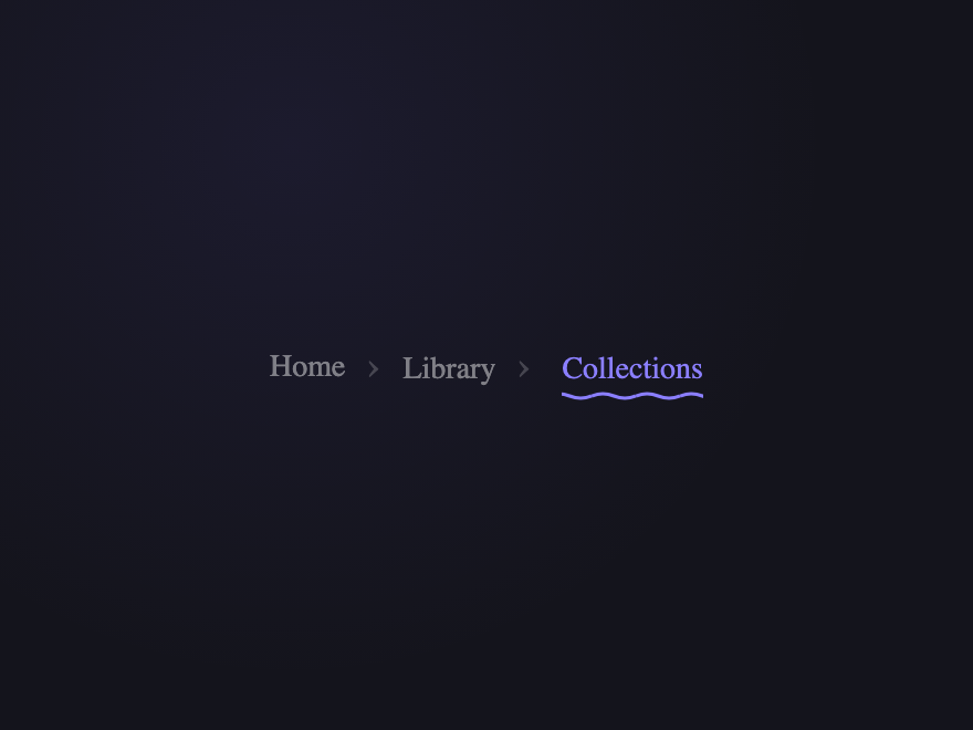
Wave Underline
Pure CSS
An animated SVG wave appears under each link on hover — the current page keeps the wave active.
Try it
.bc-21__list {
  display: flex;
  align-items: center;
  list-style: none;
  padding: 0;
  margin: 0;
}

.bc-21__item + .bc-21__item::before {
  content: "›";
  padding: 0 10px;
  color: rgba(255, 255, 255, 0.2);
  font-size: 18px;
}

.bc-21__link {
  position: relative;
  font-size: 14px;
  font-weight: 500;
  color: rgba(255, 255, 255, 0.45);
  text-decoration: none;
  padding-bottom: 6px;
  transition: color 0.25s;
}

.bc-21__link::after {
  content: "";
  position: absolute;
  bottom: 0;
  left: 0;
  right: 0;
  height: 4px;
  background-image: url("data:image/svg+xml,%3Csvg xmlns='http://www.w3.org/2000/svg' viewBox='0 0 20 4'%3E%3Cpath d='M0 2 Q5 0 10 2 Q15 4 20 2' fill='none' stroke='%238b7fff' stroke-width='1.5'/%3E%3C/svg%3E");
  background-size: 20px 4px;
  background-repeat: repeat-x;
  opacity: 0;
  transform: translateY(4px);
  transition:
    opacity 0.3s,
    transform 0.3s;
  animation: bc21wave 1.2s linear infinite paused;
}

.bc-21__link:hover::after,
.bc-21__link--cur::after {
  opacity: 1;
  transform: translateY(0);
  animation-play-state: running;
}

@keyframes bc21wave {
  from {
    background-position: 0 0;
  }
  to {
    background-position: 20px 0;
  }
}

.bc-21__link:hover {
  color: rgba(255, 255, 255, 0.85);
}

.bc-21__link--cur {
  color: #8b7fff;
  pointer-events: none;
}
<nav class="bc-21" aria-label="Breadcrumb">
  <ol class="bc-21__list">
    <li class="bc-21__item"><a class="bc-21__link" href="javascript:void(0)">Home</a></li>
    <li class="bc-21__item"><a class="bc-21__link" href="javascript:void(0)">Library</a></li>
    <li class="bc-21__item">
      <a class="bc-21__link bc-21__link--cur" aria-current="page" href="javascript:void(0)"
        >Collections</a
      >
    </li>
  </ol>
</nav>
22 / 22
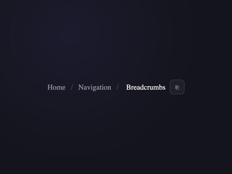
Copy Path
CSS+JS
Standard breadcrumb with a copy button that copies the current URL path and shows a toast.
Try it
.bc-22 {
  position: relative;
}

.bc-22__wrap {
  display: flex;
  align-items: center;
  gap: 8px;
}

.bc-22__list {
  display: flex;
  align-items: center;
  list-style: none;
  padding: 0;
  margin: 0;
}

.bc-22__item + .bc-22__item::before {
  content: "/";
  padding: 0 10px;
  color: rgba(255, 255, 255, 0.2);
}

.bc-22__link {
  font-size: 14px;
  font-weight: 500;
  color: rgba(255, 255, 255, 0.55);
  text-decoration: none;
  transition: color 0.25s;
}

.bc-22__link:hover {
  color: rgba(255, 255, 255, 0.8);
}

.bc-22__link--cur {
  color: #fff;
  pointer-events: none;
}

.bc-22__copy {
  width: 28px;
  height: 28px;
  border-radius: 7px;
  border: 1px solid rgba(255, 255, 255, 0.12);
  background: rgba(255, 255, 255, 0.05);
  cursor: pointer;
  font-size: 14px;
  color: rgba(255, 255, 255, 0.55);
  display: flex;
  align-items: center;
  justify-content: center;
  transition:
    background 0.2s,
    color 0.2s,
    border-color 0.2s;
}

.bc-22__copy:hover {
  background: rgba(139, 127, 255, 0.2);
  border-color: rgba(139, 127, 255, 0.4);
  color: #8b7fff;
}

.bc-22__copy-icon {
  line-height: 1;
  display: block;
}

.bc-22__toast {
  position: absolute;
  top: -34px;
  left: 50%;
  transform: translateX(-50%) translateY(4px);
  background: #8b7fff;
  color: #fff;
  font-size: 11px;
  font-weight: 700;
  padding: 4px 10px;
  border-radius: 6px;
  opacity: 0;
  pointer-events: none;
  transition:
    opacity 0.2s,
    transform 0.2s;
  white-space: nowrap;
}

.bc-22__toast--show {
  opacity: 1;
  transform: translateX(-50%) translateY(0);
}
<nav class="bc-22" aria-label="Breadcrumb">
  <div class="bc-22__wrap">
    <ol class="bc-22__list">
      <li class="bc-22__item"><a class="bc-22__link" href="javascript:void(0)">Home</a></li>
      <li class="bc-22__item"><a class="bc-22__link" href="javascript:void(0)">Navigation</a></li>
      <li class="bc-22__item">
        <a class="bc-22__link bc-22__link--cur" aria-current="page" href="javascript:void(0)"
          >Breadcrumbs</a
        >
      </li>
    </ol>
    <button class="bc-22__copy" id="bc22-btn" aria-label="Copy path">
      <span class="bc-22__copy-icon" aria-hidden="true">⎘</span>
    </button>
  </div>
  <span class="bc-22__toast" id="bc22-toast">Copied!</span>
</nav>
document.querySelectorAll(".bc-22__copy").forEach(function (btn) {
  btn.addEventListener("click", function () {
    var toast = btn.closest(".bc-22").querySelector(".bc-22__toast");
    navigator.clipboard.writeText(window.location.href).then(function () {
      toast.classList.add("bc-22__toast--show");
      setTimeout(function () {
        toast.classList.remove("bc-22__toast--show");
      }, 2000);
    });
  });
});
Advertisement

Build your own

Tweak the exact look in our visual generators — no signup, instant copy-paste.

FAQ

Frequently asked questions

What is the correct HTML for a breadcrumb?
Wrap the trail in a nav element with aria-label='Breadcrumb', put the items in an ordered list (ol) since the order is meaningful, and make each step a link except the current page. Mark the current page with aria-current='page'. This semantic structure is what screen readers and search engines expect — every breadcrumb in this gallery uses it.
How do I style breadcrumb separators in pure CSS?
Don't put separator characters in the HTML — add them with CSS so they stay decorative. Use a ::before pseudo-element on each list item (skipping the first) with content: '/' or '›', or a chevron drawn with borders. This keeps the markup clean and means assistive tech reads only the real link text, not the slashes.
Do CSS breadcrumbs help SEO?
Yes. Breadcrumbs show site hierarchy, and when paired with BreadcrumbList structured data (JSON-LD) Google can display the breadcrumb trail directly in search results instead of a plain URL. The semantic nav + ol markup these demos use is the foundation; add the matching BreadcrumbList schema on real pages to get the rich result.
Do these CSS breadcrumbs need JavaScript?
The layouts and hover effects are pure CSS. JavaScript is only used for a couple of interactive variants (such as a collapsing trail that expands on click for very deep paths); where used, the snippet is included with the demo. The standard breadcrumb designs need no JS at all.
Are these breadcrumb designs accessible and free?
Yes. Each demo uses nav with aria-label, an ordered list, real links, aria-current on the active page, and visible focus states; decorative separators are CSS-only so they aren't announced. All 22 designs are MIT licensed and free for personal and commercial use.

Related collections

Search CodeFronts

Loading…