Minimalist UI is the discipline of letting whitespace and typography carry the design. These 6 hand-coded screen mocks cover the surfaces minimalist design has to win: a dark SaaS dashboard with sparkline KPIs and a live bar chart, a Florentine luxury e-commerce storefront with editorial product photography, a brutalist-white architect's portfolio with hover-revealed SVG previews, a broadsheet editorial layout with drop-cap leads and reading-progress, a fintech mobile app rendered inside a realistic phone frame, and a high-impact single-product SaaS landing with perspective grid + animated mock dashboard. Every demo is wrapped in its own scoped class so all six render on the gallery page without bleed.
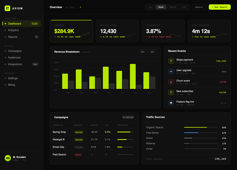
A dark minimalist SaaS dashboard UI with a chartreuse #c8ff00 accent — a complete cockpit composition that proves how strategic whitespace and crisp typography reduce cognitive load on data-heavy applications.
Best forSaaS product dashboards, admin panels, analytics products, internal tools, monochrome data UIs.
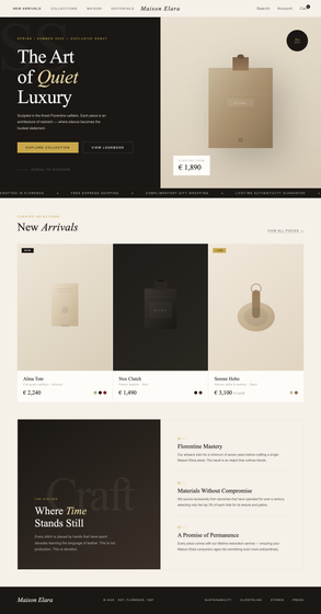
A minimalist luxury e-commerce storefront UI in cream + deep ink with a Florentine fashion-house aesthetic — proving that high-end retail layouts work best when whitespace, typography hierarchy, and product photography do all the talking.
Best forluxury fashion e-commerce, premium retail storefronts, jewellery brands, perfume houses, boutique hotel landing pages.
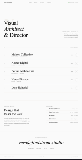
A brutalist-white minimalist portfolio UI for a Stockholm-based art director — a gallery-wall approach where the interface disappears so the creative work takes center stage.
Best fordesigner portfolios, photographer sites, architect studios, art director landing pages, creative agency homepages.
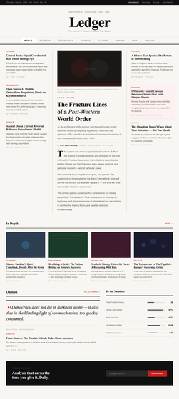
A minimalist editorial UI built like a broadsheet newspaper — proving that text-heavy content websites work best when typography hierarchy and reading rhythm carry the design.
Best fornews websites, blog sites, online magazines, content-heavy editorial layouts, Substack-style publications, wiki-style reading apps.
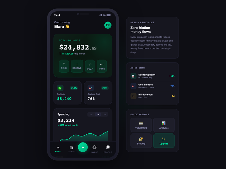
A minimalist mobile fintech app UI rendered inside a realistic phone frame — proving that small-screen mobile interfaces win by stripping visual noise and exposing primary data in a single glance.
Best forfintech mobile apps, banking apps, crypto wallets, budgeting UIs, neobank landing pages, mobile-first product showcases.
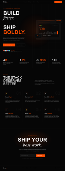
A minimalist SaaS landing page UI for a deployment platform — proving that high-impact single-product landing pages convert when they marry bold display typography to a focused single CTA.
What separates minimalist UI from just 'a clean UI'?
A clean UI removes obvious clutter. Minimalist UI is the discipline of letting whitespace and typography carry the design — every element earns its place. The dashboards here use one accent colour (#c8ff00 for Axiom, #00e5a0 for Elara), the e-commerce demo uses three (cream, ink, gold), the portfolio uses two (off-white, ink). Type stacks pair one display face with one neutral sans (Syne + DM Mono, Cormorant Garamond + Jost, Playfair Display + IBM Plex Sans, Libre Baskerville + Source Sans 3, Plus Jakarta Sans + Space Mono, Bebas Neue + Fraunces + Inter). Strip a real minimalist UI and what's left is a typography system and a colour pair. Strip a 'clean' UI and you usually find a Bootstrap default.
How does minimalist design actually reduce cognitive load?
Cognitive load comes from three sources in interfaces: parsing the visual hierarchy ('where do I look?'), distinguishing functional elements ('is that clickable?'), and disambiguating data ('does that number mean revenue or active users?'). Minimalism wins on all three by being rigorous about contrast and spacing. The Axiom dashboard uses 28px font-weight 800 for KPI values, 10px font-weight 400 mono for labels — there's no ambiguity which number is the headline. The e-commerce demo uses 72px serif italic for the hero pitch and 11px uppercase letterspaced 0.2em for CTAs — buttons cannot be confused with copy. Minimalism isn't 'less stuff' — it's higher contrast between functional layers.
Why so many serif fonts in 'minimalist' designs?
Two reasons. First, serif type carries editorial weight a geometric sans can't — the Maison Elara hero in Cormorant Garamond italic reads as 'luxury fashion house' immediately; in Inter it reads as 'tech startup pretending'. Second, italic serif inside an otherwise sans-serif system creates a hierarchy spike with zero added colour. The Crest landing page mixes Bebas Neue (display sans), Fraunces italic serif (the 'faster.' word), and Inter (body) — three faces, one accent colour (#ff4d00), and the headline still has three distinct tonal levels. Modern minimalism has moved past pure-Helvetica orthodoxy because serif italic is the cheapest way to add expressive hierarchy.
Are these production code or just visual references?
Production code, fully responsive, semantic HTML, prefers-reduced-motion respected on every keyframe animation, real `
Which demo do I steal first if I'm starting a SaaS marketing site?
Crest (demo 6) is the obvious answer — it has the full landing-page anatomy: sticky nav, hero split with animated product mock, social-proof avatars, 4-up stats strip with hover-revealed underlines, 3×2 features grid with oversized ghost numbers, centered CTA with email capture, footer. But if your product is a dashboard or internal tool, Axiom (demo 1) is the more honest reference — your eventual app will look closer to that than to a marketing page, and your landing site can borrow Axiom's typography system (Syne + DM Mono, chartreuse accent) for visual continuity between marketing and product.
How is each demo's CSS kept from leaking into the others?
Every widget is wrapped in its own scoped class — `.mu-sd` (Axiom dashboard), `.mu-ec` (Maison Elara e-commerce), `.mu-pf` (Vera Lindstrom portfolio), `.mu-ed` (Ledger editorial), `.mu-fn` (Elara fintech), `.mu-ls` (Crest landing). The source mocks' `:root { --foo: … }` design tokens are re-scoped to `.mu-XX { --mu-XX-foo: … }` so the tokens don't leak globally. Body-level styles (background, font-family, padding, overflow) are re-applied to the wrapper. `position: fixed` chrome (nav bars, reading progress, ambient glows) is re-scoped to `position: absolute` or `position: sticky` inside the wrapper. The portfolio demo's viewport-dependent `mix-blend-mode` custom cursor is dropped entirely (it would look broken in an embedded card) but the hover-triggered SVG project preview that's the actual differentiator is kept and re-scoped. Same discipline as the neon and brutalist collections.