Banners and alerts are the smallest UI surfaces with the biggest stakes. These 14 hand-coded CSS banner and alert patterns cover every notification surface a real product needs — dismissible cards, sticky announcements, semantic status alerts, cookie consent, form validation, toasts, live-update banners, and promotional hero banners. Pure CSS plus scoped JS, no UI framework, semantic HTML, accessibility-first. Every demo is wrapped in its own scoped class so all 14 render on the gallery page without bleed — copy any one into your project and it works on its own.
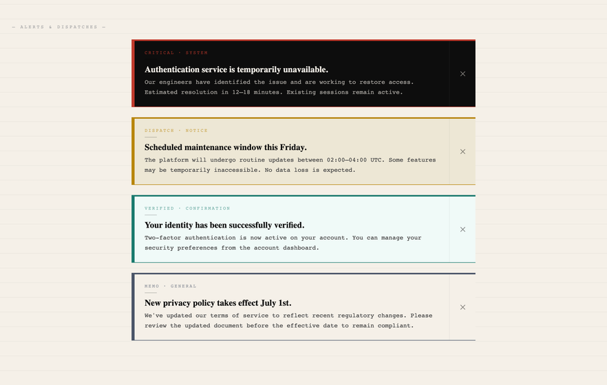
Four dismissible CSS alerts in a dark editorial magazine aesthetic — ink-on-paper texture, Playfair Display headlines, and four variant alerts (Critical / Dispatch / Verified / Memo) each with a unique colour story.
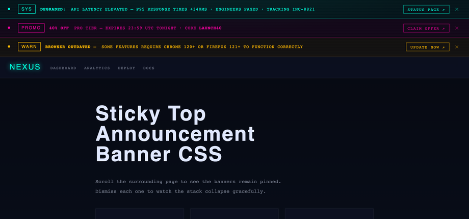
Three stackable sticky top announcement banners in a retro-futuristic terminal / neon aesthetic — deep space background, cyan / magenta / amber neon variants with layered glow effects, scanline texture overlay, and blinking live-indicator dots.
Best forSaaS dashboards, product announcements, status pages, cyberpunk-themed UIs.
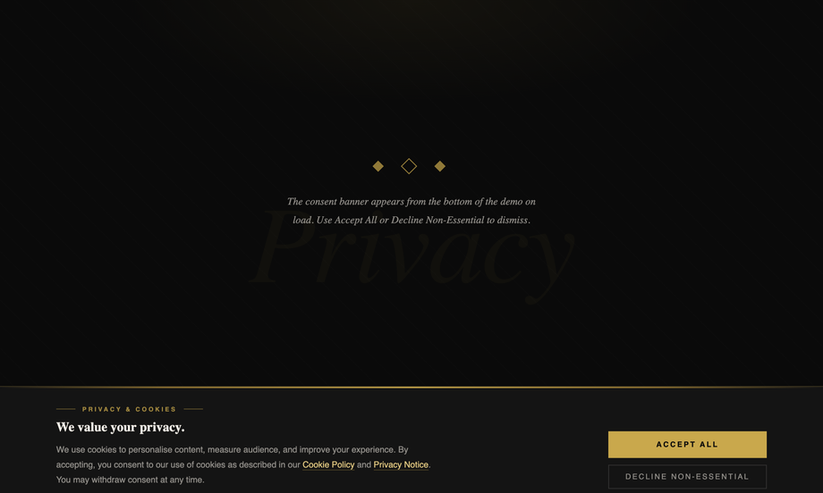
A bottom CSS cookie consent banner in a luxury Art Deco aesthetic — obsidian background, gold gradient top rule, diagonal corner motifs, and a smooth slide-up entrance animation.
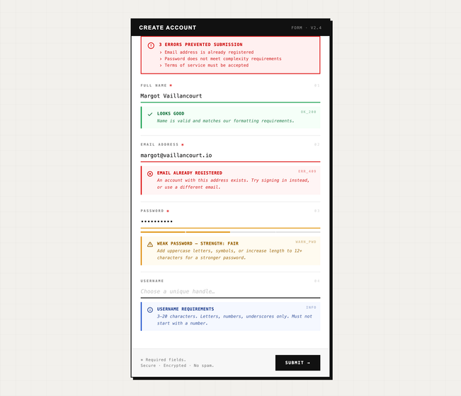
Inline form validation alerts in a brutalist / raw industrial aesthetic — grid paper texture, IBM Plex Mono throughout, black heavy borders with offset box shadow.
Best forregistration forms, signup flows, account validation, dev-tool input dialogs.
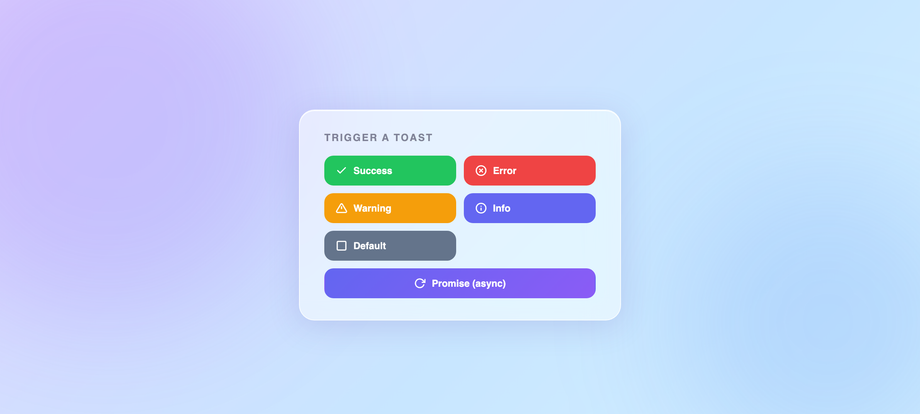
A top-right CSS toast notification system in a soft glassmorphism / frosted UI aesthetic — purple-blue ambient orbs, translucent frosted cards, spring-physics slide-in from right, and a progress bar that shrinks via <code>scaleX</code> as the auto-dismiss timer runs.
Best forSaaS dashboards, web-app feedback, async operations confirmation, modern notification systems.
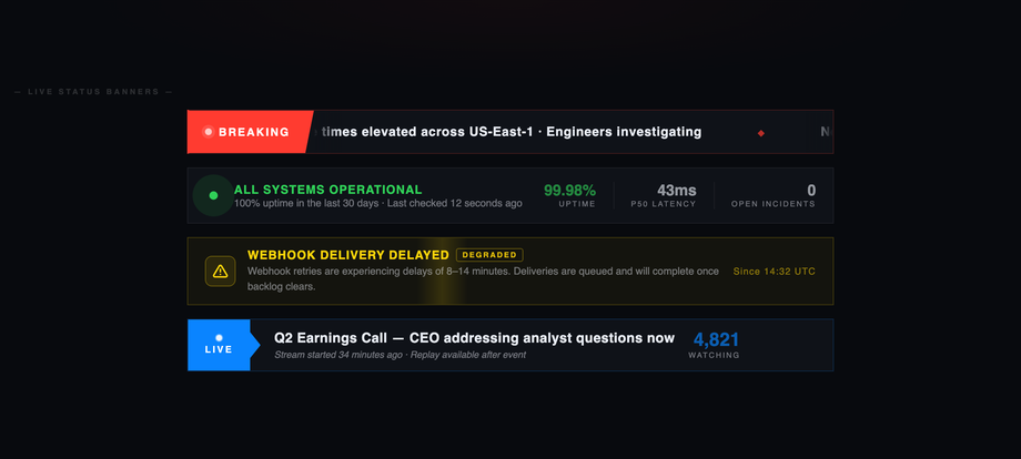
Four live-update CSS banners in a dark broadcast / newsroom aesthetic — a Breaking News ticker with seamless duplicate-string loop, a System Status bar with pulsing box-shadow ring orbs (operational green, 99.98% uptime, P50 latency), a Degraded service banner with sweeping diagonal glow scan + subtle shake animation, and a Live Coverage bar with viewer count + clip-path chevron badge. Every banner uses pure CSS animations — no JS required for the live feel. Barlow Condensed + Barlow. Best for status pages, live broadcasts, real-time dashboards, news sites.
Best forstatus pages, live broadcasts, real-time dashboards, news sites.
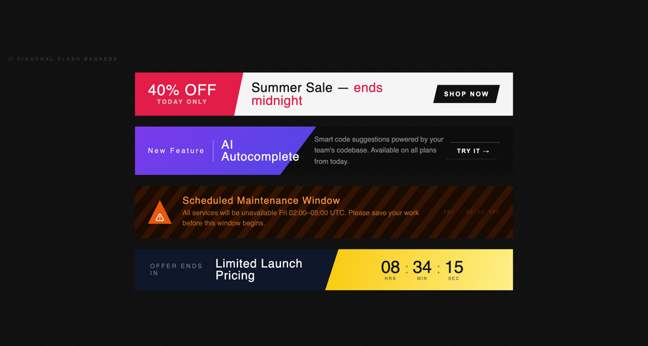
Four diagonal-slash CSS banners in a bold geometric streetwear aesthetic — four distinct slash techniques side-by-side: a <code>transform: skewX(-12deg)</code> badge with red 40% OFF promo, a <code>clip-path: polygon()</code> angled purple fill on a New Feature card, a <code>repeating-linear-gradient</code> hazard-stripe system warning in amber, and a crisp <code>linear-gradient(108deg)</code> dark/yellow split with a live countdown timer (hours / minutes / seconds).
Best forpromo banners, sale announcements, dev-tool warnings, attention-grabbing CTAs.
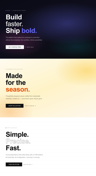
Three responsive full-width CSS hero banners stacked in completely different colour worlds — a dark cinematic mesh-gradient hero (Build faster / Ship bold) with grain texture overlay + glow eyebrow dot, a warm amber summer-collection hero, and a monochrome paper-grid hero for an open-source utility — all using <code>clamp()</code> for fluid typography throughout so no media queries are needed for type scaling.
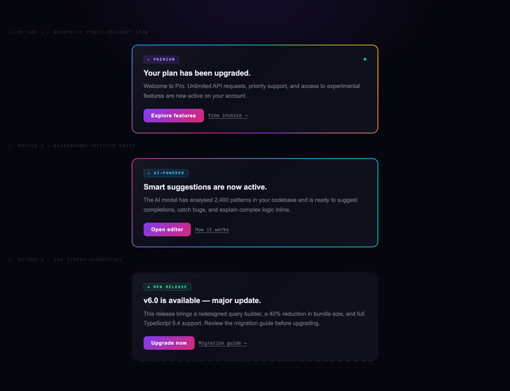
Three CSS gradient-animated border alerts in a web3 / iridescent holographic aesthetic — three techniques side-by-side: a <code>@property --angle</code> conic-gradient spinning border with blurred glow bloom (Premium plan upgrade), a <code>background-position</code> shifting linear gradient for maximum browser support (AI-Powered suggestions card), and an SVG <code>stroke-dashoffset</code> animation driven by ResizeObserver (v6.0 New Release card). Each card has a badge + title + body + dual-action footer. Space Grotesk + Space Mono. Best for web3 sites, AI / ML products, premium upgrade prompts, web3 dashboards.
Best forweb3 sites, AI / ML products, premium upgrade prompts, web3 dashboards.
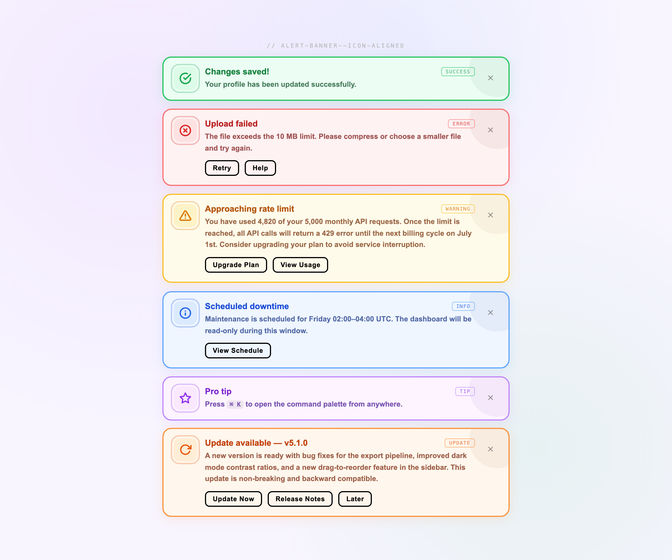
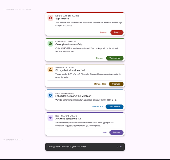
Material Design floating alert cards in an authentic Material You aesthetic — tactile physical depth via dual-layer shadows (ambient + directional), tinted icon containers using <code>color-mix()</code>, pill-shaped buttons with transparent <code>::after</code> ripple overlay, coloured top strip for semantic indication, and a full semantic set (Error / Success / Warning / Info / Primary).
Best forMaterial You apps, Android-inspired web UIs, Material 3 design systems, mobile-first web apps.
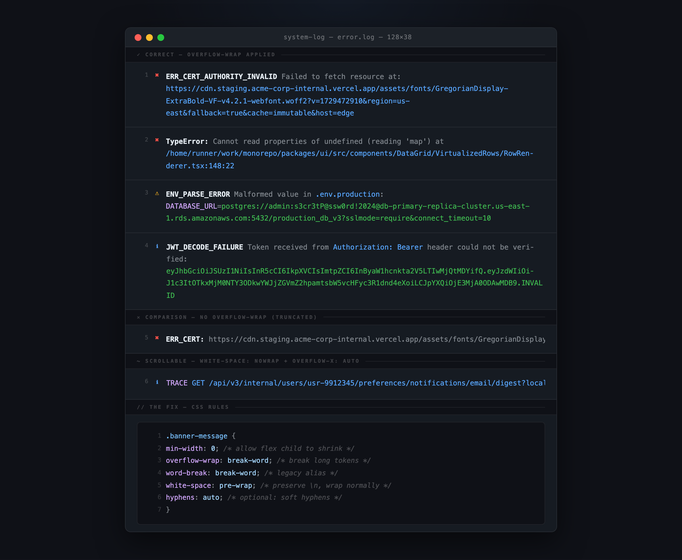
A CSS text-wrap banner demo in a developer terminal / GitHub-dark aesthetic — rendered as a real terminal window (traffic-light dots, title bar) with syntax-highlighted error log lines, side-by-side comparison of broken (truncated, <code>white-space: nowrap</code>) vs fixed (<code>overflow-wrap: break-word</code> applied) vs scrollable alternatives.
Best fordeveloper documentation, status pages, error log UIs, terminal-style displays.
Which CSS alert pattern should I use — Bootstrap-style, border-left, or toast?
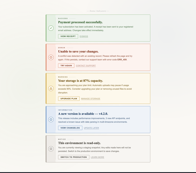
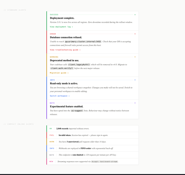
Match the pattern to the urgency and the surface. Inline status messages (the form submitted, the upload finished, the integration is connected) want the Bootstrap-style semantic alerts from demo 3 — they sit in the document flow, they map success/error/warning/info to four obvious colours, and screen readers already know how to read them when you wire `role="alert"` and `aria-live`. Long-form changelog or docs entries (deprecated API, breaking change, migration guide link) want the minimalist border-left from demo 9 — the 3px left border lets the message stack vertically inside a card without each entry needing its own colored fill, which would compete with body copy. Ephemeral confirmations (saved, copied, deleted) want the top-right toast from demo 7 — they don't interrupt the user's hand position, they auto-dismiss in 4–6 seconds, and they queue cleanly with `position: absolute` inside the wrapper. The wrong choice is using a toast for a critical error (it disappears before the user reads it) or using an inline alert for a 'copied to clipboard' (it interrupts flow for an action the user already completed).
How do I make a sticky top announcement banner accessible without breaking layout?