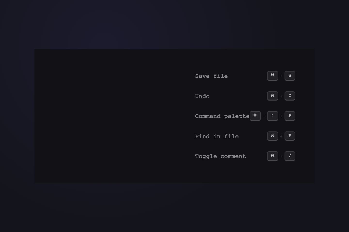
21 CSS Tooltips
A CSS tooltip is a hover-revealed information panel — anything from a one-line button label to a full documentation card with charts and metadata. These 21 hand-coded CSS tooltips cover the most common use cases on the modern web — compact labels, contextual help, hover cards, and rich data popovers. Every demo is namespaced under its own CSS prefix so two tooltips on the same page never collide. Pure CSS hover, no JavaScript. Layer keyboard focus and aria-describedby on top for production accessibility.

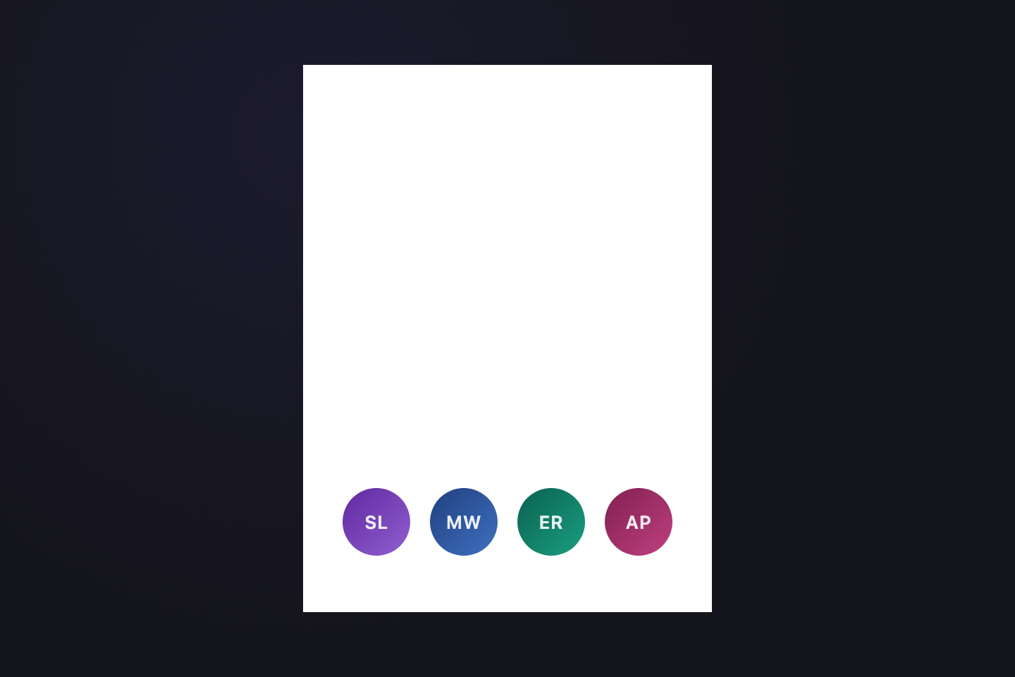

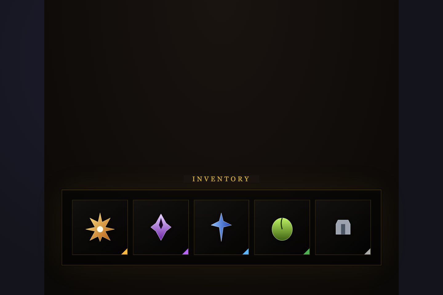
Frequently asked questions
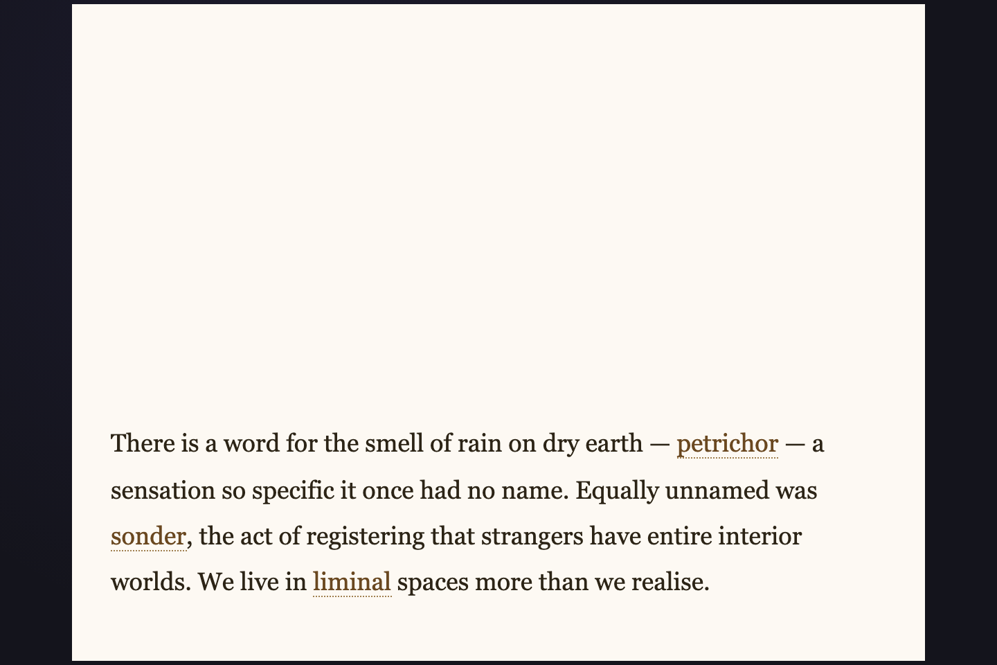
What is a CSS tooltip?
How do I keep tooltip styles from leaking between demos?
Are these accessible?
Do tooltips need JavaScript?
When should I use a tooltip versus a popover?
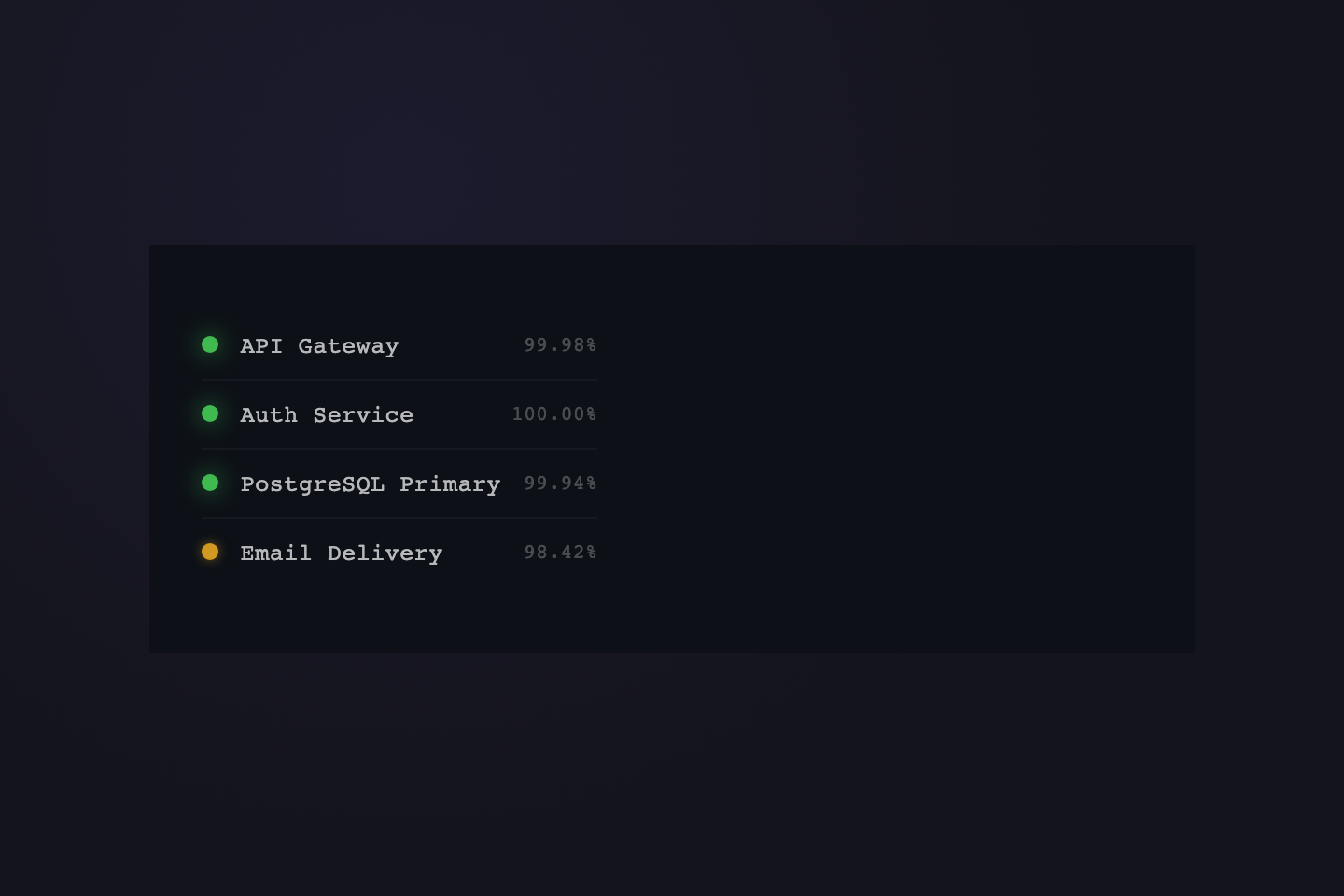
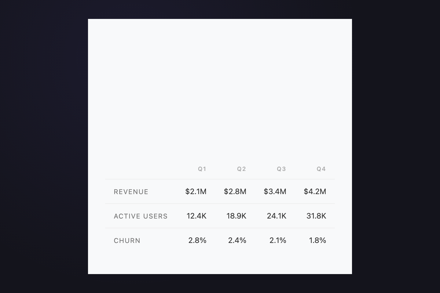
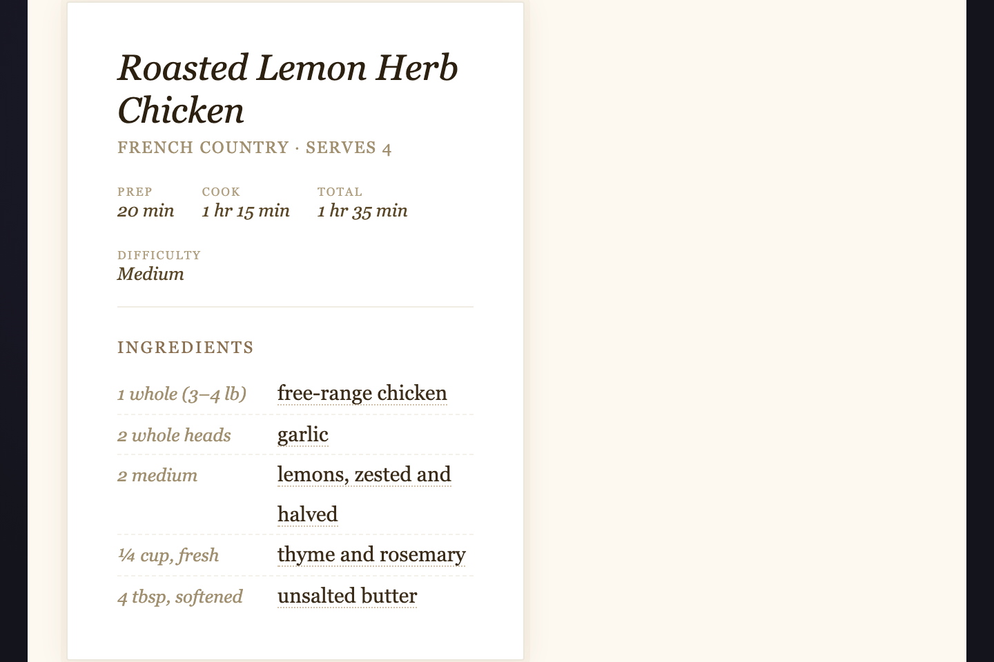
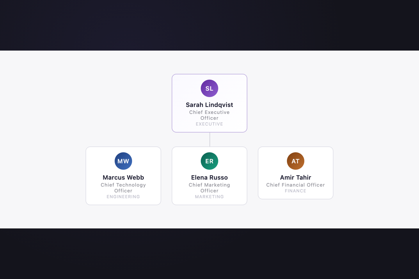
How do I adapt the data-rich tooltips to real data?
Why fonts from Google Fonts instead of system fonts?
Related collections

30 CSS Badges
30 hand-coded CSS badges spanning collectibles, status indicators, certifications, notifications, membership tiers, and live-data displays. Upload progress, typing indicator, scrabble tile, keycap shortcut, transit indicator, origami medal, hreflang, E-E-A-T, crawl status, schema, search intent, core web vitals, ECG, build pipeline, countdown, live price, file extension, dice, signal bars, reading time, aurora, vaporwave, risograph, wax seal, conference lanyard, botanical tier, cyberpunk glitch, art deco, brutalist status, holographic.

14 CSS Banners & Alerts
Hand-coded CSS banner and alert patterns covering every notification surface a real product needs — dismissible alerts, sticky announcements, semantic status alerts, cookie consent, form validation, toasts, live-update banners, and promotional hero banners. Pure CSS plus scoped JS — no framework, semantic HTML, accessibility-first, copy-paste ready.

19 CSS Blockquote Designs
19 hand-coded CSS blockquote designs — pull quotes, testimonials, speech bubbles, tweet style, newspaper drop-caps, code comments and more. Semantic HTML, copy-paste ready.