12 CSS Dark Mode UI Patterns

A CSS dark-mode UI is a surface, control, or layout designed for dark-first interfaces. These 12 hand-coded examples are ready-to-ship dark-theme surfaces for dashboards, marketing pages, and product UI — copy the markup, swap your accent color, and ship.
12 unique patterns 12 Pure CSS 0 dependencies 100% copy-paste ready Published
01 / 12
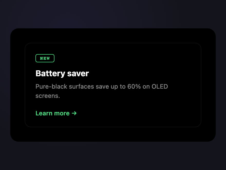
OLED Card
Pure CSS
OLED Card — preview
True-black background that switches off OLED pixels entirely — paired with a single accent stroke for the active element.
02 / 12
Stealth Panel
Pure CSS
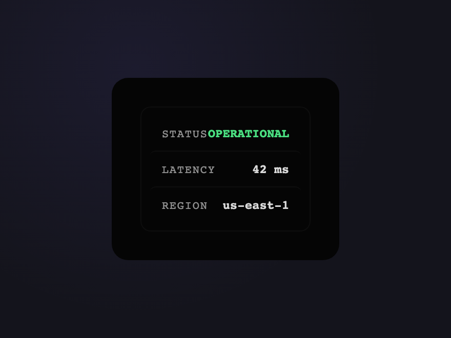
Stealth Panel — preview
Surfaces hide behind a near-black background — only the active control reveals itself with a hairline stroke.
03 / 12
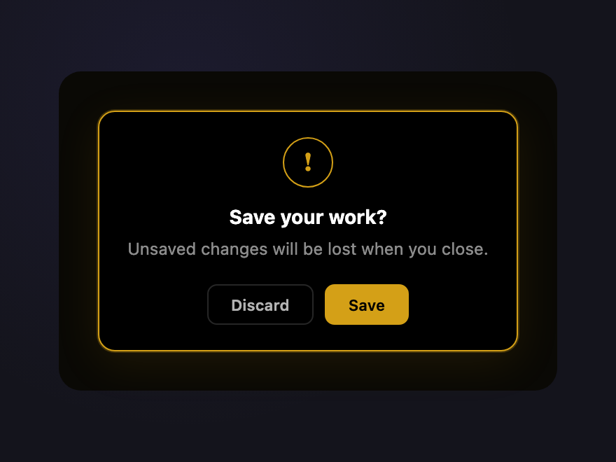
Inkwell Modal
Pure CSS
Inkwell Modal — preview
Deep-black dialog with a single warm-amber rim — the kind of confirmation modal that whispers instead of shouting.
04 / 12
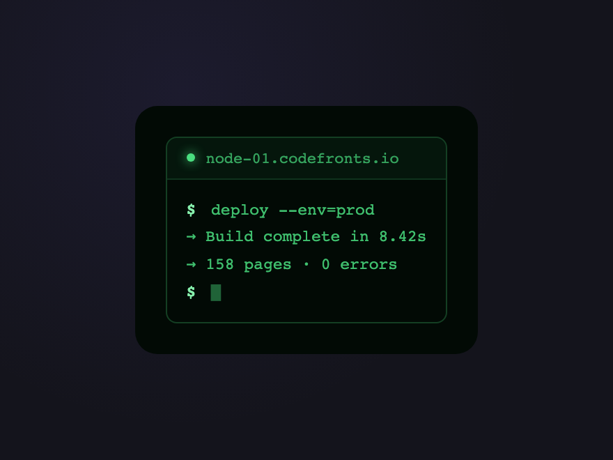
Cyber Terminal
Pure CSS
Cyber Terminal — preview
Phosphor-green CRT terminal aesthetic — text and chrome share one accent color, suggesting a coherent technical voice.
05 / 12
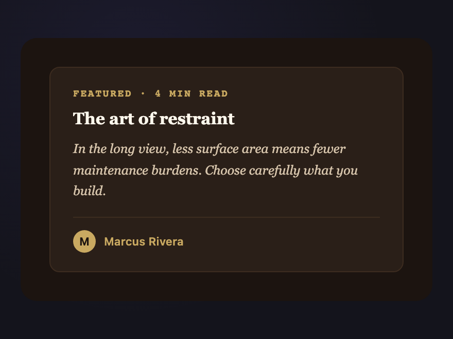
Mocha Workstation
Pure CSS
Mocha Workstation — preview
Warm coffee-tone dark mode — espresso brown surfaces with cream highlights for a cozy reading-app aesthetic.
06 / 12
Forest Dim
Pure CSS
Forest Dim — preview
Deep evergreen surfaces with sage accents — a calmer alternative to violet/cyan dark modes for reading-heavy interfaces.
07 / 12
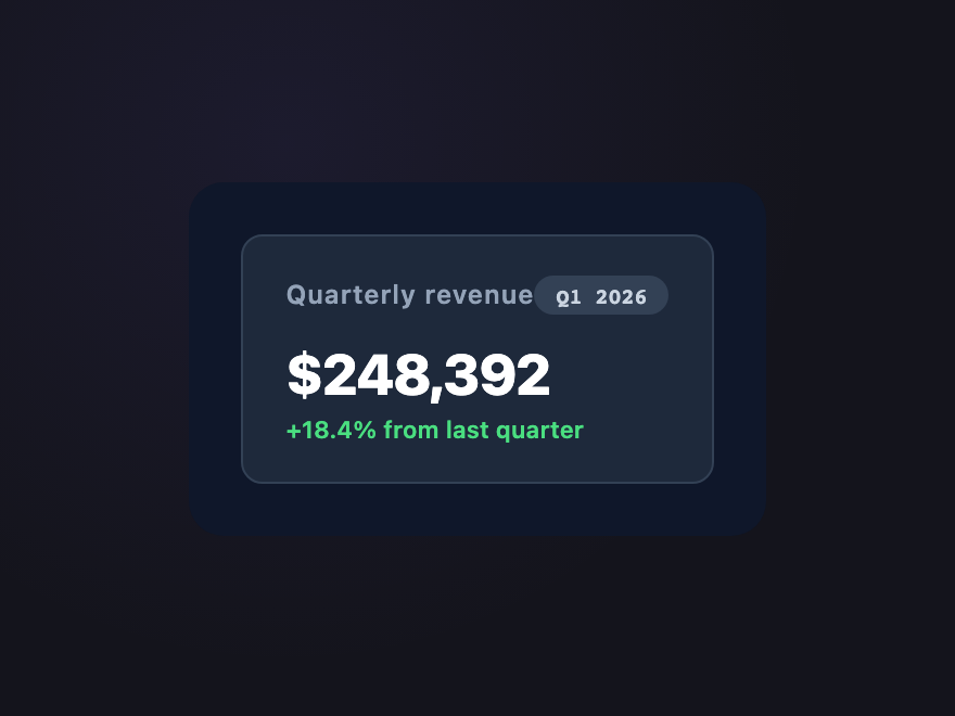
Slate Stack
Pure CSS
Slate Stack — preview
Three slate tones layered to create depth without color — useful for dashboard chrome where data is the only color.
08 / 12
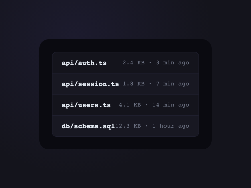
Carbon Shelves
Pure CSS
Carbon Shelves — preview
List rows shelving against a darker rail — alternating row depth without alternating colors keeps long lists scannable.
09 / 12
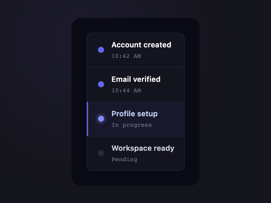
Onyx Ladder
Pure CSS
Onyx Ladder — preview
Vertical step indicator on a series of dark surfaces — each completed step glows gently, future steps stay quiet.
10 / 12
Phosphor Card
Pure CSS
Phosphor Card — preview
Card with a glowing accent line on its left edge — the kind of "now playing" highlight that draws the eye in dark dashboards.
11 / 12
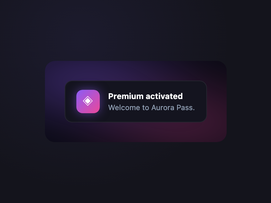
Aurora Dim
Pure CSS
Aurora Dim — preview
Dark surface with a soft drifting aurora glow underneath — the aurora is heavily blurred so it never competes with content.
12 / 12
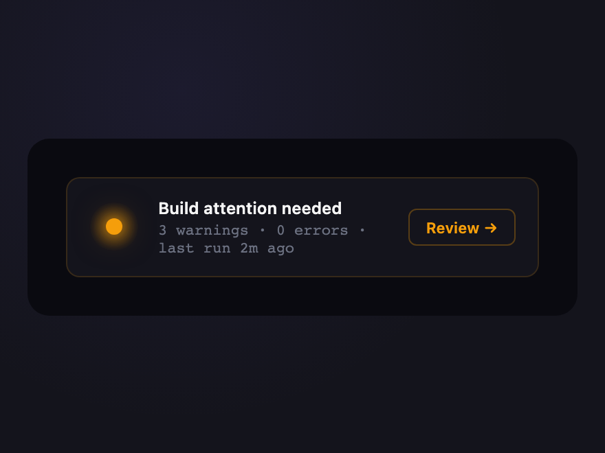
Ember Pulse
Pure CSS
Ember Pulse — preview
Notification badge with a warm orange glow that subtly breathes — designed for low-priority but persistent alerts.

Build your own

Tweak the exact look in our visual generators — no signup, instant copy-paste.

FAQ

Frequently asked questions

How do I design a dark mode UI in CSS?
Define your colours as CSS custom properties — surface, text, border, accent — and use them everywhere instead of hard-coded values. A good dark theme avoids pure black for large surfaces (it can look flat), layers slightly lighter greys to show elevation, and keeps text contrast accessible. These 12 patterns show different takes on that, from true-black OLED to layered slate.
Should dark mode use pure black (#000) backgrounds?
It depends. True black is right for OLED screens — unlit pixels save power and give deep contrast (the OLED Card demo uses this). But for general UI, a very dark grey is usually better: it reduces harsh contrast with white text, and layering progressively lighter greys lets you show depth and elevation that pure black can't.
How do I switch between light and dark mode in CSS?
Two approaches. The prefers-color-scheme media query follows the user's OS setting automatically. For a manual toggle, put a data-theme attribute or class on the html element and define two sets of CSS custom properties — one per theme — so flipping the attribute reskins the whole UI instantly. Many sites combine both.
Do these dark mode UI patterns need JavaScript?
No — all 12 patterns are pure CSS. They demonstrate the surfaces, contrast, elevation and glow of a dark theme using CSS custom properties and standard styling. A real light/dark toggle would add a few lines of JS, but the dark-mode styling itself needs none.
Are these dark mode UI examples accessible and free?
Yes. Each pattern keeps text and interactive elements at accessible contrast against their dark surfaces, and any glow or motion honours prefers-reduced-motion. All 12 designs are MIT licensed and free for personal and commercial use.

Search CodeFronts

Loading…