The navbar carries the brand the moment a visitor lands. These 8 hand-coded navigation bar patterns cover the surfaces that matter — a responsive editorial hamburger drawer for a literary magazine, a luxury fashion mega menu with 4-column hover panels, a floating glassmorphism pill nav over a living aurora background, a GitHub-dark collapsible vertical sidebar with tooltip-on-collapse, a sustainable brand sticky navbar that compresses gracefully on scroll, a creative agency full-screen overlay with two-panel curtain wipe, a navbar with a built-in light/dark theme toggle and a live token preview, and a minimalist editorial navbar with three distinct underline hover animation techniques. Every demo is wrapped in its own scoped class so all eight render on the gallery page without bleed.
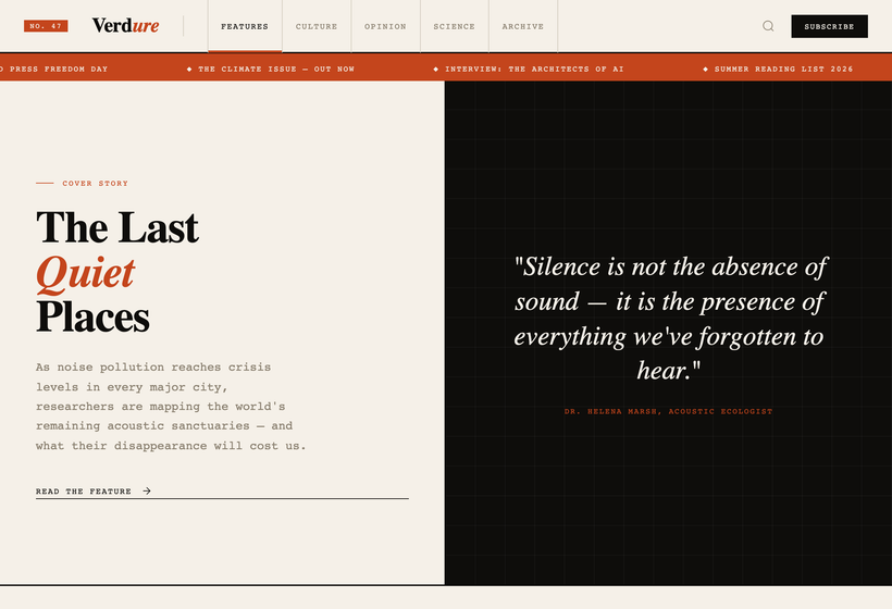
A literary-magazine editorial navbar UI in ink and paper — proving that a responsive hamburger nav can carry serious typographic identity instead of disappearing into a sans-serif default.
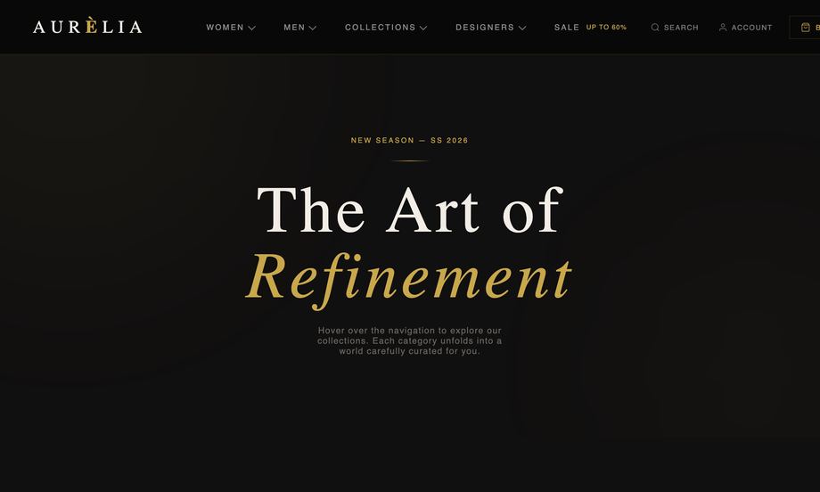
A luxury fashion mega menu navbar UI in deep void black with gold #c9a84c accents and Cormorant Garamond display type — proving a mega menu can carry editorial weight without the SaaS-default look.
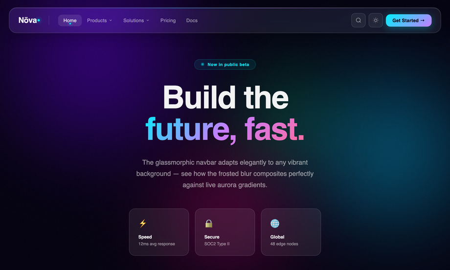
A pill-shaped glassmorphism navbar UI floating 20px above the wrapper edge, built with backdrop-filter:blur() over a living aurora gradient background — proving that frosted-glass navbars composite cleanly against any vibrant scene.
Best forSaaS product sites, AI/ML company landing pages, modern marketing chrome, cyberpunk-inflected dashboards.
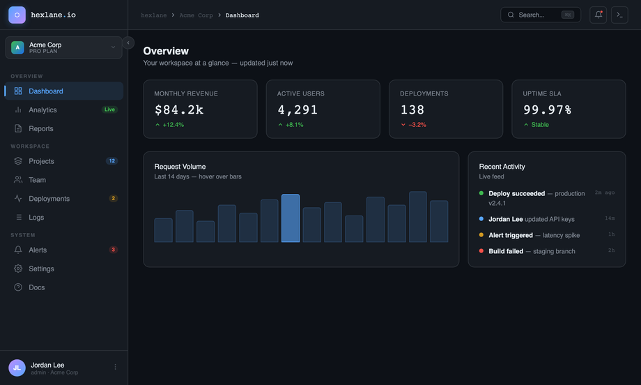
A GitHub-dark-inspired collapsible sidebar navbar UI for a SaaS dashboard — proving that the canonical 240px ↔ 64px sidebar collapse pattern can carry a complete information density.
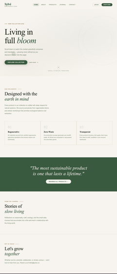
A sustainable lifestyle brand navbar UI that gracefully compresses on scroll — proving the right way to do scroll-transforming sticky navigation without janky reflow.
Best forsustainable brands, lifestyle e-commerce, editorial product sites, slow-content brands, marketing pages that need scroll-aware chrome.
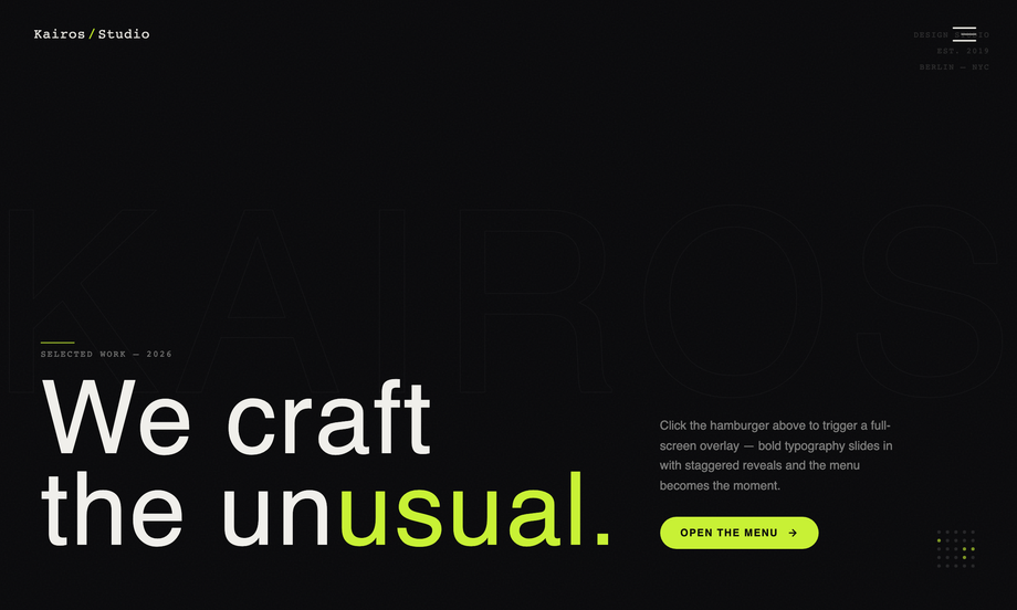
A creative-agency full-screen overlay menu navbar UI for Kairos/Studio — proving that hamburger nav can be the headline interaction instead of an afterthought.
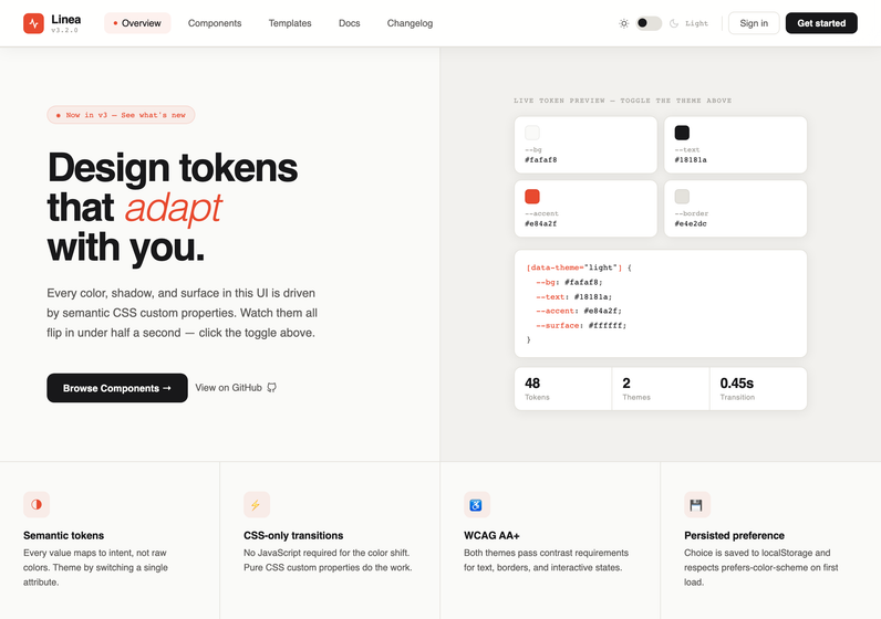
A CSS navbar with a built-in dark mode toggle that flips the entire UI in under half a second — proving that semantic design tokens beat a `prefers-color-scheme` media query when you want users to control the theme themselves.
Best fordesign system docs, developer tool sites, modern SaaS landing pages, theme-toggle component galleries.
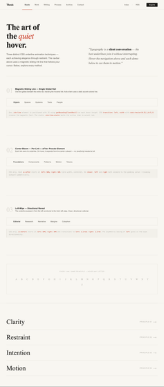
A minimalist CSS navbar with three distinct underline hover animation techniques side-by-side — proving that the most elegant nav effects come from doing less, not more.
Best foreditorial sites, personal portfolios, design studio navs, content-led blogs, minimalist typography-first layouts.
Match the pattern to the content density and the brand voice. A content site with 4-7 top-level destinations should use the editorial bar from demo 1 (Verdure) — the column-ruled link list reads as discipline and editorial weight, not as 'tech startup default'. An e-commerce site with deep taxonomy needs the mega menu from demo 2 (Aurélia) so visitors can drill into the third level (Ready to Wear → Coats → Trench) without three page loads. A SaaS marketing page with a vibrant gradient hero is the natural home for the glassmorphic pill from demo 3 (Nōva) — the frosted blur is the whole pitch. A product dashboard with deep navigation needs the collapsible sidebar from demo 4 (hexlane). A scroll-heavy storytelling page (lookbook, manifesto, journal) benefits from the sticky-compress nav in demo 5 (Sylvé). A creative agency or portfolio site that wants the menu to BE the moment chooses the overlay from demo 6 (Kairos).
How do I make the responsive hamburger menu accessible?
Three rules. (1) The trigger is a real `
Why does the mega menu use hover instead of click on desktop?
Demo 2 (Aurélia) opens its 4-column panels on `:hover` and `:focus-within` — that's the e-commerce-store convention because shoppers in a hurry want zero-click navigation. The CSS uses `position: static` on the trigger `
` plus an absolute-positioned `.mega` that spans the full nav width, which keeps the panel anchored to the nav even when triggers shift sideways at different viewports. The two-state interaction (`:hover` opens, mouse-out closes) needs no JS, but the trade-off is accessibility: keyboard-only users need `:focus-within` for the same behaviour, which the demo provides. Touch devices fall back to the click semantics that `
How does the collapsible sidebar shrink without breaking the layout?
Demo 4 (hexlane) uses a single CSS custom-property pair — `--nb-sdb-sidebar-w: 240px` and `--nb-sdb-sidebar-collapsed: 64px` — applied as `width` on `aside`. When the JS toggles `.collapsed`, every label, badge, and the workspace info animates `opacity` and `width: 0` together (so they collapse cleanly to the icon-only rail without leaving ghost whitespace). The main pane uses `flex: 1` so it expands to fill the freed space automatically. Tooltips appear via `data-label` attribute + `::after` pseudo-element shown only on `.collapsed .nav-item:hover` — no JS tooltip library needed. The whole collapse is a 220ms `cubic-bezier(0.4, 0, 0.2, 1)` transition that finishes before the user can perceive jank.
Yes, and that's why this collection re-scopes every `position: fixed` element to `position: absolute` (or `position: sticky` where the demo genuinely wants to track wrapper scroll). The source mocks all use `fixed` because they assume they own the viewport. Inside our gallery each demo is wrapped in `.nb-XX` and the bar is bounded to that wrapper, so multiple demos render side-by-side without their nav chrome colliding. Demo 5's sticky scroll uses an IntersectionObserver bound to the hero sentinel — when the host page scrolls past the demo's hero, the navbar gets the `.scrolled` class. Demo 6's overlay menu's `Escape` listener is bound to the wrapper instead of `document`, so closing one demo's menu doesn't close another's.
How is each demo's CSS kept from leaking into the others?
Every navbar is wrapped in its own scoped class — `.nb-hbg` (editorial hamburger), `.nb-mga` (luxury mega menu), `.nb-gls` (glass pill), `.nb-sdb` (sidebar), `.nb-stk` (sticky scroll), `.nb-ovl` (overlay). All `:root { --foo: … }` design tokens from the source mocks are re-scoped to `.nb-XX { --nb-XX-foo: … }` so they don't leak to the host page or collide with the host's own custom-property names. Body-level styles (background, font-family, padding, overflow, `display: flex` for the sidebar layout) are re-applied to the wrapper. The same scoping discipline used in the minimalist UI and neon collections — six full-page navbar mocks coexist on the gallery.