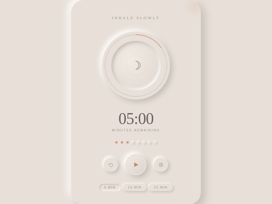
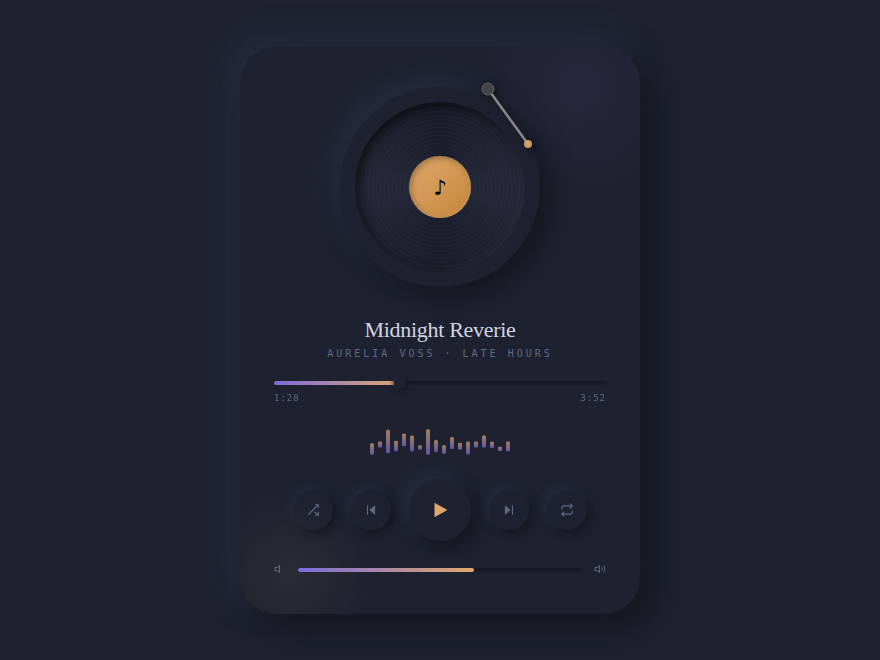
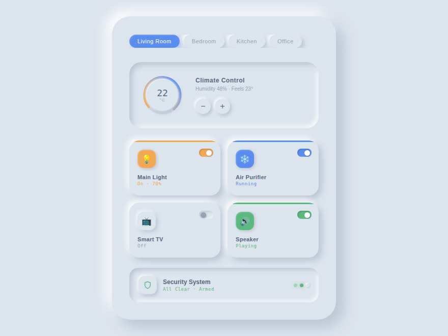
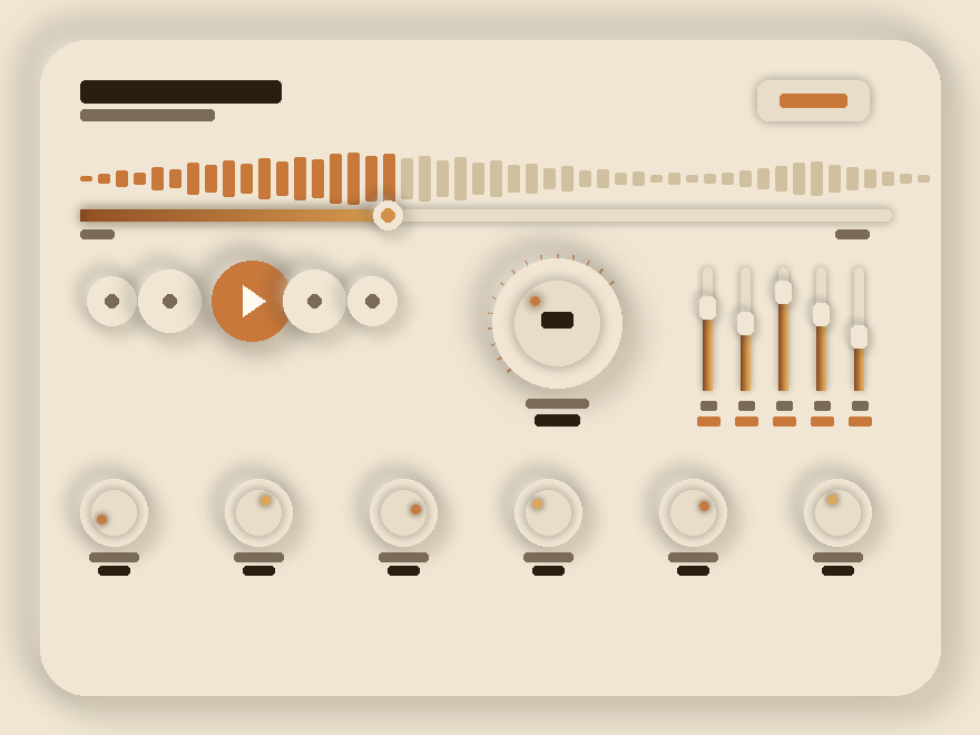
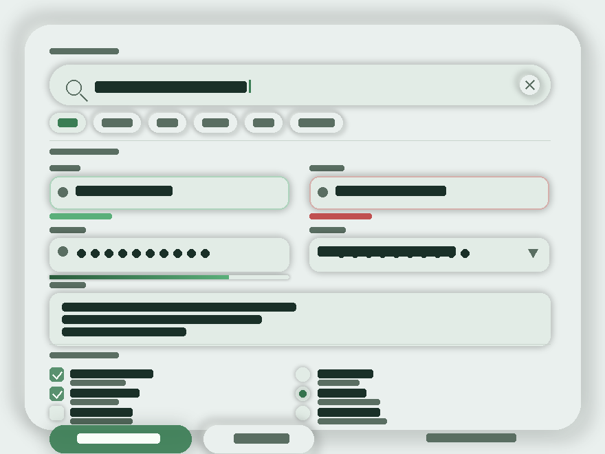
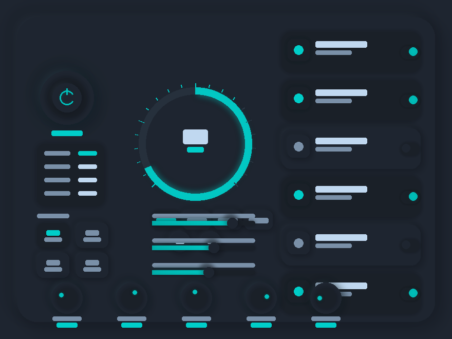
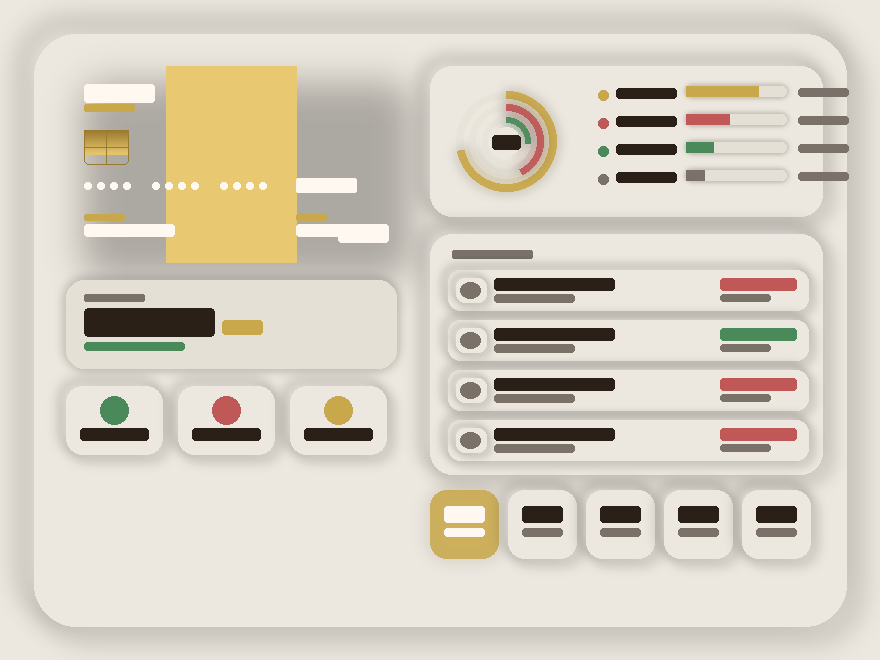
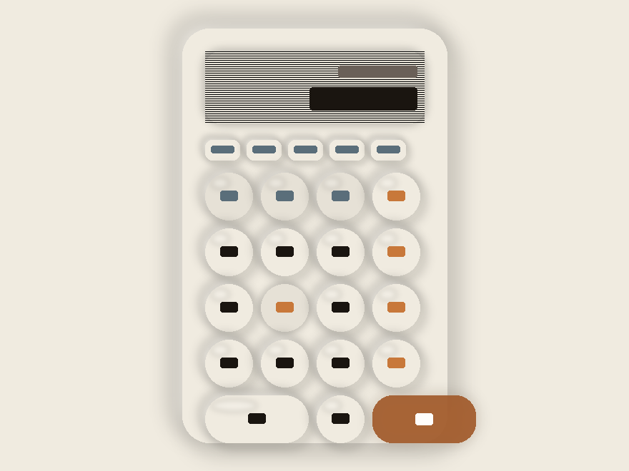
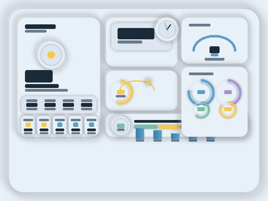
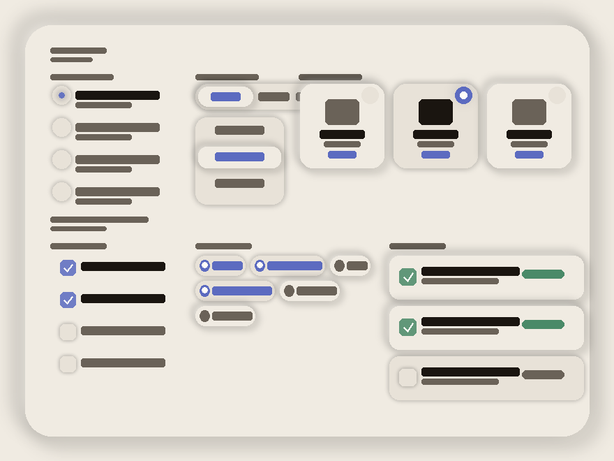
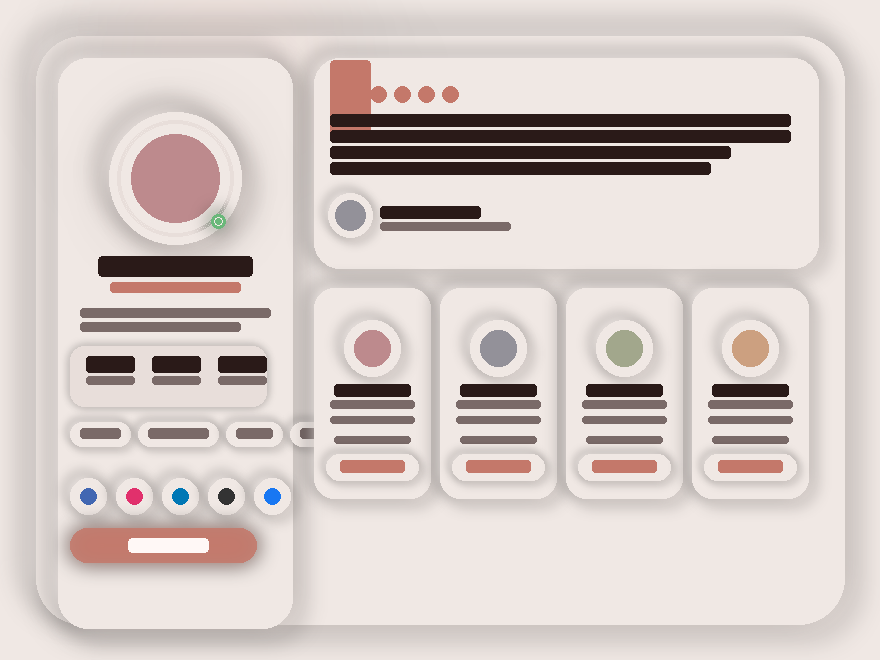
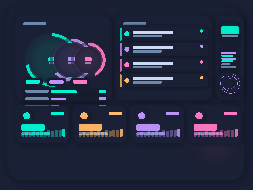
13 CSS Neumorphism & Soft UI Designs

Neumorphism — Soft UI — is the aesthetic of plastic light: shadows pushing out, shadows pulling in, no hard borders. These 13 hand-coded widgets push the style past its 2020 portfolio era — eleven on warm light palettes, two on dark navy with neon glow accents. Every widget's palette is scoped to its wrapper, so all thirteen can coexist on the same page without their shadows colliding.

13 unique neumorphic widgets 3 Pure CSS 10 CSS + JS 100% copy-paste ready Published
01 / 13
Breathe
CSS + JS
Breathe — preview
A warm sand-toned neumorphic wellness widget built around a breathing orb.
Best formeditation apps, wellness brands, mindfulness tools.
02 / 13
Vinyl Player
CSS + JS
Vinyl Player — preview
A deep-slate dark-neumorphic music player with a spinning vinyl disc featuring real grooves via repeating-radial-gradient.
Best formusic apps, podcast platforms, audio dashboards.
03 / 13
Nexus
CSS + JS
Nexus — preview
A cool blue-gray light-neumorphic room control dashboard.
Best forsmart-home apps, IoT dashboards, control panels.
04 / 13
Soft UI Button Lab
CSS + JS
Soft UI Button Lab — preview
A cool-slate showcase panel demonstrating the full neumorphic vocabulary.
Best fordesign-system docs, button libraries, component galleries.
05 / 13
Audio Control Suite
CSS + JS
Audio Control Suite — preview
A warm-parchment audio mixing console.
Best formusic production tools, DAW dashboards, audio plugins.
06 / 13
Sunken Form Studio
CSS + JS
Sunken Form Studio — preview
A sage-mist neumorphic form panel.
Best forsign-up flows, settings pages, profile editors.
07 / 13
Smart IoT Control Panel
CSS + JS
Smart IoT Control Panel — preview
The first dark-neumorphic widget in the collection — deep charcoal with glowing teal accents.
Best forsmart-home hubs, IoT dashboards, building automation.
08 / 13
Aurum Finance Dashboard
Pure CSS
Aurum Finance Dashboard — preview
A champagne-toned luxury banking dashboard.
Best forfintech apps, wealth dashboards, banking UIs.
09 / 13
Soft UI Calculator
CSS + JS
Soft UI Calculator — preview
A warm-cream desk calculator where every button is a fully extruded neumorphic circle with a CSS specular shine highlight at the top-left.
Best forcalculator tools, finance widgets, conversion utilities.
10 / 13
Sky Widgets
CSS + JS
Sky Widgets — preview
Five asymmetric weather widgets in a sky-mist palette.
Best forweather apps, dashboard widgets, IoT environmental sensors.
11 / 13
Soft UI Form Controls
Pure CSS
Soft UI Form Controls — preview
A pure-CSS showcase of soft-UI form controls with zero JavaScript.
Best fordesign-system docs, form pattern libraries, settings panels.
12 / 13
Aurum Profile & Testimonial
Pure CSS
Aurum Profile & Testimonial — preview
A rose-parchment profile layout.
Best forportfolios, team pages, social profiles.
Advertisement
13 / 13
Dark Mode Neumorphism
CSS + JS
Dark Mode Neumorphism — preview
The exact dark-neumorphic formula in action — deep navy with shadow 15% darker / highlight 10% lighter.
Best fordev dashboards, gamer interfaces, futuristic admin panels.
FAQ

Frequently asked questions

What is neumorphism and how is it different from glassmorphism?
Neumorphism (a portmanteau of 'new' + 'skeuomorphism') is the look of plastic light — a surface that looks like it's been pressed up out of, or down into, a single-colored background. The whole effect is built from two shadows: a dark one offset down-right and a light one offset up-left. There are no borders, no fills, no gradients on the controls themselves — just shadow. Glassmorphism, by contrast, is the look of frosted glass on top of a busy background — built from backdrop-filter blur + a thin border + a subtle gradient on a semi-transparent surface. Use neumorphism when you want monochromatic calm; use glassmorphism when you want layered depth on top of imagery.
Is neumorphism accessible? I've heard it has contrast problems.
Yes, it's a real concern. The most-shared critique of neumorphism in 2020 was that the standard implementation — light gray button on light gray background, contrast ratio under 1.5:1 — fails WCAG AA. Fix it three ways: (1) Add a visible state — color, an inset ring, an icon weight change — so disabled vs. active vs. hover are unambiguous. (2) Pair the neumorphic surface with high-contrast type and icons: dark text on light cards, light text on dark cards. (3) Use neumorphism for chrome (panels, dials, big cards) and use solid colors for primary CTAs that need 4.5:1 contrast. Every demo in this collection follows those three rules.
Why do the shadows look wrong when I paste this into my site?
Two reasons, both fixable. (1) Neumorphism only works on a SOLID background that matches the widget's background color — if your site has a gradient or image behind it, the inset/outset shadows visually break. Set the surrounding section to a flat color from the widget's palette. (2) The light and dark shadow colors must be derived FROM that background color, not arbitrary. The rule of thumb: dark shadow ≈ background darkened 8%, light shadow ≈ background lightened 8%. Each widget here ships its own --shadow-dark / --shadow-light pair tuned to its background — change one without changing the other and the illusion breaks.
Why does each widget have its own scoped CSS prefix?
Because all three widgets render together on this collection page, and each one defines its own --bg, --shadow-dark, --shadow-light, etc. If we left them in :root, the last widget's palette would override the others. So every variable is scoped: .nm-bre { --nm-bre-bg: ... }, .nm-vin { --nm-vin-bg: ... }, .nm-nex { --nm-nex-bg: ... }. The same trick lets you drop two neumorphic widgets onto the same page in production — give each one its own scope and they coexist without conflict.
How heavy is the box-shadow performance?
Neumorphic widgets typically have 2–4 box-shadows per visible element (outer dark + outer light + sometimes inset pair). On a panel with 10 controls that's 20–40 shadow paints per frame on hover/animation. Modern GPUs handle that fine for static layouts, but if you stack ten widgets on a page and animate them all simultaneously you'll feel it on mid-range phones. Mitigations: avoid `box-shadow` inside CSS animations (animate `transform` or `opacity` instead, which doesn't repaint shadows), and use `will-change` sparingly — only on widgets that genuinely move.
Can I customize the colors and accents?
Yes — the palette is the first block of CSS in every widget. Change the four core tokens (--bg, --shadow-dark, --shadow-light, --accent) and the whole widget rebrands. The Breathe demo uses a warm sand palette (#e8e0d8 background, #c4856a terracotta accent), Vinyl uses a deep slate (#1e2230 background, amber + violet accents), Nexus uses a cool blue-gray (#dce4ee background, blue + warm orange + green per-device accents). Pick a background color first, then derive the shadow pair from it (±8% lightness), then pick an accent that has 4.5:1 contrast against the background for text.

Search CodeFronts

Loading…