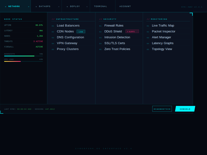
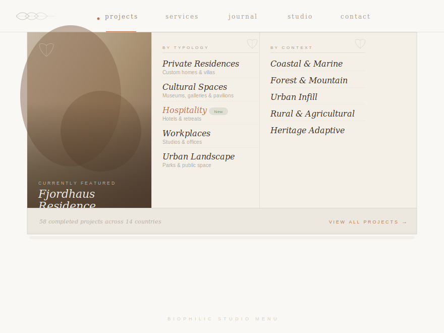
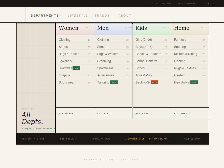
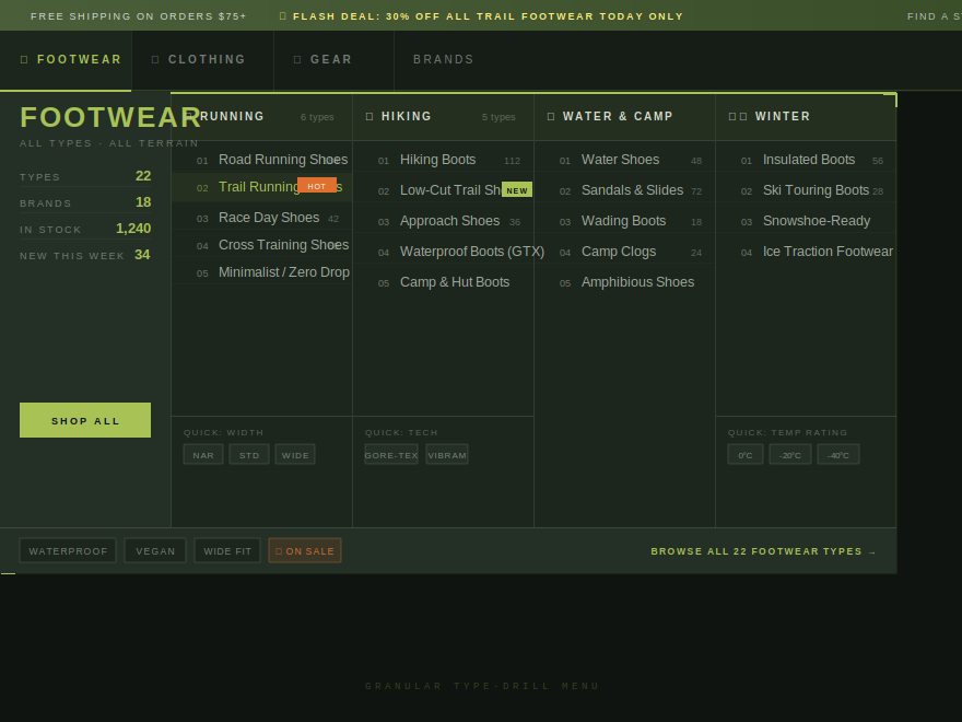
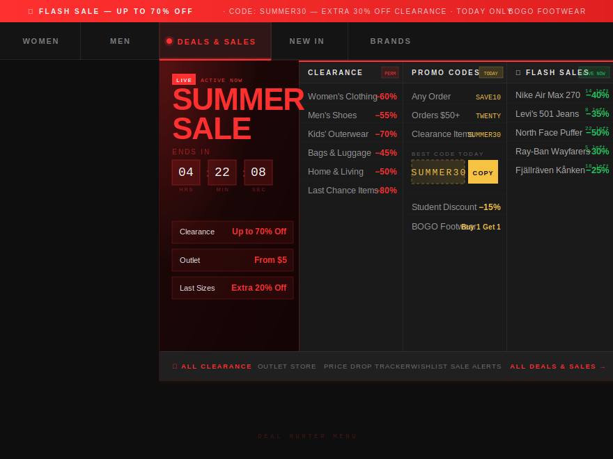
The mega menu is the moment a marketing site stops feeling like a site and starts feeling like a product. These 6 hand-coded mega-menu + dropdown layouts span dark luxury editorial fashion, cyberpunk-inspired terminal control panels, warm biophilic architecture-studio aesthetics, Swiss-grid department-store taxonomies, precision outdoor gear finders with type-drill copy ("Trail Running Shoes (96)" not "Footwear"), and ignited flash-sale command centers with live countdown timers. Each opens on hover and on click/tap, contains real semantic <nav> + role="menubar" markup, and ships its scanlines, paper-grain, fire-glow, and decorations inside the demo wrapper so nothing leaks into the host page.
6 unique mega menus100% copy-paste readyPublished
01 / 06
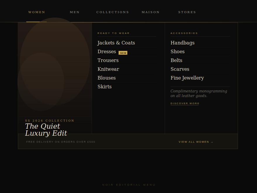
Noir Editorial
CSS + JS
A dark luxury fashion-house mega menu on a pure black canvas.
Best forluxury fashion, haute couture, editorial retail.
When should I use a mega menu instead of a single dropdown?
Mega menus pay off when your navigation has 15+ destinations the visitor genuinely needs surfaced, not buried. The classic pattern — a single 'Products' dropdown that hides eight sub-categories behind another hover — costs you clicks because each interaction is friction. A mega panel reveals all of it in one motion: typology, context, season, capsule, featured imagery, the lot. The break-even point is roughly 5–6 items per category — fewer than that and a simple dropdown is faster and lighter; more, and the mega menu earns its complexity by surfacing the full taxonomy on first hover.
Do mega menus hurt SEO?
No — the panel's links are real anchors in real markup. Google crawls them whether they're visible by default or revealed on hover. Two caveats: (1) don't render the panel only via JavaScript on the client (use CSS visibility/opacity instead so the HTML is in the initial response), and (2) keep duplicate anchor text in the panel meaningful — repeating the same 'Learn more' twenty times bleeds out anchor-text relevance. Every demo here ships the full link set as static <a> elements in the HTML; the show/hide is purely CSS visibility.
How do I make a mega menu accessible to keyboard and screen-reader users?
Five things. (1) The trigger is a real <button>, not a styled <div>, so it lands in the tab order naturally. (2) Add aria-haspopup='true' and aria-expanded that toggles with the open state. (3) Wrap the bar in <nav aria-label='Main menu'> and the visible items in <ul role='menubar'>. (4) Esc closes the open panel; clicking outside closes it. (5) Decorative scanlines, glyphs, dots, badges get aria-hidden='true' so screen readers don't dictate them. Every demo here ships all five — read the HTML and you'll see the patterns.
Does the hover-based open work on touch devices?
Yes — every demo in this collection adds a small JS click handler that toggles a .mm-open class on the nav-item, mirroring the :hover state. So mouse users get the original hover open, touch users get a tap-to-open / tap-outside-to-close behaviour, and keyboard users get focus + Enter + Escape. The CSS reads .mm-open the same way it reads :hover, so the visual transition is identical across input types. Lifting a finger doesn't snap the panel shut mid-read on touch — only an outside tap or Escape closes it.
Why are the scanlines and paper-grain overlays inside the demo wrapper instead of on body::before?
The original mocks attached the scanline overlay (Cyberpunk) and paper-grain texture (Biophilic) to body::before / body::after with position:fixed. That works on a standalone demo page but breaks once the demo is dropped into a real site — the overlay leaks across the whole viewport, including content that has nothing to do with the mega menu. The CSS in this collection scopes those overlays to .mm-cyb::before / .mm-bio::before with position:absolute + overflow:hidden on the wrapper, so the texture stays inside the demo and doesn't leak when you paste the code into your own page.
Can I swap out the photos and fonts?
Yes — the photos are vanilla <img> tags pointing at Unsplash, and the fonts are loaded with @import inside the demo CSS. Replace the src attribute with your own image URL (or the path to a local asset) and the demo updates instantly. To swap fonts, change the @import URL and the font-family declarations at the top of each demo's CSS. The colour palette lives in the CSS custom properties at the top of each scope block (e.g. --mm-noi-gold, --mm-cyb-cyan, --mm-bio-terra) — change those and the whole demo rebrands.