Neon CSS is one of the few aesthetics that scales from a single CTA to a full hero scene. These 12 hand-coded designs cover the full vocabulary: glowing buttons, retro signage with layered text-shadow stacks, rotating conic-gradient pricing cards, a complete 80s synthwave scene, a futuristic control panel, three nav patterns, broken/flickering signs with dead-bulb letters, a cyberpunk palette token showcase, a Tailwind theme.extend config, drop-shadow SVG icon glows, an infinite seamless 3D perspective grid, and five rainbow text cycling techniques. Every glow is layered shadow — no images, no SVG filters. Every demo is wrapped in its own scoped class so all twelve render together without bleed.
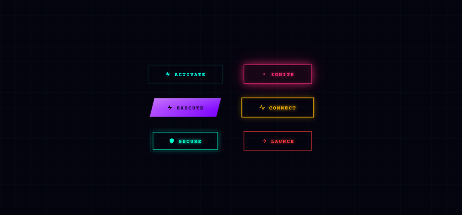
Six glowing neon button treatments on one dark grid backdrop — border-trace cyan, pulse-glow pink, chamfered violet, ghost amber, double-border teal, and a red fill-sweep CTA.
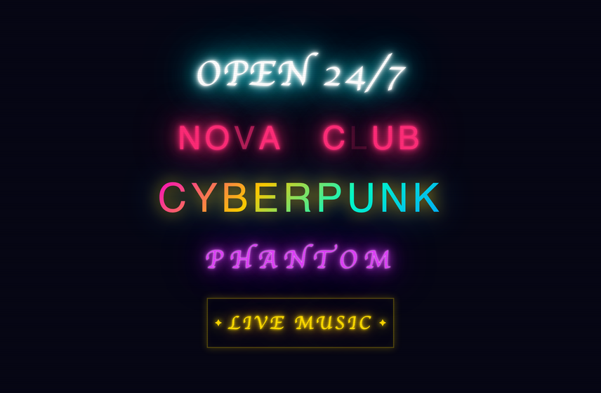
Five neon text treatments arranged like a row of vintage bar signs — a classic cyan tube reading "OPEN 24/7", a flickering pink "NOVA CLUB" with two letters wired as dead bulbs that intermittently glow back to half-life, a chroma-shifting "CYBERPUNK" outline that cycles through pink/yellow/cyan/blue gradient stops, a breathing violet "PHANTOM" in Monoton, and a warm amber "LIVE MUSIC" framed by pulsing star glyphs.
Best formusic venues, bar/restaurant sites, retro-gaming, vaporwave/cyberpunk hero sections.
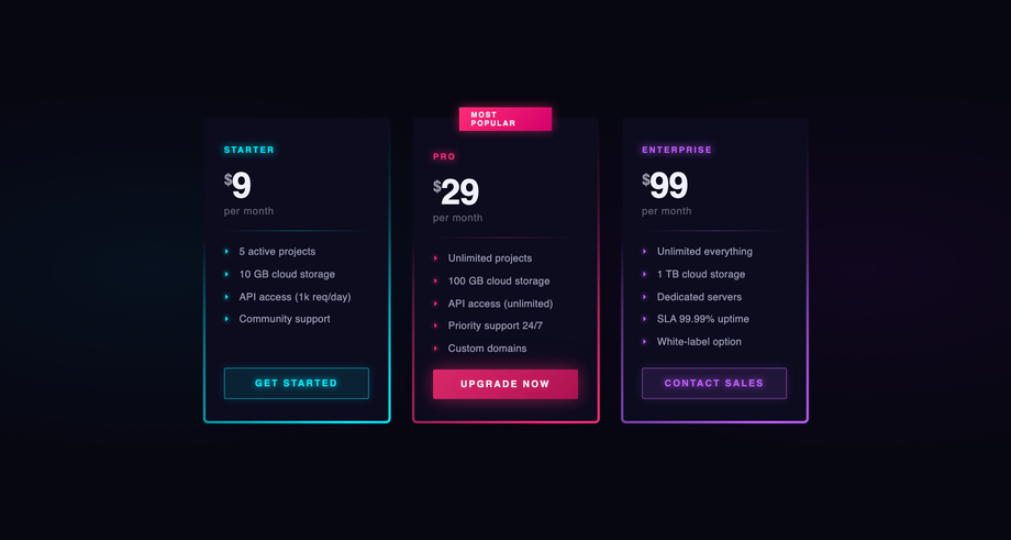
A three-tier pricing layout — Starter (cyan), Pro (pink, featured with "Most Popular" badge), Enterprise (violet) — each ringed by a conic-gradient border that rotates continuously.
Best forSaaS pricing pages, hosting/devtool tiers, cyberpunk product comparison.
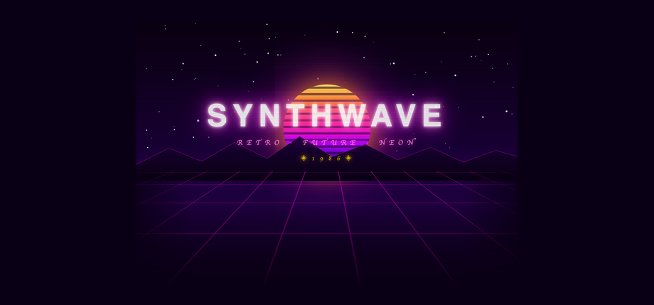
A complete 80s retrofuture scene: a starfield (90 stars injected by JS, each with randomised size and twinkle timing), a vertically-banded sun melting from yellow to violet with horizontal CRT bands cutting through it, a glowing magenta horizon line, a perspective-rotated pink wireframe grid that scrolls toward the viewer, a polygon mountain silhouette with wireframe ridge highlights, a CRT-scanline overlay across the whole composition, and the "SYNTHWAVE" title with a layered magenta glow, "Retro · Future · Neon" tagline, and a "◈ 1 9 8 6 ◈" year badge in golden text.
Best forvaporwave/synthwave landing pages, music albums, retro-gaming, nostalgic hero sections.
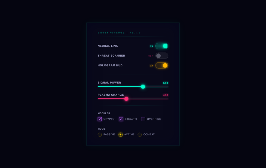
A "System Controls" panel with three glowing toggle rows (Neural Link cyan, Threat Scanner pink, Hologram HUD amber) that flip ON/OFF with text labels syncing to colour, two custom range sliders (cyan Signal Power and pink Plasma Charge) whose filled-track gradient updates as the user drags, three violet checkboxes for module selection (Crypto / Stealth / Override), and three yellow radio buttons for operating mode (Passive / Active / Combat).
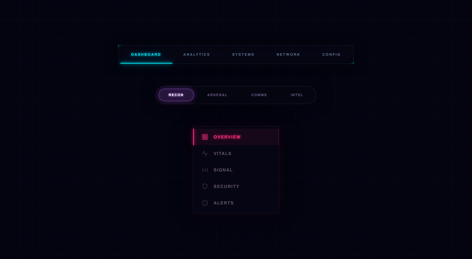
Three production-ready neon nav patterns on a dark grid stage — a horizontal sliding-underline bar in cyan, a pill-tab nav with a violet sliding pill background, and a vertical sidebar with row icons and a pink accent indicator.
Best forSaaS app shells, admin dashboards, gaming/cyberpunk site navigation, futuristic landing pages.
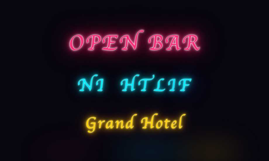
Three distinct broken-sign CSS techniques side-by-side — a whole-word fault on "OPEN BAR", per-letter staggered animations on "NIGHTLIF" with two dead-bulb characters, and a vintage amber "Grand Hotel" with mechanical hum.
Best forvintage bar/restaurant sites, dive-bar branding, retrowave horror, neo-noir film promo.
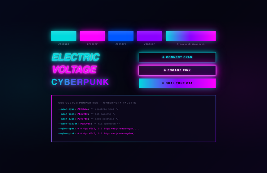
A complete design-token showcase for a pink/blue cyberpunk palette — five glowing swatch chips, three italic display headlines, three button variants, and an animated gradient-border card showing the actual CSS custom-property variable list inside.
Best fordesign system showcases, cyberpunk style guides, branding pages, dev-portfolio palette demos.
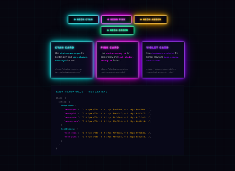
A demo of what a Tailwind theme.extend neon config looks like in practice — built in plain CSS so it runs anywhere, but visually identical to the Tailwind output. Four buttons reading `shadow-neon-cyan` / `text-shadow-neon-pink` / etc, three cards each showing one accent (cyan / pink / violet) with the corresponding Tailwind class name printed inline so readers can copy the exact strings. The bottom block is the syntax-highlighted tailwind.config.js theme.extend object: five boxShadow entries, five textShadow entries, plus a tiny plugin that wires textShadow as utilities (`text-shadow-neon-cyan` etc). Token colours match the visible demo above. Inter + Fira Code. Best for Tailwind tutorials, design-system READMEs, dev blogs explaining theme.extend, copy-pasteable config snippets.
Best forTailwind tutorials, design-system READMEs, dev blogs explaining theme.
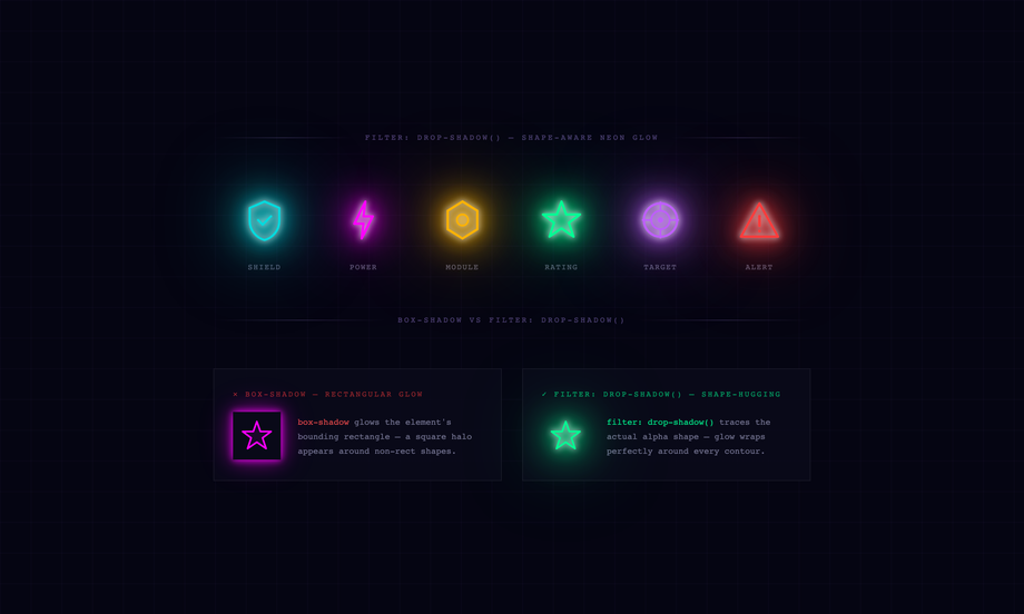
Six non-rectangular SVG icons each glowing with stacked CSS filter: drop-shadow() — the glow hugs every contour with no rectangular halo, plus a side-by-side comparison of box-shadow vs drop-shadow showing the failure mode.
Best foricon-library demos, cyberpunk dashboards, security/IoT UIs, dev blog posts about CSS filters.
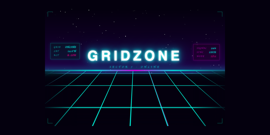
A pure-CSS infinite synthwave floor grid with perfectly seamless looping — dual-frequency cyan + pink lines on a perspective-rotated plane, a 100-star JS-injected starfield, dual-color horizon glow, two floating HUD panels, and a flickering "GRIDZONE" title.
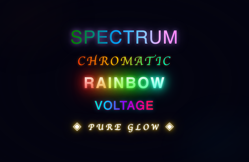
Five distinct CSS rainbow text techniques stacked side-by-side — hue-rotate gradient spin, sliding background-position, per-letter HSL stagger, outline-only stroke, and a pure text-shadow cycle with no gradient-clip at all.
Best forhero animations, music/festival branding, gaming title cards, pride-themed surfaces.
How is a CSS neon glow actually built — is it one shadow or many?
It is always many. A single `text-shadow: 0 0 20px cyan` looks like a halo, not a neon tube. The trick that every demo here uses is to stack 4–7 shadows of the same colour at increasing blur radii — the first 2–3 layers are tight white-cored highlights (`0 0 4px #fff, 0 0 10px #fff`), the next 2–3 are the colour at medium blur (`0 0 18px #00eeff, 0 0 30px #00eeff`), and the outer 1–2 are wide diffuse halos (`0 0 80px #00eeff, 0 0 120px #00eeff`). The classic cyan sign in demo 2 uses 7 shadow layers; the violet 'PHANTOM' uses 6 across two different colours. Single-shadow approximations always look flat because real neon has a tight bright core, a coloured tube glow, and a soft room-light bloom — three optical layers, three shadow tiers.
Why does the pricing card border rotate smoothly instead of flickering?
Demo 3 uses a CSS `@property` registration: `@property --a { syntax: ''; inherits: false; initial-value: 0deg; }`. Once `--a` is declared as a typed ``, the browser can interpolate it on keyframes — so `@keyframes spinBorder { to { --a: 360deg; } }` produces a smooth rotation. Without the @property declaration, custom properties are treated as opaque strings; an `` custom property would jump straight from 0 to 360deg with no in-between frames. @property is the unlock for any 'animate the gradient itself' pattern — conic-gradient angles, linear-gradient stops, hsl hues, all of it. Supported in Chromium, Safari, Firefox 128+ (May 2024).
How does the synthwave grid get perspective without 3D rendering or images?
Demo 4 uses CSS `perspective: 300px` on the container and `transform: rotateX(55deg)` on the grid plane itself. The grid is a 200%-wide `
` with two crossed linear-gradient backgrounds (`linear-gradient(rgba(255,0,200,0.7) 1px, transparent 1px)` repeated at 60×60px) — that's the grid texture. Rotating that flat plane forward by 55 degrees gives it the floor-receding-into-the-distance look. A `background-position` keyframe scrolls the gradient vertically by 60px in 1.5s, which combined with the perspective looks like the grid is flowing toward the viewer. Pure CSS, ~30 lines, zero images. The stars are 90 JS-injected divs because hand-authoring 90 random positions in CSS would be silly.
Why do the toggles and nav demos use scoped event delegation instead of inline handlers?
The source mocks used inline `onchange="updateStatus(...)"` / `onclick="setActive(...)"` calling globally-defined functions that read globally-scoped element IDs. That works for a one-off demo but breaks the moment a second instance lands on the same page — both call the same global function, both target the same element id, the first one wins. Every demo on codefronts.com lives in a gallery (six demos on one page) and a /try/ playground (per-demo, but the gallery may add more), so global handlers are non-negotiable. Both demo 5 (controls) and demo 6 (navigation) are rewritten so a single delegator at the wrapper level (`root.addEventListener('click', ...)`) reads `data-*` attributes off the clicked element and walks up to find its nearest nav container. Same UX, zero global state.
Is neon design accessible — those glow-stacked text-shadows can't be readable, right?
It's an honest trade-off. A 6-layer text-shadow stack does reduce edge contrast — that's the whole point, the letterforms melt into a halo. The mitigation in every demo here is to keep the *core* glyph high-contrast: 'OPEN 24/7' is white on near-black (contrast ratio 19.6 against the wrapper background, before any glow is added), and the layered shadow only blooms outward from those white pixels. If you read the inner letterform, contrast is fine; the glow is decorative. The two demos that worry most about readability — the pricing cards (demo 3) and the control panel (demo 5) — use opaque body text (`rgba(210,210,240,0.7)` to `rgba(240,240,255)`) with no shadow at all, and reserve the neon glow for accents, badges, and active states. Use neon for emphasis, not for paragraph-length content.
How is each demo's CSS kept from leaking into the others?
Every widget is wrapped in its own scoped class — `.nn-btn`, `.nn-typ`, `.nn-crd`, `.nn-syn`, `.nn-ctl`, `.nn-nav`. All CSS rules are nested under that class (`.nn-syn .grid { animation: nn-syn-gridscroll ... }`, not just `.grid`). Keyframe and `@property` names are also scope-prefixed (`nn-syn-gridscroll`, `nn-crd-spin`, `--nn-crd-a`) since those live in document scope by spec — without prefixing, two collections defining `@keyframes spin` would silently fight. The few body-level pseudo-elements from the source mocks (grid background, scanlines, ambient gradients) are re-scoped to `.nn-XXX::before / ::after` with `position: absolute`, so they paint inside the widget's wrapper instead of leaking to the viewport. Same scoping discipline as the brutalist and 3D collections — six neon widgets coexist on one page.