10 CSS Sidebar Navigation
The sidebar is the spine of every dashboard, admin panel, and documentation site. 10 hand-coded patterns — collapsible rails, drawer menus with text and icons, nested vertical navigation, sidebar dropdowns, sticky full-height layouts, glassmorphic blur, mobile slide-out overlays, and bottom-pinned profile sidebars. Pure CSS, no framework, accessibility-first, copy-paste ready.
Frequently asked questions
Which CSS sidebar navigation pattern is right for my app?
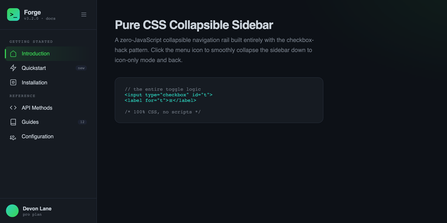
How does the pure-CSS collapsible sidebar work without JavaScript?
<input type="checkbox" id="t"> sits at the top of the wrapper. A <label for="t"> anywhere in the DOM toggles that checkbox when clicked. The sibling combinator .toggle:checked ~ .sidebar { width: 74px } then collapses the rail. Labels inside (item text, badges, group captions) fade with opacity: 0 + pointer-events: none so the rail is visually icon-only but stays keyboard-reachable. The width transition uses cubic-bezier(.4,0,.2,1) for the natural 320ms ease. Zero JavaScript, zero dependencies — just two HTML elements and one CSS rule pair, and you have a side menu that hides and shows on click.How do I add multi-level nested submenus to a CSS sidebar?
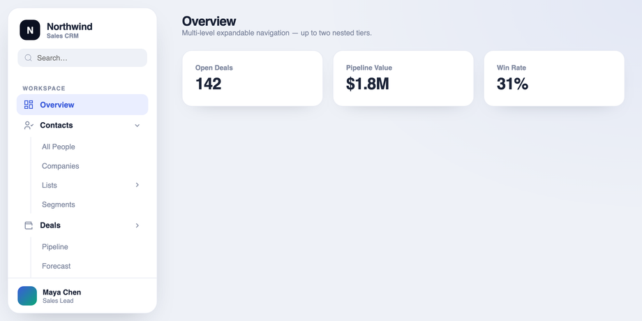
#m1:checked ~ .sub-l1 { max-height: 360px }. Tier 2: #m2:checked ~ .sub-l2 { max-height: 200px }. The general sibling combinator (~) lets each toggle reach across DOM cousins, so the level-2 toggle inside .sub-l1 still controls .sub-l2. The trick that makes it animate cleanly is using max-height (not height: auto, which can't transition). Match each max-height to the sum of its children's heights; if the content is dynamic, use max-height: 100vh and accept the close animation will run the full duration regardless of actual content. For a single-tier sidebar dropdown menu in HTML/CSS, demo 4 is simpler — one checkbox per group, one rotating chevron, one expanding submenu.How do I make the sidebar stay pinned while the main content scrolls?
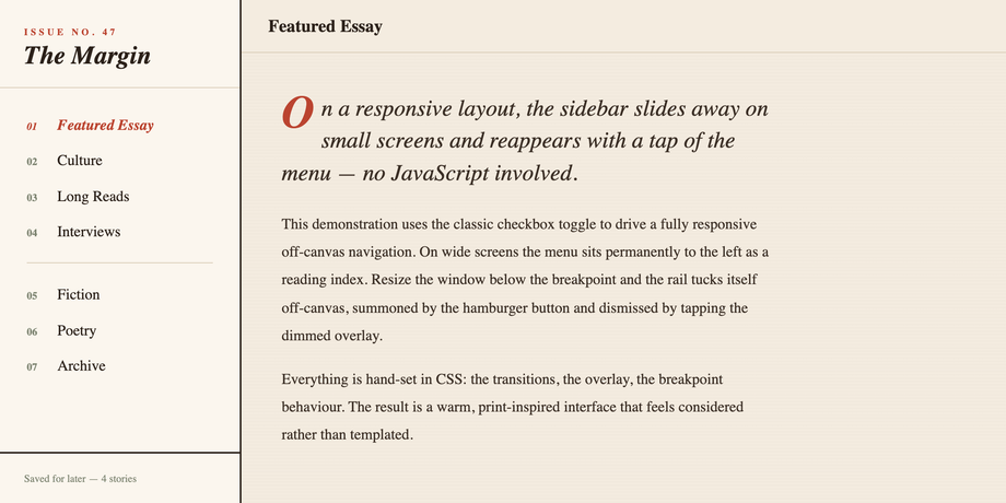
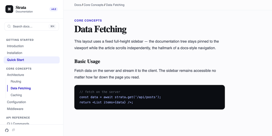
position: fixed; top: 0; left: 0; bottom: 0; width: 280px, and the main content area gets margin-left: 280px so the article scrolls independently. The breadcrumb topbar inside the content area adds position: sticky; top: 0 plus backdrop-filter: blur(10px) for the frosted scroll-survival effect. If you prefer a CSS grid layout instead of margin-offset (cleaner for nested scroll containers), use display: grid; grid-template-columns: 280px 1fr on the wrapper and position: sticky; top: 0; height: 100vh on the sidebar — same sticky vertical menu behaviour, no fixed-positioning side effects on z-index stacking or transformed parents.How is the glassmorphic side nav with backdrop-blur effect built?
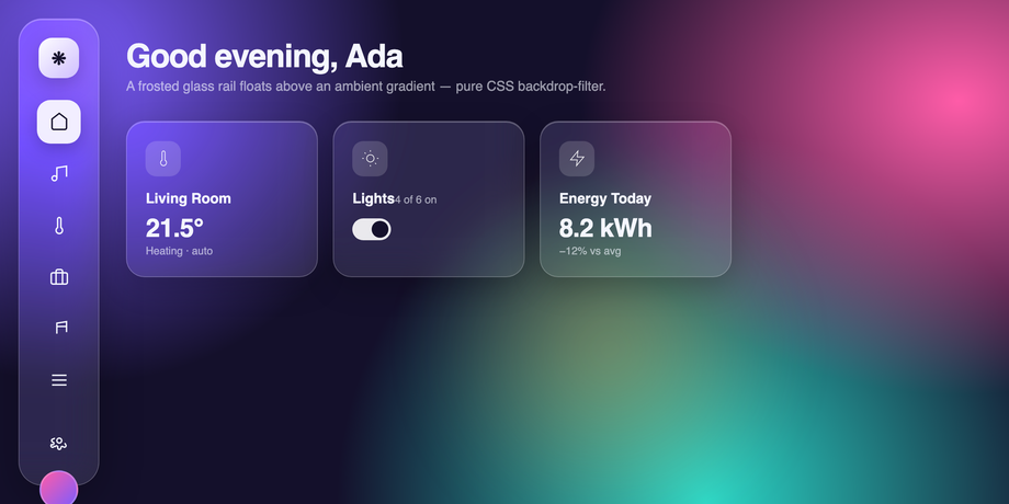
background: rgba(255,255,255,.1) sets a translucent fill, backdrop-filter: blur(22px) saturate(160%) blurs whatever shows through the panel (use -webkit-backdrop-filter too for Safari), and box-shadow: inset 0 1px 0 rgba(255,255,255,.3) adds the top-edge highlight that makes the rail feel physically raised. The backdrop-filter only produces a visible blur effect if there's something interesting behind it — demo 8 paints three overlapping radial-gradient orbs plus an animated ::before blob so the rail always has rich colour to blur. The same recipe works for any glassmorphic side nav, modal, header, or floating card.How does the mobile slide-out sidebar with CSS overlay work?
transform: translateX(-100%) (slid off-screen), and a sibling overlay div has opacity: 0; visibility: hidden. A hidden checkbox is the state holder; the hamburger button is a <label for="m"> that toggles it. When checked, .toggle:checked ~ .drawer { transform: translateX(0) } slides the drawer in, and .toggle:checked ~ .overlay { opacity: 1; visibility: visible } fades in the dimmed backdrop. The overlay itself is also a <label for="m">, so tapping outside the drawer closes it — a true responsive offcanvas drawer with no JavaScript.How do I push the user profile or settings to the bottom of the sidebar?
margin-top: auto on the profile wrapper. The parent <aside class="sidebar"> must be display: flex; flex-direction: column, and the nav above must be flex: 1 to consume the remaining space. margin-top: auto then pushes the profile to the bottom without absolute positioning, so it never overlaps the nav and always sits naturally at the bottom whether you have 3 nav items or 30. This is the cleanest way to push any menu item to the bottom of a CSS sidebar — far better than position: absolute; bottom: 0, which lifts the block out of normal flow and can overlap scrolling content.How is each demo's CSS kept from leaking into the others?
.sn-clp (collapsible rail), .sn-rsp (responsive editorial), .sn-rai (neon icon rail), .sn-dsh (dashboard submenus), .sn-mul (multi-level CRM), .sn-acc (brutalist accordion), .sn-fix (fixed full-height docs), .sn-gls (glassmorphism floating), .sn-off (mobile off-canvas), .sn-pin (bottom-pinned profile). All :root { --foo: … } design tokens from the source mocks are re-scoped to .sn-XX { --sn-XX-foo: … } so they don't leak to the host page or collide with other demos. Body-level styles (background, font-family, the flex layout) are re-applied to the wrapper instead. Every checkbox / radio ID and every label[for] attribute is renamed with the sn-XX- prefix so two demos with the same control name (every sidebar has a #t or #d toggle in the source) can coexist. All ten demos render side-by-side on the gallery without a single style or state collision.Related collections

26 CSS Accordions — Vertical & Horizontal
26 free CSS accordions — 17 vertical and 9 horizontal layouts with copy-paste HTML and CSS.

22 CSS Breadcrumbs
22 original CSS breadcrumb designs — underline grow, pill, diagonal slash, neon trail, brutalist, frosted glass, vertical stacked, progress track, holographic shimmer and more.

21 CSS Circular & Radial Menu Designs
21 free CSS circular and radial menu designs — pie, dome, orbital and skeumorphic layouts with copy-paste HTML and CSS.