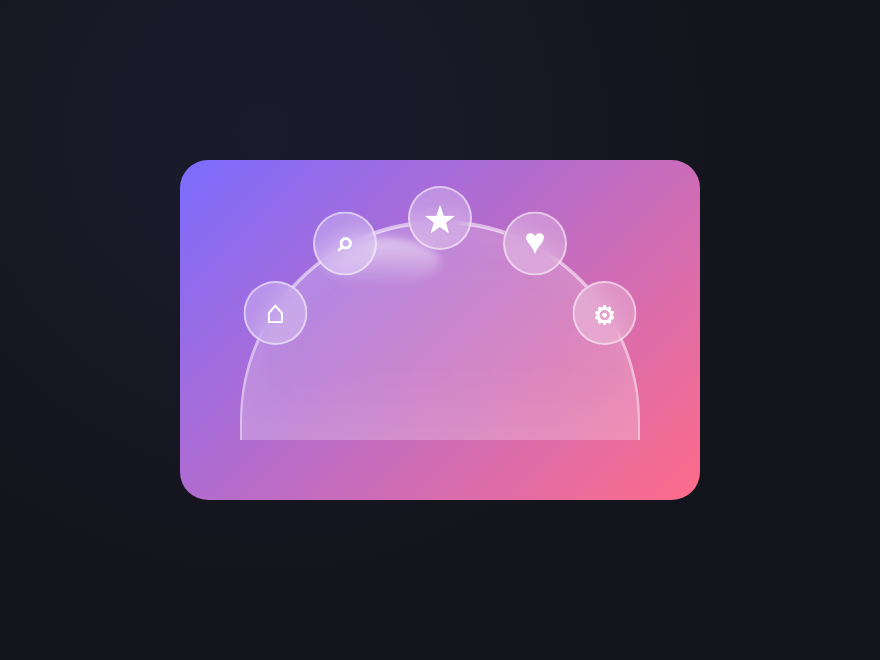
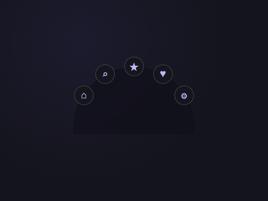
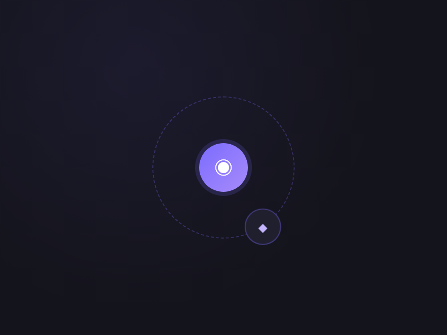
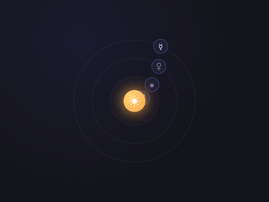
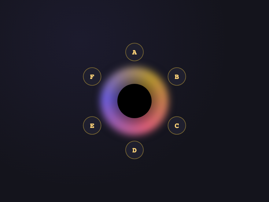
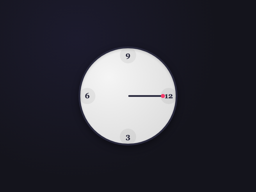
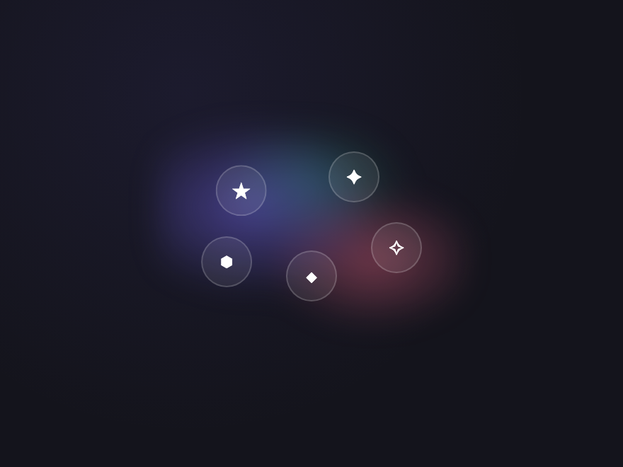
21 CSS Circular & Radial Menu Designs
A CSS circular menu arranges navigation items around a circle, ring, or arc instead of a flat row. These 21 hand-coded designs are ready-to-ship radial action menus, compass nav, and skeumorphic widgets you can drop into a project today — copy the markup, point items at your routes, and ship.


Build your own
Tweak the exact look in our visual generators — no signup, instant copy-paste.
Frequently asked questions
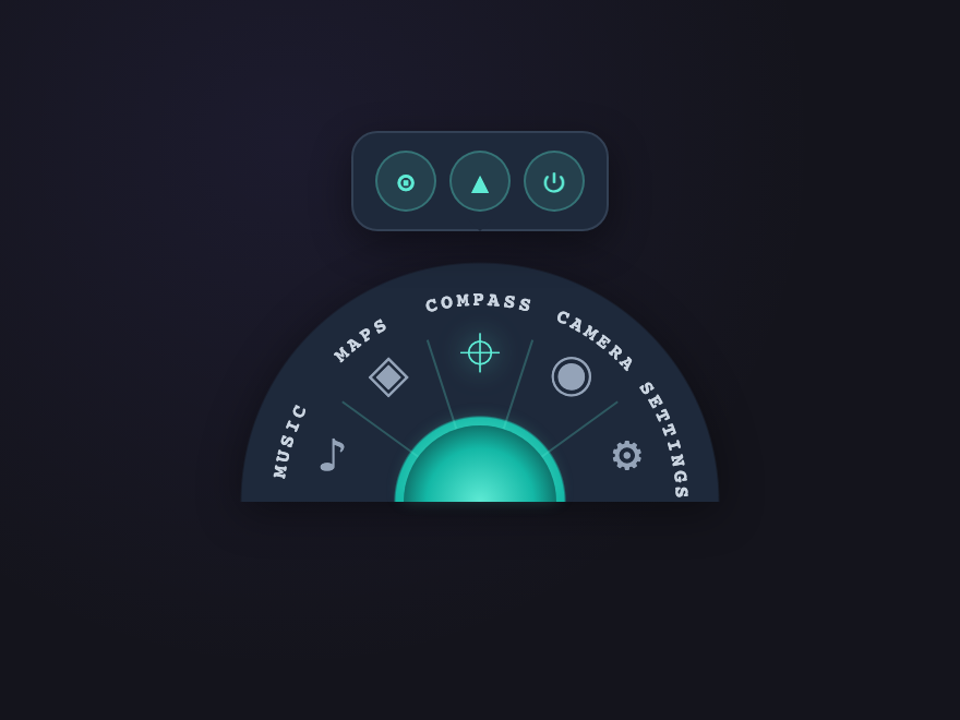
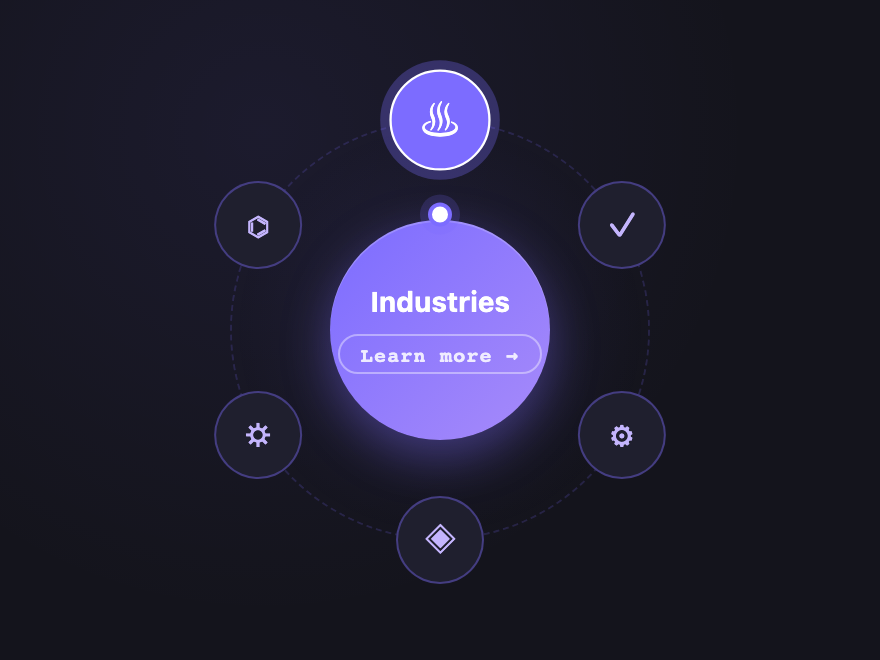
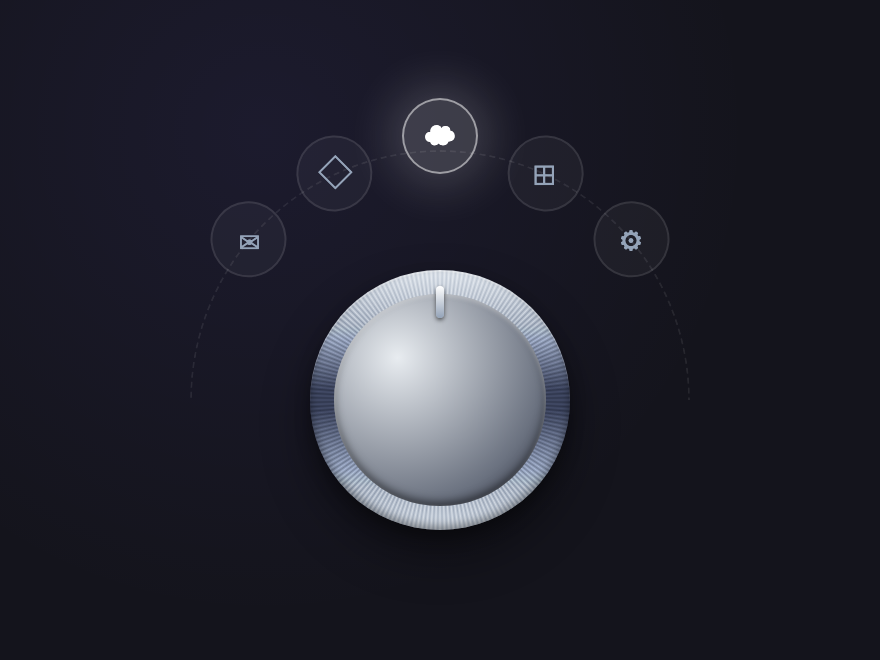
What is a CSS circular or radial menu?
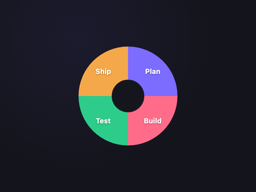
How do I build a radial menu in pure CSS?
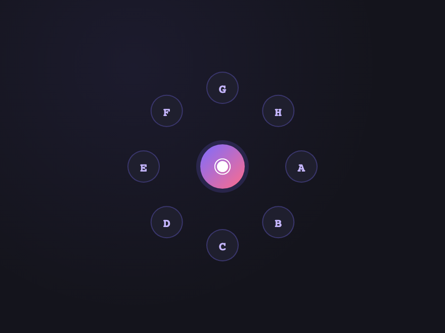
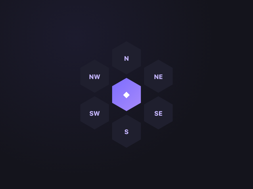
How do you position items in a circle with pure CSS?
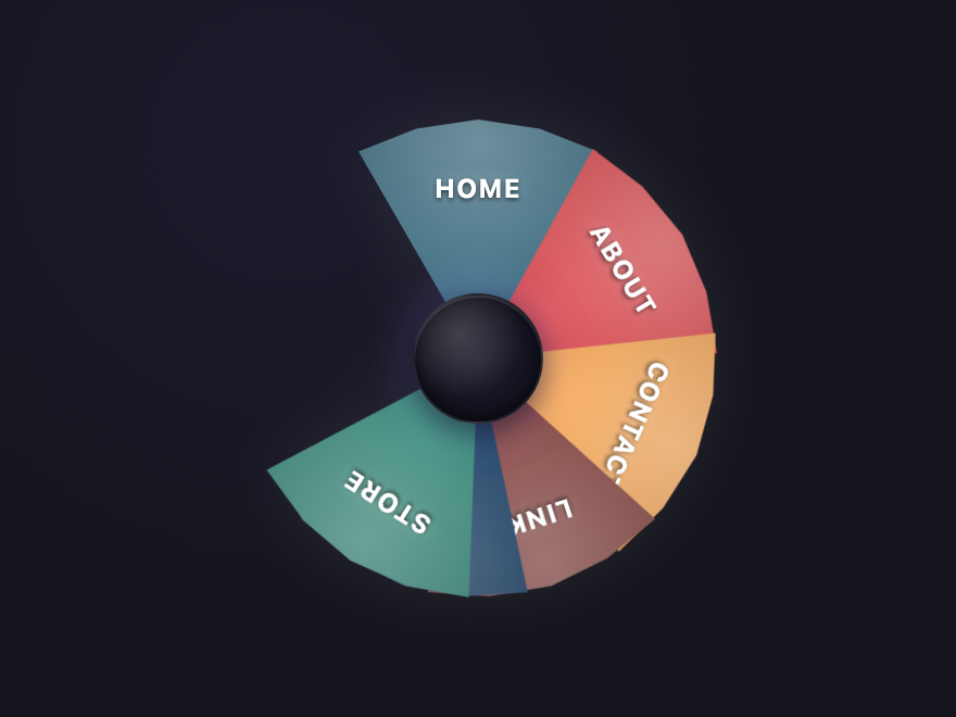
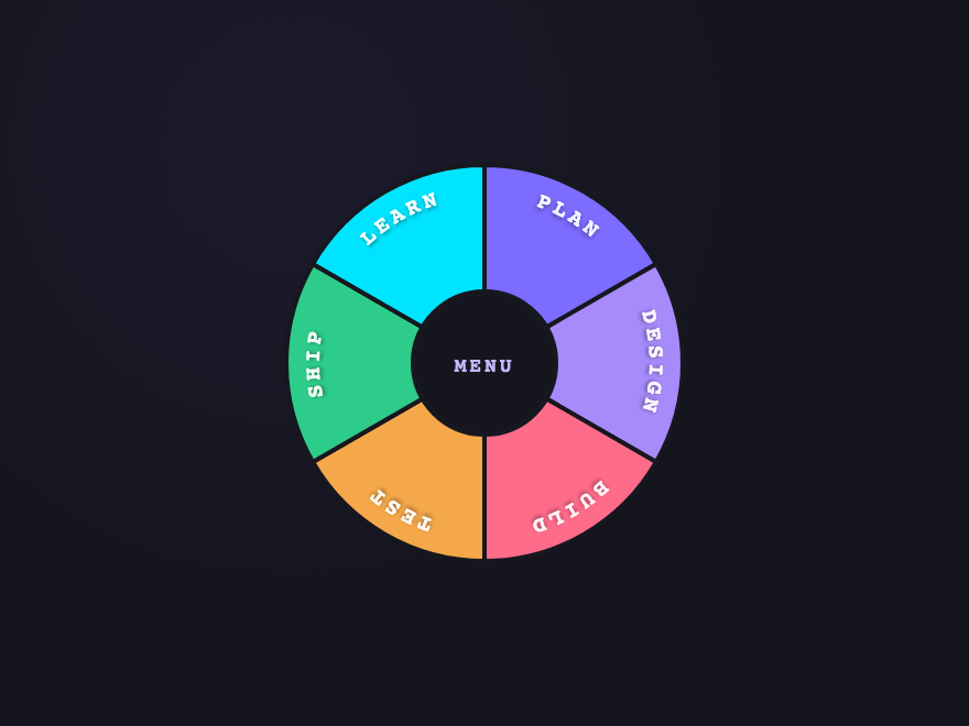
How do you add curved text along a donut sector?
<path> inside <defs> that traces the arc you want the text to follow, then a <text><textPath href="#path-id">YOUR LABEL</textPath></text>. The text-anchor="middle" and startOffset="50%" attributes center the label along the arc. The Donut Sectors demo (#04) uses exactly this pattern with one path per sector.Are these circular menus accessible?
<a> elements with aria-label on icon-only items, visible focus states, and keyboard tab order that follows the visual arrangement. Continuous animations (orbital spins, conic rotations, vinyl spin) honour the prefers-reduced-motion media query — animations stop and items show in their static position for users who request reduced motion.Do circular menus work on touch devices?
Can I use these circular menus in any framework?
Related collections

26 CSS Accordions — Vertical & Horizontal
26 free CSS accordions — 17 vertical and 9 horizontal layouts with copy-paste HTML and CSS.

22 CSS Breadcrumbs
22 original CSS breadcrumb designs — underline grow, pill, diagonal slash, neon trail, brutalist, frosted glass, vertical stacked, progress track, holographic shimmer and more.

22 CSS Dropdown Menu Designs
22 hand-coded CSS dropdown menu designs with live demos — slide-down fade, clip-path curtain reveal, 3D perspective flip, elastic bounce spring, glassmorphism float panel, stagger children reveal, mega-menu grid, underline nav fade, native details/summary, checkbox-hack mobile nav, nested multi-level flyout, icon sidebar flyout, split-screen mega-menu, segmented pill nav, color swatch picker, right-click context menu, keyboard-accessible roving tabindex, stagger blur entrance, command palette search, autocomplete suggestion, click-outside close, and multi-select chip. 15 pure CSS + 7 with a tiny vanilla JS snippet — no framework. WCAG 2.2 aria-expanded + aria-haspopup + focus management, prefers-reduced-motion honoured, MIT licensed.