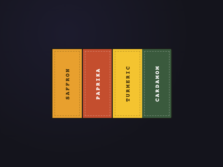
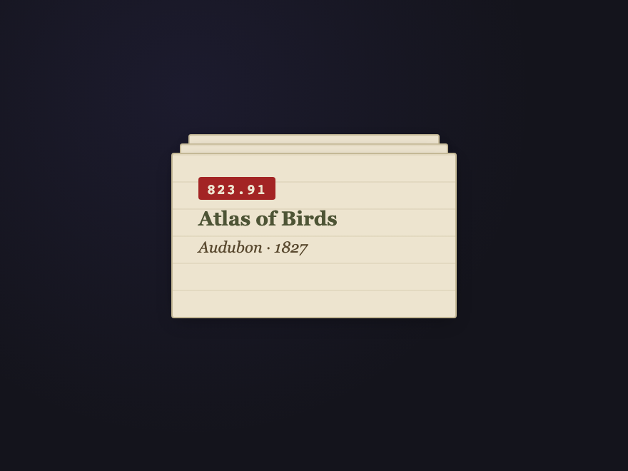
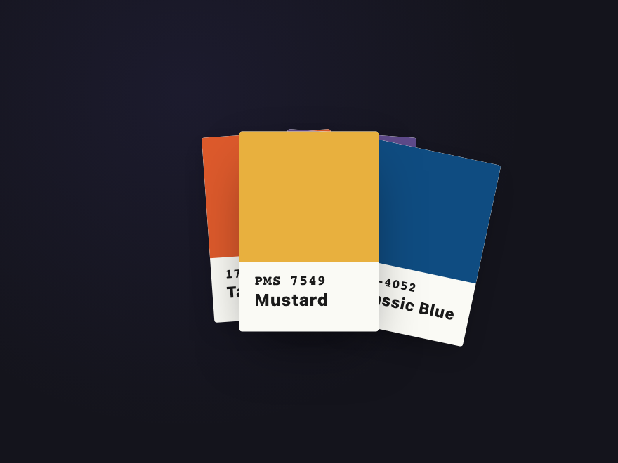
A CSS stacked-card layout renders multiple cards as a 3D depth-stack instead of a flat row or grid. These 28 hand-coded designs lead with an editorial hover-reveal deck that fans on cursor enter, a scroll-activated sticky stack where each step pins as the next slides over it, a pure-CSS testimonial slider built on hidden radio inputs (zero JS), three pricing tiers floated in a true isometric plane, a Tinder-style swipeable flashcard deck, and a minimalist bento dashboard grid with an embedded mini-stack — plus a casino-felt poker deck, botanical fan spread, scattered Polaroids, staircase bricks, glassmorphic perspective tunnel, iOS-style notification pile, thermal-printer receipt that unrolls, a continuously rotating spiral tower, cursor-parallax tilt card, and a real <canvas> scratch-off lottery card. 20 are pure CSS; 8 add a short vanilla JS snippet for click/drag/scratch/scroll interactivity. Each demo ships with semantic HTML, scoped .scd-<prefix> class names that never collide with your existing styles, prefers-reduced-motion fallbacks, and MIT licensing — copy from any code panel and drop onto your existing card markup.
28 unique stacks20 Pure CSS8 CSS + JS100% copy-paste readyPublished
Updated · 6 new designs added
·
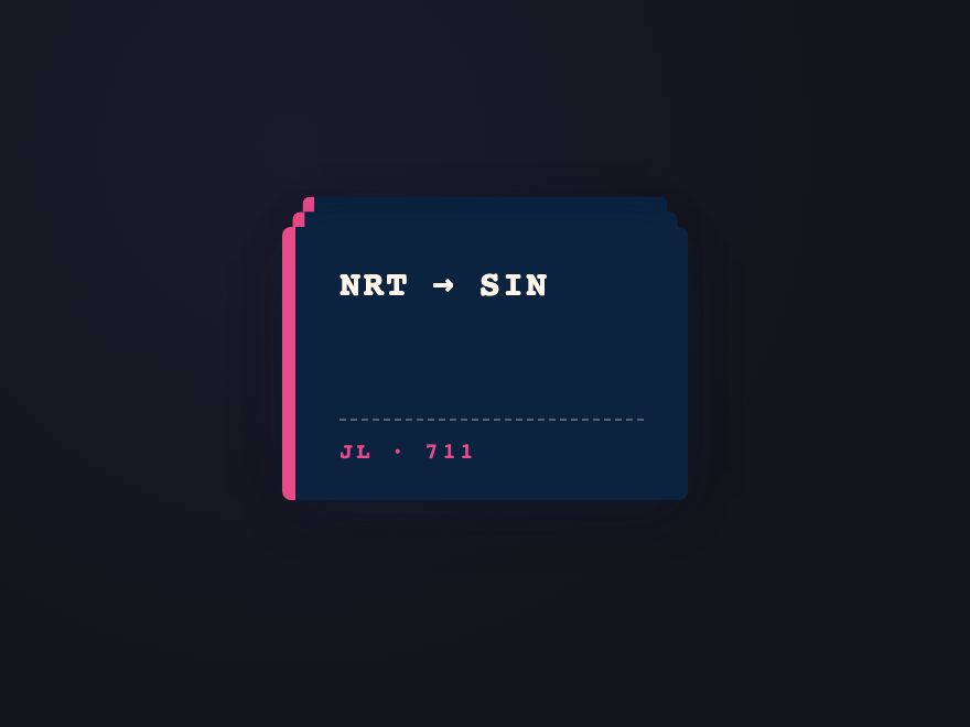
01 / 28
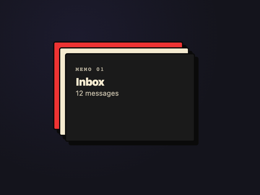
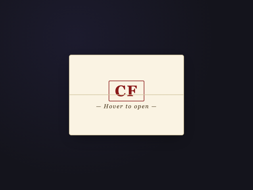
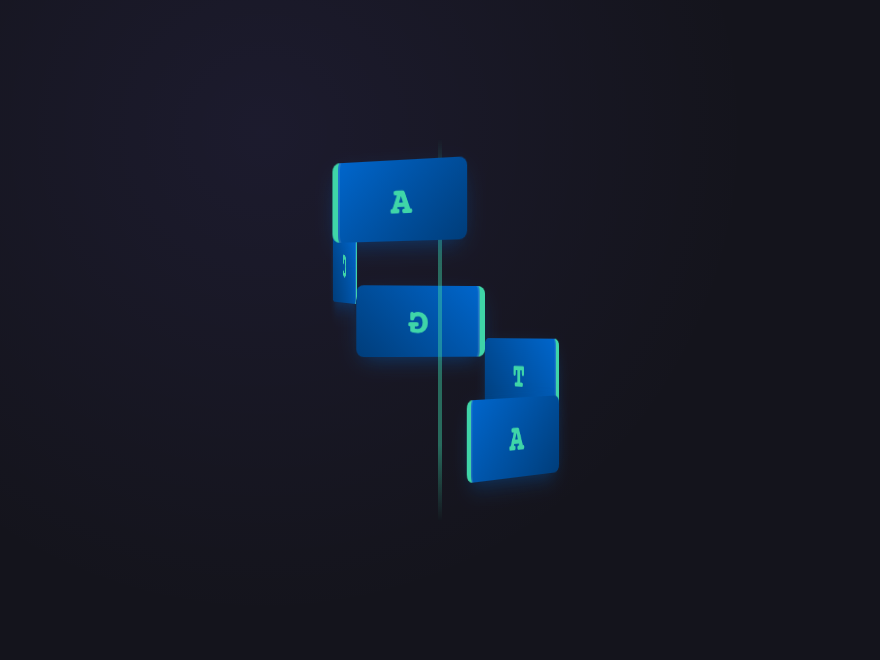
CSS Stacked Cards Hover Reveal
Pure CSS NEW
An editorial-style deck of portfolio cards sitting in a slightly rotated pile on a warm paper backdrop.
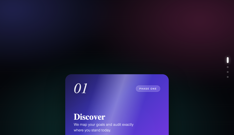
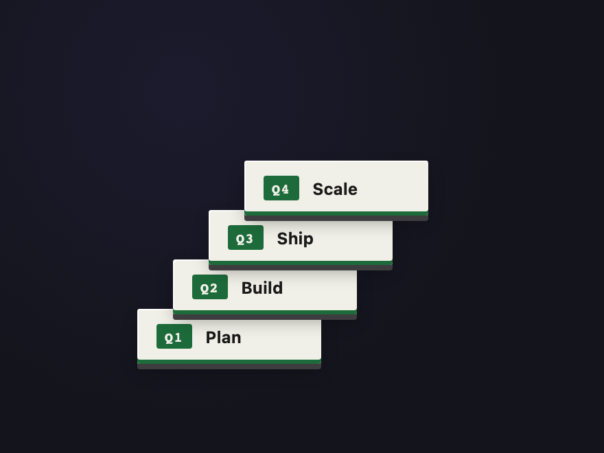
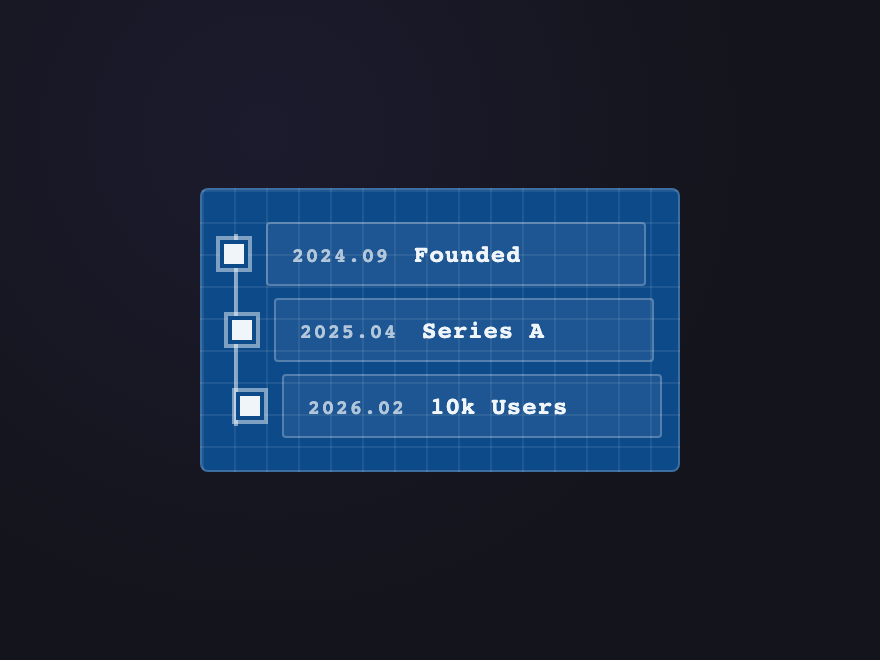
A vertical "How It Works" sequence where each step pins with position: sticky and the previous card scales down and dims as the next slides over it, keeping the reader anchored as they scroll.
Best forfeature sections, agency workflows, and process pages.
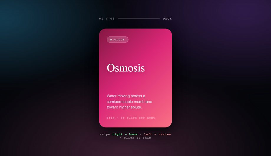
A Tinder-style flashcard deck optimized for the web: drag the top card (mouse or touch) past a threshold to send it to the back, or simply click it to cycle through.
Best forflashcard learning apps, quick-choice discovery widgets, and interactive portfolios.
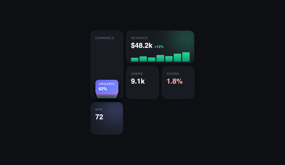
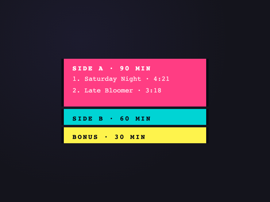
A dark, dashboard-style bento grid where one tile embeds a stacked mini-card component to conserve space — channel breakdowns sit collapsed inside a single cell and fan open on hover, while neighboring tiles show stats, a sparkline, and glow accents.
How do I make stacked cards fan out on hover with pure CSS?
Wrap the cards in a positioned container, give each one <code>position: absolute</code> with a small base offset + descending <code>z-index</code>, then on the container's <code>:hover</code> retarget every child with a wider <code>transform</code> (larger rotation + horizontal translate). A <code>transition</code> on each card eases the spread smoothly. The CSS Stacked Cards Hover Reveal demo (#01) is the canonical reference — four editorial portfolio cards on a warm paper backdrop that arc outward into a fan, with an individual <code>:hover</code> lift on whichever card the cursor lands on. Pure CSS, no JavaScript required.
How do I build scroll-activated stacked cards with sticky positioning?
The Scroll-Activated Stacked Cards demo (#02) shows the pattern. Give each card section <code>position: sticky; top: 0</code> (or a small offset) so it pins to the top of the scroll container when its content reaches that point. As the next section scrolls in, IntersectionObserver (or a short scroll listener) reads each card's progress and applies a <code>transform: scale(0.96)</code> + reduced opacity to the outgoing card. The new card slides over the dimmed previous one, keeping the reader anchored. About 30 lines of JS to compute the progress; the sticky behavior + the cross-fade are pure CSS.
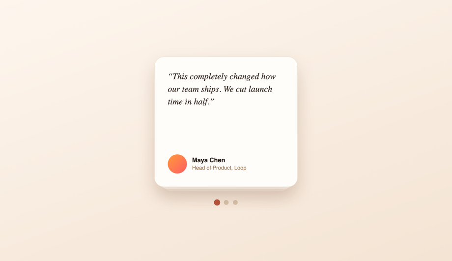
How do I build a testimonial slider with pure CSS — no JavaScript?
The Pure CSS Stacked Card Testimonial Slider demo (#03) uses hidden radio inputs as the source of truth for which card is active. Each radio's <code>:checked</code> state drives the visible state via general-sibling selectors: <code>input:checked ~ .card-1 { transform: translateY(0); z-index: 3 }</code>. Click a dot (which is a <code><label for="radio-id"></code>) and CSS does the rest. Zero JavaScript, no libraries, works back to evergreen browser support. Trade-off: keyboard focus order needs explicit <code>tabindex</code> on the labels.
How do I make 3D overlapping stacked cards in an isometric view?
The 3D Overlapping Stacked Cards demo (#04) uses <code>perspective: 1200px</code> on the parent, then <code>transform: rotateX(55deg) rotateZ(-45deg) translateZ(N)</code> on each card to float them in true isometric space. Each tier gets a different <code>translateZ</code> so they stack with real depth. Hover eases the rotation toward zero so the cards present readably for inspection. Three pricing tiers fit cleanly in this layout because the isometric tilt naturally separates overlapping rectangles.
How do I build a swipeable card stack with mouse and touch drag?
The Swipeable / Click-to-Front Stacked Cards demo (#05) ships the full pattern in ~50 lines of vanilla JS. Listen for <code>mousedown</code>/<code>touchstart</code> on the top card; capture <code>mousemove</code>/<code>touchmove</code> on the wrapper (not <code>document</code> — scoped containment) and translate the card by the delta. On <code>mouseup</code>/<code>touchend</code> if the delta exceeds a threshold, animate the card off-screen and shuffle it to the back; otherwise spring back. Click cycles to the next card without dragging. Works with mouse and touch out of the box.
How do I embed a stacked-card component inside a bento grid?
The Minimalist Bento Grid Stacked Cards demo (#06) shows the pattern. A normal CSS-grid bento layout reserves one cell for a stack component — a mini deck of collapsed cards. On hover that cell fans the collapsed cards open horizontally (transform translateX + a small rotation per card). The neighboring tiles (stats, sparkline, glow accents) stay static. The stack inside a single cell saves vertical space versus listing every channel as a row — useful in analytics dashboards where every cell is contested real estate.
How do I create a stacked-card effect in pure CSS?
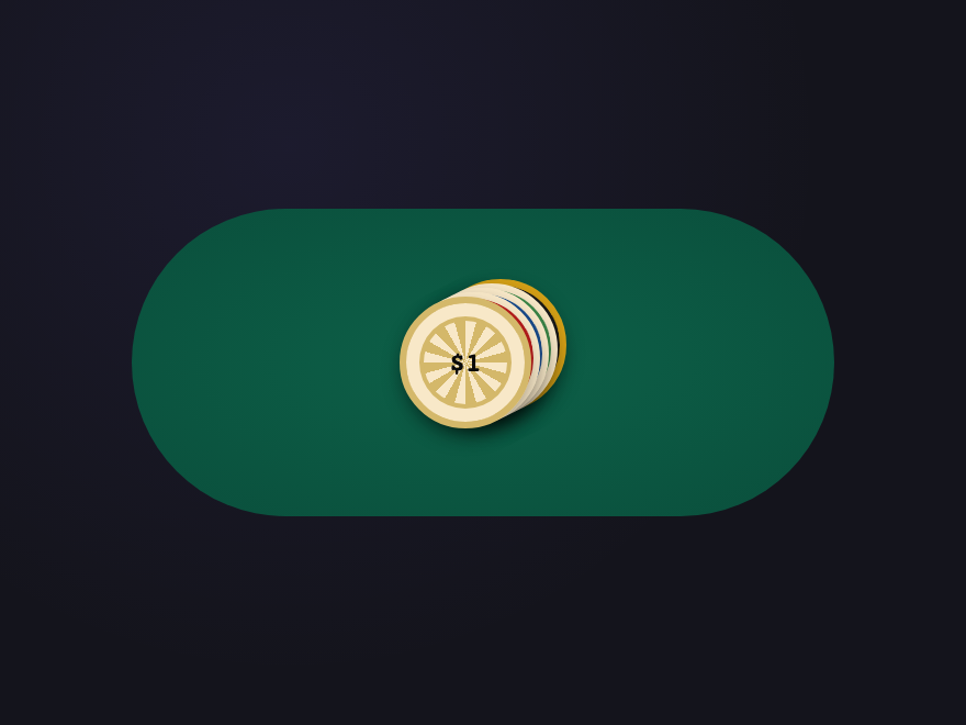
Place the cards as siblings inside a positioned container, give each one <code>position: absolute; inset: 0</code>, and offset every card with a unique <code>transform</code> (small translate, rotate, scale) plus a descending <code>z-index</code> so the front card sits on top. The Classic Deck demo (#07) ships the canonical recipe with five poker cards at a 4px-per-card offset and 2deg rotation increment. Copy from the code panel and swap the content for your own cards.
Which of the 28 demos need JavaScript? Are they accessible without it?
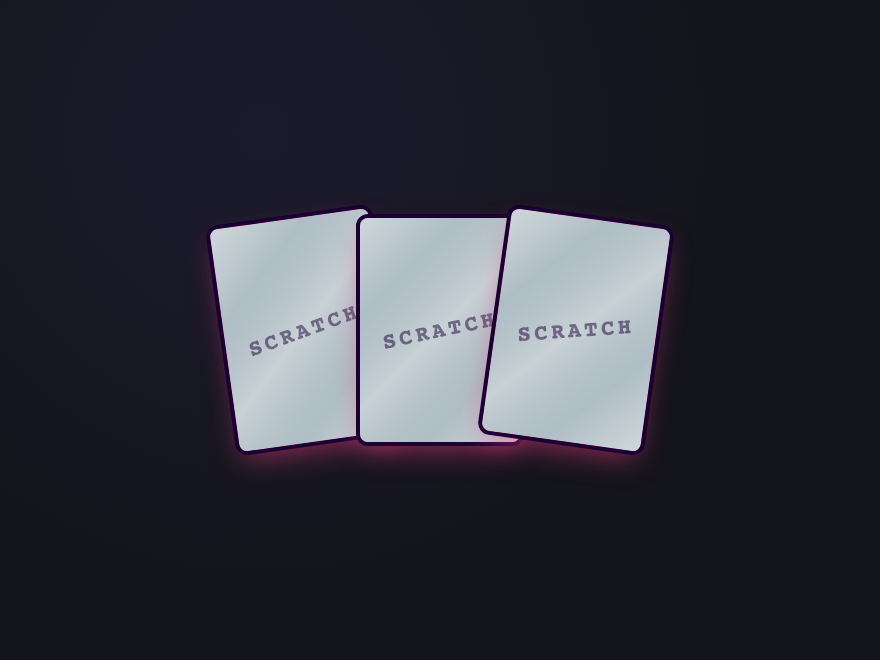
Eight demos use a short vanilla JS snippet: Sticky Stack (#02, sticky scroll progress), Swipeable Flashcards (#05, drag-to-back), Shuffle Reveal (#16, click to cycle), Swipe Stack (#19, drag to discard), Accordion Card (#20, click to expand), 3D Flip Stack (#23, click to flip), Tilt on Hover (#25, cursor parallax), and Scratch Cards (#28, drag to scratch). The other 20 are pure CSS — <code>:hover</code>, transitions, transforms, <code>:checked</code> radio-input state, <code>position: sticky</code>, pseudo-elements, and <code>@keyframes</code>. The JS demos degrade gracefully: every card's content is fully visible without JS (touch + keyboard users see the resting stack with all content present). Every continuous animation respects <code>@media (prefers-reduced-motion: reduce)</code>. No library required.
How do I keep a stacked-card hover animation smooth and not janky?
Animate <code>transform</code> and <code>opacity</code> ONLY — they're GPU-accelerated and skip layout reflow. Avoid animating <code>top</code>, <code>left</code>, <code>width</code>, <code>height</code>, or <code>margin</code> on hover; they trigger reflow + paint every frame. Put the <code>transition</code> on the card's base state so it eases out as well as in. Keep durations in the 200–500ms range. Use <code>will-change: transform</code> sparingly — only on the cards actually animating, not the container. If two hover rules can fire on the same element (e.g. a container :hover + a child :hover), guard one with <code>:not(:has(:hover))</code> so they don't fight on a still-running transition — that's what fixed the Tab Stack jitter.
Are these stacked card designs responsive and free to use?
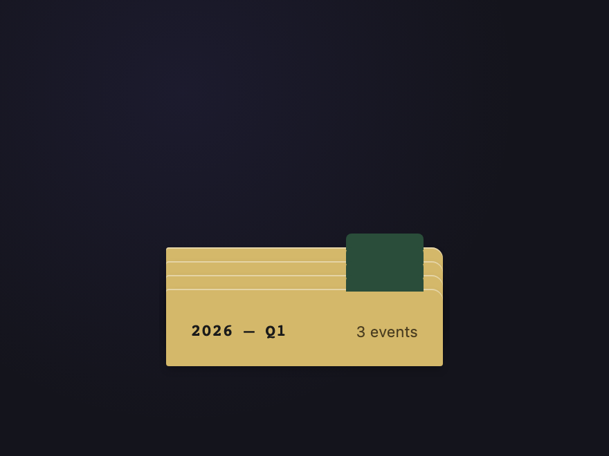
Yes. Each stack adapts to its container width and works inside a CSS grid or flex layout. The Sticky Stack (#02), Notification Pile (#26), Receipt Roll (#27), and Timeline Stack (#21) are particularly suited for mobile because they're vertically-oriented. The 3D-perspective demos (Isometric View #04, Perspective Deck #11, Spiral Tower #24, 3D Flip Stack #23, Isometric Tower #22) respect the parent container's transform-origin so they nest cleanly. All 28 designs are MIT licensed and free for personal AND commercial projects, no attribution required.