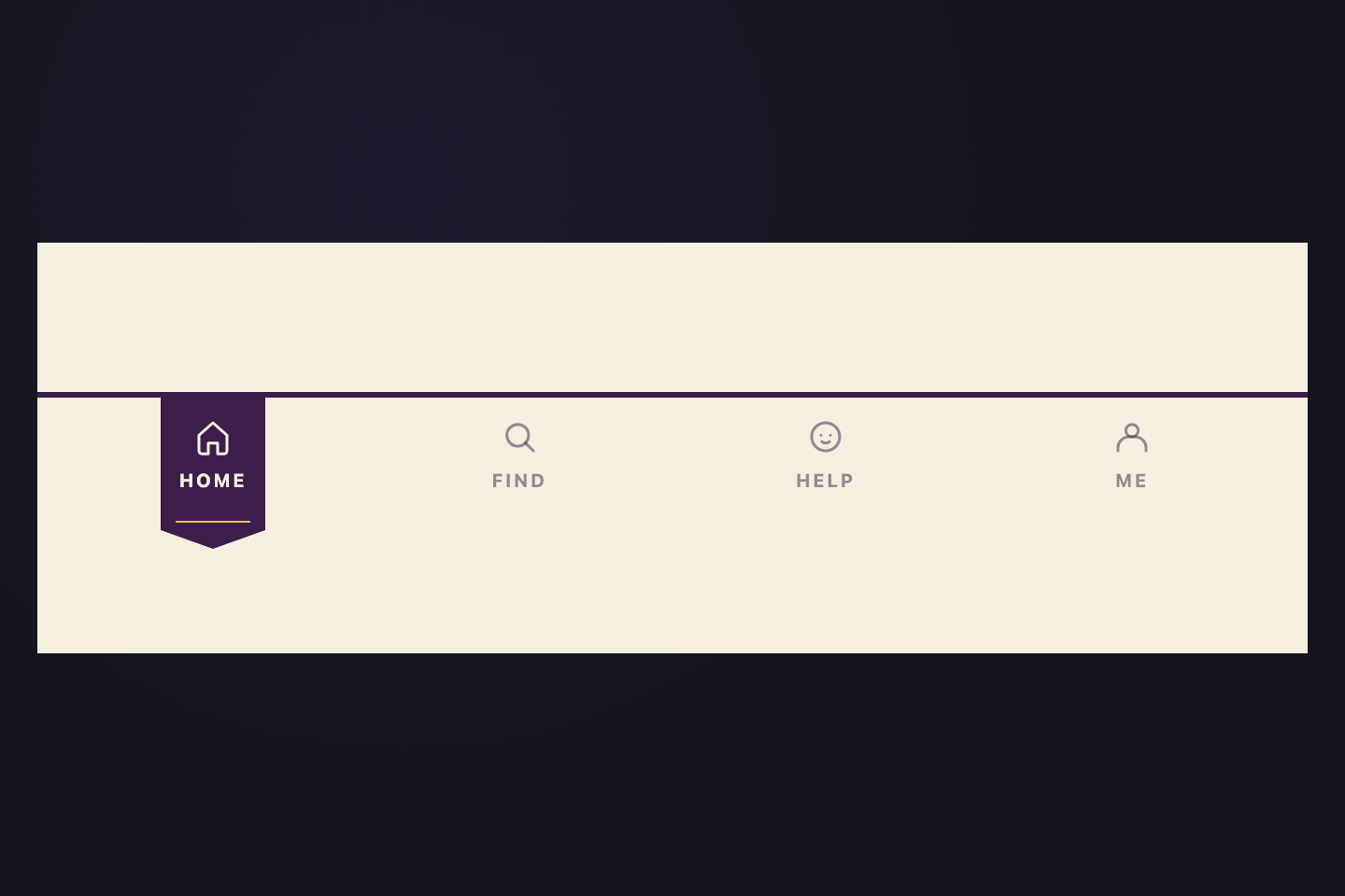
A CSS tab interface is a layered content switcher that shows one panel at a time from a row of tab triggers. These 32 hand-coded designs are ready-to-ship tab UIs for settings panels, feature overviews, code-language selectors, and product comparisons — copy the markup, plug in your panels, and ship.
32 unique designs23 Pure CSS9 CSS + JS100% copy-paste readyPublished
Updated · 12 new designs added
·
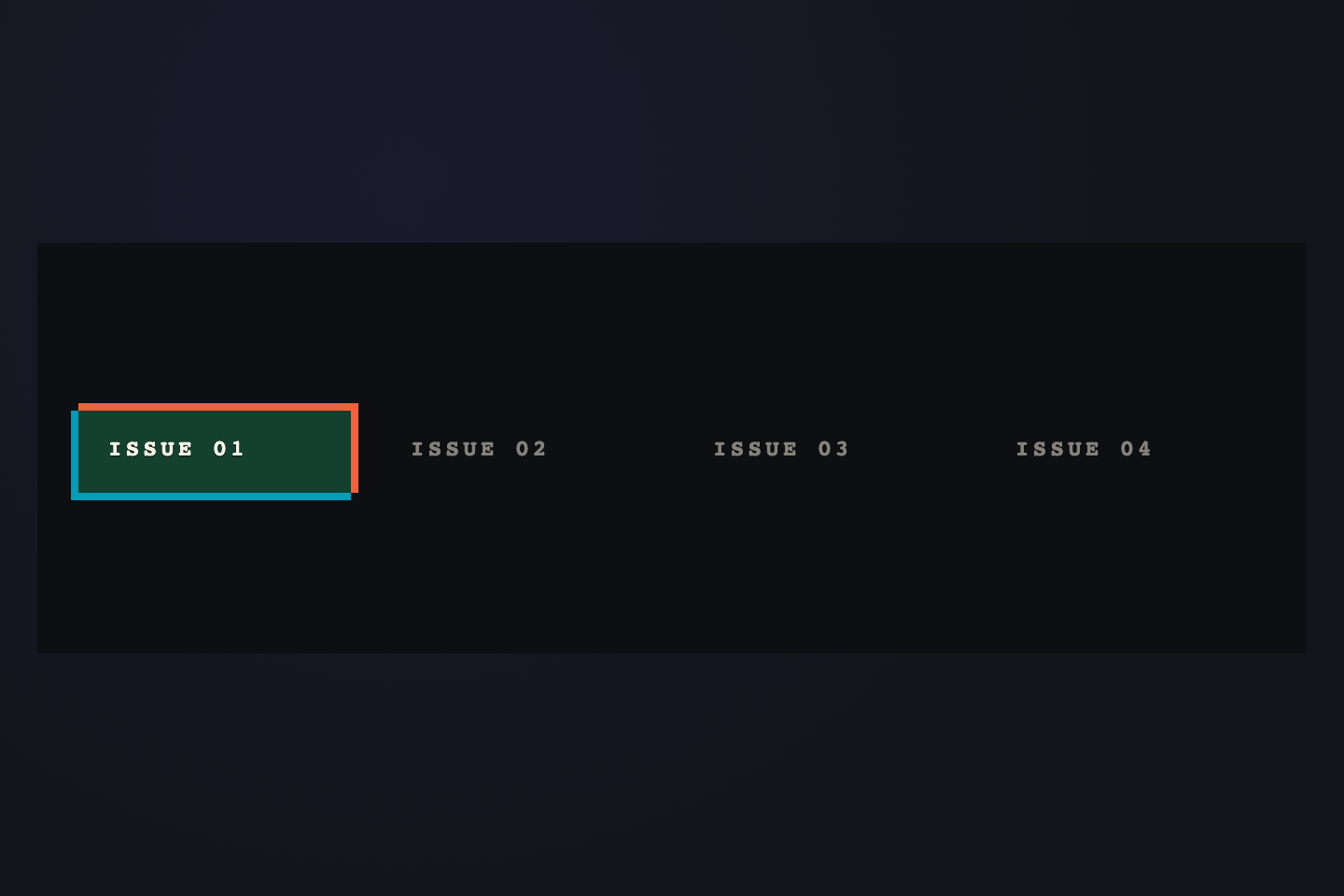
01 / 32
Ink Slider
CSS + JS NEW
Solid ink-violet bar slides horizontally beneath the active tab.
What makes these tab designs different from typical CSS tabs?
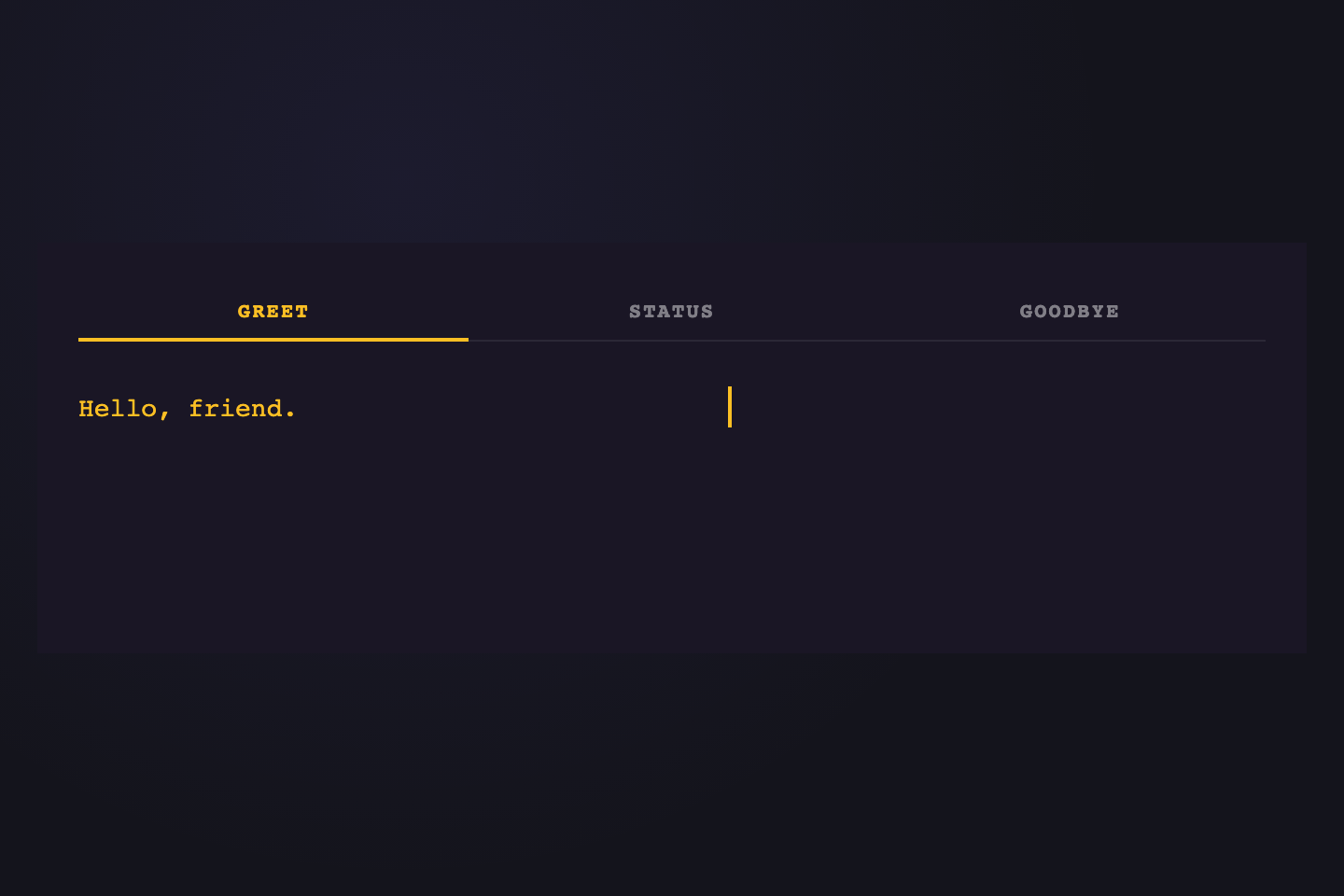
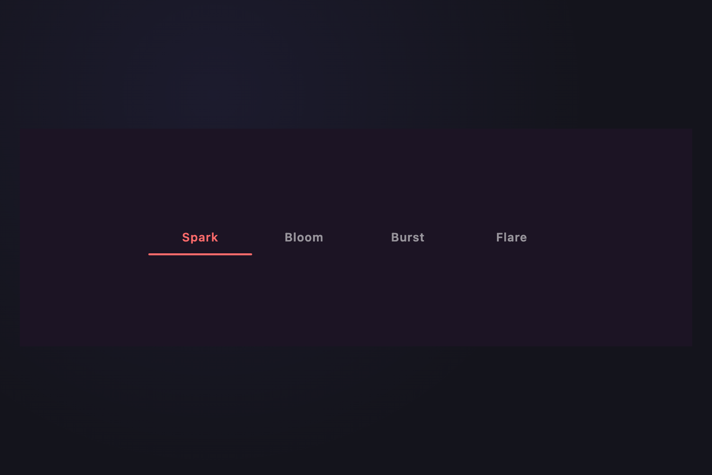
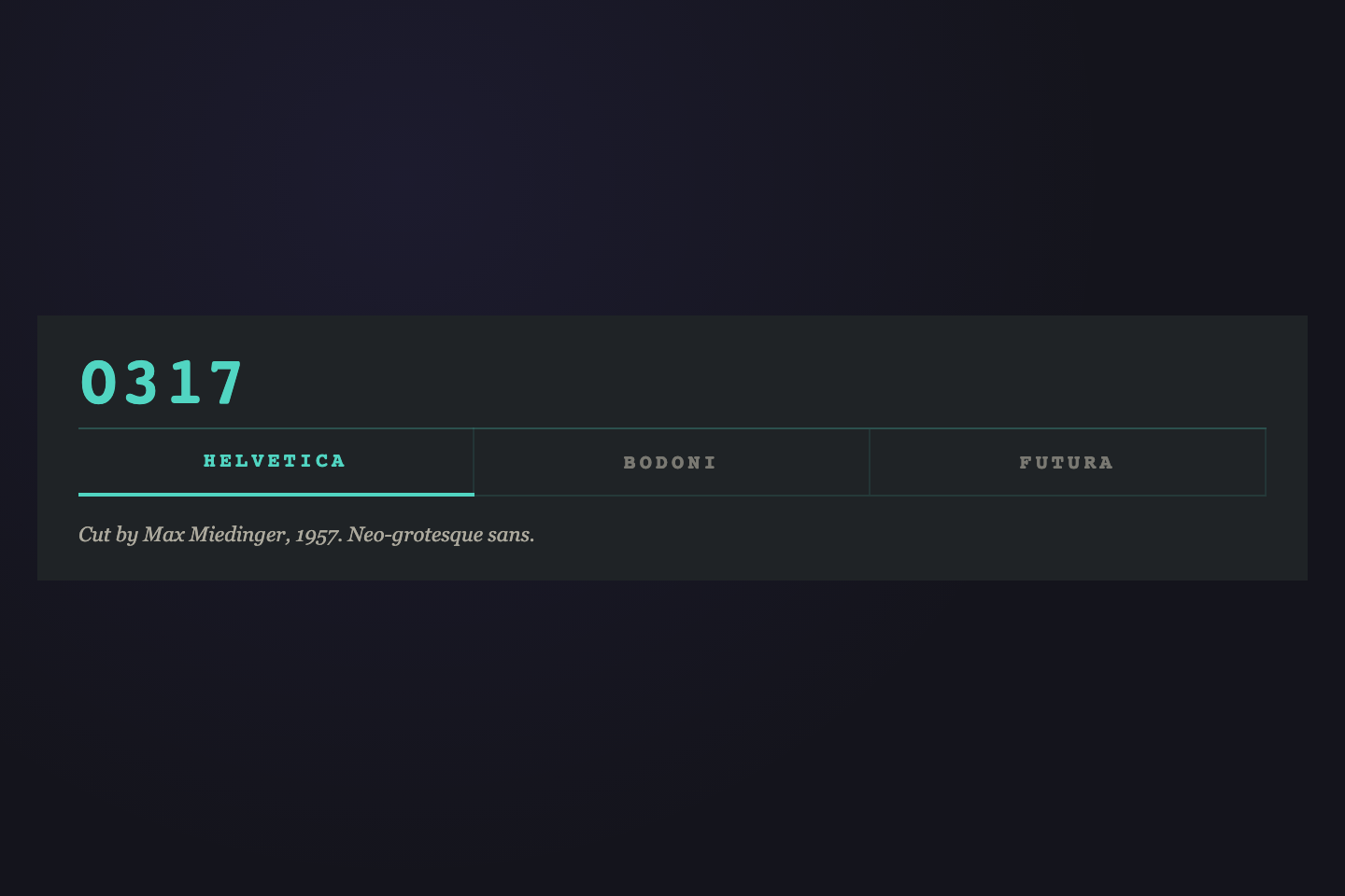
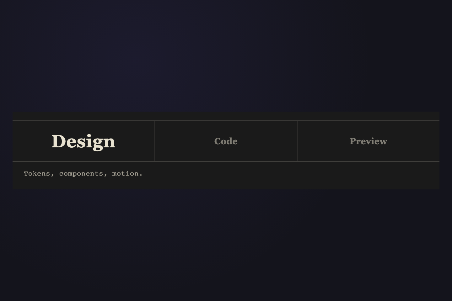
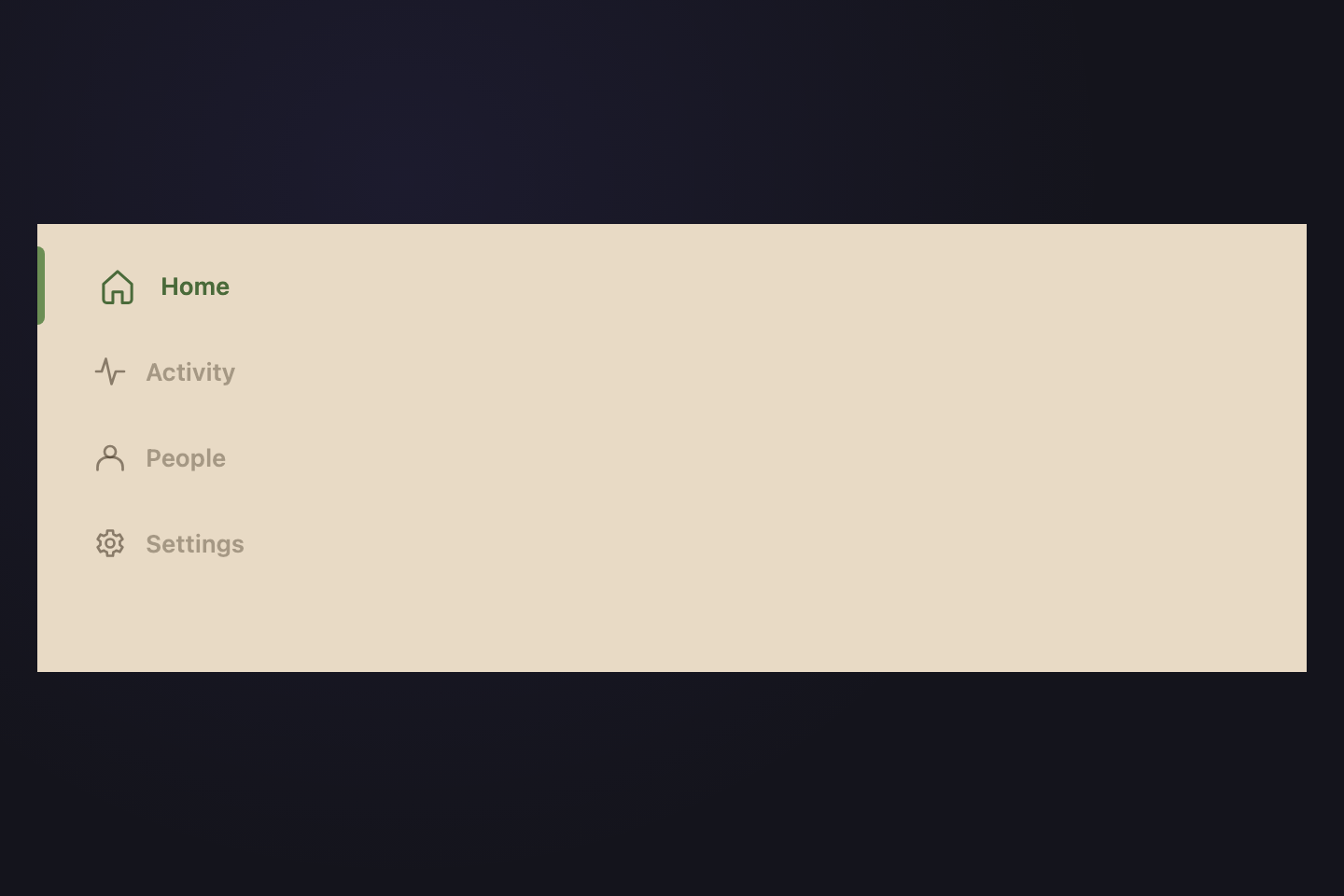
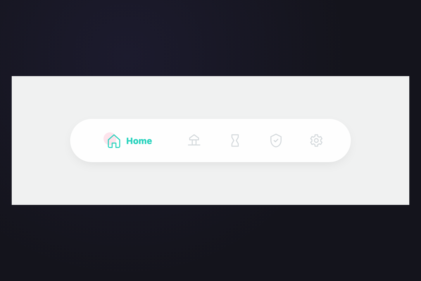
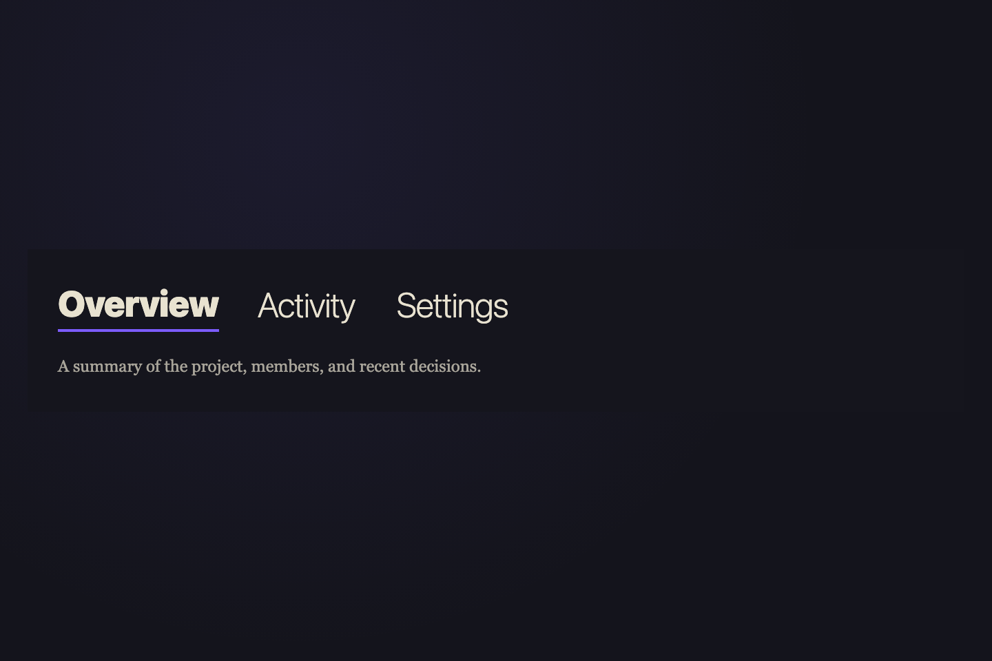
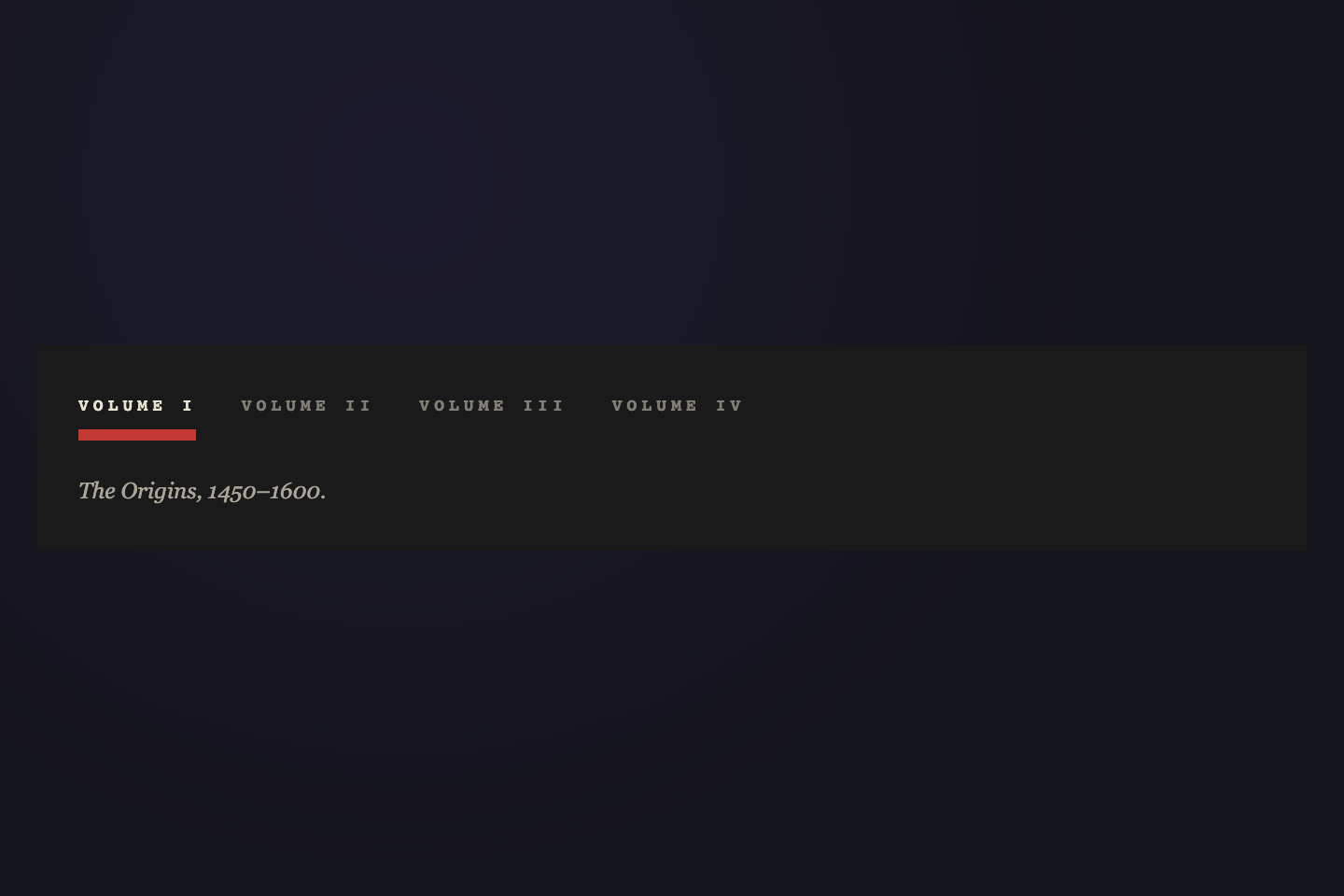
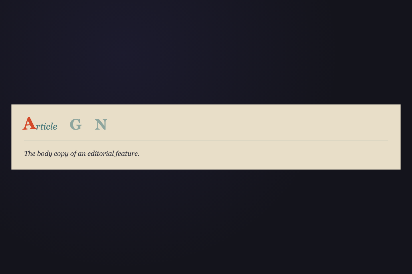
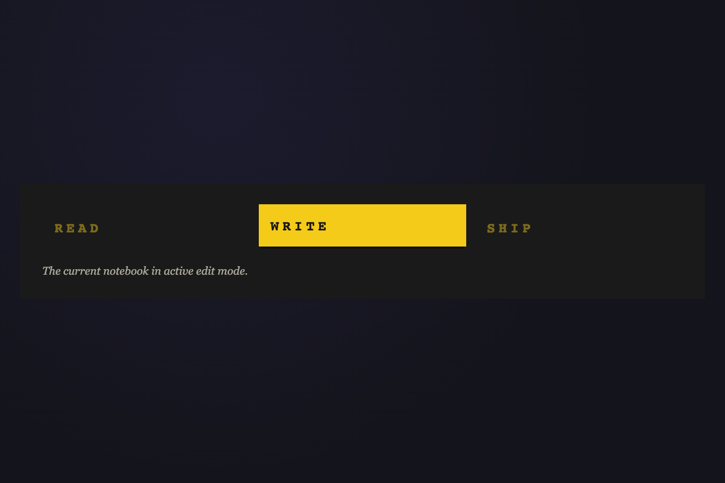
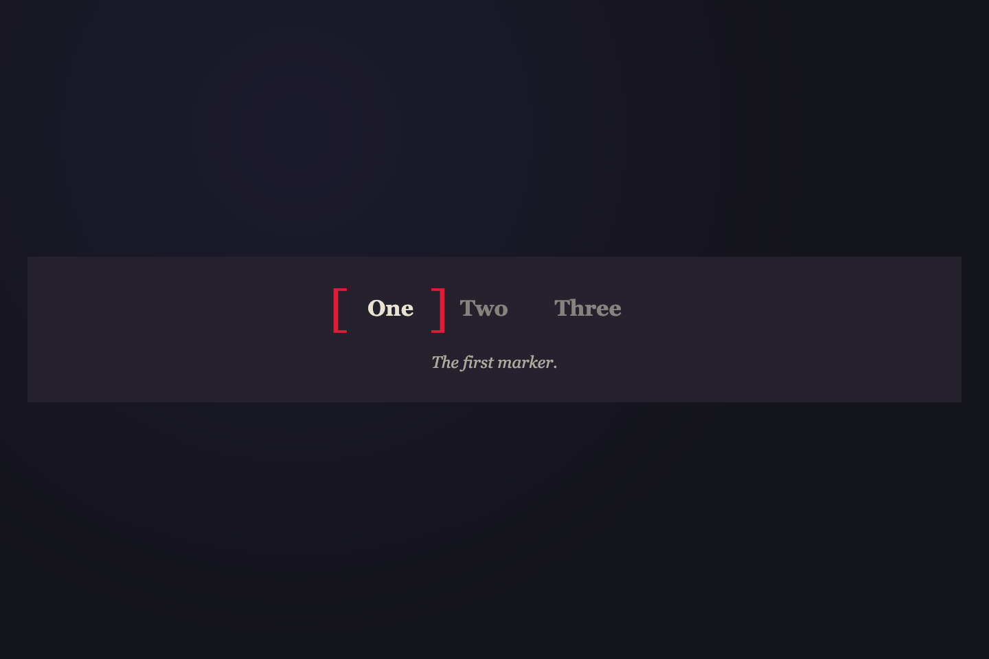
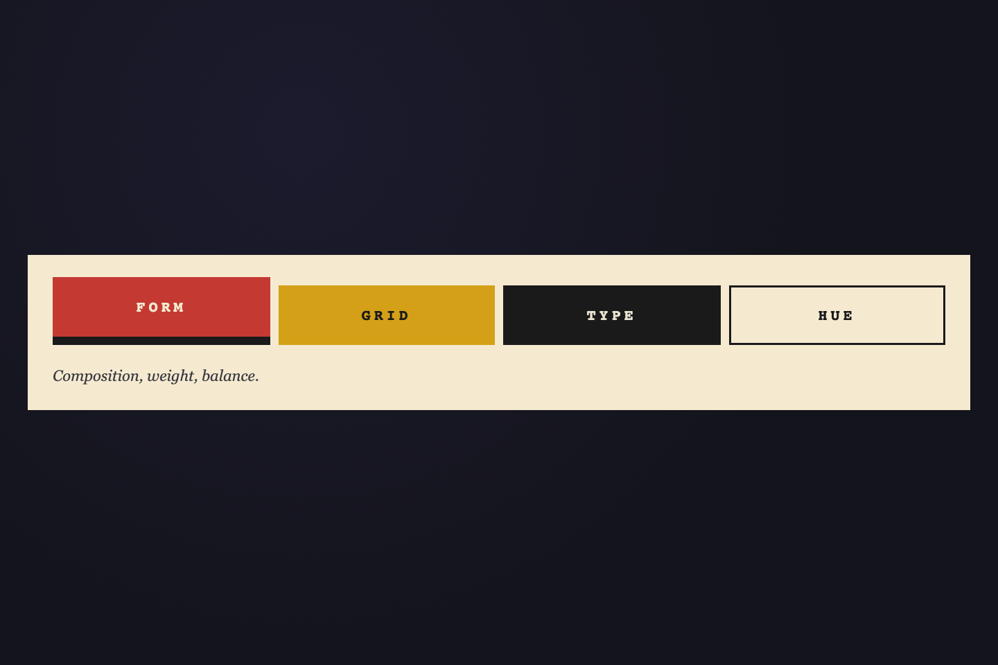
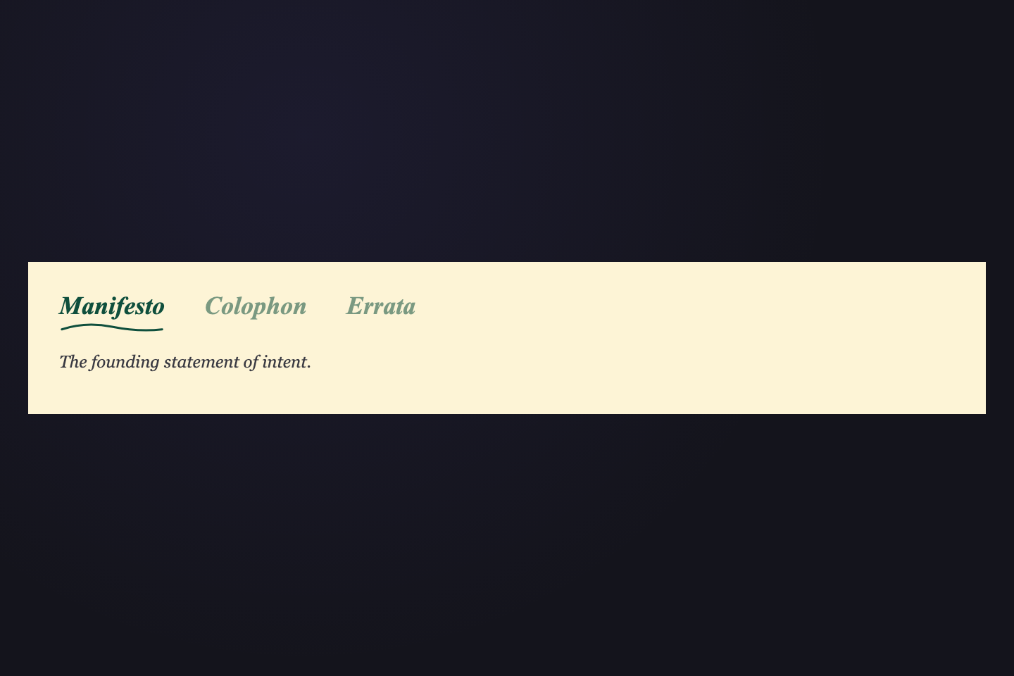
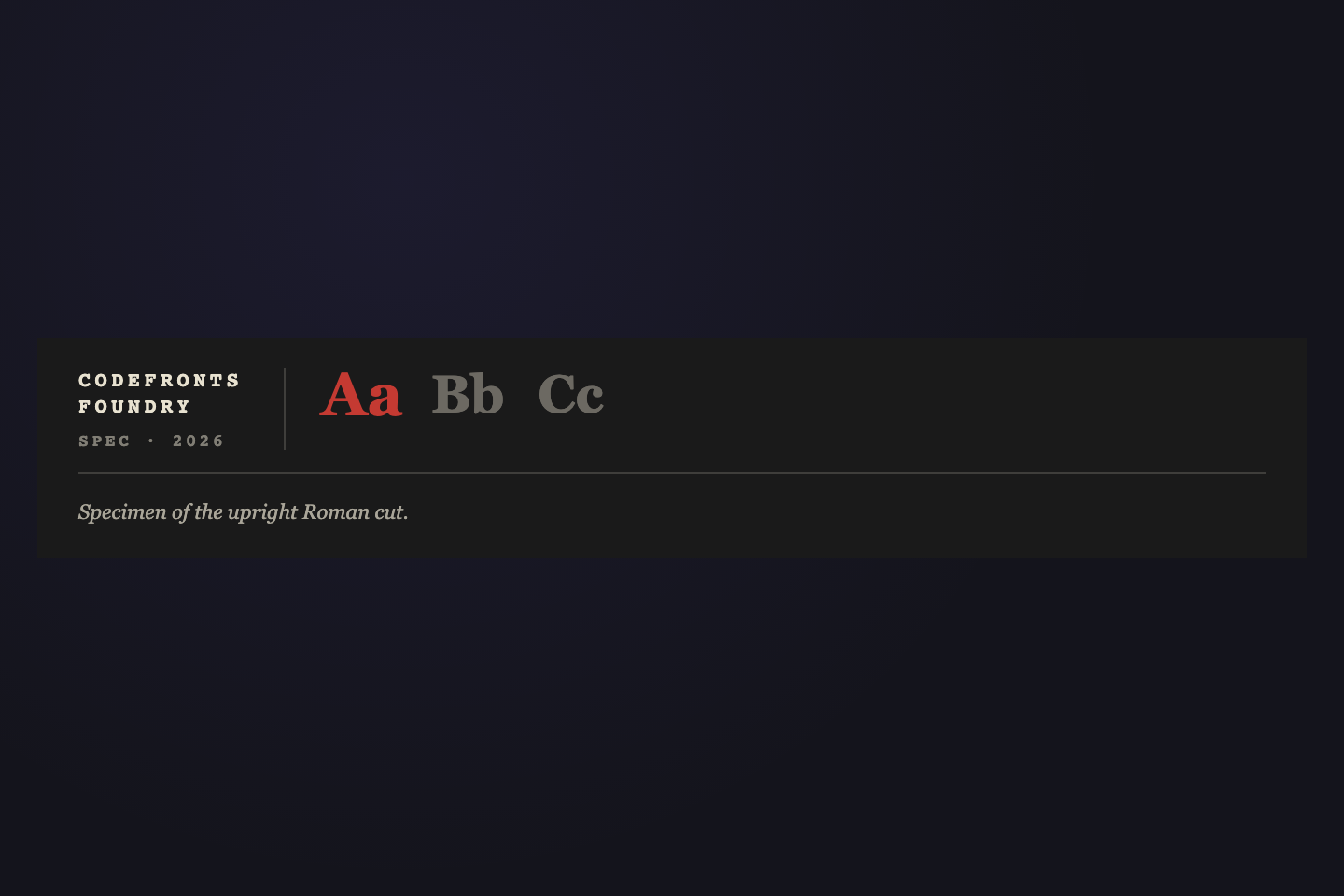
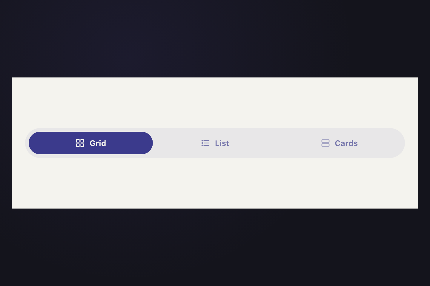
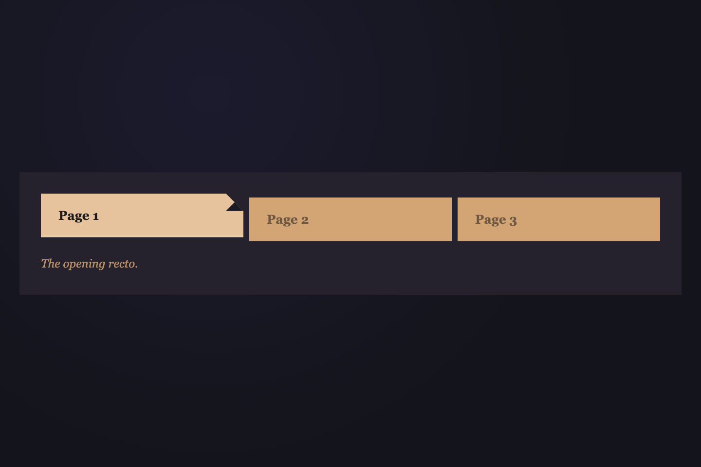
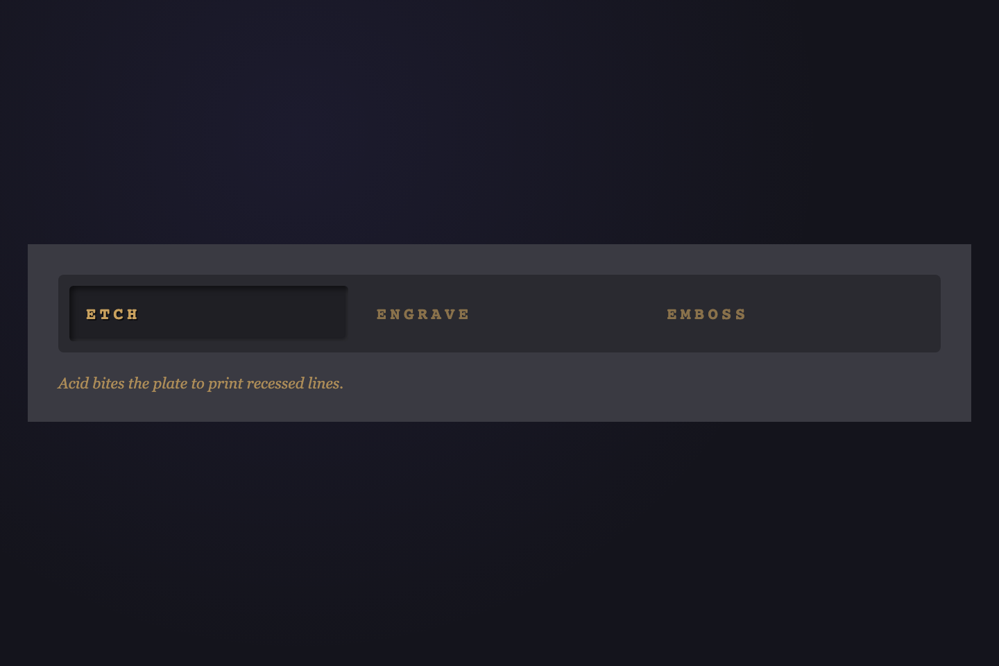
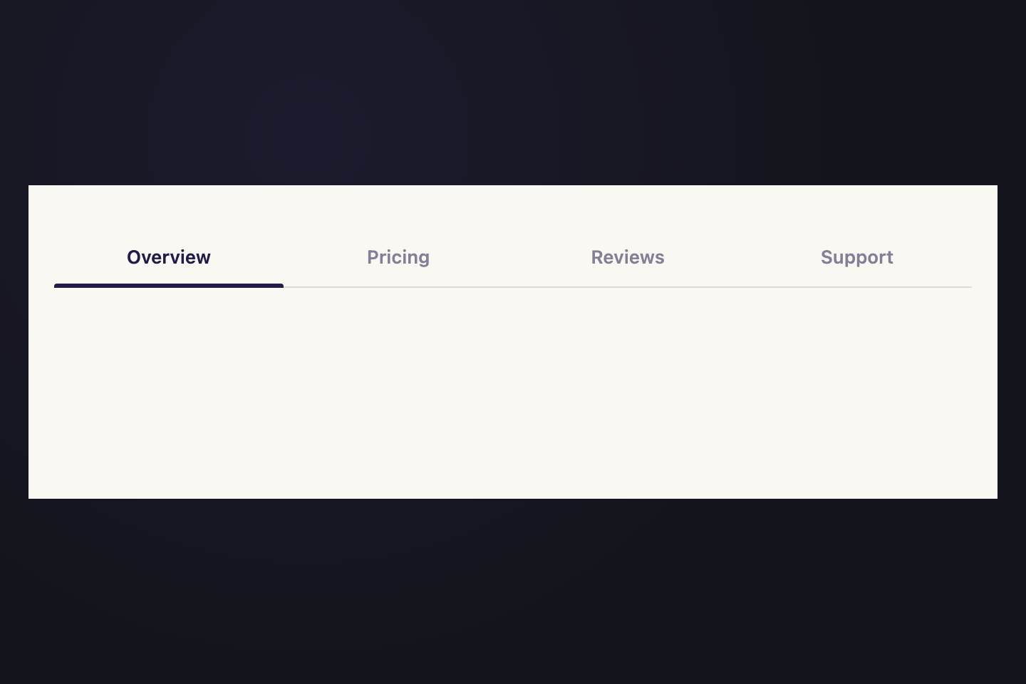
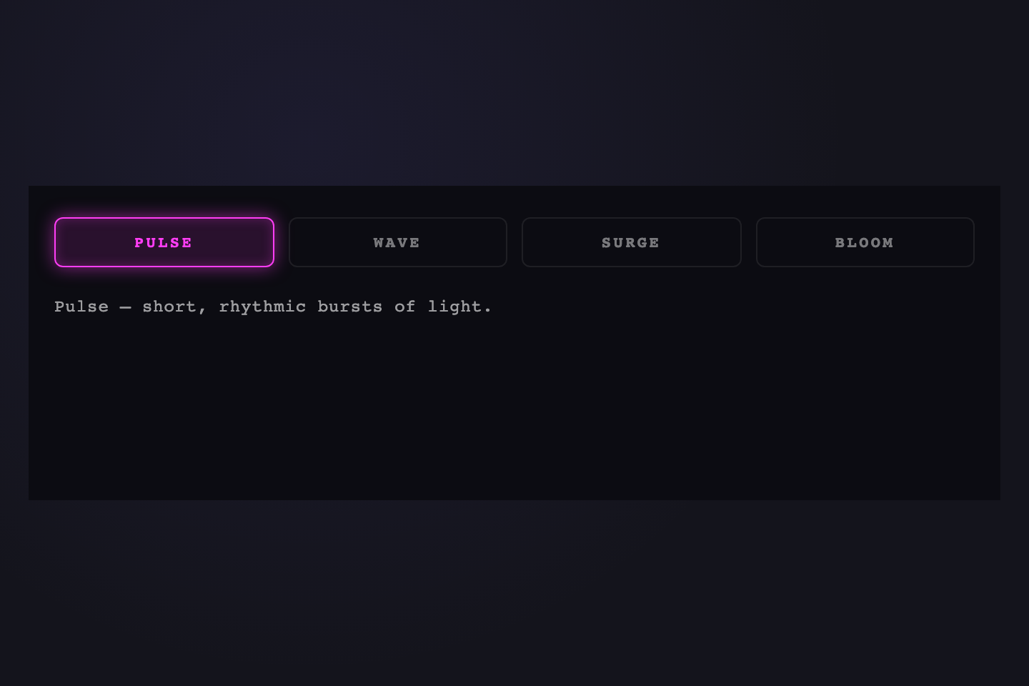
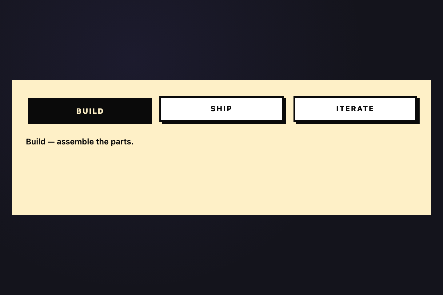
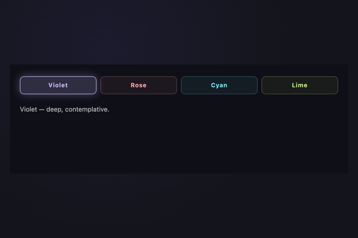
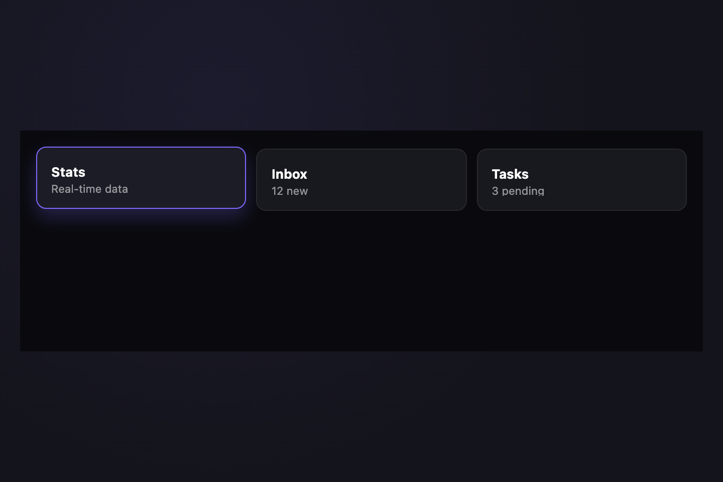
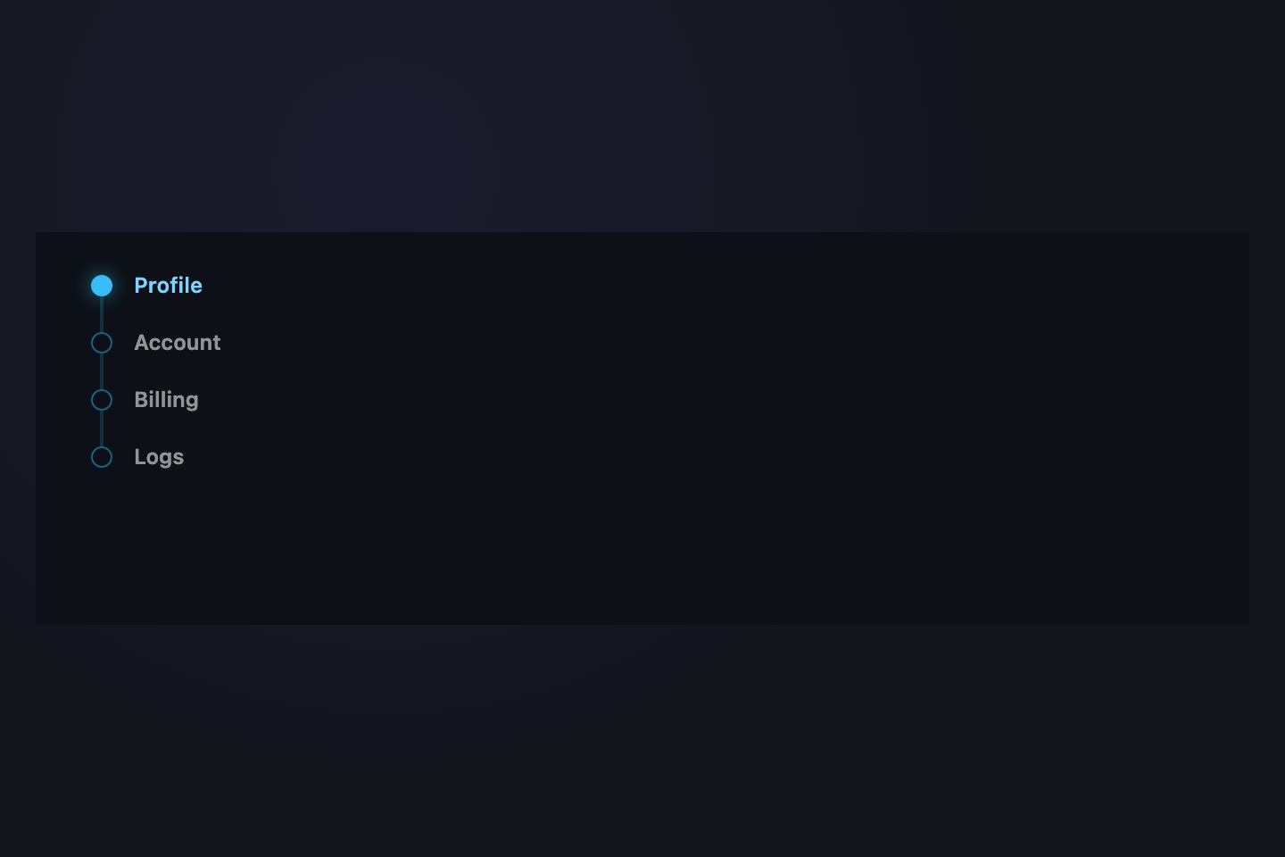
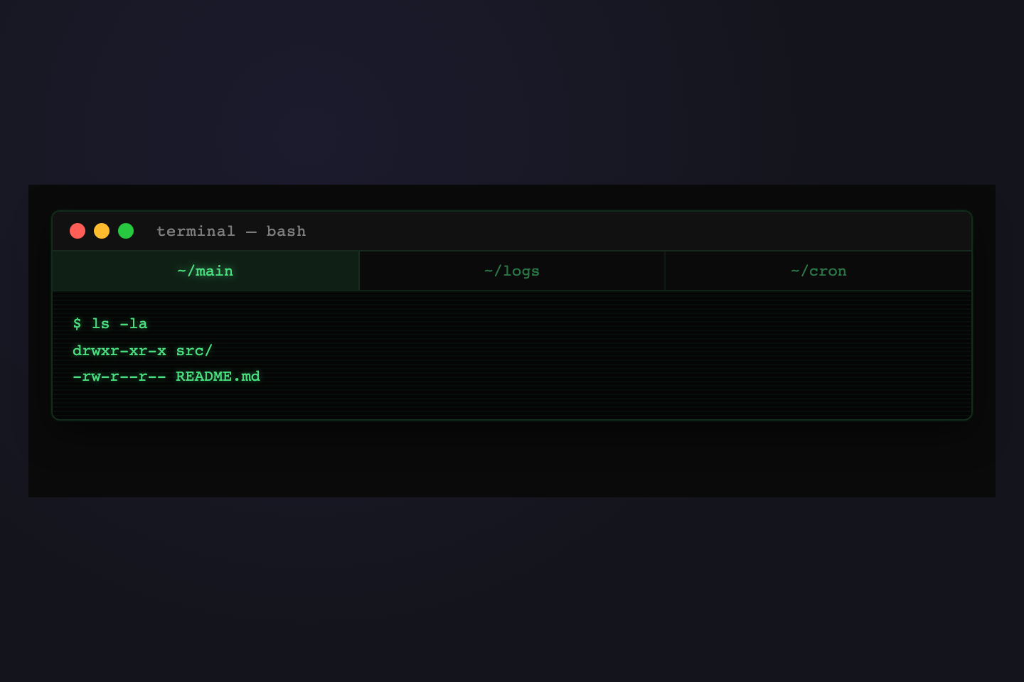
Each demo is built around a single bold gesture — sliding indicator, neon glow, brutalist shadow, color-coded segments, IDE chrome, terminal scanlines, particle burst, typewriter reveal, oversized numbers, stencil cuts, bracket marks. The focus is on the tab strip itself, not the content panel. Solid colors and geometric shapes throughout.
Are these tabs accessible?
Yes. Every demo uses real <button> elements (for JS-driven tabs) or radio inputs with paired <label>s (for pure-CSS tabs), keeping keyboard navigation and screen-reader semantics native. Visible focus rings via :focus-visible. No ARIA hacks. All animations honor prefers-reduced-motion.
Do these tabs work without JavaScript?
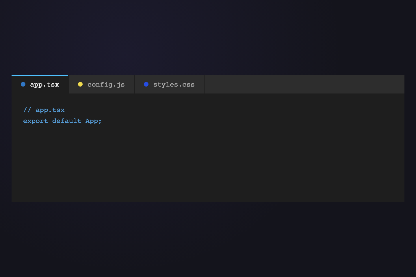
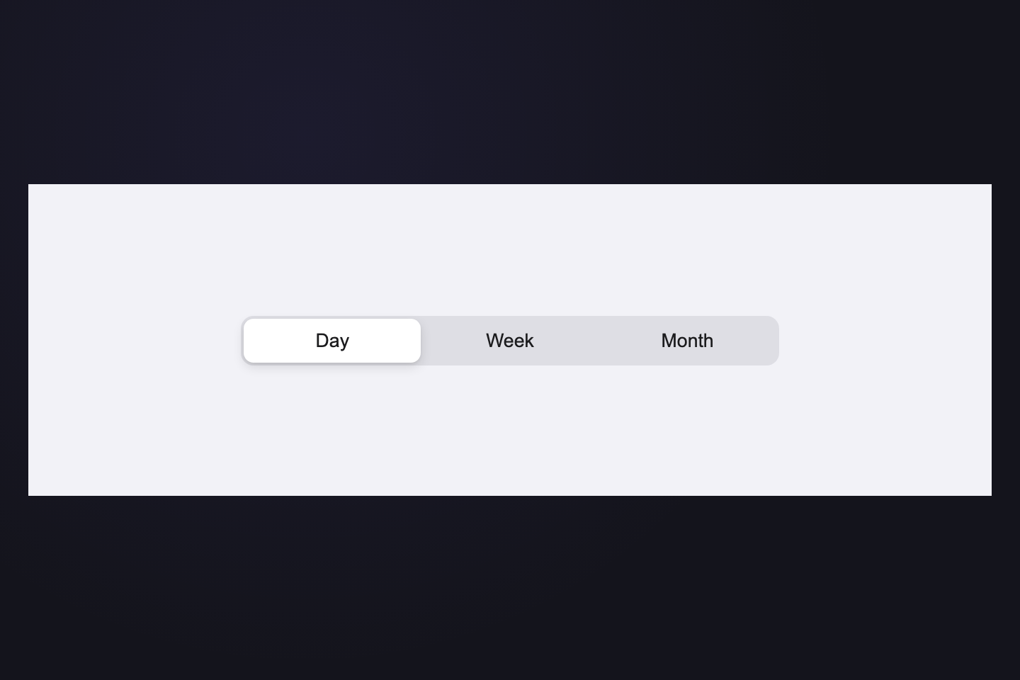
23 of the 32 demos are Pure CSS — they ship HTML + CSS only and switch panels via radio inputs and `:has()` / `:checked` selectors. The remaining 9 demos (Ink Slider, iOS Segmented, Particle Burst, Specimen No., Sidebar Nav, Underset Caps, Bracket Marks, Sliding Pill, Velvet Ribbon) carry small focused JS snippets to drive their positional indicators (sliding rules, sliding pills, sliding ribbons) and re-align them on viewport resize. Each demo carries only its own indicator code — never dead code from other demos.
Are the demos responsive?
Yes — every demo is built to work at any viewport width. Defensive CSS includes width: 100%, box-sizing: border-box, min-width: 0 on flex children, flex-shrink: 0 on icons, and text-overflow: ellipsis on labels. Every JS-driven positional indicator adds a window resize listener so the indicator stays locked to its active tab when the viewport changes — same behavior in the gallery preview, the Try-it playground, and your own paste.
Can I swap the colors and fonts?
Yes. Every demo uses solid hex values in plain CSS — no design tokens, no preprocessor variables. Pick the demo you like, copy the HTML + CSS + JS into your project, and find/replace the accent values (#231c48 ink violet, #4ade80 phosphor green, #d4437f hot pink, #38bdf8 sky cyan, #fbbf24 amber, etc.) with your own brand colors.
What's new in this collection?
12 fan-favorite tab patterns were added on May 7, 2026: Ink Slider, Neon Electric, Brutalist Press, Chromatic, VS Code Files, iOS Segmented, Bento Grid, Vertical Dots, CRT Terminal, Morph Icon, Typewriter, and Particle Burst. They sit at the top of the gallery; the original 20 typography-driven specimens follow.