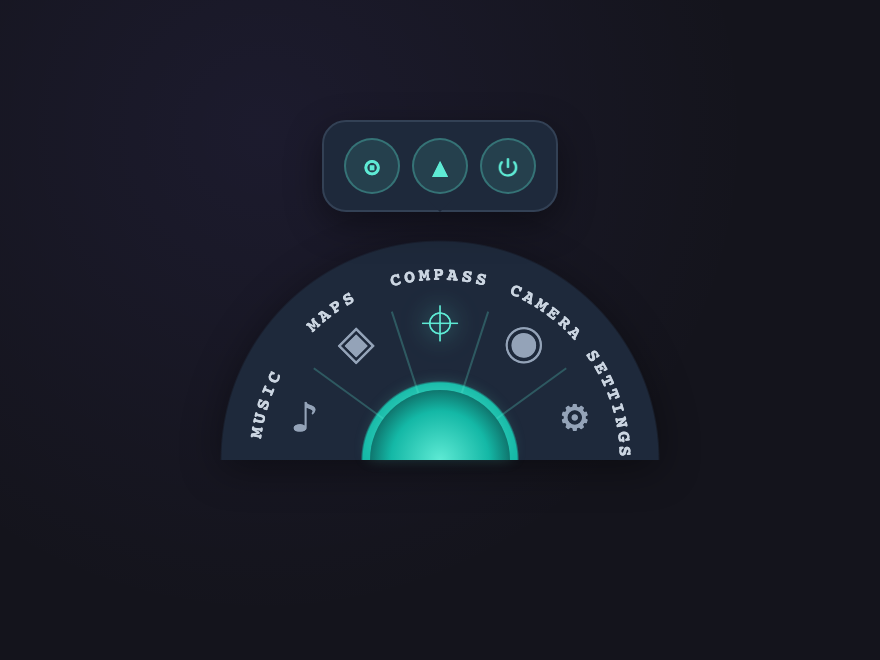
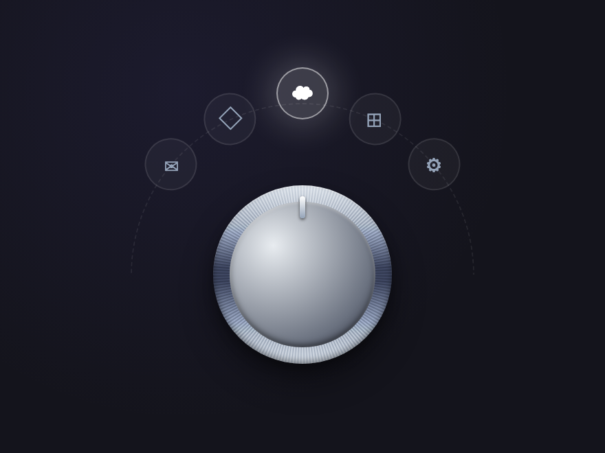
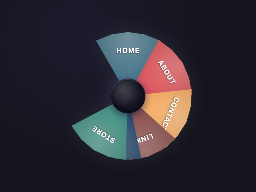
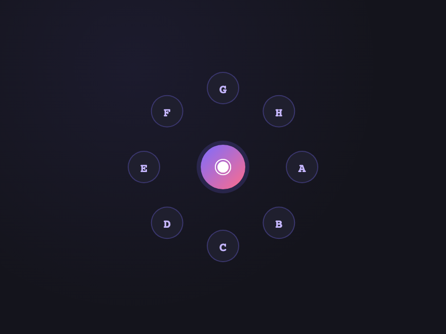
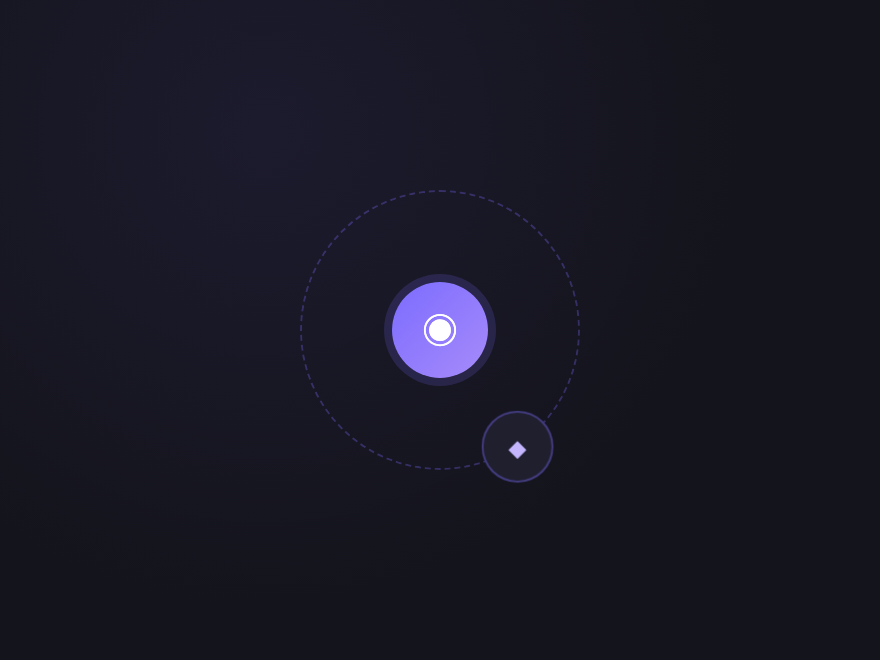
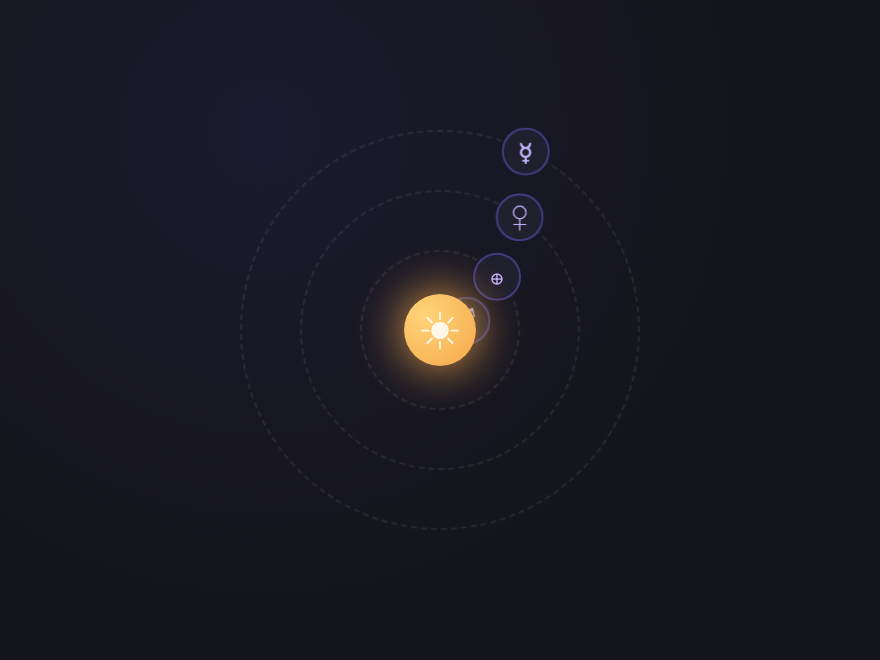
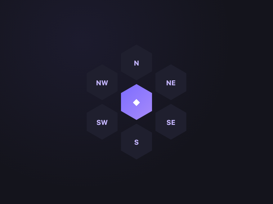
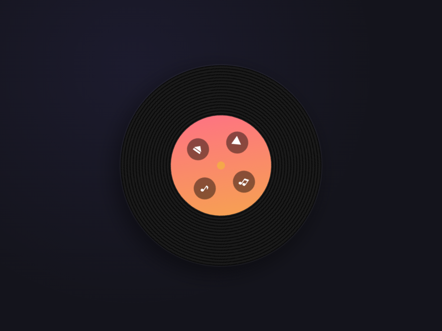
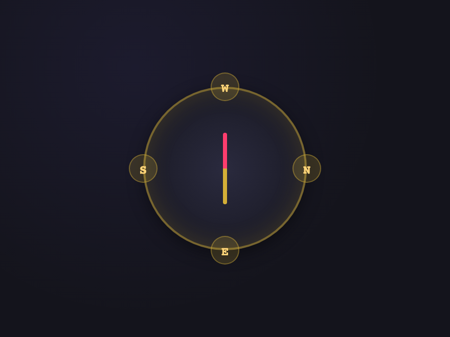
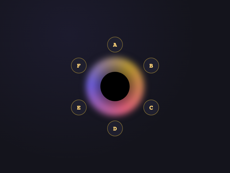
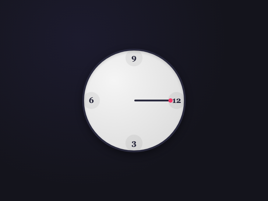
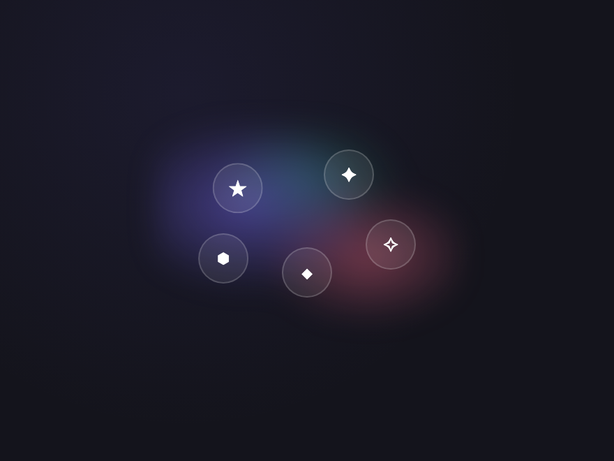
21 CSS Circular Menu Designs
A CSS circular menu is a navigation pattern where items are arranged around a circle, ring, dome, or orbit instead of a flat list. These 21 hand-coded designs span four themes — radial fan-outs, dome containers, orbital systems, and skeumorphic novelties — all 100% pure CSS with custom-property trigonometry. Every continuous animation honours prefers-reduced-motion.
21 free CSS circular menu designs across four themes — radial, dome, orbital and skeumorphic. Every demo uses semantic <a> or <label> elements with aria-label on icon-only items and respects prefers-reduced-motion.
.ccm-sun {
--n: 5;
--ba: calc(180deg / var(--n));
--r: 110px;
position: relative;
width: 240px;
height: 130px;
overflow: visible;
font-family: system-ui, sans-serif;
}
.ccm-sun-wheel {
position: absolute;
bottom: 0;
left: 50%;
width: calc(var(--r) * 2);
height: var(--r);
margin-left: calc(var(--r) * -1);
border-radius: var(--r) var(--r) 0 0;
background: radial-gradient(farthest-side at 50% 100%, #14b8a6 35%, #1e293b 36%, #1e293b calc(100% - 1px), transparent 100%);
filter: drop-shadow(0 4px 10px rgba(0, 0, 0, 0.4));
}
.ccm-sun-rim {
position: absolute;
bottom: 0;
left: 50%;
width: 240px;
height: 130px;
margin-left: -120px;
pointer-events: none;
z-index: 1;
}
.ccm-sun-dividers line {
stroke: rgba(94, 234, 212, 0.25);
stroke-width: 1;
}
.ccm-sun-curve {
font: 700 9px/1 ui-monospace, monospace;
letter-spacing: 0.18em;
fill: #cbd5e1;
}
.ccm-sun-pivot {
position: absolute;
bottom: 0;
left: 50%;
width: 70px;
height: 35px;
margin-left: -35px;
border-radius: 35px 35px 0 0;
background: radial-gradient(farthest-side at 50% 100%, #5eead4 0%, #14b8a6 70%, #0f766e 100%);
box-shadow: 0 -2px 8px rgba(94, 234, 212, 0.35);
z-index: 3;
}
.ccm-sun-arc {
position: absolute;
bottom: 0;
left: 50%;
width: 50px;
height: var(--r);
margin-left: -25px;
display: flex;
align-items: flex-start;
justify-content: center;
padding-top: 28px;
cursor: pointer;
transform-origin: 50% 100%;
transform: rotate(calc((var(--i) + 0.5) * var(--ba) - 90deg));
transition: color 0.25s;
color: #94a3b8;
z-index: 2;
}
.ccm-sun-ico {
display: inline-block;
font-size: 22px;
line-height: 1;
transform: rotate(calc((var(--i) + 0.5) * var(--ba) * -1 + 90deg));
transition: transform 0.3s cubic-bezier(0.34, 1.56, 0.64, 1);
}
.ccm-sun-arc:hover,
.ccm-sun-arc:focus-visible {
color: #5eead4;
}
.ccm-sun-arc:hover .ccm-sun-ico,
.ccm-sun-arc:focus-visible .ccm-sun-ico {
transform: rotate(calc((var(--i) + 0.5) * var(--ba) * -1 + 90deg)) translateY(-3px) scale(1.1);
}
.ccm-sun:has(#ccm-sun-0:checked) [for="ccm-sun-0"],
.ccm-sun:has(#ccm-sun-1:checked) [for="ccm-sun-1"],
.ccm-sun:has(#ccm-sun-2:checked) [for="ccm-sun-2"],
.ccm-sun:has(#ccm-sun-3:checked) [for="ccm-sun-3"],
.ccm-sun:has(#ccm-sun-4:checked) [for="ccm-sun-4"] {
color: #5eead4;
}
.ccm-sun:has(#ccm-sun-0:checked) [for="ccm-sun-0"] .ccm-sun-ico,
.ccm-sun:has(#ccm-sun-1:checked) [for="ccm-sun-1"] .ccm-sun-ico,
.ccm-sun:has(#ccm-sun-2:checked) [for="ccm-sun-2"] .ccm-sun-ico,
.ccm-sun:has(#ccm-sun-3:checked) [for="ccm-sun-3"] .ccm-sun-ico,
.ccm-sun:has(#ccm-sun-4:checked) [for="ccm-sun-4"] .ccm-sun-ico {
filter: drop-shadow(0 0 6px rgba(94, 234, 212, 0.7));
}
.ccm-sun-bar {
position: absolute;
left: 50%;
bottom: calc(var(--r) + 14px);
display: flex;
gap: 6px;
padding: 8px 10px;
background: #1e293b;
border: 1px solid #334155;
border-radius: 12px;
transform: translateX(-50%) scale(0);
transform-origin: 50% calc(100% + 10px);
transition: transform 0.35s cubic-bezier(0.34, 1.56, 0.64, 1);
z-index: 4;
box-shadow: 0 6px 18px rgba(0, 0, 0, 0.4);
}
.ccm-sun-bar::after {
content: '';
position: absolute;
left: 50%;
bottom: -7px;
margin-left: -6px;
border: 6px solid transparent;
border-top-color: #1e293b;
}
/* Show only the sub-toolbar that matches the currently-checked radio */
.ccm-sun:has(#ccm-sun-0:checked) .ccm-sun-bar-0,
.ccm-sun:has(#ccm-sun-1:checked) .ccm-sun-bar-1,
.ccm-sun:has(#ccm-sun-2:checked) .ccm-sun-bar-2,
.ccm-sun:has(#ccm-sun-3:checked) .ccm-sun-bar-3,
.ccm-sun:has(#ccm-sun-4:checked) .ccm-sun-bar-4 {
transform: translateX(-50%) scale(1);
}
.ccm-sun-sub {
display: inline-flex;
align-items: center;
justify-content: center;
width: 28px;
height: 28px;
border-radius: 50%;
background: rgba(94, 234, 212, 0.12);
color: #5eead4;
font: 700 13px/1 ui-monospace, monospace;
text-decoration: none;
border: 1px solid rgba(94, 234, 212, 0.3);
transition: background 0.2s, color 0.2s, transform 0.2s;
}
.ccm-sun-sub:hover,
.ccm-sun-sub:focus-visible {
background: #5eead4;
color: #0f172a;
transform: scale(1.1);
} <div class="ccm-sun" role="toolbar" aria-label="Mission Hub">
<input type="radio" name="ccm-sun" id="ccm-sun-0" class="ccm-sun-r" hidden>
<input type="radio" name="ccm-sun" id="ccm-sun-1" class="ccm-sun-r" hidden>
<input type="radio" name="ccm-sun" id="ccm-sun-2" class="ccm-sun-r" hidden checked>
<input type="radio" name="ccm-sun" id="ccm-sun-3" class="ccm-sun-r" hidden>
<input type="radio" name="ccm-sun" id="ccm-sun-4" class="ccm-sun-r" hidden>
<div class="ccm-sun-wheel" aria-hidden="true"></div>
<svg class="ccm-sun-rim" viewBox="0 0 240 130" aria-hidden="true">
<defs>
<path id="ccm-sun-arc-path" d="M 30 130 A 90 90 0 0 1 210 130" fill="none"/>
</defs>
<g class="ccm-sun-dividers">
<line x1="91.7" y1="109.4" x2="56.9" y2="84.1"/>
<line x1="109.2" y1="96.7" x2="95.9" y2="55.8"/>
<line x1="130.8" y1="96.7" x2="144.1" y2="55.8"/>
<line x1="148.3" y1="109.4" x2="183.1" y2="84.1"/>
</g>
<text class="ccm-sun-curve">
<textPath href="#ccm-sun-arc-path" startOffset="10%" text-anchor="middle">MUSIC</textPath>
<textPath href="#ccm-sun-arc-path" startOffset="30%" text-anchor="middle">MAPS</textPath>
<textPath href="#ccm-sun-arc-path" startOffset="50%" text-anchor="middle">COMPASS</textPath>
<textPath href="#ccm-sun-arc-path" startOffset="70%" text-anchor="middle">CAMERA</textPath>
<textPath href="#ccm-sun-arc-path" startOffset="90%" text-anchor="middle">SETTINGS</textPath>
</text>
</svg>
<div class="ccm-sun-pivot" aria-hidden="true"></div>
<label for="ccm-sun-0" class="ccm-sun-arc" style="--i:0" aria-label="Music"><span class="ccm-sun-ico">♪</span></label>
<label for="ccm-sun-1" class="ccm-sun-arc" style="--i:1" aria-label="Maps"><span class="ccm-sun-ico">◈</span></label>
<label for="ccm-sun-2" class="ccm-sun-arc" style="--i:2" aria-label="Compass"><span class="ccm-sun-ico">⌖</span></label>
<label for="ccm-sun-3" class="ccm-sun-arc" style="--i:3" aria-label="Camera"><span class="ccm-sun-ico">◉</span></label>
<label for="ccm-sun-4" class="ccm-sun-arc" style="--i:4" aria-label="Settings"><span class="ccm-sun-ico">⚙</span></label>
<div class="ccm-sun-bar ccm-sun-bar-0" role="toolbar" aria-label="Music actions">
<a href="#" class="ccm-sun-sub" aria-label="Play">▶</a>
<a href="#" class="ccm-sun-sub" aria-label="Pause">❚❚</a>
<a href="#" class="ccm-sun-sub" aria-label="Skip">⏭</a>
</div>
<div class="ccm-sun-bar ccm-sun-bar-1" role="toolbar" aria-label="Maps actions">
<a href="#" class="ccm-sun-sub" aria-label="Search">⌕</a>
<a href="#" class="ccm-sun-sub" aria-label="Pin">◉</a>
<a href="#" class="ccm-sun-sub" aria-label="Route">➤</a>
</div>
<div class="ccm-sun-bar ccm-sun-bar-2" role="toolbar" aria-label="Compass actions">
<a href="#" class="ccm-sun-sub" aria-label="Calibrate">⊙</a>
<a href="#" class="ccm-sun-sub" aria-label="North">▲</a>
<a href="#" class="ccm-sun-sub" aria-label="Lock">⏻</a>
</div>
<div class="ccm-sun-bar ccm-sun-bar-3" role="toolbar" aria-label="Camera actions">
<a href="#" class="ccm-sun-sub" aria-label="Shutter">●</a>
<a href="#" class="ccm-sun-sub" aria-label="Flash">⚡</a>
<a href="#" class="ccm-sun-sub" aria-label="Flip">⤾</a>
</div>
<div class="ccm-sun-bar ccm-sun-bar-4" role="toolbar" aria-label="Settings actions">
<a href="#" class="ccm-sun-sub" aria-label="Profile">☺</a>
<a href="#" class="ccm-sun-sub" aria-label="Theme">◐</a>
<a href="#" class="ccm-sun-sub" aria-label="Help">?</a>
</div>
</div> .ccm-svc {
--n: 6;
--ba: calc(360deg / var(--n));
--r: 105px;
--pa: 0deg;
position: relative;
width: 260px;
height: 260px;
display: flex;
align-items: center;
justify-content: center;
font-family: system-ui, sans-serif;
}
.ccm-svc-orbit {
position: absolute;
width: calc(var(--r) * 2);
height: calc(var(--r) * 2);
border-radius: 50%;
border: 1px dashed rgba(124, 108, 255, 0.18);
background: radial-gradient(circle at center, rgba(124, 108, 255, 0.08), transparent 70%);
}
.ccm-svc-disc {
position: relative;
width: 110px;
height: 110px;
border-radius: 50%;
background: linear-gradient(135deg, #7c6cff, #a78bfa);
color: #fff;
display: flex;
flex-direction: column;
align-items: center;
justify-content: center;
box-shadow: 0 8px 24px rgba(124, 108, 255, 0.4), inset 0 1px 0 rgba(255, 255, 255, 0.2);
z-index: 2;
}
.ccm-svc-title {
display: none;
font: 700 14px/1.2 system-ui, sans-serif;
text-align: center;
padding: 0 12px;
}
.ccm-svc-cta {
display: block;
margin-top: 8px;
padding: 4px 10px;
font: 600 10px/1 ui-monospace, monospace;
letter-spacing: 0.06em;
color: rgba(255, 255, 255, 0.85);
border: 1px solid rgba(255, 255, 255, 0.4);
border-radius: 999px;
cursor: pointer;
transition: background 0.2s, color 0.2s;
}
.ccm-svc-cta:hover {
background: #fff;
color: #7c6cff;
}
/* Show only the active service title */
.ccm-svc:has(#ccm-svc-0:checked) .ccm-svc-t-0,
.ccm-svc:has(#ccm-svc-1:checked) .ccm-svc-t-1,
.ccm-svc:has(#ccm-svc-2:checked) .ccm-svc-t-2,
.ccm-svc:has(#ccm-svc-3:checked) .ccm-svc-t-3,
.ccm-svc:has(#ccm-svc-4:checked) .ccm-svc-t-4,
.ccm-svc:has(#ccm-svc-5:checked) .ccm-svc-t-5 {
display: block;
}
/* Pointer rides between disc and satellites; snaps to active position */
.ccm-svc-pointer {
position: absolute;
width: 12px;
height: 12px;
border-radius: 50%;
background: #fff;
border: 2px solid #7c6cff;
box-shadow: 0 0 0 4px rgba(124, 108, 255, 0.18);
transform: rotate(var(--pa)) translateY(calc(var(--r) * -0.55));
transform-origin: 50% 50%;
transition: transform 0.5s cubic-bezier(0.34, 1.56, 0.64, 1);
z-index: 3;
}
.ccm-svc:has(#ccm-svc-0:checked) { --pa: 0deg; }
.ccm-svc:has(#ccm-svc-1:checked) { --pa: 60deg; }
.ccm-svc:has(#ccm-svc-2:checked) { --pa: 120deg; }
.ccm-svc:has(#ccm-svc-3:checked) { --pa: 180deg; }
.ccm-svc:has(#ccm-svc-4:checked) { --pa: 240deg; }
.ccm-svc:has(#ccm-svc-5:checked) { --pa: 300deg; }
/* Satellites positioned around the orbit */
.ccm-svc-sat {
position: absolute;
width: 44px;
height: 44px;
border-radius: 50%;
background: #1f1f2e;
border: 1px solid rgba(124, 108, 255, 0.4);
color: #c4b5fd;
display: inline-flex;
align-items: center;
justify-content: center;
cursor: pointer;
transform: rotate(calc(var(--i) * var(--ba))) translateY(calc(var(--r) * -1)) rotate(calc(var(--i) * var(--ba) * -1));
transition: background 0.25s, color 0.25s, transform 0.3s cubic-bezier(0.34, 1.56, 0.64, 1), box-shadow 0.25s;
z-index: 4;
}
.ccm-svc-sat span {
font-size: 18px;
line-height: 1;
}
.ccm-svc-sat:hover,
.ccm-svc-sat:focus-visible {
background: #2a2a3e;
color: #fff;
transform: rotate(calc(var(--i) * var(--ba))) translateY(calc(var(--r) * -1)) rotate(calc(var(--i) * var(--ba) * -1)) scale(1.15);
}
.ccm-svc:has(#ccm-svc-0:checked) [for="ccm-svc-0"],
.ccm-svc:has(#ccm-svc-1:checked) [for="ccm-svc-1"],
.ccm-svc:has(#ccm-svc-2:checked) [for="ccm-svc-2"],
.ccm-svc:has(#ccm-svc-3:checked) [for="ccm-svc-3"],
.ccm-svc:has(#ccm-svc-4:checked) [for="ccm-svc-4"],
.ccm-svc:has(#ccm-svc-5:checked) [for="ccm-svc-5"] {
background: #7c6cff;
color: #fff;
border-color: #fff;
box-shadow: 0 0 0 4px rgba(124, 108, 255, 0.3);
transform: rotate(calc(var(--i) * var(--ba))) translateY(calc(var(--r) * -1)) rotate(calc(var(--i) * var(--ba) * -1)) scale(1.15);
} <div class="ccm-svc">
<input type="radio" name="ccm-svc" id="ccm-svc-0" class="ccm-svc-r" hidden checked>
<input type="radio" name="ccm-svc" id="ccm-svc-1" class="ccm-svc-r" hidden>
<input type="radio" name="ccm-svc" id="ccm-svc-2" class="ccm-svc-r" hidden>
<input type="radio" name="ccm-svc" id="ccm-svc-3" class="ccm-svc-r" hidden>
<input type="radio" name="ccm-svc" id="ccm-svc-4" class="ccm-svc-r" hidden>
<input type="radio" name="ccm-svc" id="ccm-svc-5" class="ccm-svc-r" hidden>
<div class="ccm-svc-orbit" aria-hidden="true"></div>
<div class="ccm-svc-disc">
<span class="ccm-svc-title ccm-svc-t-0">Industries</span>
<span class="ccm-svc-title ccm-svc-t-1">Validation</span>
<span class="ccm-svc-title ccm-svc-t-2">Engineering</span>
<span class="ccm-svc-title ccm-svc-t-3">Project Mgmt</span>
<span class="ccm-svc-title ccm-svc-t-4">Manufacturing</span>
<span class="ccm-svc-title ccm-svc-t-5">Automation</span>
<span class="ccm-svc-cta">Learn more →</span>
</div>
<div class="ccm-svc-pointer" aria-hidden="true"></div>
<label for="ccm-svc-0" class="ccm-svc-sat" style="--i:0" aria-label="Industries"><span>♨</span></label>
<label for="ccm-svc-1" class="ccm-svc-sat" style="--i:1" aria-label="Validation"><span>✓</span></label>
<label for="ccm-svc-2" class="ccm-svc-sat" style="--i:2" aria-label="Engineering"><span>⚙</span></label>
<label for="ccm-svc-3" class="ccm-svc-sat" style="--i:3" aria-label="Project Management"><span>◈</span></label>
<label for="ccm-svc-4" class="ccm-svc-sat" style="--i:4" aria-label="Manufacturing"><span>⛭</span></label>
<label for="ccm-svc-5" class="ccm-svc-sat" style="--i:5" aria-label="Automation"><span>⌬</span></label>
</div> .ccm-tac {
--rot: 0deg;
position: relative;
width: 280px;
height: 240px;
display: flex;
align-items: flex-end;
justify-content: center;
font-family: system-ui, sans-serif;
}
/* Brushed-steel dial — rotates as a whole based on selection */
.ccm-tac-dial {
position: absolute;
bottom: 20px;
left: 50%;
width: 130px;
height: 130px;
margin-left: -65px;
border-radius: 50%;
background:
repeating-conic-gradient(from 0deg, #c9cfd7 0deg, #8b929c 1deg, #c9cfd7 2deg),
linear-gradient(180deg, #c9cfd7 0%, #2b2f3e 46%, #2b2f3e 54%, #b0b7c1 100%);
background-blend-mode: overlay, normal;
box-shadow:
0 12px 24px rgba(0, 0, 0, 0.4),
0 4px 8px rgba(0, 0, 0, 0.3),
inset 0 1px 0 rgba(255, 255, 255, 0.3),
inset 0 -2px 4px rgba(0, 0, 0, 0.4);
transform: rotate(var(--rot));
transform-origin: center;
transition: transform 0.7s cubic-bezier(0.65, 0, 0.35, 1);
z-index: 2;
}
/* Inner bevel ring */
.ccm-tac-bevel {
position: absolute;
inset: 12px;
border-radius: 50%;
background: radial-gradient(circle at 30% 30%, #e8ecf0, #6b7280 70%, #2b2f3e);
box-shadow: inset 0 1px 2px rgba(255, 255, 255, 0.4), inset 0 -2px 4px rgba(0, 0, 0, 0.5);
}
/* Pointer mark on the dial — top, points up toward the icons */
.ccm-tac-mark {
position: absolute;
top: 8px;
left: 50%;
width: 4px;
height: 16px;
margin-left: -2px;
background: linear-gradient(180deg, #fff, #94a3b8);
border-radius: 2px;
box-shadow: 0 1px 2px rgba(0, 0, 0, 0.6);
z-index: 3;
}
/* Drive the dial rotation from the checked radio.
Angles match the icon positions (each icon is (p-2)*25° from up). */
.ccm-tac:has(#ccm-tac-0:checked) { --rot: -50deg; }
.ccm-tac:has(#ccm-tac-1:checked) { --rot: -25deg; }
.ccm-tac:has(#ccm-tac-2:checked) { --rot: 0deg; }
.ccm-tac:has(#ccm-tac-3:checked) { --rot: 25deg; }
.ccm-tac:has(#ccm-tac-4:checked) { --rot: 50deg; }
/* Dashed orbit guide — full circle centered on the dial's center.
Icons sit on this orbit (radius 125px from the dial center).
The dial overlays the bottom half of the ring; only the top arc is visible. */
.ccm-tac-arc {
position: absolute;
bottom: -40px;
left: 50%;
width: 250px;
height: 250px;
margin-left: -125px;
border-radius: 50%;
border: 1px dashed rgba(255, 255, 255, 0.08);
pointer-events: none;
/* Mask the bottom half so the ring only shows where icons live (above the dial) */
-webkit-mask: linear-gradient(180deg, #000 0%, #000 50%, transparent 50%);
mask: linear-gradient(180deg, #000 0%, #000 50%, transparent 50%);
}
/* Icons curve as satellites around the top of the dial.
Each icon is centered on the dial's center, then translated outward
(radius 125px) and rotated around the dial's center.
For 5 icons spanning roughly 100° centered at "straight up",
the angles are -50°, -25°, 0°, +25°, +50°. */
.ccm-tac-i {
position: absolute;
bottom: calc(20px + 65px); /* 20px from container bottom + half the dial height */
left: 50%;
width: 38px;
height: 38px;
margin: -19px;
border-radius: 50%;
background: rgba(255, 255, 255, 0.04);
border: 1px solid rgba(255, 255, 255, 0.1);
color: #94a3b8;
display: inline-flex;
align-items: center;
justify-content: center;
cursor: pointer;
transform: rotate(calc((var(--p) - 2) * 25deg)) translateY(-125px);
transform-origin: 50% 50%;
transition: background 0.25s, color 0.25s, box-shadow 0.3s, border-color 0.25s, transform 0.25s;
z-index: 4;
}
.ccm-tac-i span {
font-size: 17px;
line-height: 1;
display: inline-block;
/* Counter-rotate so the icon glyph stays upright */
transform: rotate(calc((var(--p) - 2) * -25deg));
}
.ccm-tac-i:hover,
.ccm-tac-i:focus-visible {
background: rgba(255, 255, 255, 0.08);
color: #fff;
border-color: rgba(255, 255, 255, 0.25);
transform: rotate(calc((var(--p) - 2) * 25deg)) translateY(-130px);
}
/* Active icon — soft white halo glow */
.ccm-tac:has(#ccm-tac-0:checked) [for="ccm-tac-0"],
.ccm-tac:has(#ccm-tac-1:checked) [for="ccm-tac-1"],
.ccm-tac:has(#ccm-tac-2:checked) [for="ccm-tac-2"],
.ccm-tac:has(#ccm-tac-3:checked) [for="ccm-tac-3"],
.ccm-tac:has(#ccm-tac-4:checked) [for="ccm-tac-4"] {
background: rgba(255, 255, 255, 0.16);
color: #fff;
border-color: rgba(255, 255, 255, 0.5);
box-shadow: 0 0 24px 6px rgba(255, 255, 255, 0.18);
transform: rotate(calc((var(--p) - 2) * 25deg)) translateY(-132px);
}
@media (prefers-reduced-motion: reduce) {
.ccm-tac-dial { transition: none; }
} <div class="ccm-tac" role="toolbar" aria-label="Tactile Dial">
<input type="radio" name="ccm-tac" id="ccm-tac-0" class="ccm-tac-r" hidden>
<input type="radio" name="ccm-tac" id="ccm-tac-1" class="ccm-tac-r" hidden>
<input type="radio" name="ccm-tac" id="ccm-tac-2" class="ccm-tac-r" hidden checked>
<input type="radio" name="ccm-tac" id="ccm-tac-3" class="ccm-tac-r" hidden>
<input type="radio" name="ccm-tac" id="ccm-tac-4" class="ccm-tac-r" hidden>
<div class="ccm-tac-dial" aria-hidden="true">
<div class="ccm-tac-mark"></div>
<div class="ccm-tac-bevel"></div>
</div>
<div class="ccm-tac-arc" aria-hidden="true"></div>
<label for="ccm-tac-0" class="ccm-tac-i" style="--p:0" aria-label="Email"><span>✉</span></label>
<label for="ccm-tac-1" class="ccm-tac-i" style="--p:1" aria-label="Photos"><span>◇</span></label>
<label for="ccm-tac-2" class="ccm-tac-i" style="--p:2" aria-label="Cloud"><span>☁</span></label>
<label for="ccm-tac-3" class="ccm-tac-i" style="--p:3" aria-label="Portfolio"><span>⊞</span></label>
<label for="ccm-tac-4" class="ccm-tac-i" style="--p:4" aria-label="Settings"><span>⚙</span></label>
</div> .ccm-fan {
position: relative;
width: 220px;
height: 220px;
display: flex;
align-items: center;
justify-content: center;
font-family: 'Lato', system-ui, sans-serif;
/* Outer ambient halo around the whole wheel */
filter: drop-shadow(0 0 18px rgba(255, 255, 255, 0.08));
}
/* Each wedge is a 220×220 box clipped via clip-path to a 60° pie slice pointing
straight UP. Background is a radial gradient that brightens toward the upper
outer edge — gives each wedge a soft dome look. */
.ccm-fan-w {
position: absolute;
inset: 0;
background:
radial-gradient(circle at 50% 5%, rgba(255, 255, 255, 0.35), transparent 55%),
radial-gradient(circle at 50% 30%, var(--c) 0%, color-mix(in srgb, var(--c), #000 35%) 100%);
cursor: pointer;
clip-path: polygon(
50% 50%,
25% 6.7%,
37.06% 1.92%,
50% 0%,
62.94% 1.92%,
75% 6.7%
);
transform-origin: 50% 50%;
transform: rotate(0deg);
animation: ccm-fan-deal 0.9s cubic-bezier(0.49, 0.24, 0.32, 0.96) forwards;
animation-delay: calc(var(--i) * 0.08s);
transition: filter 0.3s, transform 0.3s;
}
.ccm-fan-w span {
position: absolute;
top: 24px;
left: 50%;
display: inline-block;
color: #fff;
font-size: 12px;
font-weight: 700;
letter-spacing: 0.06em;
text-transform: uppercase;
transform: translateX(-50%);
pointer-events: none;
text-shadow: 0 1px 2px rgba(0, 0, 0, 0.6), 0 0 8px rgba(255, 255, 255, 0.25);
white-space: nowrap;
}
@keyframes ccm-fan-deal {
from { transform: rotate(0deg); }
to { transform: rotate(calc(var(--i) * 60deg)); }
}
.ccm-fan-w:hover,
.ccm-fan-w:focus-visible {
filter:
brightness(1.18)
saturate(1.2)
drop-shadow(0 0 12px color-mix(in srgb, var(--c), white 20%));
z-index: 2;
}
/* Active wedge — strong color halo, scale-up lift, brighter saturation */
.ccm-fan:has(#ccm-fan-0:checked) [for="ccm-fan-0"],
.ccm-fan:has(#ccm-fan-1:checked) [for="ccm-fan-1"],
.ccm-fan:has(#ccm-fan-2:checked) [for="ccm-fan-2"],
.ccm-fan:has(#ccm-fan-3:checked) [for="ccm-fan-3"],
.ccm-fan:has(#ccm-fan-4:checked) [for="ccm-fan-4"],
.ccm-fan:has(#ccm-fan-5:checked) [for="ccm-fan-5"] {
filter:
brightness(1.45)
saturate(1.5)
drop-shadow(0 0 22px color-mix(in srgb, var(--c), white 40%))
drop-shadow(0 0 6px color-mix(in srgb, var(--c), white 60%));
z-index: 3;
/* Scale slightly so the active wedge protrudes; rotation is preserved via the
keyframe's "to" transform — this builds on top of it. */
transform: rotate(calc(var(--i) * 60deg)) scale(1.06);
}
/* Bigger, brighter label on the active wedge */
.ccm-fan:has(#ccm-fan-0:checked) [for="ccm-fan-0"] span,
.ccm-fan:has(#ccm-fan-1:checked) [for="ccm-fan-1"] span,
.ccm-fan:has(#ccm-fan-2:checked) [for="ccm-fan-2"] span,
.ccm-fan:has(#ccm-fan-3:checked) [for="ccm-fan-3"] span,
.ccm-fan:has(#ccm-fan-4:checked) [for="ccm-fan-4"] span,
.ccm-fan:has(#ccm-fan-5:checked) [for="ccm-fan-5"] span {
font-size: 13px;
letter-spacing: 0.1em;
text-shadow:
0 1px 2px rgba(0, 0, 0, 0.7),
0 0 12px rgba(255, 255, 255, 0.6);
}
/* Hub: glassy radial-gradient core with a faint inner highlight + violet rim glow */
.ccm-fan-hub {
position: absolute;
width: 60px;
height: 60px;
border-radius: 50%;
background:
radial-gradient(circle at 35% 30%, rgba(255, 255, 255, 0.18), transparent 55%),
radial-gradient(circle at center, #1f1f2e 0%, #0a0a14 100%);
border: 1px solid rgba(255, 255, 255, 0.08);
box-shadow:
inset 0 1px 0 rgba(255, 255, 255, 0.12),
inset 0 -2px 6px rgba(0, 0, 0, 0.5),
0 0 24px rgba(124, 108, 255, 0.25),
0 4px 12px rgba(0, 0, 0, 0.5);
z-index: 4;
pointer-events: none;
}
@media (prefers-reduced-motion: reduce) {
.ccm-fan-w {
animation: none;
transform: rotate(calc(var(--i) * 60deg));
}
} <div class="ccm-fan" role="toolbar" aria-label="Fan Reveal"> <input type="radio" name="ccm-fan" id="ccm-fan-0" class="ccm-fan-r" hidden> <input type="radio" name="ccm-fan" id="ccm-fan-1" class="ccm-fan-r" hidden> <input type="radio" name="ccm-fan" id="ccm-fan-2" class="ccm-fan-r" hidden> <input type="radio" name="ccm-fan" id="ccm-fan-3" class="ccm-fan-r" hidden> <input type="radio" name="ccm-fan" id="ccm-fan-4" class="ccm-fan-r" hidden> <input type="radio" name="ccm-fan" id="ccm-fan-5" class="ccm-fan-r" hidden> <label for="ccm-fan-0" class="ccm-fan-w" style="--i:0; --c:#255D74" aria-label="Home"><span>home</span></label> <label for="ccm-fan-1" class="ccm-fan-w" style="--i:1; --c:#DA353B" aria-label="About"><span>about</span></label> <label for="ccm-fan-2" class="ccm-fan-w" style="--i:2; --c:#F89F44" aria-label="Contact"><span>contact</span></label> <label for="ccm-fan-3" class="ccm-fan-w" style="--i:3; --c:#78302C" aria-label="Links"><span>links</span></label> <label for="ccm-fan-4" class="ccm-fan-w" style="--i:4; --c:#002B55" aria-label="Bio"><span>bio</span></label> <label for="ccm-fan-5" class="ccm-fan-w" style="--i:5; --c:#207C6B" aria-label="Store"><span>store</span></label> <span class="ccm-fan-hub" aria-hidden="true"></span> </div>
.ccm-petal { position: relative; width: 220px; height: 140px; }
.ccm-petal-fab {
position: absolute; left: 50%; bottom: 0;
width: 52px; height: 52px;
border-radius: 50%;
background: linear-gradient(135deg, #7c6cff, #a78bfa);
color: #fff; font-size: 26px; line-height: 52px;
text-align: center; cursor: pointer;
transform: translateX(-50%);
transition: transform 0.4s;
box-shadow: 0 6px 18px rgba(124,108,255,0.4);
z-index: 2;
}
.ccm-petal-i {
position: absolute; left: 50%; bottom: 12px;
width: 36px; height: 36px;
border-radius: 50%;
background: #1f1f2e;
color: #c4b5fd; font-size: 14px;
display: flex; align-items: center; justify-content: center;
text-decoration: none;
border: 1px solid rgba(255,255,255,0.08);
transform: translate(-50%, 0) rotate(0) translateY(0) rotate(0);
opacity: 0;
transition: transform 0.45s cubic-bezier(0.34,1.56,0.64,1), opacity 0.3s;
}
.ccm-petal:hover .ccm-petal-fab,
.ccm-petal-t:checked + .ccm-petal-fab { transform: translateX(-50%) rotate(45deg); }
.ccm-petal:hover .ccm-petal-i,
.ccm-petal-t:checked ~ .ccm-petal-i {
transform: translate(-50%, 0) rotate(var(--a)) translateY(-72px) rotate(calc(var(--a) * -1));
opacity: 1;
}
.ccm-petal-i:nth-of-type(1) { transition-delay: 0.05s; }
.ccm-petal-i:nth-of-type(2) { transition-delay: 0.10s; }
.ccm-petal-i:nth-of-type(3) { transition-delay: 0.15s; }
.ccm-petal-i:nth-of-type(4) { transition-delay: 0.20s; }
.ccm-petal-i:nth-of-type(5) { transition-delay: 0.25s; }
.ccm-petal-i:nth-of-type(6) { transition-delay: 0.30s; } <div class="ccm-petal"> <input type="checkbox" id="ccm-petal-t" class="ccm-petal-t" hidden> <label for="ccm-petal-t" class="ccm-petal-fab" aria-label="Open menu">+</label> <a href="#" class="ccm-petal-i" style="--a:-90deg" aria-label="Home">⌂</a> <a href="#" class="ccm-petal-i" style="--a:-126deg" aria-label="Search">⌕</a> <a href="#" class="ccm-petal-i" style="--a:-162deg" aria-label="Star">★</a> <a href="#" class="ccm-petal-i" style="--a:-54deg" aria-label="Like">♥</a> <a href="#" class="ccm-petal-i" style="--a:-18deg" aria-label="Mail">✉</a> <a href="#" class="ccm-petal-i" style="--a:-198deg" aria-label="Settings">⚙</a> </div>
.ccm-wheel {
position: relative;
width: 200px; height: 200px;
display: flex; align-items: center; justify-content: center;
}
.ccm-wheel-c {
width: 44px; height: 44px;
border-radius: 50%;
background: linear-gradient(135deg, #7c6cff, #ff6c8a);
color: #fff; font-size: 18px;
display: inline-flex; align-items: center; justify-content: center;
box-shadow: 0 0 0 4px rgba(124,108,255,0.18);
}
.ccm-wheel-i {
position: absolute;
top: 50%; left: 50%;
width: 32px; height: 32px;
margin: -16px;
border-radius: 50%;
background: #1f1f2e;
color: #c4b5fd;
font: 700 12px/32px ui-monospace, monospace;
text-align: center; text-decoration: none;
border: 1px solid rgba(124,108,255,0.3);
transform: rotate(var(--a)) translate(78px) rotate(calc(var(--a) * -1));
transition: transform 0.25s, background 0.2s, color 0.2s;
}
.ccm-wheel-i:hover, .ccm-wheel-i:focus-visible {
background: #7c6cff; color: #fff;
transform: rotate(var(--a)) translate(78px) rotate(calc(var(--a) * -1)) scale(1.4);
z-index: 2;
} <div class="ccm-wheel"> <span class="ccm-wheel-c" aria-hidden="true">◉</span> <a href="#" class="ccm-wheel-i" style="--a:0deg">A</a> <a href="#" class="ccm-wheel-i" style="--a:45deg">B</a> <a href="#" class="ccm-wheel-i" style="--a:90deg">C</a> <a href="#" class="ccm-wheel-i" style="--a:135deg">D</a> <a href="#" class="ccm-wheel-i" style="--a:180deg">E</a> <a href="#" class="ccm-wheel-i" style="--a:225deg">F</a> <a href="#" class="ccm-wheel-i" style="--a:270deg">G</a> <a href="#" class="ccm-wheel-i" style="--a:315deg">H</a> </div>
.ccm-pie {
position: relative;
width: 170px; height: 170px;
}
.ccm-pie-s {
position: absolute;
width: 50%; height: 50%;
background: var(--c);
text-decoration: none;
cursor: pointer;
transition: filter 0.2s, transform 0.2s;
display: flex;
}
.ccm-pie-tr { top: 0; right: 0; border-top-right-radius: 100% 100%; transform-origin: 0% 100%; }
.ccm-pie-br { bottom: 0; right: 0; border-bottom-right-radius: 100% 100%; transform-origin: 0% 0%; }
.ccm-pie-bl { bottom: 0; left: 0; border-bottom-left-radius: 100% 100%; transform-origin: 100% 0%; }
.ccm-pie-tl { top: 0; left: 0; border-top-left-radius: 100% 100%; transform-origin: 100% 100%; }
.ccm-pie-s span {
margin: auto;
padding: 8px 18px;
font: 700 12px/1 system-ui, sans-serif;
color: #fff;
text-shadow: 0 1px 2px rgba(0,0,0,0.3);
}
.ccm-pie-s:hover, .ccm-pie-s:focus-visible {
filter: brightness(1.18) saturate(1.15);
transform: scale(1.04);
z-index: 2;
}
.ccm-pie-h {
position: absolute;
top: 50%; left: 50%;
width: 56px; height: 56px;
margin: -28px;
border-radius: 50%;
background: #15151d;
border: 3px solid #17171f;
pointer-events: none;
z-index: 3;
} <div class="ccm-pie"> <a href="#" class="ccm-pie-s ccm-pie-tr" style="--c:#7c6cff" aria-label="Plan"><span>Plan</span></a> <a href="#" class="ccm-pie-s ccm-pie-br" style="--c:#ff6c8a" aria-label="Build"><span>Build</span></a> <a href="#" class="ccm-pie-s ccm-pie-bl" style="--c:#2ecc8a" aria-label="Test"><span>Test</span></a> <a href="#" class="ccm-pie-s ccm-pie-tl" style="--c:#f5a84a" aria-label="Ship"><span>Ship</span></a> <span class="ccm-pie-h" aria-hidden="true"></span> </div>
.ccm-donut {
width: 200px; height: 200px;
display: block;
overflow: visible;
font-family: ui-monospace, 'SF Mono', monospace;
}
.ccm-donut-s {
cursor: pointer;
transform-origin: 100px 100px;
transform: scale(1) translate(0, 0);
transition: transform 0.35s cubic-bezier(0.34,1.56,0.64,1), filter 0.2s;
text-decoration: none;
}
.ccm-donut-s path {
stroke: #17171f;
stroke-width: 2;
transition: filter 0.2s;
}
.ccm-donut-l {
font: 700 10px/1 ui-monospace, monospace;
fill: #fff;
letter-spacing: 0.18em;
pointer-events: none;
opacity: 0.92;
text-shadow: 0 1px 2px rgba(0,0,0,0.4);
}
.ccm-donut-c {
font: 700 9px/1 ui-monospace, monospace;
fill: #c4b5fd;
letter-spacing: 0.16em;
pointer-events: none;
}
/* Each sector pulls outward along its center-axis on hover */
.ccm-donut-s:nth-of-type(1):hover, .ccm-donut-s:nth-of-type(1):focus-visible { transform: translate(4px, -4px); } /* top-right */
.ccm-donut-s:nth-of-type(2):hover, .ccm-donut-s:nth-of-type(2):focus-visible { transform: translate(6px, 0px); } /* right */
.ccm-donut-s:nth-of-type(3):hover, .ccm-donut-s:nth-of-type(3):focus-visible { transform: translate(4px, 4px); } /* bottom-right */
.ccm-donut-s:nth-of-type(4):hover, .ccm-donut-s:nth-of-type(4):focus-visible { transform: translate(-4px, 4px); } /* bottom-left */
.ccm-donut-s:nth-of-type(5):hover, .ccm-donut-s:nth-of-type(5):focus-visible { transform: translate(-6px, 0px); } /* left */
.ccm-donut-s:nth-of-type(6):hover, .ccm-donut-s:nth-of-type(6):focus-visible { transform: translate(-4px, -4px); } /* top-left */
.ccm-donut-s:hover path, .ccm-donut-s:focus-visible path { filter: brightness(1.18) saturate(1.1); }
/* Pop-in entry animation on first paint */
.ccm-donut-s {
animation: ccm-donut-pop 0.5s cubic-bezier(0.34,1.56,0.64,1) backwards;
}
.ccm-donut-s:nth-of-type(1) { animation-delay: 0.05s; }
.ccm-donut-s:nth-of-type(2) { animation-delay: 0.10s; }
.ccm-donut-s:nth-of-type(3) { animation-delay: 0.15s; }
.ccm-donut-s:nth-of-type(4) { animation-delay: 0.20s; }
.ccm-donut-s:nth-of-type(5) { animation-delay: 0.25s; }
.ccm-donut-s:nth-of-type(6) { animation-delay: 0.30s; }
@keyframes ccm-donut-pop {
from { opacity: 0; transform: scale(0.6); }
to { opacity: 1; transform: scale(1); }
}
@media (prefers-reduced-motion: reduce) { .ccm-donut-s { animation: none; } } <svg class="ccm-donut" viewBox="0 0 200 200" role="navigation" aria-label="Donut menu">
<defs>
<path id="ccm-donut-arc-1" d="M 100 25 A 75 75 0 0 1 164.95 62.5"/>
<path id="ccm-donut-arc-2" d="M 164.95 62.5 A 75 75 0 0 1 164.95 137.5"/>
<path id="ccm-donut-arc-3" d="M 164.95 137.5 A 75 75 0 0 1 100 175"/>
<path id="ccm-donut-arc-4" d="M 35.05 137.5 A 75 75 0 0 1 35.05 62.5"/>
<path id="ccm-donut-arc-5" d="M 100 175 A 75 75 0 0 1 35.05 137.5"/>
<path id="ccm-donut-arc-6" d="M 35.05 62.5 A 75 75 0 0 1 100 25"/>
</defs>
<a href="#" class="ccm-donut-s" style="--c:#7c6cff" aria-label="Plan">
<path d="M 100 100 L 100 10 A 90 90 0 0 1 177.94 55 Z" fill="var(--c)"/>
<text class="ccm-donut-l"><textPath href="#ccm-donut-arc-1" startOffset="50%" text-anchor="middle">PLAN</textPath></text>
</a>
<a href="#" class="ccm-donut-s" style="--c:#a78bfa" aria-label="Design">
<path d="M 100 100 L 177.94 55 A 90 90 0 0 1 177.94 145 Z" fill="var(--c)"/>
<text class="ccm-donut-l"><textPath href="#ccm-donut-arc-2" startOffset="50%" text-anchor="middle">DESIGN</textPath></text>
</a>
<a href="#" class="ccm-donut-s" style="--c:#ff6c8a" aria-label="Build">
<path d="M 100 100 L 177.94 145 A 90 90 0 0 1 100 190 Z" fill="var(--c)"/>
<text class="ccm-donut-l"><textPath href="#ccm-donut-arc-3" startOffset="50%" text-anchor="middle">BUILD</textPath></text>
</a>
<a href="#" class="ccm-donut-s" style="--c:#f5a84a" aria-label="Test">
<path d="M 100 100 L 100 190 A 90 90 0 0 1 22.06 145 Z" fill="var(--c)"/>
<text class="ccm-donut-l"><textPath href="#ccm-donut-arc-5" startOffset="50%" text-anchor="middle">TEST</textPath></text>
</a>
<a href="#" class="ccm-donut-s" style="--c:#2ecc8a" aria-label="Ship">
<path d="M 100 100 L 22.06 145 A 90 90 0 0 1 22.06 55 Z" fill="var(--c)"/>
<text class="ccm-donut-l"><textPath href="#ccm-donut-arc-4" startOffset="50%" text-anchor="middle">SHIP</textPath></text>
</a>
<a href="#" class="ccm-donut-s" style="--c:#00e5ff" aria-label="Learn">
<path d="M 100 100 L 22.06 55 A 90 90 0 0 1 100 10 Z" fill="var(--c)"/>
<text class="ccm-donut-l"><textPath href="#ccm-donut-arc-6" startOffset="50%" text-anchor="middle">LEARN</textPath></text>
</a>
<circle cx="100" cy="100" r="32" fill="#15151d" stroke="#17171f" stroke-width="3"/>
<text x="100" y="104" class="ccm-donut-c" text-anchor="middle">MENU</text>
</svg> .ccm-half {
position: relative;
width: 220px; height: 130px;
display: flex; align-items: flex-end; justify-content: center;
}
.ccm-half-fab {
width: 56px; height: 56px;
border-radius: 50%;
background: linear-gradient(135deg, #2ecc8a, #00e5ff);
color: #0a0f0c; font-weight: 700; font-size: 24px;
display: flex; align-items: center; justify-content: center;
cursor: pointer;
transition: transform 0.4s;
z-index: 2;
box-shadow: 0 6px 22px rgba(46,204,138,0.4);
}
input:checked + .ccm-half-fab { transform: rotate(180deg); }
.ccm-half-i {
position: absolute;
bottom: 28px; left: 50%;
width: 36px; height: 36px; margin: -18px;
border-radius: 50%;
background: #1f1f2e;
border: 1.5px solid #2ecc8a;
color: #2ecc8a; font: 700 12px/36px ui-monospace, monospace;
text-align: center; text-decoration: none;
transform: translate(0, 0) rotate(var(--a)) translate(0) rotate(calc(var(--a) * -1));
opacity: 0;
transition: transform 0.5s cubic-bezier(0.34,1.56,0.64,1), opacity 0.3s;
}
input:checked ~ .ccm-half-i {
transform: translate(0, 0) rotate(var(--a)) translate(80px) rotate(calc(var(--a) * -1));
opacity: 1;
}
.ccm-half-i:nth-of-type(1) { transition-delay: 0.05s; }
.ccm-half-i:nth-of-type(2) { transition-delay: 0.10s; }
.ccm-half-i:nth-of-type(3) { transition-delay: 0.15s; }
.ccm-half-i:nth-of-type(4) { transition-delay: 0.20s; }
.ccm-half-i:nth-of-type(5) { transition-delay: 0.25s; } <div class="ccm-half"> <input type="checkbox" id="ccm-half-t" hidden> <label for="ccm-half-t" class="ccm-half-fab" aria-label="Toggle">⊕</label> <a href="#" class="ccm-half-i" style="--a:180deg">A</a> <a href="#" class="ccm-half-i" style="--a:225deg">B</a> <a href="#" class="ccm-half-i" style="--a:270deg">C</a> <a href="#" class="ccm-half-i" style="--a:315deg">D</a> <a href="#" class="ccm-half-i" style="--a:0deg">E</a> </div>
.ccm-glass-bg {
padding: 30px;
border-radius: 14px;
background: linear-gradient(135deg, #7c6cff 0%, #ff6c8a 100%);
}
.ccm-glass {
position: relative;
width: 200px; height: 110px;
}
.ccm-glass-dome {
position: absolute;
bottom: 0; left: 0; right: 0;
height: 110px;
border-radius: 100px 100px 0 0;
background: rgba(255,255,255,0.18);
border: 1px solid rgba(255,255,255,0.45);
border-bottom: none;
backdrop-filter: blur(14px);
-webkit-backdrop-filter: blur(14px);
box-shadow:
inset 0 1px 0 rgba(255,255,255,0.6),
inset 0 -10px 30px rgba(255,255,255,0.1);
}
.ccm-glass-dome::before {
content: '';
position: absolute;
top: 8px; left: 20%; right: 50%;
height: 24px;
border-radius: 50%;
background: linear-gradient(180deg, rgba(255,255,255,0.55), transparent);
filter: blur(2px);
}
.ccm-glass-i {
position: absolute;
bottom: 0; left: 50%;
width: 32px; height: 32px; margin-left: -16px;
border-radius: 50%;
background: rgba(255,255,255,0.25);
border: 1px solid rgba(255,255,255,0.5);
color: #fff;
display: flex; align-items: center; justify-content: center;
text-decoration: none;
transform: rotate(var(--a)) translate(95px) rotate(calc(var(--a) * -1));
transition: transform 0.3s, background 0.2s;
backdrop-filter: blur(6px);
}
.ccm-glass-i:hover {
background: rgba(255,255,255,0.45);
transform: rotate(var(--a)) translate(95px) rotate(calc(var(--a) * -1)) scale(1.18) translateY(-6px);
} <div class="ccm-glass-bg">
<div class="ccm-glass">
<div class="ccm-glass-dome"></div>
<a href="#" class="ccm-glass-i" style="--a:-150deg">⌂</a>
<a href="#" class="ccm-glass-i" style="--a:-120deg">⌕</a>
<a href="#" class="ccm-glass-i" style="--a:-90deg">★</a>
<a href="#" class="ccm-glass-i" style="--a:-60deg">♥</a>
<a href="#" class="ccm-glass-i" style="--a:-30deg">⚙</a>
</div>
</div> @property --ccm-holo-a {
syntax: '<angle>';
inherits: false;
initial-value: 0deg;
}
.ccm-holo {
position: relative;
width: 200px; height: 110px;
}
.ccm-holo-rim {
position: absolute;
bottom: -2px; left: -2px; right: -2px;
height: 114px;
border-radius: 100px 100px 0 0;
background: conic-gradient(from var(--ccm-holo-a), #7c6cff, #ff6c8a, #2ecc8a, #00e5ff, #7c6cff);
animation: ccm-holo-spin 4s linear infinite;
filter: blur(0.5px);
}
.ccm-holo-dome {
position: absolute;
bottom: 0; left: 0; right: 0;
height: 110px;
border-radius: 100px 100px 0 0;
background: rgba(15,15,25,0.7);
backdrop-filter: blur(8px);
border-bottom: none;
}
.ccm-holo-i {
position: absolute;
bottom: 0; left: 50%;
width: 32px; height: 32px; margin-left: -16px;
border-radius: 50%;
background: #15151d;
border: 1px solid rgba(255,255,255,0.18);
color: #c4b5fd;
display: flex; align-items: center; justify-content: center;
text-decoration: none;
transform: rotate(var(--a)) translate(95px) rotate(calc(var(--a) * -1));
transition: transform 0.3s, color 0.2s;
}
.ccm-holo-i:hover { color: #fff; transform: rotate(var(--a)) translate(95px) rotate(calc(var(--a) * -1)) scale(1.2); }
@keyframes ccm-holo-spin { to { --ccm-holo-a: 360deg; } }
@media (prefers-reduced-motion: reduce) { .ccm-holo-rim { animation: none; } } <div class="ccm-holo"> <div class="ccm-holo-rim"></div> <div class="ccm-holo-dome"></div> <a href="#" class="ccm-holo-i" style="--a:-150deg">⌂</a> <a href="#" class="ccm-holo-i" style="--a:-120deg">⌕</a> <a href="#" class="ccm-holo-i" style="--a:-90deg">★</a> <a href="#" class="ccm-holo-i" style="--a:-60deg">♥</a> <a href="#" class="ccm-holo-i" style="--a:-30deg">⚙</a> </div>
.ccm-orbit {
position: relative;
width: 180px; height: 180px;
display: flex; align-items: center; justify-content: center;
}
.ccm-orbit-track {
position: absolute; inset: 20px;
border-radius: 50%;
border: 1px dashed rgba(124,108,255,0.3);
}
.ccm-orbit-c {
width: 48px; height: 48px;
border-radius: 50%;
background: linear-gradient(135deg, #7c6cff, #a78bfa);
color: #fff;
display: inline-flex; align-items: center; justify-content: center;
text-decoration: none;
font-size: 18px;
z-index: 2;
box-shadow: 0 0 0 4px rgba(124,108,255,0.18);
}
.ccm-orbit-sat {
position: absolute;
inset: 0;
display: flex; align-items: center; justify-content: center;
animation: ccm-orbit-spin 5s linear infinite;
}
.ccm-orbit-i {
display: inline-flex; align-items: center; justify-content: center;
width: 36px; height: 36px;
border-radius: 50%;
background: #1f1f2e;
color: #c4b5fd;
text-decoration: none;
border: 1px solid rgba(124,108,255,0.4);
transform: translate(70px) rotate(var(--rev, 0deg));
animation: ccm-orbit-counter 5s linear infinite;
}
@keyframes ccm-orbit-spin { to { transform: rotate(360deg); } }
@keyframes ccm-orbit-counter { to { transform: translate(70px) rotate(-360deg); } }
.ccm-orbit:hover .ccm-orbit-sat,
.ccm-orbit:hover .ccm-orbit-i { animation-play-state: paused; }
@media (prefers-reduced-motion: reduce) {
.ccm-orbit-sat, .ccm-orbit-i { animation: none; }
.ccm-orbit-i { transform: translate(70px); }
} <div class="ccm-orbit"> <div class="ccm-orbit-track"></div> <div class="ccm-orbit-sat"><a href="#" class="ccm-orbit-i" aria-label="Item">◆</a></div> <a href="#" class="ccm-orbit-c" aria-label="Center">◉</a> </div>
.ccm-solar {
position: relative;
width: 240px; height: 240px;
display: flex; align-items: center; justify-content: center;
}
.ccm-solar-c {
width: 36px; height: 36px;
border-radius: 50%;
background: radial-gradient(circle at 30% 30%, #ffd479, #f5a84a);
display: inline-flex; align-items: center; justify-content: center;
color: rgba(255,255,255,0.85); font-size: 20px;
text-decoration: none;
box-shadow: 0 0 24px #f5a84a;
z-index: 5;
}
.ccm-solar-o {
position: absolute;
border-radius: 50%;
border: 1px dashed rgba(255,255,255,0.08);
animation: ccm-solar-spin linear infinite;
}
.ccm-solar-o1 { inset: 20px; animation-duration: 11s; }
.ccm-solar-o2 { inset: 50px; animation-duration: 8s; }
.ccm-solar-o3 { inset: 80px; animation-duration: 6s; }
.ccm-solar-o4 { inset: 105px; animation-duration: 4s; }
/* Positioner span: rides on the orbit at the 12-o'clock point */
.ccm-solar-pos {
position: absolute;
top: 0; left: 50%;
width: 0; height: 0;
}
/* Planet anchor: counter-rotates so it stays upright; centered on the positioner */
.ccm-solar-p {
position: absolute;
top: 0; left: 0;
width: 24px; height: 24px;
margin: -12px;
border-radius: 50%;
background: #1f1f2e;
color: #c4b5fd;
font-size: 13px;
display: inline-flex; align-items: center; justify-content: center;
text-decoration: none;
border: 1px solid rgba(124,108,255,0.4);
animation: ccm-solar-counter linear infinite;
animation-duration: inherit;
z-index: 6;
}
.ccm-solar-o1 .ccm-solar-p { animation-duration: 11s; }
.ccm-solar-o2 .ccm-solar-p { animation-duration: 8s; }
.ccm-solar-o3 .ccm-solar-p { animation-duration: 6s; }
.ccm-solar-o4 .ccm-solar-p { animation-duration: 4s; }
.ccm-solar-p:hover { background: #7c6cff; color: #fff; }
@keyframes ccm-solar-spin { to { transform: rotate(360deg); } }
@keyframes ccm-solar-counter { to { transform: rotate(-360deg); } }
.ccm-solar:hover .ccm-solar-o, .ccm-solar:hover .ccm-solar-p { animation-play-state: paused; }
@media (prefers-reduced-motion: reduce) {
.ccm-solar-o, .ccm-solar-p { animation: none; }
} <div class="ccm-solar"> <a href="#" class="ccm-solar-c" aria-label="Sun">☀</a> <div class="ccm-solar-o ccm-solar-o1"><span class="ccm-solar-pos"><a href="#" class="ccm-solar-p" aria-label="Mercury">☿</a></span></div> <div class="ccm-solar-o ccm-solar-o2"><span class="ccm-solar-pos"><a href="#" class="ccm-solar-p" aria-label="Venus">♀</a></span></div> <div class="ccm-solar-o ccm-solar-o3"><span class="ccm-solar-pos"><a href="#" class="ccm-solar-p" aria-label="Earth">♁</a></span></div> <div class="ccm-solar-o ccm-solar-o4"><span class="ccm-solar-pos"><a href="#" class="ccm-solar-p" aria-label="Mars">♂</a></span></div> </div>
.ccm-hex {
position: relative;
width: 200px; height: 200px;
display: flex; align-items: center; justify-content: center;
}
.ccm-hex-c, .ccm-hex-i {
width: 50px; height: 58px;
clip-path: polygon(50% 0%, 100% 25%, 100% 75%, 50% 100%, 0% 75%, 0% 25%);
display: inline-flex; align-items: center; justify-content: center;
font: 700 11px/1 system-ui, sans-serif;
text-decoration: none;
transition: transform 0.2s, background 0.2s;
}
.ccm-hex-c {
background: linear-gradient(135deg, #7c6cff, #a78bfa);
color: #fff;
position: relative; z-index: 2;
}
.ccm-hex-i {
position: absolute;
top: 50%; left: 50%; margin: -29px -25px;
background: #1f1f2e;
color: #c4b5fd;
border: 1px solid rgba(124,108,255,0.0);
transform: rotate(var(--a)) translate(64px) rotate(calc(var(--a) * -1));
}
.ccm-hex-i:hover, .ccm-hex-i:focus-visible {
background: #2a2a3e; color: #fff;
transform: rotate(var(--a)) translate(64px) rotate(calc(var(--a) * -1)) scale(1.1);
} <div class="ccm-hex"> <a href="#" class="ccm-hex-c" aria-label="Center">◆</a> <a href="#" class="ccm-hex-i" style="--a:-90deg" aria-label="N">N</a> <a href="#" class="ccm-hex-i" style="--a:-30deg" aria-label="NE">NE</a> <a href="#" class="ccm-hex-i" style="--a:30deg" aria-label="SE">SE</a> <a href="#" class="ccm-hex-i" style="--a:90deg" aria-label="S">S</a> <a href="#" class="ccm-hex-i" style="--a:150deg" aria-label="SW">SW</a> <a href="#" class="ccm-hex-i" style="--a:210deg" aria-label="NW">NW</a> </div>
.ccm-tri {
position: relative;
width: 180px; height: 180px;
display: flex; align-items: center; justify-content: center;
}
.ccm-tri-grp {
position: absolute; inset: 0;
display: flex; align-items: center; justify-content: center;
animation: ccm-tri-spin 16s linear infinite;
}
@keyframes ccm-tri-spin { to { transform: rotate(360deg); } }
.ccm-tri-i {
position: absolute;
width: 48px; height: 48px;
display: inline-flex; align-items: center; justify-content: center;
background: linear-gradient(135deg, #ff6c8a, #f5a84a);
color: #fff; font: 700 14px/1 system-ui, sans-serif;
text-decoration: none;
clip-path: polygon(50% 5%, 95% 95%, 5% 95%);
transform: rotate(var(--a)) translate(60px);
transition: transform 0.3s;
}
.ccm-tri-i:hover {
transform: rotate(var(--a)) translate(60px) scale(1.2);
filter: drop-shadow(0 4px 12px rgba(255,108,138,0.5));
z-index: 2;
}
.ccm-tri-c {
width: 14px; height: 14px;
border-radius: 50%;
background: #1f1f2e;
border: 2px solid #7c6cff;
position: relative; z-index: 1;
}
@media (prefers-reduced-motion: reduce) { .ccm-tri-grp { animation: none; } } <div class="ccm-tri">
<div class="ccm-tri-grp">
<a href="#" class="ccm-tri-i" style="--a:-90deg">A</a>
<a href="#" class="ccm-tri-i" style="--a:30deg">B</a>
<a href="#" class="ccm-tri-i" style="--a:150deg">C</a>
</div>
<span class="ccm-tri-c" aria-hidden="true">◯</span>
</div> .ccm-vinyl {
position: relative;
width: 200px; height: 200px;
display: flex; align-items: center; justify-content: center;
}
.ccm-vinyl-disc {
width: 200px; height: 200px;
border-radius: 50%;
background:
radial-gradient(circle at center, #1a1a1a 30%, transparent 31%),
repeating-radial-gradient(circle at center, #0a0a0a 0, #0a0a0a 1px, #1a1a1a 1px, #1a1a1a 3px);
position: relative;
animation: ccm-vinyl-spin 8s linear infinite;
box-shadow: 0 0 0 1px rgba(255,255,255,0.05), 0 8px 24px rgba(0,0,0,0.5);
}
.ccm-vinyl-disc::after {
content: '';
position: absolute;
top: 50%; left: 50%;
width: 8px; height: 8px;
margin: -4px;
border-radius: 50%;
background: #f5a84a;
}
.ccm-vinyl-label {
position: absolute;
top: 50%; left: 50%;
width: 100px; height: 100px;
margin: -50px;
border-radius: 50%;
background: linear-gradient(135deg, #ff6c8a, #f5a84a);
}
.ccm-vinyl-i {
position: absolute;
top: 50%; left: 50%;
width: 22px; height: 22px;
margin: -11px;
border-radius: 50%;
background: rgba(0,0,0,0.45);
color: #fff;
display: inline-flex; align-items: center; justify-content: center;
font-size: 11px; text-decoration: none;
transform: rotate(var(--a)) translate(28px) rotate(calc(var(--a) * -1));
}
.ccm-vinyl-i:hover { background: rgba(0,0,0,0.7); }
@keyframes ccm-vinyl-spin { to { transform: rotate(360deg); } }
.ccm-vinyl:hover .ccm-vinyl-disc { animation-play-state: paused; }
@media (prefers-reduced-motion: reduce) { .ccm-vinyl-disc { animation: none; } } <div class="ccm-vinyl">
<div class="ccm-vinyl-disc">
<div class="ccm-vinyl-label">
<a href="#" class="ccm-vinyl-i" style="--a:-90deg">▶</a>
<a href="#" class="ccm-vinyl-i" style="--a:0deg">♫</a>
<a href="#" class="ccm-vinyl-i" style="--a:90deg">♪</a>
<a href="#" class="ccm-vinyl-i" style="--a:180deg">⏏</a>
</div>
</div>
</div> .ccm-compass {
position: relative;
width: 190px; height: 190px;
display: flex; align-items: center; justify-content: center;
}
.ccm-compass-face {
width: 160px; height: 160px;
border-radius: 50%;
background: radial-gradient(circle at center, #2a2a3e, #15151d);
border: 2px solid rgba(212,175,55,0.5);
box-shadow: inset 0 0 24px rgba(212,175,55,0.2), 0 4px 16px rgba(0,0,0,0.4);
}
.ccm-compass-needle {
position: absolute;
top: 50%; left: 50%;
width: 4px; height: 70px;
margin: -35px -2px;
background: linear-gradient(180deg, #ff3d6e 0 50%, #d4af37 50% 100%);
transform-origin: center;
transform: rotate(0deg);
transition: transform 0.6s cubic-bezier(0.34,1.56,0.64,1);
border-radius: 2px;
}
.ccm-compass:has(#ccm-compass-n:checked) .ccm-compass-needle { transform: rotate(0deg); }
.ccm-compass:has(#ccm-compass-e:checked) .ccm-compass-needle { transform: rotate(90deg); }
.ccm-compass:has(#ccm-compass-s:checked) .ccm-compass-needle { transform: rotate(180deg); }
.ccm-compass:has(#ccm-compass-w:checked) .ccm-compass-needle { transform: rotate(270deg); }
.ccm-compass-i {
position: absolute;
top: 50%; left: 50%;
width: 28px; height: 28px;
margin: -14px;
border-radius: 50%;
background: rgba(212,175,55,0.18);
color: #ffd479;
font: 700 12px/28px ui-monospace, monospace;
text-align: center;
cursor: pointer;
border: 1px solid rgba(212,175,55,0.4);
transform: rotate(var(--a)) translate(80px) rotate(calc(var(--a) * -1));
transition: background 0.2s, color 0.2s, transform 0.2s;
}
.ccm-compass-i:hover { background: rgba(212,175,55,0.4); color: #fff; } <div class="ccm-compass"> <input type="radio" name="ccm-compass" id="ccm-compass-n" hidden checked> <input type="radio" name="ccm-compass" id="ccm-compass-e" hidden> <input type="radio" name="ccm-compass" id="ccm-compass-s" hidden> <input type="radio" name="ccm-compass" id="ccm-compass-w" hidden> <div class="ccm-compass-face"></div> <div class="ccm-compass-needle" aria-hidden="true"></div> <label for="ccm-compass-n" class="ccm-compass-i" style="--a:0deg">N</label> <label for="ccm-compass-e" class="ccm-compass-i" style="--a:90deg">E</label> <label for="ccm-compass-s" class="ccm-compass-i" style="--a:180deg">S</label> <label for="ccm-compass-w" class="ccm-compass-i" style="--a:270deg">W</label> </div>
.ccm-iris {
position: relative;
width: 200px; height: 200px;
display: flex; align-items: center; justify-content: center;
border-radius: 50%;
background: radial-gradient(circle at center, #0a0a14 30%, #15151d);
border: 4px solid #2a2a3e;
}
.ccm-iris-blade {
position: absolute;
top: 50%; left: 50%;
width: 100px; height: 100px;
margin: -50px;
background: linear-gradient(135deg, #2a2a3e, #15151d);
clip-path: polygon(50% 0%, 100% 50%, 50% 50%);
transform: rotate(var(--a)) translateY(-30px);
transform-origin: center;
transition: transform 0.5s cubic-bezier(0.65,0,0.35,1);
}
.ccm-iris:hover .ccm-iris-blade {
transform: rotate(calc(var(--a) + 30deg)) translateY(-50px);
}
.ccm-iris-i {
position: absolute;
top: 50%; left: 50%;
width: 28px; height: 28px;
margin: -14px;
border-radius: 50%;
background: #1f1f2e;
color: #00e5ff;
display: inline-flex; align-items: center; justify-content: center;
text-decoration: none;
border: 1px solid rgba(0,229,255,0.4);
transform: rotate(var(--a)) translate(70px) rotate(calc(var(--a) * -1));
opacity: 0;
transition: opacity 0.4s ease 0.25s;
z-index: 2;
}
.ccm-iris:hover .ccm-iris-i { opacity: 1; }
.ccm-iris-i:hover { background: #00e5ff; color: #0a0a14; } <div class="ccm-iris"> <div class="ccm-iris-blade" style="--a:0deg"></div> <div class="ccm-iris-blade" style="--a:60deg"></div> <div class="ccm-iris-blade" style="--a:120deg"></div> <div class="ccm-iris-blade" style="--a:180deg"></div> <div class="ccm-iris-blade" style="--a:240deg"></div> <div class="ccm-iris-blade" style="--a:300deg"></div> <a href="#" class="ccm-iris-i" style="--a:-90deg">◐</a> <a href="#" class="ccm-iris-i" style="--a:-30deg">◑</a> <a href="#" class="ccm-iris-i" style="--a:30deg">◒</a> <a href="#" class="ccm-iris-i" style="--a:90deg">◓</a> <a href="#" class="ccm-iris-i" style="--a:150deg">◉</a> <a href="#" class="ccm-iris-i" style="--a:210deg">○</a> </div>
.ccm-bh {
position: relative;
width: 200px; height: 200px;
display: flex; align-items: center; justify-content: center;
}
.ccm-bh-disk {
position: absolute;
top: 50%; left: 50%;
width: 110px; height: 110px;
margin: -55px;
border-radius: 50%;
background: conic-gradient(from 0deg, #d4af37, #ff6c8a, #7c6cff, #d4af37);
filter: blur(6px);
animation: ccm-bh-spin 8s linear infinite;
transition: filter 0.4s;
z-index: 1;
}
.ccm-bh:hover .ccm-bh-disk { filter: blur(4px) brightness(1.3); }
.ccm-bh-core {
position: absolute;
top: 50%; left: 50%;
width: 56px; height: 56px;
margin: -28px;
border-radius: 50%;
background: #000;
box-shadow: 0 0 30px 8px rgba(0,0,0,0.7);
z-index: 2;
}
@keyframes ccm-bh-spin { to { transform: rotate(360deg); } }
.ccm-bh-i {
position: absolute;
top: 50%; left: 50%;
width: 30px; height: 30px;
margin: -15px;
border-radius: 50%;
background: #1f1f2e;
color: #ffd479;
display: inline-flex; align-items: center; justify-content: center;
font: 700 12px/1 ui-monospace, monospace;
text-decoration: none;
border: 1px solid rgba(212,175,55,0.5);
transform: rotate(var(--a)) translate(80px) rotate(calc(var(--a) * -1));
transition: transform 0.5s cubic-bezier(0.34,1.56,0.64,1), background 0.2s, color 0.2s, box-shadow 0.3s;
z-index: 3;
}
.ccm-bh:hover .ccm-bh-i {
transform: rotate(var(--a)) translate(92px) rotate(calc(var(--a) * -1));
box-shadow: 0 0 12px rgba(212,175,55,0.45);
}
.ccm-bh-i:hover, .ccm-bh-i:focus-visible {
background: #ffd479;
color: #0a0a14;
transform: rotate(var(--a)) translate(96px) rotate(calc(var(--a) * -1)) scale(1.2);
z-index: 4;
}
@media (prefers-reduced-motion: reduce) { .ccm-bh-disk { animation: none; } } <div class="ccm-bh"> <div class="ccm-bh-disk" aria-hidden="true"></div> <div class="ccm-bh-core" aria-hidden="true"></div> <a href="#" class="ccm-bh-i" style="--a:-90deg" aria-label="Item A">A</a> <a href="#" class="ccm-bh-i" style="--a:-30deg" aria-label="Item B">B</a> <a href="#" class="ccm-bh-i" style="--a:30deg" aria-label="Item C">C</a> <a href="#" class="ccm-bh-i" style="--a:90deg" aria-label="Item D">D</a> <a href="#" class="ccm-bh-i" style="--a:150deg" aria-label="Item E">E</a> <a href="#" class="ccm-bh-i" style="--a:210deg" aria-label="Item F">F</a> </div>
.ccm-chrono {
position: relative;
width: 190px; height: 190px;
display: flex; align-items: center; justify-content: center;
--hand: 90deg;
}
.ccm-chrono-face {
width: 170px; height: 170px;
border-radius: 50%;
background: radial-gradient(circle at 30% 30%, #f5f5f5, #d8d8d8);
border: 3px solid #2a2a3e;
box-shadow: inset 0 2px 4px rgba(0,0,0,0.15), 0 4px 12px rgba(0,0,0,0.4);
}
/* Hand: a 60px tall bar rooted at the center, pointing up at rotate(0deg) */
.ccm-chrono-hand {
position: absolute;
top: 50%; left: 50%;
width: 3px; height: 60px;
margin-left: -1.5px;
background: #2a2a3e;
border-radius: 1.5px;
transform-origin: top center;
transform: rotate(var(--hand));
transition: transform 0.6s cubic-bezier(0.34,1.56,0.64,1);
/* Position the hand's top at the center; the bar extends downward toward 6 o'clock by default */
/* By rotating 0deg = pointing down (6 o'clock); we want default to point right (3 o'clock) which is rotate(-90deg from down) = -90deg */
}
/* Tip dot at the far end (rotation-origin is at top, so the tip is at the bottom of the bar visually) */
.ccm-chrono-hand::after {
content: '';
position: absolute;
bottom: -3px; left: -2px;
width: 7px; height: 7px;
border-radius: 50%;
background: #ff3d6e;
}
/* Default (3 o'clock checked) — set on the parent by :has() so the radio order doesn't matter */
.ccm-chrono:has(#ccm-chrono-3:checked) { --hand: -90deg; }
.ccm-chrono:has(#ccm-chrono-6:checked) { --hand: 0deg; }
.ccm-chrono:has(#ccm-chrono-9:checked) { --hand: 90deg; }
.ccm-chrono:has(#ccm-chrono-12:checked) { --hand: 180deg; }
.ccm-chrono-i {
position: absolute;
top: 50%; left: 50%;
width: 28px; height: 28px;
margin: -14px;
border-radius: 50%;
background: rgba(0,0,0,0.05);
color: #2a2a3e;
font: 700 13px/28px Georgia, serif;
text-align: center;
cursor: pointer;
transform: rotate(var(--a)) translate(70px) rotate(calc(var(--a) * -1));
transition: background 0.2s, color 0.2s;
}
.ccm-chrono-i:hover { background: rgba(255,61,110,0.15); color: #ff3d6e; } <div class="ccm-chrono"> <input type="radio" name="ccm-chrono" id="ccm-chrono-3" hidden checked> <input type="radio" name="ccm-chrono" id="ccm-chrono-6" hidden> <input type="radio" name="ccm-chrono" id="ccm-chrono-9" hidden> <input type="radio" name="ccm-chrono" id="ccm-chrono-12" hidden> <div class="ccm-chrono-face"></div> <div class="ccm-chrono-hand" aria-hidden="true"></div> <label for="ccm-chrono-12" class="ccm-chrono-i" style="--a:0deg" aria-label="12">12</label> <label for="ccm-chrono-3" class="ccm-chrono-i" style="--a:90deg" aria-label="3">3</label> <label for="ccm-chrono-6" class="ccm-chrono-i" style="--a:180deg" aria-label="6">6</label> <label for="ccm-chrono-9" class="ccm-chrono-i" style="--a:270deg" aria-label="9">9</label> </div>
.ccm-neb {
position: relative;
width: 220px; height: 180px;
display: flex; align-items: center; justify-content: center;
}
.ccm-neb-cloud {
position: absolute; inset: 0;
background:
radial-gradient(60% 50% at 30% 40%, rgba(124,108,255,0.45), transparent 70%),
radial-gradient(50% 40% at 70% 60%, rgba(255,108,138,0.4), transparent 70%),
radial-gradient(45% 35% at 50% 30%, rgba(46,184,138,0.3), transparent 70%);
filter: blur(10px);
animation: ccm-neb-drift 10s ease-in-out infinite alternate;
}
@keyframes ccm-neb-drift {
0% { transform: translate(0,0) scale(1); }
100% { transform: translate(8px, -6px) scale(1.05); }
}
.ccm-neb-i {
position: absolute;
top: 50%; left: 50%;
width: 36px; height: 36px;
margin: -18px;
border-radius: 50%;
background: rgba(255,255,255,0.08);
border: 1px solid rgba(255,255,255,0.18);
color: #fff; font-size: 14px;
display: inline-flex; align-items: center; justify-content: center;
text-decoration: none;
transform: translate(var(--x), var(--y));
animation: ccm-neb-float 4s ease-in-out var(--d) infinite alternate;
transition: transform 0.3s, background 0.2s, box-shadow 0.3s;
z-index: 2;
}
@keyframes ccm-neb-float {
to { transform: translate(calc(var(--x) + 4px), calc(var(--y) - 4px)); }
}
.ccm-neb-i:hover {
background: rgba(255,255,255,0.25);
box-shadow: 0 0 20px rgba(255,255,255,0.4);
transform: translate(var(--x), var(--y)) scale(1.3);
animation-play-state: paused;
}
@media (prefers-reduced-motion: reduce) { .ccm-neb-cloud, .ccm-neb-i { animation: none; } } <div class="ccm-neb"> <div class="ccm-neb-cloud"></div> <a href="#" class="ccm-neb-i" style="--x:-50px;--y:-30px;--d:0s">★</a> <a href="#" class="ccm-neb-i" style="--x:30px;--y:-40px;--d:1s">✦</a> <a href="#" class="ccm-neb-i" style="--x:60px;--y:10px;--d:2s">✧</a> <a href="#" class="ccm-neb-i" style="--x:0px;--y:30px;--d:1.5s">◆</a> <a href="#" class="ccm-neb-i" style="--x:-60px;--y:20px;--d:0.5s">⬢</a> </div>
Frequently asked questions
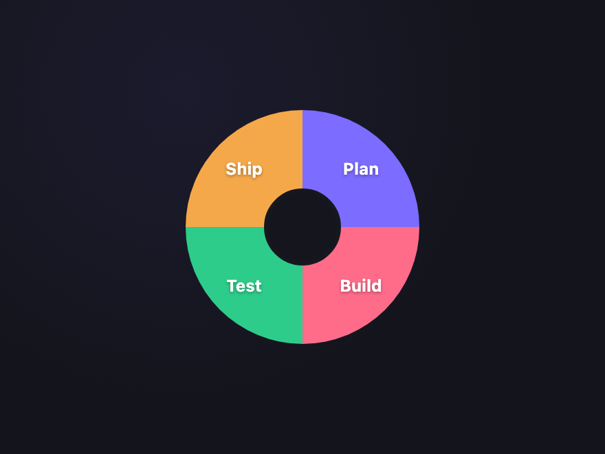
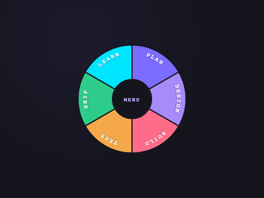
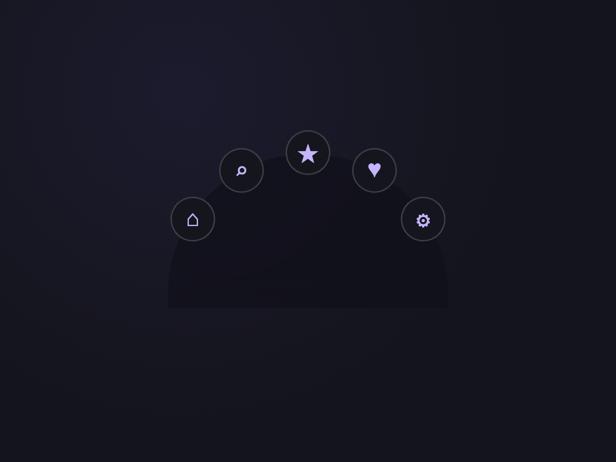
What is a CSS circular menu?
How do you position items in a circle with pure CSS?
How do you add curved text along a donut sector?
Are these circular menus accessible?
Do circular menus work on touch devices?
Can I use these circular menus in any framework?
Related collections
26 CSS Accordions — Vertical & Horizontal
26 free CSS accordions — 17 vertical and 9 horizontal layouts with copy-paste HTML and CSS.
22 CSS Breadcrumbs
22 original CSS breadcrumb designs — underline grow, pill, diagonal slash, neon trail, brutalist, frosted glass, vertical stacked, progress track, holographic shimmer and more.
20 CSS Tabs
20 original CSS tab designs — ink slider, aurora pill, frosted crystal, brutalist press, iOS segmented, bento grid, CRT terminal and more. Copy-paste ready.