CSS gradient text uses background-clip: text to mask a gradient through the shape of a letterform — the gradient becomes the visible fill, the text becomes the clipping mask. These 20 hand-coded designs cover the full modern playbook — animated @property flow, aurora sweep, conic hue spin, per-letter rainbow wave, neon glow, outline stroke, metallic chrome/gold/copper, holographic foil, duotone, texture fills, cursor-tracked radials, glitter sparkle and more. Every demo uses scoped .gt-NN class names that never collide with your existing styles, honours prefers-reduced-motion, and ships under the MIT license.
20 unique gradient text effects16 Pure CSS4 CSS + JS100% copy-paste readyPublished
01 / 20
CSS Animated Gradient Text Flow
Pure CSS
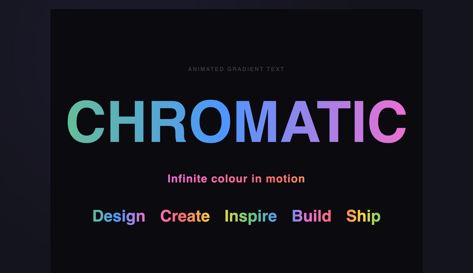
A flowing rainbow gradient sweeps across bold display text using a horizontally-extended linear-gradient and background-position animation for a seamless loop.
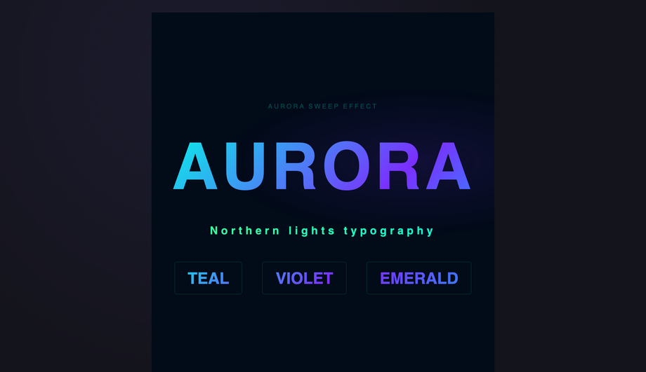
An aurora-inspired diagonal gradient sweeps across a headline using animated background-position on a multi-stop linear-gradient with teal, violet, and emerald hues.
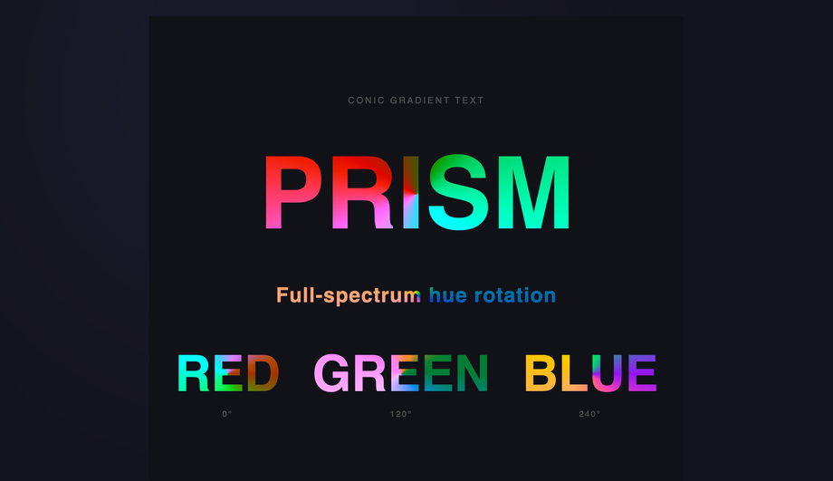
Full-spectrum hue rotation applied to conic-gradient-filled text, creating a continuously spinning rainbow prism effect driven by a CSS filter animation.
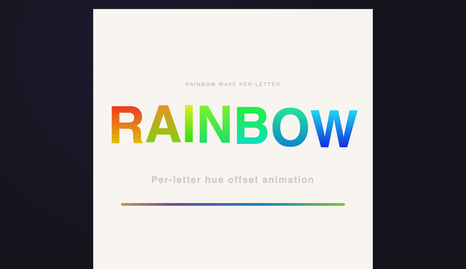
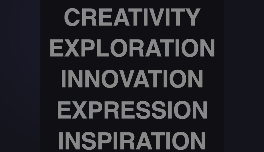
Each letter bounces on its own phase-offset translateY wave while carrying a unique hue-stop pair, producing a travelling rainbow wave entirely in CSS.
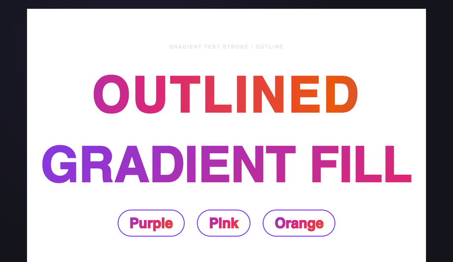
A gradient is applied as the stroke colour of outlined text using -webkit-text-stroke combined with background-clip:text, creating crisp gradient-coloured letterform outlines.
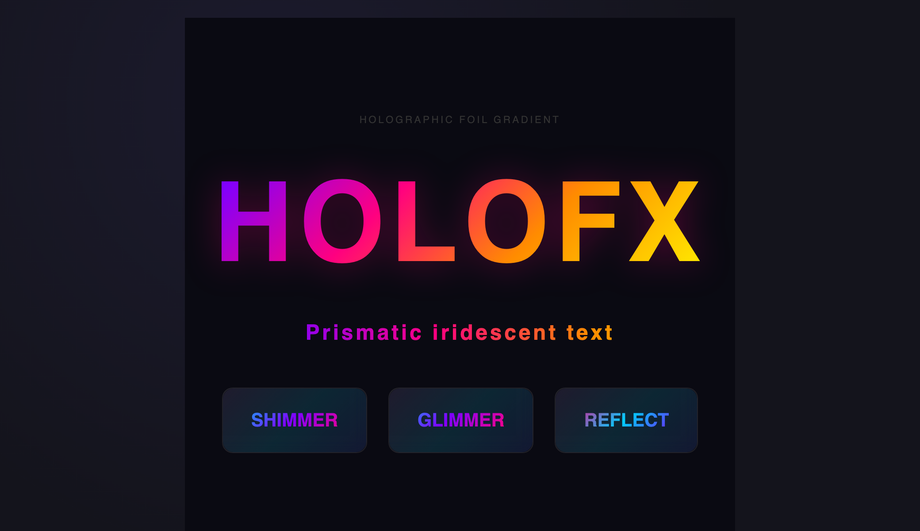
A dense multi-stop rainbow gradient animating diagonally across text and card surfaces recreates the colour-shifting prismatic effect of holographic foil stickers.
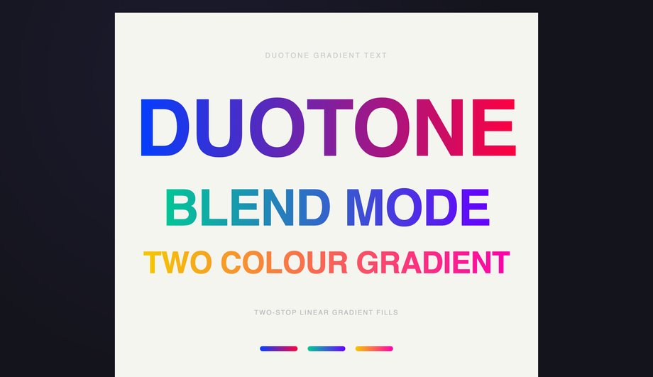
Bold typography filled with two-stop duotone linear gradients, with animated letter-spacing expansion that makes each pairing feel alive and cinematic.
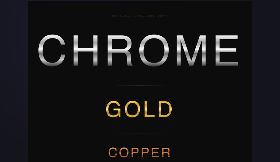
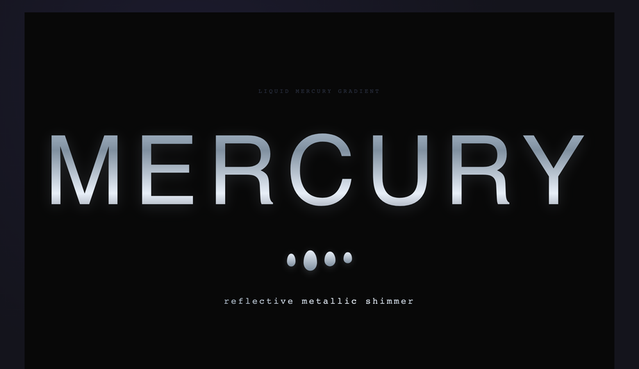
A cool blue-grey metallic gradient with rippling background-position animation and teardrop orbs below the headline evoke the look of flowing liquid mercury.
Each line of text sits in a muted grey state until hovered, triggering a smooth transition that unveils a distinct gradient per line using -webkit-text-fill-color toggling.
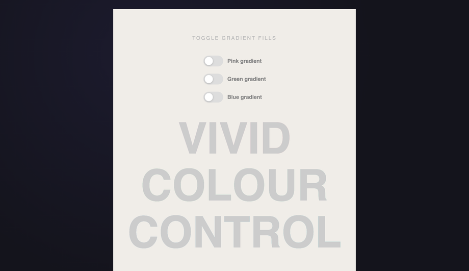
Three checkbox-driven toggle switches independently enable gradient fills on individual words, demonstrating CSS state-driven gradient text with zero JavaScript.
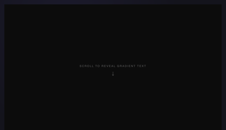
Each section's headline fades in from below with a gradient fill sliding from washed-out to vivid, triggered by IntersectionObserver as the element enters the viewport.
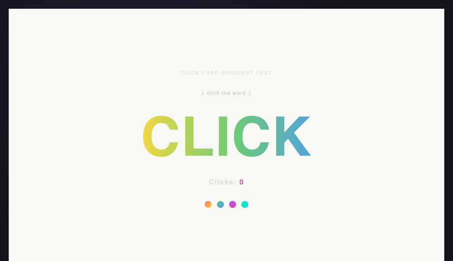
Clicking the gradient headline spawns a ripple ring at the click point while the headline flashes brighter, demonstrating CSS keyframe injection via JavaScript.
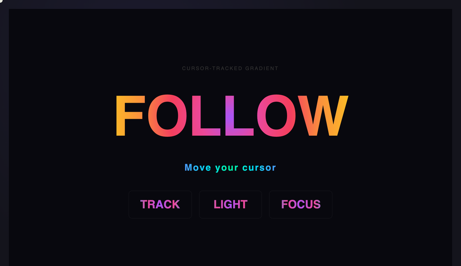
A radial gradient spotlight follows the cursor position inside the demo, illuminating text from the exact point the mouse hovers, driven by CSS custom properties updated in JavaScript.
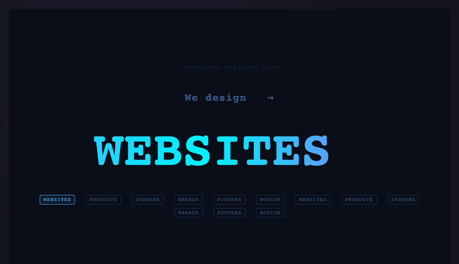
A typewriter loop cycles through a curated list of words letter by letter, each rendered in a continuously scrolling gradient, with a blinking cursor and word chip indicators.
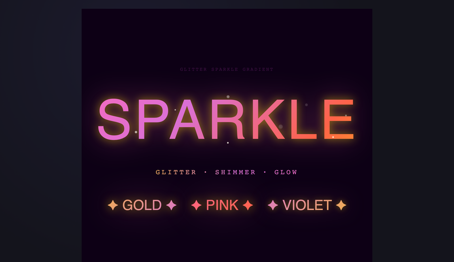
Gold-pink-violet gradient text paired with animating spark particles via absolute-positioned siblings and staggered scale/opacity keyframes recreates the glitter foil aesthetic.
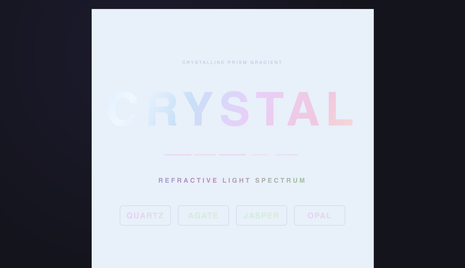
A pastel multi-stop gradient mimics the delicate refractive colours of crystal or cut glass, with animated background-position movement and complementary facet stripe accents.
What is CSS gradient text and how does it actually work?
CSS gradient text uses the <code>background-clip: text</code> property to mask a gradient through the shape of a letterform — the gradient becomes the visible fill while the text glyph becomes the clipping mask. The canonical four-line recipe: (1) set a <code>background</code> to your gradient on the text element, (2) set <code>background-clip: text</code> AND <code>-webkit-background-clip: text</code> (Safari + older Chrome still need the prefix in 2026), (3) set <code>color: transparent</code> OR <code>-webkit-text-fill-color: transparent</code> to make the text itself see-through, (4) the gradient now shows through the letter shapes. Demo #01 (Animated Gradient Text Flow) ships the modern <code>@property --angle</code> typed-custom-property version that animates smoothly (the older background-position trick is jerky because percentages can't be interpolated with sub-pixel precision). The technique works for any gradient: linear, radial, conic, repeating, or animated.
Which gradient text pattern should I pick for my use case?
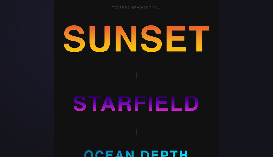
Decision rule by intent. <strong>Hero headline / above-the-fold</strong>: Demo #01 (Animated Gradient Text Flow) for a subtle continuous shimmer, or Demo #02 (Aurora Borealis Sweep) for premium SaaS. <strong>Logo / brand mark</strong>: Demo #08 (Metallic Chrome Gold Copper) for luxury / premium, Demo #09 (Holographic Foil) for trendy / tech-forward, Demo #07 (Outline Stroke) for editorial. <strong>CTA / button text</strong>: Demo #06 (Neon Pulse Glow) for cyberpunk / gaming, Demo #13 (Hover Reveal) for understated interactivity. <strong>Editorial / magazine headline</strong>: Demo #10 (Duotone) for art-direction restraint, Demo #11 (Texture Fill — Sunset / Starfield / Ocean) for image-style fills without an actual PNG. <strong>Interactive / playful</strong>: Demo #04 (Per-Letter Rainbow Wave) for kid-friendly apps, Demo #17 (Cursor-Tracked Radial) for design-forward marketing, Demo #19 (Glitter Sparkle) for celebration moments. <strong>Tech / data / dashboards</strong>: Demo #03 (Conic Hue Spin) for analytics, Demo #12 (Liquid Mercury) for fintech / crypto. <strong>Demo / showcase / scroll page</strong>: Demo #15 (Scroll Reveal) for storytelling, Demo #18 (Typewriter Loop) for landing-page rotators. All 20 demos use scoped <code>.gt-NN</code> class names so you can drop multiple onto the same page without conflicts.
Why use background-clip: text instead of a gradient image PNG?
Three reasons. <strong>1. Editable</strong>: change the gradient colors / angle / stops in milliseconds via CSS — no Photoshop, no re-export. <strong>2. Crisp at any size</strong>: PNGs pixelate above their source resolution; CSS gradients are vector-rendered and stay sharp at any zoom level, on any DPI screen (retina, 4K, the new 8K displays). <strong>3. Performant</strong>: an inline CSS gradient is ~50 bytes in your stylesheet; a PNG screenshot of the same text at 2x retina is 8-40KB and adds an HTTP request. Page-weight savings compound across a marketing page with several headline elements. <strong>4. Animatable</strong>: a PNG can't shimmer, sweep aurora, or track your cursor — gradient text can. <strong>5. Selectable + accessible</strong>: gradient text is real <code><h1></code> / <code><p></code> content — selectable by the user, indexable by Google, readable by screen readers, translatable by Google Translate / DeepL. A PNG is just an image; even with alt text, search engines and assistive tech can't extract the actual words. <strong>The only reason to use a PNG</strong> is if you need exact pixel-perfect rendering of a custom font with effects no CSS technique can produce (e.g. distressed grunge texture from a 3D render). For 99% of marketing UI, gradient text wins on every dimension.
Is gradient text WCAG-accessible? Doesn't it fail contrast?
It CAN fail contrast easily — the gradient varies across the text, so depending on the stops, parts of the letter may sit at 1.5:1 or 2:1 contrast against the page background. WCAG 2.2 AA requires <strong>4.5:1 for body text</strong> and <strong>3:1 for large text (24px+ regular, 18.66px+ bold)</strong>. To keep gradient text compliant: (1) Use gradient text only on <strong>large display sizes</strong> (40px+, ideally 60px+ for hero headlines) where the 3:1 threshold applies — the lower bar makes mid-gradient sections more forgiving. (2) Pick gradient stops where the <strong>worst single point still clears 3:1</strong> against your page background — test it with axe DevTools, Lighthouse, WAVE, or the WebAIM contrast checker by sampling the lightest and darkest pixel in your gradient. (3) For body-size text (16px), use solid color, not gradient — the WCAG 4.5:1 threshold is too narrow for safe gradient implementation. (4) Add a high-contrast <strong>fallback color</strong> that solid-fills the text when <code>background-clip</code> isn't supported or when prefers-reduced-motion is set (some users with cognitive disabilities find gradient text harder to read). The CSS recipe: <code>color: #fff; background: ...; background-clip: text; -webkit-text-fill-color: transparent;</code> — if <code>background-clip</code> fails, the <code>color: #fff</code> falls back gracefully. Regulatory frameworks that mandate WCAG compliance: <strong>EU EAA</strong> (European Accessibility Act, enforceable June 2025), <strong>US Section 508</strong>, <strong>Canada ACA</strong>, <strong>UK Equality Act</strong>.
Browser support — does background-clip: text still need the -webkit- prefix in 2026?
Yes, awkwardly. Spec-compliant <code>background-clip: text</code> reached Chrome 120+, Firefox 117+, and Safari 18.2+ — but you should still ship BOTH declarations in 2026 because Safari on iOS lags behind desktop Safari by ~6 months on user adoption (most users haven't updated past iOS 17 yet). The canonical recipe in modern code: <code>background-clip: text; -webkit-background-clip: text; -webkit-text-fill-color: transparent;</code> The <code>-webkit-text-fill-color: transparent</code> is the older Safari/Chromium way of making text see-through; modern code can use just <code>color: transparent</code> instead, but the <code>-webkit-text-fill-color</code> version takes precedence over color inheritance in some edge cases (forms, inputs) so it's the safer cross-browser default. <strong>Caniuse data</strong>: as of mid-2026, ~96% of global browser usage supports unprefixed <code>background-clip: text</code>; the 4% gap is iOS Safari < 16.4 and Samsung Internet < 23. Shipping both declarations costs you 30 bytes per element — cheap insurance. The Animated Gradient Flow demo (#01) ships both.
How does gradient text compare to Tailwind / shadcn / MUI / Chakra / styled-components gradient text recipes?
<strong>Tailwind v3 / v4</strong>: the canonical recipe is <code>bg-gradient-to-r from-violet-500 to-pink-500 bg-clip-text text-transparent</code> — Tailwind doesn't have a single utility for 'gradient text', you assemble three utilities. Our <a href="/tools/css-to-tailwind-converter/">CSS to Tailwind converter</a> outputs this combination automatically when you paste a gradient-text CSS rule. <strong>shadcn/ui</strong>: doesn't ship a gradient-text primitive; you write the Tailwind classes inline or in a custom component. <strong>MUI / Material UI</strong>: pass the gradient via <code>sx</code> prop — <code>sx={{ background: 'linear-gradient(...)', WebkitBackgroundClip: 'text', WebkitTextFillColor: 'transparent' }}</code>. The camelCased React style names hide the <code>-webkit-</code> prefix. <strong>Chakra UI</strong>: similar pattern via the <code>bgGradient</code> prop + <code>bgClip='text'</code> — Chakra ships this as a first-class shorthand, which is nice. <strong>Ant Design / Mantine</strong>: no first-class gradient-text component; same React-inline pattern as MUI. <strong>styled-components / Emotion</strong>: identical to plain CSS inside the template literal. <strong>For complex effects</strong> (per-letter wave, cursor-tracked, scroll-reveal): every framework requires the same custom JS that we ship in the demo's JS tab — copy it as-is. The CSS-in-JS layer doesn't change the underlying technique.
Why does my gradient text disappear when I add a text-shadow?
Because <code>-webkit-text-fill-color: transparent</code> (or <code>color: transparent</code>) makes the text glyph transparent — text-shadow then casts the shape of TRANSPARENT pixels, which means the shadow shows through and over the gradient, often producing visual chaos. <strong>The fix</strong>: use <code>filter: drop-shadow()</code> on the parent element instead of <code>text-shadow</code> on the text itself. <code>drop-shadow</code> respects the gradient-filled appearance because it operates on the rendered pixels, not the glyph alpha channel. The Neon Pulse Glow demo (#06) ships this pattern: <code>filter: drop-shadow(0 0 8px rgba(255, 0, 255, 0.6))</code> wraps the gradient text in a magenta glow without breaking the fill. <strong>Performance note</strong>: <code>drop-shadow</code> is more expensive than <code>text-shadow</code> (it creates a paint layer); use it sparingly on hero text, not body text. <strong>Multiple shadows</strong>: stack multiple <code>drop-shadow</code> filters: <code>filter: drop-shadow(0 0 8px ...) drop-shadow(0 0 16px ...)</code> — each is its own GPU-rendered layer.
How do I animate gradient text smoothly? My background-position animation looks jerky.
Animating <code>background-position</code> from <code>0% 50%</code> to <code>100% 50%</code> is the legacy 2018 recipe — it animates the gradient stops shifting across the text, but because percentage values aren't interpolated with sub-pixel precision on all browsers, you get visible stuttering, especially on retina screens. <strong>The modern fix</strong>: use <code>@property</code> to declare a typed custom property and animate THAT instead. <code>@property --angle { syntax: '<angle>'; initial-value: 0deg; inherits: false; }</code> declares <code>--angle</code> as an actual <code><angle></code> value (not a string) so the browser can interpolate between angle values with sub-degree precision. Then write your gradient as <code>linear-gradient(var(--angle), #f43f5e, #8b5cf6, #06b6d4)</code> and animate <code>--angle</code> from <code>0deg</code> to <code>360deg</code>. <strong>Result</strong>: silky-smooth rotation at 120fps, GPU-accelerated, no main-thread cost. Demos #01 (Animated Flow) and #03 (Conic Hue Spin) both ship this pattern. <code>@property</code> is supported in Chrome 85+, Safari 16.4+, Firefox 128+ — for older browsers, fall back gracefully to the static gradient (the typed property degrades to undefined, so the gradient uses its initial value). The same trick works for any animatable gradient parameter: hue rotation, conic from-angle, radial position.
Can I use OKLCH and Display-P3 wide-gamut colors in gradient text?
Yes — and you should for production marketing pages on modern displays. <strong>OKLCH</strong> (Chrome 111+, Safari 16.4+, Firefox 113+) is a perceptually uniform color space — interpolating between two OKLCH colors produces visually smoother gradients than interpolating between two hex codes, because hex (sRGB) interpolation passes through muddy mid-gray midpoints. Example: <code>linear-gradient(45deg, oklch(0.7 0.18 30), oklch(0.7 0.18 250))</code> produces a clean magenta→cyan sweep where the equivalent hex gradient would muddy through grey-purple. <strong>Display-P3</strong> (Chrome 111+, Safari 15+, Firefox 113+) extends color into the wider P3 gamut available on every Apple device since 2018, recent Pixel phones, and high-end Windows laptops. Reds and greens are ~25% more saturated than sRGB. Example: <code>color(display-p3 1 0 0)</code> is a more vivid red than <code>#ff0000</code>. <strong>Cross-browser strategy</strong>: layered declarations — <code>color: #ff0000; color: oklch(0.6 0.25 30); color: color(display-p3 1 0 0);</code> — browsers ignore declarations they don't understand and use the last supported one. <strong>Modern <code>color-mix()</code> function</strong> (Chrome 111+, Safari 16.2+, Firefox 113+) lets you blend two colors at runtime: <code>color-mix(in oklch, #f43f5e 60%, #8b5cf6)</code> — useful for theme-aware gradient stops. Demos #02 (Aurora) and #09 (Holographic) use OKLCH gradients; Demo #20 (Crystalline Prism) uses color-mix for the prism refractions.
Are these gradient text designs free, and how should I attribute them?
Yes — all 20 designs are <strong>MIT licensed</strong> and free for personal and commercial use, including client projects, SaaS products, design systems, and open-source libraries. The MIT license requires only that you keep the copyright notice if you redistribute the source code as-is; in shipped production HTML / CSS that you've adapted, no visible attribution is needed. If you ship one as part of an open-source UI library or component kit, a one-line credit pointing to https://codefronts.com is appreciated but not legally required. <strong>Accessibility</strong>: every demo uses semantic HTML, honours <code>prefers-reduced-motion: reduce</code> (animations fall back to static gradients), and includes a high-contrast solid-color fallback for browsers that don't support <code>background-clip: text</code>. Verify your specific use case with <strong>axe DevTools</strong>, <strong>Lighthouse</strong>, <strong>WAVE</strong>, or <strong>WebAIM contrast checker</strong> before shipping to EU EAA / US Section 508 / Canada ACA / UK Equality Act audits — the demos are AA-compliant at large display sizes but body-text usage may need a different approach.