Material Design is Google's open-source design system, used across Android, Wear OS, Chrome, and Google's web properties — but reaching for the Material UI / MUI / Material Components Web library to get the look adds 50-100kb to your bundle. These 14 hand-coded components ship the canonical Material Design 3 (Material You) aesthetics — elevated buttons with ripple, rounded corners, Roboto typography, the indigo + amber palette — as 100% pure CSS. Zero JavaScript, zero library dependencies. Every interactive component (dialogs, tabs, chips, expansion panels) uses checkbox/radio state machines and CSS :checked + :has() selectors. Drop into any stack: React, Vue, Astro, Rails ERB, plain HTML. MIT-licensed.
14 unique Material components100% copy-paste readyPublished
01 / 14
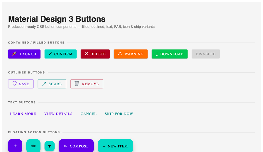
Material Design Buttons CSS
Pure CSS
Filled, outlined, text, elevated, tonal, and FAB buttons plus toggle groups and filter chips — all Material Design 3, zero JavaScript.
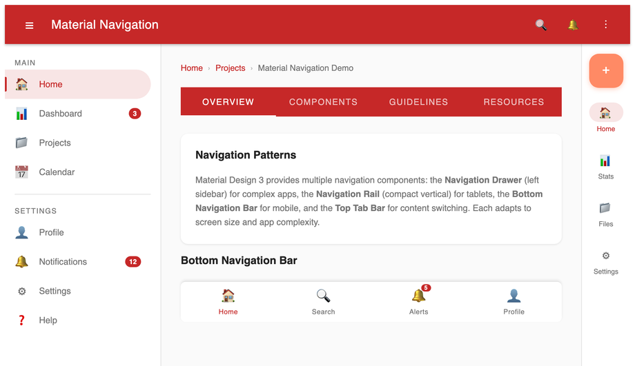
Top app bar, navigation drawer, navigation rail, bottom navigation bar, scrollable tab bar, and breadcrumb trail — all built with CSS custom properties and zero JavaScript.
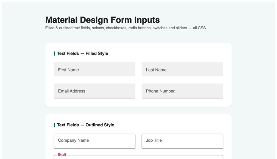
Filled and outlined text fields with floating labels, select menus, textarea, checkboxes, radio buttons, toggle switches, and range sliders — interactive, fully accessible, no JavaScript.
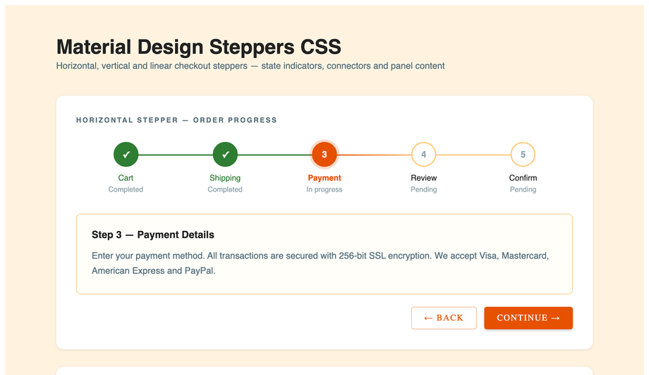
Horizontal step indicator with done/active/error states, vertical accordion stepper, and a linear checkout stepper — built entirely with CSS counter and radio-hack.
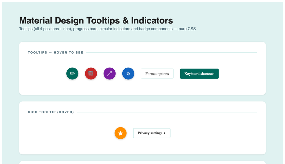
Plain and rich tooltips in four directions, linear progress (determinate and indeterminate), circular progress, notification badges, and page dot navigation — all pure CSS.
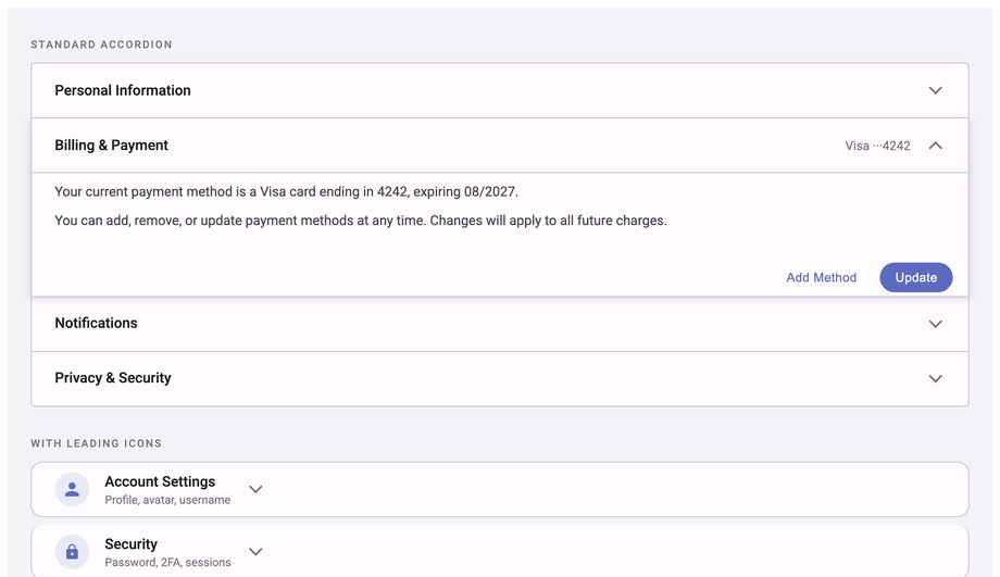
Standard accordion, icon-leading accordion with inline forms, and FAQ-style fully-rounded panels — interactive via the CSS checkbox-hack, zero JavaScript.
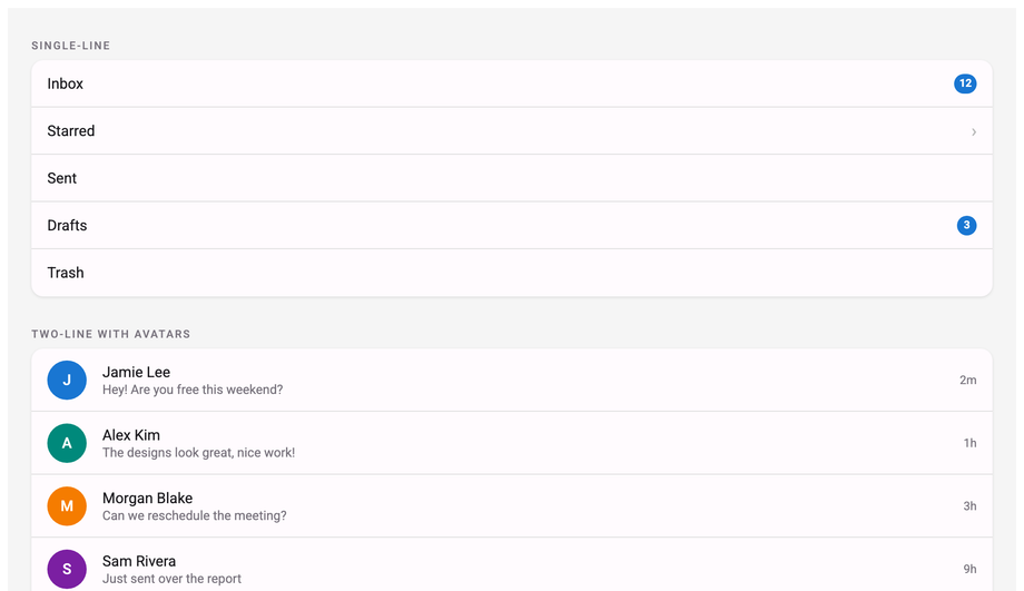
Single-line, two-line with avatars, three-line with thumbnails, icon lists with subheaders and dividers, checkbox lists, and action-button rows — complete Material Design 3 list system.
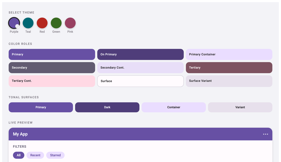
Interactive five-theme Material Design 3 colour switcher — purple, teal, red, green, pink — with live colour role grid, tonal surfaces, and a live UI preview panel, all driven by CSS custom properties and radio inputs.
Full responsive app shell with sticky top app bar, persistent navigation drawer, breadcrumb toolbar, three-column stats grid, activity feed list, and a floating action button — production-ready layout, no JavaScript.
What is Material Design and why use it for a web project?
Material Design is Google's open-source design system, introduced in 2014 and currently on its third major version (Material Design 3, also marketed as "Material You"). It defines a visual language — elevated surfaces with shadows, the indigo + amber palette, Roboto typography, 4dp/8dp spacing rhythm, the FAB pattern, the ripple touch feedback — alongside specific component behaviours (how a chip removes itself, how a tab's underline transitions, how an expansion panel rotates its chevron). <strong>Why use it on the web</strong>: (1) <strong>Familiar to billions of users</strong> — every Android phone uses Material, so visitors recognise the patterns instinctively. (2) <strong>Accessibility baked in</strong> — Material's components ship WCAG-AA contrast ratios, 48dp tap targets, focus indicators by default. (3) <strong>Comprehensive</strong> — Material defines components for almost every UI need, from FABs to data tables to navigation drawers. (4) <strong>Cross-platform consistency</strong> — if your product also has a mobile app, using Material on the web gives users a unified experience.
Should I use Material UI (MUI) or build Material Design with vanilla CSS?
MUI is excellent if you're ALREADY on React + want every Material component + theme system + ~150 components + 95kb gzipped bundle. <strong>If you're NOT on React+MUI</strong> (Astro, Vue, Svelte, Rails ERB, plain HTML, WordPress, vanilla JS) — installing MUI just to get the Material aesthetic adds 95kb to your bundle for components you may never use. Or worse: trying to use MUI with Vue / Svelte means rewriting it because MUI is React-only. <strong>This collection's 14 components</strong> ship the canonical Material Design 3 look — elevated buttons with ripple, rounded corners, Roboto typography, the indigo + amber palette — as 100% pure CSS. Zero JavaScript, zero libraries, framework-neutral. Cost comparison: <strong>MUI</strong> ~95kb React+MUI bundle. <strong>Material Components Web (MDC)</strong> ~50kb framework-neutral but still requires JS imports per component. <strong>Material Design Lite (MDL)</strong> deprecated since 2017. <strong>Tailwind UI's Material-inspired components</strong> $300+. <strong>This collection</strong>: 0 bytes of JavaScript, the CSS itself is ~20-50kb per demo (only the demos you use). MIT-licensed, modify-and-resell allowed.
How do I implement the Material Design ripple effect without any JavaScript?
Demo 01 (Material Design Buttons CSS) ships the canonical pure-CSS ripple. Most online tutorials show the JS-driven ripple where a <code><span></code> is spawned at the click coordinate — that requires JavaScript and you have to recalculate positions on every click. <strong>This demo's pure-CSS approach</strong>: a <code>::after</code> pseudo-element with <code>position: absolute; inset: 0; background: radial-gradient(...) center / 0 0 no-repeat</code>. On <code>:hover</code> and <code>:focus-visible</code>, the background-size animates from <code>0 0</code> to <code>200% 200%</code> over 0.4s with <code>ease-out</code> — creating a ripple that radiates from the button center. On <code>:active</code> a separate keyframe runs a faster, more contained ripple for the press feedback. Tradeoff vs JS ripple: the ripple always originates from the BUTTON center, not the click coordinate. For ~95% of UI use cases (CTAs, primary actions, navigation buttons) this is indistinguishable from a JS ripple and saves you the entire JS implementation. The 5% case where ripple-at-cursor matters (interactive canvases, design tools): use the JS approach Demo 16 in <a href="/components/css-floating-buttons/">CSS Floating Buttons</a>.
How do I implement Material Design's floating label form input pattern?
Demo 04 (Material Design Form Inputs CSS) ships the floating-label pattern that every Material form uses — the placeholder text starts inside the input at full font-size, then animates upward and shrinks to a small label above the input when the field receives focus or has content. <strong>Pure-CSS implementation</strong>: <code><label></code> sits absolutely positioned over the <code><input></code>'s placeholder area. The <code>:placeholder-shown</code> pseudo-class targets inputs that still show their placeholder (i.e., empty + not focused). When the input is <code>:focus</code> OR NOT <code>:placeholder-shown</code> (has content), the label translates up and scales down via transitions. The selector chain: <code>.md-04__field input:focus + label, .md-04__field input:not(:placeholder-shown) + label { transform: translateY(-22px) scale(0.78); color: var(--md-primary); }</code>. Three details most online tutorials get wrong: (1) <strong>Use <code>placeholder=" "</code></strong> (single space) on the input, not empty — Chrome treats an empty placeholder as no placeholder and breaks the selector. (2) <strong>Animate <code>transform</code> not <code>top/font-size</code></strong> — transform is GPU-accelerated and won't trigger layout reflow. (3) <strong>Set <code>transform-origin: left center</code></strong> so the label scales from its left edge, matching Material's spec.
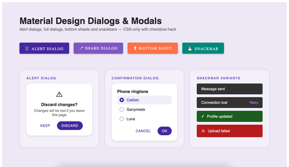
How do I build a Material Design dialog / modal in pure CSS?
Demo 05 (Material Design Dialog Modal CSS) ships the pure-CSS dialog using the modern native <code><dialog></code> element. The pattern: <code><dialog id="md-05-dialog"></code> contains the dialog content; an open-trigger button has a <code><label for="md-05-open"></code> + hidden checkbox; CSS shows the dialog when <code>#md-05-open:checked ~ * #md-05-dialog</code> matches. The modern alternative (which Demo 05 also illustrates as a snippet): <code><dialog></code> opened by <code>modal.showModal()</code> automatically gets focus trap, Esc-to-close, scroll lock, and backdrop — but requires one line of JS. <strong>Why the checkbox-hack version exists alongside</strong>: zero JS, works on every browser since 2016, useful for marketing pages or static landing pages where adding a JS click handler feels like overkill. <strong>Three production gotchas</strong>: (a) <strong>Focus trap</strong> — the pure-CSS dialog doesn't trap focus (Tab can leave the dialog). For accessibility-critical UIs, use the native <code><dialog></code> + JS instead. (b) <strong>Scroll lock</strong> — body still scrolls behind the open dialog unless you add <code>html:has(#md-05-open:checked) body { overflow: hidden }</code> (requires <code>:has()</code> — Chrome 105+, Safari 15.4+, Firefox 121+). (c) <strong>Backdrop click to close</strong> — works via <code><label for="md-05-open"></code> on the backdrop element.
What's the difference between Material Design 2 and Material Design 3 (Material You)?
Material Design 2 (2018-2022) was the dominant style for most of Google's web/Android products. Material Design 3 (2022-present), branded as <strong>Material You</strong>, brought four significant changes: <strong>(1) Dynamic color theming</strong> — Android pulls a color palette from the user's wallpaper and applies it across the system. On the web, this translates to CSS custom-property-driven theme tokens you can swap at runtime. <strong>(2) Rounder shapes</strong> — MD3 increased corner radii across most components. Buttons went from 4px to 8-20px depending on size; cards from 4px to 12px; FABs from circle/round-square to fully rounded. <strong>(3) Bigger touch targets</strong> — minimum tap target increased from 40dp to 48dp (now WCAG 2.5.5 AAA-compliant). <strong>(4) Updated typography</strong> — Roboto stays as default, but MD3 expanded the type scale and added Display / Headline / Title / Label tiers with clear hierarchy. This collection's 14 components implement MD3 aesthetics: 8-20px corner radii, 48px button heights, the new color token system (--md-primary, --md-on-primary, --md-surface, etc.), and the larger Roboto-based type scale. Use this collection if you want the 2026-current Material look. For MD2 styles (sharper corners, smaller buttons), the Material UI v4 docs or older MDL templates are closer fits.
How do I build the Material Design app shell layout (drawer + top app bar)?
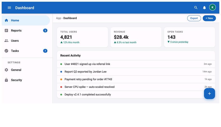
Demo 14 (Material Design App Shell Layout CSS) ships the canonical Material app-shell pattern that every Google Workspace product (Docs, Sheets, Drive) uses. The layout: <strong>(1)</strong> Top app bar with hamburger icon (left), product title, search field (middle), action icons (right) — fixed at top, ~64px tall. <strong>(2)</strong> Collapsible navigation drawer (left side, 256px wide when open). Toggled by clicking the hamburger via a checkbox-hack: <code>:checked</code> on the hidden toggle slides the drawer in via <code>transform: translateX(-256px) → translateX(0)</code>. <strong>(3)</strong> Main content area to the right of the drawer, with a backdrop overlay on mobile when the drawer is open. <strong>(4)</strong> A bottom navigation bar on mobile breakpoints (below 768px) — the drawer becomes a modal overlay rather than always-visible. Three production-grade details: (a) <strong>Use CSS Grid for the shell</strong>: <code>grid-template-columns: auto 1fr</code> on desktop, <code>1fr</code> on mobile. (b) <strong>Persist drawer state via <code>localStorage</code></strong> if you wire one line of JS — visitors who close the drawer want it stay closed across page navigations. (c) <strong>Trap focus when the drawer is modal on mobile</strong> — Tab order should cycle within the drawer until Esc closes it. ~60 lines of CSS, 0 lines of JS.
Is Material Design suitable for non-Google products? Won't my site look like Google?
Two-part answer. <strong>(1) Yes, Material Design works for non-Google products</strong> — millions of non-Google sites use it, and visitors don't think "this looks like Google" because the visual language has become a generic "modern app" aesthetic, not specifically Google-branded. <strong>(2) The way to differentiate</strong> is to swap the color tokens. Material Design provides the visual GRAMMAR (elevation shadows, corner radii, type scale, spacing rhythm); your brand provides the VOCABULARY (your specific colors, your fonts, your imagery). Demo 13 (Material Design Color Palette CSS) shows all 500 Material shades — pick a primary + secondary that match your brand instead of Google's indigo + amber, override the <code>--md-primary</code>, <code>--md-secondary</code>, <code>--md-surface</code> custom properties at the demo root, and the Material grammar carries your brand's identity. Substituting Roboto with your brand font (or with Inter, IBM Plex Sans, Geist) also differentiates the look. Most successful Material-derived products do exactly this — Slack's web app, Notion's settings panel, Linear's editor all use Material patterns with brand-specific color + typography substitutions.
Is Material Design accessible? What about screen readers and keyboard navigation?
Material Design ships accessibility-aware components by default — that's one of the main reasons to use it. The 14 demos in this collection respect: <strong>(1) WCAG-AA contrast.</strong> Every color token pair (--md-on-primary on --md-primary, --md-on-surface on --md-surface) clears 4.5:1 contrast at small text and 3:1 at large text. The demo 13 color palette shows all swatches with their contrast indicators. <strong>(2) 48×48px minimum tap targets.</strong> WCAG 2.5.5 AAA-compliant. Button heights, list item heights, tab heights all default to 48px. <strong>(3) Visible focus indicators.</strong> Every interactive component has a <code>:focus-visible</code> ring (typically <code>outline: 2px solid var(--md-primary); outline-offset: 2px</code>) that survives Material's ripple animation. <strong>(4) Semantic HTML.</strong> Real <code><button></code> / <code><input></code> / <code><dialog></code> / <code><nav></code> elements, not divs styled as buttons. Screen reader announcements work automatically. <strong>(5) <code>aria-current</code>, <code>aria-expanded</code>, <code>aria-selected</code>, <code>aria-controls</code></strong> on interactive components (tabs, expansion panels, navigation links) so screen readers announce the current state. <strong>(6) <code>prefers-reduced-motion</code></strong> media query on every demo — vestibular-sensitive visitors don't see ripples, slide-in panels, or other continuous motion.
Which Material Design component should I use for my project?
Quick decision guide for all 14 demos. <strong>Primary CTAs / form submit buttons</strong>: Demo 01 (Material Design Buttons CSS) — elevated, filled, and outlined variants with the canonical Material ripple. <strong>Product / blog / pricing card layouts</strong>: Demo 02 (Material Design Card CSS) — elevated content cards with proper shadow tiers. <strong>App navigation header</strong>: Demo 03 (Material Design Navigation CSS) — top app bar with hamburger, search, actions. <strong>Form inputs (signup, contact, profile)</strong>: Demo 04 (Material Design Form Inputs CSS) — floating-label pattern. <strong>Confirmation / alert dialogs</strong>: Demo 05 (Material Design Dialog Modal CSS) — checkbox-hack + native <code><dialog></code> dual implementation. <strong>Tabular data (orders, users, transactions)</strong>: Demo 06 (Material Design Data Table CSS) — proper alignment, hover states, sortable column headers. <strong>Tabbed content panels</strong>: Demo 07 (Material Design Tabs CSS) — ripple-driven underline transitions. <strong>Filter / tag UI</strong>: Demo 08 (Material Design Chip CSS) — removable chips with leading icons. <strong>Multi-step form flows</strong>: Demo 09 (Material Design Stepper CSS) — vertical step indicator. <strong>Hover help / contextual info</strong>: Demo 10 (Material Design Tooltip CSS) — four directional variants. <strong>FAQ / collapsible content</strong>: Demo 11 (Material Design Expansion Panel CSS) — Material's accordion. <strong>Profile lists / contact lists / settings menus</strong>: Demo 12 (Material Design List CSS) — two-line list with avatars. <strong>Design system documentation page</strong>: Demo 13 (Material Design Color Palette CSS) — full 500-shade palette with theme switcher. <strong>Full-app skeleton</strong>: Demo 14 (Material Design App Shell Layout CSS) — drawer + top bar + content. All 14 are 100% pure CSS, MIT-licensed, framework-neutral.