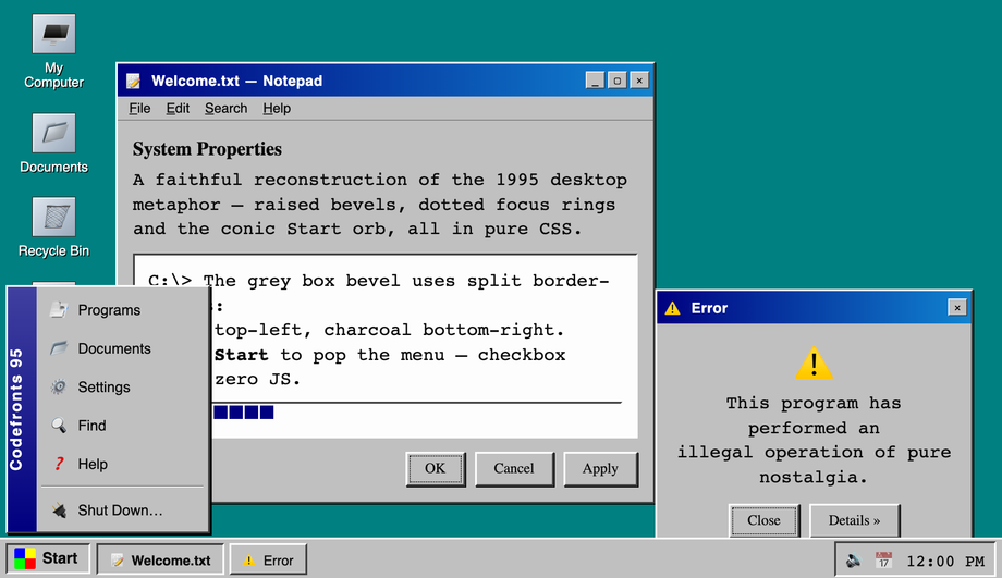
A pixel-faithful Windows 95 desktop rebuilt in pure CSS — raised/inset bevels via split border-colors, the conic-gradient Start orb, a checkbox-hack Start menu, draggable-looking title bars, dotted focus rings and a working taskbar with tray clock.
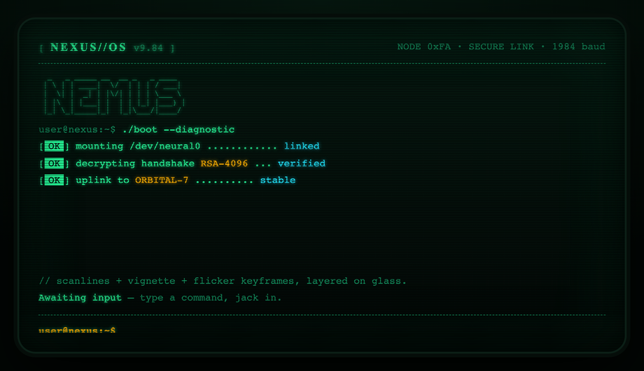
A boot-sequence CRT terminal with curved glass: layered scanlines, rolling interlace, vignette curvature, phosphor glow and a flicker keyframe, plus staggered line-by-line teletype reveal and a blinking block cursor.
An 8-bit RPG HUD kit drawn entirely with layered box-shadows — no border-radius, no images: chunky pixel panels, a heart-based HP row, a stepped XP bar, coin counter, type-on dialogue box and depressible 3D pixel buttons.
A neo-brutalist component board: 3px black strokes, blunt offset hard-shadows that grow on hover, clashing primaries, an inset-shadow text field, a stepped checkbox-hack toggle, badges, stat tiles and a punch-down CTA.
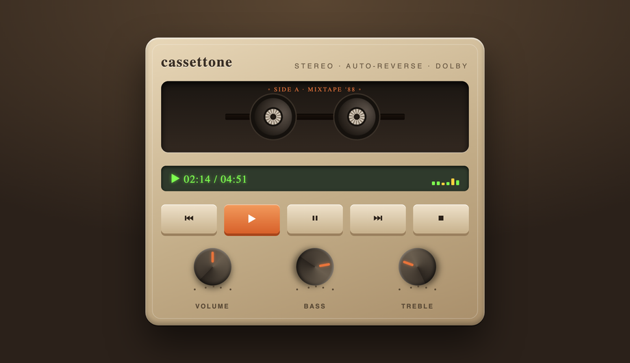
A skeuomorphic tape deck modelled in pure CSS gradients — moulded plastic body with inset highlights, a recessed window with two spinning reels, an LCD with an animated VU meter, real pressable transport keys with travel, and three rotary knobs with pointer ticks.
A vaporwave scene assembled from CSS masks and gradients only — a halftone striped sun bobbing on the horizon, an infinite scrolling neon perspective grid floor, chrome gradient-clip title type with a glitch shudder, and a translucent retro window card.
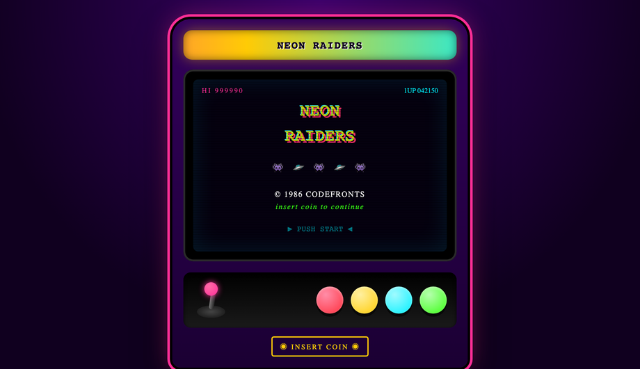
A full arcade cabinet UI kit: an animated rainbow marquee, a bezelled CRT attract-screen with scanlines, hue-shifting logo, marching sprites and a blinking PUSH START, plus a control panel with a wiggling joystick and four glossy convex pressable buttons.
A live, typeable bash shell with an ASCII logo, ANSI-coloured output and a blinking caret — type real commands (help, ls, neofetch, cowsay, echo, clear) and watch them execute.
An authentic Web 1.0 GeoCities-era homepage: a rainbow banner with a blinking hit counter, a scrolling marquee, ridge/inset bevelled tables, a sign-the-guestbook form with vintage entries, a webring, 88×31-style badges and an animated UNDER CONSTRUCTION sign. Times + Comic Neue + Courier Prime on tiled teal.
A glossy Y2K / Aqua interface — candy jelly buttons with specular top-gloss and a 3D push, a pinstripe-animated progress pill, a frosted aqua titlebar with gel orbs, and a glassy toggle switch.
A vintage mail-order catalogue storefront: a double-rule masthead, halftone-textured paper, ticket-stub price tags, a wax-seal discount badge, a product grid with diagonal-weave thumbnails that lift on hover, and an old-school phone-order footer.
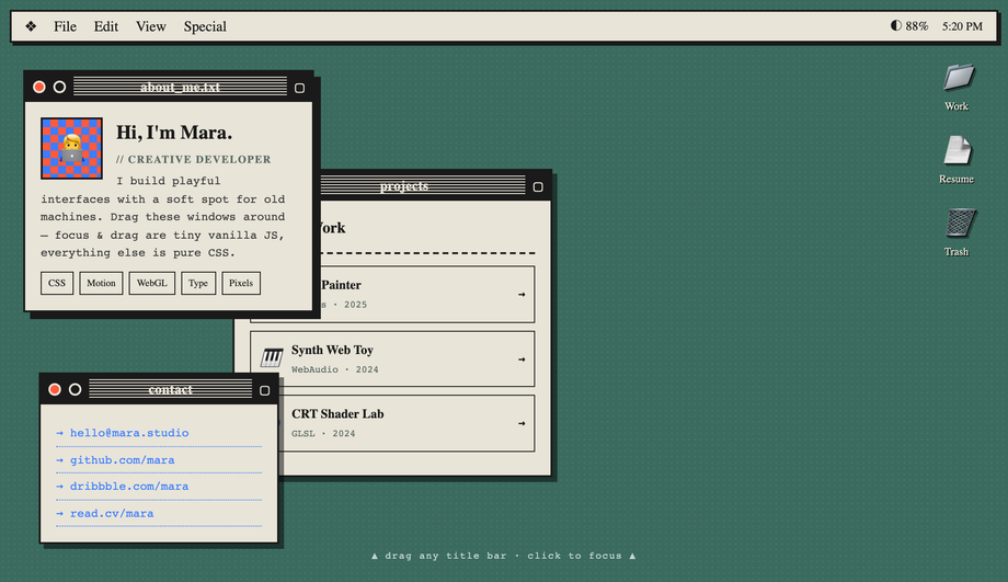
A classic desktop-OS portfolio: a System-style menu bar with live clock, desktop folder icons, and stacked windows (about / projects / contact) you can drag and bring-to-focus.
How do I build a Windows 95 UI in pure CSS without a framework like 98.css or XP.css?
98.css and XP.css are popular CSS frameworks that recreate Win98/XP — but they're external dependencies (an extra ~30 KB), they hard-code their own class names you have to adopt, and customising them means fighting their cascade. Demo #01 ships the same Win95 fidelity built from scratch in pure CSS so you can copy the bits you need and skip the framework. The core mechanics: <strong>raised/inset bevels via split <code>border-color</code></strong> (top + left = white/grey light, right + bottom = dark grey/black, no gradients needed — same trick the original Windows GDI used), the iconic <strong>Start orb</strong> built with a <code>conic-gradient</code> for the four-color flag, a <strong>checkbox-hack Start menu</strong> (hidden <code><input type="checkbox"></code> + <code>:checked</code> sibling selectors so the menu opens with zero JS), <strong>dotted focus rings</strong> using <code>outline: 1px dotted</code>, and a <strong>working taskbar tray clock</strong> via CSS only. Fonts: Pixelify Sans + VT323 for the authentic look. Most "retro UI" tutorials online either point you at the 98.css framework or skip the raised/inset bevel mechanic entirely — both are competitor gaps fixed here.
How do I make a CRT terminal effect with scanlines in pure CSS?
Demo #02 ships the canonical recipe: three layered effects on a single dark surface. (1) <strong>Horizontal scanlines</strong> via a repeating linear-gradient at 2px intervals: <code>background: repeating-linear-gradient(to bottom, transparent 0 1px, rgba(0,255,0,0.04) 1px 2px)</code> overlaid via a <code>::before</code> pseudo-element. (2) <strong>Phosphor glow</strong> on text via <code>text-shadow: 0 0 4px currentColor, 0 0 12px currentColor</code> — the green-on-black halo. (3) <strong>Subtle curvature</strong> via <code>border-radius</code> + an inner box-shadow that simulates the slight pillow distortion CRT tubes had at the corners. Add a boot-reveal animation (<code>@keyframes</code> typing each line then a cursor blink) and the effect is complete. Most "CRT effect" tutorials reach for WebGL or canvas filters; the pure-CSS version uses zero JavaScript and runs entirely on the compositor. Browser support: every evergreen browser since 2018.
How do you make 8-bit pixel-art UI elements in pure CSS without an SVG?
Demo #03 uses the <strong>multi-layered <code>box-shadow</code> trick</strong> — a single empty <code><div></code> (no markup overhead) becomes a multi-color pixel sprite by listing dozens of 1px-spaced <code>box-shadow</code> entries. Each shadow declaration places one "pixel" at an exact offset: <code>box-shadow: 1px 0 0 #ff0, 2px 0 0 #ff0, 1px 1px 0 #f00, ...</code>. The result is a real pixel-art icon rendered in pure CSS at any size that respects <code>image-rendering: pixelated</code>. The same technique drives 8-bit button bevels (top edge = bright color, right + bottom = darker shade — the classic NES "3D" look). Demo #03 ships a complete HUD with health bar (chunky pixel segments), inventory grid, dialog box, and four button variants. Compared to using SVG pixel art, the CSS approach is purely declarative — no separate asset files to manage, infinitely scalable, and the colors are CSS variables you can theme.
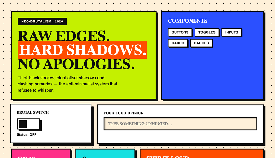
What's neo-brutalism in UI design and how do I build it in CSS?
Neo-brutalism is the deliberate-ugly aesthetic that swept design Twitter in 2021-2023 and remains a strong differentiator for indie SaaS / dev tools (Gumroad, Linear's marketing site, Vercel ship demos). The recipe is intentionally hostile to traditional polish: <strong>thick black borders</strong> (<code>border: 4px solid #000</code>), <strong>hard offset shadows with zero blur</strong> (<code>box-shadow: 8px 8px 0 #000</code>) that snap to a flat plane instead of softly fading, <strong>zero <code>border-radius</code></strong> (sharp corners only), <strong>saturated primary colors</strong> on big flat fills (hot pink, electric yellow, lime green, cobalt), <strong>oversized condensed sans-serif</strong> typography (Archivo Black, Space Grotesk Bold), and <strong>visible button press</strong> — on <code>:active</code> the box-shadow collapses to 0 and the element translates <code>3px 3px</code> to fake the depression. Demo #04 ships a complete component toggle board with checkboxes, buttons, cards, badges, and pills all in this aesthetic. Browser support: anything. The hardest part is the design discipline of NOT softening the edges.
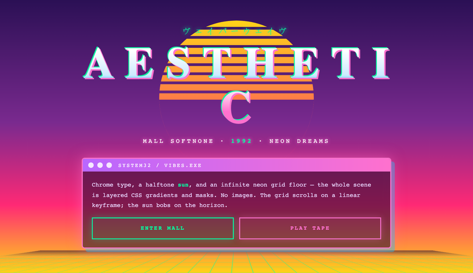
How do I make a vaporwave / synthwave background in CSS?
Demo #06 is the canonical vaporwave aesthetic with the three signature elements all rendered in CSS (no images). (1) <strong>Sun gradient</strong>: an absolutely-positioned circle with <code>background: linear-gradient(180deg, #ff71ce, #ff8b3d, #ffea00)</code> and a <code>mask-image: linear-gradient(to top, transparent 0%, black 50%)</code> so the sun fades into the horizon. (2) <strong>Perspective grid floor</strong>: a 2D grid via <code>background-image: linear-gradient(to right, #ff00ff 1px, transparent 1px), linear-gradient(to bottom, #ff00ff 1px, transparent 1px)</code> tilted with <code>transform: perspective(400px) rotateX(60deg)</code> for the iconic Tron-style receding floor. (3) <strong>Statue silhouettes / palm trees</strong> via <code>clip-path: polygon(...)</code> on solid fills — pure SVG-shaped CSS, no image assets. Pair with Bebas Neue or Monoton typography, the #ff71ce hot-pink + #00f0ff cyan palette, and an animated <code>filter: hue-rotate</code> for the optional color shift. Most vaporwave "how to" articles online show the palette and call it done — they skip the perspective grid + masked sun + clip-path silhouettes that actually make the aesthetic recognizable.
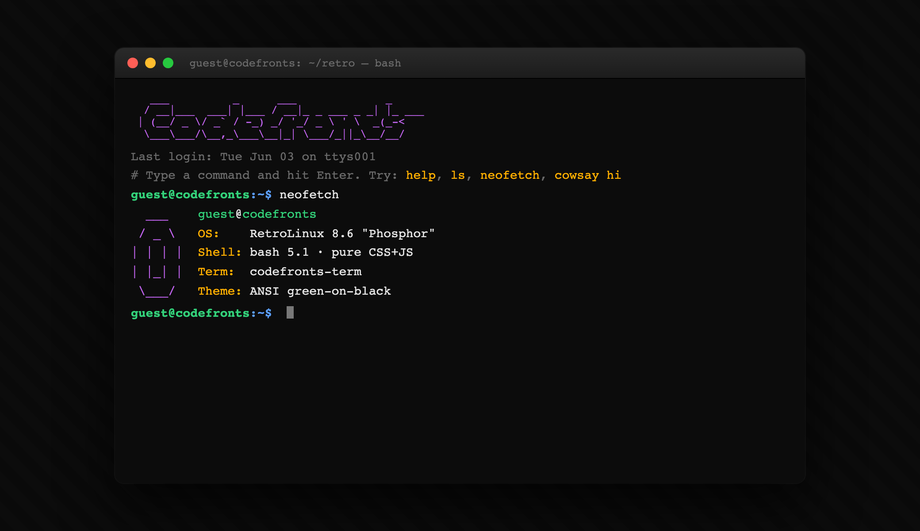
What's a working ASCII art web interface and how does the bash interpreter work?
Demo #08 ships an interactive ASCII shell — a real command interpreter that parses commands (<code>ls</code>, <code>cd</code>, <code>cat</code>, <code>help</code>, <code>clear</code>, <code>whoami</code>, etc.) from a virtual filesystem and renders output in monospace text within an ASCII-bordered panel. The CSS handles the entire <strong>visual chrome</strong> — the ASCII border (built with Unicode box-drawing characters <code>┌ ─ ┐ │ └ ┘</code>), the green-on-black monospace surface, the prompt cursor that blinks via <code>@keyframes</code>, the scrollable output history. JavaScript handles only the <strong>command parsing + virtual filesystem</strong> (~80 lines, no dependencies). Compared to a real terminal emulator (xterm.js: ~250 KB, hyperterm: even bigger), this is a stylistic ASCII shell that's perfect for a portfolio or 404 page or developer tool landing. The competitor gap: every "ASCII art on the web" article shows static ASCII figlet text; this one is actually interactive.
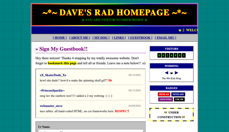
How do I recreate a 90s website / Web 1.0 aesthetic in modern CSS?
Demo #09 is a faithful 1996-era guestbook page with all six period-correct elements: a <strong>tiled background</strong> via <code>background-image</code> with a Geocities-style starfield, a <strong>hit counter</strong> using a CSS-only animated odometer with each digit in a flipping panel, <strong>marquee text</strong> (using the modern CSS <code>animation</code> equivalent of the deprecated <code><marquee></code> tag — no need for the legacy element), an <strong>animated GIF placeholder</strong> using a stepped CSS animation that cycles through frames, <strong>under construction blink</strong> via <code>animation: blink 1s step-end infinite</code>, and a <strong>webring footer</strong> with the iconic prev/random/next links + ring buttons. Typography is Comic Sans MS (this is the one place where it's actually correct). What makes this useful in 2026: nostalgia design is a strong genre for indie SaaS, retro-themed event sites, and developer portfolios. Most "90s website CSS" tutorials online stop at the tiled background; this demo ships the full kit.
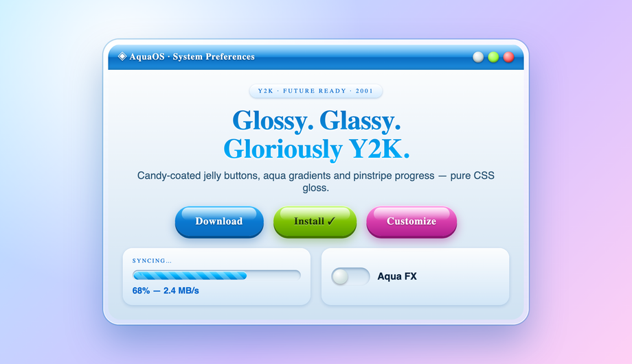
What's Y2K aesthetic in web design and how is it different from vaporwave?
Y2K (the late-90s through ~2003 aesthetic) and vaporwave are often confused but they're distinct. <strong>Y2K</strong> is the actual visual language of that era — chrome / aqua / liquid metal gradients (Apple's Aqua interface, WinXP Luna theme), bubble buttons with glossy highlights, transparent vinyl-style overlays, jellybean shapes, holographic / iridescent foils, and a palette of pearl whites, sky blues, baby pinks. <strong>Vaporwave</strong> is a 2010s INTERPRETATION of mid-90s nostalgia — different palette (hot pink + cyan), different references (Greco-Roman statues, dolphins, Windows 95 error dialogs as ironic memes), more digital-decay textures. Demo #10 ships the Y2K kit: aqua-gloss buttons with the iconic three-layer gradient (light to mid to dark with a top highlight stripe), bubble-shaped input fields, pearl-effect cards, chrome typography via background-clip text gradients, and a working checkbox-driven theme toggle. The Y2K aesthetic is having a real revival in 2023-2026 fashion + design; demo #10 captures the canonical patterns.
How do I build a draggable window / desktop portfolio in CSS + minimal JS?
Demo #12 is a fully draggable retro desktop portfolio — multiple windows the visitor can grab by the title bar and drag around the canvas, with z-index focus (clicking a window brings it to the front), a minimize/maximize/close trio per window, and a working taskbar. The <strong>visual chrome</strong> is 100% CSS — the title bar, window controls (red/yellow/green Mac dots OR Windows-style square X), inset/raised bevels, the desktop wallpaper. The <strong>drag + focus mechanics</strong> are ~60 lines of vanilla JS using <code>pointerdown</code> / <code>pointermove</code> / <code>pointerup</code> to track the drag delta and update <code>transform: translate</code> on the active window. Falls back gracefully without JS: windows render in CSS Grid as a static portfolio layout. Used by Rauno Freiberg, Henry Heffernan, and Bruno Simon as personal-site signatures — the draggable desktop is a strong portfolio differentiator that most "portfolio template" lists skip entirely.
Are these retro UI demos responsive and accessible?
Yes on both. Every demo has a sensible mobile breakpoint — the Win95 desktop (#01) reflows to a single window on narrow screens, the cassette deck (#05) keeps its proportions but shrinks, the desktop portfolio (#12) collapses to a stacked-window mobile view rather than trying to be draggable on touch. Every interactive surface is a real <code><button></code>, <code><a></code>, <code><input></code>, or <code><label></code>-wrapped checkbox — no clickable <code><div></code>s — so keyboard navigation and screen readers work. The CRT (#02), 8-bit HUD (#03), and vaporwave (#06) demos all respect <code>@media (prefers-reduced-motion: reduce)</code> and disable continuous animations for visitors with that OS preference. All 12 demos are MIT-licensed for both personal AND commercial projects; copy any demo's HTML + CSS from the code panel and drop it into your project.
Which retro demo should I use for my project?
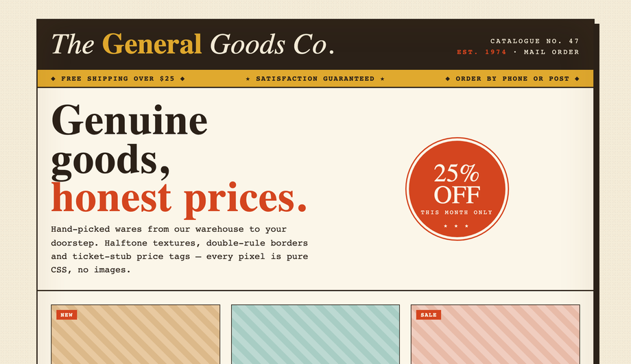
Quick decision guide. <strong>Indie SaaS landing page</strong>: Demo #04 (neo-brutalism) — the aesthetic signals "made by humans, not a template" and stands out in a sea of polished SaaS sites. <strong>Developer tool / CLI product</strong>: Demo #02 (CRT terminal) or Demo #08 (ASCII shell) for the cyberpunk dev-tool aesthetic; pairs especially well with terminal-first products. <strong>Game / Twitch overlay / Discord bot landing</strong>: Demo #03 (8-bit pixel) or Demo #07 (arcade cabinet) — both nail the gaming nostalgia. <strong>Personal portfolio</strong>: Demo #12 (draggable desktop) is the highest-effort, highest-reward — visitors play with your portfolio AS the portfolio. Or Demo #01 (Win95) for a slightly less interactive version of the same idea. <strong>Marketing / lifestyle brand</strong>: Demo #06 (vaporwave) or Demo #10 (Y2K) for nostalgia-driven branding. <strong>404 page / event site / fun side project</strong>: Demo #09 (90s guestbook) for the lo-fi maximalist Web 1.0 feel. Demo #11 (retro storefront) is the most production-ready of the kit — drop-in vintage catalogue aesthetic for fashion, vinyl, or any product that benefits from a curated retail vibe.