A CSS fade-in animation is the gentle reveal that signals "content has loaded" or "this section is now in view" — the most-used entrance pattern on the web. These 16 hand-coded designs cover the full modern fade-in playbook — staggered opacity hero, clip-path reveals, blur defocus, scroll-triggered IntersectionObserver, directional slide-fade, scale zoom, rotate tilt, word-by-word split, radial mask, greyscale-to-color, glitch flash and more. Every demo uses scoped .fi-NN class names that never collide with your existing styles, honours prefers-reduced-motion, and ships under the MIT license.
16 unique fade in animations13 Pure CSS3 CSS + JS100% copy-paste readyPublished
01 / 16
Pure Opacity Hero Fade
Pure CSS
A layered hero section where eyebrow, heading, paragraph, CTA buttons, and indicator dots each fade in sequentially using staggered animation-delay on a single opacity keyframe.
A cyberpunk status panel that sweeps into view from left using clip-path: inset(0 100% 0 0 round 16px) animated to inset(0 0% 0 0), revealing content like a shutter opening.
A feature card that emerges from a dreamlike haze using filter: blur(20px) combined with opacity: 0, animating to sharp focus — the cinematographic rack-focus in pure CSS.
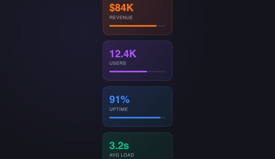
A dashboard metrics grid where six stat cards stagger into view with nth-child animation-delay offsets, each sliding up from translateY(16px) to its resting position.
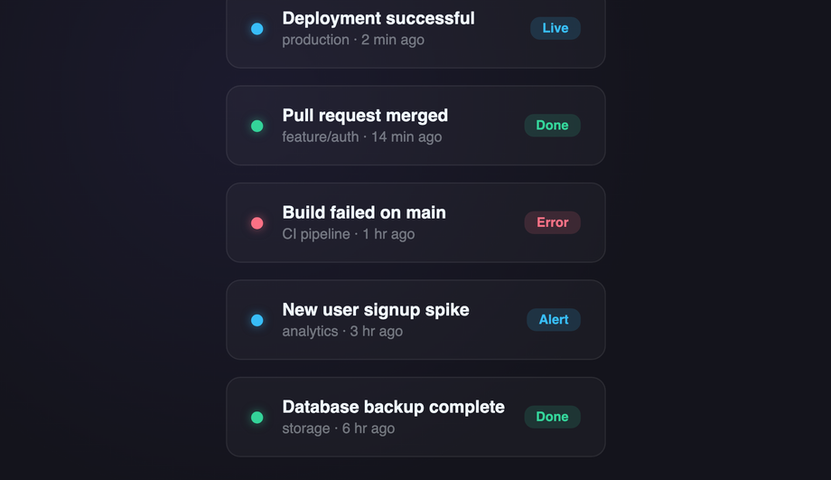
An activity feed list where items observe viewport entry via IntersectionObserver and acquire a .fi-05--visible class, triggering CSS transitions to slide and fade in staggered.
A two-column feature section where the text block slides up from below while card items follow with sequential translateY(30px → 0) + opacity delays for a rising-content effect.
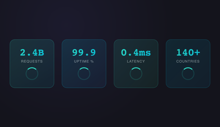
Four metric stat cards pop into view from scale(0.5) using a spring cubic-bezier(.34,1.56,.64,1) overshoot curve — a satisfying organic scale-up growth entrance.
A premium hero that fades in from scale(1.4), shrinking to normal — a dramatic 'punch out' cinematic entrance where content arrives oversized then settles into place.
Three feature tiles tumble forward into position via perspective(800px) rotateX(60deg → 0) with staggered delays, creating a card-dealing 3D tilt-down entrance.
A headline is split word-by-word into spans via JavaScript, each assigned an animation-delay, creating a sequential typewriter-style word cascade with translateY spring bounce.
A feature panel expands outward from the centre using clip-path: circle(0% → 100%) — a portal-opening radial mask reveal radiating from a single focal point.
Three profile cards transition from filter: saturate(0) brightness(0.7) to full color, creating a greyscale-to-vivid reveal with cascading animation delays.
Three feature cards flip into view from the side via perspective(800px) rotateY(90deg → 0), fanning in sequence like a hand of cards being dealt face-up.
A terminal-style display where the headline stutters into existence through a multi-step opacity flicker keyframe with micro translateX jitter, simulating a signal locking on.
JavaScript splits a headline character-by-character into spans with staggered animation-delay; each letter drops in from above with a spring bounce, creating a raindrop cascade.
What is a CSS fade-in animation and what's the simplest recipe?
A CSS fade-in animation transitions an element from invisible to visible — most commonly via opacity (<code>opacity: 0 → 1</code>), often combined with translateY for a slide-in feel. The canonical pure-CSS recipe (Demo #01) is four lines: <code>@keyframes fade { from { opacity: 0 } to { opacity: 1 } }</code> defines the visibility transition, then <code>.element { opacity: 0; animation: fade 0.8s cubic-bezier(.16, 1, .3, 1) forwards; }</code> applies it. <strong>Critical detail</strong>: <code>animation-fill-mode: forwards</code> locks the final state — without it, the element snaps back to <code>opacity: 0</code> when the animation ends. The opening <code>opacity: 0</code> on the element prevents a flash-of-visible-content before JavaScript or CSS loads. <code>cubic-bezier(.16, 1, .3, 1)</code> is the modern fast-out / slow-arrive ease that feels snappy without overshoot. For staggered groups (hero + heading + paragraph + CTA), apply the same animation to each child with incremental <code>animation-delay</code> values (0.1s, 0.35s, 0.55s, 0.75s, 0.95s) to create a sequential cascade. Demo #01 ships the canonical 5-element hero pattern.
Which fade-in pattern should I pick for my use case?
Decision rule by intent. <strong>Hero / above-the-fold</strong>: Demo #01 (Pure Opacity Hero Fade) for the canonical staggered entrance, Demo #03 (Blur Defocus) for premium SaaS arrival feel, Demo #09 (rotateX Perspective Tilt) for tech / fintech brands. <strong>Scroll-revealed sections (long pages, marketing, case studies)</strong>: Demo #05 (Scroll-Triggered Observer Fade) — the canonical IntersectionObserver pattern that fires each section's fade-in as it enters the viewport. <strong>Card grids (e-commerce, portfolio, blog index)</strong>: Demo #04 (Staggered Grid Card Fade) — staggered <code>animation-delay</code> across grid items produces a cascading reveal. <strong>Text reveals (headlines, quotes, callouts)</strong>: Demo #10 (Word-by-Word Split), Demo #16 (Cascade Letter Drop). <strong>Editorial / brand</strong>: Demo #12 (Radial Clip-Path Mask Reveal) for cinematic aperture-style entrances, Demo #13 (Greyscale to Color Saturate) for photo-led storytelling. <strong>Directional reveals</strong>: Demo #06 (Slide-Fade Up) — the most-used modern entrance, the dominant pattern in Vercel / Linear / Stripe marketing. <strong>Playful / interactive</strong>: Demo #15 (Glitch Flash Multi-Step) for gaming / Web3, Demo #14 (rotateY Flip Card) for portfolio cards. <strong>Whatever you pick</strong>: all 16 demos use scoped <code>.fi-NN</code> class names so you can drop multiple onto the same page without conflicts.
How do I make a fade-in trigger when the user scrolls to it?
Two production-grade options. <strong>1. IntersectionObserver (canonical, supported everywhere)</strong>: Demo #05 ships the full recipe — observe each element with <code>{ threshold: 0.15 }</code>, on <code>isIntersecting</code> add a <code>.is-visible</code> class that triggers the CSS animation. ~20 lines of vanilla JS, no framework, no library. The IntersectionObserver is GPU-friendly and doesn't run on every scroll frame like a manual <code>window.scroll</code> listener would (a major Core Web Vitals win — manual scroll listeners cause INP regressions). <strong>2. Scroll-driven animations (CSS-only, modern)</strong>: Chrome 115+, Edge 115+, Opera 101+, partial Safari 26+ and Firefox 134+ support <code>animation-timeline: view(block)</code> which lets you drive a fade-in entirely from CSS based on the element's position in the viewport — zero JavaScript. Demo #05's CSS includes a commented-out scroll-driven-animations version next to the IntersectionObserver implementation; uncomment if your target browsers support it. <strong>Don't</strong> use libraries like AOS (Animate On Scroll, ~15KB) or wow.js (~6KB) for this — both add bundle weight and external dependencies for what's now a 20-line vanilla pattern or zero-line CSS feature.
Why does my CSS fade-in flash visible before the animation plays?
Two causes. <strong>1. The element renders before the CSS loads (FOUC — flash of unstyled content)</strong>: the browser paints the HTML with default browser styles (which include <code>opacity: 1</code>) before the stylesheet downloads + parses, so the element flashes visible then disappears when CSS applies <code>opacity: 0</code>. Fix: load your animation CSS in <code><head></code> as a critical <code><link rel='stylesheet'></code>, NOT lazy-loaded or async. For inline-on-render frameworks (Astro, Next.js with server components), the CSS is bundled with the HTML so this isn't usually an issue. <strong>2. Missing <code>animation-fill-mode</code></strong>: without <code>forwards</code> the animation runs and then the element snaps back to its INITIAL CSS state — if the element didn't have <code>opacity: 0</code> in its base CSS, it'll show fully visible after the animation ends. Fix: BOTH set <code>opacity: 0</code> in the base rule AND set <code>animation-fill-mode: forwards</code> on the animation. The base <code>opacity: 0</code> prevents pre-animation flash; <code>forwards</code> locks the final state. <strong>3. Browser back-button restoration</strong>: when a user navigates away and back via the browser back button, some browsers replay the page from a cached state where animations have already run; the element may flash if <code>opacity</code> is animation-driven. Fix: use <code>page show</code> event handlers to re-trigger animations on bfcache restore, OR use <code>transition</code> instead of <code>animation</code> for state-driven fades (transitions don't replay).
Is the CSS fade-in accessible? What about prefers-reduced-motion?
Yes, when implemented carefully. ~35% of adults have some level of motion sensitivity — vestibular disorders, migraine triggers, ADHD-related visual processing, or just personal preference. WCAG 2.2 SC 2.3.3 (Animation from Interactions) recommends honouring <code>prefers-reduced-motion: reduce</code>. <strong>The recipe</strong>: wrap every <code>@keyframes</code> rule in <code>@media (prefers-reduced-motion: no-preference)</code> so the animation ONLY runs when the user hasn't opted out — OR (simpler) wrap the animation declaration in <code>@media (prefers-reduced-motion: reduce) { .element { animation: none; opacity: 1; } }</code> so users with reduced-motion see the final state instantly. Every demo in this collection ships the reduced-motion guard automatically. <strong>Additional a11y concerns</strong>: (1) Don't fade-in content that's required for understanding — long fade durations on body text frustrate screen-reader users who hear an empty page. (2) Don't fade-in error messages, validation, or interactive controls — these need instant visibility. (3) Fade-in content should still be in the DOM at <code>opacity: 0</code> (not <code>display: none</code> or <code>visibility: hidden</code>) so screen readers can pre-announce it. (4) Reserve final layout space to prevent CLS. Regulatory frameworks requiring WCAG 2.2 AA: <strong>EU EAA</strong> (June 2025), <strong>US Section 508</strong>, <strong>Canada ACA</strong>, <strong>UK Equality Act</strong>.
How does this compare to animate.css, Framer Motion, GSAP, or anime.js fade-in?
<strong>animate.css</strong> (~70KB minified, ~700K weekly downloads): the most-installed CSS animation library — drop the stylesheet, add <code>animate__animated animate__fadeIn</code> classes. Wide variety of presets but you ship 70KB even if you only use 1 fade-in. <strong>Framer Motion</strong> (~80KB gzipped): React-first animation library with declarative <code>initial / animate / exit</code> props. Powerful for scroll-driven and gesture animations but adds significant bundle weight. <strong>GSAP</strong> (~50KB core, +30KB ScrollTrigger): the industry-standard JS animation library, beats CSS for complex timelines and morphing but overkill for simple fades. <strong>anime.js</strong> (~17KB minified): leaner GSAP alternative, similar API. <strong>This collection vs all of the above</strong>: the same fade-in effects in 4-30 lines of CSS per demo that ship inline with your HTML — zero bundle cost, zero npm dependency, zero CVE surface, faster First Contentful Paint and Largest Contentful Paint, no library hydration delay. For 95% of fade-in use cases (entrances, scroll reveals, staggered cards), the CSS approach wins on every Core Web Vitals dimension. Reserve <strong>GSAP / Framer Motion</strong> for complex scrubbed timelines and morph transitions; reserve <strong>animate.css</strong> for prototyping speed. Production marketing pages should ship the CSS recipes from this collection.
Tailwind / shadcn / MUI / Chakra fade-in — how do these compare?
<strong>Tailwind v3 / v4</strong>: ships <code>animate-fade-in</code> only via plugins (tailwindcss-animate which shadcn uses) — by default Tailwind has <code>animate-pulse</code>, <code>animate-spin</code>, <code>animate-bounce</code>, and <code>animate-ping</code> but NOT a baseline fade-in. To add: register a custom <code>fadeIn</code> keyframe + utility in <code>tailwind.config.js</code> (or extend via <code>theme.extend.keyframes</code> + <code>theme.extend.animation</code>), OR use the arbitrary-value syntax <code>animate-[fadeIn_1s_ease-out_forwards]</code>. Our <a href="/tools/css-to-tailwind-converter/">CSS to Tailwind converter</a> handles the conversion automatically. <strong>shadcn/ui</strong>: ships tailwindcss-animate plugin out of the box (enables <code>animate-in fade-in slide-in-from-bottom-4</code> etc) — used by Radix UI components, can be applied to any element. <strong>Material UI / MUI</strong>: ships the <code><Fade in={true} timeout={500}></code> component (uses MUI's <code>transitions</code> package, ~10KB), or via the <code>sx</code> prop's <code>transition</code> shortcut. <strong>Chakra UI</strong>: ships <code><Fade in={open}></code> as a first-class component, similar to MUI. <strong>Framer Motion</strong>: pair <code>initial={{ opacity: 0 }}</code> + <code>animate={{ opacity: 1 }}</code> + <code>transition={{ duration: 0.8 }}</code>. <strong>For static marketing pages</strong>, the CSS approach in this collection ships zero JavaScript for 13 of the 16 demos — for fade-in-driven hero pages and scroll-reveal sites, this is the lowest-overhead approach.
How do I prevent cumulative layout shift (CLS) from fade-in animations?
CLS is one of three Core Web Vitals — Google measures it on every Lighthouse audit and ranks pages with high CLS lower. Fade-in animations can cause CLS three ways: <strong>1. Layout-affecting initial state</strong>: setting <code>opacity: 0; transform: translateY(20px)</code> shifts the element's PAINTED position but transform doesn't affect layout, so layout shift isn't triggered (good). But setting <code>visibility: hidden</code> or <code>display: none</code> does affect layout — avoid these for fade-in initial states. Use <code>opacity: 0</code> + <code>transform</code> only. <strong>2. Image-driven fades without reserved dimensions</strong>: if your fading element contains an <code><img></code> that loads asynchronously, the image's intrinsic dimensions can shift layout AFTER the fade starts. Fix: set <code>width</code> + <code>height</code> attributes on the img OR use <code>aspect-ratio</code> on the container. <strong>3. Font-swap during fade</strong>: web fonts loading mid-fade can re-flow the text. Fix: <code>font-display: optional</code> or pair <code>font-display: swap</code> with <code>size-adjust</code> in <code>@font-face</code>. <strong>4. Late-loading content fading in below existing content</strong>: scroll-triggered fades on long pages can shift the viewport if the user scrolls past the element while it animates. Demo #05 uses IntersectionObserver with <code>{ threshold: 0.15 }</code> to fire the animation early enough that it completes before the user scrolls into the affected zone. Tools to audit: Chrome DevTools Performance Insights, Lighthouse, Core Web Vitals report in Google Search Console, WebPageTest.
Why does my fade-in look smooth in Chrome but jerky in Safari or Firefox?
Two common cross-browser traps. <strong>1. Compositor-only vs paint properties</strong>: <code>opacity</code> and <code>transform</code> are compositor-only — the GPU handles them without re-painting or re-laying-out the page. They're 60-120fps smooth on every browser. <code>filter: blur()</code>, <code>backdrop-filter: blur()</code>, <code>clip-path</code>, <code>width</code>, <code>height</code>, <code>margin</code>, <code>padding</code>, <code>top/left</code>, and <code>box-shadow</code> are NOT compositor-only — they trigger paint or layout on every frame, which can stutter on lower-powered devices and especially Safari with its more conservative compositing. <strong>Fix</strong>: prefer <code>opacity</code> + <code>transform: translate3d(0, 20px, 0)</code> over <code>top: 20px → 0</code>; prefer <code>transform: scale(0.95)</code> over <code>width / height</code> changes. <strong>2. <code>will-change: transform, opacity</code></strong>: hints the browser to pre-promote the layer onto the GPU before the animation starts. Use ONLY on elements about to animate; overusing it (every element) eats GPU memory. Remove the <code>will-change</code> declaration when the animation completes (or just before — using <code>animationend</code> event). <strong>3. Safari's animation-fill-mode quirk</strong>: in Safari < 17, combining <code>animation-fill-mode: forwards</code> with very short durations (<200ms) can drop the final keyframe. Fix: use <code>animation-fill-mode: both</code> instead — covers both <code>0%</code> and <code>100%</code> keyframes outside the animation range. Demos in this collection use <code>both</code> by default.
Are these fade-in animations free, accessible, and how do I attribute them?
Yes — all 16 designs are <strong>MIT licensed</strong> and free for personal and commercial use, including client projects, SaaS products, design systems, and open-source libraries. The MIT license requires only that you keep the copyright notice if you redistribute the source code as-is; in shipped production HTML / CSS that you've adapted, no visible attribution is needed. If you ship one as part of an open-source UI library, a one-line credit pointing to https://codefronts.com is appreciated but not legally required. <strong>Accessibility</strong>: every demo honours <code>prefers-reduced-motion: reduce</code> (animations fall back to instantly-visible final state), uses semantic HTML, and is designed to work with screen readers (elements remain in the DOM at <code>opacity: 0</code>, not <code>display: none</code>). Verify your specific use case with <strong>axe DevTools</strong>, <strong>Lighthouse</strong>, <strong>WAVE</strong>, or the <strong>WebAIM</strong> tools before shipping to EU EAA / US Section 508 / Canada ACA / UK Equality Act audits — the demos are AA-compliant by default but layout context matters.