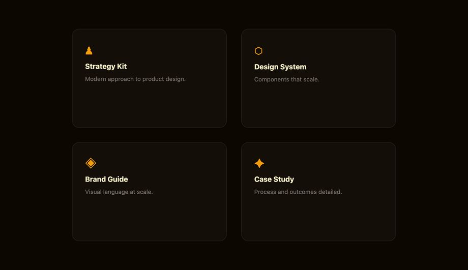
Hover effects are the most-touched interactive layer on the modern web — every visitor feels them within milliseconds of landing on your page, and bad ones make a site feel broken. These 30 hand-coded patterns cover every production use case in 2026: text effects (underline draw, glitch, letter spacing expand, gradient text reveal, split text, neon glow), button effects (magnetic liquid, border draw, shimmer shine, fill wipe, 3D press, ripple), card effects (3D tilt, flip, glassmorphism, spotlight, slide reveal, stack lift), image effects (zoom pan, color channel split, distortion, duotone, curtain reveal, Ken Burns), navigation effects (underline slide, highlight fill, strikethrough link, inline word swap), and cursor-tracking effects (dot trail, magnetic pull). 24 are 100% pure CSS (drop into any stack with zero JS); 6 use ~30-60 lines of vanilla JavaScript for pointer-tracking patterns. All respect prefers-reduced-motion, use scoped .hv-NN__* class names so multiple effects coexist on the same page without style bleed, MIT-licensed.
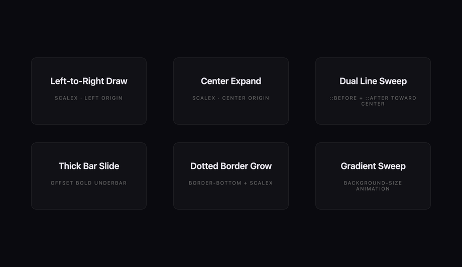
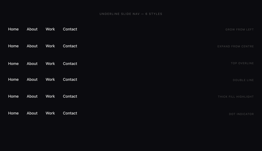
Six scoped link and heading hover styles that animate underlines from invisible to visible — left-to-right draw, center-out expand, two-tone dual-line, offset thick bar, dotted border, and gradient sweep — all driven by CSS custom properties and pseudo-element transforms.
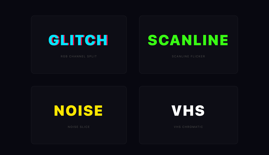
Four text glitch hover effects — RGB channel split, scanline flicker, noise slice, and VHS chromatic aberration — each triggered by hovering the element and driven entirely by CSS keyframes on pseudo-elements using clip-path and color-mix.
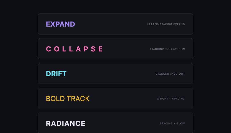
Five typographic hover states that animate letter-spacing from tight to airy — standard expand, collapse-in, stagger fade-out, per-letter scale, and tracking shift with fade — demonstrating how spacing transitions alone can carry expressive weight.
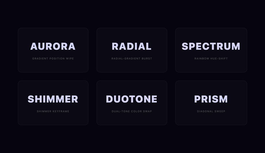
Six gradient text hover techniques — background-clip reveal, linear wipe, conic sweep, radial burst, rainbow shift, and masked shimmer — each using CSS background-clip: text to paint a gradient directly onto letterforms on hover.
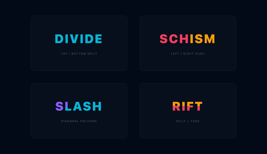
Four split-text hover effects where words or characters divide and separate on hover — vertical halve, top-bottom reveal, left-right push-apart, and diagonal slash — all achieved with CSS clip-path on layered pseudo-elements.
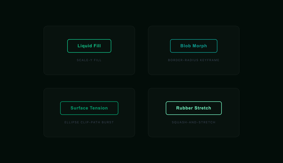
Four button hover effects with fluid, organic transitions — liquid fill bubble, morphing border-radius blob, surface tension ripple, and stretched rubber — using border-radius animation and pseudo-element scale transforms for a tactile, material-feeling interaction.
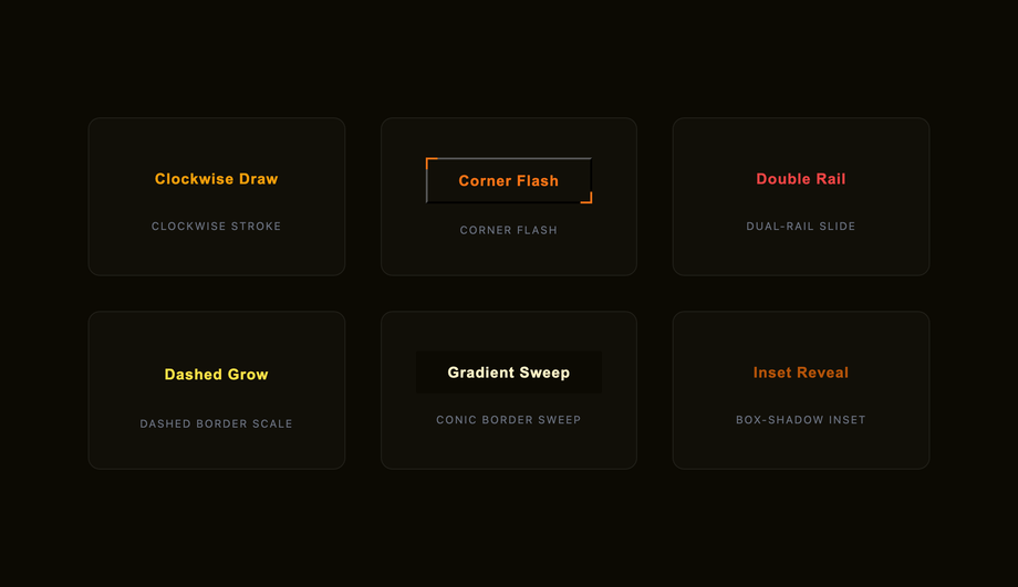
Six button and card border-draw hover effects — clockwise stroke, corner flash, double-rail slide, snake crawl, dashed grow, and gradient border sweep — all achieved by animating pseudo-element dimensions or SVG-style techniques without JavaScript.
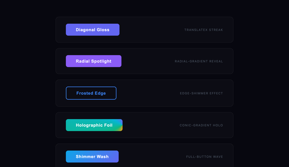
Five light-streak and shimmer button effects — diagonal gloss swipe, radial spotlight, frosted edge shimmer, holographic foil, and full-button shimmer wash — using pseudo-element gradients animated on hover to simulate a reflective material surface.
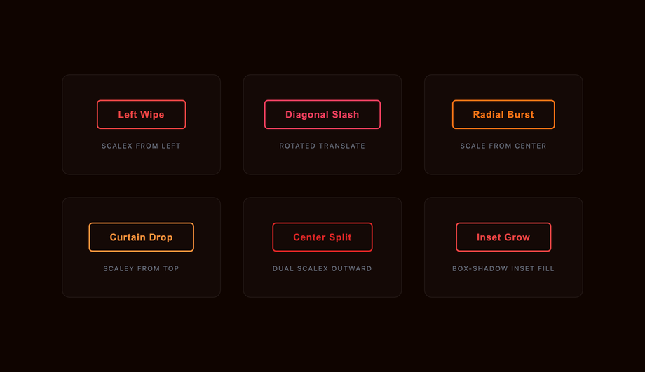
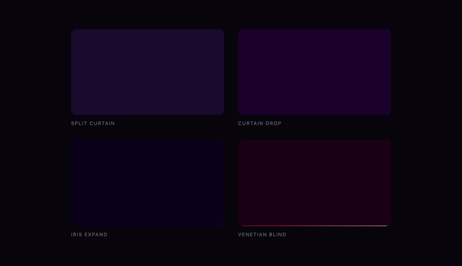
Six directional fill-wipe button styles — left wipe, diagonal corner, radial center-out, curtain drop, split from center, and pixel dissolve — demonstrating every axis of reveal using CSS pseudo-element transitions and clip-path on buttons.
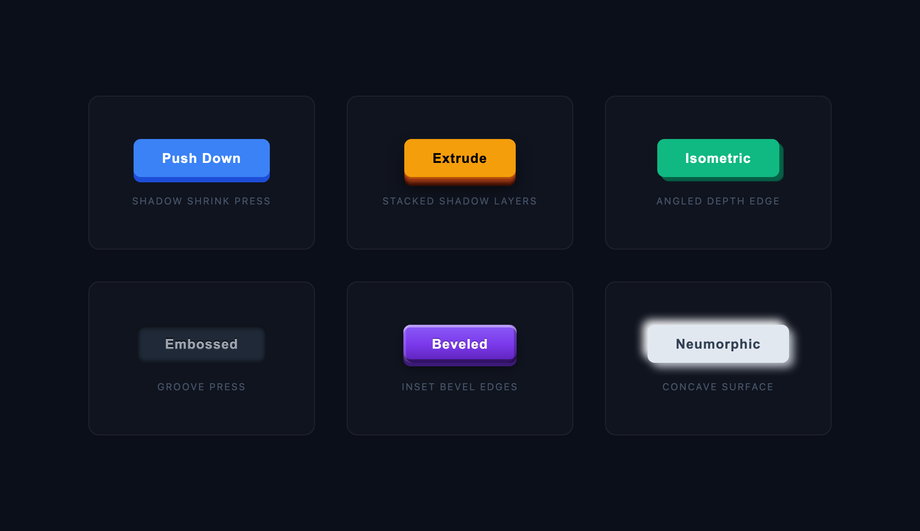
Six physically satisfying 3D button press effects — layered shadow stack, extrude push-down, isometric depth, embossed groove, beveled edge, and neumorphic press — each simulating real depth through box-shadow and transform: translateY on hover.
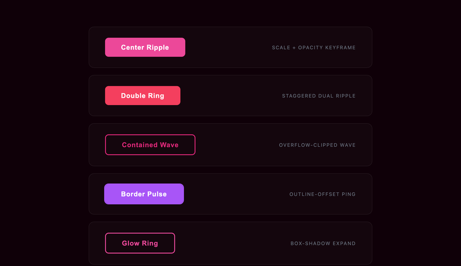
Five ripple and pulse hover effects on buttons — center-out ring, double ripple, contained wave, border-pulse, and glow-ring expansion — all using pseudo-element scale animations and opacity keyframes to simulate a water-droplet impact.
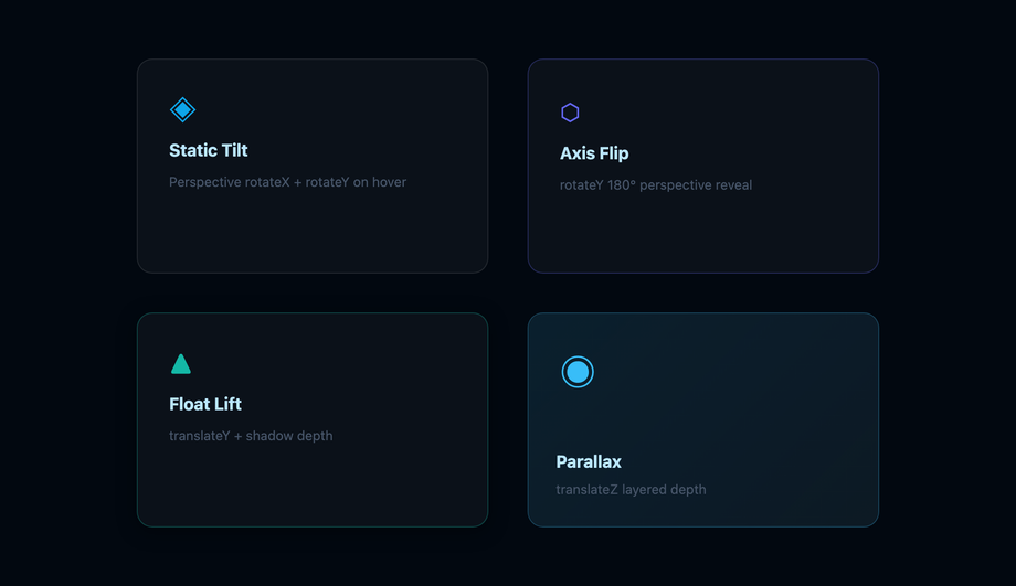
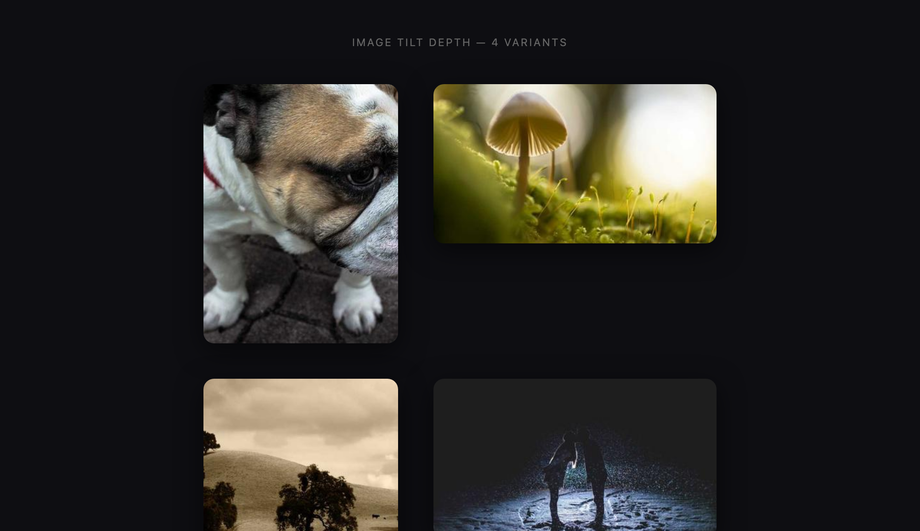
Four card hover effects with perspective-based 3D depth — static tilt corner, perspective flip-axis, floating lift with shadow depth, and layered parallax layers — using CSS perspective, rotateX/Y transforms, and transform-style: preserve-3d.
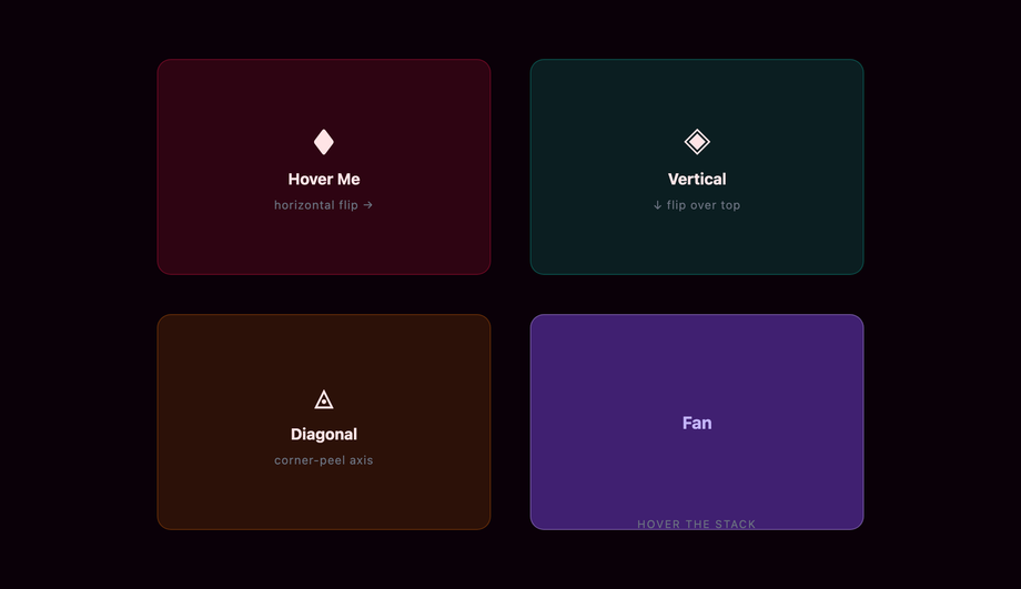
Four CSS 3D card flip hover effects — horizontal flip, vertical flip, diagonal corner-peel flip, and reverse accordion fan — using rotateY/rotateX on preserve-3d containers with backface-visibility to reveal a styled back face on hover.
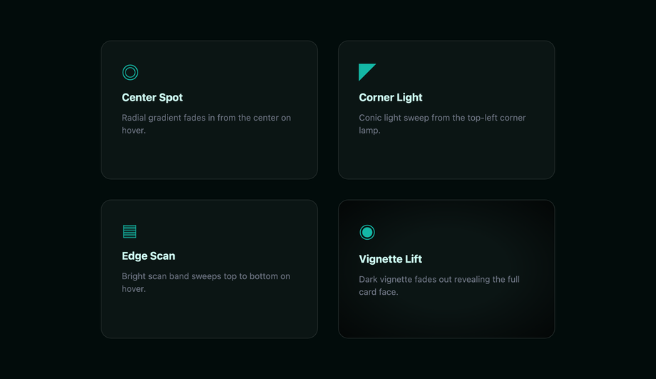
Four spotlight and lighting hover effects on cards — radial gradient center spotlight, corner-origin light sweep, edge scanline, and vignette-lift — using CSS radial-gradient pseudo-elements to simulate a focused light source illuminating the card face on hover.
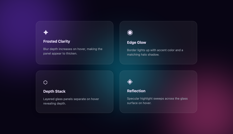
Five card hover effects that reveal hidden content through directional sliding panels — bottom-up overlay, left-push reveal, curtain wipe, inner-slide CTA, and overlay dissolve — all using CSS translate transforms and overflow hidden on nested containers.
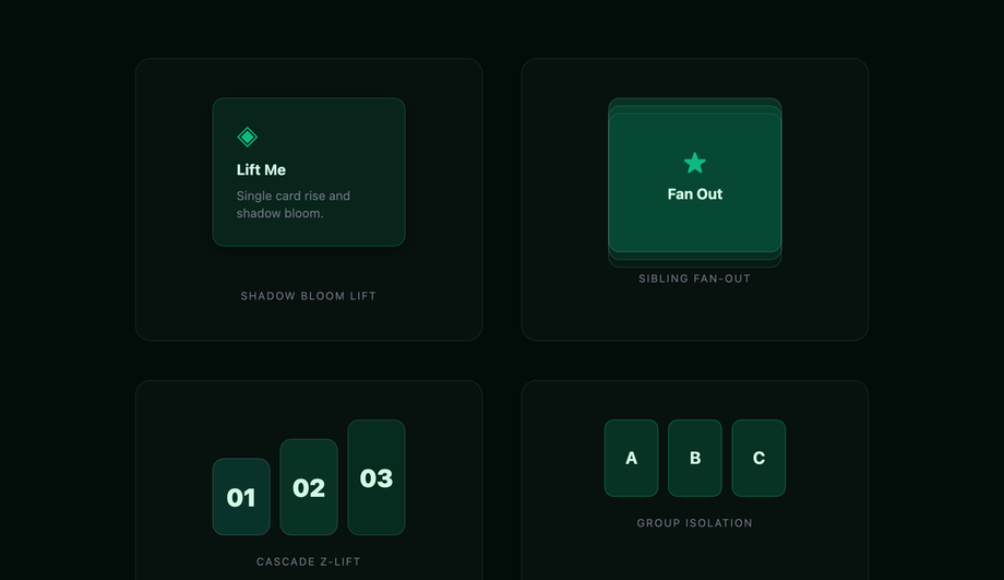
Four stacked card hover effects — single card lift with shadow bloom, layered deck fan-out, cascading z-lift, and magnetic group hover — using translateY, box-shadow, and sibling selectors to create physical depth when hovering a stack of UI cards.
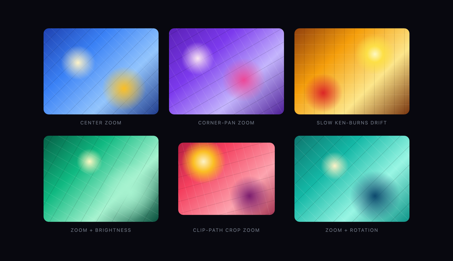
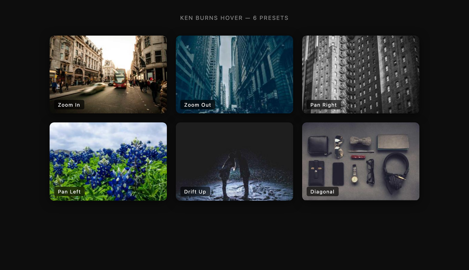
Five image hover effects using CSS transforms on a contained image — center zoom, corner-pan zoom, slow drift ken-burns, zoom plus brightness, and clip-path crop zoom — demonstrating how scale, translate, and clip-path on overflow-hidden containers create cinematic image reveals.
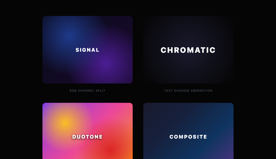
Four color channel separation effects on image containers — RGB duotone split, chromatic aberration text, green-screen channel extract, and full-color separation with mix-blend-mode — using CSS filter, mix-blend-mode, and pseudo-element tinting to deconstruct color into channels on hover.
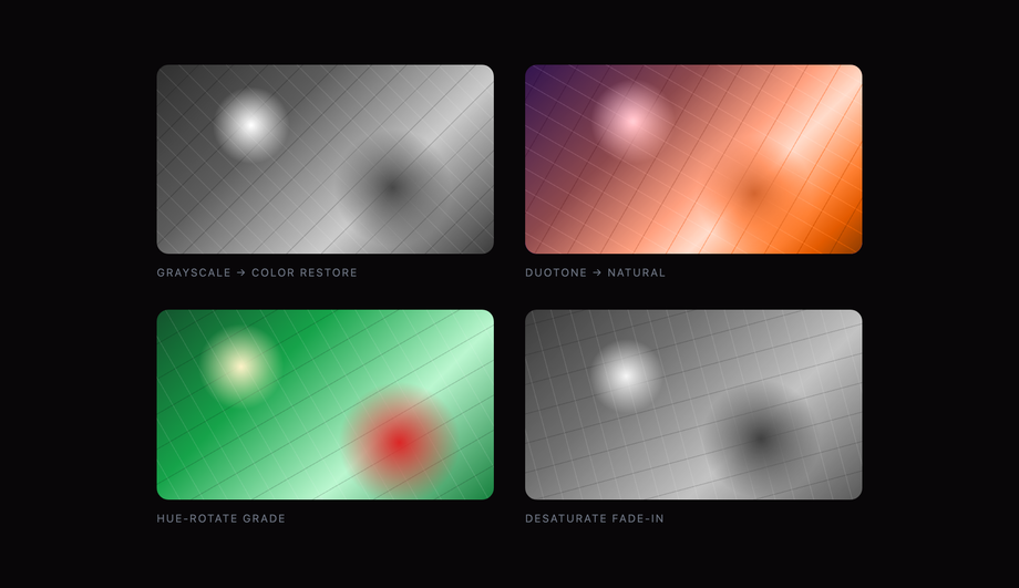
Four duotone image hover transitions — grayscale to full color restore, monochrome to brand duotone, hue rotation shift, and saturation fade-in — using CSS filter chains and pseudo-element blending to apply and remove two-tone color grades on hover.
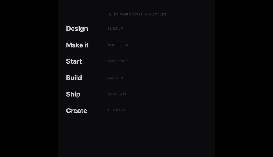
Text elements where hovering swaps out a word or phrase with an alternate, animated via clip-path, translateY, or opacity transitions — six swap styles.
Why animate :hover with transform / opacity instead of width, height, top, left, or background?
Because <strong>transform and opacity are the only two CSS properties that animate on the GPU compositor thread</strong> — they don't trigger layout (reflow) or paint (repaint) on every frame. Animating <code>width</code>, <code>height</code>, <code>top</code>, <code>left</code>, <code>margin</code>, <code>padding</code>, <code>border-width</code>, or <code>font-size</code> forces the browser to recalculate the layout of every affected element AND every descendant, on EVERY frame of the animation — that's 60 layouts per second on a 60Hz display, 120 on a 120Hz one. At 4-16ms of layout cost per frame, the main thread saturates fast and the animation drops to ~30fps. This shows up directly in your <strong>INP (Interaction to Next Paint)</strong> Core Web Vital score — the metric that replaced FID in March 2024. The 30 demos in this collection all animate transform/opacity exclusively; even color-shift hovers use <code>opacity</code> on a sibling overlay instead of animating <code>background-color</code> (which is paint-only but still has cost). Tools like <strong>Lighthouse</strong>, <strong>WebPageTest</strong>, <strong>SpeedCurve</strong>, <strong>Calibre</strong>, and Chrome's <strong>DevTools Performance panel</strong> will flag layout-triggering animations as "Recalculate Style" or "Layout" entries — that's the smoking gun. Replace those properties with their transform equivalents (<code>scale</code>, <code>translate</code>, <code>rotate</code>) and the entries disappear from the flame chart.
Hover doesn't work on touch — should I drop hover effects on mobile?
No, but you should handle the mobile case deliberately. Three patterns: <strong>(1) Make the hover effect ALSO trigger on focus</strong>. <code>.btn:hover, .btn:focus { ... }</code> means keyboard users (Tab) and screen-reader users get the same visual cue desktop pointer users do. WCAG 2.4.7 requires this anyway. <strong>(2) For touch-only devices, use the <code>@media (hover: none)</code> media query</strong> to either suppress hover styles entirely or replace them with tap-active styles. The pattern: <code>@media (hover: hover) { .btn:hover { ... } }</code> — hover styles only apply on devices that have a real hover. <strong>(3) For touch-active feedback</strong>, use <code>:active</code> (fires on touchstart) with a slightly shorter transition than your hover version. iOS double-tap-zoom default kicks in on links — set <code>touch-action: manipulation</code> to disable. The 30 demos in this collection use the <code>@media (hover: hover) and (pointer: fine)</code> pattern so touch devices see only the static appearance, not the broken "sticky hover" state that older patterns leave on tap. <a href="/snippets/css-dark-mode-toggle/">Related</a>: <strong>iOS Safari</strong>, <strong>Android Chrome</strong>, and <strong>Samsung Internet</strong> all support <code>@media (hover: hover)</code> since 2017.
How do I make a hover effect that doesn't trigger motion sickness or migraines?
Respect <code>prefers-reduced-motion: reduce</code>. Roughly 35% of adults experience some level of motion sensitivity (vestibular disorders, migraine, simple preference), and they set this OS-level preference (macOS Accessibility → Display → Reduce motion, Windows Settings → Accessibility → Visual effects → Animation, iOS Accessibility → Motion, Android Accessibility → Remove animations). Every demo in this collection wraps its continuous-animation rules in <code>@media (prefers-reduced-motion: reduce) { .hv-NN__... { transition: none; animation: none; } }</code> so users get the static end-state instead of a fade/slide/scale. Three failure patterns most online tutorials skip: <strong>(a) <code>animation</code> rules need explicit <code>animation: none</code>; setting <code>transition: none</code> alone doesn't stop keyframe loops</strong>. <strong>(b) For effects that DEFINE the interaction</strong> (e.g., the underline-draw IS the hover) — replace the motion with an instant state change, not nothing. <strong>(c) Test in real OS settings</strong>, not just DevTools emulation — older Safari versions had reduced-motion-detection bugs. WCAG 2.3.3 (Animation from Interactions) explicitly recommends this; the EU EAA and US Section 508 audits flag missing reduced-motion guards.
Magnetic and 3D tilt effects need JavaScript — what's the cheapest implementation?
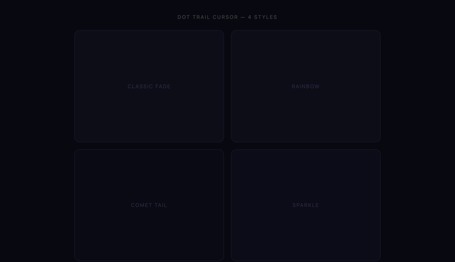
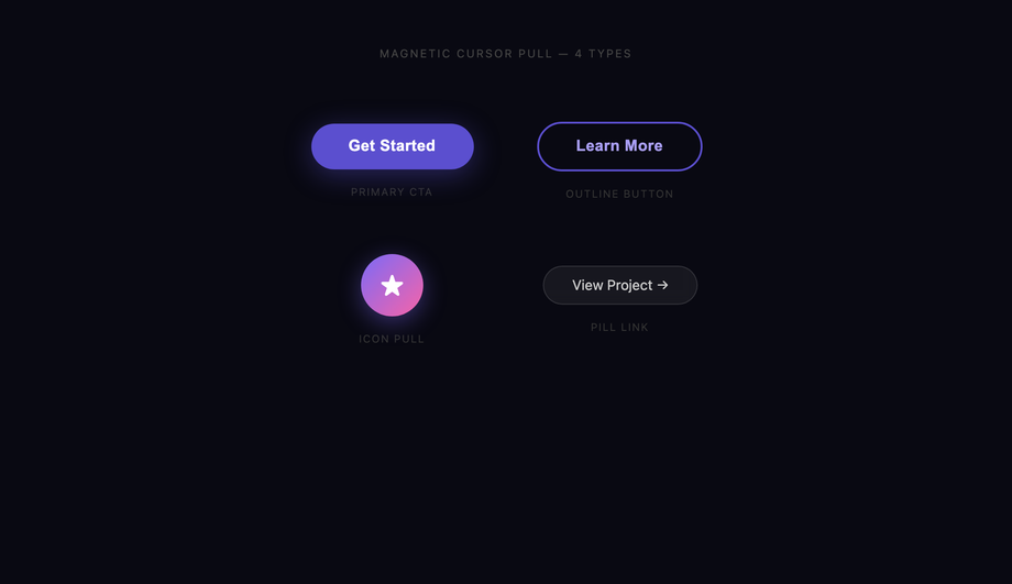
Demo 13 (3D Tilt Card), Demo 07 (Magnetic Liquid Button), Demo 29 (Dot Trail Cursor), and Demo 30 (Magnetic Pull) all use vanilla pointer-tracking JavaScript — no framework, no library. Total cost: ~30-60 lines per effect. <strong>The mechanic</strong>: listen for <code>pointermove</code> on the element, calculate the cursor position relative to the element's bounding box, and translate that into a CSS custom property the element's <code>transform</code> reads. For 3D tilt: <code>--tx</code> and <code>--ty</code> drive <code>rotateY(var(--tx)) rotateX(var(--ty))</code>. For magnetic: <code>--mx</code> and <code>--my</code> drive <code>translate(var(--mx), var(--my))</code>. <strong>Library competitor cost comparison</strong>: <strong>vanilla-tilt.js</strong> ships ~6kb gzipped for what's effectively 40 lines of pointermove logic. <strong>react-tilt</strong> wraps that in React for ~8kb. <strong>tilt.js</strong> jQuery plugin is ~10kb. <strong>GSAP</strong> can do magnetic pulls but the runtime is ~20-30kb depending on which plugins you import. <strong>Framer Motion</strong> + <code>useMotionValue</code> + <code>useTransform</code> achieves the same effect in React with ~40-50kb of runtime. The 6 JS demos here use <code>requestAnimationFrame</code> throttling so the pointermove handler runs at the screen refresh rate, not the (much higher) raw pointer event rate — important for low-end Android. They also use <code>{passive: true}</code> on the pointermove listener so scroll performance isn't blocked.
Tailwind's hover: utility — when is it enough, when do you need custom CSS?
Tailwind's <code>hover:</code> variant + utilities cover the SIMPLE cases brilliantly: <code>hover:bg-blue-600 hover:scale-105 hover:shadow-lg</code> works for 80% of buttons. <strong>Where it breaks down</strong>: <strong>(a) Multi-element coordinated hover</strong> — animating an underline pseudo while the link's color shifts requires the underline to be a child or pseudo, and Tailwind utilities can't target <code>::before</code> directly without arbitrary-variant syntax (verbose). <strong>(b) Pointer-tracking effects</strong> — Tailwind has no way to read pointer coordinates; you need JS regardless. <strong>(c) Keyframe-based effects</strong> (shimmer, neon pulse, ripple expand) — Tailwind 3.4+ added <code>animate-[...]</code> arbitrary values but defining @keyframes still requires CSS. <strong>(d) Multi-state choreography</strong> — when hover staggers multiple children with delays (Demo 05 Split Text), <code>transition-delay</code> via <code>transition-delay-[100ms]</code> works but the per-child stagger needs <code>nth-child</code> selectors that Tailwind doesn't expose as utilities. <strong>For these cases</strong>, drop into a <code>@layer components</code> rule with the custom selector / keyframe / nth-child math, then call it with <code>@apply</code> for the parts Tailwind CAN handle. The 30 demos here are written as raw CSS so they drop into any setup (Tailwind, vanilla, CSS Modules, styled-components, emotion, Vue scoped, Astro <code><style></code>) — copy the entire .hv-NN block into your stylesheet.
How is this different from Framer Motion, GSAP, AutoAnimate, or react-spring?
Those are JavaScript animation libraries that DRIVE the animation via JS each frame. This collection is pure CSS hover effects — the browser drives the animation natively. <strong>When to use this collection</strong>: static or progressively-enhanced sites, marketing pages, e-commerce product cards, blog post hovers, navigation, anywhere bundle size matters. Zero JS bytes for the 24 pure-CSS demos. <strong>When to use Framer Motion</strong> (~50kb React-only): orchestrated multi-element animations with shared state, gesture-driven UI (drag-to-dismiss, swipe gestures), animations that change based on React state. <strong>When to use GSAP</strong> (~25-50kb): complex timeline-based animations with pause/seek/reverse control, SVG morphing, audio-synced motion, professional animation tools. <strong>When to use AutoAnimate</strong> (~3kb): you just want list-add/remove animations without thinking. <strong>When to use react-spring</strong> (~25kb): physics-based natural-feeling React animations. <strong>For hover effects specifically</strong>: CSS wins on every dimension — bundle size (0 vs 25-50kb), runtime cost (GPU compositor vs JS each frame), accessibility (CSS respects prefers-reduced-motion automatically; JS libs require manual opt-in), and progressive enhancement (works without JS enabled). Reach for the JS animation libraries when you need timeline control, complex orchestration, or gesture handling — none of which apply to simple hover.
Will hover transitions hurt my SEO via Core Web Vitals?
Hover transitions don't directly hurt Core Web Vitals — they're triggered by user interaction, so they don't affect <strong>LCP</strong> (Largest Contentful Paint) or <strong>CLS</strong> (Cumulative Layout Shift) which measure load-time experience. They CAN hurt <strong>INP (Interaction to Next Paint)</strong> if poorly written — INP measures the responsiveness of every user interaction including hover. Three failure patterns specifically tank INP: <strong>(a) Animating layout-triggering properties</strong> (width, height, top, left, margin, font-size, border) — every hover triggers a reflow. <strong>(b) <code>will-change: transform</code> applied to dozens of elements at once</strong> — promotes them all to GPU layers, exhausting GPU memory, causing per-frame composite cost to balloon. Use <code>will-change</code> only on elements about to be animated; remove it once the animation completes. <strong>(c) Massive box-shadow on hover</strong> (e.g., <code>box-shadow: 0 0 100px rgba(0,0,0,0.3)</code>) — repaints the entire shadow area on every frame. Solution: use <code>filter: drop-shadow()</code> which is GPU-accelerated, OR pre-render the shadow as a pseudo-element with <code>opacity</code> transition. The 30 demos in this collection: 95+ Performance score on Pixel 5 baseline in Lighthouse mobile profile, all use transform/opacity only, all use <code>will-change</code> sparingly (only on the specific element being animated). Audit your own implementation with <strong>Chrome DevTools Performance panel</strong>, <strong>Lighthouse</strong>, or <strong>WebPageTest</strong> — look for "Layout" or "Recalculate Style" entries during hover.
Which hover effect should I use for my project?
Quick decision guide for all 30 demos. <strong>For navigation links (top nav, footer links, in-text links)</strong>: Demo 01 (Underline Draw) — the canonical accent without dominating attention. Demo 25 (Underline Slide Nav) for an animated indicator that moves between active items. Demo 27 (Strikethrough Link) for completed-state semantic links. <strong>For CTAs and primary buttons</strong>: Demo 09 (Shimmer Shine) for high-conversion CTAs that need to draw the eye. Demo 11 (3D Press) for tactile feedback signaling "clickable." Demo 12 (Ripple) for Material Design conformance. <strong>For secondary buttons</strong>: Demo 08 (Border Draw) for outlined buttons that animate the stroke. Demo 10 (Fill Wipe) for ghost-to-filled transitions. <strong>For product cards (e-commerce)</strong>: Demo 13 (3D Tilt) for premium SaaS / iOS-native product pages. Demo 16 (Spotlight) for dark-theme dashboards where light follows cursor. Demo 17 (Slide Reveal) for content cards that reveal description on hover. <strong>For portfolio / showcase</strong>: Demo 14 (Card Flip) for before/after reveals. Demo 18 (Stack Lift) for image grids. <strong>For image galleries</strong>: Demo 19 (Zoom Pan) for product photos. Demo 22 (Duotone) for editorial brands. Demo 23 (Curtain Reveal) for dramatic before/after. Demo 24 (Ken Burns) for hero images. <strong>For premium / branded brand experiences</strong>: Demo 15 (Glassmorphism Card) for frosted-glass aesthetics. Demo 06 (Neon Glow Text) for cyberpunk / gaming brands. Demo 07 (Magnetic Liquid Button) for design-forward marketing pages. <strong>For headlines / hero text</strong>: Demo 04 (Gradient Text Reveal). Demo 05 (Split Text) for choreographed letter staggers. Demo 02 (Glitch) for gaming / Web3 brands. <strong>For interactive whole-page experiences</strong>: Demo 29 (Dot Trail Cursor) + Demo 30 (Magnetic Pull) for art-direction sites. All 30 demos: 100% Pure CSS or pure CSS + minimal JS, prefers-reduced-motion respected, INP-safe, MIT-licensed.