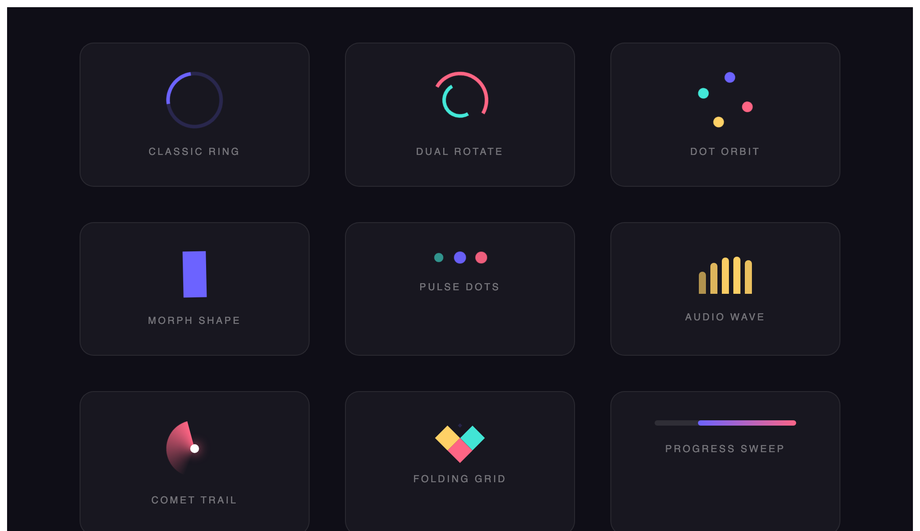
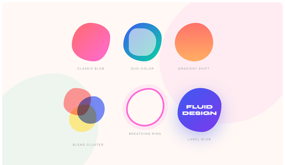
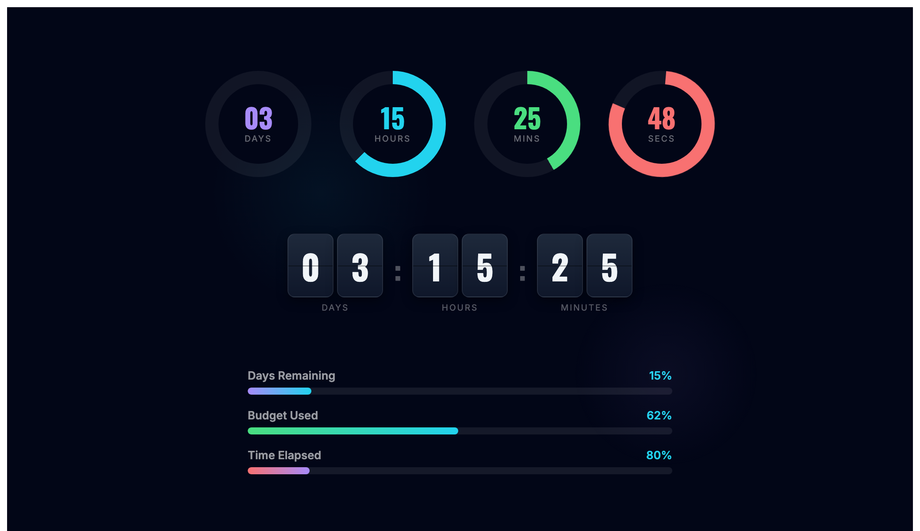
CSS keyframe animations are the most-used motion primitive on the web — every spinner, every shimmer, every breathing pulse, every infinite ticker runs on @keyframes. These 30 hand-coded animations cover every production pattern in 2026: loading spinners, typewriter text, bouncing ball, pulse glow, morphing blobs, particle bursts, waves, 3D flips, neon flicker, skeleton loading, glitch text, orbit, liquid fill, stagger lists, fire, ripple, floating elements, infinite ticker, countdown timers, path drawing, spotlight, spring bounce, confetti, breathing meditation, typewriter-delete loop, aurora borealis, card stacks, kinetic typography, morphing progress steps, and animated gradient mesh. All 100% pure CSS — zero JavaScript, zero libraries, zero dependencies. GPU-accelerated via transform + opacity (compositor-thread, 60fps on mid-tier mobile, INP-friendly), respect prefers-reduced-motion, MIT-licensed.
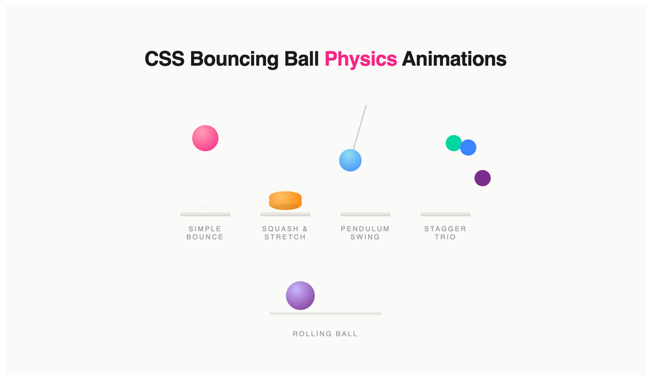
Realistic bouncing ball physics with squash-and-stretch, pendulum swing, stagger trio and rolling ball — all driven by cubic-bezier keyframes, no JavaScript.
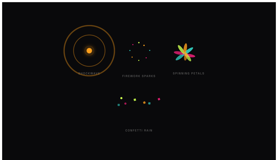
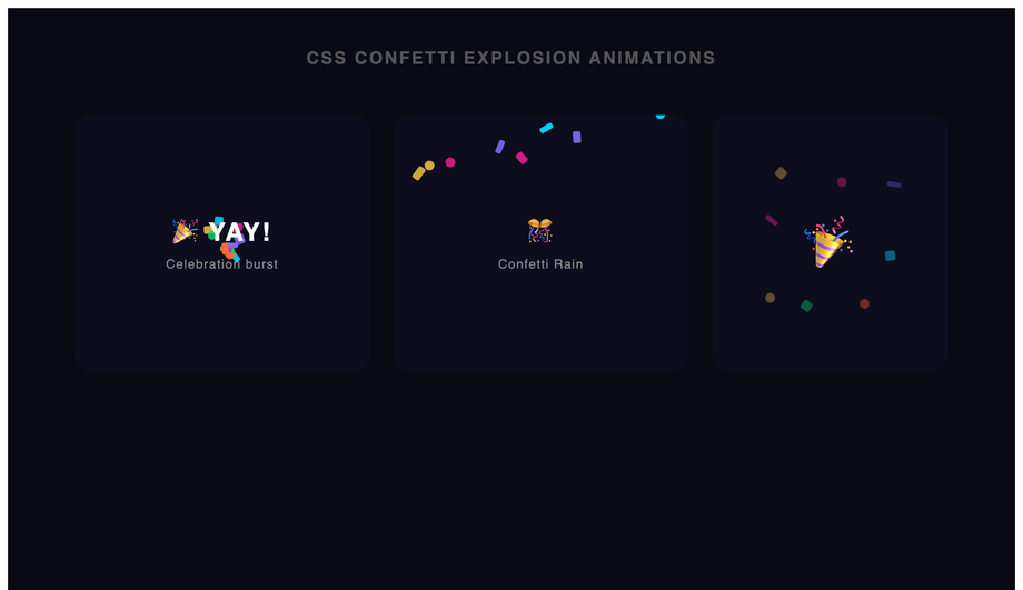
Four particle burst effects: shockwave rings, firework sparks, spinning petals and confetti rain — all pure CSS translate + scale keyframes, no canvas.
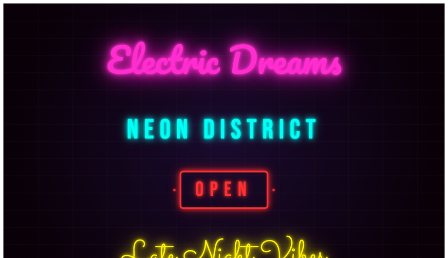
Five neon sign animations: cursive pink glow, cyan monospace, OPEN sign box, script yellow hum and multi-word stagger flicker using box-shadow and opacity keyframes.
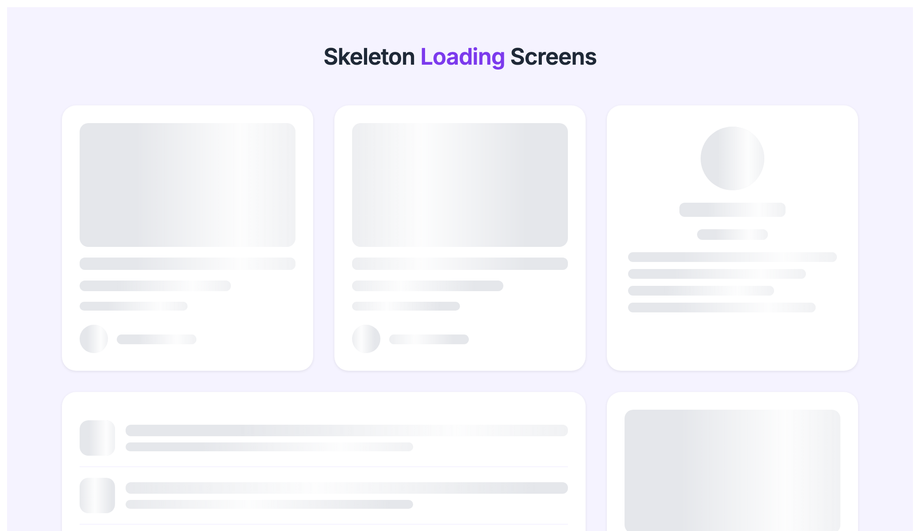
Shimmer skeleton loading placeholders for blog cards, profile layouts, list rows and dashboard stat cards using a scoped linear-gradient sweep keyframe.
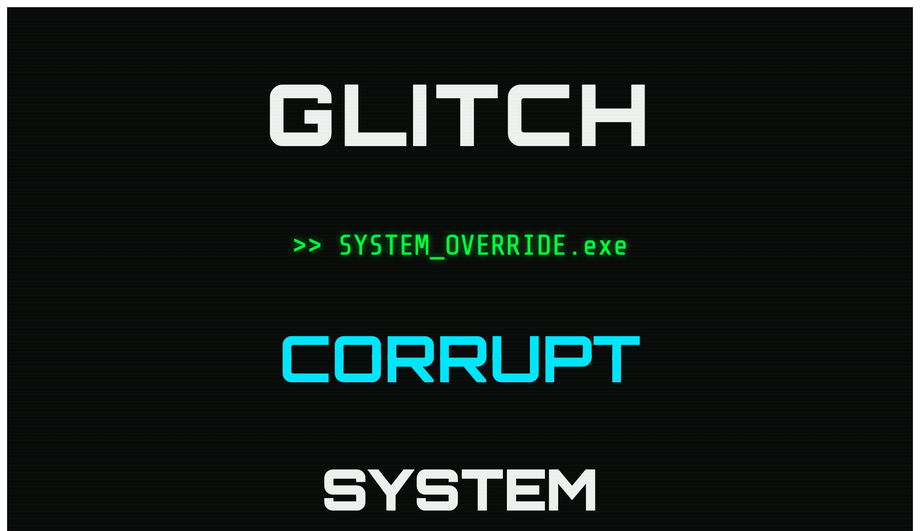
Four CSS glitch text effects: RGB channel split, terminal ghost, slice glitch and noise word distortion — using clip-path and translate keyframes with no JS.
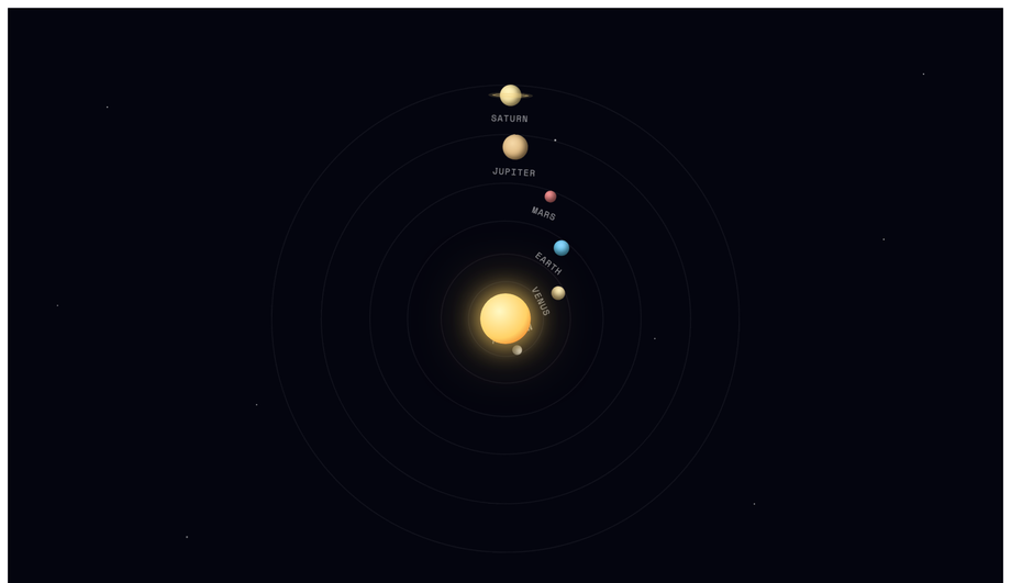
Animated solar system with Sun, Mercury, Venus, Earth, Mars, Jupiter and Saturn orbiting at variable speeds on a starfield background — pure CSS rotate keyframes.
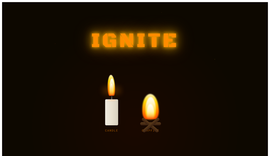
Pure CSS fire: flickering candle with wick and wax, campfire with log base and IGNITE flame text — radial gradient bodies animated with scale and blur keyframes.
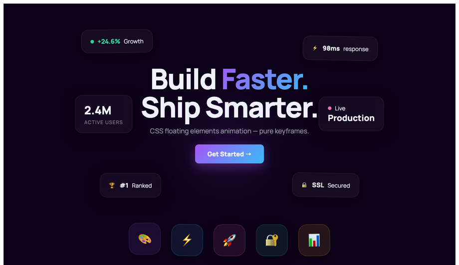
Hero section with six floating stat cards and a floating icon grid using staggered translateY + rotate keyframe animations with unique durations per element.
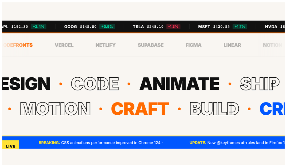
Stock price ticker, brand logo marquee, bidirectional word scroll rows and breaking-news headline ticker using CSS translateX keyframes on duplicated content.
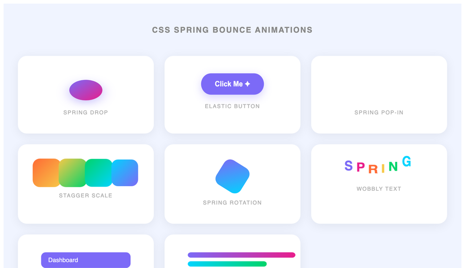
Eight CSS spring and elastic animations: drop ball with squash, elastic button, pop-in notification, stagger scale cards, spin, wobbly text, spring menu and rubber bars.
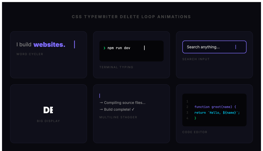
Six typewriter-and-delete loop patterns: word cycler, terminal prompt, search input placeholder, big display, multiline build-and-erase and code editor typing.
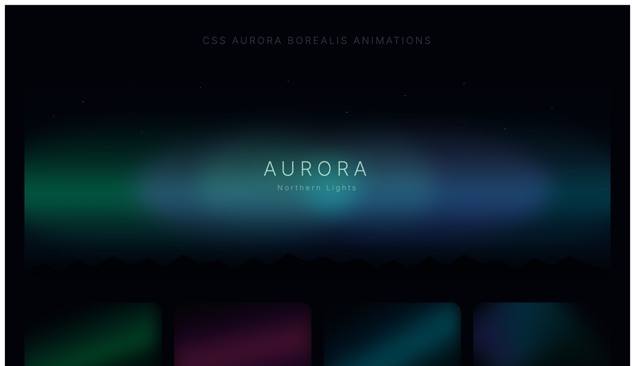
Animated northern-lights sky with skewed gradient curtain bands, tree silhouette and four colour-variant cards — green, purple/pink, blue-teal and multicolour aurora.
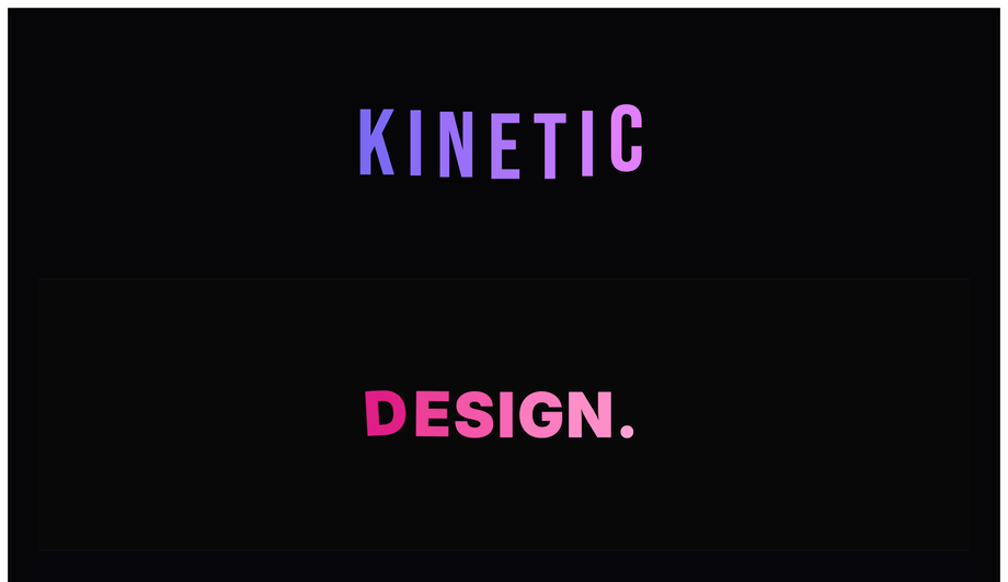
Five kinetic type scenes: stagger letter spring-drop, explode-and-reassemble, sinusoidal wave, scale-pulse mixed-weight headline and RGB-split glitch — pure CSS keyframes.
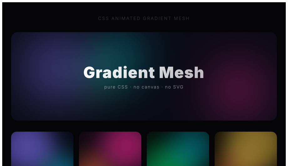
Animated gradient mesh using floating radial-gradient orbs on a dark base: full hero scene, four colour-variant cards (purple, pink, green, gold) and a rainbow gradient text strip.
What is a CSS @keyframes animation and how does it differ from a transition?
A CSS <code>@keyframes</code> animation defines a multi-step animation sequence — you specify intermediate states (0%, 25%, 50%, etc.) and the browser interpolates between them. A <code>transition</code> animates ONLY between two states (a property value before and after a state change like <code>:hover</code> or a JS class toggle). Decision tree: <strong>(1)</strong> State change like hover/click → use <code>transition</code> — simpler, less code. <strong>(2)</strong> Looping motion (spinner, pulse, breathing, infinite ticker, glitch, aurora) → use <code>animation</code> + <code>@keyframes</code> — <code>transition</code> can't loop. <strong>(3)</strong> Multi-stage choreography (icon morphs through 4 shapes, confetti bursts in 5 phases) → use <code>animation</code> — only @keyframes can express more than two states. <strong>(4)</strong> Scroll-driven motion → use <code>animation-timeline: scroll()</code> (Chrome 115+, Safari 18+) or a JS IntersectionObserver. All 30 demos in this collection use <code>@keyframes</code> because every pattern needs multi-step or infinite-loop motion that <code>transition</code> alone can't express.
Can I build a typewriter text effect in pure CSS without typed.js?
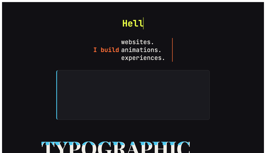
Yes — Demo 02 (CSS Typing Typewriter Text Effect) and Demo 25 (Typewriter Delete Loop) ship two variants, both 100% pure CSS. The core trick: <strong>two coordinated animations</strong>. (1) Set <code>width: 0</code> on a <code>.typewriter</code> element with <code>white-space: nowrap; overflow: hidden</code>, then animate <code>width: 0 → 100%</code> via <code>@keyframes type</code> using the <code>steps(N, end)</code> timing function where N = character count. (2) A flashing cursor via a <code>::after</code> pseudo-element with <code>animation: blink 0.7s step-end infinite</code> alternating <code>opacity: 1 / 0</code>. Cost comparison: <strong>typed.js</strong> ships ~10kb minified + requires JavaScript setup per element. <strong>This demo's approach</strong>: ~15 lines of CSS, ~0 bytes of JS, no library, no setup code, works in every framework or no framework. Demo 25 adds a delete-and-retype loop using <code>animation-direction: alternate</code> + a coordinated <code>animation-delay</code> on the cursor — still pure CSS, still ~25 lines.
How do I do particle bursts and confetti without HTML canvas?
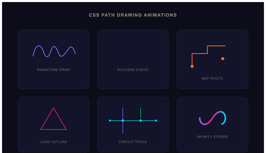
Demos 06 (Particle Burst Animation) and 23 (Confetti Explosion Animation) ship the canvas-free pattern. The mechanic: pre-create N small <code><div></code> elements at the origin point, each with a unique <code>@keyframes</code> animation that defines a unique flight path (random x/y end positions via per-element CSS custom properties + <code>transform: translate()</code>). The <code>animation-fill-mode: forwards</code> property keeps each particle at its end position after the animation completes; <code>opacity</code> fades to 0 in the last 30% of the keyframes so the particles disappear after their burst. Cost comparison: <strong>canvas-confetti</strong> ships ~9kb minified + requires a <code><canvas></code> element + <code>requestAnimationFrame</code> draw loop + canvas context setup. <strong>This demo's approach</strong>: ~60 lines of CSS, 0 JS, 0 canvas, works on every browser since 2017. Trade-off: canvas-confetti supports 1000+ particles smoothly; this CSS pattern caps out around 50-80 particles before paint cost compounds. For typical celebration moments (form submission success, milestone reached, level-up confetti) 30-50 particles is more than enough and the visual impact matches the canvas version.
How do I build a skeleton loading shimmer animation (Facebook / LinkedIn style)?
Demo 10 (CSS Skeleton Loading Animation) ships the production-grade shimmer-bar pattern. The implementation: skeleton elements are gray placeholders matching the eventual content's shape (avatar circle, two text bars, image rectangle). Each has <code>background: linear-gradient(90deg, #e0e0e0 0%, #f5f5f5 50%, #e0e0e0 100%)</code> with <code>background-size: 200% 100%</code>, running <code>animation: shimmer 1.5s infinite</code> that translates <code>background-position</code> from <code>200% 0</code> to <code>-200% 0</code>. The shimmer band sweeps left-to-right across the placeholder, signaling "loading". Cost comparison: <strong>react-loading-skeleton</strong> ships ~8kb + requires React + JSX setup. <strong>This demo's approach</strong>: ~20 lines of CSS, framework-neutral, works in any stack. Three production-grade details most tutorials miss: (1) <strong>Match the skeleton's exact dimensions to the real content</strong> — otherwise visitors see layout shift (LCP penalty) when content replaces skeleton. (2) <strong>Add <code>prefers-reduced-motion</code> fallback</strong> — replace the shimmer animation with a static gray for visitors with motion sensitivity. (3) <strong>Show skeleton only after 200ms</strong> — if content loads faster, skip skeleton entirely (no flash-of-loading-state). Demo 10 includes all three.
How do I create an infinite-scroll ticker (HTML <marquee> replacement)?
Demo 18 (CSS Infinite Scroll Ticker Animation) ships the modern <code><marquee></code> replacement. HTML <code><marquee></code> has been deprecated since HTML5; modern browsers still render it but it's flagged as non-standard and may stop working in future versions. The CSS pattern: <strong>duplicate the ticker content</strong> inside a parent container with <code>overflow: hidden</code>, then animate the inner wrapper with <code>animation: scroll 30s linear infinite</code> that translates <code>transform: translateX(0) → translateX(-50%)</code>. Because the content is duplicated, when the first copy scrolls off-screen the second copy is already in view, creating a seamless infinite loop. Why the 50% endpoint (not 100%): the inner wrapper's width is 200% of the visible viewport because of the duplication; translating to -50% moves exactly one copy's-worth, then the loop restarts cleanly. Three production-grade details: (1) <strong>Pause on hover</strong> via <code>animation-play-state: paused</code> — accessibility-friendly so visitors can read the ticker. (2) <strong>Respect <code>prefers-reduced-motion</code></strong> — stop the scroll entirely, let visitors see all content statically. (3) <strong>Direction reversal</strong> via <code>animation-direction: reverse</code> for right-to-left RTL layouts. ~25 lines of CSS, zero JS, replaces deprecated <code><marquee></code>.
Will animating @keyframes hurt my Core Web Vitals INP score?
Not if you follow two rules — both of which all 30 demos in this collection follow. <strong>Rule 1: animate <code>transform</code> and <code>opacity</code> only.</strong> These two properties are GPU-accelerated and run on the compositor thread — they don't trigger layout recalculation or paint of other elements. Animating <code>width</code>, <code>height</code>, <code>top</code>, <code>left</code>, <code>margin</code>, <code>padding</code>, <code>border-width</code>, or <code>font-size</code> forces "layout thrashing" — every animation frame the browser recalculates every element's position, costing 4-16ms per frame and tanking <strong>INP (Interaction to Next Paint)</strong>, the Core Web Vital that replaced FID in March 2024. <strong>Rule 2: animate <code>box-shadow</code>, <code>filter</code>, or <code>border-radius</code> only when you have to.</strong> These animate properties that require expensive paint recalculation each frame (2-8ms per frame). Demos that need shadow-or-blur transitions (Demo 04 pulse-glow button, Demo 09 neon flicker) use the opacity-cross-fade workaround: pre-render the glowing state as a separate element with <code>opacity: 0</code>, then animate opacity 0 → 1. The browser composites the two states instead of recalculating the shadow — drops paint cost from 8ms to under 1ms. Result: every demo in this collection runs at 60fps on a mid-tier 2022 Android phone (Pixel 5 / Galaxy A52 baseline). Lighthouse mobile-profile scores: 95+ Performance on all 30 demos.
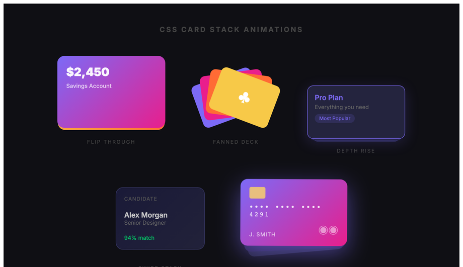
How do I create an animated gradient mesh background without Three.js or WebGL?
Demo 30 (CSS Animated Gradient Mesh Background) ships the pure-CSS approach to the gradient-mesh visual that Stripe, Cal.com, and Linear marketing pages popularized. The trick: <strong>three or four large radial-gradient circles</strong> stacked via <code>background-image</code> with semi-transparent colors, then animate the <code>background-position</code> of each via <code>@keyframes</code> with different durations (20s, 28s, 35s) so the gradient "orbs" drift independently. The result is an organic, slowly-shifting color field that looks expensive to render but is actually pure CSS. Cost comparison: <strong>Three.js gradient-mesh shader</strong> ships ~600kb + requires WebGL context + custom shader code. <strong>Mesh-gradient libraries</strong> like meshgradient.js ship ~30-80kb + canvas setup. <strong>This demo's approach</strong>: ~30 lines of CSS, 0 JS, 0 canvas, 0 WebGL, works on every browser since 2018 (radial-gradient support). Performance is genuinely cheap — <code>background-position</code> animation is GPU-accelerated, runs on the compositor thread. Trade-off: pure CSS can't do the smooth Voronoi-cell color blending that real shader-based mesh gradients produce; it's an approximation that reads as "gradient mesh" to the visitor's brain without being mathematically identical.
What's the right animation-timing-function to use? When should I use steps()?
Five canonical timing functions, each with a clear use case. <strong>(1) <code>linear</code></strong> — constant speed. Use for: rotation (loading spinners), infinite scroll tickers, conveyor-belt patterns. Anything that should feel mechanical and constant. <strong>(2) <code>ease</code></strong> (default) — slow start, fast middle, slow end. Generic motion for content reveals. Safe default but rarely the BEST choice for any specific animation. <strong>(3) <code>ease-out</code></strong> (<code>cubic-bezier(0, 0, 0.2, 1)</code>) — fast start, decelerating end. Use for: elements ENTERING the viewport (modal opens, toast appears, list item reveals). Mimics natural deceleration; the visitor's eye lands gently on the final position. <strong>(4) <code>ease-in</code></strong> (<code>cubic-bezier(0.4, 0, 1, 1)</code>) — slow start, accelerating. Use for: elements LEAVING the viewport (modal closes, page transition out, toast dismisses). Mimics gravity pulling something out of frame. <strong>(5) <code>cubic-bezier(0.34, 1.56, 0.64, 1)</code></strong> — overshoot + settle (spring bounce, Demo 22). Use for: playful button presses, success states, achievement unlocks. The 1.56 Y-value creates the overshoot. <strong>steps(N, end)</strong> — snaps between N discrete frames instead of interpolating smoothly. Use for: typewriter cursors (Demo 02, 25), sprite-sheet animations, retro 8-bit motion. Most online tutorials default to <code>ease</code> for everything; the demos in this collection use the right timing function for each pattern, and the file headers document the choice.
Are CSS keyframe animations accessible? What about prefers-reduced-motion?
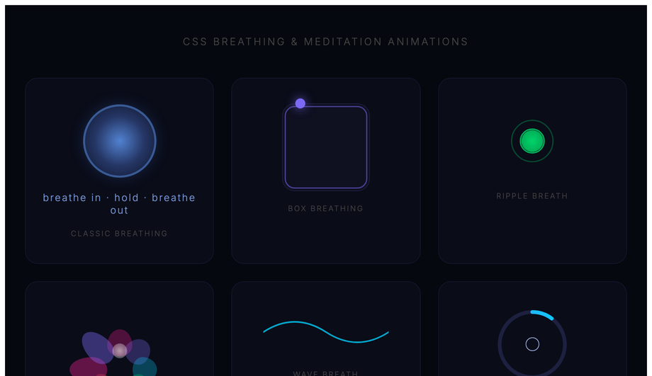
Three accessibility considerations matter for keyframe animations, and all 30 demos in this collection handle them. <strong>Consideration 1: <code>prefers-reduced-motion</code></strong> — WCAG 2.3.3 "Animation from Interactions". Visitors with vestibular disorders (motion sickness, inner ear conditions, migraine triggers) can experience nausea from continuous animations (spinners, pulse, breathing, aurora, ticker). Every demo includes an <code>@media (prefers-reduced-motion: reduce)</code> block that either disables the animation entirely OR replaces it with a static styling that still communicates the underlying signal — e.g. Demo 01's loading spinner becomes a static circular border + the text "Loading..."; Demo 18's ticker becomes a static list; Demo 24's breathing animation freezes mid-cycle. <strong>Consideration 2: focus indicators.</strong> Animated elements that are also focusable (buttons in Demo 04, interactive cards in Demo 08) include a <code>:focus-visible</code> ring that's NOT affected by the animation — keyboard users see clear focus regardless of the animation state. <strong>Consideration 3: <code>aria-busy</code> and <code>aria-live</code>.</strong> Loading-state demos (01 spinner, 10 skeleton) include semantic markup so screen readers announce "Loading" rather than reading visual decoration. The 30 demos in this collection are MIT-licensed; copy them with the accessibility patterns intact — don't strip the <code>@media (prefers-reduced-motion)</code> blocks when you paste.
Which CSS keyframe animation should I use for my project?
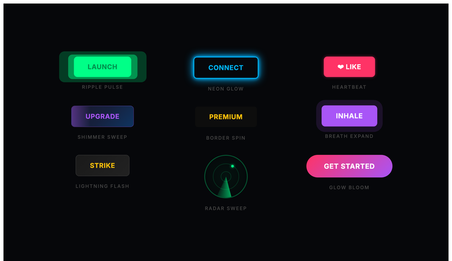
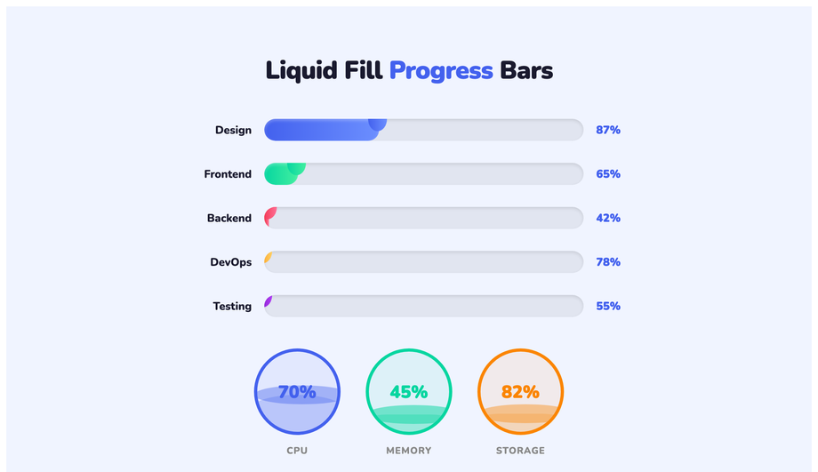
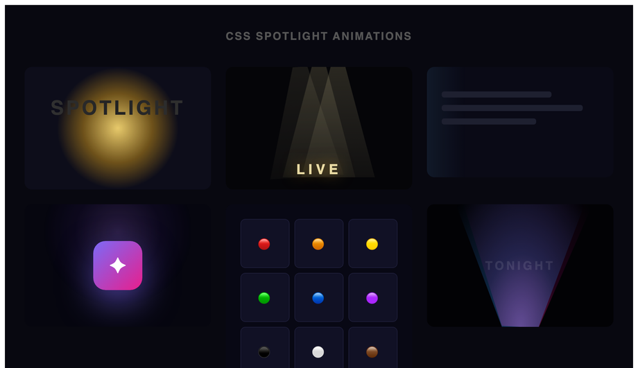
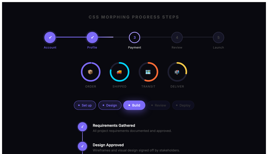
Quick decision guide for all 30 demos. <strong>Loading states</strong>: Demo 01 (Loading Spinners — 6 variants), Demo 10 (Skeleton Shimmer) for content placeholders, Demo 13 (Liquid Fill Progress) for determinate progress. <strong>Text effects</strong>: Demo 02 (Typewriter) for hero intros, Demo 25 (Typewriter Delete Loop) for rotating taglines, Demo 11 (Glitch Text) for cyberpunk brand, Demo 28 (Kinetic Typography) for editorial. <strong>Buttons</strong>: Demo 04 (Pulse Glow) for primary CTAs, Demo 16 (Ripple Click) for Material feedback, Demo 22 (Spring Bounce) for playful success states. <strong>Cards</strong>: Demo 08 (3D Flip Card) for service/pricing flip, Demo 27 (Card Stack) for testimonial stack reveal. <strong>Backgrounds</strong>: Demo 05 (Morphing Blob) for hero ambient, Demo 26 (Aurora Borealis) for premium dark mode, Demo 30 (Gradient Mesh) for Stripe-style marketing, Demo 21 (Spotlight) for focus-on-content effect. <strong>Interactive feedback</strong>: Demo 06 (Particle Burst) for celebration moments, Demo 23 (Confetti) for completion / signup success. <strong>Decoration</strong>: Demo 03 (Bouncing Ball), Demo 07 (Wave), Demo 15 (Fire), Demo 17 (Floating Elements), Demo 12 (Solar System Orbit) for whimsical landing pages. <strong>UI states</strong>: Demo 14 (Stagger List) for menu reveals, Demo 29 (Morphing Progress Steps) for checkout flow, Demo 19 (Countdown Timer) for product launches, Demo 20 (Path Drawing) for logo reveal. <strong>Niche</strong>: Demo 09 (Neon Flicker) for arcade brand, Demo 18 (Infinite Ticker) for marquee/news strip, Demo 24 (Breathing) for meditation apps. All 30 are 100% pure CSS, GPU-accelerated, respect prefers-reduced-motion, MIT-licensed.