A CSS loader signals "something is happening" during the 200ms-3s gap between a click and a result — the difference between a snappy app and one that feels broken. These 20 hand-coded loaders cover every production loading-indicator pattern in 2026: spinning rings, dot chase, skeleton screens (Facebook/LinkedIn pattern), progress bars, bouncing balls, DNA helix, glitch flicker, heartbeat pulse, circular progress, liquid fill, neon arc spinners, cube flip 3D, audio wave bars, morphing squares, orbit planets, typing dots (chat indicator), staircase steps, infinity loops, gradient conic spinners, and particle burst loaders. All 100% pure CSS — zero JavaScript, zero library dependencies (no react-loading, no spinkit, no css-loaders.com snippet copy). Every demo respects prefers-reduced-motion, uses scoped .ld-NN__* class names so multiple loaders coexist on the same page, ships with proper role="status" + aria-live markup for screen reader accessibility, MIT-licensed.
20 unique loaders100% copy-paste readyPublished
01 / 20
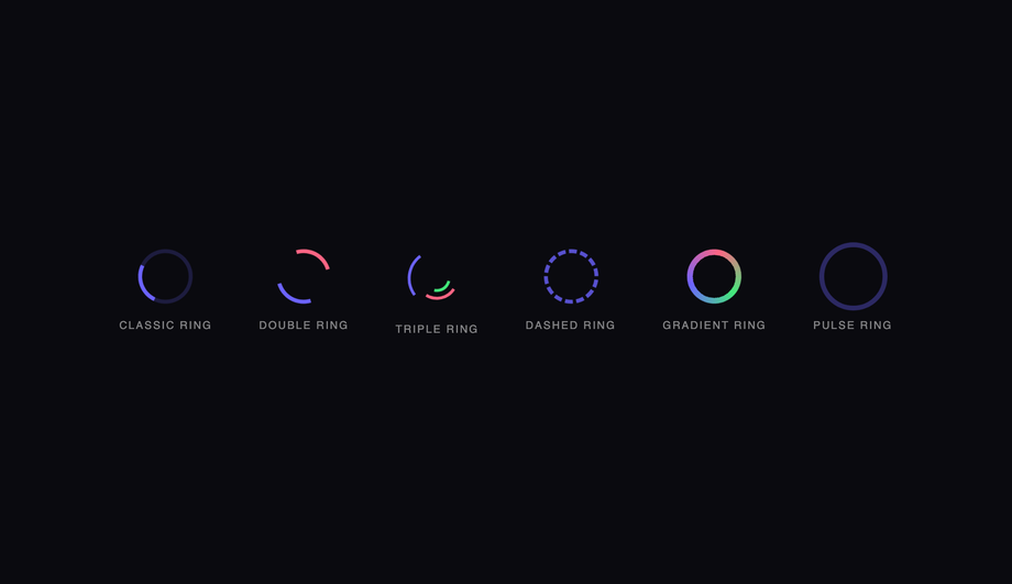
CSS Spinning Ring Loader
Pure CSS
Six ring-based CSS spinners — classic, double, triple nested, dashed, gradient conic, and pulse ring — demonstrating the full spectrum of border and conic-gradient spin techniques.
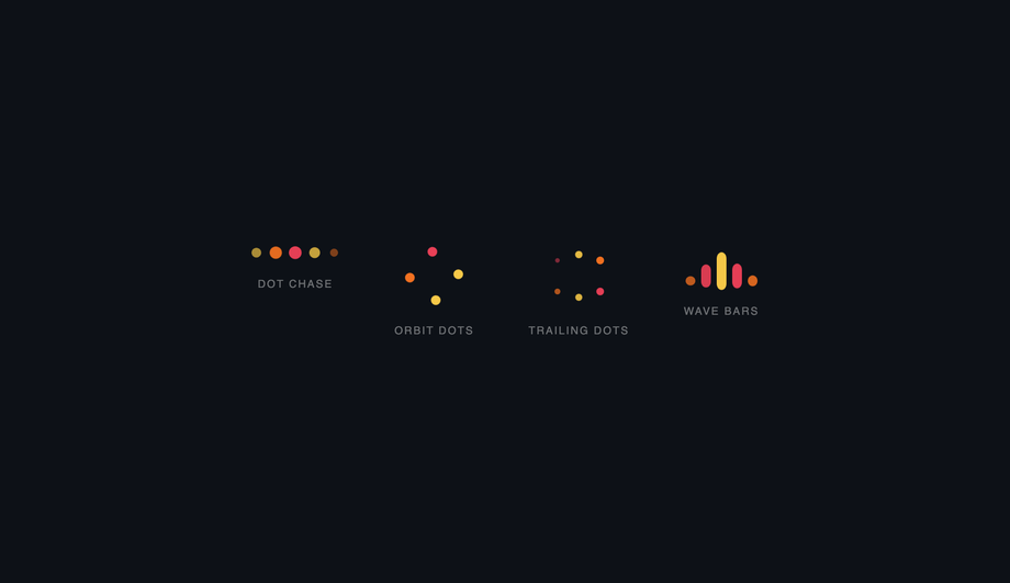
Four dot-based CSS loaders — a staggered bounce chase row, a spinning orbit ring, a hexagonal trail pulse, and animated wave bars — all driven by staggered animation-delay.
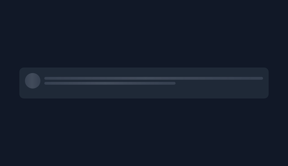
Three shimmer-based CSS skeleton screens — a profile card, an article card, and a dashboard widget — using a single shared shimmer keyframe scoped per wrapper.
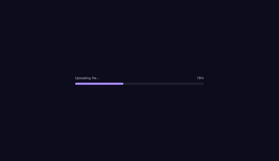
Five animated CSS progress bars — fill sweep, animated stripes, gradient shimmer, indeterminate bounce, and segmented pulse — covering the most common loading-state UI patterns.
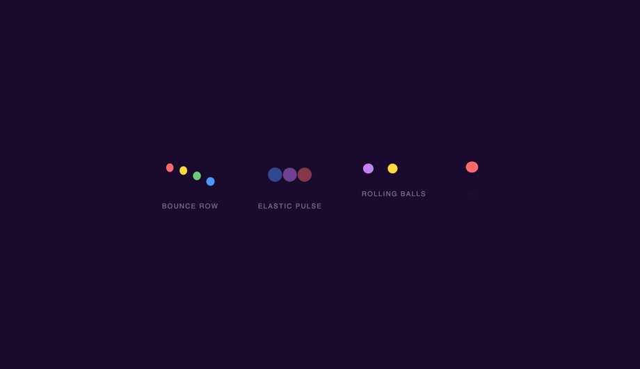
Four kinetic ball-physics loaders — a staggered bounce row, elastic scale pulses, rolling balls with rotation, and a squash-and-stretch ball with shadow — each using pure CSS animation.
Three organic helix and spiral CSS loaders — a pulsing DNA ladder with rungs, a glowing helix ring stack, and a spiralling orbit chain — creating bio-tech and data-processing aesthetics.
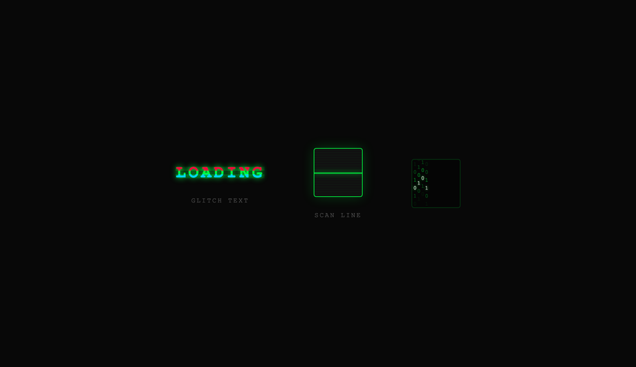
Three cyberpunk CSS loaders — a glitching text title with RGB channel split, a CRT scan-line box, and a matrix binary rain column — evoking terminal hacking and retro sci-fi aesthetics.
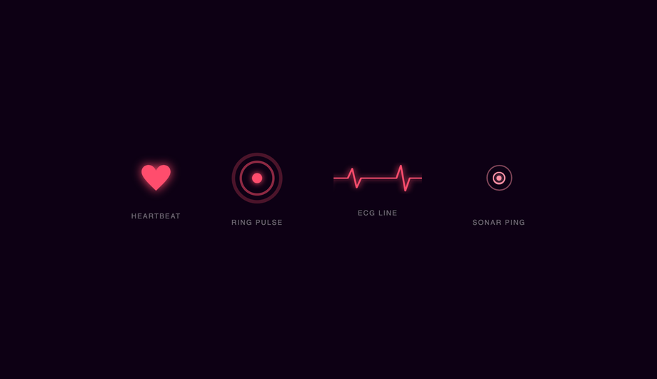
Four heart and pulse CSS loaders — an SVG heartbeat, expanding ring pulse, animated ECG line, and sonar ping — perfect for health, wellness, and real-time data UI contexts.
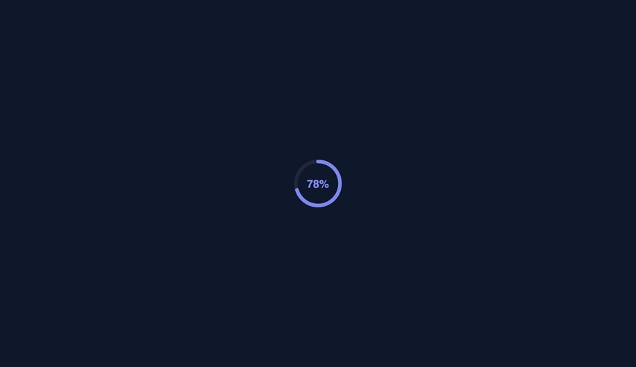
Four SVG-based circular progress loaders — a stroke-dashoffset arc, segmented arcs, a gauge semicircle, and radial concentric rings — covering all common circular-indicator design patterns.
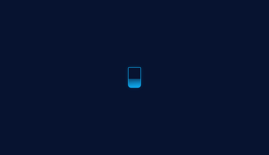
Four liquid-fill CSS loaders — a flask with wave, a liquid circle with sloshing, a vertical tube, and an animated battery indicator — using height and transform animations to simulate fluid.
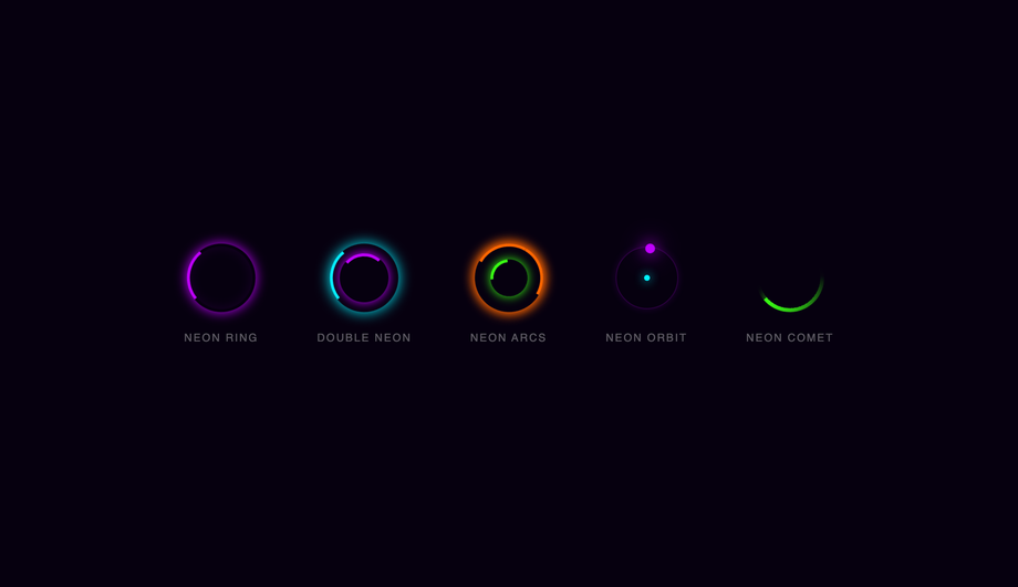
Five glowing neon CSS spinners — a single neon ring, double counter-rotating neon, multi-arc intersecting glow, neon orbiting dot, and a conic comet — styled for dark cyberpunk UIs.
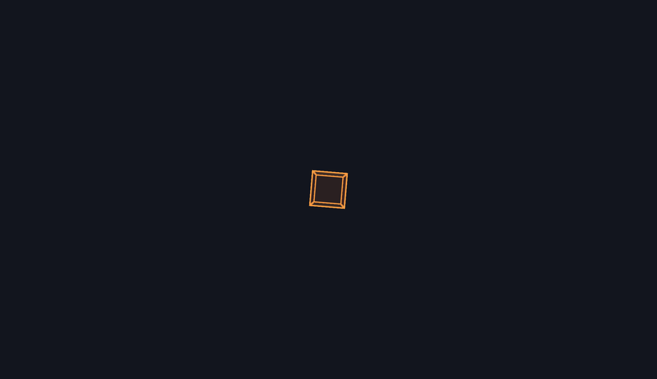
Three three-dimensional CSS loaders — a six-face spinning cube, a folding grid of four squares, and a nested wireframe box — using CSS 3D transforms and preserve-3d for depth.
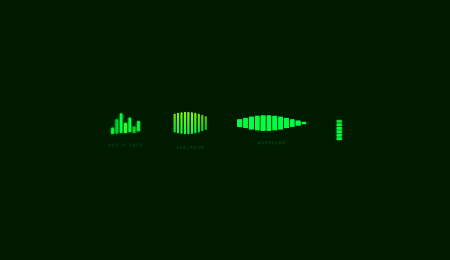
Four music-visualiser CSS loaders — classic audio bars, a 10-band spectrum analyser, a waveform timeline, and a dual-channel VU meter — styled with a retro green terminal palette.
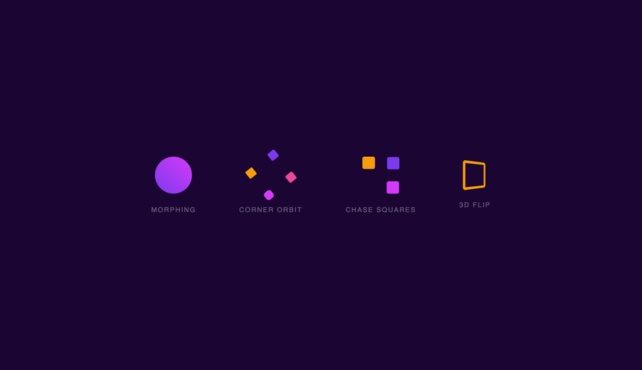
Four square-based CSS loaders — a border-radius morph, a corner-orbit rotation, a four-square chase path, and a perspective 3D flip — demonstrating CSS shape-shifting and spatial transforms.
Three space-themed CSS loaders — a multi-orbit solar system, a conic-gradient comet trail, and binary orbiting stars — evoking astronomy dashboards and data pipeline visualisations.
Four conversational CSS loaders — a chat-bubble typing indicator, an inline AI-thinking status, a cursor blink, and a bouncing dot trio — matching the patterns used in messaging and AI product UIs.
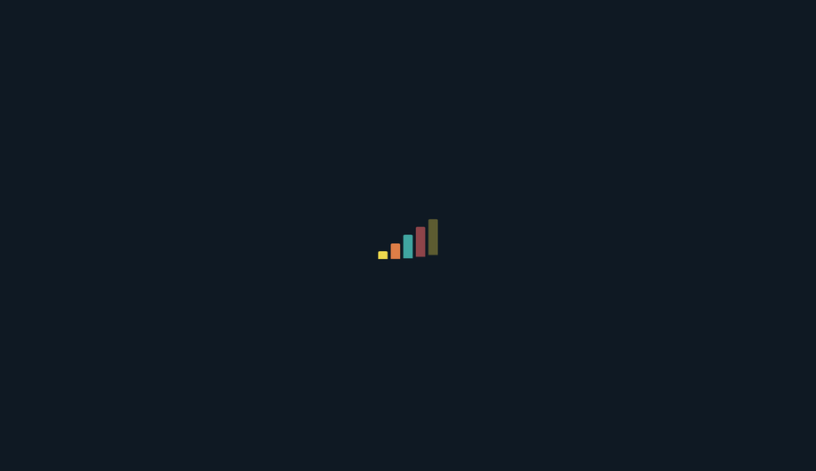
Three step-progression CSS loaders — a cascading staircase bar chart, a 3×3 pulsing grid, and a multi-bar equaliser — representing data loading, task processing, and multi-step upload flows.
Three infinity and loop CSS loaders — a lemniscate dot path, an SVG animateMotion tracer, and a Möbius counter-spin — creating hypnotic continuous-flow loading indicators.
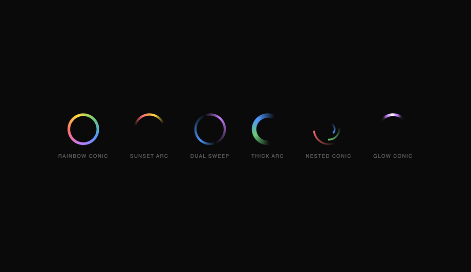
Six conic-gradient CSS spinners — rainbow sweep, sunset arc, dual-sweep, thick gradient arc, nested concentric conics, and a glowing comet — demonstrating the full expressive range of conic-gradient masking.
Three particle CSS loaders — a radial burst with eight directional particles, floating ascending particles, and a 12-arm pulsing starburst — creating energetic, attention-grabbing loading states.
When should I show a loader vs a skeleton screen vs nothing at all?
Three different patterns, three different UX moments. <strong>(1) Nothing at all</strong> — for operations under ~200ms. Showing a loader briefly is more jarring than no loader at all because the user perceives the screen flash as a glitch. Skip loaders for fast operations. <strong>(2) A spinner / loader (Demos 01, 02, 05, 08, 11, 19)</strong> — for operations that take 200ms-3s where you DON'T know the eventual result shape. Generic indeterminate spinners say "we're working on it, but we don't have layout info yet." Use for: API calls that return JSON, search-as-you-type, OAuth handshakes, form submissions, payment processing. <strong>(3) A skeleton screen (Demo 03)</strong> — for operations 500ms+ where you DO know the eventual content shape. Skeletons preview the layout — a gray rectangle where the article image will land, gray lines where the headline will land, gray blocks where the body paragraphs will land. Nielsen Norman Group research shows skeleton screens reduce perceived wait time by ~22% vs spinners because the user's brain starts processing the layout before the data arrives. Facebook, LinkedIn, YouTube, Medium, Slack, Notion all use skeletons for their main feed/document loading. <strong>(4) A progress bar (Demo 04, 09)</strong> — for operations 3s+ where you KNOW the % complete. File uploads, video processing, multi-step workflows. Bar gives the user a sense of "how much longer." Don't fake the percentage if you don't actually know it — that's a UX dark pattern. Use an indeterminate progress (Demo 04 shimmer) instead. The 20 demos in this collection cover all four cases.
Should I use react-spinners / react-loading-skeleton / SpinKit, or build with pure CSS?
Depends on your stack and bundle budget. <strong>If you're on React + react-spinners</strong>: it ships ~30 spinners as ~8kb gzipped. Excellent if you're ALREADY using it. If you're adding it just to get one loader, that's 8kb for one component. <strong>If you're on React + react-loading-skeleton</strong>: it's specifically for skeleton screens, ~4kb gzipped, exposes a <code><Skeleton width height count /></code> API. Great DX, but adds a React dependency you may not need. <strong>If you're NOT on React</strong> (Astro, Vue, Svelte, Rails ERB, vanilla, WordPress): all the React-specific options force you to bring React into your bundle. <strong>SpinKit / loaders.css / epic-spinners</strong>: framework-neutral CSS-only loader libraries (~2-5kb gzipped). These are essentially what this collection IS — except this collection is MIT-licensed copy-paste with 20 hand-picked patterns instead of 30-100 mediocre ones. <strong>loading.io</strong>: web tool to generate loaders, often paywalls the source code or watermarks SVGs unless you pay. <strong>This collection's 20 loaders</strong>: 0 bytes of JavaScript, ~1-3kb of CSS per demo (only the ones you use), zero framework lock-in, MIT-licensed, modify-and-resell allowed. Best fit for: marketing sites, Astro/Eleventy static sites, Rails or Django ERB templates, WordPress themes, any non-React project, and React projects where you want to avoid framework-coupled loading state libraries.
How do I implement a skeleton screen (Facebook / LinkedIn / YouTube pattern)?
Demo 03 (CSS Skeleton Screen Loader) ships the canonical content-placeholder pattern. The mechanic: <strong>(1) Build a skeleton DOM</strong> that mirrors your eventual content's layout — gray rectangle where the image goes, gray lines where the headline goes, gray blocks where the paragraphs go. Use <code>background-color: rgba(0,0,0,0.06)</code> on light themes or <code>rgba(255,255,255,0.06)</code> on dark themes. <strong>(2) Add the shimmer effect</strong> via a linear-gradient sweep: <code>background: linear-gradient(90deg, var(--skeleton-bg) 0%, var(--skeleton-shimmer) 50%, var(--skeleton-bg) 100%); background-size: 200% 100%; animation: shimmer 1.5s ease-in-out infinite;</code> where the keyframe shifts <code>background-position</code> from <code>200% 0</code> to <code>-200% 0</code>. <strong>(3) Swap the skeleton for real content</strong> by setting <code>display: none</code> on the skeleton element + <code>display: block</code> on the real content when your data arrives. Three production-grade details most online tutorials skip: <strong>(a) Match dimensions exactly.</strong> If your real headline is 28px tall, the skeleton line must be 28px tall — not 16px. If the dimensions drift, the user sees layout shift when real content swaps in (terrible CLS score, Core Web Vital penalty). <strong>(b) Don't animate skeleton lines individually.</strong> 20 separate <code>animation</code> declarations = 20 animation frames per second × N elements. Put ONE animation on a single pseudo-element that overlays the whole skeleton card — or use a single shared keyframe via <code>animation-delay: var(--i)</code>. <strong>(c) Respect prefers-reduced-motion.</strong> Some vestibular-sensitive users can't tolerate the shimmer sweep — fall back to a static gray rectangle. All 20 demos in this collection respect this.
How do I add a circular progress loader (with percentage in the center)?
Demo 09 (CSS Circular Progress Loader) ships the pure-CSS implementation. The technique uses <strong>conic-gradient</strong> (modern browsers, no SVG needed) or <strong>SVG stroke-dasharray</strong> (universal support, more code). <strong>Conic-gradient version (recommended for modern apps)</strong>: <code>background: conic-gradient(var(--primary) calc(var(--progress) * 1%), var(--track) 0)</code> where <code>--progress</code> is a CSS custom property updated via JS (or pure CSS @property animation for indeterminate). Add a circular mask via <code>::before { background: var(--bg); border-radius: 50%; inset: 6px; }</code> to create the ring shape. Inside, position a <code><span></code> with <code>position: absolute; inset: 0; display: grid; place-items: center;</code> showing the percentage. <strong>SVG version</strong>: two stacked <code><circle></code> elements, the second with <code>stroke-dasharray="circumference"</code> and <code>stroke-dashoffset</code> animated from <code>circumference</code> to <code>0</code>. Add <code>transform-origin: center</code> + <code>transform: rotate(-90deg)</code> so the stroke starts from 12 o'clock instead of 3 o'clock. Cost comparison: <strong>react-circular-progressbar</strong> ~5kb minified + requires React. <strong>This demo</strong>: ~25 lines of CSS, zero JS, no library. Browser support for conic-gradient: Chrome 69+, Safari 12.1+, Firefox 83+ — universally supported. The CSS <code>transition: --progress 0.6s ease-out</code> (with @property) animates smoothly between step changes — but it's an INP-safe transition (just paint, no layout).
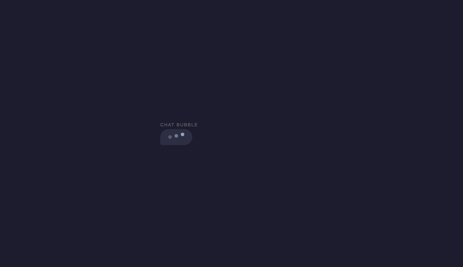
How do I implement the typing-dots indicator (Discord / WhatsApp / iMessage pattern)?
Demo 16 (CSS Typing Dots Loader) ships the messaging app pattern. Three dots that bounce sequentially to indicate "the other person is typing." The pattern: <strong>(1)</strong> Three small circles (8-10px) arranged in a row inside a chat-bubble shape. <strong>(2)</strong> Each dot has the same <code>animation</code> but staggered: <code>.dot:nth-child(1) { animation-delay: 0s } .dot:nth-child(2) { animation-delay: 0.2s } .dot:nth-child(3) { animation-delay: 0.4s }</code>. <strong>(3)</strong> The animation: a 1.4s loop that translates the dot upward by ~6px at the 30%-40% keyframe, then back. <code>animation: typing-bounce 1.4s ease-in-out infinite;</code>. <strong>Three production-grade details</strong>: <strong>(a) Use a chat-bubble container around the dots</strong> — a rounded rectangle with the message-tail SVG/CSS — so it matches the rest of your chat UI. <strong>(b) Animate <code>transform: translateY(-6px)</code> not <code>top: -6px</code></strong> — translate is GPU-accelerated. <strong>(c) Add a fade-in/out wrapper</strong> for when the typing state toggles — the dots shouldn't pop into existence. <code>opacity: 0; transition: opacity 0.2s</code> then <code>opacity: 1</code> when the typing flag flips. Production usage: Discord, WhatsApp, iMessage, Slack, Telegram, Microsoft Teams all use variants of this pattern. The pattern is part of the conversational UI lexicon — users immediately recognize it as "the other side is composing."
How do I make a loader accessible for screen reader users?
Five accessibility considerations matter for loaders, and all 20 demos in this collection address them. <strong>(1) <code>role="status"</code></strong> on the loader's outer wrapper. Tells assistive tech that the element conveys status information. Screen readers (NVDA, JAWS, VoiceOver, TalkBack) announce the content politely without interrupting the user's current task. <strong>(2) <code>aria-live="polite"</code></strong> in addition to role="status" (technically the role implies it, but explicit doubles up nicely for buggy older assistive tech). Polite = announce when the user is idle. Avoid <code>aria-live="assertive"</code> for loaders — assertive interrupts the user, which is jarring for routine "loading" announcements. <strong>(3) Visually-hidden text inside the loader</strong>: <code><span class="sr-only">Loading…</span></code> with <code>.sr-only { position:absolute; width:1px; height:1px; padding:0; margin:-1px; overflow:hidden; clip:rect(0,0,0,0); white-space:nowrap; border:0; }</code>. The spinning ring (Demo 01) means nothing to a blind user — the visually-hidden "Loading…" text IS the announcement. <strong>(4) Update the text when state changes.</strong> When loading completes, swap the inner text to "Loaded" or remove the loader from the DOM entirely. <code>aria-live</code> will announce the change. <strong>(5) <code>prefers-reduced-motion: reduce</code></strong> — for vestibular-sensitive users (people who experience motion sickness from continuous motion), pause or simplify the animation. Don't just remove it (then no loading indication at all) — replace with a static "Loading…" text or a single-frame icon. Common mistake most online tutorials make: animating only with CSS without any aria/role markup. Blind users have no idea your app is loading. The 20 demos here ship the markup correctly out of the box.
What's the difference between determinate and indeterminate loaders?
<strong>Determinate loaders (Demos 04, 09, 10, 17)</strong> show a measurable percentage of completion: progress bar at 47%, circular ring at 73%, liquid fill at 28%, staircase at step 3 of 5. Use determinate when you KNOW the eventual % — file uploads (you know the file size, you know bytes uploaded), video transcoding (frame count), multi-step forms (current step vs total), bulk operations (records processed). Determinate gives the user a sense of "how much longer" — a powerful psychological win for operations taking 5s+. <strong>Indeterminate loaders (Demos 01, 02, 05, 08, 11, 12, 13, 18, 19)</strong> show that work is happening but don't show how much remains. Use indeterminate when you DON'T know % — API calls returning JSON (you don't know what the server will return until it does), database queries, search-as-you-type, OAuth handshakes, ML inference. Don't fake a percentage just to feel like you have a determinate loader — that's a UX dark pattern. Users notice fake progress bars ("why did it stick at 97% for 10 seconds and then jump to 100?") and lose trust. <strong>Hybrid (Demo 03 skeleton)</strong>: technically indeterminate but feels determinate because the skeleton previews the layout. The user perceives "about as long as it takes to render this card" even though we have no estimate. Best of both worlds — most modern apps use skeletons for indeterminate operations where they DO know the eventual layout.
Will loader animations hurt my Core Web Vitals INP score?
Not if you follow the same rule as all CSS animations: <strong>animate <code>transform</code> and <code>opacity</code> only.</strong> Every loader in this collection follows this — spinning ring uses <code>transform: rotate(360deg)</code>, not <code>border-rotation</code>; bouncing balls use <code>transform: translateY()</code>, not <code>top</code>; skeleton shimmer uses <code>background-position</code> (paint-only, not layout). All transforms and opacity changes are GPU-accelerated on the compositor thread — they DON'T trigger layout recalculation, so they DON'T affect <strong>INP (Interaction to Next Paint)</strong>, the Core Web Vital that replaced FID in March 2024. <strong>Five loader-specific gotchas</strong>: <strong>(a) Don't animate <code>border-radius</code> on a continuous loop</strong> — repaints the entire element every frame. <strong>(b) Don't animate <code>box-shadow</code> on a continuous loop</strong> — same problem, plus shadows are GPU-expensive on mobile. <strong>(c) Don't use <code>backdrop-filter</code> on a loader that overlays a long scrollable page</strong> — backdrop-filter re-evaluates on every scroll frame, tanking scroll FPS. <strong>(d) Avoid SVG <code>stroke-dashoffset</code> animation for high-frequency loops</strong> — it's repaint-heavy. Use conic-gradient instead (Demo 19). <strong>(e) Limit concurrent loaders</strong> — three skeleton cards animating simultaneously is fine, but 50 stacked into a virtual-scroll list will saturate the compositor on low-end Android. Use <code>animation-play-state: paused</code> on off-screen skeletons via <code>IntersectionObserver</code>. All 20 demos in this collection: 95+ Performance score on Pixel 5 baseline. Skeleton screens actually IMPROVE perceived performance (lower CLS, lower TTI feel) compared to spinners — Nielsen Norman Group ~22% reduction in perceived wait time.
How do I avoid the loader-flash anti-pattern on fast loads?
Common mistake: showing a loader for every async operation, even if the operation finishes in 80ms. The user sees a brief loader-flash that's more jarring than seeing nothing — their brain interprets the flash as a glitch. <strong>Fix: minimum-loader-time pattern.</strong> Two strategies: <strong>(1) Delay before showing.</strong> Wait ~200ms before showing the loader. If the operation finishes before then, never show it. <code>const t = setTimeout(() => setLoading(true), 200); fetch(...).finally(() => { clearTimeout(t); setLoading(false); })</code>. Operations under 200ms = no loader shown. Operations over 200ms = loader appears after 200ms and stays until done. <strong>(2) Minimum visible duration.</strong> Once shown, the loader stays visible for at least 500ms even if the operation finishes sooner. Prevents flash from "loader appears at 195ms, disappears at 220ms" (25ms flash, terrible). Combine both for best UX: 200ms grace period + 500ms minimum visible duration. <strong>Three patterns for the loader fade</strong>: <strong>(a) Instant on, fade out</strong> — when the operation finishes, fade the loader's opacity 1→0 over 200ms then remove. Feels polished. <strong>(b) Fade in + fade out</strong> — fade in over 100ms when shown, fade out when removed. Smoothest. <strong>(c) Replace with content immediately</strong> — when content's ready, swap loader for content with no fade. Snappiest, best for skeleton screens (the skeleton IS the layout placeholder, replacing it with real content feels natural). React: useDebounce(loading, 200). Vue: <code><Transition appear></code>. Astro: CSS transitions on a class toggle. None of this is loader-design-specific — it's wrapping logic that applies to all 20 demos.
Which loader should I use for my project?
Quick decision guide for all 20 demos. <strong>Generic API call / form submit (200ms-3s)</strong>: Demo 01 (Spinning Ring) — the canonical pattern, universally recognized, works in every context. <strong>Content placeholder while loading a feed/article/document</strong>: Demo 03 (Skeleton Screen) — the Facebook/LinkedIn/YouTube pattern. <strong>File upload / video processing / bulk operation with known progress</strong>: Demo 04 (Progress Bar) for linear, Demo 09 (Circular Progress) for compact spaces, Demo 10 (Liquid Fill) for design-forward brand. <strong>Chat / messaging "other side is typing"</strong>: Demo 16 (Typing Dots) — Discord/WhatsApp/iMessage pattern. <strong>Multi-step workflow (signup, checkout, onboarding)</strong>: Demo 17 (Staircase) — shows step N of M. <strong>iOS / iPad feeling app</strong>: Demo 01 (Spinning Ring) matching iOS UIActivityIndicator. <strong>Material Design app</strong>: Demo 09 (Circular Progress) matching MUI's CircularProgress. <strong>Gaming / Web3 / esports brand</strong>: Demo 11 (Neon Arc Spinner) or Demo 07 (Glitch Flicker). <strong>Music player / audio app</strong>: Demo 13 (Wave Bars) — the audio-visualizer pattern. <strong>Scientific / biotech / data product</strong>: Demo 06 (DNA Helix) — visually communicates "processing data." <strong>Medical / wellness app</strong>: Demo 08 (Heartbeat Pulse). <strong>Astronomy / space / planetary app</strong>: Demo 15 (Orbit Planet). <strong>3D-forward / WebGL adjacent brand</strong>: Demo 12 (Cube Flip 3D). <strong>Instagram-stories / progress-ring pattern</strong>: Demo 19 (Gradient Conic Spinner). <strong>Playful / branded / celebration moment</strong>: Demo 20 (Particle Burst) — when you want "loading" to feel like "something exciting is happening." <strong>Minimal / abstract / art-direction</strong>: Demo 14 (Morphing Square), Demo 18 (Infinity Loop). <strong>Dot-based variants</strong>: Demo 02 (Dot Chase), Demo 05 (Bouncing Balls) — small, low-emphasis indicators that don't dominate the viewport. All 20 demos: 100% Pure CSS, role="status" + aria-live="polite" + visually-hidden "Loading…" text out of the box, prefers-reduced-motion respected, MIT-licensed.