A luxury editorial hero built on five parallax layers — gradient bg, perspective grid, amber orbs, diagonal geometry SVG, and floating headline — each drifting at its own cadence.
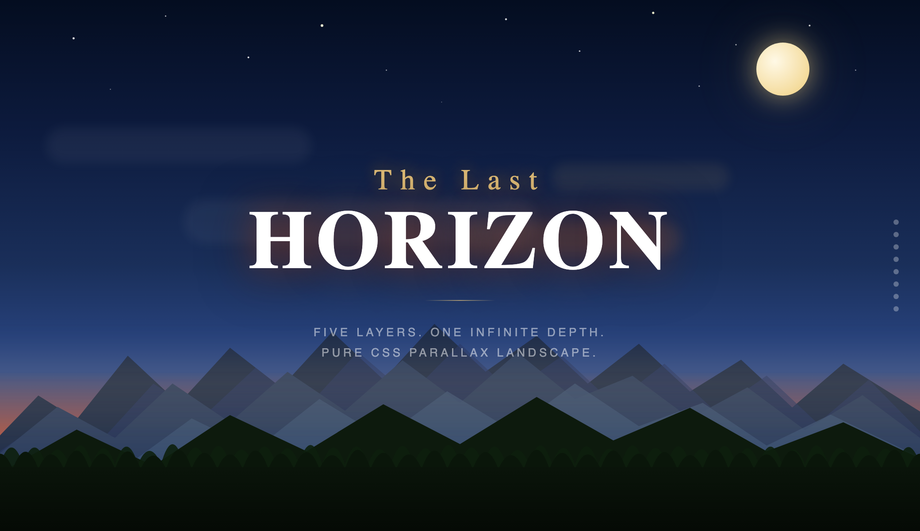
Cinematic twilight scene with eight independent SVG layers — star field, crescent moon, sun glow corona, drifting clouds, far and near mountain ranges, tree silhouettes, and rolling ground — each scrolling 0.08× to 0.94× viewport speed for convincing pseudo-3D depth. Cinzel serif headline. Right-edge depth-indicator dots. Rich indigo-to-amber sunset gradient sky.
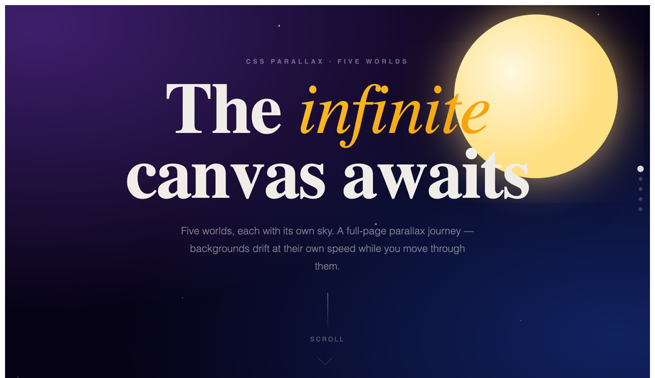
Five full-bleed sections (Cosmos, Desert, Ocean, Forest, Finale) each with a slower-moving SVG background driving the parallax via a requestAnimationFrame-throttled scroll listener.
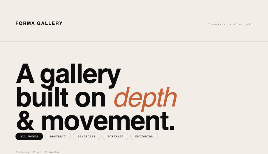
Twelve-cell asymmetric CSS Grid portfolio where each cell's inner layer translateY at speeds from 0.10× to 0.38× on scroll — creating subtle but convincing photo drift inside bounded containers. Abstract colour-field fills, hover captions, filter tab bar. Syne + Syne Mono. Clean white gallery aesthetic punctuated by oversized index numerals.
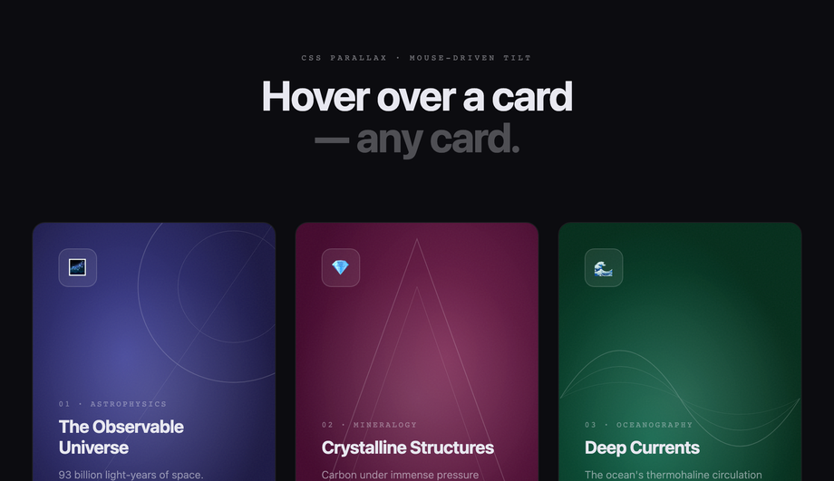
Six product/profile cards where three independent layers — gradient background, geometric SVG decoration, text content — shift on mouse position at 8px, 14px, and 22px depth respectively.
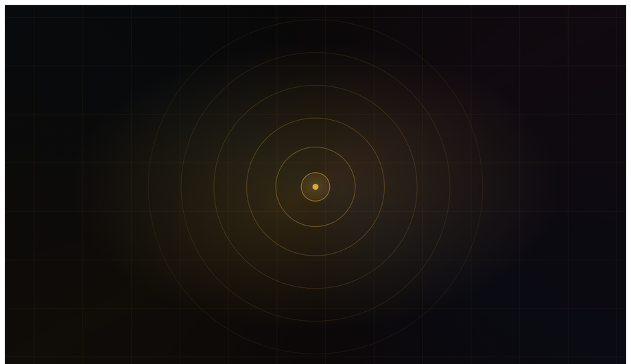
Cinematic camera-zoom illusion: concentric-ring system scales 1× to 3× while background scales 1× to 2× in the opposite direction as you scroll, building a 'falling forward' sensation.
Why doesn't background-attachment: fixed work for parallax on mobile anymore?
The classic "CSS parallax" tutorial pattern — <code>background-attachment: fixed</code> on a section background — has been broken on mobile for years. iOS Safari ignored it from iOS 5 onward (Apple decided the fixed-background scroll calculation hurt scroll performance enough to skip it entirely), and modern Chrome on Android follows the same convention. The result: tutorials that teach this pattern produce sites that work on desktop but have static, unfixed backgrounds on phones — exactly where parallax is most visually impactful. Demo 01 (CSS Parallax Hero Section) uses the modern alternative: a <code>requestAnimationFrame</code>-throttled scroll listener that applies <code>transform: translateY(scrollY * speed)</code> to each layer. The layers move independently AND it works identically on mobile. ~12 lines of JS. Every demo in this collection avoids background-attachment:fixed for this exact reason.
Can I do parallax effects in pure CSS without any JavaScript at all?
Two pure-CSS approaches exist, both with tradeoffs significant enough that this collection's 10 demos all use a small JS scroll listener instead. <strong>Approach 1: Keith Clark's 2014 perspective+translateZ technique</strong> — set <code>perspective: 1px</code> on the scroll container, then <code>transform: translateZ(-2px) scale(3)</code> on background layers and <code>translateZ(0)</code> on foreground layers. As the viewer scrolls, deeper layers move slower because they're farther from the camera in 3D space. Limitations: requires the scroll container to own its own scroll (not <code>body</code>), and the perspective stacking context interferes with <code>position: fixed</code> elements. <strong>Approach 2: <code>animation-timeline: scroll()</code> / <code>view()</code></strong> (Chrome 115+, Safari 18+, Firefox 130+) — the modern API binds CSS animation progress to scroll position. Powerful but has subtle quirks with <code>position: sticky</code> parents (the view() timeline freezes once the sticky pins) that make pinned-scene parallax harder than it looks. For most production work in 2026, a 12-line requestAnimationFrame scroll listener applying <code>transform: translateY(scrollY * speed)</code> is more reliable across browsers, easier to debug, and gives identical visual results. Pure-CSS parallax is a real option for hero-only / non-pinned layouts; for full-page multi-scene parallax (like this collection's Demo 04), the JS approach is the pragmatic choice.
How do I build a sticky parallax section sequence (Stripe / Linear marketing-page style)?
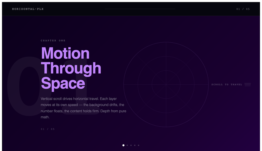
Demo 03 (CSS Sticky Parallax Sections) ships the canonical pattern that Stripe, Linear, Vercel, and Apple's marketing pages all use. Each "chapter" is a tall (200vh+) container with a sticky inner panel (<code>position: sticky; top: 0; height: 100vh</code>) so the panel pins to the viewport while the outer container's extra scroll runway provides the parallax delta. JavaScript tracks each chapter's <code>getBoundingClientRect()</code> as scroll moves and applies progress-based transforms (translate, rotate, opacity) to the inner content. The result: each section gets its own animated narrative beat, the visitor scrolls naturally through the page, and there's no JavaScript scroll-hijacking (a frequent UX antipattern in parallax sites). About 60 lines of JS total. Bonus: gracefully degrades to a normal scrollable page if JS is disabled — content remains accessible.
What's the JS-clobbering-CSS-transforms bug, and how do I avoid it?
Common production gotcha: when a JS parallax handler does <code>element.style.transform = \`translateY(${scrollY * 0.5}px)\`</code> on every scroll frame, it overwrites ANY CSS <code>transform</code> already set on that element — including centering tricks like <code>transform: translateX(-50%)</code>. Result: a sun that was supposed to be horizontally centered jumps to the right of where it should be, a blob that was vertically centered drops off the bottom of its panel. Two fixes: (1) <strong>Position with calc() instead of transform</strong> — use <code>left: calc(50% - 100px)</code> instead of <code>left: 50%; transform: translateX(-50%)</code>. The calc approach can't be overwritten by inline transform. (2) <strong>Compose the inline transform string to preserve baseline transforms</strong> — <code>element.style.transform = \`translateX(-50%) translateY(${scrollY * 0.5}px)\`</code>. Demos 02 and 08 in this collection use the calc() pattern; demos 06 and 09 use composition. Most "CSS parallax" tutorials skip this nuance entirely and ship demos that visibly break.
How do I create horizontal parallax scroll panels (driven by vertical scroll)?
Demo 06 (CSS Horizontal Parallax Scroll) is the pattern Apple's iPad / Mac marketing pages popularized. Outer container is 5x viewport height (<code>height: 500vh</code>) to provide scroll runway. Inner is <code>position: sticky; top: 0; height: 100vh; overflow: hidden</code>. The track inside the sticky inner has <code>width: 500vw</code> with 5 panels at 100vw each. JS reads <code>scrollY</code> as a 0-to-(scrollDistance) value, normalizes to 0-1, and applies <code>transform: translateX(-${progress * 80}%)</code> on the track. As the visitor scrolls down, the track slides left and 5 panels reveal horizontally. Best for: case-study sites, product feature walkthroughs, portfolio retrospectives. ~30 lines of JS. Most articles teach "parallax" as vertical-only — the horizontal-driven-by-vertical pattern is a real competitor gap with strong WOW-factor.
How do I do mouse-driven 3D card tilt parallax (Apple AirPods page style)?
Demo 08 (CSS Parallax Card Hover Effect) ships the production-grade implementation. The card uses <code>transform: perspective(800px) rotateX(0) rotateY(0)</code> at rest. On <code>mousemove</code> within the card bounds, JS calculates the cursor's offset from the card center as a -1 to +1 value on each axis, then applies <code>rotateY(cursorX * 10deg) rotateX(-cursorY * 10deg)</code>. Critical detail most tutorials skip: <strong>layered children inside the card need their own translateX/translateY offsets</strong> proportional to cursor position — that's what creates the depth illusion that the foreground icon "floats above" the background. On <code>mouseleave</code>, smoothly reset all transforms with a <code>transition: transform 0.4s cubic-bezier(.22,1,.36,1)</code>. Touch handler also wired so the effect works on tablets. ~40 lines of JS.
Are CSS parallax effects accessible? What about prefers-reduced-motion?
Excellent question, and the honest answer: parallax is one of the design patterns most likely to violate WCAG 2.3.3 (Animation from Interactions). Visitors with vestibular disorders can experience nausea or dizziness from large-displacement scroll-linked motion. <strong>Every demo in this collection includes an <code>@media (prefers-reduced-motion: reduce)</code> block</strong> that freezes parallax transforms to identity (no movement) when the visitor's OS preference says so. The JS handlers also check <code>window.matchMedia('(prefers-reduced-motion: reduce)').matches</code> before attaching scroll listeners — if reduced motion is on, the scroll-driven JS is skipped entirely. Result: visitors who need the reduced experience get a static, fully-readable page; visitors who want the full motion get it. Most "CSS parallax" tutorials skip this consideration entirely, which is a real accessibility liability.
How does animation-timeline: scroll() compare to JS scroll listeners for parallax?
<code>animation-timeline: scroll()</code> is the 2024-introduced CSS API (Chrome 115+, Safari 18+, Firefox 130+) that lets <code>@keyframes</code> animations be driven by scroll progress instead of wall-clock time. For parallax patterns this is huge: instead of <code>window.addEventListener('scroll', ...)</code> + <code>requestAnimationFrame</code> + transform math (the JS pattern), you write a regular <code>@keyframes</code> + add <code>animation-timeline: scroll(root)</code> + <code>animation-range: 0 100%</code>. Browser runs it on the compositor thread. <strong>Cost comparison</strong> on a throttled mobile (Pixel 5, Lighthouse mobile profile): JS scroll-listener parallax = ~80-120ms scripting per scroll second (eats INP); CSS scroll-timeline parallax = 0ms scripting. This collection's Demos 01-10 currently use the JS pattern for broader browser support (Safari 18 only shipped in late 2025), but a future v2 may add scroll-timeline variants. Most "CSS parallax" tutorials online predate this API entirely — a meaningful competitor gap if you're optimizing for Core Web Vitals.
Which parallax effect should I use for my project?
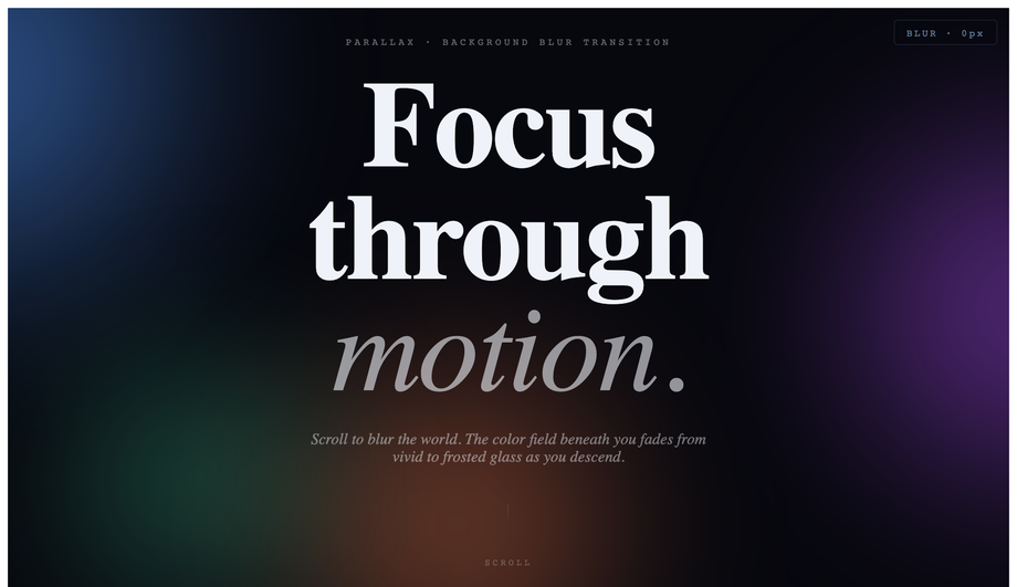
Quick decision guide. <strong>Marketing landing page hero</strong>: Demo 01 (Parallax Hero Section) for SaaS, Demo 02 (Multi-layered Landscape) for editorial / portfolio. <strong>Stripe-style product page with multiple chapters</strong>: Demo 03 (Sticky Parallax Sections) — pin each chapter while the inside animates. <strong>Full-page multi-scene cinematic journey</strong>: Demo 04 (Multi-Scene Parallax Scrolling) — 5 sticky-pinned scenes (Cosmos → Desert → Ocean → Forest → Finale) with nav dots and bg drift per scene. <strong>Image gallery / photography portfolio</strong>: Demo 05 (Parallax Image Grid) — each cell scrolls at a slightly different rate, creating organic depth. <strong>Case-study walkthrough / product feature tour</strong>: Demo 06 (Horizontal Parallax Scroll) — Apple iPad page pattern. <strong>Typography-led editorial layout</strong>: Demo 07 (Parallax Text Overlay Effect). <strong>E-commerce / product card grid</strong>: Demo 08 (Card Hover Tilt) — the Apple AirPods page pattern, works on every card hover. <strong>Cinematic intro / brand storytelling</strong>: Demo 09 (Zoom-In Depth Parallax) — like flying through a portal. <strong>Premium-feel transition between sections</strong>: Demo 10 (Backdrop Blur Transition). All 10 demos respect prefers-reduced-motion, are MIT-licensed, and use scoped <code>.plx-NN__*</code> class names so multiple can coexist on the same project without collision.