12 CSS Scroll Animations

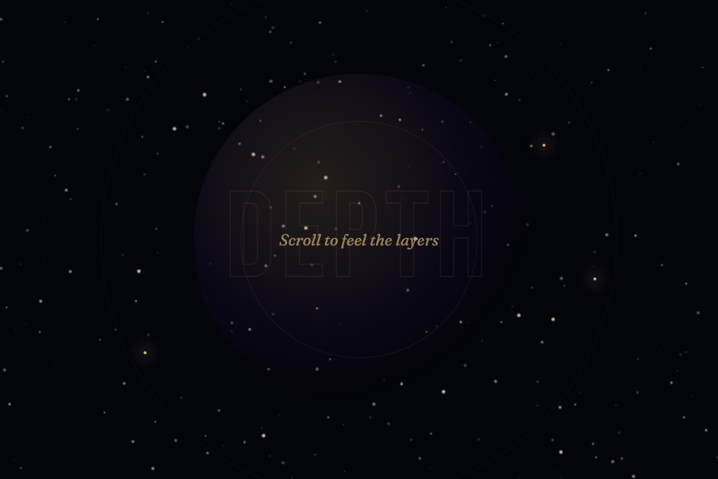
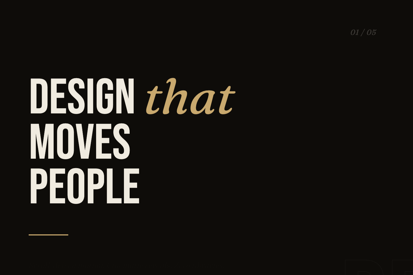
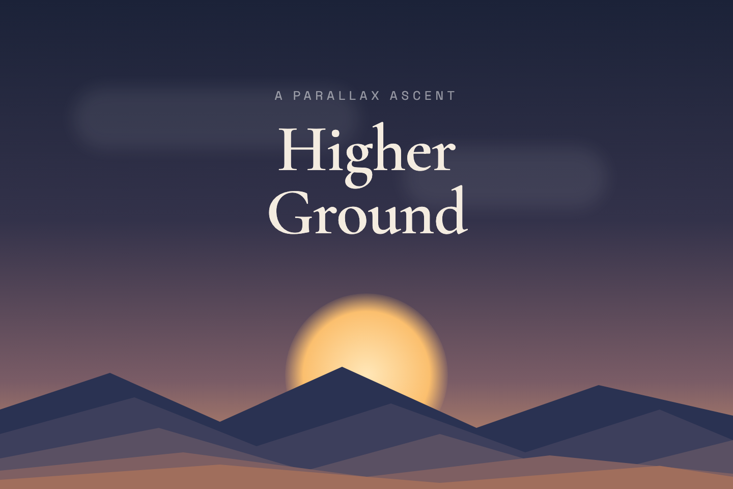
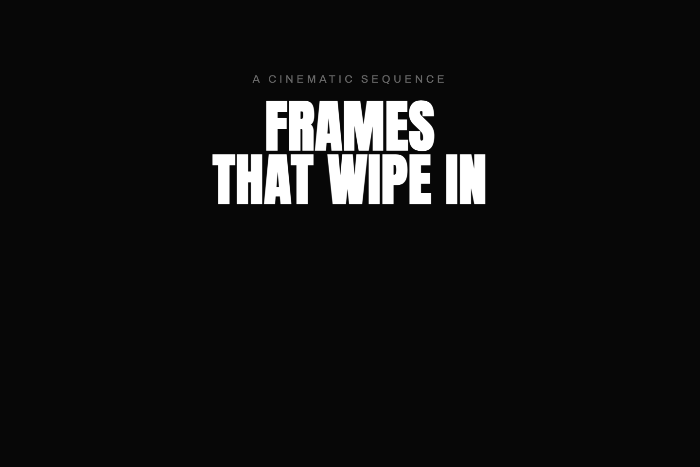
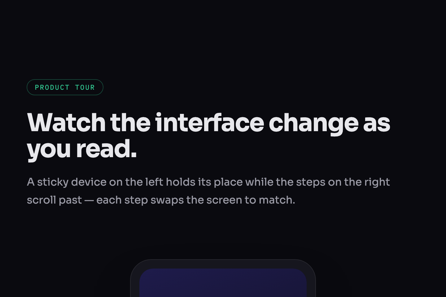
Scroll-driven animation ties motion to scroll position rather than a clock. These 12 demos are complete, full-page scroll experiences. Click Live Demo on any tile to see it run in an isolated frame, or Try it to open the editable playground.

12 unique scroll experiences 100% copy-paste ready Published
01 / 12
Parallax Cosmos
CSS + JS
Parallax Cosmos — preview
A 320vh sticky scene with six depth layers and a canvas starfield drifting at independent speeds, depth labels, and a scroll-progress bar.
02 / 12
Kinetic Typography
CSS + JS
Kinetic Typography — preview
Five full-screen type blocks where words slide, stagger, and settle into place as each panel enters the viewport.
03 / 12
Staggered Grid Waves
CSS + JS
Staggered Grid Waves — preview
Four waves of nine-card grids, each wave entering with a different physics — rise, scale, rotate, and depth burst.
04 / 12
Animated Data Stats
CSS + JS
Animated Data Stats — preview
Counters that ease toward their value, eight scroll-triggered progress bars, and five SVG ring gauges that fill on reveal.
05 / 12
Clip-Path Reveals
CSS + JS
Clip-Path Reveals — preview
Six full-width panels each unveiled with a different clip-path wipe — bottom-up, horizontal, radial burst, drop, inset zoom.
06 / 12
3D Card Entrances
CSS + JS
3D Card Entrances — preview
Four rows of cards that rotate, flip, and burst in from 3D space on scroll, then respond to live mouse tilt.
07 / 12
Scroll Reveal Suite
CSS + JS
Scroll Reveal Suite — preview
An architecture-studio portfolio showcasing six reveal techniques: mask-slide, lift, scale-curtain, clip, wipe, and blur dissolve.
08 / 12
Triple Scroll Progress
CSS + JS
Triple Scroll Progress — preview
A long-form essay reader with three synced progress indicators — a top gradient bar, a chapter rail, and a circular reading-time orb.
09 / 12
Staggered Portfolio List
CSS + JS
Staggered Portfolio List — preview
A work index whose rows arrive one at a time with a staggered slide-up, plus a hover sweep and arrow nudge.
10 / 12
Mountain Parallax Layers
CSS + JS
Mountain Parallax Layers — preview
A sticky 340vh landscape where five mountain ridges, clouds, and a rising sun move at independent parallax speeds.
11 / 12
Cinematic Image Wipe
CSS + JS
Cinematic Image Wipe — preview
Full-viewport frames revealed by a directional clip-path wipe that alternates side to side, captions riding in a beat behind.
12 / 12
Sticky Product Tour
CSS + JS
Sticky Product Tour — preview
Classic scrollytelling — a sticky device on the left swaps its screen to match each step as the copy scrolls past on the right.
FAQ

Frequently asked questions

What is a CSS scroll animation?
A CSS scroll animation is motion driven by scroll position rather than by a timer. As the page scrolls, elements can reveal, fade, slide, parallax, pin in place, wipe open, or zoom. Because the motion is tied to where the scroll is — not how much time has passed — scrolling back reverses it. This collection covers the most common production patterns: sticky parallax scenes, kinetic typography, staggered grid and list reveals, animated data counters, clip-path wipes, 3D card entrances and full scrollytelling tours.
How are these scroll animation demos built?
Each demo is a complete, standalone HTML document — its own markup, CSS and a small script — rather than a snippet. Reveal and stagger effects use IntersectionObserver to add a class when an element enters the viewport, then CSS transitions handle the motion. Parallax and scrollytelling demos read scroll position (via a scroll listener with requestAnimationFrame, or position: sticky) to move layers and swap panels. There are no libraries and no dependencies — copying the document gives you a working file.
Why does each demo run inside its own frame?
Every demo is a full-page scroll experience with its own global styles, body background and scroll behaviour. Rendering them all on one page would cause their CSS to collide and their scroll handlers to fight over the window. So each demo is isolated in its own iframe — scroll inside a frame to see that demo move, without it affecting the page or the other demos. The full HTML document is shown in the code panel below each preview so you can copy it intact.
Do CSS scroll animations work in every browser?
Yes. These demos rely on IntersectionObserver, position: sticky, clip-path, CSS transforms and scroll listeners — all supported in every modern browser, including Safari. They avoid the still-cutting-edge scroll-driven timeline APIs (animation-timeline, scroll(), view()) so the demos behave identically across Chrome, Edge, Firefox and Safari with no fallback needed.
How do I make scroll animations accessible?
The key rule is to respect prefers-reduced-motion. Scroll-linked motion is decorative, so when adapting these demos you should add a reduced-motion media query that collapses each effect to its finished, fully-visible state — no movement, no animation. Never hide content behind a scroll animation a user cannot trigger: reveal effects should start hidden but become visible by default under reduced motion, and the markup reading order should stay correct so screen readers walk the content normally regardless of the animation.
How do I adapt these scroll animations to my project?
Each demo is a self-contained HTML document, so the fastest path is to copy one whole and strip it down — keep the structure and the script, then swap the placeholder content, colours and gradients for your own. The demos are written as full-page experiences (320vh sticky scenes, multi-screen blocks), so in your project you'll typically drop them into a real page section and let them run against the actual page scroll. Tune the IntersectionObserver thresholds and transition delays to control when and how fast each effect fires.

Related collections

15 CSS Background Animations preview

15 CSS Background Animations

15

15 hand-coded CSS background animations with live demos — infinite shifting gradient, floating particle bubbles, parallax starry night, clickable cyberpunk ripple, sliding geometric grid, SVG wave overlays, glassmorphism orbs, aurora borealis ribbons, matrix digital rain, mesh gradient blobs, falling snow, morphing blob, retro synthwave 3D grid, infinite scrolling diagonal marquee, comic-book halftone dots. 100% Pure CSS, no JavaScript, no canvas, no particles.js. prefers-reduced-motion respected, scoped class names, MIT-licensed.

css background animation animated gradient background css css floating particles Responsive
27 CSS Button Hover Effects preview

27 CSS Button Hover Effects

27

27 hand-coded CSS button hover effects — 3D press, neon glow, gradient slide, border draw, liquid fill, ripple, glitch text, and kinetic flips. Every demo is pure CSS (no JavaScript, no framework), tuned for 60fps with transform and opacity, and respects prefers-reduced-motion out of the box.

css buttons button hover button hover effects Responsive
33 CSS Card Hover Effects preview

33 CSS Card Hover Effects

33

33 hand-coded CSS card hover effects with live demos — multi-axis 3D tilt with parallax, glowing gradient glassmorphic border, image zoom with content slide-up, front-to-back 3D flip, sibling de-emphasis with :has(), minimalist elevation, plus 27 more (elastic lift, conic-gradient border, holographic foil, neon sign, glitch RGB split, magnetic float, blueprint reveal, aurora drift and more). 26 pure CSS + 7 with a small vanilla JS snippet for cursor tracking. prefers-reduced-motion respected, scoped class names, MIT-licensed.

css card hover effect css card hover animation card hover effect pure css Responsive

Search CodeFronts

Loading…