A CSS transition is the smooth animated change between two states — the most-used motion primitive on the web in 2026. These 22 hand-coded transition effects cover every production pattern: button hover, scroll-reveal, flip cards, text reveal, image zoom, modal open/close, page transitions, ripple, magnetic hover, 3D card tilt, glassmorphism, staggered lists, cursor trails, progress bars, and more. All GPU-accelerated (transform + opacity only — no layout thrashing, 60fps on mid-tier mobile), respect prefers-reduced-motion, and ship MIT-licensed. Drop into any stack: React, Vue, Svelte, Astro, Rails, plain HTML — no framework dependencies.
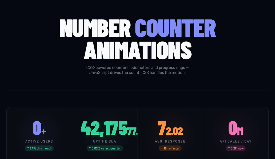
Stat grid counters animating on load, live odometer incrementing every three seconds and SVG circular progress rings with stroke-dashoffset transition.
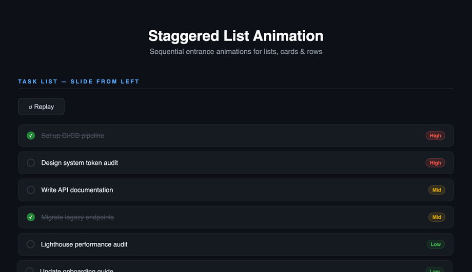
Sequential entrance for tasks (slide left), feature cards (scale up), navigation menu (slide right) and data table rows (fade up) with replay controls.
What is the difference between a CSS transition and a CSS animation?
Both produce motion, but they're different tools. <strong><code>transition</code></strong> animates a property between two states — usually triggered by a state change like <code>:hover</code>, <code>:focus</code>, <code>:checked</code>, or a JavaScript class toggle. You declare the start state, declare the end state, and CSS interpolates between them. <strong><code>animation</code></strong> + <code>@keyframes</code> runs a multi-step sequence over time (can have 2, 5, or 50 intermediate states), runs on page load or via class toggle, can loop infinitely, and can chain via <code>animation-delay</code>. Decision tree: (1) State change like hover or click → use <code>transition</code> — simpler, fewer keystrokes, less code to maintain. (2) Looping motion (spinner, pulse, marquee, breathing button) → use <code>animation</code> — <code>transition</code> can't loop. (3) Multi-stage choreography (icon morphs through 4 shapes) → use <code>animation</code> — only @keyframes can express more than two states. (4) Scroll-driven motion → use <code>animation-timeline: scroll()</code> (Chrome 115+, Safari 18+) or a JS IntersectionObserver-triggered <code>transition</code>. All 22 demos in this collection use the right tool for each pattern.
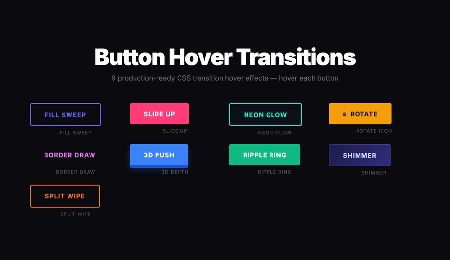
How do I add button hover transitions without :hover breaking on touch devices?
Demo 01 (Button Hover Transitions) ships 9 production-grade variants that work correctly across mouse, touch, and pen inputs. The trick: <strong>never rely on <code>:hover</code> alone for state changes</strong> — it fires inconsistently on touch (some browsers fire <code>:hover</code> on tap and leave it stuck until another tap elsewhere; others skip it entirely). Three production-grade fixes that this demo applies: (1) <strong>Pair <code>:hover</code> with <code>:focus-visible</code></strong> so keyboard users get the same visual feedback. (2) <strong>Add <code>@media (hover: hover)</code></strong> wrapper around hover-only effects (cursor-attraction, magnetic pull, image zoom) so they don't fire weirdly on touch — only when a real mouse cursor is detected. (3) <strong>Use <code>:active</code> for tap feedback</strong> on mobile — the brief touchdown state gives users confirmation their tap was registered. The 9 button variants in Demo 01 (fill sweep, slide-up, neon glow, rotate icon, border draw, 3D depth, ripple ring, shimmer, split wipe) are each a self-contained CSS class you can copy into any button — semantic HTML, no library, ~10-25 lines of CSS per variant.
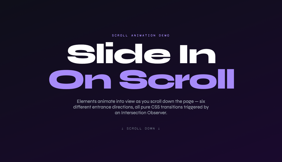
How do I do scroll-reveal animations without AOS.js, Framer Motion, or GSAP?
Demos 02 (Slide-In on Scroll) and 18 (Staggered List Animation) ship the vanilla pattern using IntersectionObserver — no library required. Cost comparison: <strong>AOS.js</strong> ships ~22kb minified for this effect. <strong>Framer Motion's <code>whileInView</code></strong> requires React + ~140kb motion library. <strong>GSAP ScrollTrigger</strong> is ~70kb. <strong>This demo's approach</strong>: ~15 lines of vanilla JavaScript using IntersectionObserver. The pattern: each <code>.reveal</code> element starts with <code>opacity: 0; transform: translateY(40px)</code>. A single IntersectionObserver watches all <code>.reveal</code> elements; when one enters the viewport, JavaScript adds an <code>.is-visible</code> class. The CSS <code>.is-visible</code> rule transitions opacity to 1 and transform to 0 over 0.7s. Total: ~600 bytes, zero dependencies, works in every framework or no framework. Plus the <code>prefers-reduced-motion</code> query disables the transform entirely for visitors with the OS preference set. Demo 18 adds staggered <code>transition-delay</code> values (100ms × index) so list items cascade in sequence instead of appearing simultaneously.
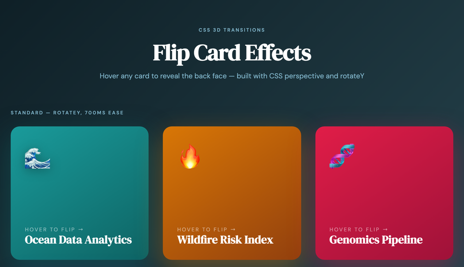
How do I build a production-grade 3D flip card transition?
Demo 03 (Flip Card 3D Transition) ships the canonical implementation that most online tutorials get wrong. The pattern requires three CSS properties working together: (1) <strong><code>perspective: 1000px</code></strong> on the parent scene container — this creates the 3D viewing distance. Without it, the rotation looks flat / glitchy. (2) <strong><code>transform-style: preserve-3d</code></strong> on the inner card flipper — without this, child elements collapse to 2D when the parent rotates. (3) <strong><code>backface-visibility: hidden</code></strong> on both faces — without this, you see the back of the front face mirrored through the card when it's mid-rotation. The flip itself is a single <code>transition: transform 0.6s cubic-bezier(.22,1,.36,1)</code> + <code>transform: rotateY(180deg)</code> on hover. Most tutorials skip <code>backface-visibility</code> or only apply it to one face — the result is text appearing backward during the flip. Bonus production detail: add <code>will-change: transform</code> on the flipper so the browser promotes it to a GPU layer before the animation starts, preventing first-frame stutter. Pure CSS, zero JavaScript.
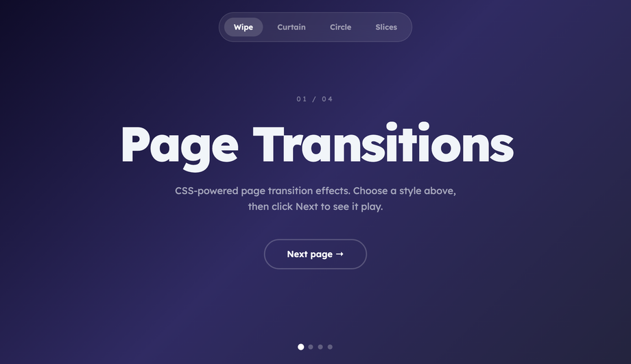
How do I do page transitions in vanilla CSS / JS (Next.js / Vue Router / Astro alternative)?
Demo 12 (Page Transition Effect) ships the cross-framework pattern using the new <strong>View Transitions API</strong> (Chrome 111+, Safari 18+, Firefox 129+). The native API: wrap navigation in <code>document.startViewTransition(() => updateDOM())</code> — the browser automatically captures before/after snapshots and crossfades them. To customise: add CSS rules targeting <code>::view-transition-old(root)</code> and <code>::view-transition-new(root)</code> with custom animations (slide, fade, scale, blur). Demo 12 ships 4 transition variants: fade, slide-left, scale-up, blur-cross — switch between them with a button. Why use this over Framer Motion's <code>AnimatePresence</code> or Next.js page transitions: <strong>(a) zero bundle cost</strong> — it's a browser API. <strong>(b) cross-framework</strong> — works in Astro, Next.js, vanilla HTML, Vue Router, SvelteKit — anywhere you can call <code>startViewTransition()</code>. <strong>(c) GPU-accelerated</strong> — transitions run on the compositor thread, no React reconciliation pause. Fallback for older browsers: feature-detect <code>document.startViewTransition</code> and fall back to a synchronous update (no animation, page still works). ~30 lines of JS.
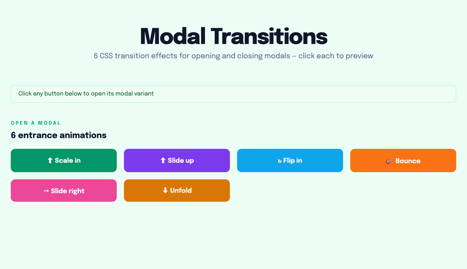
How do I build modal / dialog open-close transitions without animation libraries?
Demo 11 (Modal Open Close Transition) ships the production pattern using the native <code><dialog></code> element + CSS transitions. The platform-modern approach: semantic <code><dialog id="myModal"></code>, opened with <code>modal.showModal()</code> (which provides focus-trap, Esc-to-close, and scroll-lock for free — no library needed), closed with <code>modal.close()</code>. Animate the open with <code>@starting-style</code> (Chrome 117+, Safari 17.5+, Firefox 129+) for the entry transition: <code>@starting-style { dialog[open] { opacity: 0; transform: scale(0.9); } } dialog[open] { opacity: 1; transform: scale(1); transition: all 0.3s; }</code>. For the close: <code>transition-behavior: allow-discrete</code> + <code>display: block</code> in the closed state. Cost comparison: <strong>Framer Motion's <code><AnimatePresence></code></strong> + a custom dialog implementation = ~140kb React + Motion + focus-trap libraries. <strong>This demo's approach</strong>: ~25 lines of vanilla JavaScript (open/close handlers + backdrop click) + ~40 lines of CSS. Zero library bundle, full keyboard accessibility from the native dialog element, works in every framework. Browser support: native <code><dialog></code> is Chrome 37+, Safari 15.4+, Firefox 98+ — universally supported as of 2024.
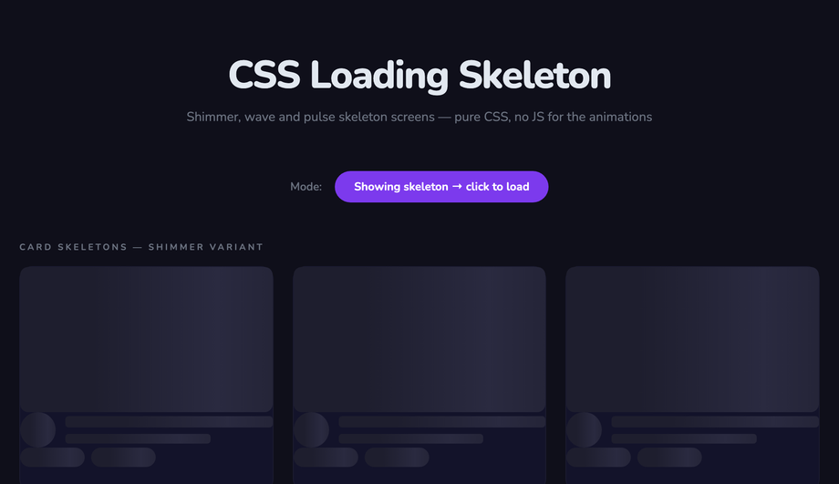
How do I create skeleton loader transitions (Facebook / LinkedIn style)?
Demo 10 (Loading Skeleton Transition) ships the shimmer-bar pattern that Facebook, LinkedIn, and YouTube use during content load. The pattern: skeleton boxes are gray placeholders matching the eventual content's shape (avatar circle, two text bars, image rectangle), with a moving shimmer gradient overlay. Pure CSS implementation: each skeleton element has <code>background: linear-gradient(90deg, #e0e0e0 0%, #f5f5f5 50%, #e0e0e0 100%); background-size: 200% 100%</code> and runs <code>animation: shimmer 1.5s infinite</code> that animates <code>background-position</code> from <code>200% 0</code> to <code>-200% 0</code>. The shimmer band sweeps across the placeholder, signaling "loading" without a spinner. JS toggles the skeleton state — replace skeleton DOM with real content when fetch completes. Cost comparison: <strong>React Skeleton library</strong> ships ~8kb + requires React. <strong>This demo's approach</strong>: ~20 lines of CSS, framework-neutral, works in any stack. Three production-grade details most tutorials miss: (1) <strong>Match the skeleton's exact dimensions to the real content</strong> — otherwise users see layout shift (LCP penalty) when content replaces skeleton. (2) <strong>Add <code>prefers-reduced-motion</code> fallback</strong> — replace the shimmer animation with a static gray for visitors with motion sensitivity. (3) <strong>Show skeleton only after 200ms</strong> — if content loads faster, skip skeleton entirely (no flash-of-loading-state).
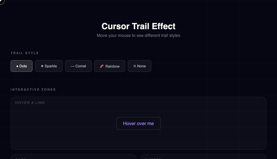
How do I build a cursor trail effect (Awwwards-winning sites style)?
Demo 19 (Cursor Trail Effect) ships the production-grade implementation made famous by Awwwards-winning portfolio sites and the Stripe Sigma landing page. The mechanic: on <code>pointermove</code> across the viewport, JavaScript captures the cursor coordinates and spawns trail dots at decreasing opacity values that follow the cursor with a slight lag. Three implementation strategies, ranked by performance: (1) <strong>Best — recycle a fixed pool of 20-30 trail dots</strong>, updating their transform position with each move event. No DOM creation/destruction in the hot path → 60fps even on mid-tier mobile. (2) <strong>OK — spawn new dot per move event, remove via animationend</strong> — works but creates DOM churn that can stutter at high mouse speeds. (3) <strong>Avoid — Canvas trail with requestAnimationFrame redraw</strong> — looks great but eats 8-15ms scripting per frame, tanking INP score on lower-end devices. This demo uses approach (1) — ~80 lines of vanilla JS, no library. Three production gotchas: (a) <strong>Skip on touch devices</strong> via <code>matchMedia('(hover: none)')</code> — pointer-move on touch is gesture-not-cursor. (b) <strong>Respect <code>prefers-reduced-motion</code></strong> — disable the trail entirely for vestibular-sensitive visitors. (c) <strong>Cap the trail at 30 dots maximum</strong> — beyond that, the visual gets noisy and the perf cost compounds.
Will animating box-shadow, filter, or background-color hurt my Core Web Vitals INP score?
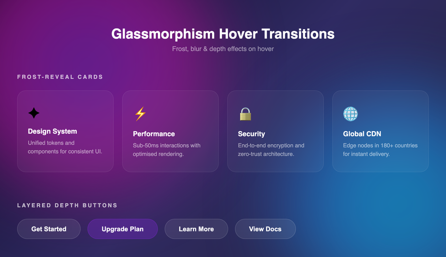
Short answer: <strong>animating <code>box-shadow</code> and <code>filter</code> can hurt INP significantly; animating <code>background-color</code> is usually fine.</strong> Here's the breakdown. <strong>Animatable on the compositor (cheap, 60fps)</strong>: <code>transform</code> (translate/rotate/scale), <code>opacity</code>. These don't trigger layout or painting — they run on the GPU thread. All 22 demos in this collection use these primarily. <strong>Animatable but expensive (paint cost per frame)</strong>: <code>background-color</code>, <code>color</code>, <code>border-color</code> — these require repainting the element each frame, costing 2-4ms per frame. Usually fine for a single element; tanks INP if you animate 50+ elements simultaneously. <strong>Avoid animating</strong>: <code>box-shadow</code>, <code>filter: blur()</code>, <code>border-radius</code>, <code>width</code>, <code>height</code>, <code>top</code>, <code>left</code>, <code>margin</code>, <code>padding</code>. These trigger expensive recalculations — animating <code>filter: blur(0px) → blur(20px)</code> on hover can cost 16-30ms per frame, single-handedly failing INP. <strong>Workaround for shadow / blur effects</strong>: pre-render the blurred/shadowed state as a separate element with <code>opacity: 0</code>, then transition opacity 0 → 1 on hover. The browser composites the two states instead of recalculating the filter — drops paint cost from 30ms to under 1ms. Demo 17 (Glassmorphism Hover) uses this opacity-cross-fade trick for the backdrop-filter blur.
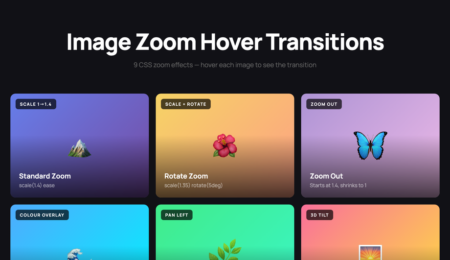
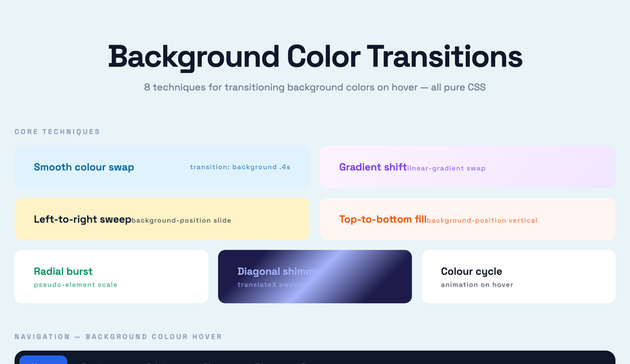
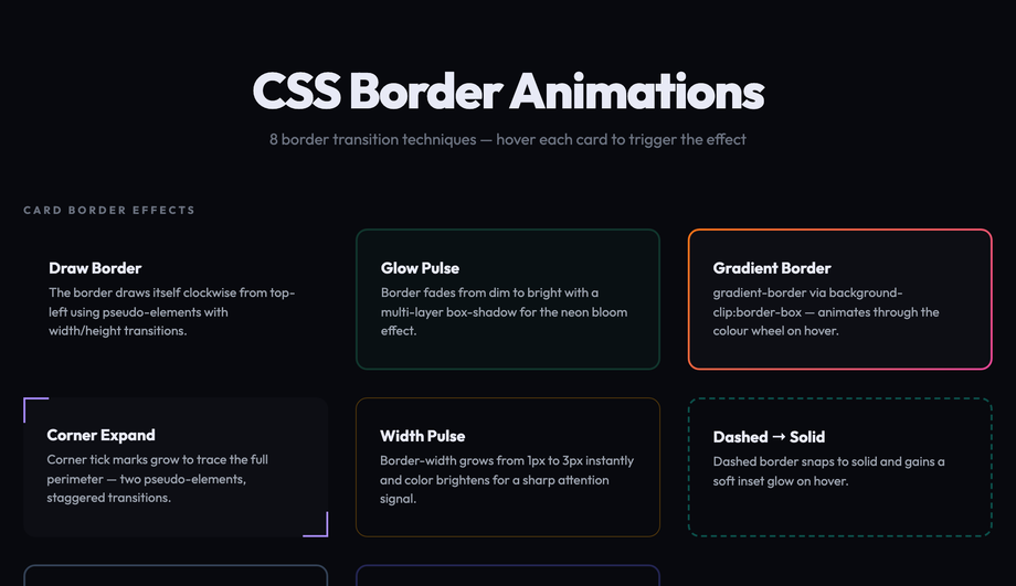
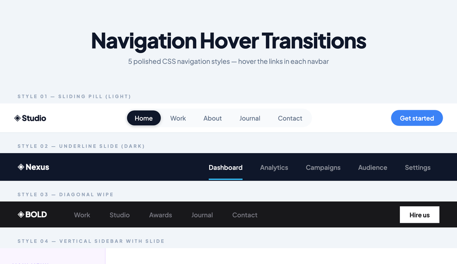
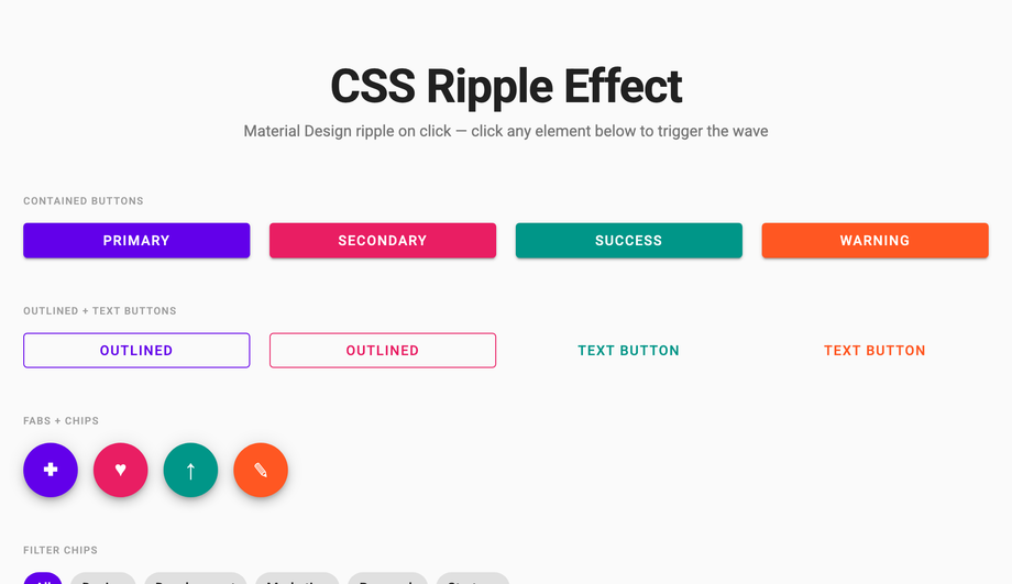
Which CSS transition effect should I use for my project?
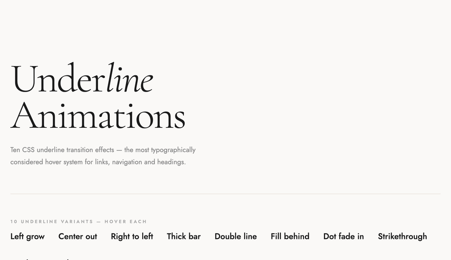
Quick decision guide. <strong>Button feedback</strong>: Demo 01 (Button Hover Transitions — 9 variants). <strong>Hero section / landing page elements appearing on scroll</strong>: Demo 02 (Slide-In on Scroll). <strong>Product cards or testimonials revealing on scroll</strong>: Demo 18 (Staggered List Animation). <strong>Service / pricing cards with flip interaction</strong>: Demo 03 (Flip Card 3D Transition). <strong>Editorial text intro</strong>: Demo 04 (Text Reveal Animation) for masked clip reveal; Demo 21 (Split Text Reveal) for GSAP-style word-by-word. <strong>E-commerce / portfolio image gallery</strong>: Demo 05 (Image Zoom Hover) for product cards; Demo 16 (Card Tilt 3D Hover) for premium feel. <strong>Form button or theme toggle</strong>: Demo 06 (Background Color Transition). <strong>CTA emphasis</strong>: Demo 07 (Border Animation). <strong>Tabs or accordion content</strong>: Demo 08 (Fade In/Out). <strong>Navigation menu</strong>: Demo 09 (Navigation Hover). <strong>Skeleton loading state</strong>: Demo 10 — replaces spinners. <strong>Modal / dialog</strong>: Demo 11 — uses native <code><dialog></code>. <strong>SPA-like page transitions</strong>: Demo 12 — uses View Transitions API. <strong>Material click feedback</strong>: Demo 13 (Ripple on Click). <strong>Link hover states</strong>: Demo 14 (Underline Animation). <strong>Stats / metric blocks</strong>: Demo 15 (Number Counter). <strong>Glassmorphism brand</strong>: Demo 17 — frosted glass hover. <strong>Awwwards-style portfolio</strong>: Demo 19 (Cursor Trail) + Demo 20 (Magnetic Button). <strong>Progress / completion indicator</strong>: Demo 22 (Progress Bar). All 22 demos respect prefers-reduced-motion, are MIT-licensed, GPU-accelerated, and work in every framework or no framework.