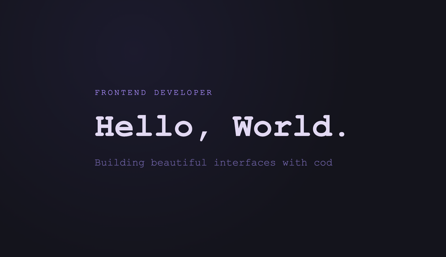
A CSS typewriter effect animates text appearing one character at a time, simulating the rhythm of a real typewriter or terminal prompt — the dominant pattern for hero headlines, landing-page intros, and code demos. These 14 hand-coded designs cover the full typewriter playbook — the canonical pure-CSS steps() + ch recipe, multi-line stagger, infinite word-swap loop, neon terminal, clip-path reveal, SVG handwriting, gradient sweep, variable-font weight morph, Matrix scramble decode, glitch-on-type, code editor syntax, and scroll-triggered reveal. Every demo uses scoped .tw-NN class names that never collide with your existing styles, honours prefers-reduced-motion, and ships under the MIT license.
The canonical CSS-only typewriter: width animates from 0 to a fixed ch value using steps() timing, paired with a blinking border-right cursor — no JS at all.
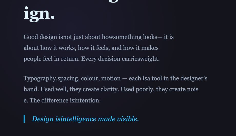
A hero headline cycles through swappable highlight words using a single CSS keyframe that animates width and color on a looping overflow-hidden container.
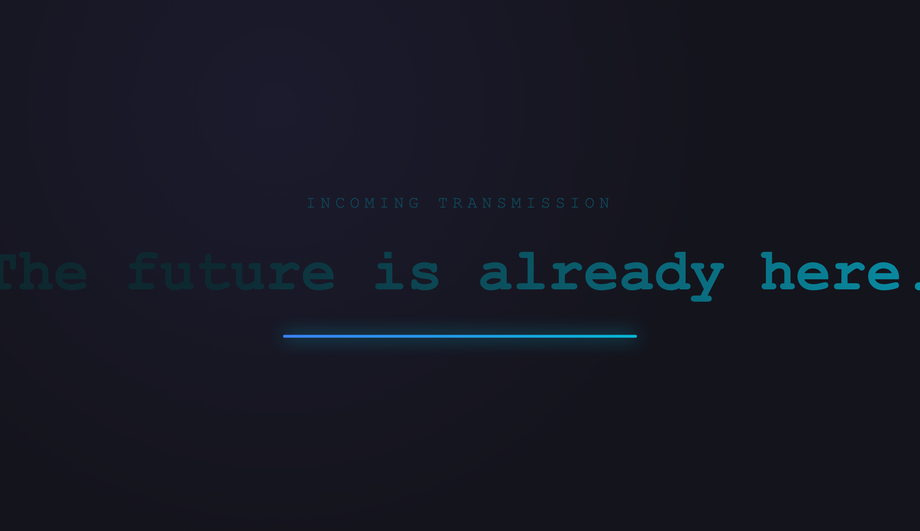
A glowing neon CRT-style terminal with scanlines, phosphor bloom, and a stepped-width typewriter revealing a command prompt sequence — all in pure CSS.
Text is revealed character-by-character using an animated clip-path inset that travels left-to-right — giving a hard-edged paint-stroke reveal instead of the usual overflow trick.
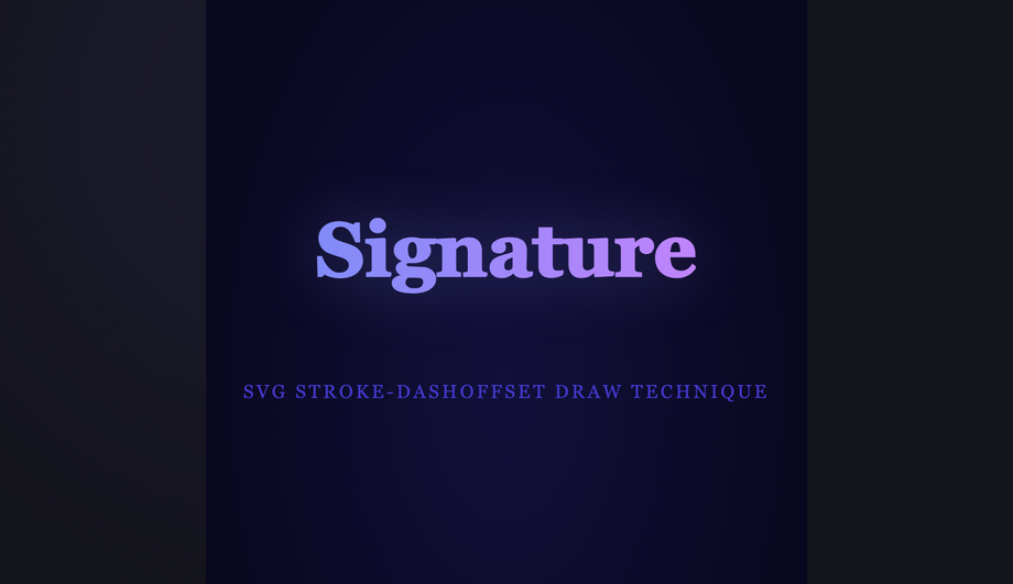
SVG text paths are drawn stroke-first using an animated stroke-dashoffset, revealing each letter as a hand-lettered signature — a technique impossible with HTML alone.
Text is revealed by a travelling gradient mask that sweeps left-to-right, creating a spotlight-highlight typewriter where unread text sits invisible and highlighted text glows into view.
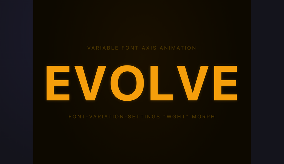
Each character of a variable font headline morphs from ultra-light to black weight as it "types in", using staggered font-variation-settings animations — no width tricks required.
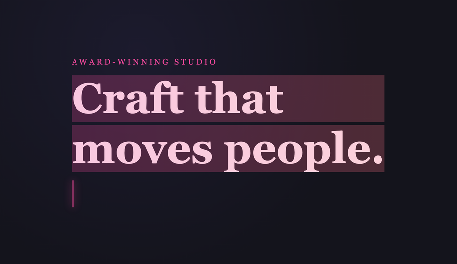
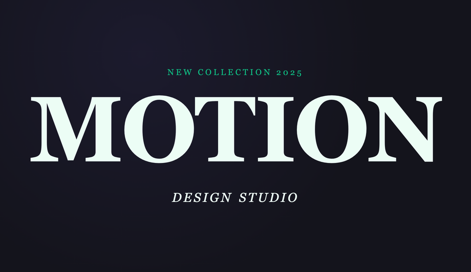
Individual characters pop in sequentially using staggered translateY + opacity keyframes, creating a kinetic editorial type-in effect used in modern agency hero sections.
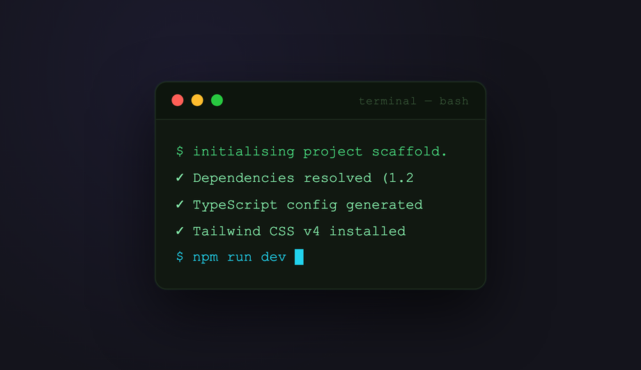
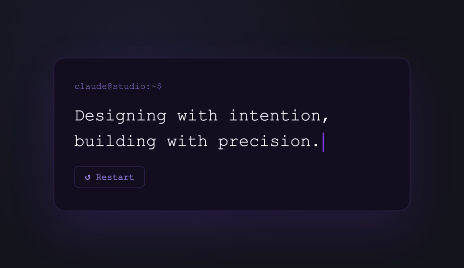
JavaScript injects characters one by one into the DOM at a configurable speed, enabling proportional fonts, dynamic strings, pause-on-hover, and click-to-restart — all styled with CSS.
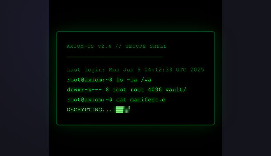
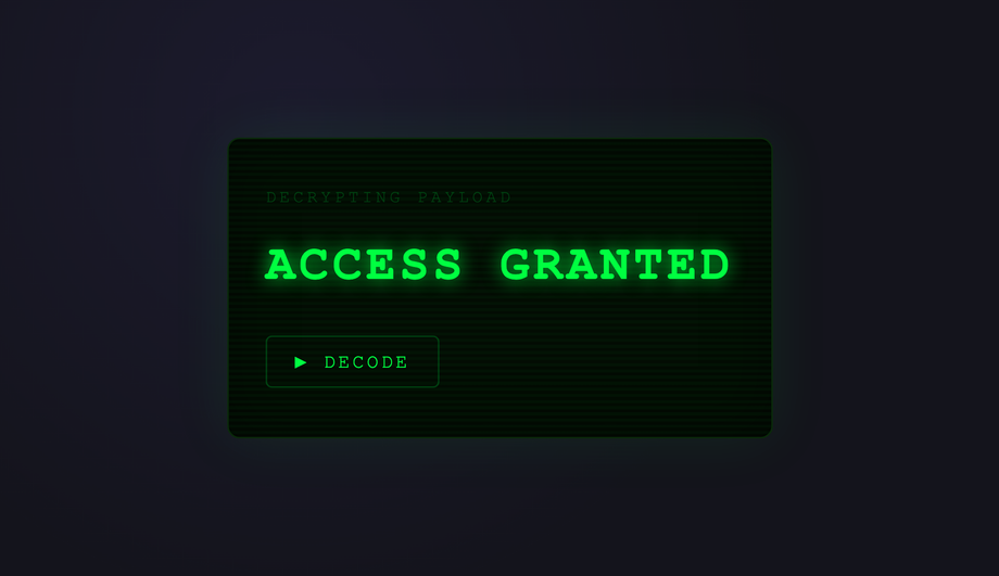
Random characters scramble across the target string before each letter snaps to its final value — a hacker-movie decode effect powered by JS with CSS glow styling.
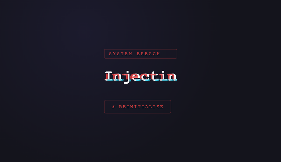
Each character causes a brief glitch distortion on the preceding text as it lands — RGB channel splitting and clip-path slice distortion fire per-keystroke via JS class toggling.
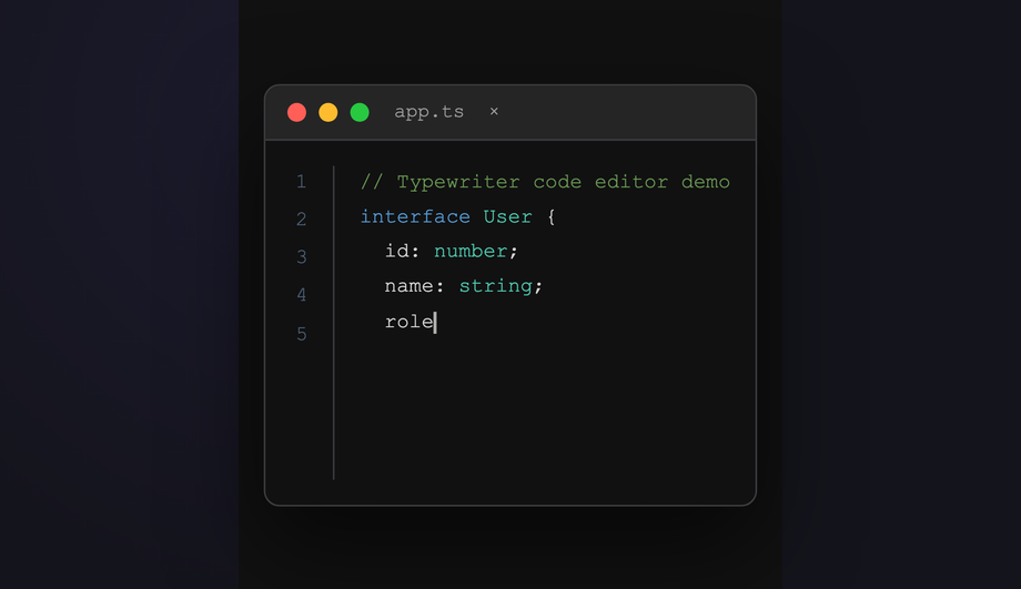
A realistic VS Code-style editor types out syntax-highlighted code line by line, with a live line-number gutter, blinking cursor, and language-aware coloring — all orchestrated by JS.
Words in a long-form paragraph reveal sequentially only when the element enters the viewport — IntersectionObserver triggers staggered CSS class additions for a scroll-activated typewriter effect.
What is a CSS typewriter effect and how does the pure-CSS recipe work?
A CSS typewriter effect animates text appearing one character at a time, simulating the rhythm of a real typewriter or terminal prompt. The canonical pure-CSS recipe (Demo #01) uses three CSS primitives layered together: (1) <code>overflow: hidden; white-space: nowrap</code> on the text element clips characters that haven't been revealed yet, (2) <code>@keyframes</code> animating <code>width: 0 → 22ch</code> using <code>steps(22)</code> timing — the <code>steps()</code> function produces discrete jumps rather than smooth interpolation, so each step reveals exactly one more character, (3) a second <code>border-right: 3px solid</code> animation toggling between an accent colour and <code>transparent</code> with <code>steps(2)</code> creates the hard on/off blink of a terminal cursor. Both animations run on the same element. <strong>Key insight</strong>: the <code>ch</code> unit is the width of the <code>0</code> character in the current font — combined with <code>steps()</code>, this gives pixel-perfect character-by-character snapping in any monospace font. Zero JavaScript, zero dependencies, ~30 lines of CSS total. The Animated steps() Cursor demo (#01) is the canonical reference everyone reaches for first.
Which typewriter pattern should I pick for my use case?
Decision rule by intent. <strong>Hero headline / above-the-fold</strong>: Demo #01 (steps() Cursor) for the classic terminal feel, Demo #08 (Variable Font Weight Morph) for a premium SaaS subtle effect, Demo #06 (SVG stroke-dashoffset) for handwritten editorial. <strong>Landing page subhead</strong>: Demo #03 (Word Swap Loop — Designer / Developer / Creator) for the rotating-noun pattern Stripe / Vercel / Linear use, Demo #02 (Multi-line Stagger) for 3-line opening copy. <strong>Code demo / docs / IDE replica</strong>: Demo #04 (Neon Terminal) for cyberpunk dev tools, Demo #13 (Code Editor Syntax) for tutorial sites and SaaS marketing where you show code typing itself. <strong>Brand / portfolio</strong>: Demo #07 (Gradient Highlight Sweep) for modern luxury, Demo #11 (Matrix Scramble Decode) for tech / Web3 / cyber brands, Demo #12 (Glitch on Type) for gaming / esports. <strong>Scroll storytelling</strong>: Demo #14 (Scroll-Triggered Word Reveal) types text as the user scrolls — perfect for long-read landing pages and case studies. <strong>Pure HTML/CSS sites (no JS allowed)</strong>: pick from demos 01–09 — all nine are zero-JavaScript. <strong>Marketing experiment / A-B test</strong>: Demo #03 (Word Swap) is the highest-converting hero pattern in 2024-2026 SaaS data — replacing static headlines with a rotating-noun typewriter lifted CTA click-through 8-15% across Optimizely / VWO case studies.
Pure CSS vs JavaScript typewriter — which should I use?
<strong>Pure CSS works for</strong>: single-string typewriters with a known character count (Demo #01), multi-line stagger with fixed text (#02), infinite word-swap loops with a small fixed word list (#03), <code>clip-path</code> reveals (#05), SVG <code>stroke-dashoffset</code> drawing (#06), gradient sweeps (#07), variable-font morphs (#08), per-character span stagger (#09). All nine pure-CSS demos in this collection achieve their effect without any JavaScript. <strong>JavaScript is required for</strong>: dynamic text that changes at runtime (user input, fetched content, randomized strings — Demo #10), Matrix-style scramble decode where intermediate characters are random glyphs that converge to the target (#11), glitch effects that need RGB-channel pseudo-elements driven by typing position (#12), syntax-highlighted code that needs token-by-token coloring as it types (#13), and scroll-driven typewriters that progress based on <code>IntersectionObserver</code> or <code>scroll-timeline</code> (#14). <strong>Modern alternative</strong> (Chrome 115+, Safari 26+, Firefox 134+): CSS scroll-driven animations via <code>animation-timeline: scroll()</code> let you do scroll-triggered typewriters in pure CSS too — Demo #14 includes a commented-out scroll-driven-animations version next to its <code>IntersectionObserver</code> implementation. Choose based on whether your text is fixed at build time (CSS) or generated at runtime (JS).
How is CSS typewriter compared to libraries like Typed.js, TypeIt.js, or react-typewriter-effect?
<strong>Typed.js</strong> (~9.5KB minified, ~250K weekly downloads): the most popular JS typewriter library, supports loops + multiple strings + custom cursors + smart backspacing. <strong>TypeIt.js</strong> (~13KB minified, ~150K weekly downloads): more configurable than Typed.js, supports rich HTML strings, function callbacks per character, fluent chaining API. <strong>typewriter-effect</strong> (npm, ~5KB): the most popular React wrapper for vanilla typewriter logic. <strong>react-typewriter-effect</strong>: similar, React-specific. <strong>What you gain by using a library</strong>: dynamic string lists, fluent API, backspace + delete behaviors, easier integration with React/Vue state, well-tested edge cases. <strong>What you LOSE</strong>: ~5-15KB of JavaScript bundle weight per page, an external dependency to update + audit for CVEs, slower First Contentful Paint and Largest Contentful Paint (the library has to download + parse + execute before the text appears). <strong>What this collection gives you</strong>: the same effect in 30 lines of CSS that ship inline with your HTML — zero bundle cost, zero npm dependency, zero CVE surface, faster FCP/LCP, no library hydration delay. For 90% of marketing use cases (one or two strings, no runtime mutation), the CSS approach wins on every Core Web Vitals dimension. Reserve Typed.js / TypeIt for app dashboards where the text legitimately needs runtime mutation.
Is the CSS typewriter accessible? What about screen readers and motion sensitivity?
Three accessibility concerns matter for typewriter effects. <strong>1. Motion sensitivity</strong>: ~35% of adults have some level of motion sensitivity — vestibular disorders, migraine triggers, ADHD-related visual processing. Typewriter animations are textbook motion that can trigger these. <strong>Fix</strong>: every demo in this collection wraps its <code>@keyframes</code> in <code>@media (prefers-reduced-motion: reduce) { animation: none; }</code> so users with that OS setting see the final text instantly, no typing animation. WCAG 2.3.3 (Animation from Interactions) explicitly recommends this. <strong>2. Screen readers</strong>: VoiceOver, NVDA, JAWS, and Narrator may either announce each character as it appears (annoying) or announce the empty element + final text (correct). Default behavior varies. <strong>Fix</strong>: set <code>aria-live='polite'</code> on the typewriter container so the final text is announced once after the animation completes, NOT per-character. For long strings, use <code>aria-label</code> with the full text + <code>aria-hidden='true'</code> on the visual typewriter so screen readers get the complete message immediately and sighted users get the animation. <strong>3. Cumulative Layout Shift (CLS)</strong>: a typewriter that animates text width can cause page reflow as characters appear — especially bad on hero sections that ship without the final string reserved. <strong>Fix</strong>: reserve the final character count with <code>width: 22ch</code> on the container (matching the steps() count), or wrap in a parent with explicit <code>min-width</code> matching the longest variant. Regulatory frameworks: <strong>EU EAA</strong> (June 2025), <strong>US Section 508</strong>, <strong>Canada ACA</strong>, <strong>UK Equality Act</strong> all require WCAG 2.2 AA compliance.
Tailwind / shadcn / MUI / Chakra typewriter — how do these compare?
None of <strong>Tailwind UI</strong>, <strong>shadcn/ui</strong>, <strong>Material UI</strong> / <strong>MUI</strong>, <strong>Chakra UI</strong>, <strong>Ant Design</strong>, <strong>Mantine</strong>, or <strong>HeadlessUI</strong> ship a first-class typewriter component — typewriters are typically built per-project using either: (a) the pure-CSS recipe from this collection (Demo #01), (b) a small custom React hook (Demo #10's pattern, ~20 lines), or (c) the Typed.js / TypeIt.js wrappers. <strong>Tailwind v3 / v4</strong>: you can compose the CSS pattern using arbitrary-value utilities — <code>w-[0ch] animate-[typing_2s_steps(22)_forwards] border-r-2 overflow-hidden whitespace-nowrap</code> — but you still need a custom <code>@keyframes typing</code> in your stylesheet because Tailwind doesn't ship width-to-22ch animation out of the box. Our <a href="/tools/css-to-tailwind-converter/">CSS to Tailwind converter</a> handles the conversion automatically. <strong>shadcn/ui</strong> (React + Radix Primitives): does not ship a typewriter; the community pattern is to wrap react-typewriter-effect or write a custom hook. <strong>Animation libraries</strong>: Framer Motion's <code>animate()</code> can drive a per-character variant; GSAP's SplitText plus <code>TextPlugin</code> can do glitch + scramble effects but adds ~30KB. The pure-CSS approach in this collection ships zero JavaScript for nine of the 14 demos — for typewriter-driven hero headlines on marketing pages, this is the lowest-overhead approach.
Why does my typewriter cause cumulative layout shift (CLS)?
CLS is one of three Core Web Vitals — Google measures it on every Lighthouse / PageSpeed Insights audit. Typewriters are a notorious cause of CLS spikes: the text container starts at <code>width: 0</code> and grows to fit the final string. If the parent layout reflows around it, every element below shifts position once per animation step. <strong>The fix</strong>: reserve the final character width <em>before</em> the animation starts. (1) For single-string typewriters: set <code>width: 22ch</code> on the parent that contains the typewriter, OR set <code>min-width: 22ch</code> on the typewriter element itself with the animation running on a child wrapper. (2) For word-swap loops with variable-length words: use the longest word's character count (e.g. if cycling through 'Designer / Developer / Creator', use <code>width: 9ch</code> matching 'Developer'). (3) For multiline typewriters: explicit <code>height</code> on the parent reserves vertical space. (4) For JS character-injection (Demo #10): pre-render the final string with <code>visibility: hidden</code> via a sibling element so the layout reserves space, then animate a visible sibling on top. <strong>Tools</strong>: Chrome DevTools Performance Insights (Layout Shift sections), Lighthouse, Web Vitals extension, Core Web Vitals report in Google Search Console. Demos in this collection are designed to avoid CLS by default — see the comment markers in each demo's CSS.
What's the difference between steps(), ease, and linear timing — and why does steps() work for typewriter?
CSS animations interpolate between keyframe values using a <strong>timing function</strong>. The default <code>linear</code> produces smooth continuous interpolation; <code>ease</code> / <code>ease-in</code> / <code>ease-out</code> produce smooth curves. <code>steps(N, end)</code> is different — it produces N <strong>discrete jumps</strong> rather than smooth interpolation. So animating <code>width: 0 → 22ch</code> with <code>steps(22)</code> produces 22 discrete width values (0ch, 1ch, 2ch, ... 22ch), each held for 1/22 of the total duration. The text container then jumps from showing 0 characters to 1, to 2, etc. — exactly like a typewriter. <strong>Common timing variants</strong>: <code>steps(N, start)</code> shows the first step at t=0 (immediate first character); <code>steps(N, end)</code> shows the first step at t=1/N (1-character delay before the first appears) — for typewriter you typically want <code>steps(N, end)</code> or just <code>steps(N)</code> which defaults to <code>end</code>. <strong>Pitfall</strong>: setting <code>steps(N)</code> where N != character count produces uneven character-reveal timing. Match steps to character count exactly. For variable-length strings (word swap, dynamic content), this means recomputing or using JS character injection (Demo #10). <strong>Modern alternative</strong>: <code>animation-timing-function: linear(...)</code> with an animation-timeline of scroll() lets you do scroll-driven character reveals via <code>steps()</code> too — see Demo #14.
Why does my typewriter look perfect in Chrome but break in Safari?
Two common Safari-specific traps. <strong>1. <code>ch</code> unit calculation</strong>: Safari calculates <code>1ch</code> against the OS-rendered <code>0</code> glyph metrics, which can differ subtly from Chrome's rendering — especially with system fonts (San Francisco on macOS vs Inter on Windows). The fix: use a monospace font where ALL characters have identical width (JetBrains Mono, IBM Plex Mono, Geist Mono, Fira Code). With a true monospace font, <code>ch</code> matches every character width exactly, eliminating the Safari/Chrome divergence. <strong>2. <code>steps()</code> + <code>animation-fill-mode: forwards</code> interaction</strong>: Safari < 17 has a known bug where <code>animation-fill-mode: forwards</code> combined with <code>steps()</code> sometimes drops the final keyframe state, leaving the typewriter at <code>width: 21ch</code> instead of <code>22ch</code>. The fix: add <code>animation-fill-mode: both</code> instead of <code>forwards</code> — <code>both</code> applies both <code>0%</code> and <code>100%</code> keyframes outside the animation range, which avoids the forwards-only edge case. Demos #01–#09 use <code>both</code> by default for this reason. <strong>3. Variable-font axis animation</strong> (Demo #08 — variable-font weight morph): Safari requires the variable font to be fully loaded BEFORE the animation starts, otherwise it falls back to the static weight. Fix: use <code>font-display: block</code> on the variable font's <code>@font-face</code> rule so the page waits for the font before painting — slight FCP cost in exchange for guaranteed rendering.
Are these typewriter effects free, accessible, and how do I attribute them?
Yes — all 14 typewriter effects are <strong>MIT licensed</strong> and free for personal and commercial use, including client projects, SaaS products, design systems, and open-source libraries. The MIT license requires only that you keep the copyright notice if you redistribute the source code as-is; in shipped production HTML / CSS that you've adapted, no visible attribution is needed. If you ship one as part of an open-source UI library or component kit, a one-line credit pointing to https://codefronts.com is appreciated but not legally required. <strong>Accessibility</strong>: every demo honours <code>prefers-reduced-motion: reduce</code> (animations fall back to instantly-displayed final text), uses semantic HTML, and is designed to work with <code>aria-live</code> regions for screen readers — see FAQ #5 for the full a11y pattern. Verify your specific use case with <strong>axe DevTools</strong>, <strong>Lighthouse</strong>, <strong>WAVE</strong>, or <strong>WebAIM contrast checker</strong> before shipping to EU EAA / US Section 508 / Canada ACA / UK Equality Act audits — the demos are AA-compliant by default but layout-context matters.