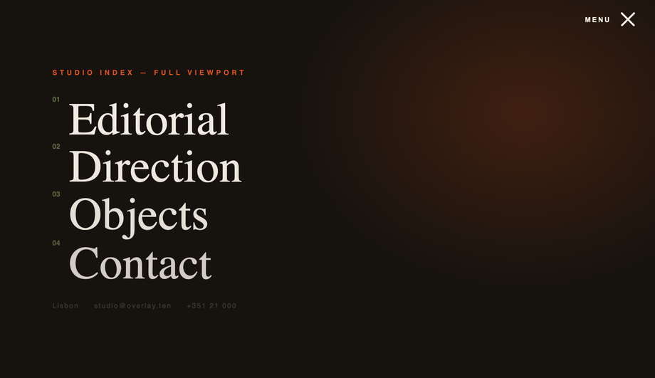
A CSS hamburger menu is a three-bar icon button that toggles a hidden navigation panel — the dominant mobile-nav pattern across the modern web. These 20 hand-coded designs span the full hamburger playbook: a pure-CSS checkbox-hack toggle with circular clip-path reveal (no JavaScript), three side-by-side icon morph personalities (bars→X, fold, pinch), a full-screen editorial overlay, a true push-canvas slide-out sidebar, a responsive 860px-breakpoint navbar, a floating corner FAB with radial bloom, a Tailwind CDN build, a real Bootstrap 5 reskin, a WCAG-2.2-compliant pattern with aria-expanded + focus trap + Escape handler, the modern grid-template-rows: 0fr → 1fr accordion trick, six pure-CSS icon hover micro-interactions, a glassmorphism blur overlay, a PWA-style bottom nav with floating launcher, a three-level nested <details> accordion, a flexbox right-aligned navbar, a circular clip-path ripple expand, a scroll-linked shrinking sticky header, a neumorphic soft-UI toggle, a brutalist hot-yellow bordered version, and a 3D perspective + rotateY push that rotates the whole page canvas back on open. 16 ship a short vanilla JS snippet (most are 5-15 lines); 4 ship no custom JS (one uses the Bootstrap bundle library, the other three are pure CSS). Every demo has scoped .chm-NN class names that never collide with your existing styles, prefers-reduced-motion fallbacks, and MIT licensing — copy from any code panel and drop into your nav.
Minimalist 3-Line CSS Menu Icon with Hover Effects
Pure CSS
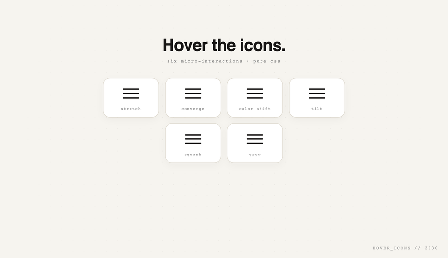
A gallery of six pure-CSS hover micro-interactions — stretch, converge, color-shift cascade, tilt, squash, grow — using transitions and transforms on a tidy card grid.
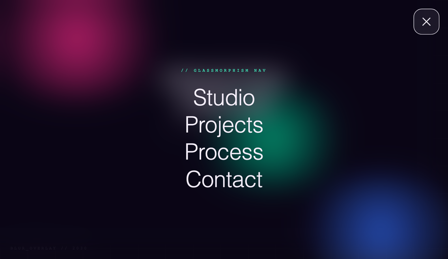
Glassmorphism showcase: animated colored orbs behind, and on open a full-screen backdrop-filter: blur() overlay with layered z-indexing and fading large links.
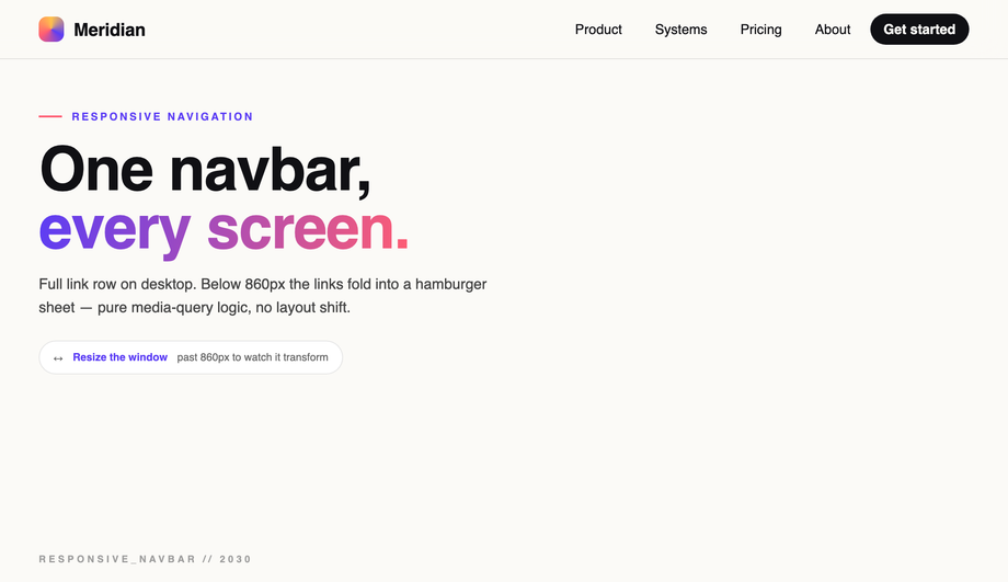
Textbook justify-content: space-between + align-items: center — logo locked left, hamburger snapped hard right, with a desktop link cluster that hides on mobile.
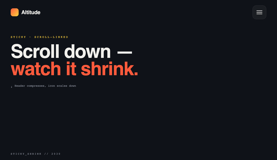
Scroll-linked sticky header that compresses padding, shrinks the logo mark, and scales the hamburger down smoothly past a scroll threshold — scroll up to expand again.
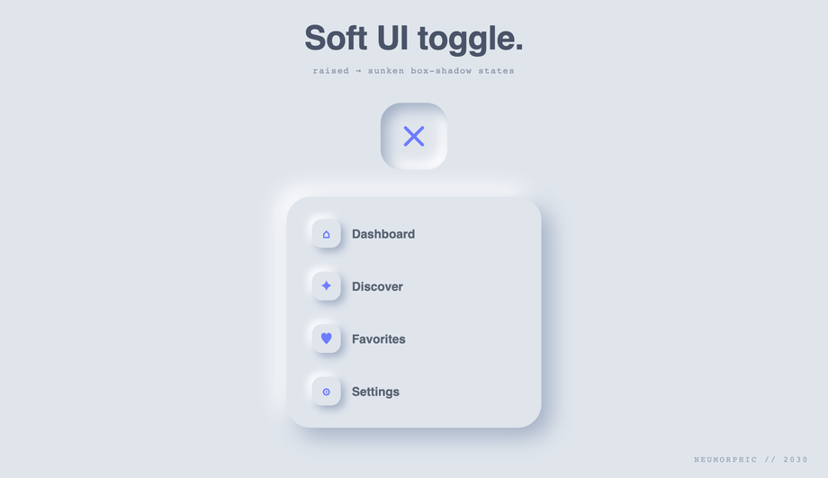
Soft-UI on the classic #e0e5ec surface — dual light/dark box-shadow for the raised state flipping to inset (sunken) on toggle, with an extruded menu card.
Advanced showcase — opening the menu pushes the entire page canvas back in 3D with perspective + rotateY() + scale, revealing the navigation sitting behind it.
How do I make a hamburger menu with pure CSS — no JavaScript?
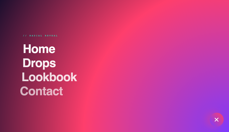
The classic pattern uses a hidden checkbox (or radio) input as the state machine. A <code><label></code> covers your hamburger button and points to the checkbox via <code>for="toggle-id"</code>. Clicking the label flips <code>:checked</code> on the input, and CSS sibling selectors (<code>~</code>, <code>+</code>) project that state down into the menu panel, the bar icon, and any backdrop. The Pure CSS Hamburger Menu demo (#01) is the canonical reference — it ships a circular <code>clip-path</code> reveal, staggered link animations, and the bars→X morph entirely from <code>#nav-toggle:checked ~ ...</code> selectors. Zero JavaScript, full keyboard support (the label is focusable and Space/Enter toggle the checkbox), and works back to evergreen browser support. The CSS Slide Down Dropdown demo (#10) shows the same technique with the modern <code>grid-template-rows: 0fr → 1fr</code> trick for buttery vertical height transitions — no fixed <code>max-height</code> needed.
How do I animate the hamburger bars into an X (or other morphs)?
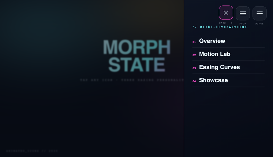
Stack three thin <code><span></code> bars inside the button, give each a <code>transition</code>, then on the open state apply: top bar rotates 45° and translates down to overlap the middle, bottom bar rotates -45° and translates up to overlap the middle, middle bar fades to <code>opacity: 0</code> (or scales to 0). The Hamburger Menu with Morphing Icon Animations demo (#02) ships THREE different morph personalities side-by-side — bars→X (rotate + translate), fold (top + bottom rotate inward toward center), and pinch (middle bar shrinks while top + bottom converge) — so you can compare the spring vs. ease curves and pick the one that fits your brand. Each costs ~10 lines of CSS.
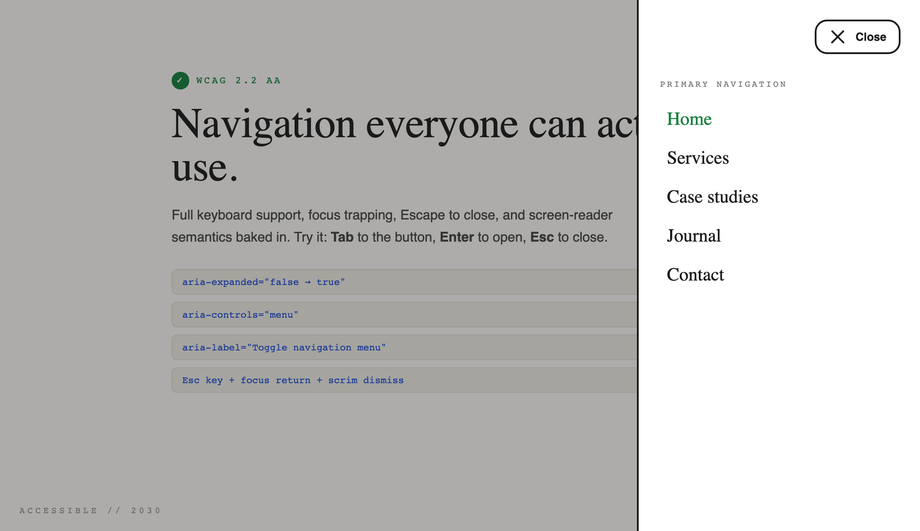
What's the accessible hamburger menu pattern? (WCAG 2.2 compliant)
Full WCAG 2.2 compliance for a hamburger requires SEVEN signals, all demonstrated in the Accessible Hamburger Menu demo (#09): (1) <code><button></code> not <code><div></code> for the trigger so it's keyboard-focusable + Enter/Space activatable for free, (2) <code>aria-expanded="false"</code> on the button that toggles to <code>true</code> when open so screen readers announce state, (3) <code>aria-controls="menu-id"</code> linking the button to the panel it controls, (4) <code>aria-label="Open menu"</code> on the button since it's icon-only, (5) a visible <code>:focus-visible</code> ring with 3:1 contrast against the surface, (6) Escape closes the menu and returns focus to the trigger, (7) a focus trap inside the open menu so Tab cycles through links instead of escaping to the page beneath. Many "accessible hamburger" listicles online stop at <code>aria-expanded</code> + <code>aria-controls</code> and miss focus trap + return — both are required for WCAG 2.1.2 (No Keyboard Trap inverse) and 2.4.3 (Focus Order).
Should I use a hamburger menu on desktop?
Generally no. Research (NN/g, Smashing Magazine) consistently finds that hiding navigation behind a hamburger on desktop drops engagement 20-40% because the menu options become invisible discoverable surfaces. The Responsive Navbar demo (#05) shows the right pattern: show the full link row above a 860px media-query breakpoint, collapse to hamburger only below. Use hamburgers on mobile (where horizontal space is genuinely constrained) and the Flexbox Navbar demo (#15) as the desktop fallback. The Sticky Shrinking Header (#17) is a middle ground: keeps the hamburger visible on desktop AS WELL as a primary link row, useful for content-heavy sites with many sections.
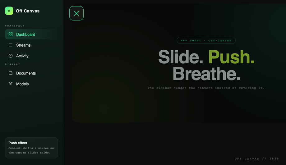
How do I build a slide-out sidebar / off-canvas menu in CSS?
The Slide-out Sidebar / Off-Canvas Navigation demo (#04) shows the canonical pattern. Position the sidebar with <code>position: fixed; left: 0; top: 0; height: 100vh; transform: translateX(-100%)</code> so it starts hidden off-canvas. On open, <code>transform: translateX(0)</code>. For a true push-canvas effect (sidebar pushes the page content right instead of overlaying), apply <code>transform: translateX(280px) scale(0.95)</code> + <code>border-radius: 24px</code> to the main canvas at the same time. Add a semi-transparent <code>backdrop-filter: blur</code> scrim that fades in to provide depth + a tap-target to close. The Full Screen Blur Overlay demo (#12) uses the same technique with full-viewport coverage instead of a side panel.
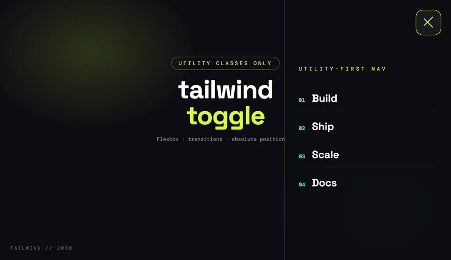
How do I make a CSS hamburger menu with Tailwind CSS?
The Tailwind CSS Hamburger Menu demo (#07) loads Tailwind via the CDN (<code>cdn.tailwindcss.com</code>) with a custom config that sets an acid/sky/plum palette, then builds the trigger and the slide-in panel entirely from utility classes — <code>flex items-center justify-center</code> for the bars wrapper, <code>fixed inset-y-0 right-0 w-80</code> for the panel, <code>transition-transform translate-x-full</code> for the off-canvas position, with <code>aria-expanded</code> hooks for the open state. The morph is JS-driven (toggles classes) so Tailwind's static utilities can describe both states. Drop the snippet into any Tailwind project — no extension to your config needed beyond the custom palette.
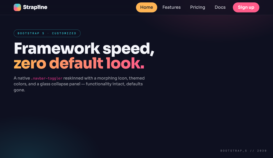
How do I make a CSS hamburger menu with Bootstrap 5?
The Bootstrap 5 Responsive Navbar with Hamburger demo (#08) wires the native <code>.navbar-toggler</code> + <code>data-bs-toggle="collapse"</code> + <code>data-bs-target="#nav"</code> pattern but reskins the default look completely — themed conic-gradient mark on the bars, morphing icon transition, glass collapse panel via <code>backdrop-filter</code> on the dropdown. Bootstrap's bundle.js handles the collapse mechanics natively (Bootstrap 5.3.3 here); your CSS is just visual polish on top of <code>.navbar-toggler[aria-expanded="true"]</code>. Drop into any Bootstrap 5 project — the markup is standard Bootstrap, just with extra theming classes.
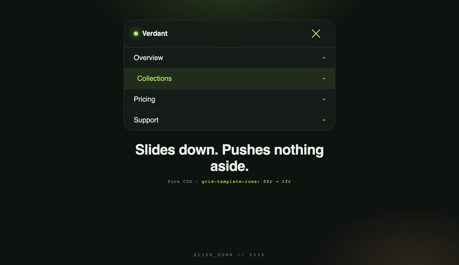
How do I animate menu reveal with the modern grid-template-rows trick?
The CSS Slide Down Dropdown demo (#10) uses a 2022 technique that finally fixes "animating to auto-height." Wrap your menu items in a container with <code>display: grid; grid-template-rows: 0fr; transition: grid-template-rows 0.4s</code>. Inside, the actual content lives in a child with <code>overflow: hidden</code>. When the menu opens, change <code>grid-template-rows: 1fr</code> and the container smoothly animates to the natural content height — no fixed <code>max-height</code> guess, no JS measurement, works at any content length. Browser support: Chrome 117+, Safari 17.4+, Firefox 121+ — all evergreen majors as of 2026.
Which of the 20 demos need JavaScript? Are they accessible without it?
Four demos ship NO user-authored JavaScript: Pure CSS Hamburger Menu (#01, checkbox hack), Bootstrap 5 Responsive Navbar (#08 — uses Bootstrap's bundle.js library but you don't write any custom JS), CSS Slide Down Dropdown (#10, checkbox + grid-template-rows), and Minimalist 3-Line Menu Icon Hover Effects (#11, pure :hover transitions on icon variants). The other 16 use vanilla JavaScript snippets ranging from ~5 lines (toggle a class) to ~30 lines (focus trap + Escape handler in the WCAG-accessible demo). All 16 degrade gracefully without JS — the button stays interactive (it's a real <code><button></code>), the link list is in the DOM (just hidden behind a closed state), and the page remains usable. The WCAG-accessible demo (#09) is the gold standard for the noscript case: even without JS, screen readers still see the menu links in source order via the <code>aria-controls</code> + the panel's stable DOM position.
How do I do a 3D canvas push effect (whole page rotates back on menu open)?
The 3D Rotating Canvas Mobile Hamburger Menu demo (#20) wraps the entire "page" content in a <code>.canvas</code> element with <code>transform-style: preserve-3d</code> on a parent <code>.scene</code> that has <code>perspective: 1200px</code>. On menu open, the canvas gets <code>transform: rotateY(-25deg) translateX(180px) scale(0.85)</code>, revealing a sidebar that's been sitting behind it (z-positioned with <code>translateZ(-200px)</code>). The whole thing eases on a <code>cubic-bezier(.7, 0, .2, 1)</code> curve so the motion feels weighty. About 15 lines of CSS + a 3-line toggle. Used by Carbon Five and a few high-profile portfolios as a wow-factor mobile pattern.
How do I make a neumorphic hamburger toggle?
The Neumorphic Hamburger Menu Toggle Button demo (#18) shows the classic soft-UI recipe: a single light surface (the canonical <code>#e0e5ec</code>) with two box-shadows on the button — top-left light highlight + bottom-right dark shadow — to make it look extruded. On press, swap those to <code>inset</code> versions and the button reads as pressed-in. The hamburger bars themselves change color to match the new depth (slightly darker when sunken). Pair with restrained motion (no bouncy springs) — the aesthetic is contemplative, not playful.
Are these CSS hamburger menus responsive, accessible, and free to use?
Yes on all three. Every demo respects <code>@media (prefers-reduced-motion: reduce)</code> and disables continuous transitions for users with that OS preference. Every clickable surface is a <code><button></code> or proper anchor (no clickable <code><div></code>s). Keyboard focus works without JS. The Responsive Navbar demo (#05) and Sticky Shrinking Header demo (#17) include real media-query breakpoints so they adapt to viewport changes. All 20 demos are MIT licensed and free for personal AND commercial projects — no attribution required, though we appreciate it if you link back to <a href="https://codefronts.com">codefronts.com</a>.