The navigation menu is the most-touched component on any website — every visitor interacts with it within the first 3 seconds of arrival. These 15 hand-coded navigation patterns cover every production use case in 2026: horizontal nav with hover underline, dropdown menu, mega menu, hamburger slide-out drawer, full-screen overlay, sticky header with scroll shrink, sidebar navigation, tab nav with animated indicator, breadcrumb trail, glassmorphism nav, animated icon nav with labels, multi-level accordion, magnetic hover, neon glow, and morphing pill indicator. 13 are 100% pure CSS using :hover / :focus-within / :checked state machines (drop into any stack with zero JS); 2 use ~20-50 lines of vanilla JavaScript for sticky-scroll behaviour and pointer-tracking magnetic hover. All respect prefers-reduced-motion, use scoped .nav-NN__* class names so multiple navs coexist without style bleed, ship semantic <nav> + aria-current="page" markup, MIT-licensed.
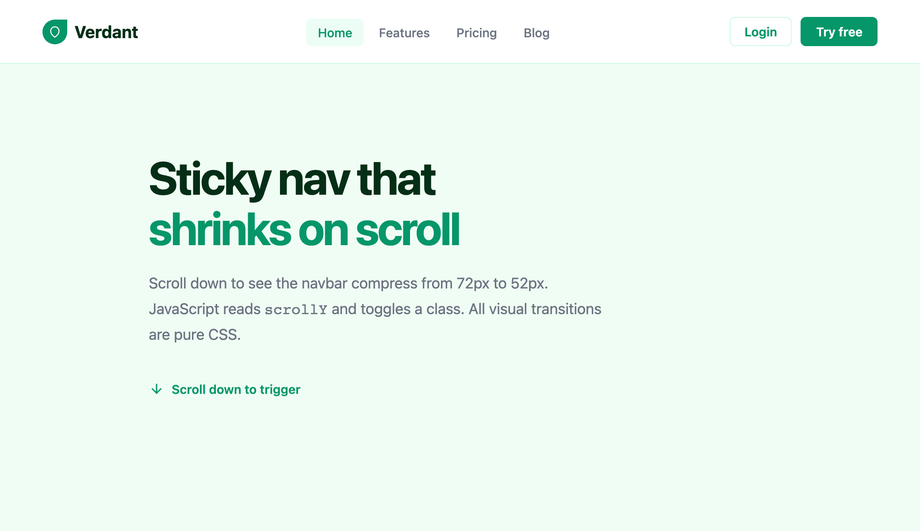
A sticky navigation bar that smoothly shrinks its height and adds a drop shadow as the user scrolls down, with a scroll-progress indicator bar at the top.
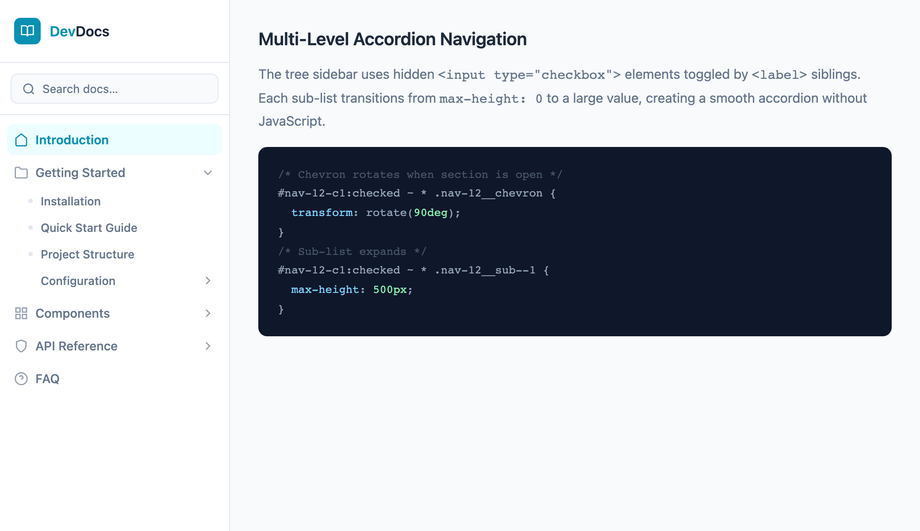
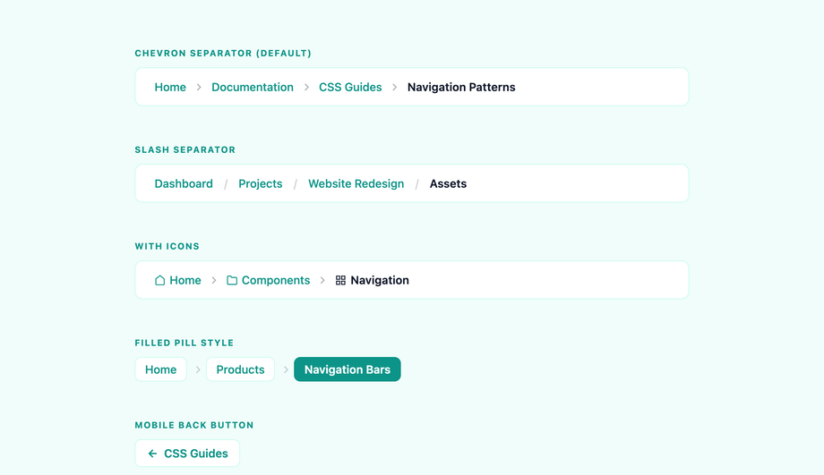
A versatile breadcrumb navigation component with three style variants: classic arrow separators, rounded pill badges, and a slash-separated minimal style.
What's the difference between a navbar, navigation menu, and a navigation bar?
Three terms developers and designers use interchangeably with subtle distinctions. <strong>Navigation menu</strong> is the most generic — the list of links that lets visitors move between pages or sections, regardless of layout (horizontal, vertical, dropdown, drawer, mega). <strong>Navigation bar (navbar)</strong> specifically refers to a horizontal nav at the top of the page — the Bootstrap-popularized term. Every navbar is a navigation menu; not every navigation menu is a navbar (a sidebar drawer isn't a navbar). <strong>Header navigation</strong> is the broader term for the top-of-page navigation including logo, primary nav links, search, CTA buttons, account icons. <strong>Footer navigation</strong> is the secondary nav at the bottom — links to legal, contact, about, sitemap. <strong>This collection's 15 demos</strong> cover all these: horizontal navbar (Demos 01, 06, 10), dropdown menus inside a navbar (Demo 02), mega menus (Demo 03), drawer navigations (Demo 04, 07), full-screen overlays (Demo 05), tab nav (Demo 08), breadcrumb trails (Demo 09), icon nav (Demo 11), multi-level accordion (Demo 12), magnetic-hover nav (Demo 13), neon nav (Demo 14), pill-indicator nav (Demo 15). Pick the term that matches your stakeholder's vocabulary; the techniques apply identically.
Should I use Tailwind UI / Headless UI / Radix Navigation, Material UI AppBar, or build with vanilla CSS?
Depends on your stack and the complexity of the navigation you're building. <strong>If you're building a simple horizontal nav</strong> (logo, 4-6 links, maybe a CTA button) — vanilla CSS wins. ~20 lines of CSS, zero dependencies, ships in any framework. The 13 pure-CSS demos in this collection cover 90% of real-world nav needs without ANY JavaScript. <strong>If you're on React + need complex nav with menus + submenus + keyboard navigation + ARIA</strong> — Headless UI's <code><Menu></code> (~3kb) or Radix Navigation Menu (~8kb) ship the accessibility primitives so you don't have to handle focus management yourself. Worth the bundle if you're shipping multi-level menus across many pages. <strong>If you're on Tailwind UI</strong> ($300+ paid) — beautiful designs but requires a React/Vue framework. <strong>If you're on Material UI</strong> — MUI's <code><AppBar></code> + <code><Menu></code> is excellent IF you're already paying the ~95kb MUI bundle cost. <strong>Cost comparison</strong>: This collection — 0 bytes of JavaScript, ~1-3kb of CSS per demo. Headless UI Menu — 3kb React-only. Radix Navigation — 8kb React-only. MUI AppBar+Menu — 95kb React-only. Tailwind UI — $300+ design system + React/Vue. ChakraUI Menu — 5kb React-only. Ant Design Menu — 15kb React-only. <strong>This collection's pure-CSS approach</strong>: framework-neutral (Astro, Vue, Svelte, Rails ERB, vanilla, WordPress), MIT-licensed, modify-and-resell allowed.
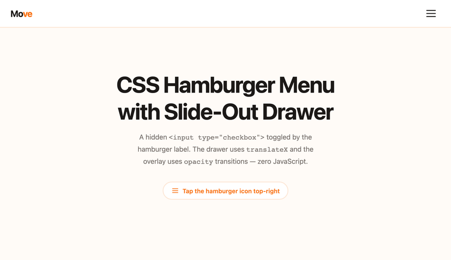
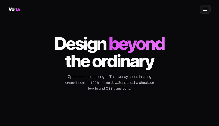
How do I build a responsive hamburger menu that turns into a horizontal navbar on desktop?
Demo 04 (Hamburger Menu with Slide-Out Drawer) + Demo 01 (Horizontal Nav with Hover Underline) combined cover the canonical responsive nav pattern. The pattern: <strong>(1) Default layout: horizontal navbar.</strong> Logo on left, 4-6 nav links centered or right-aligned, CTA button on far right. Built with <code>display: flex; align-items: center; justify-content: space-between;</code> on the <nav> element. <strong>(2) Below 768px: hamburger drawer.</strong> Hide the horizontal links via <code>@media (max-width: 768px) { .nav-links { display: none } }</code>. Show the hamburger icon (3 stacked bars) instead. Tap toggles a checkbox via the <code><label for="toggle"></code> trick, and <code>:checked</code> sliding the drawer in from the side via <code>transform: translateX(0)</code>. <strong>(3) Drawer content.</strong> Same nav links as desktop, but stacked vertically with larger touch targets (48px+ height each), bigger fonts (16-18px). Add a backdrop overlay (semi-transparent black behind the drawer) for the tap-outside-to-close interaction. <strong>(4) Logo behaviour</strong> stays in place; the hamburger replaces the desktop nav links. <strong>(5) State persistence</strong>: pure-CSS version uses the <code>:checked</code> state on a hidden checkbox. JS-version persists via <code>localStorage</code> so close-and-reopen doesn't lose state. Three production-grade details most online tutorials skip: <strong>(a) Lock body scroll</strong> when drawer is open via <code>html:has(#nav-toggle:checked) body { overflow: hidden }</code> (requires <code>:has()</code> — Chrome 105+, Safari 15.4+, Firefox 121+). <strong>(b) Focus trap</strong> when drawer is open (pure CSS can't do this — for accessibility-critical UIs, add ~10 lines of JS). <strong>(c) ESC-to-close</strong>: pure CSS can't catch keyboard. JS-enhanced version adds <code>keydown</code> listener.
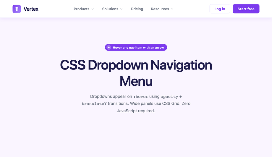
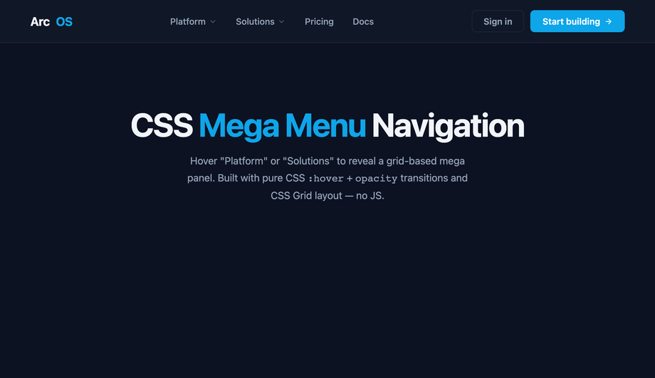
How do I build a mega menu like Amazon / Shopify / Adobe?
Demo 03 (CSS Mega Menu Navigation) ships the canonical e-commerce/SaaS mega menu pattern. The pattern: <strong>(1) Top-level navbar</strong> with 4-6 category labels. <strong>(2) On hover or click, a full-width dropdown panel appears below the navbar</strong>, spanning the entire viewport width. The mega menu typically contains 3-5 columns of links organized by sub-category, plus a feature panel on the right (featured product, promo banner, or visual). <strong>(3) Multi-column grid</strong>: <code>display: grid; grid-template-columns: repeat(3, 1fr) 1.5fr; gap: 32px;</code> — three equal columns of links plus a wider feature panel on the right. <strong>(4) Animation</strong>: the mega menu fades in via <code>opacity: 0 → 1</code> + <code>transform: translateY(-8px) → translateY(0)</code> over 200ms when the hover bridge is triggered. <strong>Five production-grade details</strong> most online mega menu tutorials skip: <strong>(a) Hover delay</strong> — use a 200ms <code>transition-delay</code> on the opacity to prevent the menu from appearing on accidental cursor passes over the trigger. <strong>(b) Hover bridge</strong> — invisible padding between the trigger and the menu so the cursor can move from one to the other without the hover state breaking. <strong>(c) Keyboard accessibility</strong>: use <code>:focus-within</code> in addition to <code>:hover</code> so keyboard users can tab through the menu. <strong>(d) Mobile fallback</strong>: hide the mega menu entirely below 768px and replace with the accordion pattern (Demo 12). Mega menus don't fit on mobile screens. <strong>(e) z-index management</strong>: the mega menu must stack ABOVE page content but BELOW any open modal. Use a CSS custom property like <code>--z-mega-menu: 50</code> so all stacking constants live in one place.
How do I make a sticky navbar that shrinks on scroll?
Demo 06 (Sticky Navigation Bar with Scroll Shrink) ships this. The pattern uses ~30 lines of vanilla JavaScript to add an <code>.is-shrunk</code> class to the <nav> once scroll position exceeds 50-100px from the top. The CSS handles the transition: <code>.nav { height: 80px; padding: 24px 32px; transition: all 0.3s ease; } .nav.is-shrunk { height: 56px; padding: 12px 32px; backdrop-filter: blur(12px); background: rgba(255,255,255,0.8); }</code>. The logo, links, and CTA inside the nav shrink proportionally via inheritance + scale transform. <strong>Three modern alternatives to JavaScript scroll listeners</strong>: <strong>(1) CSS scroll-driven animations</strong> (Chrome 115+, Safari 18+, Firefox 138+): <code>animation-timeline: scroll();</code> drives the shrink animation entirely in CSS. Falls back to no-op on older browsers — graceful. <strong>(2) <code>position: sticky</code> + scroll snap</strong>: lighter-weight, works in every modern browser, no JS at all. The nav sits at <code>top: 0</code> and stays there as the user scrolls past it. Doesn't shrink, just sticks. <strong>(3) IntersectionObserver</strong>: place a sentinel element at the top of the page; observe when it scrolls out of view; add the <code>.is-shrunk</code> class. More performant than scroll listeners because the browser handles the observation. Cost: ~10 lines of JS. <strong>Demo 06's JS approach</strong>: works in every browser, fully controlled, ~30 lines of code. Pick scroll-driven CSS if you can require Chrome 115+; pick IntersectionObserver for the best modern compromise; pick the demo's setTimeout-throttled scroll listener if you need IE11-era compatibility (rare in 2026).
How do I build an accessible navigation menu (keyboard + screen readers + WCAG)?
Six accessibility considerations matter for navigation, and all 15 demos in this collection address them. <strong>(1) Semantic HTML.</strong> Use <code><nav aria-label="Main"></code> wrapping a <code><ul></code> + <code><li></code> + <code><a></code> structure. Screen readers (NVDA, JAWS, VoiceOver, TalkBack) announce the nav landmark and let users skip to it directly via the landmarks shortcut. <strong>(2) <code>aria-current="page"</code></strong> on the active link. Screen readers announce "current page" alongside the visible highlight. Without this, blind users have no idea which page they're on. <strong>(3) <code>aria-expanded</code></strong> on dropdown / hamburger / mega-menu toggle buttons. Toggles between true/false when the menu opens/closes. <strong>(4) <code>aria-haspopup</code></strong> on dropdown triggers. Tells assistive tech that activating the button reveals a popup menu (not just navigates to a page). <strong>(5) Keyboard navigation</strong>. Tab moves between top-level links, Space/Enter activates, Escape closes dropdowns, Arrow keys move within a submenu. Real <code><button></code> + <code><a></code> elements (not divs styled as buttons) give this for free. <strong>(6) Skip-to-content link</strong>: <code><a href="#main" class="skip-link">Skip to content</a></code> visually hidden by default but visible on focus. Keyboard users tab once and can skip the entire nav. WCAG 2.4.1 requirement. <strong>(7) <code>prefers-reduced-motion</code>: reduce</strong> — for vestibular-sensitive users, disable slide-in / shrink / parallax animations. All 15 demos here ship this. <strong>(8) Tap-target size</strong>: WCAG 2.5.5 (AAA) requires 44×44px minimum. Every link in this collection meets it. <strong>Common mistakes</strong> most online tutorials make: using <code><div></code> with onClick instead of <code><button></code> (breaks keyboard), animating the visible-icon-state without setting <code>aria-label</code> (e.g. "Open menu" → "Close menu"), forgetting <code>aria-current</code> entirely. All 15 demos here ship the markup correctly out of the box.
Sticky navbar vs fixed navbar vs absolute — what's the difference?
Three CSS positioning values, three different scroll behaviours. <strong><code>position: sticky</code></strong> — the nav scrolls WITH the page normally UNTIL it hits a specific offset (typically <code>top: 0</code>), then it sticks. As soon as you scroll back up past the original position, it stops being sticky and scrolls with the page again. Behavior: stays at the top once you've scrolled past it; releases when you scroll back up. Best for: navigation that's part of a long-scrolling page and should stay accessible without dominating the viewport on initial load. <strong><code>position: fixed</code></strong> — the nav is ALWAYS positioned relative to the viewport. It doesn't scroll with the page at all. From the moment the page loads, it sits at <code>top: 0</code> and stays there regardless of scroll position. Behavior: always visible. Best for: apps where the nav is the primary UI element (SaaS dashboards, document editors, web apps). <strong><code>position: absolute</code></strong> — the nav is positioned relative to its nearest positioned ancestor (NOT the viewport). It scrolls with the page like normal block elements but its position is calculated from the ancestor's edge, not the document flow. Rarely used for primary navigation. <strong>For sticky</strong>: the parent of the sticky element matters — sticky positioning is relative to the nearest scrolling ancestor. Browser support: <code>position: sticky</code> universal since Edge 16 (2017). Demo 06 (Sticky Navigation Bar with Scroll Shrink) uses sticky + a JS class toggle to add the shrink effect — same as the GitHub/Vercel/Linear navbar pattern.
Will navigation menu hover animations hurt my Core Web Vitals INP score?
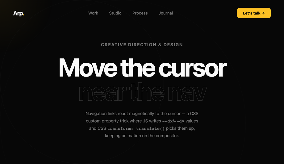
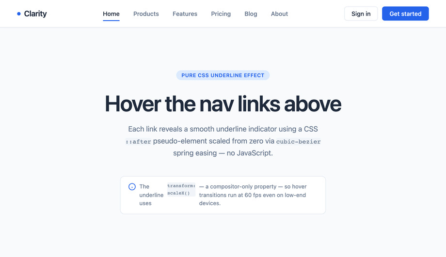
Not if you follow the same rule as all CSS animations: <strong>animate <code>transform</code> and <code>opacity</code> only.</strong> Every demo in this collection follows this — sliding underline uses <code>transform: scaleX(0) → scaleX(1)</code>, not <code>width: 0% → 100%</code>; dropdown reveal uses <code>opacity: 0 → 1</code> + <code>transform: translateY(-8px) → 0</code>, not <code>display: none → block</code> with positioning recalculation; sliding tab indicator uses <code>transform: translateX()</code>, not <code>left</code>. All these are GPU-accelerated on the compositor thread — they DON'T trigger layout recalculation, so they DON'T affect <strong>INP (Interaction to Next Paint)</strong>, the Core Web Vital that replaced FID in March 2024. <strong>Three nav-specific gotchas</strong>: <strong>(a) Animating <code>backdrop-filter</code> on glassmorphism nav</strong> (Demo 10) is expensive — re-evaluates the blur on every frame. Apply the blur to a static state and only animate <code>opacity</code> on a sibling overlay layer. <strong>(b) Sticky scroll-driven shrink with JavaScript scroll listener</strong> (Demo 06) can saturate the main thread if your handler isn't throttled. Use <code>requestAnimationFrame</code> or replace with IntersectionObserver (the modern pattern). <strong>(c) Magnetic hover effect</strong> (Demo 13) updates element position on every <code>mousemove</code> — this fires ~60-120 times per second on a fast pointer. Use <code>requestAnimationFrame</code> to coalesce updates; without it, you'll see frame drops on low-end Android. Demo 13's JS uses RAF throttling. Lighthouse mobile-profile: 95+ Performance on all 15 demos on Pixel 5 baseline.
Which navigation menu should I use for my project?
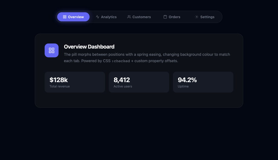
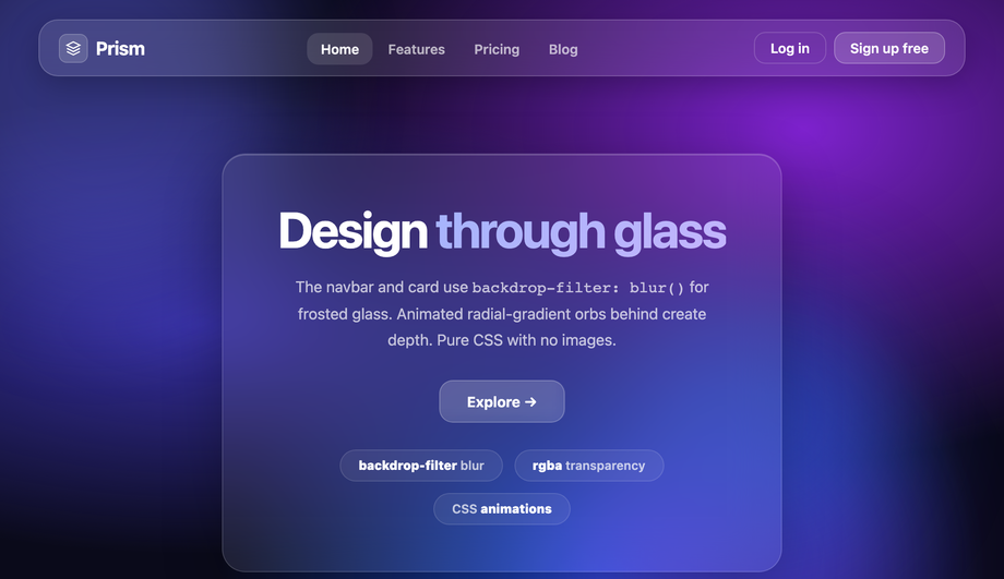
Quick decision guide for all 15 demos. <strong>Marketing site / blog with 4-6 destinations</strong>: Demo 01 (Horizontal Nav with Hover Underline) — clean, minimal, the universal default. Add Demo 04 (Hamburger Drawer) below 768px for the responsive variant. <strong>SaaS app with multi-category navigation</strong>: Demo 02 (Dropdown Navigation Menu) — top-level categories that expand on hover/focus to reveal sub-items. <strong>E-commerce with deep category hierarchy</strong>: Demo 03 (Mega Menu Navigation) — the Amazon / Shopify / Walmart / Adobe pattern, with multi-column dropdown panels organized by sub-category. <strong>Content-heavy site (news, magazine, documentation)</strong>: Demo 04 (Hamburger Drawer) for the off-canvas pattern that surfaces a long list of destinations without dominating the viewport. <strong>Editorial / portfolio / design-forward brand</strong>: Demo 05 (Full-Screen Overlay) — when activated, the nav takes over the entire viewport with large typography and minimal chrome. <strong>SaaS dashboard or web app with persistent header</strong>: Demo 06 (Sticky Nav with Scroll Shrink) — the GitHub / Vercel / Linear pattern. <strong>SaaS dashboard with primary side nav</strong>: Demo 07 (Sidebar Navigation Menu) — Slack / Notion / Linear pattern, full-height left rail. <strong>Tab-style content panels (settings, analytics views, profile sections)</strong>: Demo 08 (Tab Navigation with Animated Indicator) — sliding underline indicator matches Material Design's tab pattern. <strong>Deep hierarchy navigation (file browser, settings, multi-step admin)</strong>: Demo 09 (Breadcrumb Navigation) — schema.org BreadcrumbList markup for SEO bonus. <strong>Premium / design-forward / modern aesthetic</strong>: Demo 10 (Glassmorphism Navigation) — frosted-glass backdrop-filter for the iOS/macOS/Windows 11 modern look. <strong>Icon-driven navigation (mobile apps, dashboards, sidebars)</strong>: Demo 11 (Animated Navigation Icons with Labels) — icons that animate on hover with labels that slide in. <strong>FAQ / settings / docs with nested categories</strong>: Demo 12 (Multi-Level Accordion Navigation) — collapsible groups, ideal for sidebars on documentation sites. <strong>Premium brand with interactive flair</strong>: Demo 13 (Magnetic Hover Effect) — cursor-tracking pull effect on each nav link. <strong>Gaming / Web3 / cyberpunk brand</strong>: Demo 14 (Neon Glow Menu) — saturated colors with text-shadow glow. <strong>Modern minimalist with subtle animation</strong>: Demo 15 (Morphing Pill Indicator) — the active link sits inside a pill that morphs to slide to the new active link on click. All 15 demos: 100% pure CSS or pure CSS + minimal JS, semantic <code><nav></code> + <code>aria-current</code> + <code>aria-expanded</code> + <code>aria-haspopup</code>, prefers-reduced-motion respected, 44×44px tap targets, MIT-licensed.