A responsive CSS navbar is the chrome at the top of every page — the single most-used component on the web. These 20 hand-coded designs cover the full modern navbar playbook — glassmorphism, mega menu dropdown, sidebar drawer, animated underline tabs, pill highlight, scroll-shrink, neon, reading-progress, bottom tab bar, gradient border, centered logo, fullscreen overlay, morphing search, floating island, scroll-spy and more. Every demo uses scoped .nav-NN class names that never collide with your existing styles, honours prefers-reduced-motion, and ships under the MIT license.
What is a responsive navbar and which design pattern should I use?
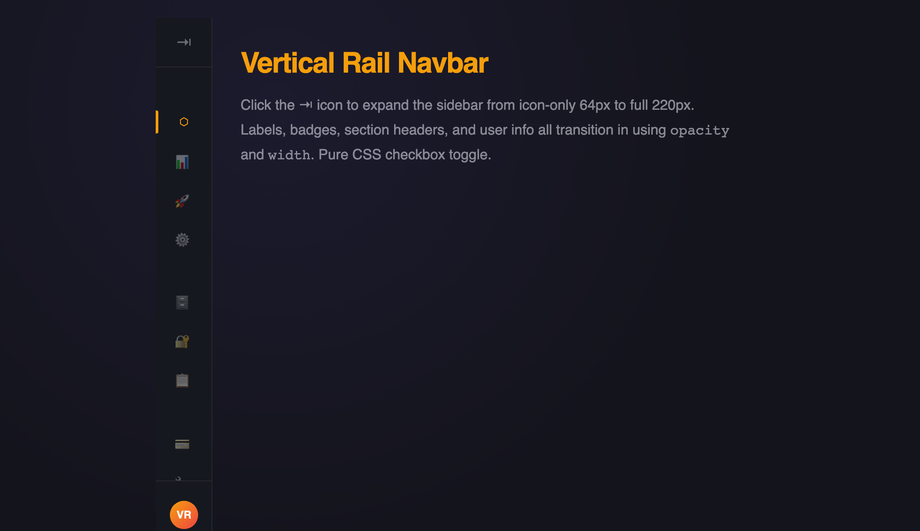
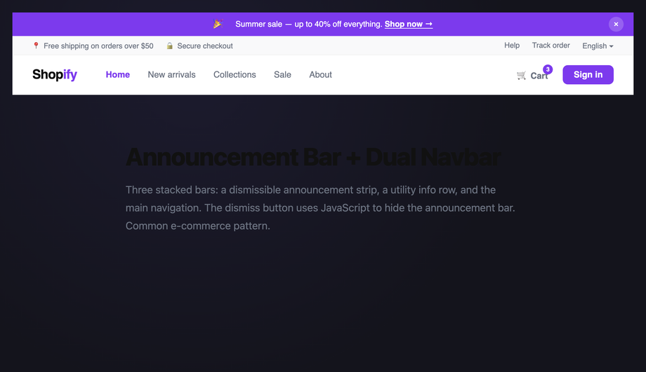
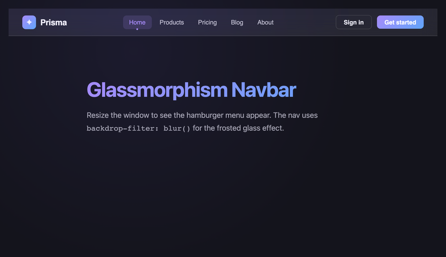
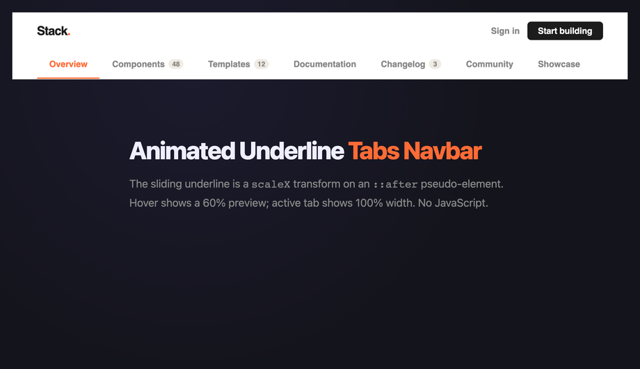
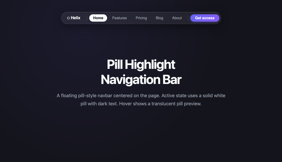
A responsive navbar is the page-level navigation chrome that adapts its layout across viewport sizes — desktop typically shows full horizontal links, tablet usually trims utility links, and mobile collapses behind a hamburger, bottom tab bar, or off-canvas drawer. Decision rule: <strong>content-heavy site (marketing, docs, blog)</strong> → sticky shrink-on-scroll navbar (Demo #06) + animated underline tabs (#04) or pill highlight (#05). <strong>App / SaaS dashboard</strong> → fixed sidebar drawer (#03) or vertical rail (#18) for primary nav with a compact top bar for context. <strong>E-commerce</strong> → mega menu dropdown (#02) for deep category trees + a glassmorphism (#01) or split two-tone (#09) brand bar. <strong>Long-read article / docs</strong> → reading-progress breadcrumb (#08) + scroll-spy section highlight (#20). <strong>Mobile-first product</strong> → bottom tab bar (#10) plus a top brand bar. <strong>Premium / luxury</strong> → centered logo (#12), neon dark (#07), or floating island (#16). Every demo here is scoped <code>.nav-NN</code> so you can copy multiple patterns into the same page without style collisions while you decide.
How do I make a sticky shrink-on-scroll navbar WITHOUT cumulative layout shift?
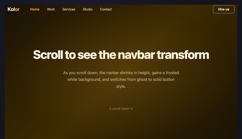
Cumulative Layout Shift (CLS) is one of three Core Web Vitals Google measures, and shrinking headers are a notorious cause. The trap: a tall hero header that suddenly compresses to a thin sticky bar at scrollY > 100 ALSO removes its document-flow height, causing every below-fold element to jump up by the delta. <strong>The fix</strong>: keep the header at a constant <code>height</code> on the layout (e.g. <code>height: 80px</code>) and shrink only the <em>internal</em> elements (logo size, padding, font-size) via a <code>.is-shrunk</code> class. Demo #06 (Scroll-Aware Shrink Navbar) ships this pattern: the outer <code>nav</code> stays at fixed <code>height: 80px</code> sticky-positioned, an IntersectionObserver toggles <code>.is-shrunk</code> on scroll, and the children animate their own dimensions inside the constant outer box. <strong>Modern alternative</strong> (Chrome 115+, Safari 26+): use scroll-driven animations with <code>animation-timeline: scroll(root)</code> instead of an IntersectionObserver — zero JavaScript, GPU-accelerated, no main-thread scroll listener. The CSS export in Demo #06 includes both implementations so you can pick based on browser support targets.
When can a responsive navbar be pure CSS, and when do I need JavaScript?
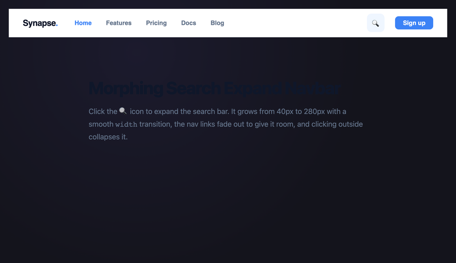
<strong>Pure CSS works for</strong>: dropdown menus (use <code>:hover</code> on desktop and <code>:focus-within</code> for keyboard), hamburger toggles (checkbox-hack with hidden <code>input</code> + sibling selectors), animated underlines (<code>:hover</code> + <code>::after</code> pseudo), pill highlights (<code>:has()</code> in modern browsers or radio-button state machines), and most static layout patterns. <strong>JavaScript is required for</strong>: scroll-spy active highlighting (you need <code>IntersectionObserver</code> or <code>scroll-driven animations</code> with the new <code>animation-timeline: scroll()</code>), reading-progress bars that track exact scroll percentage, focus traps inside fullscreen overlay menus (WCAG 2.4.3 requires it for modal-like UI), Escape-key dismissal, and persistent state across page navigations. We ship 14 pure-CSS demos and 6 with a vanilla-JS snippet (no framework, no library, no jQuery) for the patterns that genuinely require it. Each JS snippet is 5–30 lines and lives in the demo's JS tab — copy alongside the CSS tab and drop into a <code><script></code> at the bottom of your page.
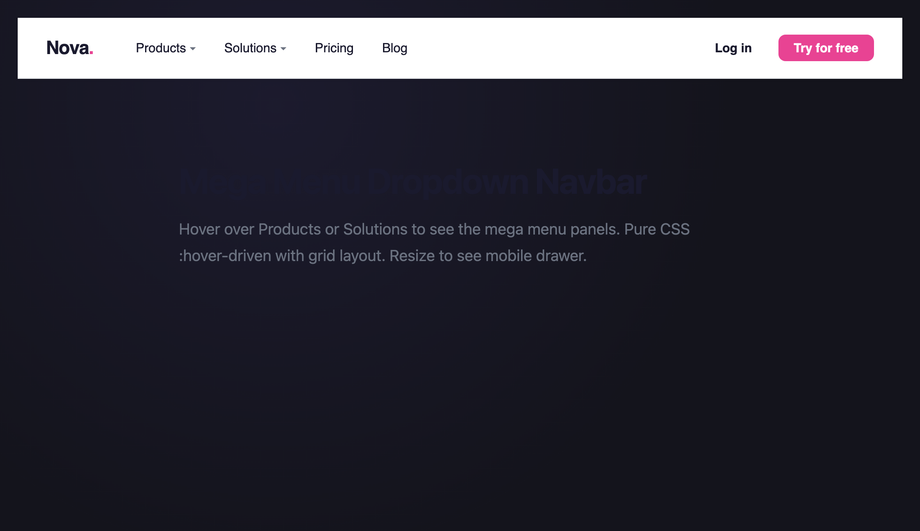
The mega menu accessibility gap — what do most tutorials get wrong?
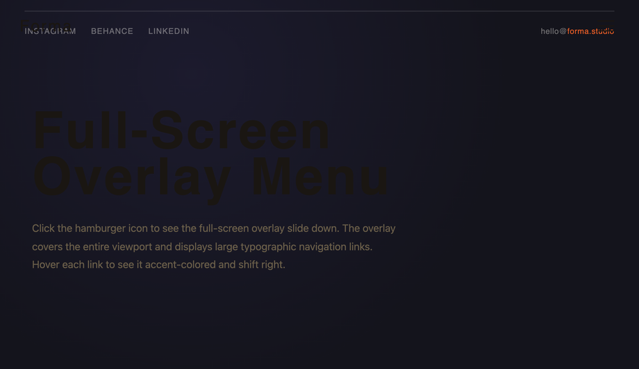
Most 'CSS mega menu' tutorials stop at <code>:hover</code> opens / <code>:hover</code> closes. That breaks <strong>keyboard users</strong> (Tab can't enter the panel because hover is mouse-only) and <strong>screen-reader users</strong> (the open/closed state isn't announced). The WCAG 2.2 / Section 508 / EU EAA accessible pattern requires: (1) <code>:focus-within</code> opens the panel on keyboard focus (works alongside <code>:hover</code>), (2) <code>aria-expanded="true|false"</code> on the parent trigger announces the state, (3) <code>aria-haspopup="menu"</code> tells screen readers there's a submenu, (4) <code>Escape</code> key closes the panel and returns focus to the trigger, (5) arrow-key navigation within the panel (Roving tabindex pattern), (6) the panel itself uses <code>role="menu"</code> with children as <code>role="menuitem"</code>. Demo #02 (CSS Mega Menu Dropdown Navbar) ships the full pattern, and Demo #14 (Full-Screen Overlay Menu) implements a complete focus trap with focus return on close. <strong>Tools to audit</strong>: axe DevTools, Lighthouse, WAVE, NVDA + screen reader testing — every one of these will catch the missing aria-expanded that 90% of tutorial mega menus ship without.
How does my navbar compare to Tailwind UI, shadcn/ui, MUI, Chakra, or Bootstrap navbars?
<strong>Tailwind UI</strong> ($300+/year): ships pre-styled navbar Catalyst / Catalyst Pro components, beautiful but you're licensed not owning the design. <strong>shadcn/ui</strong> (free, React + Radix): does NOT ship a dedicated navbar; you compose one from <code>NavigationMenu</code> + <code>DropdownMenu</code> primitives. <strong>Material UI / MUI</strong>: ships <code><AppBar></code> with Material aesthetics and ~95kb bundle cost. <strong>Chakra UI</strong>: composable but you assemble nav from <code>Flex</code> + <code>Menu</code> primitives. <strong>Ant Design</strong>: ships <code><Menu mode='horizontal'></code> with enterprise-friendly defaults. <strong>Bootstrap 5</strong>: ships <code>.navbar</code> + <code>.navbar-collapse</code> with the canonical mobile collapse pattern. <strong>This generator vs. all of the above</strong>: these are EDITABLE source CSS / HTML / JS — copy what you like and customize freely (brand color, exact corner radius, specific hover behaviour). Use the component libraries when you want a complete design system in 30 seconds. Use these demos when you want fine control or when you're building your own design system from scratch and need the source CSS to inform your token decisions. <a href="/tools/css-to-tailwind-converter/">Drop any demo's CSS into our converter</a> to see the Tailwind utility-class equivalent.
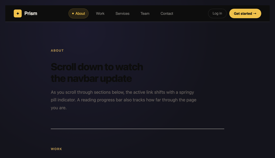
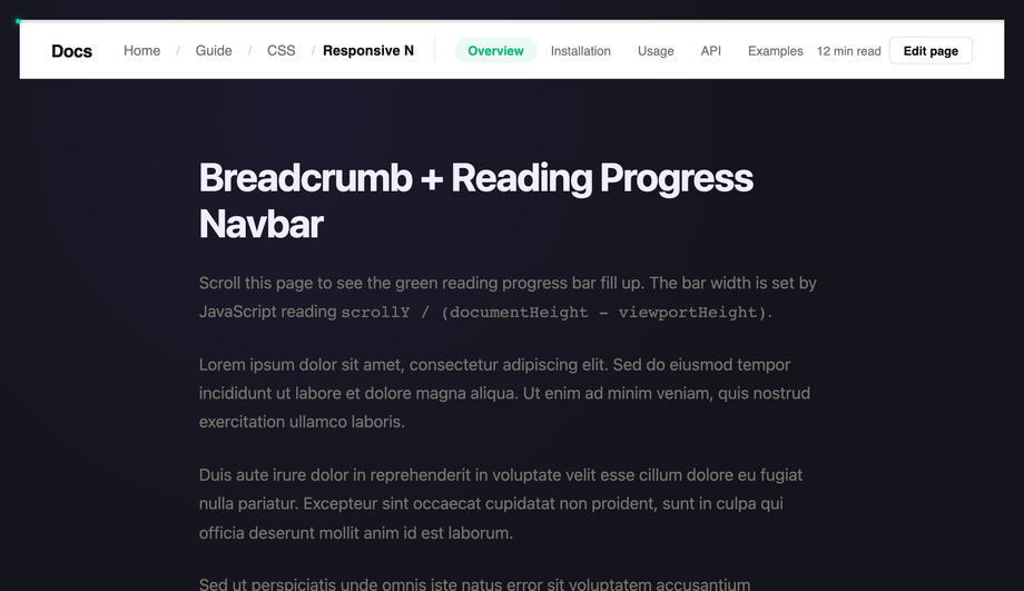
How do I implement scroll-spy active-section highlighting?
The classic approach uses <strong><code>IntersectionObserver</code></strong> to watch each section enter/leave the viewport and toggle <code>.is-active</code> on the matching nav link. Demo #20 (CSS Scroll Spy Active Highlight Navbar) ships this pattern in ~15 lines of vanilla JS: <code>const obs = new IntersectionObserver(entries => entries.forEach(e => { if (e.isIntersecting) document.querySelector(`a[href="#${e.target.id}"]`).classList.add('is-active'); }), { threshold: 0.5 });</code> then iterate all <code>section[id]</code> elements and observe them. The IntersectionObserver is GPU-friendly and doesn't run on every scroll frame like a manual <code>window.scroll</code> listener would. <strong>Modern alternative</strong> (Chrome 115+ / Edge 115+ / Opera 101+; partial Safari 26+ / Firefox 134+): <strong>CSS scroll-driven animations</strong> via <code>animation-timeline: view()</code> let you do scroll-spy entirely in CSS — animate <code>--active</code> custom property as each section scrolls through the viewport, then use <code>:has()</code> + <code>@scope</code> to flip the matching nav link's color. Zero JavaScript. Demo #20's CSS includes a commented-out scroll-driven-animations version next to the IO implementation.
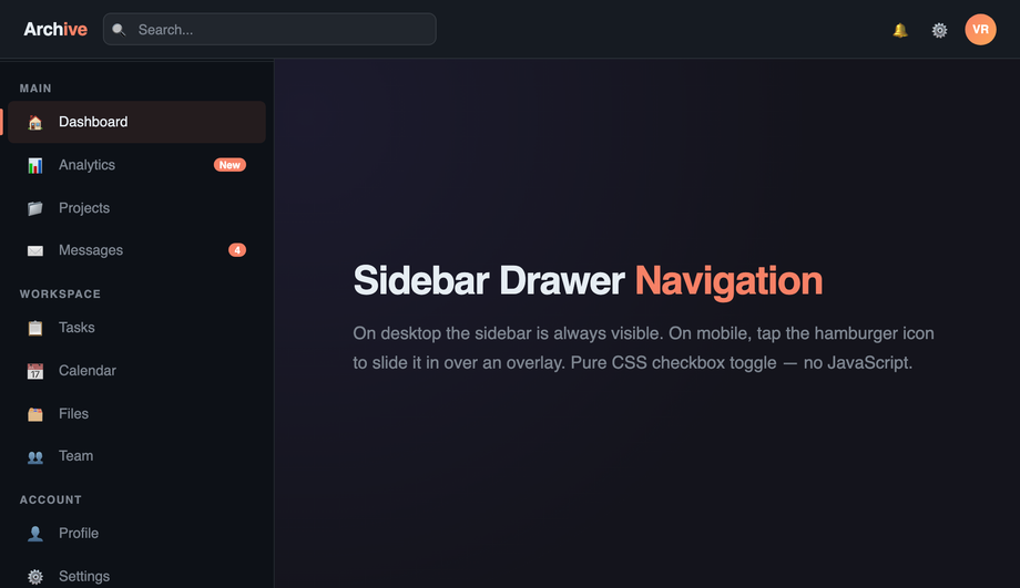
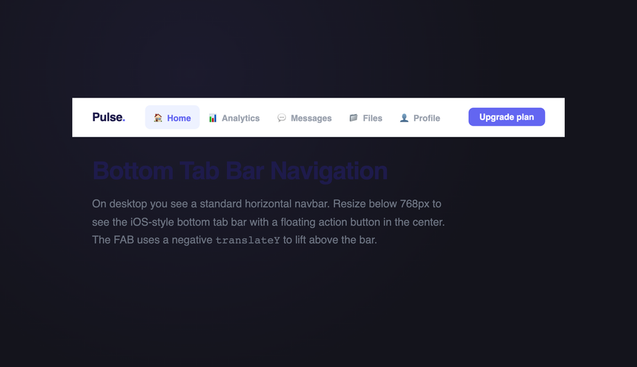
Hamburger menu vs. bottom tab bar vs. fullscreen overlay — which mobile navigation pattern?
Decision rule by app type. <strong>Bottom tab bar</strong> (Demo #10): 3–5 primary destinations the user switches between FREQUENTLY (Instagram, Twitter/X, TikTok pattern). One-tap access; thumbs reach the bottom; ALWAYS visible. Best for: social apps, e-commerce shopping (Home / Search / Cart / Account), B2C SaaS. <strong>Hamburger menu</strong> (see our <a href="/navigation/css-hamburger-menus/">CSS Hamburger Menus collection</a>): 6–15+ destinations, secondary tasks, settings, admin pages. Best for: content sites, docs, blogs, admin dashboards. <strong>Fullscreen overlay menu</strong> (Demo #14): editorial / portfolio / agency sites where the navigation transition itself is part of the brand expression. Beautiful but ALWAYS adds an interaction step before the user reaches content. <strong>Off-canvas sidebar drawer</strong> (Demo #03): SaaS dashboards with deep but-not-frequently-accessed nav (admin tools, project switcher, settings hierarchy). Combines well with a small persistent top bar carrying context (page title, user avatar). Most production apps use a HYBRID: bottom tab bar for the 4 most-used destinations + a hamburger or drawer for everything else. The Twitter / Instagram / Threads apps all do this. Demos #03, #10, and #14 in this collection are designed to layer together — copy multiple onto the same page and gate them by viewport width via <code>@media</code> queries.
Why does my navbar cause cumulative layout shift (CLS), and how do I fix it?
CLS is one of three Core Web Vitals — Google measures it on every Lighthouse / PageSpeed Insights audit and ranks pages with high CLS lower. Common navbar causes: (1) <strong>Web font swap</strong>: if the navbar uses a custom font, fallback font has different metrics → text reflows → CLS spike. Fix: use <code>font-display: optional</code> or <code>font-display: swap</code> + <code>size-adjust</code> in <code>@font-face</code>. (2) <strong>Shrink-on-scroll without fixed height</strong>: the navbar's height changes on scroll → entire page-below-navbar shifts up. Fix described in FAQ #2 — keep outer navbar height constant, shrink only inner elements. (3) <strong>Logo image with no dimensions</strong>: image loads asynchronously and reflows the layout. Fix: <code>width</code> + <code>height</code> attributes on <code><img></code>, or <code>aspect-ratio: 4/1</code> on the logo container. (4) <strong>Mobile hamburger toggle uses <code>display: none → block</code></strong>: the menu's opening shifts content. Fix: use <code>transform: translateY()</code> + <code>height: 100dvh</code> on an overlay (no layout impact). (5) <strong>Sticky positioning glitch</strong>: <code>position: sticky</code> on a navbar inside an <code>overflow: hidden</code> parent silently fails on some browsers. Fix: move sticky to a direct child of <code><body></code> and ensure no ancestor clips overflow. Tools to verify: <strong>Chrome DevTools Performance Insights</strong>, <strong>Lighthouse</strong>, <strong>Core Web Vitals report in Google Search Console</strong>, <strong>axe DevTools</strong>, <strong>WebPageTest filmstrip</strong>.
Should I use a bottom tab bar on web like iOS / Android apps do?
Generally NO for desktop, conditionally YES for mobile. <strong>Why mobile-yes</strong>: thumbs naturally rest near the bottom of phone screens — a top-positioned navigation requires reaching up (especially on 6.5"+ devices). The iOS Human Interface Guidelines, Android Material 3, and the Threads / Instagram / TikTok / Pinterest apps all use bottom tabs because of this ergonomic. <strong>Why desktop-no</strong>: on a 1440px monitor, the bottom of the screen is below the user's natural reading position — they have to scroll their eyes / mouse there. Desktop conventions place primary nav at top because the user is already there. <strong>The hybrid pattern</strong> (Demo #10 ships this): bottom tab bar visible at <code>max-width: 720px</code> via media query, hidden at desktop where a conventional top navbar takes over. Add <code>padding-bottom: 72px</code> to <code>main</code> on mobile so the fixed bottom bar doesn't overlap content. Use 3–5 tabs maximum (more than 5 reduces tap accuracy). Each tab needs a 24×24px icon minimum + label below ≤ 12px. Mark the active tab with both color AND a small indicator (icon dot, top border, or fill) — color alone fails WCAG 1.4.1 (Use of Color).
Are these responsive navbars free, accessible, and how do I attribute them?
Yes — all 20 navbars are <strong>MIT licensed</strong> and free for personal and commercial use, including in client projects, SaaS products, design systems, and open-source libraries. The MIT license requires only that you keep the copyright notice if you redistribute the source code itself; in shipped production HTML / CSS that you've adapted, no visible attribution is needed. If you ship one as part of an open-source UI library, a one-line credit pointing to https://codefronts.com is appreciated but not legally required. <strong>Accessibility</strong>: every demo uses semantic <code><nav></code> + <code><ul></code>/<code><li></code> structure, <code>aria-current="page"</code> on the active link, <code>aria-label</code> on icon-only buttons, visible <code>:focus-visible</code> rings, <code>aria-expanded</code> on toggles, focus trap on modal-like overlays, Escape-key dismissal, and proper landmark roles so screen-reader users navigate them correctly. Continuous animations honour <code>prefers-reduced-motion: reduce</code>. The collection ships ready to pass WCAG 2.2 AA — verify with axe DevTools, Lighthouse, or WAVE before shipping to EU EAA / US Section 508 / UK Equality Act audits.