A CSS image gallery arranges photos in a grid, carousel, or stacked layout with hover effects, lightboxes, or auto-advancing slideshows — the dominant content pattern for portfolios, e-commerce, photo blogs, and editorial sites. These 16 hand-coded designs cover the full modern gallery playbook — CSS columns masonry, lightbox overlay, infinite scroll filmstrip, polaroid stack, tilt parallax cards, magazine layout, mosaic zoom, metro tile grid, perspective depth stack, diagonal slice reveal, glassmorphism hover cards, 3D cube viewer, scattered photos, Ken Burns slideshow, and accordion. Every demo uses scoped .ig-NN class names that never collide with your existing styles, honours prefers-reduced-motion, and ships under the MIT license.
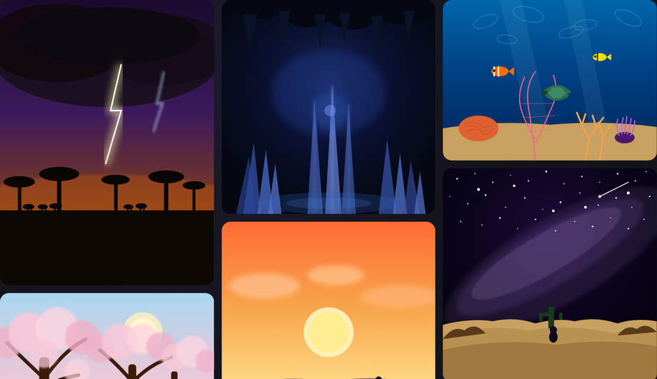
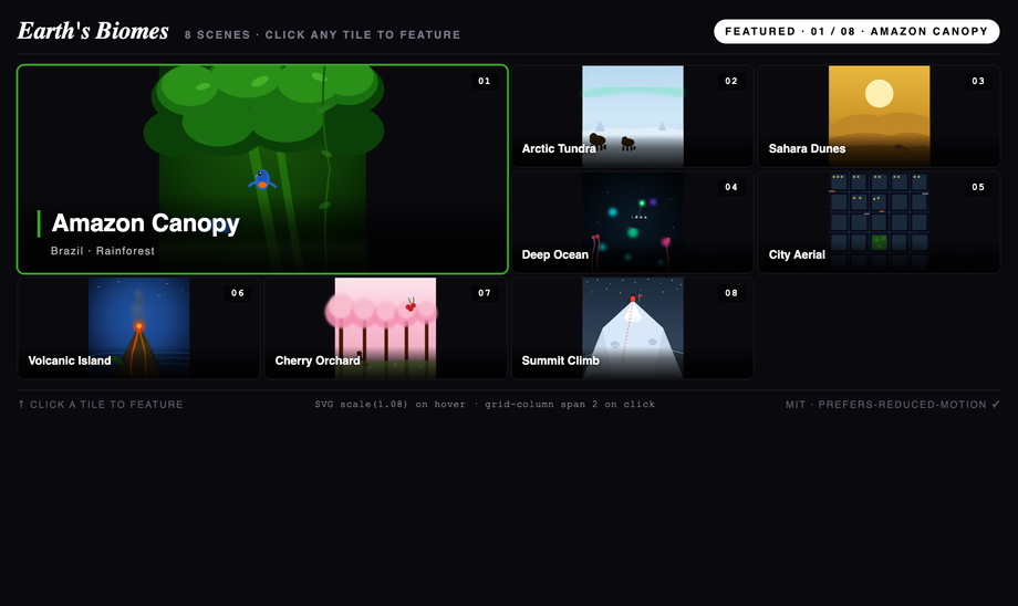
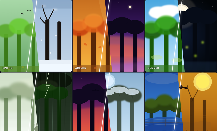
Editorial "Earth's Biomes" mosaic dashboard — 8 illustrated biome tiles in a 4×3 grid where clicking any tile expands it to a 2×2 featured hero.
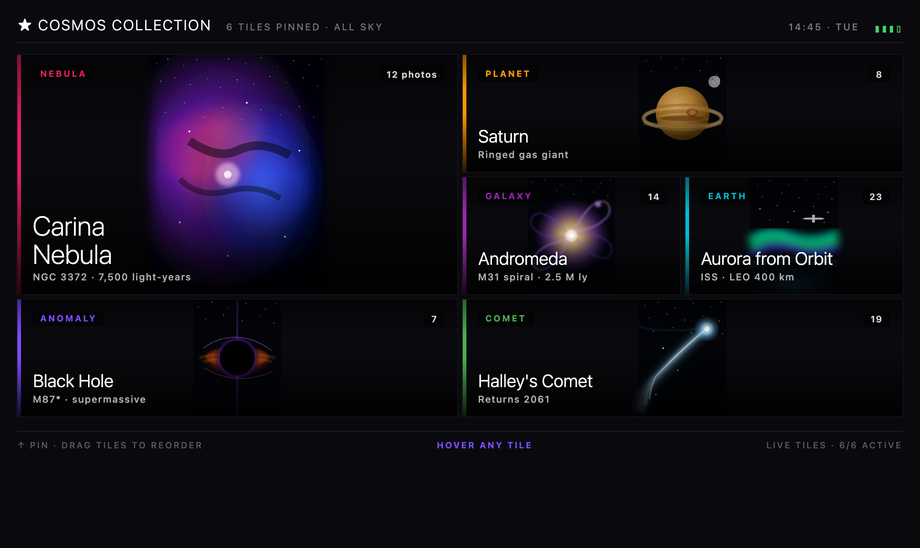
A real Windows Metro / Live Tile dashboard: start-screen chrome with username + pin count + signal/time, six bold sans-serif tiles in a 4-column grid with mixed span-1/span-2 sizing, category accent stripes on the left edge, in-tile metadata (category badge, photo count, big light-weight title, subtitle), and a live-tile flip on hover that swaps the chrome for a full metadata panel (mission, capture date, resolution, distance, telescope) with a VIEW → CTA in the accent color.
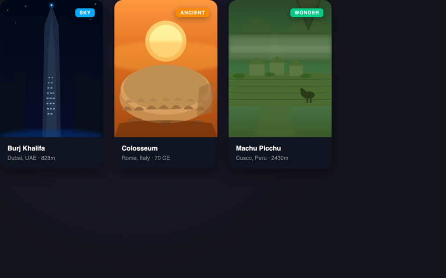
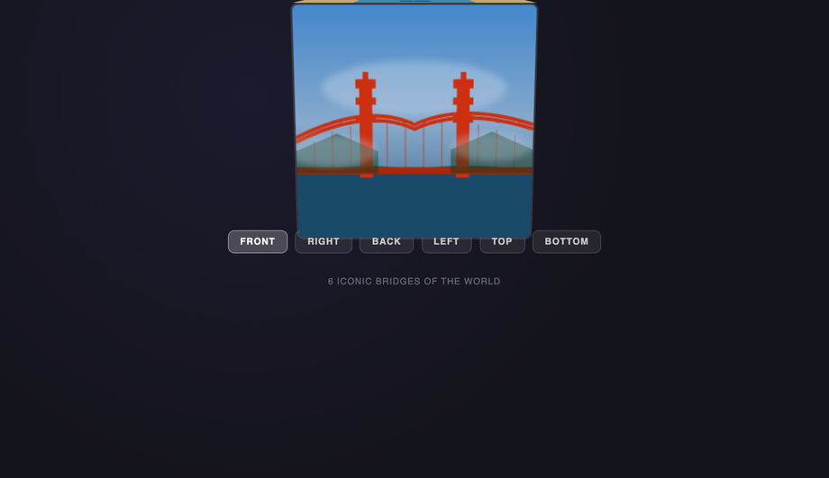
Five illustrated ancient-wonder cards stacked in a true CSS 3D perspective scene — each card peeks at rest so you see all five at once; hover any card to pop it forward toward the viewer while the others dim and recede.
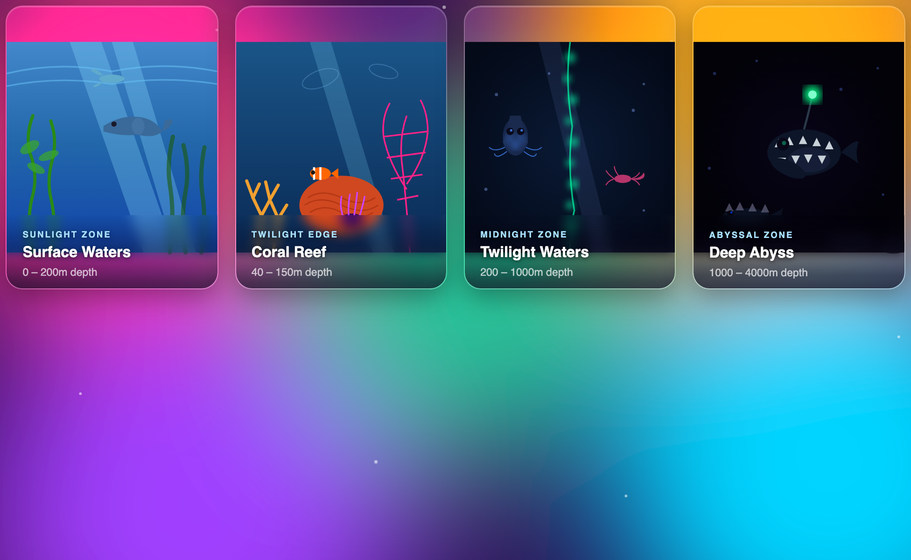
Four ocean-zone cards floating above a vivid sunset-aurora SVG background — the frosted-glass blur reveals the colors behind, and hover slides up an info panel with species detail and a CTA chip while sibling cards dim to focus attention.
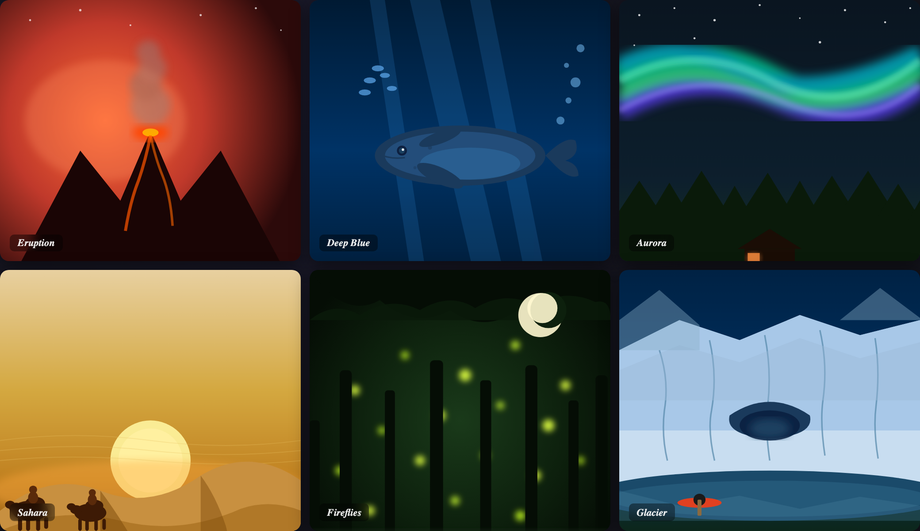
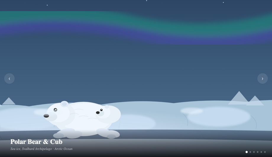
A six-slide arctic wildlife slideshow with the Ken Burns zoom-pan effect on each active slide, auto-advancing with JS dot navigation and manual controls.
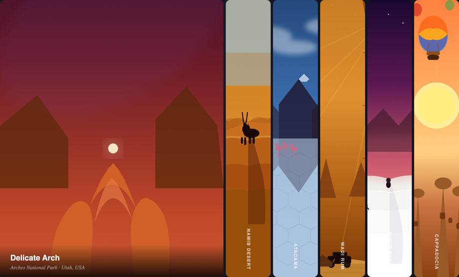
Six desert landscape panels in a horizontal accordion — clicking any panel expands it to 5× width while the others compress, driven by CSS flex transitions.
What is a CSS image gallery and which layout pattern should I pick?
A CSS image gallery arranges photos in a grid, carousel, or stacked layout — the dominant content pattern for portfolios, e-commerce, photo blogs, and editorial sites. There are roughly five canonical layout families: <strong>1. Grid / Masonry</strong> (Demos #01, #08, #09) — uniform tiles or staggered-height Pinterest-style columns; best for content-heavy collections. <strong>2. Filmstrip / Carousel</strong> (Demos #03, #06) — horizontal scrolling row; best for product photos and timelines. <strong>3. Stacked / Polaroid</strong> (Demos #04, #10, #14) — overlapping cards or scattered photos; best for editorial brands and creative portfolios. <strong>4. Interactive viewer</strong> (Demos #02 lightbox, #13 3D cube, #15 Ken Burns slideshow) — one large image at a time with navigation. <strong>5. Hover-revealed</strong> (Demos #05 tilt parallax, #07 mosaic zoom, #11 diagonal slice, #12 glassmorphism cards, #16 accordion) — image grid that reveals captions or zooms on hover. Decision rule: if visitors need to BROWSE many photos quickly → grid or masonry. If they need to FOCUS on one image → lightbox or cube. If the gallery is BRAND-driven (portfolio, agency) → stacked or hover-revealed. Every demo uses scoped <code>.ig-NN</code> class names so you can drop multiple onto the same page without conflicts.
Can I build an image lightbox with pure CSS? (no JavaScript)
Yes — the canonical pure-CSS lightbox uses the <code>:target</code> pseudo-class. Wrap each thumbnail in <code><a href='#image-1'></code>, then a fullscreen overlay with <code>id='image-1'</code> that's <code>opacity: 0; pointer-events: none</code> at rest. When the URL hash matches (<code>:target</code>), the overlay becomes <code>opacity: 1; pointer-events: auto</code> and the image appears. Close with a sibling link <code><a href='#close'></code> or by hashchange. Demo #02 ships this pattern with the modern alternative: the checkbox-hack (hidden <code><input type='radio'></code> + sibling selectors) which avoids polluting browser history with hash entries — important for back-button UX. <strong>Modern alternative</strong> (Chrome 114+, Safari 17+, Firefox 125+): the HTML Popover API with <code>popover='auto'</code> and <code>popovertarget</code> gives you a native top-layer overlay with built-in click-outside-close + Escape dismissal — zero JavaScript needed for a complete a11y-compliant lightbox. <strong>For production sites</strong>: a 30-line vanilla JS lightbox is often simpler than the CSS gymnastics — adds keyboard nav (arrow keys), pinch-zoom, swipe gestures, and analytics. The :target / checkbox-hack approach is best for marketing pages where no-JS is a hard requirement.
How does this compare to lightGallery, PhotoSwipe, Fancybox, Lightbox2, Magnific Popup, react-image-gallery?
<strong>lightGallery</strong> (~95KB minified, jQuery-based originally now vanilla, paid pro tier for video/zoom): industry-standard with thumbnails strip, fullscreen, share, download, video support. Best for client photography portfolios. <strong>PhotoSwipe</strong> (~35KB, vanilla JS): touch-first lightbox with pinch zoom and swipe — the default for mobile-first photography sites. <strong>Fancybox</strong> (~120KB, jQuery + own deps): feature-rich but heavy; consider only for legacy projects. <strong>Lightbox2</strong> (~10KB + jQuery): the original lightbox library; simple but dated, no longer maintained — replace with PhotoSwipe. <strong>Magnific Popup</strong> (~30KB + jQuery): lighter Fancybox alternative, still jQuery-dependent. <strong>react-image-gallery</strong> (~25KB + React peer): the dominant React component, used by Airbnb/Etsy-style product pages. <strong>react-photo-gallery</strong> (~15KB): justified-layout masonry for React. <strong>This collection vs all of the above</strong>: 7 demos are PURE CSS (zero JS), 9 ship vanilla JS in ~10–40 lines each. Total bundle: 0KB to ~3KB per demo embedded in your page, no npm dependency, no CVE surface, no jQuery requirement. For 90% of marketing / portfolio / e-commerce use cases, the demos here win on Core Web Vitals (LCP, INP) by shipping zero or minimal JavaScript. Reserve the libraries above for apps where you need every feature (video, zoom, sharing, analytics) packaged together.
How do I make an image gallery WCAG-accessible? What about alt text and lightbox a11y?
Image gallery a11y has FIVE requirements most tutorials miss. <strong>1. Real <code>alt</code> text on EVERY image</strong> — not <code>alt=''</code> (which marks the image decorative). Describe what's in the photo as if you were narrating it to a friend on the phone. For a wedding gallery, alt is <code>'Bride and groom kissing under a cherry blossom arch at sunset'</code>, NOT <code>'IMG_4523'</code>. <strong>2. Lightbox aria pattern</strong>: when an image opens fullscreen, the lightbox is a MODAL DIALOG — needs <code>role='dialog'</code> + <code>aria-modal='true'</code> + <code>aria-label</code> (e.g. 'Image viewer'). Focus must move INTO the lightbox on open and RETURN to the trigger thumbnail on close (focus trap inside until close). <strong>3. Keyboard navigation</strong>: <code>Escape</code> closes the lightbox. <code>ArrowLeft</code> / <code>ArrowRight</code> navigate prev/next image. <code>Tab</code> cycles between Prev / Image / Next / Close inside the modal. <strong>4. Screen reader announcement</strong>: when navigating to next image, announce the new image's caption via <code>aria-live='polite'</code> region. <strong>5. Decorative captions</strong>: caption text duplicates alt text? Mark caption as <code>aria-hidden='true'</code> to avoid double-announcement. Mismatched? Mark the image's <code>alt</code> as the more-descriptive of the two. <strong>Regulatory frameworks</strong>: WCAG 2.2 (especially 1.1.1 Non-text Content), EU EAA (June 2025), US Section 508, Canada ACA, UK Equality Act. Test with axe DevTools, Lighthouse, WAVE, NVDA / VoiceOver. Demo #02 ships the full lightbox a11y pattern.
How do I prevent layout shift (CLS) and slow LCP in my image gallery?
Image-heavy pages are a Core Web Vitals nightmare without these five fixes. <strong>1. Always set <code>width</code> and <code>height</code> on <code><img></code></strong>: this lets the browser reserve layout space BEFORE the image downloads, preventing the content shift when images load late. Modern browsers compute aspect-ratio from these attrs automatically. <strong>2. <code>loading='lazy'</code> on below-the-fold images</strong>: browser-native lazy loading, zero JS. The first 2-3 images visible above the fold should be <code>loading='eager'</code> + <code>fetchpriority='high'</code> so LCP fires fast. <strong>3. Responsive images with <code>srcset</code> + <code>sizes</code></strong>: serve a 400px-wide image to mobile, 1200px to desktop, etc. — saves 60-80% of bytes on mobile. Use the <code><picture></code> element for art-direction (different crop for mobile vs desktop). <strong>4. Modern image formats</strong>: AVIF (best compression, ~50% smaller than JPEG), WebP (good browser support, ~30% smaller), with JPEG fallback. <code><picture></code> + <code><source type='image/avif'></code> + <code><source type='image/webp'></code> + JPEG <code><img></code> fallback. <strong>5. CDN with on-the-fly resizing</strong>: Cloudinary, ImageKit, Cloudflare Images, or Vercel Image Optimization let you request <code>image.jpg?w=400&format=auto</code> and the CDN serves the optimal format/size per request. Tools: Chrome DevTools Performance Insights, Lighthouse, PageSpeed Insights, WebPageTest, Web Vitals extension. Every demo in this collection uses inline SVG art (zero HTTP requests, infinite scalability, zero CLS) — but for production, swap the SVG <code><svg></code> for <code><img loading='lazy' srcset='...' width='...' height='...' alt='...'></code>.
Pure-CSS vs JavaScript image galleries — when do I need JS?
Pure CSS handles a LOT — and the answers are getting better in 2026. <strong>Pure-CSS works for</strong>: masonry layout (CSS <code>columns</code> or the new <code>grid-template-rows: masonry</code> behind a flag), hover effects (zoom, caption reveal, parallax-tilt approximation), lightbox via <code>:target</code> or checkbox-hack (Demo #02 ships both), CSS-only image accordion (Demo #16 — uses radio inputs + sibling selectors), perspective stacks (Demo #10), polaroid scattered layouts (Demo #14 — using <code>:nth-child</code> rotations), magazine asymmetric grids (Demo #09 — CSS Grid + named areas), metro tile uniform grids (Demo #08), diagonal clip-path reveals (Demo #11), and glassmorphism hover (Demo #12). <strong>JavaScript is required for</strong>: true infinite scroll (DOM-injecting new images as user scrolls — Demo #03), real mousemove-driven parallax tilt (CSS-only tilt approximations exist but mousemove gives pixel precision — Demo #05), filmstrip carousel auto-advance + swipe gestures (Demo #06), 3D cube viewer with arrow navigation (Demo #13), random rotation generation for scattered layouts (Demo #14 picks random angles per session), Ken Burns slideshow auto-advance + manual nav (Demo #15), keyboard arrows + focus management inside the lightbox (Demo #02's JS-enhanced variant). <strong>Modern alternatives</strong>: <code>scroll-snap-type: x mandatory</code> + <code>scroll-snap-align: start</code> gives you a swipe carousel WITHOUT JavaScript (Chrome 69+, Safari 11+, Firefox 68+). <code>@scroll-timeline</code> + <code>animation-timeline: scroll()</code> let you do scroll-driven parallax effects in pure CSS (Chrome 115+). The 'CSS or JS?' line is moving — re-evaluate every 2 years.
Tailwind, shadcn/ui, MUI, Chakra image gallery — how do these compare?
<strong>Tailwind CSS</strong>: no first-class gallery component; you compose with utility classes (<code>grid grid-cols-3 gap-4</code> for grid, <code>columns-3 break-inside-avoid</code> for masonry). Tailwind UI ($300+/yr) ships a few gallery templates. Our <a href="/tools/css-to-tailwind-converter/">CSS to Tailwind converter</a> handles paste-conversion of any demo here. <strong>shadcn/ui</strong>: no dedicated gallery; community pattern uses Tailwind grid + Dialog component for lightbox. <strong>Material UI / MUI</strong>: ships <code><ImageList></code> + <code><ImageListItem></code> components for masonry/standard/quilted/woven grids — convenient but adds ~15KB to bundle. <strong>Chakra UI</strong>: no dedicated gallery; compose with <code><Grid></code> + <code><Image></code>. <strong>Ant Design</strong>: <code><Image.PreviewGroup></code> ships a built-in lightbox with prev/next + zoom — most feature-complete out of all React libraries. <strong>Mantine</strong>: <code><SimpleGrid></code> + <code><Image></code> for grid; community packages for masonry. <strong>react-photo-album</strong> (~12KB): the dominant 'justified row' gallery library (Flickr-style). <strong>This collection vs all of the above</strong>: 16 layout patterns, framework-free CSS that drops into ANY of these libraries. Use the demos as design references — copy a CSS pattern into your MUI / Chakra / shadcn project; the underlying CSS works regardless of framework. For lightbox specifically, MUI ImageList and Ant Design Image.PreviewGroup are production-ready out of the box; consider those if you're already in their ecosystem.
Real masonry with CSS — what's the difference between columns, Grid masonry, and JavaScript libraries?
Three masonry techniques, each with trade-offs. <strong>1. CSS <code>columns: 3</code></strong> (Demo #01) — the long-standing pure-CSS approach. Browser flows items top-to-bottom in each column, then left-to-right across columns. Pros: zero JS, automatic. Cons: visual reading order doesn't match DOM order (item 4 might appear in column 2 even though item 3 is in column 1) — bad for accessibility and sequential reading. <strong>2. CSS Grid masonry</strong>: <code>grid-template-rows: masonry</code> + <code>grid-template-columns: repeat(3, 1fr)</code> — the modern proposed standard. Items flow left-to-right (matching DOM order, fixing the columns issue), then top-down into the shortest column. Currently behind a flag in Firefox (about:config <code>layout.css.grid-template-masonry-value.enabled</code>); Chrome and Safari haven't shipped yet as of 2026 mid-year. <strong>3. JavaScript libraries</strong> (Masonry.js ~30KB, Bricks.js ~10KB, react-masonry-css ~5KB, react-photo-album ~12KB): compute item positions imperatively and use absolute positioning. Cons: bundle weight, requires re-layout on resize/image-load, can cause CLS. Pros: works everywhere, controls reading order strictly. <strong>Recommendation</strong>: for marketing pages where reading order doesn't matter (Pinterest-style discovery), use CSS columns (Demo #01). For chronological content (blog grid, photojournalism timeline), wait for grid-template-rows:masonry to ship in Chrome/Safari OR use a small JS library that preserves DOM order. Avoid the heavy libraries for new projects.
Should I lazy-load every image? When does lazy loading HURT performance?
<code>loading='lazy'</code> defers loading until the image scrolls near the viewport — saves bandwidth and improves Time-to-Interactive. But applied wrong, it HURTS Core Web Vitals. <strong>Rule 1: NEVER lazy-load above-the-fold images.</strong> The first hero image, the first 2-3 visible gallery thumbnails, the LCP candidate — all must be <code>loading='eager'</code> (the default) PLUS <code>fetchpriority='high'</code> on the LCP image specifically. Lazy-loading the LCP image delays it by ~500-1000ms while the browser figures out 'is this in viewport yet?', tanking your LCP score. <strong>Rule 2: <code>loading='lazy'</code> is browser-native, not a JS library.</strong> Don't combine native lazy with a JS lazy library (Intersection Observer pattern) — they double-defer and cause flashes. Pick one. <strong>Rule 3: <code>fetchpriority</code> matters more than people realize.</strong> <code>fetchpriority='high'</code> on the LCP image, <code>fetchpriority='low'</code> on below-the-fold images (combined with <code>loading='lazy'</code>). The browser prioritizes high-priority downloads even when network is congested. <strong>Rule 4: decoded vs not-yet-decoded</strong>. <code>decoding='async'</code> on every image lets the main thread paint before the image is decoded — pairs naturally with <code>loading='lazy'</code>. <strong>The complete recipe</strong>: <code><img src='...' srcset='... 400w, ... 800w, ... 1200w' sizes='(max-width:600px) 100vw, 33vw' loading='lazy' decoding='async' width='400' height='300' alt='...' fetchpriority='auto'></code>. For the hero image, swap <code>loading='lazy'</code> → <code>loading='eager'</code> and <code>fetchpriority='auto'</code> → <code>fetchpriority='high'</code>. Verify with Lighthouse, PageSpeed Insights, Chrome DevTools Performance Insights.
Are these image gallery designs free, accessible, and how do I attribute them?
Yes — all 16 designs are <strong>MIT licensed</strong> and free for personal and commercial use, including client projects, SaaS products, design systems, and open-source libraries. The MIT license requires only that you keep the copyright notice if you redistribute the source code as-is; in shipped production HTML / CSS that you've adapted, no visible attribution is needed. If you ship one as part of an open-source UI library or component kit, a one-line credit pointing to https://codefronts.com is appreciated but not legally required. <strong>Accessibility</strong>: the demo HTML uses semantic markup (real <code><img></code>, real <code><a></code>, real <code><button></code> where appropriate), honours <code>prefers-reduced-motion: reduce</code> (animations fall back to instant transitions), and the lightbox demo includes the full a11y pattern (focus trap + Escape key + aria-modal). When swapping the inline SVG placeholders for real <code><img></code> elements in production, REQUIRE alt text on every image (see FAQ #4). Verify your specific use case with axe DevTools, Lighthouse, WAVE, NVDA / VoiceOver screen reader testing — the demos are AA-compliant by default but real-world a11y depends on the alt text you write and the context you embed them in.