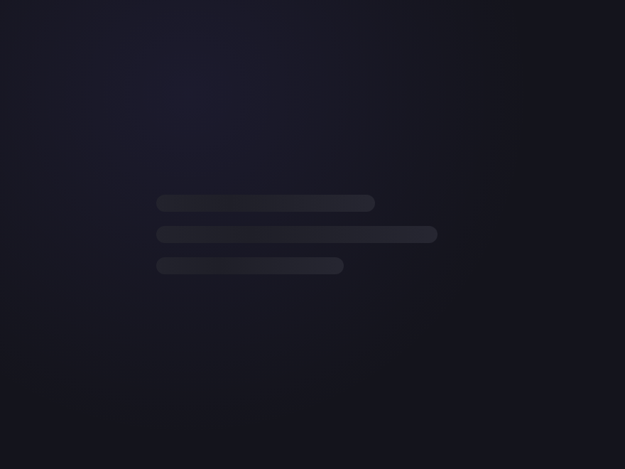
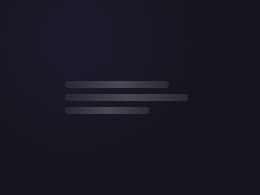
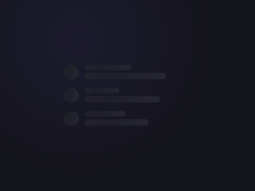
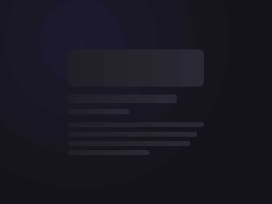
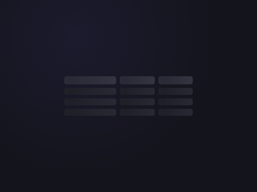
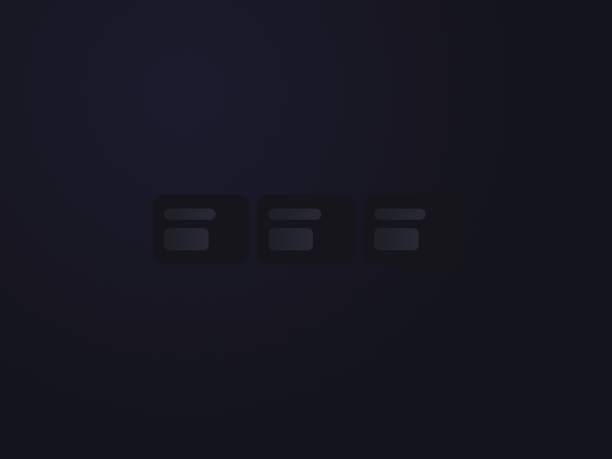
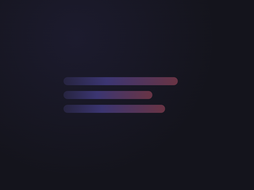
12 CSS Skeleton Loaders

Advertisement

A CSS skeleton loader is a content-shaped placeholder shown during data fetching to reduce perceived wait time. These 12 hand-coded skeletons are ready-to-ship placeholders for article lists, product grids, dashboards, and feed UIs — copy the markup, show during your fetches, and ship.
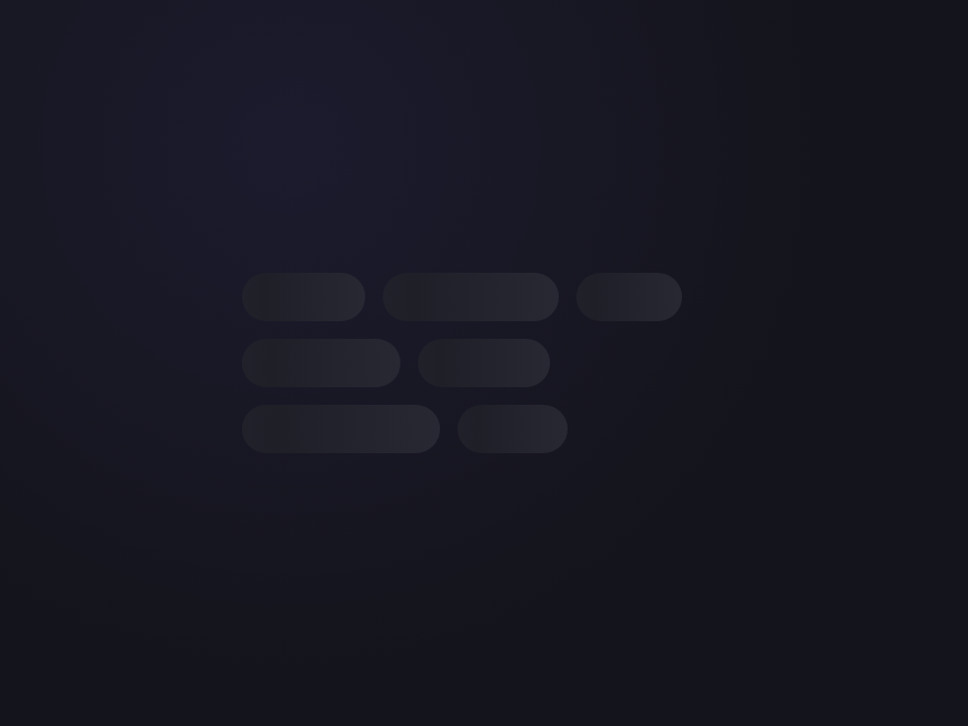
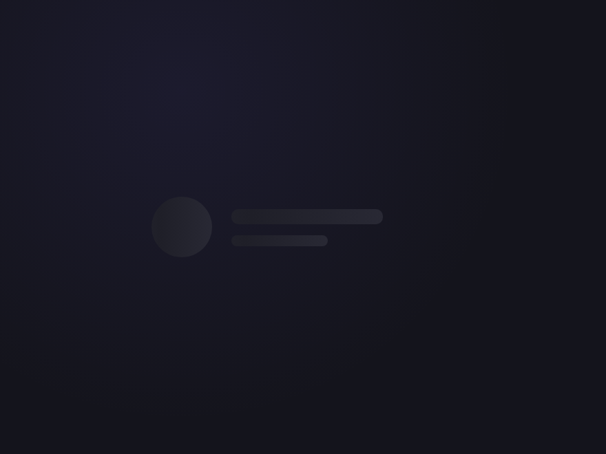
12 unique skeletons 12 Pure CSS 0 dependencies 100% copy-paste ready Published
01 / 12
Classic Shimmer
Pure CSS
Classic Shimmer — preview
A diagonal gradient slides left-to-right across each placeholder bar — the most-recognised skeleton style, used by LinkedIn, Facebook, and Slack.
02 / 12
Pulse Block
Pure CSS
Pulse Block — preview
A simple opacity pulse — minimal, GPU-friendly, and the default style used by the Tailwind animate-pulse utility class.
03 / 12
Avatar Card
Pure CSS
Avatar Card — preview
A circular avatar plus two text lines — the canonical user-profile placeholder. Combines a round shimmer with two narrower bars.
04 / 12
Image Card
Pure CSS
Image Card — preview
A 16:9 image placeholder topped with a title and two body lines — the "feed item" template every social and blog UI ships with.
05 / 12
Wave Sweep
Pure CSS
Wave Sweep — preview
A bright highlight strip travels across the placeholder using a CSS mask — adds a glassy "light passing over" feel without changing the base colour.
06 / 12
Comment Thread
Pure CSS
Comment Thread — preview
Three stacked rows, each a small avatar + two text lines — perfect for chat windows, comment lists, and message inbox loading states.
07 / 12
Article Page
Pure CSS
Article Page — preview
A page-level skeleton: hero image, headline, byline, and four paragraph lines. The full reading-page placeholder for blog and news templates.
08 / 12
Table Rows
Pure CSS
Table Rows — preview
Three table rows of three cells each, with a header row above. Each cell shimmers — the canonical placeholder for data tables and dashboards.
09 / 12
Stat Tiles
Pure CSS
Stat Tiles — preview
Three KPI tiles in a row, each with a small label and a big number placeholder — the dashboard / analytics loading state.
10 / 12
Gradient Glow
Pure CSS
Gradient Glow — preview
A soft brand-coloured gradient sweeps through each bar — a more decorative shimmer that fits hero sections and marketing pages.
11 / 12
List with Thumbnails
Pure CSS
List with Thumbnails — preview
A search-result / file-browser layout: square thumbnail beside two text lines, repeated three times. Mirrors media library and admin list views.
12 / 12
Chip Cluster
Pure CSS
Chip Cluster — preview
Pill-shaped chips of varying widths shimmer in a flex-wrap layout — the right placeholder for tag filters, category lists, and search facets.
Advertisement

Build your own

Tweak the exact look in our visual generators — no signup, instant copy-paste.

FAQ

Frequently asked questions

What is a skeleton loader?
A skeleton loader is a placeholder UI shown while real content loads. Instead of a spinner, it displays grey blocks shaped like the content to come — lines for text, a circle for an avatar, a rectangle for an image. It makes the page feel structured and faster, because the user sees the layout immediately. This gallery has 12, from a simple card to a full comment thread.
How do I build a skeleton loader in pure CSS?
Recreate the content's layout with plain divs given a grey background and border-radius — bars for text lines, a circle for an avatar, a block for an image. Then animate them with a shimmer or pulse so they read as 'loading'. All 12 loaders here are pure CSS; copy the markup and animation from any demo.
How does the skeleton shimmer animation work?
Put a light gradient highlight on the grey placeholder and animate its background-position across the element with @keyframes, so a sheen sweeps left to right on a loop. The simpler pulse style instead animates opacity up and down. The Classic Shimmer and Pulse Block demos show both, pure CSS.
Do skeleton loaders need JavaScript?
The skeleton itself is pure CSS — all 12 demos here need no JavaScript. JS only comes in at the application level: you show the skeleton markup while data is loading and swap in the real content when it arrives. The placeholder and its animation are entirely CSS.
Are these skeleton loaders accessible and free?
Yes. The shimmer and pulse animations honour prefers-reduced-motion, and a loading region should be paired with aria-busy or role=status so screen readers announce that content is loading rather than reading empty placeholders. All 12 designs are MIT licensed and free for commercial use.

Search CodeFronts

Loading…