28 CSS Stacked Card Designs
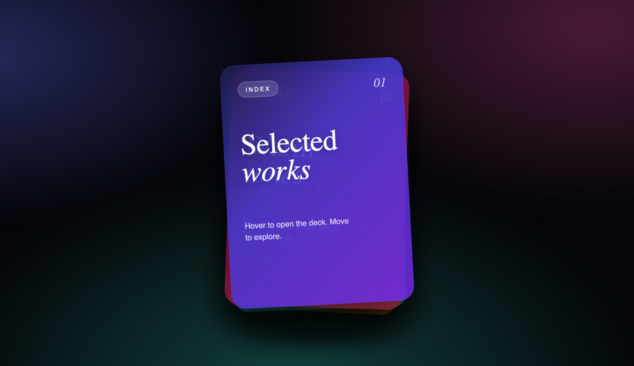
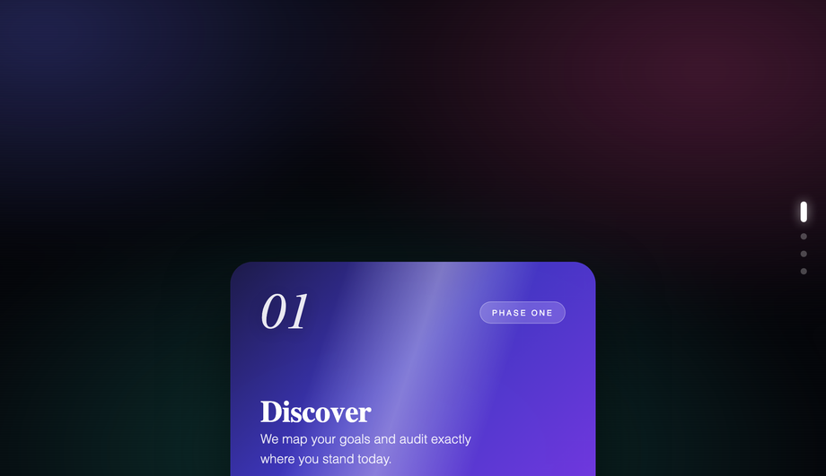
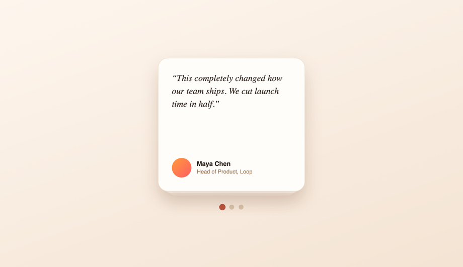
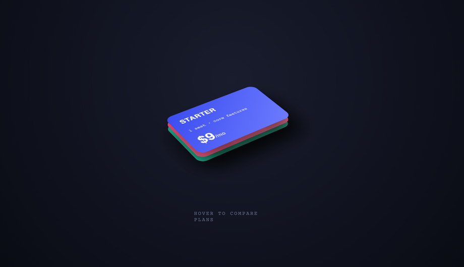
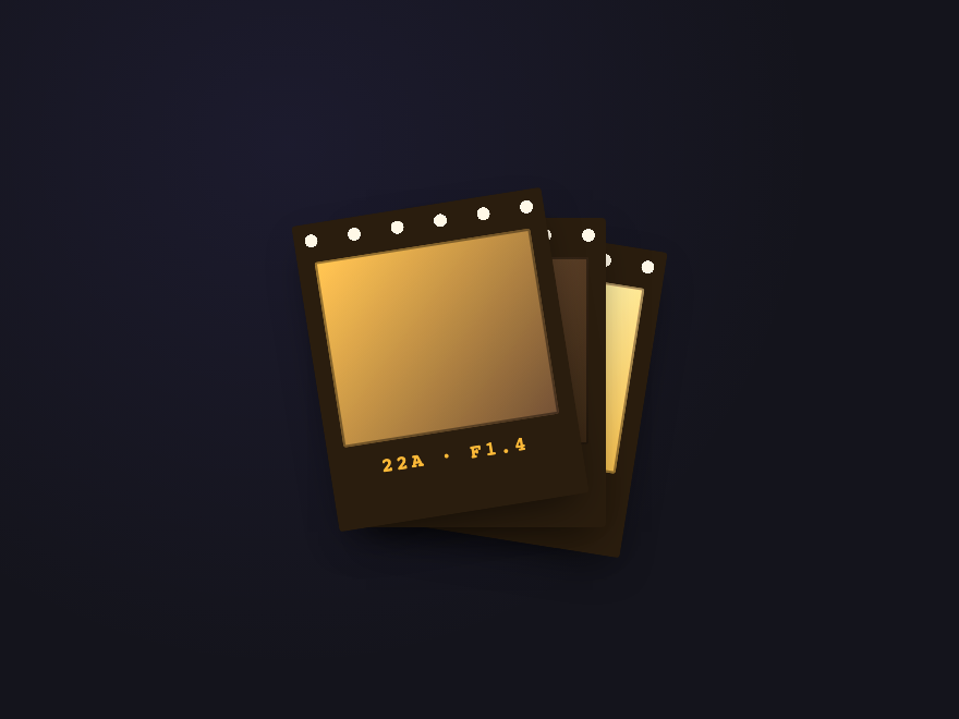
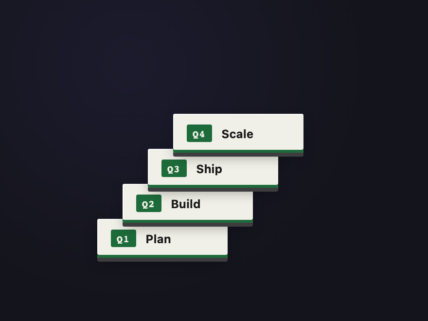
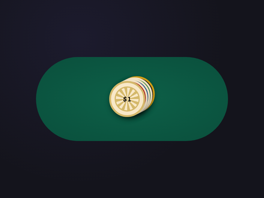
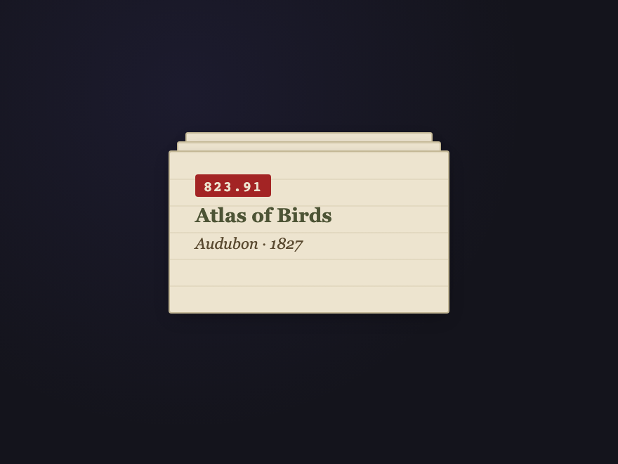
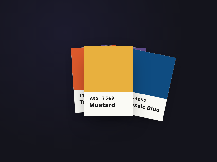
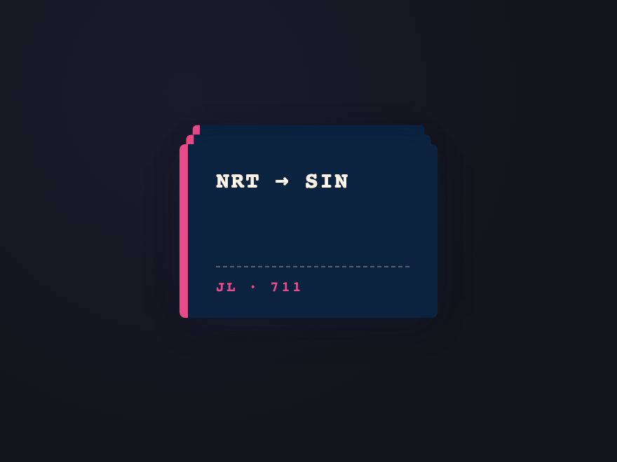
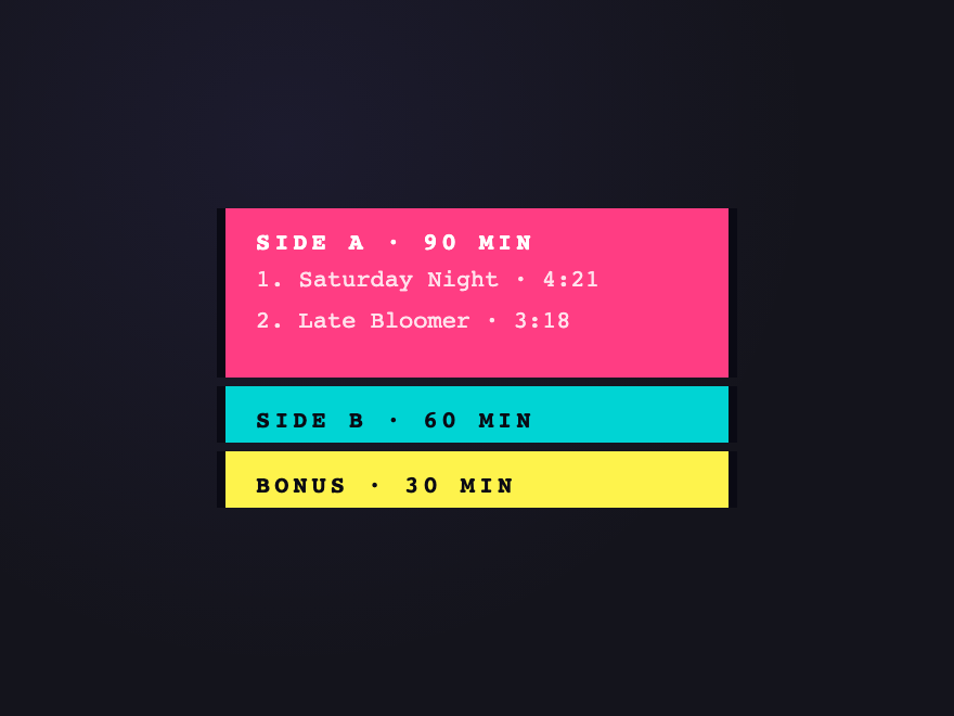
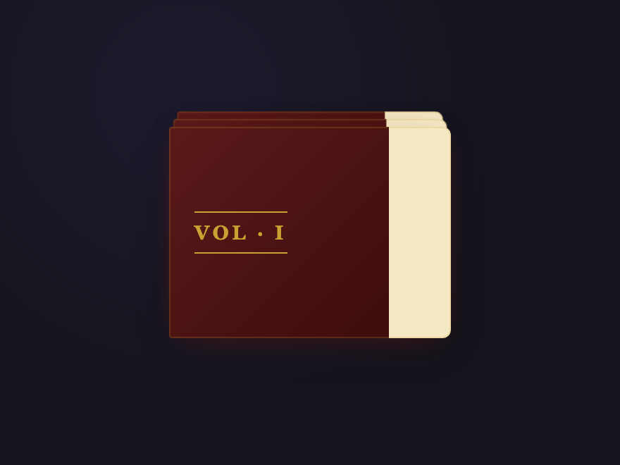
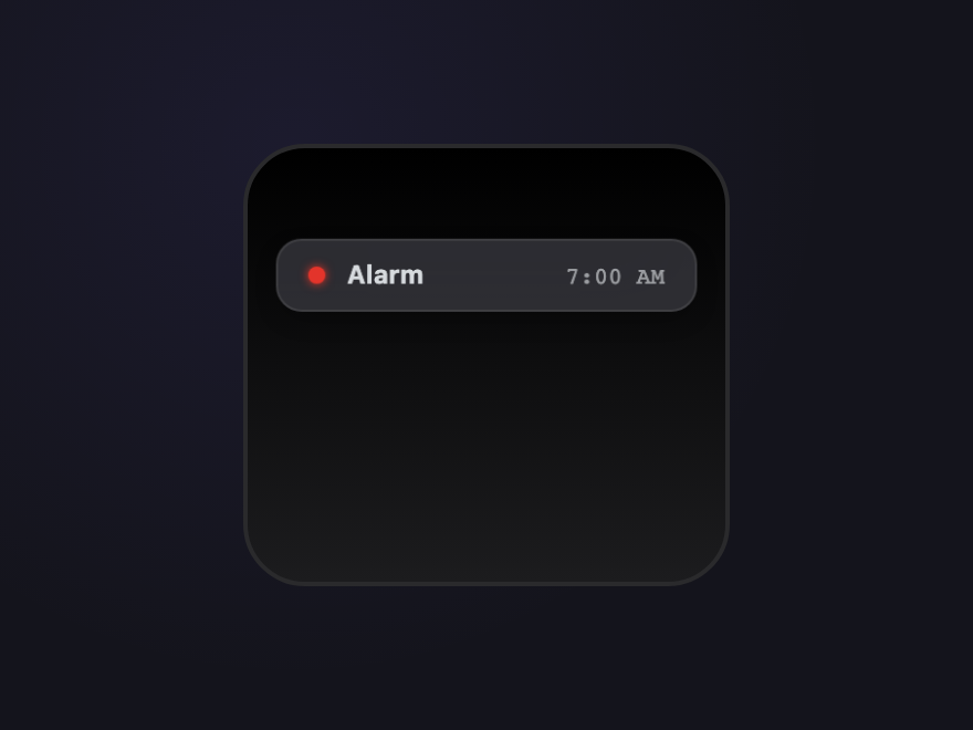
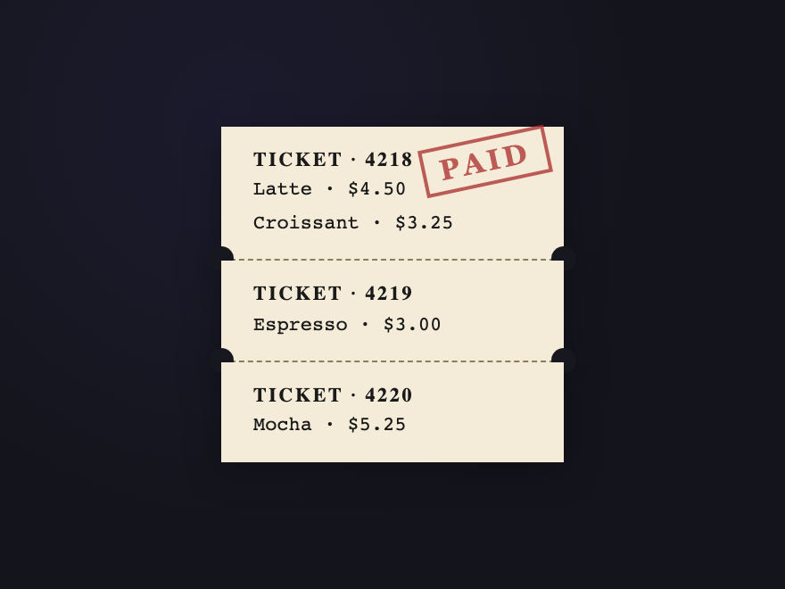
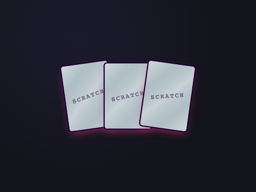
A CSS stacked-card layout renders multiple cards as a 3D depth-stack instead of a flat row or grid. These 28 hand-coded designs lead with an editorial hover-reveal deck that fans on cursor enter, a scroll-activated sticky stack where each step pins as the next slides over it, a pure-CSS testimonial slider built on hidden radio inputs (zero JS), three pricing tiers floated in a true isometric plane, a Tinder-style swipeable flashcard deck, and a minimalist bento dashboard grid with an embedded mini-stack — plus a casino-felt poker deck, botanical fan spread, scattered Polaroids, staircase bricks, glassmorphic perspective tunnel, iOS-style notification pile, thermal-printer receipt that unrolls, a continuously rotating spiral tower, cursor-parallax tilt card, and a real <canvas> scratch-off lottery card. 20 are pure CSS; 8 add a short vanilla JS snippet for click/drag/scratch/scroll interactivity. Each demo ships with semantic HTML, scoped .scd-<prefix> class names that never collide with your existing styles, prefers-reduced-motion fallbacks, and MIT licensing — copy from any code panel and drop onto your existing card markup.
Build your own
Tweak the exact look in our visual generators — no signup, instant copy-paste.
Frequently asked questions
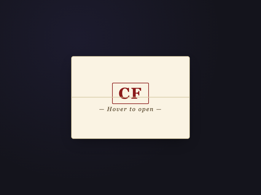
How do I make stacked cards fan out on hover with pure CSS?
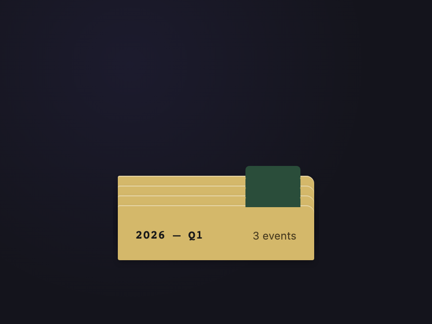
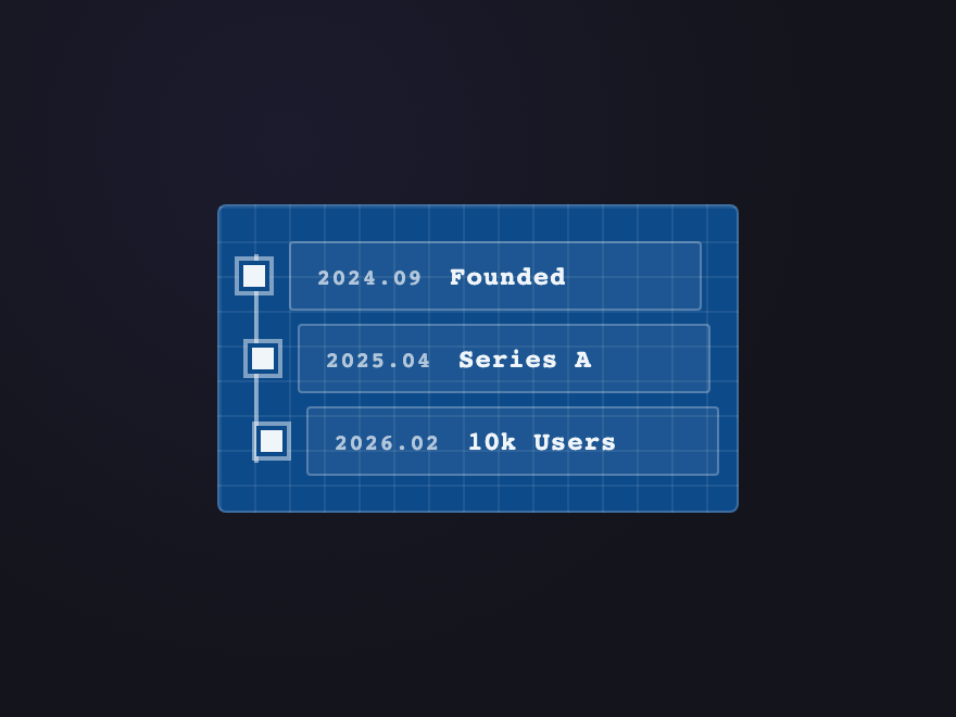
How do I build scroll-activated stacked cards with sticky positioning?
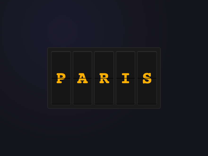
How do I build a testimonial slider with pure CSS — no JavaScript?
How do I make 3D overlapping stacked cards in an isometric view?
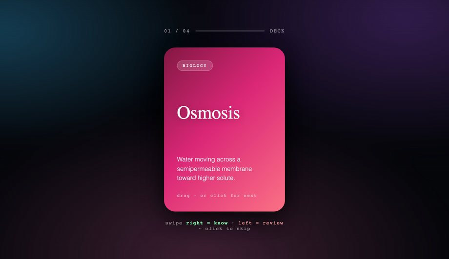
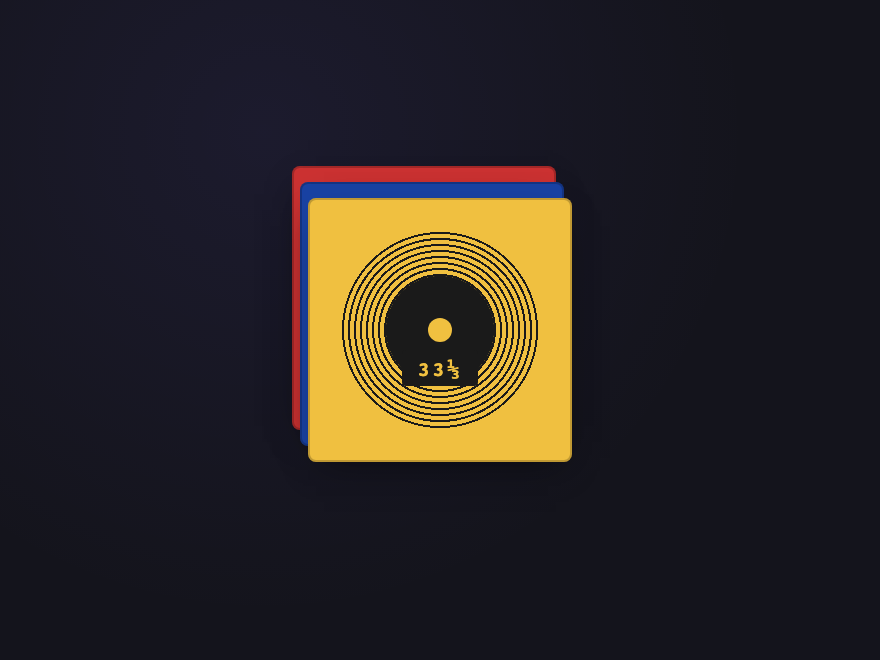
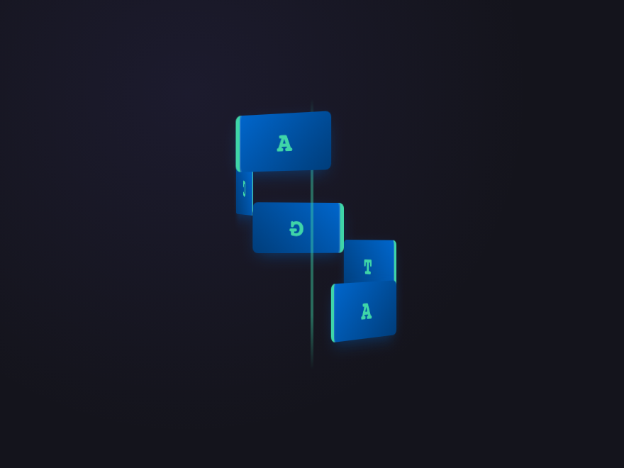
How do I build a swipeable card stack with mouse and touch drag?
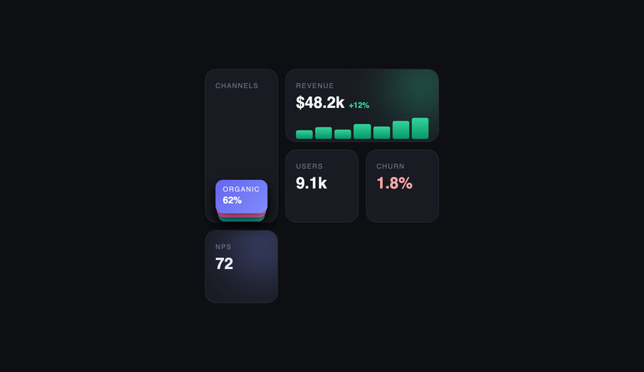
How do I embed a stacked-card component inside a bento grid?
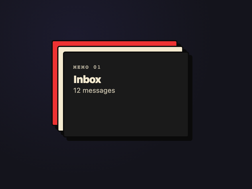
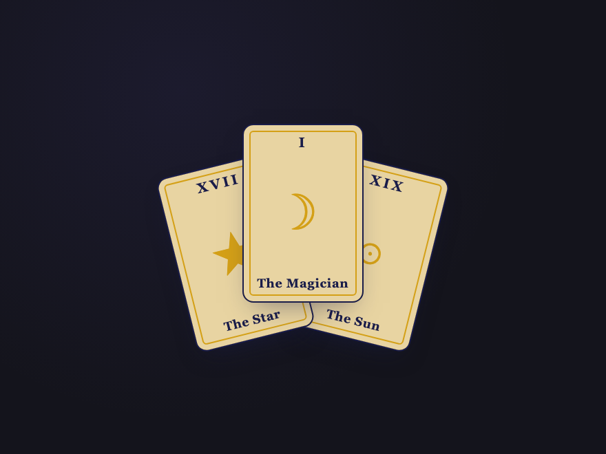
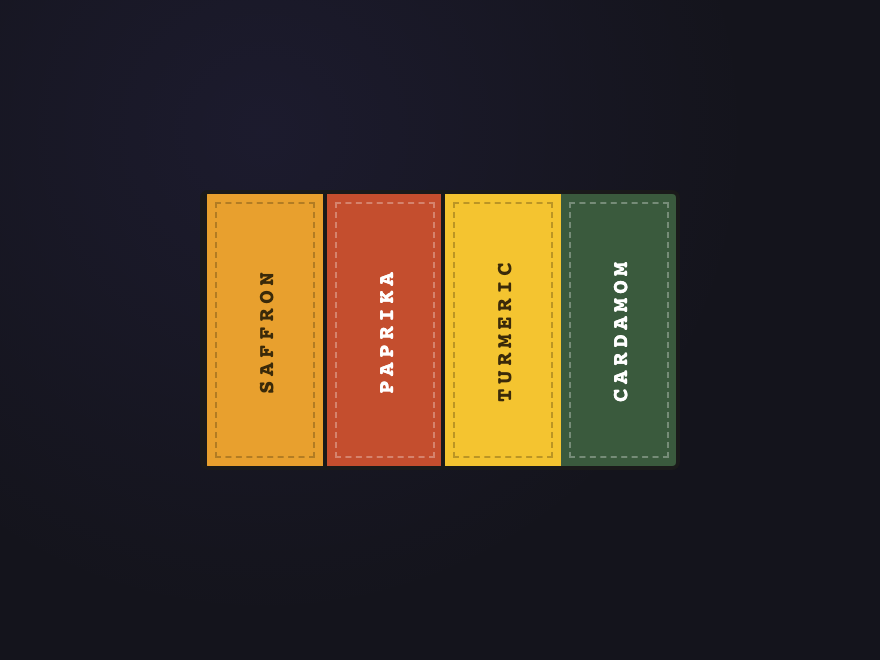
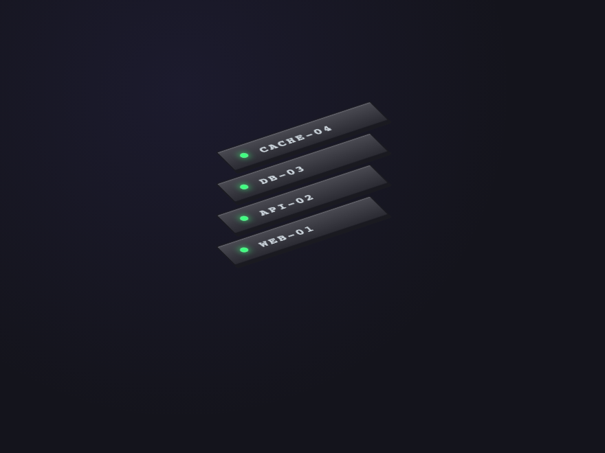
How do I create a stacked-card effect in pure CSS?
Which of the 28 demos need JavaScript? Are they accessible without it?
How do I keep a stacked-card hover animation smooth and not janky?
Are these stacked card designs responsive and free to use?
Related collections

22 CSS Button Group Designs
22 dynamic CSS button groups with motion-driven interactions — plasma loops, holographic gradients, magnetic discs, wormhole tabs, particle aurora. Pure CSS or light JS, copy-paste ready.

43 CSS Button Designs
43 hand-coded CSS buttons — real-world materials like brushed brass and vinyl, interactive use-case buttons (add-to-cart, download, like, delete), and click-effect studies: magnetic mercury ripple, brutalist glitch, neon plasma burst, clay press, ink spread, and particle shards.

27 CSS Calendar Designs
27 hand-coded CSS calendar designs covering every search intent for 'css calendar' — pure-CSS calendar (no JavaScript), CSS Grid layouts, glassmorphism widgets, brutalist designs, dark mode UIs, neumorphic cards, horizontal timelines, sidebar widgets, booking date-range pickers, CSS Grid advent calendars, Fluent / Material Design, circular / radial layouts, retro neon cyberpunk, 3D flip cards, isometric dashboards, split-screen heroes, liquid micro-interactions, bento grid booking, vintage paper tear-offs, vertical timelines, kinetic typography, and slanted diagonal grids. 1 truly pure-CSS, 26 with small vanilla JS snippets for event handling. Scoped class names that never collide, prefers-reduced-motion respected, MIT-licensed.